 Yesterday was mobile day in my inbox. In the span of two hours, both Wells Fargo and Bank of America hit me up with email reminders of how great their mobile services were.
Of the two, Wells Fargo’s was the more interesting, telling me about its revamped, mobile-optimized site, <wf.com> (see first screenshot). But since I’ve been using their iPhone app for three years, I’m not sure why I’d be super-interested in its mobile site.
In fact, the message is confusing for app users. Until I reread it for this blog post, I thought the bank was touting a new and improved app, which I was looking forward to checking out.
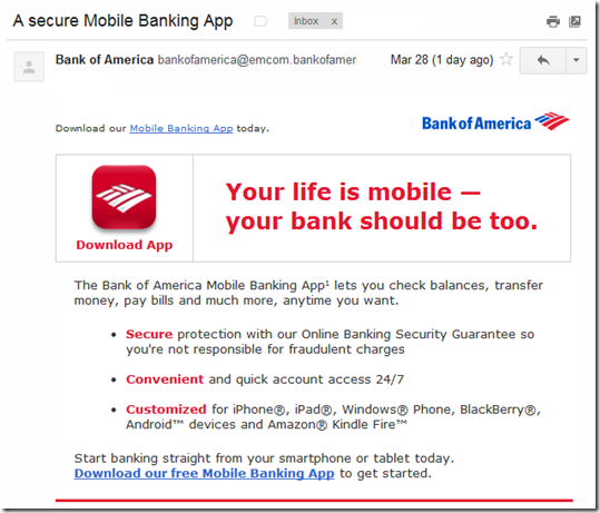
Bank of America’s message was completely generic, saying that mobile banking is secure, convenient, and customized. And the call to action was to download its app, which I did almost four years ago, so I’m not sure why I received this message (note 1). I have also used the bank’s iPad app and Kindle app.
Bottom line: The email messages were well-designed and short, so the creative scores well. But the targeting was sub-par, especially BofA, which seemed to completely miss the mark. And while Wells Fargo’s message could have been better adapted for app users, the bank gets points for acknowledging that I use the mobile channel (note 2).
——————————————-
Wells Fargo customer email (28 March 2012, 11:37 AM Pacific)
From address: [email protected]
Note: Account holder name blurred out.
Bank of America general mobile banking customer email (28 March 2012, 1:34 PM)
From address: [email protected]
Notes:
1. A month ago I had to replace my BofA card (again!) due to fraud, so possibly this was a misguided on-boarding message.
2. The Wells Fargo message was clearly targeted to mobile users: “Thanks to suggestions from mobile users like you.”


