Feature Friday: Universal Checkbook from Personal Capital

imageOne of my favorite features unveiled last week, was Universal Checkbook from Personal Capital. And apparently I wasn’t the only one. Attendees voted the startup Best of Show (again) and hit Twitter with positive comments such as the one below from Brad Leimer (@leimer) of Mechanics Bank,.

Universal Checkbook (see inset) allows users to move money directly between any linked bank/brokerage accounts, providing they have check-writing capabilities.

imageWhile many banks also support interbank transfers, they usually require funds to move in and out of the host bank account. To move money between two third-party accounts requires two separate transfers. And it would take 5 or 6 days (via U.S. ACH system) if you waited for the funds to arrive in the host account before sending them elsewhere. 

In the demo, Personal Capital showed how easy it is to enroll a new bank accounts using deposit capture to grab a check image from that account. However, this enrollment option is not yet available in the production iPhone app (note 2, 3).

Pricing: There is no word on pricing, but it looks like there may be a fee eventually. On the bottom of the pay screen it says, "Try Universal Checkbook FREE for three months!" Because Personal Capital offers basic PFM services ad- and fee-free, it will likely need fees for money movement, at least for users not committing any assets to the startup.

————————–

Tweet from Bradley Leimer (@leimer) during Personal Capital demo at FinovateSpring (8 May 2012)

image 

————
Notes:
1. We took an in-depth look at truly virtual banks (Personal Capital, Bank Simple, and PerkStreet) in our Oct 2011 Online Banking Report.
2. The app doesn’t yet explain how to enroll new payment accounts, evidently the image capture capability is still in process.
3. Universal Checkbook has not yet been incorporated into Personal Capital’s iPad or desktop versions.

Launching: EFTGuard Provides $500k in Online Fraud Protection for Business Banking Customers

image That was fast. Just two weeks after my latest appeal to the industry to provide small business owners with more security options, a new product launched today aims to do just that. And it’s packaged as a turn-key, fee-based service that could be sold by banks at a $10+ per month profit (MSRP is $25/mo).  

That all sounds too good to be true. When I was first contacted by Greenway Solutions last week, I was more than a bit skeptical. But after speaking with CEO Jerry Tylman and Managing Consultant Jon Meyer, I was convinced they had something that as a business owner, I’d definitely buy.

The product, EFTGuard, is a joint venture between Greenway Solutions and Royal Group Services. They say it’s a “win-win-win” for banks:

  • Helps banks meet “UCC requirement for commercially reasonable security and their FFIEC requirement for customer education and awareness”
  • Provides peace of mind to bank clients
  • Protects both the bank and each client up to $500,000 in unauthorized online transfers
  • Helps differentiate checking and deposit offerings

____________________________________________

How it works
____________________________________________

EFTGuard provides protection against fraudulent online-account withdrawals of $100,000 per account (with no deductible), with a maximum of $500,000 per customer. And because it’s not true “insurance” (it just behaves like it), there is no underwriting hassle and the product can be purchased in just a few minutes via online form (demo here). There is, however, the usual list of coverage exclusions; for example, it doesn’t cover insider theft. 

The catch? To qualify, business customers must download and install anti-malware software from Trusteer, Iron Key, or Webroot. And every computer accessing the business account must be running these protective software programs. For the time being, that appears to leave out any mobile access. 

Initially, banks looking to offer EFTGuard will need to work with one of these three malware-protection vendors in order to qualify their clients for the fraud protection. Other than that, EFTGuard is turn-key and comes with marketing support, a co-branded signup page, and full claims management.

The $500,000 coverage is backed by Chartis Specialty Insurance Company.

__________________________________________

Bottom line
__________________________________________

Your business customers are rightly concerned about fraud. Offering them an option to protect themselves is a great way to differentiate your deposit offerings while preventing you from getting bogged down in messy litigation with your customers.

I still have questions about how often the list of exclusions will invalidate claims when actual fraud occurs. But the company assures me that the protections are very real.

Assuming EFTGuard delivers on its protection promise AND creates a small profit center, what’s not to like? I, for one, will be the first business owner in line to buy it. 

——————-

EFTGuard homepage (24 April 2012)

image

———-

Note:
1. I believe insurance is one of the best growth areas in retail banking, especially in niche lines that can be explained and delivered online (see our December Online Banking Report for more about banks delivering insurance online).

Westpac NZ Makes it Mobile Savings Transfers Easy with Impulse Saver

image There are two schools of thought when it comes to mobile app design:

  1. Put everything in a single app for each platform (note 1), so your customers aren’t confused about which app to download
  2. Create specialized apps for various market segments and/or apps that focus on a single function

American Express (7 for iOS, note 2); JP Morgan Chase (3 for iOS); Zions Bank (3 for iOS); Southern Bancorp (2 for iOS); and a handful of other banks have launched multiple apps. But it’s still the exception: More than 99% of banks have no more than one app for each platform. 

Westpac NZ has joined the multi-app group, though oddly it has yet to launch a full-featured mobile banking app (note 3). Yesterday, we wrote about Westpac’s clever Cash Tank, that provides a no-login gauge to monitor account balances.

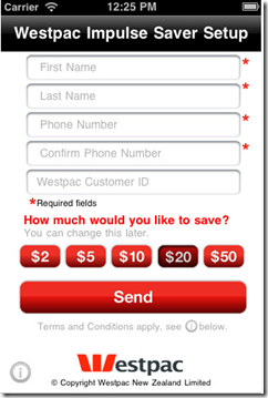
The bank has another cool single-use app, Impulse Saver, which is basically just one huge red button that users press to make a transfer from their checking account to a savings account.

obr_bestofwebThe amount of each transfer, from $2 to $50, is preset using the app settings (see second screenshot).
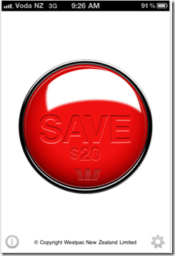
Bottom line: With Impulse Saver and Cash Tank, Westpac NZ has raised the bar for simple no-login mobile banking, earning an OBR Best of the Web (note 4).  
————————————-

Westpac’s Impulse Saver iPhone app (20 March 2012)

 image     image

———

Notes:
1. By single app, we mean one app per major platform, i.e., one app for iPhones, one for Android, one for iPad, etc.
2. In addition, American Express offers at least six more content apps through American Express publishing.
3. A number of reviewers in Apple’s App Store have been criticized for not having a full-featured app. For example, in June 2011 “crazfulla” wrote, “This is a great idea; however, we need a real app that has all the banking capabilities.”
4. Since 1997, our Online Banking Report has periodically given OBR Best of the Web awards to companies that pioneer new online or mobile banking features. It is not an endorsement of the company or product, just recognition for what we believe is an important industry development. If anyone knows of other financial institutions offering a similar feature, let us know and we’ll update the post. Westpac is is the 86th company to win the award and the third in 2012. Recent winners are profiled in the Netbanker archives.

Is BancVue’s Kasasa to Checking What "Intel Inside" was to PCs?

image I just spent the better part of two days attending BancVue’s monthly client/prospect meeting called BTAN (note 1). I knew they would have high-energy presentations, great ideas, and outrageous antics; after all, I’ve seen them take home three Finovate Best of Show trophies. They know how to drive a point home.

But what I didn’t expect was to come home believing its Kasasa strategy might really work. Kasasa launched at FinovateFall 2009 (video here) and is the first major attempt to create a nationwide brand around the checking account. They are trying to do for checking what Visa/MasterCard did for the credit card or what Intel did for PC manufacturers with “Intel inside.”

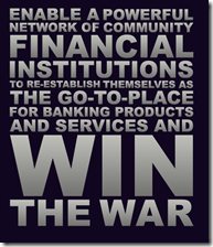
Bancvue's about us page One very different element here is that BancVue is creating a national brand exclusively for use by community banks and credit unions. Large banks are viewed as the enemy (see inset from BancVue’s “about us” page) and are not allowed to “stock” the Kasasa brand.

On the surface it seems impossible. How could hundreds, if not thousands, of proud, local financial institutions — many who’ve been building a local brand for many decades — unite under a nutty brand called “Kasasa” of all things?

But is it crazy like the iPod was crazy? Smaller banks and credit unions are being taken to the cleaners by the big banks, losing more than half their market share in the past two decades. They have the local ties, the human connection, but it is usually hard to maintain the product set, marketing power, and online/mobile UI, of Bank of America or Chase.

But what if someone was able to level the playing field with best-of-class products and combine the marketing power of 1,000 financial institutions into a national brand? (note 3) Then the community banks/CUs could go ahead and compete on service, price, value and local connections.

It sounds too good to be true, really. And I was skeptical when I heard the pitch two years ago. But after seeing how BancVue has signed up more than 600 FIs for rewards checking, hit #23 in the Inc 500, and witnessing their passion in person, I think they have a real shot.

Bottom line: It takes a long time to build a national financial brand, especially one centered on lowly checking accounts. Other than PayPal, what’s the last one you can think of? Capital One, founded 1988, maybe. Discover Card, launched in 1985, perhaps (note 4). And I can think of a hundred reasons why it won’t work.

But Kasasa is definitely out of the gates and gaining traction. Having just finished my review of the most important trends of 2011, I have a feeling Kasasa could make this list in 2012 or 2013. 

——-

Kasasa product set (11 Jan 2012)

Kasasa product set

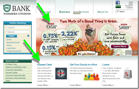
Kasasa products dominate the homepage of Farmers Citizens Bank (link)
Question: Do Kasasa ads clutter the Farmer’s homepage? No more than any other promotion. And they are at least attention getting. 

image 

Landing page at Farmers Citizens (link)

image

—————————

Notes:
1. I attended the event at the invitation of BancVue. But I am not consulting for them or their customers. BancVue is a customer of The Finovate Group for our event and our published reports just like hundreds of other companies. However, they did feed me really well, which, as my family will attest, is a powerful motivator in my life. So I can’t say I’m totally unbiased.
2. After hearing the detailed reasoning behind the branding decision, I actually think the Kasasa choice makes sense. But you’ll need to see the presentation to get it. The Financial Brand breaks it down here.
3. BancVue says that with 1,000 financial institutions offering Kasasa it would be bigger than the largest U.S. bank in branch network and marketing budget.
4. I can’t think of any major national banking brands that have appeared in the Internet age other than PayPal, and perhaps NetBank (RIP). ING Direct made it, but they were a spinoff of a powerful international brand, and even then they spent more than a BILLION in the United States alone during the past 12 years making ING Direct a household name. E*Trade, Ally also come to mind, but the former is more associated with brokerage and the latter is a name change from GMAC. Bank of Internet is doing well, but is hardly a household name.

Can Savings Accounts Be Social?

image I glanced at my ING Direct eStatement alert today (screenshot below) to see what they had to say in the new year. The soon-to-be-Capital-One direct bank is usually pretty creative in its copywriting. And I was not disappointed today. Here’s the pitch inside the alert:

image

I love the idea of a “Social Network…of Savers,” a Facebook-like place where friends help each other keep spending in check and achieve politically correct savings goals such as the down payment on a home, the college fund, or a rainy day reserve.

But I don’t think the Facebook model works in the real world (note 1). Even though it might be interesting to follow your friends’ drunk spending (note 2), most users want this info to be kept VERY private (note 3). And in most circles, money accumulation is never openly discussed. Who wants to read about someone’s “trip to Tahiti” savings goal when you are trying to get off unemployment?

In its recent email, ING Direct is NOT looking to create the Facebook of savings in any way. While the bank celebrates savings throughout its marketing (e.g., Wethesavers.com), this email offer isn’t about sharing with your network, it’s about selling to your network to earn a $10 referral fee per new account, up to $500. And that’s OK, because everyone loves to share “found money.”   
—————————-

ING Direct email (4 Jan 2012, 9 AM Pacific)

ING Direct estatement email alert 

Referral landing page (link)
Note: There’s even a Flash demo of the referral split for the math challenged.

ING Direct referral landing page

Notes:
1. I’m not saying that all sharing is a dead end. For example, sharing savings/spending goals can work very well within tight-knit groups such as extended families. And compiled/masked data about peer spending/savings is very promising (see Citi’s Bundle joint venture). Finally, there are numerous opportunities for “social investing” (our 2008 Online Banking Report on the subject), because it’s much more complicated and often openly discussed.  
2. There is room for “social savings” in the context of sharing discounts, money-savings tips, and so on. But that’s not what ING Direct is talking about in this message.
3. Hence the pivots by the two “class of 2010” startups, Blippy and Swipely, which were founded on a “transaction-sharing” model.
4. And the bank makes its win-win. The new customer gets the biggest share, $25 for a savings account, a 70/30 split of the $35 up for grabs. New checking customers get $50, from an 85/15 split of $60.
5. For info on family banking, deposit gathering, transaction sharing, social investing, and much more, see our subscription newsletter, Online Banking Report.

Wells Fargo Pitching Wachovia’s Way2Save Account at Login

imageWells Fargo generally does a good job with its login product pitches. I like how the bank provides a "Remind me later" and "No thanks" option next to "Apply Now."

However, in today’s pitch for the rebranded Wachovia Way2Save account (see old logo, inset), the bank seems to have forgotten an important part of consumer decision process: explaining what the account is. There is no Learn More button to be found on the ad or landing page.

I had to leave the app and search the Wells Fargo website to determine the rate and unique features of Way2Save (see note 1). The main benefit: users receive a 3% APY on the first $500 in the account for one year, provided they use one or these automated savings features:

  • $25+ per month or $1+ per day transferred from Wells Fargo checking (outside accounts not an option, except for initial account funding)
  • Automatic $1 transfer from WF checking to savings with every debit card purchase or pre-authorized debit  

After one-year interest drops to the prevailing rate, currently just 5 basis points, 1/60th the premium rate. 

Online application process: Choosing Apply Now on the interstitial drops users directly into the bank’s generic online app where’s it’s difficult to even confirm what you are applying for (see upper right corner of second screenshot). 

Since I only have a Wells Fargo credit card, the bank offers me a $5/mo checking account, which is free if I have direct deposit or $1500 on deposit. But the checking account is not required. You can setup a standalone savings account, though it won’t qualify for the interest rate bonus or be able to use the automation tools.

On the final page users can fund the account with a transfer from a Wells or non-Wells deposit account or they can deposit up to $500 via credit or debit card. 

Bottom line: Automatic savings are a win-win. And offering a $15 interest bonus is a good way to improve signups. But Wells needs to explain the offer better so that customers customers are motivated to complete the application.    

————————–

Wells Fargo interstitial login ad for Way2Save (10 Nov 2011)

Wells Fargo interstitial login ad for Way2Save


Landing page, which is the first page of the online application (link)

Landing page, which is the first page of the online application

Wells Fargo online application (page 2)
Note: The bank is still disclosing at $3 debit card usage fee

image

—————————-

Notes:
image1. Way2Save was inherited from Wachovia (previous posts). Here’s the cached 6 Nov page from Google. The page now redirects to Wells Fargo savings.
2. Wells Fargo acquired Wachovia in 2008.
2. For info on online account opening, deposit gathering and much more, see our subscription newsletter, Online Banking Report.

Launching: ING Direct Unveils $10 Million Campaign for Teen Banking

image Just last month we published a report (here) about the large, and mostly unmet, opportunity to bank tweens/teens AND their parents.

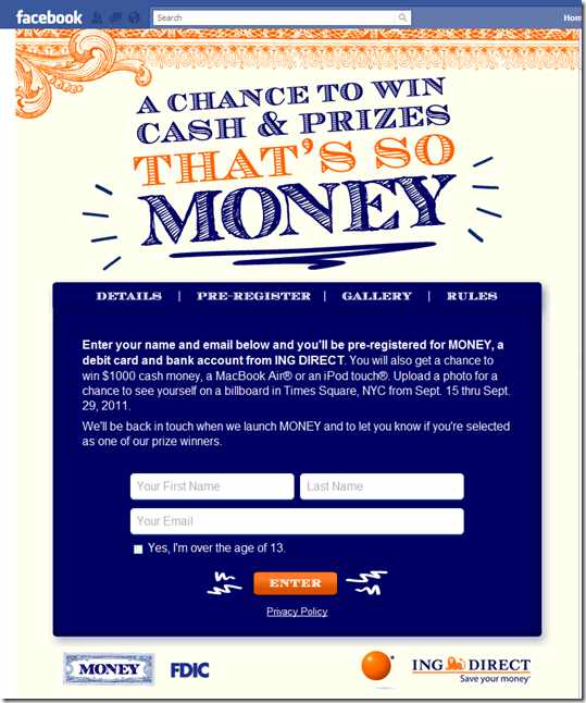
Evidently ING Direct didn’t need our report. The direct bank, soon to be part of Capital One, is launching an aggressive $10 million advertising campaign for its new MONEY account (note 1). There’s no official mention of the program at ING Direct, except for a wall post on its main Facebook page (see last screenshot).

However, several online elements have been released:

Product: There’s only a few sentences describing the product, but it sounds like a standard checking account with debit card access. It will have no fees and no minimums and can be managed online (duh) and through a smartphone app.

Campaign: The $10 million campaign (note 2) is primarily fulfilled via Facebook (see screenshots below) and includes:

  • Advertising on Facebook and online
  • Supporting sweeps has (10) $1,000 prizes, (10) MacBooks, (20) iPod Touches
  • Those submitting pictures of themselves, may get it projected on a Times Square Jumbotron for 15 seconds (begins Sept. 15)

Our take: With 1% rates killing its traditional value proposition, it makes perfect sense for ING Direct to build for the future by positioning itself as a place that caters to the banking needs of the entire family. Well played.

———————————————-

1. ING Direct’s teen-banking microsite at ingdirectmoney.com (30 Aug. 2011)
Note: In the lower right is a “pre-registration form” where the bank collects the name and email address of interested parties

ING Direct teen banking microsite at ingdirectmoney.com (29 Aug 2011)

2. Parents are encouraged to send a message to their children to let them know about the sweeps
Note: The lower right contains a place for parents to send email messages to their children

2. Parents are encouraged to send a message to their children to let them know about the sweeps

3. Facebook page at <facebook.com/ThatsMoney>

3. Facebook page at <facebook.com/ThatsMoney>

3. Facebook page info page (Facebook app)

3. Facebook page info page

4. Facebook page sign-up form

4. Facebook page signup form for ING Direct Money

5. Thank-you page after pre-registering

image

6. Wall post this afternoon on main ING Direct Facebook page (link, 30 Aug. 2011)

6. Wall post this afternoon on main ING Direct Facebook page (29 Aug 2011)

————————————

Notes:
1. New agency Berlin Cameron is spearheading the effort according to today’s Adweek article.
2. That’s about 40% of ING Direct’s projected $25 million media spend for 2011.
3. Hat tip: MyBankTracker
4. For more on teen banking, see our recent Online Banking Report.

ING Direct Raises the Security Bar Again with Checkbook Activation

ING Direct has brought a number of security innovations to the United States: 

  • Password entry via pin pad instead of keyboard
  • Trusteer “safe login” browser plugin (previous post)
  • Challenge questions at login (when needed)

  Now add a fourth item to that list:

  • Authorization required when a new book of paper checks is ordered (see update below)

ING Direct, which famously eschewed paper checks when it launched a checking account, Electric Orange, in 2007, recently began offering a paper-check option. True to form, ING Direct added a few twists to standard industry practices:

  • Paper checks can be bought only in quantifies of 50
  • Each order is just $5
  • Only one set of 50 can be ordered at a time (but once they have been authorized, another set can be ordered)
  • Before the checks can be used, the book of 50 must be activated online (similar to credit/debit card authorization)
  • Because the order must be authorized, third-party paper checks will not work at ING Direct (another security improvement)

_____________________________________________________________________

How it works
_____________________________________________________________________

The bank isn’t exactly pushing paper checkbooks. There are no obvious links to the option on the primary or secondary navigation. Users must click on the Payments tab, then select Overview on the secondary navigation. That brings up a list of the ways to make payments, with “Checkbook” listed half-way down the page (see below).

New paper-check option at ING Direct (12 Aug. 2011)

ING Direct's paper check book option 12 Aug 2011

And the bank’s order form is drop-dead simple, unlike most major banks which drop you to a third-party order-entry site.

One-click check-ordering process

One-click check ordering process at ING Direct

Confirmation screen explains next steps

Confirmation screen explains next steps

________________________________________________________________________

My take
________________________________________________________________________

Offering paper checks is a good move. Most U.S. customers still need the occasional paper check, and waiting 5 days for ING Direct to send one out on your behalf was slow and cumbersome.

And I really like the authorization feature. Since I was old enough to know about check fraud, I’ve always felt that a book of checks sitting in my mailbox was a bit disconcerting. This solves that worry.

Finally, the $5 per 50 pricing is consumer friendly and competitive. The lower quantity (compared to typical 150-200 orders) subtly discourages paper-check usage, but the price is in line with other financial institutions, which typically charge $15 to $25 per 200 checks (note 1).

——————————————-

PS. ING Direct must be very close to launching remote check deposit. It has a “stay tuned” message posted under the “Deposit Checks” tab in secondary navigation (see below). 

ING Direct’s website implies that remote check deposit is coming soon (12 Aug. 2011)

ING Direct's website implies that remote check deposit is coming soon

Update (16 Aug. 2011): I heard from Citibank today. Apparently, they’ve used checkbook authorization for online account opening since 2007.

Notes:
1. And you can pay more: Chase recently dinged me for $23 for a book of 50 money-market checks (which I didn’t ask for) when I opened a new business savings account. In comparison, I earned $0.40 (before tax) in interest on the balance. That means it would take more than 7 years to earn enough interest to pay for the book of checks. But I’ll give Chase credit for immediately reversing the fee after I dropped the unwanted checks off at the branch. 
2. Apparently ING Direct changed its homepage navigation items earlier this year. The overall minimalist design remains unchanged. But now, in addition to View My Account, the bank offers three choices: Banking, Investing or Retirement. Previously, there were only two other choices: Open an account and Learn more.

Southern Bancorp Launches "Shake and Bank" iPhone App Aimed at Youth

image It’s been more than six months since we last featured a new mobile app from a financial institution (see Arvest Bank’s financial calculators). It’s not because of lack of activity, or importance. In that time, more than 1,000 financial institution apps have been introduced and the market has really heated up.

But we focus on what’s new and different. And for the most part, the class of 2010 and 2011 have been “me-too” entries. Which is exactly as it should be. Every mid-sized and larger bank and credit union needs at least one app in the iTunes store, so the last 18 months have been about gaining competitive parity. 

But things will start to get more interesting again as financial institutions:

Southern Bancorp’s new mobile app, Shake and Bank, ticks all four boxes. It’s an iPhone/iPod Touch app designed to give kids (or any account holder) a quick look at the balance in their account. As you can see below, Shake and Bank is pretty much self-explanatory:

1. Open app (note 1)

2. Shake iPhone

3. See balance

The app requires a setup code to launch. According to the iTunes entry, the code can be obtained through the bank’s website or at a branch. But as of today, I see no mention of Shake and Bank, or mobile banking for that matter, at their website.

Bottom line: I’m a sucker for pigs, so obviously I like it. But more importantly, Southern Bancorp makes it easy to monitor account balances with a simple kid-friendly approach. And parents will appreciate the help reinforcing the savings habit (note 1).

Southern Bancorp has $1.1 billion in assets and 40 branches in Arkansas and Mississippi.
————————

Southern Bancorp’s iPhone app targeted towards kids (link, 25 April 2011)

Southern Bancorp's iPhone mobile banking app targeted towards kids      image 

—————————

Notes:
1. Since I couldn’t test the app without an account, I assume there is no subsequent login requirement once you’ve entered the setup code. And more importantly, I hope that it oinks when shaken. 
2. For more info on mobile banking, see our previous Online Banking Reports.

Piggymojo Hooks up with Brooklyn FCU to Power "Impulse Savings"

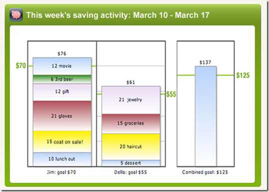
imageLast June, we wrote about Piggymojo’s unique “impulse saving” tool designed to help couples motivate each other to save (previous post). Basically, you text your spouse when you save cash during the day, e.g., drinking the company’s free swill instead of trekking to Starbucks.

The concept is great, but it needs direct integration to financial accounts so those “virtual saves” are translated into actual dollars sitting in a savings account.

imageToday, the Brooklyn-based startup announced the first financial institution integration with Brooklyn Cooperative Federal Credit Union. The program is being funded in part with a $300,000 CFSI grant to gauge whether the program helps lower-income members to increase their savings (press release). Four other projects shared in the $1.5 million total grant (details). 

Weekly summary of savings activity via Piggymojo (7 March 2011)

Weekly summary of savings activity via Piggymojo (7 March 2011)

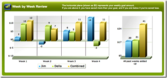
Longer-term tracking

Longer-term tracking at piggymojo

————————————————

Note: For more info, see our Online Banking Report, where we wrote in late 2008 about various ways to leverage your online/mobile channel to boost deposits (here).

Google Launches More Financial Product Comparison Pages: Savings Accounts, Checking, CDs, and Mortgages

image Today, I ran into Google’s new savings-account comparison chart for the first time (see notes 1, 2 and screenshot below, link). The search giant now offers separate pages with financial product comparisons for mortgages, credit cards, CDs, checking, and savings accounts. And the comparison matrices are at times positioned prominently on searches potentially reducing traffic to top advertisers and to organic results as well (see screenshot below).

Savings account search results
Let’s look at an example search today for “savings accounts.” The results include a blue-chip lineup of paid advertisers. Following is a list of the top 10 paid results compared to their position on the Google comparison page (note 3):

1. American Express (#1)
2. ING Direct (#7)
3. US Bank (#24, 30, 32, 33)
4. BECU (local advertiser)
5. Citibank (#19, 25, 26 )
6. Capital One (#10, 15, 31)
7. Navy Federal CU
8. TD Ameritrade
9. Zions Bank (#4, 5, 22, 23, 27)
10. Discover Bank (#2, 11)

Analysis
I still don’t understand why Google would risk antagonizing its financial advertisers by drawing traffic away from their ads and into the Google-powered comparison matrix. The company says its focus is on the user experience. So I guess they believe that long-term this approach will generate more traffic, more searches and ultimately more revenue, possibly from commissions for actual accounts generated, rather than just pay-per-click.

But in its current beta stage, there are some odd results. How would you feel if you are US Bank, bidding high enough to be number three on the search results page, but not shown until page three of the savings-account comparison page? Worse, three top-10 advertisers, BECU, Navy Federal CU, and TD Ameritrade aren’t even listed on the savings comparison page.

Which brings up a bigger question. How does Google determine which FIs are listed? The savings-product comparison indexes only 17 banks, of which five aren’t even playing the rate game at this point with rates of 0.25% or less (note 4). Furthermore, there’s not a single credit union and just one smaller bank (Bank of Internet) listed. 

I understand this is just a trial balloon from Google and that product comparisons could make it easier for users to find the best rate. But right now it’s unfair to any financial institution not in the chosen 17, and it doesn’t allow users to easily choose from criteria other than rate, monthly fee, and whether a branch is nearby.

It also looks like the system could be gamed. What’s to prevent one of these banks from launching ten, or 20 or 30 different savings accounts, all with temporary teaser rates, to soak up more space in the matrix?

Sure, Google will eventually build algorithms to prevent that, but that will take time. Meanwhile, it’s an odd transition time for the search engine and its financial advertisers. But if you rely at all on Google to deliver new customers, you better pay close attention to developments with its product-comparison pages.

Google search for “savings accounts” (12 Jan. 2011, 4:00 PM Pacific, Seattle IP address)

Google search for "savings accounts" showing new product comparison ad

Google’s “savings” comparison page

Google's "savings" comparison page

Offer details page for American Express High-Yield Savings

Offer details page for American Express High-Yield Savings

———————————

Notes:
1. According to MyBankTracker.com, Google started running the deposit-account comparisons in late December 2010 in the U.S. market.
2. We wrote about Google’s credit card comparison matrix in November.
3. Google’s savings-account matrix listed a total of 44 results, from 17 unique banks, displayed 10 per page
4. 14 of the 44 results, almost one-third of the matrix, were accounts paying 10 basis points or less.