Watch the First Mobile Payment Made via Starbucks Card iPhone App at Downtown Seattle Location

imageJohn Cook, a Seattle tech blogger at TechFlash, was apparently the first customer to use the new Starbucks Mobile Card iPhone app to purchase coffee at the Seattle Columbia Center Starbucks. The video was posted at 3 PM yesterday. For more info on the app, see yesterday’s post.

He had a little trouble getting the point-of-sale scanner to read his iPhone-app-generated barcode, but after an extra few seconds (25 seconds actually) of wiggling the phone, the transaction worked (the transaction begins at about the 1:19 mark). Hopefully, with a little practice, users will know where to place their phones in front of the scanner for easy reading. He also demonstrates a card reload after the purchase (at 3:05 mark).

Notes:
1. The myStarbucks app has moved up to number 6 in the iTunes app store, while the mobile card is at number 29 (as of 4:30 PM Pacific).
2. The mobile payments capability is live at all 16 test locations as of yesterday.

Starbucks Launches First Dedicated iPhone App for Stored-Value Cards

image This is a huge day, and one that I hadn’t expected for at least another couple years. The convergence of mobile payments and caffeine. What more could a mobile banking geek and coffee connoisseur want? 

Starbucks pioneered stored-value cards and launched its first card in 2001. Today, it became the first company (note 1) to create an iPhone app exclusively for a payments card. Apparently, Finovate alum mFoundry helped build the app (cnet story, thanks Brandon).

Users were offered $5 extra credit on their first Starbucks card reload of $25 or more made from the new app. Registered cardholders received an email notification earlier today urging them to “turn your iPhone into a Starbucks card.” (see screenshot below).

Note, the Starbucks Card Mobile app (app store link) is in addition to the regular myStarbucks app which has a store locator, coffee/drink info and a favorites-sharing function (app store link). That app also launched today (notes 2, 3). 

The app is gorgeous and shows how important design can be in creating a trustworthy and easy-to-use payment product (note 4). For example:

Home screen (left screenshot):

  • The card balance is immediately and prominently displayed

Reload screen (middle screenshot)

  • Uses big, easy-to-read buttonsremember, this is a small screen, with a giant green, full-width Continue button  
  • Current balance repeats at the top

Mobile payment screen (right screenshot)

  • The bar code for mobile point-of-sale payments (test only, see below) is rendered over a background image of the card, complete with card number, a nice touch to reassure users and Starbucks baristas that this is the real thing.

Analysis
Of course, the mobile commerce and banking community will be abuzz about the mobile payments test. At 16 Starbucks locations (8 in Seattle and 8 in Silicon Valley), iPhone users will be able to pay at the counter using a barcode generated on screen (right screenshot). Luckily, several Starbucks are within a couple miles of my home so I’ll be able to report back with results as soon as the test locations are live.

But I think the stored value card management functions are more interesting for the present. Just think if you had an application that looked like this for your debit or credit card. Think of the brand-value uptick, PR notice, and word-of-mouth buzz. 

Starbucks Card Mobile screenshots (23 Sep 2009)

image    image   image     

Email announcing the new mobile card app (sent to a registered Starbucks cardholder in the mobile payments test market, 23 Sep 2009, 12:43 PM Pacific)

image


Notes:
1. Starbucks is the first company in the U.S. to have a dedicated app for a payments card. Although unaware of any elsewhere in the world, I would expect that card apps exist, at least in Asian markets.
2. The main Starbucks app is currently the 33rd most popular free app in the store and number 1 in Lifestyle; Starbucks Card Mobile is number 46 overall and 3 in Lifestyle (6 PM Pacific).
Update (9 PM Pacific): myStarbucks has moved to number 19 and Starbucks Card Mobile to 38.
3. The Starbucks apps are huge, 6.3 MB for the regular and 3.7 MB for the card, so makes sure you have good reception or are connected via WiFi.
4. However, I have been unable to log in to my actual Starbucks account as of 7 PM Pacific, owing perhaps to overloaded servers.
5. For more info on financial institution opportunities, see our Online Banking Report: Mobile Banking via iPhone.

American Express "Take Charge" Campaign Launches with Powerful Full-Page Ads but Weak Online Support

imageEvidently, there is still a disconnect between the print and online advertising groups at major advertisers.

Case in point: American Express kicked off a new campaign (press release) with an impressive full-page ad (p. A9) in Tuesday’s WSJ (see inset) and other print media (note 1). It was a timely ad, playing on money fears and overall security concerns. It concluded with the company’s new tagline:

Don’t Take Chances. Take Charge.

The call-to-action uses a new URL <takecharge.com> that leads to a new microsite (see second screenshot below). Wanting to look at it, I did what I always do, typed “take charge” into Google. Nothing (see first screenshot). I even Binged it. Again, nothing. Searches at Twitter and Facebook also came up empty. Even at American Express’s own website, site-search results do not include the microsite (note 2).

It’s hard to understand why AmEx would spend millions on a new campaign and microsite without Google AdWords support to help people find it, at least until the microsite starts appearing on the first page of search results (note 3).

But after looking at the Take Charge microsite, I can see why the company might not be ready to direct search traffic there. The site is a good example of what NOT to do. The Flash-based site is slow-loading (note 4) and sparsely filled with ten testimonial videos (notes 5, 6), a list of seven benefits for using a charge card, and a couple links out to the main AmEx site.

So far, the microsite looks like a pure branding play. There’s little there that would motivate someone to apply for a card on the spot. But with millions being spent on other media using that URL, it seems like a wasted opportunity, so far. It will be interesting to watch it evolve.

Google search results for “take charge” (9:30 AM Pacific, 1 Sep 2009 from Seattle IP address)

 image

AmEx Take Charge microsite (1 Sep 2009)

image

Notes:
1. Here’s the initial media buy according to the company’s press release:

The marketing campaign launches (Sep. 1) with print advertisements in national newspapers, including The Wall Street Journal, The New York Times, and USA Today. On September 2, print advertisements will run in major regional newspapers, including Boston Globe, New York Post, Los Angeles Times, San Francisco Chronicle and the Chicago Tribune. Television advertising will begin to air on major broadcast and cable stations such as CBS, FOX, NBC, TNT, A&E and the Discovery Channel breaking during the U.S. Open on September 5.

2. The search results do provide relevant links, just not to the microsite.
3. I haven’t tested it on other computers, but AmEx’s TakeCharge.com site just about brings my 3-year-old Thinkpad to a grinding halt. It’s not a good first impression. The company either needs more server bandwidth or a less demanding page, or preferably both. There should also be a link to a lower-bandwidth version.
4. Currently, the AmEx site does not come up within the first 10 pages. There’s also a remote possibility that Google won’t let AmEx use “take charge” in search ads due to the similar-sounding TakeCharge Financial. But I have to think AmEx lawyers have worked through that issue already. 
5. There are small “apply now” links displayed at the end of each video.
6. Once it loads, the site is visually interesting (see screenshot above).

Things I Would Gladly Pay (my bank) For: Payment Services for Travelers

imageHaving just gone through the exercise of calling four banks to tell them I may be using their card outside the country
(see note 1), I’m convinced it’s high time for banks and card issuers to upgrade their online services for travelers. It would not only be convenient for customers, but also develop into a sizable profit center for banks. 

Newspapers have supported automated vacation stops/holds for many years primarily to reduce customer service costs. But credit and debit-card issuers have a much stronger business case. For example:

  • Fewer fraud losses
  • Lower customer service expenses
  • More interchange, exchange fees, and interest income from authorizing more transactions
  • Cross-sales of travel-related services
  • Advertising/sponsor revenues
  • Potential subscription or per-trip fees

Here’s the features I’d like today:

  1. Web-based form to input travel itinerary
  2. Ability to update the itinerary when changes occur
  3. Ability to establish withdrawal limits while traveling
  4. Ability to order foreign currency
  5. Ability to switch my email alerts to text-message alerts while traveling (see Alaska Airlines screenshot below)
  6. Ability to purchase trip insurance
  7. Ability to order prepaid travel card(s)
  8. Ability to see exchange rates and have them automatically forwarded to me on a periodic basis while abroad
  9. Info on using my debit/credit card abroad, including fees, what to do if it’s lost or stolen, calling customer service, cash advances from international banks, and so on
  10. ATM/bank maps at my destination
  11. A few disposable card numbers I could use if purchasing online while out of town
  12. And finally, something I wouldn’t have thought of until this past trip, a guarantee that the bank won’t cancel and reissue my card while I’m traveling (see Wells Fargo, note 1).

And a few more items for the future file:

  1. Automatically track my whereabouts via GPS
  2. Ability to forward travel confirmations (e.g., Tripit.com) so I wouldn’t be bothered to input my itinerary
  3. ATM/bank location on my mobile
  4. Automatic coverage of any bills that come due during the travel period

Pricing
Depending on the package, a one-time travel fee of $5 to $20 would make sense. Or, using the telecom model where every value-added service is sold on a subscription basis, a $4.95/month “frequent traveler” upcharge would be palatable.

Alaska Airlines message service (14 July 2009)
Allows user to choose different messaging options depending on whether they are home or on the road 

image


Notes:
1. And despite my advance call, Wells Fargo canceled my credit card mid-trip, without telling me (there was a letter waiting when I got home), despite the fact the fraud the bank was concerned about happened more than two months prior (see previous post). 
2. Image courtesy of http://etc.usf.edu/clipart.

Chase Bank Pitches Credit Card Balance Transfers at Login

image Chase has great graphic design panache (see previous post here and here). As I was logging in to my account last week to see what the bank had done with a pesky $2 balance remaining from my payoff a month ago (see note 1), I was presented with an eye-catching offer to transfer a balance (see first screenshot below). 

The balance-transfer options weren’t quite as enticing as they’ve been in the past:

  • 0.99% for six months plus 3% balance-transfer fee
  • 5.99% for a year plus 3% balance-transfer fee

This time last year, the 5.99% offer would have likely been for the life of the balance. However, under new regulations approved by Congress, where monthly payments must be allocated to the highest rates first, it no longer makes financial sense to offer a low rate for the life of the balance.

Note: Chase provided real-time chat support as I considered their balance-transfer offer (see second screenshot below).

Chase Bank’s login interstitial (16 June 2009)

image

Chase offered online chat via a popup window

image

Notes:
1. Kudos to the bank for automatically eliminating the $2 in extra interest accrued between the day I paid my balance in full online (at the Chase site) and when the payment posted. When I logged in I was afraid I might see a $39 late fee on the $2 remnant balance. 

2. For more info on post-login marketing, see our recent Online Banking Report on Selling Behind the Login.

PayPal markets its credit card to users at logout

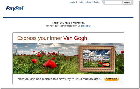
image For many years PayPal has deposited users on its shopping portal when they log out of their PayPal account. This afternoon I saw something different at logout for the first time in recent memory, a pitch for the PayPal Plus MasterCard (screenshot below).

Although the company has marketed this card to me dozens of times immediately after logging in, it’s the first time I remember seeing it after logging out. The hook is the card’s new personalized photo option.

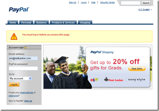
But a funny thing happened when I clicked on the Get Started button: I was dropped on to PayPal’s homepage where an error message explained:

You must log in before you can access this page.

A very odd requirement for an offer made after logging out. I followed the instructions and logged in, but there was no mention of the credit card. I just ended up at the regular account management page.

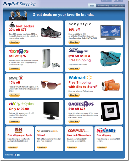
I guess it was PayPal’s turn for a programming glitch (see yesterday’s post on Rudder). Luckily, this problem doesn’t impact anything but PayPal’s online marketing results (see note 1). When I logged out this time, I was shown the usual PayPal shopping portal (see third screenshot). 

PayPal pitched its PayPal Plus MasterCard at logout
(21 May 2009, 3:30 PM Pacific)

image

 Error message after clicking “Get Started” on offer page
(21 May 2009)image

 PayPal logout offer a few minutes later (21 May 2009)

image

Note:
1. For more info, see our most recent Online Banking Report: Selling Behind the Password

New Online Banking Report Published: Selling Behind the Password

image

We just posted our latest Online Banking Report.
It will be mailed to subscribers tomorrow. It’s also available online here. There’s no charge for current subscribers; others may access it immediately
for US$395.

———————————————————

Selling Behind the Password
Unlocking the marketing potential within
online banking

48 pages (published 21 April, 2009)

In this report (abstract), we go behind the login screen and report on the marketing and cross-selling practices of 15 financial institutions and card issuers.

Even among large banks, there’s a huge disparity in the amount of cross-selling efforts within online banking. Wells Fargo is the most prolific, with nine marketing messages and product placements alone on its main account-management page. The bank also uses login and logoff activities to display promotions (see screenshot below). On the other hand, US Bank has just a single link to an “offers page” buried below the fold. Most FIs fall somewhere in between.

We looked at the opportunities within six different areas:

  • Interstitial pages (splash screen) inserted after performing any online activity, especially after the initial login.
  • Banner and keyword promotions within the secure online banking area
  • Product placement within online banking and bill pay
  • Transactional upgrades
  • Page displayed after an online banking session has concluded (either through logout or inactivity)
  • Product/shopping/discount portals and third-party ads

The following financial companies were analyzed by logging in to actual accounts and documenting their sales and marketing efforts:

  • American Express business gold
  • Bank of America online banking
  • Chase credit card
  • Citibank business card
  • Citibank online banking
  • Discover Card
  • Everbank
  • First Tech Credit Union
  • ING Direct
  • Jwaala (demo only)
  • Mint
  • Netflix (non-financial)
  • PayPal
  • Revolution Money
  • US Bank
  • WaMu
  • Wells Fargo

Wells Fargo promotion displayed after logging out from online banking
(27 March 2009)

clip_image002

Are Paper Statements on their Way Out? American Express to Force Up to 7 Million Cardholders into Electronic Statements

image Today’s American Banker tells of AmEx’s plans to force electronic statements on an undisclosed portion of its corporate cardholder base, said to number more than 7 million accounts worldwide (note 1). This is probably a bit of an exaggeration, as it’s more likely that paper statements are being eliminated as a standard account benefit and must be negotiated separately for an additional fee. The company admitted there would be exceptions for those without Internet access or those that still required paper for customer billings.

But it’s still a watershed moment. Today, paper statements are a standard feature of most banking and credit card relationships. In a study last year (note 2), Javelin Research found that only 15% of customers had given up paper statements entirely on their primary credit card.

Currently, the burden falls on the financial institutions to beg, trick, incent, or “green” their customers into giving up paper (see inset above from Texans Credit Union). For example, Citibank frequently uses an interstitial (splash screen) after login that encourages estatements (screenshot below). See our previous posts on those efforts.

The tables are about to turn. With severe profit pressure on most big banks and card issuers, most (all?) will soon adopt the American Express approach and offer electronic statements free of charge, with paper available for an extra charge. This is how checking-account pricing has evolved over the past two decades as banks migrated customers to check truncation as the standard, with paper checks returned for an extra fee (note 3).

Interstitial displayed after logging in to Citibank’s online banking
(9 April 2009, note 4)

clip_image002

Notes:
1. This decision will impact less than 10% of American Express cardholders, which number 92 million worldwide as of 31 March 2009, up 4% from 88 million cards a year ago.
2. Javelin survey of 2,500 consumer head of households in 2008.
3. For no valid reason any more, checks are still returned on my U.S. Bank “free” small business checking account for a $10 monthly fee.
4. Example from our latest Online Banking Report: Selling Behind the Password.

Straight out of Twitter: BillMyParents Launches

image I’ve mostly just observed the Twitter phenomenon, following a few people and seeing how banks and credit unions are using it (see my previous post for financial institutions on Twitter). However, I’d not fully embraced Twitter either as a publishing device or research source. The 300 or so RSS feeds, emails and news items that cross my desk each day seemed like plenty of intelligence to sift through.

But now, I’m reconsidering my priorities after learning about an interesting new alt-payment company BillMyParents from Twitter activity (see notes 1, 2).

How it works: BillMyParents is a new service from IdeaEdge’s Socialwise (press release). The service is primarily designed for kids to shop online. They select what they want, then at checkout, redirect the bill to their parents via an email alert to PC or mobile phone. Parents login and complete the payment process at their convenience using MasterCard, Visa, Discover Card (no American Express; see third screenshot below). Card info can be stored for one-click future approvals.

The company charges a $0.50 transaction fee for each purchase. But like PayPal, the real money will be made when the company pushes purchase transactions through the ACH system.  

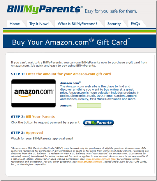
Currently, BillMyParents is selling prepaid gift cards from its site as a proof-of-concept. I tested it yesterday and everything seemed to work as described (see second screenshot below).

The opportunity: The service reminds me of the unmet need that PayPal filled nine years ago. Purchasing at eBay was a major hassle due to the lack of online payment capabilities. Kids have similar problems when trying to buy things online.

The service could also be adapted to other situations where one party does the shopping but wants someone else to authorize payment such as small businesses, nannies, or even spouses. It could also be used for extra security when the shopping is done in a non-secure environment such as public terminal and payment is redirected to a more secure device, such as your mobile phone.

Like any alternative payment, BillMyParents requires the merchant to add the option to its ecommerce platform and consumers to set up accounts. Both of those are time-consuming and face the chicken-and-egg dilemma, i.e., it’s hard to attract merchants without a substantial user base while its difficult to add users without merchants.

Bottom line: This is a winning idea. The massive discretionary purchasing power of teens and pre-teens is a tempting target in this difficult retail environment. And financial institutions, or their payment partners (e.g. Visa, MasterCard), looking to differentiate themselves with the youth market, could jumpstart the program. Or more likely, PayPal and/or Amazon will dive in, either acquiring BillMyParents outright, or building their own version(s).  

BillMyParents homepage after setting up an account (26 March 2009)
Note: Split login screen for kids (left) and parents (right)

image

Proof-of-concept: Gift card purchase (26 March 2009)
image

Parent’s approval screen (26 March 2009)

image

Notes:
1.  Thanks to Frederic Baud (@fredericbaud) who was the first in my network to Tweet about BillMyParents; and to Glenbrook’s Scott Loftesness (@sjl) who’s retweet is actually what caught my eye.

2. BillMyParents appears to have grabbed its Twitter page name (@billmyparents), but it’s not yet active.

How Can Online Banking Develop its Own Black Card?

image Yesterday, I looked at a list of free services likely to come under pressure as banks work on the Herculean task of returning to normal profitability. One area that’s likely to remain free for the foreseeable future is online and mobile banking, at least the core account-access portion of it.

But we continue to believe that financial institutions are missing a revenue opportunity to provide premium fee-based services to certain segments.

imageIf American Express can command $2500 per year for its black Centurion Card and Barclays $495 per year (see note 1) for its slightly more pedestrian Black Card launched in December (see note 2), why can’t banks get $10/mo for a similar premium version of online and mobile banking? The short answer: They haven’t tried.

Just for the sake of discussion, here’s a “gold online banking” service for which I’d pay $15 per month without a moment’s hesitation:

  • High-end website and iPhone app
  • Long-term (7+ years) online storage of images, transactions, statements
  • On-demand credit score like Credit Karma 
  • Credit bureau alerts when negative items hit
  • Account aggregation with weekly summaries like Mint
  • Email customer service with 30-minute or less turnaround time
  • VIP phone and tech support with no phone tree
  • No overdraft/NSF charges (within limits of course)
  • Travel rewards/sweepstakes on electronic transactions
  • Pre-filled one-click credit application
  • Extra security options
  • SMS balance inquiry
  • Iron-clad, no-fine-print security guarantee with 100% immediate reimbursement and emergency credit line

For more elaboration on these benefits, see our Online Banking Report on Pricing Online Services.

Visa Black Card homepage (15 Feb. 2009)
Includes one-page online application

image

Note:
1. The benefits of the Visa Black Card are similar to those from many gold/platinum cards. One of the biggest differentiators is free limited membership to Priority Pass which gets cardholders into 500 airport lounges in 250 cities. However, according to the FAQs, Black Card holders are limited to two complimentary visits per year, so this would cost $154 annually if purchased directly from Priority Pass. In fact, for $349 annually, you could get unlimited access to airport lounges. 
2. The Visa Black Card has been advertised with full-page ads in the New York Times, the latest on 10 Feb. 2009 on p. A5 (national edition).

Compete Reports an 8% Monthly Increase in Online Credit Card Applications, But 23% Decline from 2008

imageFor card issuers, the latest online application activity is is either good news, bad news, or neither since Compete tracks only applications submitted, not approvals. This following chart was presented in its webinar today. You can request the entire deck at the bottom of its blog post.

According to Compete, there were more than 12 million credit card shoppers in the U.S. in December, up 6% from November and down 11% since a year ago. Of the shoppers, about 20%, or 2.4 million submitted an application. That was an 8% increase from Nov., but a 23% decline from a year ago. 

But Compete has no way to measure whether the card applications it tracks are approved. Recent data from Lending Club shows that less than 10% of its online consumer loan applications were approved in Q4. The big credit card issuers probably do a bit better by driving creditworthy borrowers to their sites via direct mail and online advertising.

Assuming approval rates of 20%, the 2.4 million credit apps in December resulted in about a half-million new accounts.  

image

Source: Compete, 29 Jan. 2009