The Contactless Sticker as a Mobile Wallet Trojan Horse

imageI’ve had Discover’s Zip contactless sticker pasted to the back of my iPhone for a few years. Although I don’t run across very many places to use it in Seattle, I enjoy the user experience when it works. It’s not a huge time saver, but it’s easier to wave my phone than dig the right card out of my “analog wallet.” And it usually is interesting to the clerk, since “paying by phone” is still a novelty. 

Whether Discover has benefited from issuing me a sticker is debatable. Stickers are issued only by request (at least on my account). Discover not only had to pay an extra $3 or $4 for the sticker (note 1), but also paid a customer service rep to answer the phone and take my request. Assuming they incurred an admin cost of $7 to $10 to process and mail the sticker would make the total cost to Discover $10 to $15. Therefore, my measly $300 in incremental spending hasn’t yet given them a positive return. But if more terminals were around, I’d have put thousands on it, and they’d be ecstatic.

The reason I’m writing about stickers again, is that my Moven card and sticker package arrived last week (see pictures below; previous post; note 2). And I thought how much more impressive the startup’s card mailer looked with the Moven sticker (and supporting mobile banking graphics) than the typical bank card mailer (Simple excluded, of course).

I know the extra $3 to $5 it would cost to toss a sticker into the card mailer is a huge expense. But I think the potential benefits makes it worth considering, at least for a portion of your customer base. (And if you add the sticker as part of a premium package, you might even convince customers to pay for it.)

Financial institution benefits:

  • Increased POS transactions: Move your card to the top of wallet instantly when users are at a working, contactless terminal.
  • Increased online transactions: If you print the card number, expiry date, and security code on the sticker, cardholders would turn to your card more often when arriving at check-out at ecommerce sites. It also would work for mobile commerce, although not as well since users would have to flip the phone around to read the numbers.
  • Increased loyalty/referrals: Once that sticker is placed on a phone, it’s a constant reminder of your bank and card. It also makes it easy to show off to a friend.
  • 1st gen mobile wallet: The sticker, combined with your mobile banking app and/or SMS alerts, provides a fairly solid “mobile wallet experience” to compete with Google and others.
  • Seamless transition to NFC (or whatever): When the day arrives that the contactless capability is embedded in most handsets (yeah, Apple, we are looking at you), you simply tell customers to pull off the sticker and keep on waving that phone at the terminal. 
  • Competitive advantage: You differentiate yourself and earn referrals from a certain group of customers who are impressed with tech innovations.

Bottom line: Increasing costs with a contactless sticker is not for everyone. But if you are looking for a tangible point of differentiation that also builds your tech-cred, this is one possible solution. Moven, for one, is banking on it. 

————————————

Moven outside envelope (13 July 2013)
Note: I know this is good for security reasons, but I was expecting something a little snazzier. Luckily, the inside card carrier was the best I’ve ever seen (see below).

image

Moven card carrier
Note: Sticker is on left, plastic on right

image

————————————

Notes
1. I’ve seen a wide range of prices quoted for contactless stickers, but I believe the relevant range for most issuers is $3 to $7 each, depending on quantity.
2. I can’t report on actual Moven account transactions because I haven’t verified the trial deposits. While this is a clever and relatively simple authentication technique, it does require users to log in to another bank account days later, so it is easy to neglect. Moven sent me a reminder two days after my application, but that was two weeks ago. Clearly, they will have to follow up with procrastinators like me again.
3. For more info on fee-based banking services, our Online Banking Report on fee-based online services (subscription, May 2011). For more info on the “near bank” or “meta bank” phenomena see our  report on Truly Virtual Banks (subscription, Oct 2011).

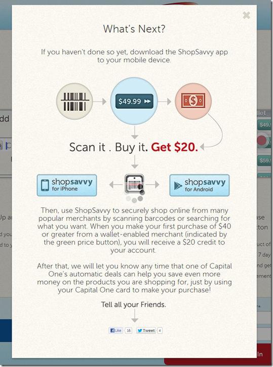
Feature Friday: Capital One Offers $20 Incentive to Try ShopSavvy Mobile Wallet

image I have been fascinated with mobile wallets for a while (note 4). They’ve been “just a few years out” since the first Finovate (Oct 2007), where multiple mobile banking pioneers laid out their product roadmaps. And now we are starting to see real implementations. Not just Square and Starbucks. But financial institutions are moving forward. 

ShopSavvy app with single-slide purchasingThe latest rollout, the Capital One and ShopSavvy deal, was announced last month (press release). Capital One has already partnered with several major card-linked offers providers (and acquired one), but apparently it is still looking to boost its mobile efforts (note 1).
ShopSavvy is a San Francisco-based startup which has built a mobile wallet, shopping and deals apps. It has raised $11 million, two-thirds from Facebook co-founder Eduardo Saverin.

The company has integrations with a number of online merchants including Walmart, Barnes & Noble, Overstock.com, Target, Best Buy and others (note 2). Those links allow users find online prices, either by scanning a bar code in-store or in-app search, then purchase online with a single slide (see inset).

I got the invite from Capital One Wednesday morning with an eye-catching $20-off offer (see first screenshot below). But this wasn’t like a straightforward card-linked offer where cardholders activate the deal and then buy. 

To bank this savings, users had to power through a three-stage process:

1. Sign up for an account at ShopSavvy using the link in the email. It’s a relatively painless process, taking just a minute or two. None of my personal info was prepopulated (see screenshot #3-5 below).

2. Add the app to your mobile phone by locating the ShopSavvy app in the App store, downloading and opening.

3. Activate the ShopSavvy app by entering your username and password and repeating the info you’d entered online to set up your profile.

Altogether, it’s a somewhat convoluted 5- to 6-minute process, but one that is probably acceptable for early adopters. I did have intermittent problems with the app, network errors, crashes and bizarre search results (note 3). But it seems to have stabilized now after the initial usage spike. 

Bottom line: Once it started working properly, the ShopSavvy features were impressive. The simple search combined with one-click purchasing would make a nice addition to a bank or card issuer’s mobile app. I’m still a little surprised that Capital One is endorsing a third-party wallet. But by getting its card “top of e-wallet,” the giant issuer boosts charge volume, mobilizes its card-linked offers, and gets a foothold in the wallet space.

——————————

Capital One email to customers offering a $20 statement credit to use the ShopSavvy wallet (12 March 2013)

Capital One email offering $20 discount forthe first use of ShopSavvy wallet

Landing page at ShopSavvy (link)

ShopSavvy Capital One landing page

Step 1: Join ShopSavvy

ShopSavvy signup process

Step 2: Add Capital One credit card

ShopSavvy signup, enter Capital one card

Step 3: Locate, download and activate the ShopSavvy mobile wallet app

ShopSavvy download instructions

——————————–

Notes:
1. Or perhaps this is more of a straight revenue-play for Capital One, with ShopSavvy paying the card issuer for each new customer.
2. Unfortunately, ShopSavvy’s one-click experience does not extend to Amazon.com, but the app does display Amazon prices and it’s just a few more clicks to buy there.
3. Initially, I tried the app with a few barcodes I found at home and it worked, but only on the media stuff. Since I didn’t want to buy anything I already owned, I went to the last remaining bookstore in northeast Seattle and gave it a try. Unfortunately, this store covers the regular barcode with its own, which are not indexed in the ShopSavvy database. But when I tried it again last night, the search function was working so I was able to easily find a DVD set and buy it from Target.com for a competitive price (even before the $20 statement credit). 
4. For mo
re info on mobile wallets, see our most recent Online Banking Report: Mobile & Cloud Wallets (Feb 2013, subscription)

New Online Banking Report Published: Breaking Down the Digital/Mobile Wallet Hype

image We now have digital wallets, cloud wallets and mobile wallets. There’s the Google Wallet, PayPal wallet, ISIS, Serve, MCX, V.me, PayPass, Lemon, Pageonce, Wallaby,  Passbook, LevelUp (see screenshot below) and 280 mobile payment startups listed on Angel List. NFC is coming, or is it? Why not just use the QR code? Or do we wait until EMV, Oct 2015?  Does this make money or just add another layer of costs? Are we having fun yet? 

Bottom line: With consumers carrying a powerful computer on their person, the days of the dumb mag-stripe are numbered. No one debates that. But what is a financial institution to do today?

That’s what we set out to answer in our latest report on Digital & Mobile Wallets.

If you are not a major credit-card issuer, you may choose to ignore the issue until the dust settles. That’s a valid strategy, but it won’t help you pick up market share during the upcoming market confusion.

We believe every bank and credit union with a mobile app should dip its toes into the wallet space now with some relatively low- to no-cost positioning moves, while waiting for the tech questions to be answered this year and next.

And if you are a big issuer, you have a very interesting few years in front of you. Do you build or buy? Which of the major wallets, if any, do you throw your marketing support behind? And how do you explain any of this to your shell-shocked customers who just want to pay their tab and get away from the cash register as fast as possible? 

__________________________________________________________________

About the report
__________________________________________________________________

Digital & Mobile Wallets (link)
Payments in the smartphone era

Author: Jim Bruene, Editor & Founder

Published: 21 Feb 2013

Length: 36 pages, 10 tables, 12,000 words

Cost: No extra charge to OBR subscribers, US$495 for others (here)

————————-

Report excerpt:

First Trade Union Bank partners with LevelUp for mobile wallets

First Trade Union Bank is teasing its LevelUp mobile wallet partnership on its homepage (19 Feb 2013).

Feature Friday: Fifth Third Combines Debit & Credit on DUO Card

image Transactional banking is fairly straightforward. There are electronic payments, ATM withdrawals, debit card payments, credit card charges, and checks.

When a technology comes along that offers to combine three of those in a familiar form factor (plastic card), you would think it would catch quickly. 

But combined credit/debit cards have not gained much of a following yet. With one big exception: Fifth Third Bank.

In 2011, the Cincinnati-based bank, the 15th largest U.S. retail bank with $120 billion in assets, launched a combined credit/debit card called DUO. According to American Banker this week, “(DUO) has recently accounted for about 25% of new credit card accounts” at the bank.

My take: That may or may not be a large number depending on the bank’s overall card marketing efforts, but it’s a good indication that there is at least some consumer demand for the so-called hybrid card. Personally, I stopped carrying an ATM card years ago, so I would love having ATM access added to the credit cards I tote around. I would even pay a modest fee for the convenience (note 2).  

True, the mobile wallet holds the promise of combining everything into one grand app. However, it’s a long, long road to mass adoption. Seventeen years into online banking, it’s still used regularly at less than 60% of U.S. households (note 3).

So bring on the hybrid cards, but make sure there is also a killer mobile app supporting them.

————————

Fifth Third landing page for its combo DUO card (link)

Fifth Third landing page for its combo DUO card

——————————

Notes:
1. It’s been 17 years since Web access was first launched by Wells Fargo (May 1995). Dial-up online banking predates that by more than a decade, but it was used by such a small group that it doesn’t really rate a mention.
2. “Modest” would be in the $1/mo neighborhood, unless there more features were added.
3. Source is our annual forecast (subscription, Jan 2012) which we are in the process of updating and will be available in a few days. 

The iPad-Enabled Checkout Experience at the POS

The Hideout Coffee House in Austin

A few week ago I spent the weekend in Austin eating BBQ, watching my alma mater get crushed by the University of Texas, and sampling the Sixth Street ambiance.

But the highlight for me was the The Hideout Coffee House. Not only did it have great coffee and eclectic furnishings, but card customers could pay via Square through an iPad mounted in a novel wood stand (see inset; it’s not possible to see well, but the ipad stand is on the counter at left).

The barista took my card and swiped it through the Square reader, which was supported by a wood guide (see similar unit left from Tinkering Monkey). Then he flipped the case over 180 degrees so it faced out towards me (see below).

Tinkering Monkey iPad holder at the POSI selected one of the large buttons for a preset tip amount and then once more to have the receipt emailed to me (I only had to enter my email the first time).

It was easier to use than most in-lane POS readers, even contactless ones, because the barista actually did the swipe. It eliminated the uncertainty about when I should tap/swipe or whether it worked or what I should do next. And I loved being able to put a tip on the card with the push of a button rather than writing it on a piece of paper or digging for change. 

Tinkering Monkey swivel ipad caseBottom line: Eventually payments will be made via proximity and settled in the cloud (my mobile will know I’m in the store and will automatically pair me to the store’s POS). But there is still a long transition period ahead.

Tablet/smartphone card readers are a great interim step for smaller merchants (note 2), especially with the price wars waging at the point of sale (note 3).

Related: And banks, even though you don’t have the POS issue, you can equip your frontline staff with iPad-powered sales tools (note 4). 

——————–

Notes:
1. On one of the Austin freeways, I also saw a billboard for the ISIS pilot. But I didn’t see any merchants promoting it. 
2. And some bigger ones. And of course, the 20,000-store Gorilla, Starbucks, is partnering with Square, though it is unlikely they’ll use iPads at the point of sale.
3. Bank of America recently jumped into the game matching Square’s 2.7% discount rate.  
4. Barclays just bought 8,500 iPads to equip its branch sales staff (Financial Brand post).

Launching: Automatic Location-and-Merchant-Based Prepaid-Card Reloading with Spending Controls

image That’s a lot of buzzwords in one title, but they’re all necessary to describe the payment innovation being tested by MoviePass.

MoviePass is a new service designed to do for physical movie theatres what Netflix did for rentals, turning movie-going into an all-you-can-eat subscription service. For $25 to $40/mo (depending on where you live), MoviePass allows you to attend as many movies as you like (but no more than once per day; note 1).

However, the company has had trouble getting theatres on board, who are rightly concerned about cannibalization. So the startup has been working on ways to get around the need to have theater partners. They tried in-home voucher printing, but it proved cumbersome and still required some level of theatre participation.

So MoviePass invented a clever workaround using a proprietary prepaid debit card. The new system allows subscribers to go to any movie at any theatre in the country, as long as they accept debit/credit cards. The service is in private beta with 1,500 users. You can add your name to the 75,000-person wait list here.

MoviePass iphone app Here’s how it works:

1. User goes to the theatre location and checks in using the MoviePass app (inset). The check-in only works within 100 yards of the theatre.

2. MoviePass then adds the price of the movie to its prepaid card.

3. Consumer walks to the window and purchases a ticket with the MoviePass card using up the entire balance (note 2).

It’s a clever mashup of GPS, point of sale, mobile and payment technologies.

Relevance: No word on who’s powering the card, but hopefully we’ll see it used in other applications. It could be a solution for youth spending (parents preapprove locations/amounts), employee purchases (employers preapprove locations/amounts), or rewards/offers (money appears on your card only when you check in at specific locations).

——————————–

Notes:
1. Clearly, the company won’t be able to make a return at $40/mo unless they cut deals with theatres for discounts (especially to fill second-run and weeknight seats), which is the end-game here. At a cost of $5/ticket, it probably works. At $10 per ticket, movie buffs hitting theatres two to three times per week are going to kill the model.  
2. Presumably, MoviePass has controls that limit the purchase to the theatre where the checkin occurred. And it must be limiting checkins to the registered phone only, otherwise the card could be passed to friends and the biz model won’t work. I also assume MoviePass will confiscate any unused balance if the ticket price is less than what was advanced or if the customer doesn’t buy a ticket.    
3. It would be interesting if they also partnered with RedBox so you could get unlimited DVD rentals AND theatres in one monthly price.

BillGuard is First Financial Service to Integrate with the New iPhone Passbook Wallet

imageApple’s Passbook is a massive wildcard in the race for mobile payments, banking and rewards. Will the iPhone’s massive user base take to it like they did iTunes, or will it be one of those ideas that sounded good on the drawing board, but just doesn’t resonate with consumers?

imageNo one knows if it will stick (although I got pretty carried away with the possibilities when it was announced in June), but given the potential upside, it seems a solid bet.

Starbucks is about to push its massive mobile base onto Passbook, a pretty strong endorsement. American Express has thrown in its support. No word yet from other financial players. 

Except BillGuard, which gets to lay claim to being first. CEO Yaron Samid emailed yesterday announcing beta support for Passbook. The startup built a landing page for the new service at <passbook.billguard.com/> (see first screenshot) and is even testing some Google Adwords spending around the feature.

BillGuard users can now view each of their monitored credit cards within the Apple Passbook application. It’s a two-step process to get the cards added to the Passbook utility.

  1. Users click on “Add to Passbook” at top of BillGuard’s normal online dashboard (see second screenshot)
  2. BillGuard sends an email with a “pass” attached for each card. Users view the email on their iPhone, then click each attachment to add to the iPhone utility (see third screenshot)

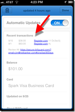
Once added, user can view their current card balance and recent transactions from the Passbook card (see last screenshots).

Bottom line: It’s a great move for BillGuard, especially since it does not yet have a native mobile app. Now I can click on the Passbook icon and without logging in, quickly see the activity on all my registered cards, and whether there are any suspicious charges.

Banks could do something similar. Basically, creating a no-login card mini-app that aligns their brand with the iPhone 5. However, one area to consider is security. Anyone who got a hold of the email BillGuard sent me could start monitoring my card(s) through Passbook without my knowledge. For a bit more security, passes can be distributed directly through native apps and websites.

————————————–

BillGuard Passbook landing page (link, 25 Sep 2012)
Note: Example is a Chase card “protected by BillGuard” image

Step 1: Click the “Add to Passbook” button on top of BillGuard’s main online dashboard

image

Step 2: BillGuard emails a “pass” for each card on file. Users open the email from their iPhone and click the attachment(s) to add each card to Passbook

image

Results: Each pass has its own “virtual card” in Passbook, with a “front” and “back”
Front includes current balance                     Back includes recent transactions

image     image 

Note: The placeholder barcode displayed in the BillGuard pass is a customer referral form according to MyBankTracker. When Starbucks unveils its Passbook support next week, I’m sure the barcode will be usable to make a mobile payment at the Starbucks counter.

Discover Card Gives Away an iPad per Day to Paperless Cardholders

image After adding my Discover Card to Google’s mobile wallet, I was automatically logged off after a period of inactivity (or what I prefer to call blogging). On the resulting page, the card issuer explained what happened on the left side and told me about their current estatement incentive program on the right (see first screenshot below).

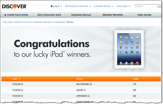
Discover is giving away an iPad every day to its paperless customers (landing page) from June 1 to Nov 30. That’s a total of 183 iPads (official rules). Both new enrollees and existing ones are eligible.

Since I’m a sucker for online sweepstakes, I pressed the button, only to find out that I was already enrolled (see second screenshot). Not only is this annoying and somewhat confusing (am I still in the running for the iPad?), it could be counterproductive. Users are given the option on this page to turn paper statements back on. So customers might mistakenly turn the paper back on thinking that’s how you enter the sweeps. To prevent that, Discover needs to reinforce the sweeps on this page. 

Bottom line: Periodic paperless incentives are a win-win. You show gratitude to existing paperless customers while pushing a few more paper holdouts over the edge. However, be careful how you handle already-enrolled users.

———————————-

Discover Card logoff screen publicizing its iPad giveaway to paperless customers (17 Aug 2012

image

 
After clicking on the "Go Paperless" button I was sent to this screen
Note: Discover should remind me that I’m still eligible for the prizes

image

Discover publicizes the winners (link)

image 

———————————–

Note: For more ideas, see our report on paperless billing and banking (Nov. 2010, subscription).

First Look: Google’s Save-to-Wallet API at Discover Card

image This week, Discover became the first to use Google’s new Save-to-Wallet API to seamlessly add its card to the wallet directly from its secure site. This API supports the recent expansion of Google’s wallet to all US-based credit cards. 

To see how it works, I logged in to my Discover Card tonight and looked through account settings and the Help area for details. Coming up empty, I searched for "Google wallet" within the secure site and found a prominent link to the function (see first screenshot below).

The API worked even better than I expected, taking just 15-20 seconds (after I found the right page). Here’s the 3-step process:

  • Press Add Your Card from within the Discover Card secure site (screenshot #2)
  • Enter your Google password into the Google popup page (screen #3; I was already logged into Gmail, so Google had prefilled my username)
  • Accept the API request from Discover (screen #4)

That’s all it there was to it.

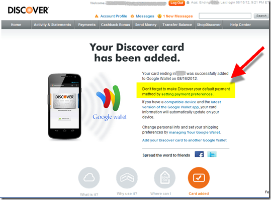
Optionally, users can go back to Google through the link on the Discover page (screen #5) to make it the preferred payment card (screen #6). Finally, Discover closes the loop with an immediate confirmation email thanking me for adding the card (screen #7). Well done.

Bottom line: Unless you are big enough to negotiate financial considerations from Google and/or build your own mobile wallet, you might as well drop this API into your secure site now. It gives your debit/credit card a fighting chance to be the default card in the wallet. While that might provide a slight spending lift, the major benefit is associating yourself with mobile wallets in general and Google in particular.

—————————–

1. Search results for "Google wallet" within Discover Card secure card management (16 Aug 2012)

Search results at Discover Card for "google wallet"


2. Landing page at Discover Card for adding it to Google Wallet

Discover Card landing page for adding to Google Wallet


3. Popup to login to Google account (at Google.com)

Login to Google Wallet through your Google account 

4. Authorization screen (at Google.com)

Google "Add Card to Wallet" API confirmation 

5. Confirmation screen with suggestion that cardholder go to Google to make Discover the default payment card
Note: Highlighting and arrow added for emphasis

Confirmation screen that Discover has been added to Google Wallet 

6. My Google Wallet contains the Discover Card on top

Note: The expired MasterCard below is a remnant of the old Google Checkout that has been replaced by the Wallet

Google wallet containing Discover Card 

7. Confirmation and thank-you email from Discover

Email from Discover Card confirming addition to Google Wallet

Out of the Inbox: Mint.com Pitches Capital One Credit Card in Triggered Email Alert

imagePrecise, content-sensitive advertising is extremely powerful. It’s what made Google a giant. 

In financial services, the biggest advertising-driven success (after BankRate and Google), at least in terms of market cap, is Mint.com. Its revenue stream is entirely made up of targeted offers to customers who aggregate banking transactions on its site.

The company wisely uses email to deliver some of the advertising pitches. As we’ve discussed before, Mint is of the few financial companies directly monetizing triggered alerts.

We were impressed by the latest effort received Tuesday (see below). Having noticed that our Chase business card was used internationally, incurring a $14 transaction surcharge, they wisely pitched us a Capital One no-foreign-transaction-fee card.

Interestingly, we already have not one, but two of those Cap One cards (personal and biz) and they are both aggregated at Mint. So I’m not sure if this alert is more of a reminder to use our Cap One charge when traversing the world or that Mint doesn’t check current product usage when cross selling (or they don’t care). If Mint is only paid on performance (eg. by new accounts generated), then it doesn’t matter to Cap One that they are marketing to an existing customer.

Bottom line: The example demonstrates the marketing value of hosting the aggregated accounts.

————————————–

Mint triggered alert (12 June 2012)
Note: The advertisement is two-fold. The banner with "apply now" is the most eye-catching, but also easier to ignore. There is also a text call to action above it, that looks more like alert copy. It says: "Stop paying extra to use your credit card overseas. Get a card that doesn’t charge foreign transaction fees."

image