PayPal’s 30-Second Credit Card Application

Paypal_card_ad_1 PayPal is advertising its PayPal Plus card with this box located in the upper-right of the main account start-page within the secure area (click screenshot below for a closeup).

With the falloff in response to traditional direct mail raising acquisition costs to $200 or more, a pitch delivered within an online banking session can be far less expensive. And with online banking users typically wanting to get in and out quickly, the 30-second response shows that the company is sensitive to the time constraints of its customers (notice they did NOT say that it was a 30-second process).
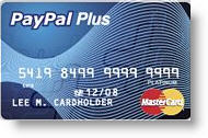
Paypal_pluscardThe PayPal card is issued by GE Money Bank, the same company behind PayPal Buyers Credit used by sellers to offer longer-term financing of major eBay purchases. The Plus card includes a free rewards program offering 1 point per dollar purchased. The current rewards structure includes three levels:

  • 1,000 points – Free shipping up to $7 on a PayPal purchase
  • 2,500 points – $25 voucher (for merchandise at most PayPal merchants)
  • 9,500 points – $100 voucher (for merchandise at most PayPal merchants)

The card carries a variable rate from 14.24% to 24.24% and has no annual fee.

Here's the main account page displayed after login:

Paypal_card_ad

Here's the landing page displayed after clicking on the apply button:

Paypal_card_ad_landing

MBNA’s Big & Ugly Card Application

In direct mail, sometimes "big & ugly" beats "short & sweet." But when it comes to preapproved credit card applications, we're pretty sure the 8-screen form posted by Bank of America's FIA Card Services (formerly MBNA) isn't going to help improve response rates (see the full form by clicking the continue link below).

My wife received a preapproved, direct-mail offer from Fidelity Investments where she has an investment account. The solicitation included the usual one-third sheet mail-back "acceptance form." Recipients could also either call a toll-free number, or go online to www.ibscredit.com.

Fidelity_mbna_cardapp_firstThose that went online were greeted with this almost-blank screen operating under a different URL www.applyforcreditnow.com and had no reassuring message or graphics to assure users they had not arrived at a phishing site.

Fidelity_mbna_cardapp_subsetAfter entering the 6-digit code from the mailing, prospective cardholders are transported to this boring form, which surprisingly includes MORE fields than its paper-based counterpart (click on inset for closeup; click on continuation below to see the full 800 x 5200 screenshot). For example, it contains a section to be completed by students, who are unlikely to be receiving this particular Fidelity Investments WorldPoints Visa card with no preset spending limits.

Not only are the layout and design dull, but also two major design flaws are readily apparent:

  1. No reinforcement of product benefits above the fold, especially the "0% through Nov. 2007" offer
  2. No division into smaller segments, the first of which should gather the email address

See Online Banking Report #104 for more on application design.

— JB

Endnote: Full online application (820 x 5200)

Fidelity_mbna_cardapp_long

Citibank Leaves Card Applicants Vulnerable to Identity Theft

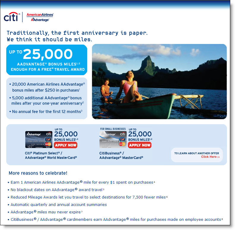
We were impressed with Citibank’s full-page ad in Sunday’s New York Times travel section offering 25,000 miles to take a new American Airlines co-branded credit card. As usual, we looked for a link to the Web-based application and were pleased to find a large, reverse-type URL along the bottom of the ad. Unfortunately, Citi did not follow the usual convention for printed landing-page URLs, creating potential problems for applicants.

Typically, offline advertisements use a special filename after the normal domain name, such as <www.yourbank.com/special>. This allows users to go directly to the landing page explaining the special offer (see landing page below).

Citi_aadvantage_25landingpage_1

Instead, Citibank used the unique server name "miles5" as in: <www.miles5.citicards.com>. There are several problems with this approach. First, it’s long and not easily recalled. But the biggest problem is its non-standard format. Internet users do not expect to see an extra period in the middle of a bank's URL. So many users, myself included, may read this as a unique domain name, <miles5citicards.com>.

Normally, that would be okay. But in this case Citibank neglected to register that domain name. An identity thief could easily have registered that domain, and then taken “applications” for days or weeks before anyone caught on, possibly leaving hundreds of applicants vulnerable to identity theft after entering their personal info, including social security number, in the application.

By mid-day on Monday, almost two days after the ad first appeared in print, the domain was still unregistered. We went ahead and registered it to prove the point, and keep it safe.

Implications
The moral of this story: If you live in a glass house, make sure any transparencies are covered. Register your domain name. Citibank, which has spent millions on its anti-identity theft campaign, left itself and its customers vulnerable for the price of an $8.95 domain name. Make sure you register the domain name of any cute URLs you put out there for marketing campaigns. While you are at it, spend $60 and lock it up for 10 years. 

Memo to Citibank’s legal team: We have no commerical interest in the domain and will happily transfer it to your ownership. All we ask is reimbursement of our 9 bucks.

JB

Getting Even with the Citibank Call Center

Citibank_paypassScore:
     Tom Brown — 1
     Citibank — 0

How many times have you been frustrated by your experience at a call center? Well, if you were a multi-millionaire hedge fund manager with his own blog, you could get back at the company, and then some.

Read today's extremely thorough account (transcribed verbatim from a tape recording) of Second Curve's Tom Brown as he attempts to add a PayPass contactless debit card to his Citibank account <bankstocks.com>.

A couple lessons here:

1. Flag Tom Brown, and other influential VIPs, in your customer database so they get topnotch phone service
2. Be careful with geographic-based product rollouts to avoid irritating customers
3. Simplify call center scripts

JB

Disposable Debit Cards

Discover_disposablenums_cardAlthough they've been around for years, with relatively little success, the time may be right for disposable card numbers. However, this time, the emphasis should be on debit, the payment of choice for many younger consumers.

A compelling case can be made for disposable debit which:

  • is the favored payment vehicle for the under-30 crowd, and often the ONLY payment option for high school and college students
  • differentiates your checking account from 16,000 other U.S. providers
  • encourages more debit card usage
  • cements account relationships
  • adds value to online banking archives
  • provides excellent PR (customer advocacy) and branding benefits

But while great strides have been made in educating consumers about credit card fraud protection, the issue is murkier on the debit side.

Consumer appeal
We were reminded of the appeal of disposable card numbers when reviewing Cambrian House <cambrianhouse.com>, a Web-based venture attempting to "open-source" the business-startup process. While we don't see that taking off, the company does maintain an interesting database of user-submitted business ideas. Of the 433 ideas listed, the most popular according to site visitors is:

Self-destructing credit cards submitted by Rohan Pinto

Discover_disposablenumsEssentially what Mr. Pinto is proposing is the one-time-use credit card number offered since the late 1990s by Citibank, American Express, and, more recently, Discover Card (see inset). The main difference is the name, which actually is pretty good, if it hasn't been trademarked yet (we couldn't find any business using the term in a quick Google).

JB


Update on EmmigrantDirect

Emigrantdirect_card_websiteHow does a small bank rate a WSJ-bylined story when it ups its credit card reward percentage by 15 basis points? Sure, it helps to be headquartered in NYC, home to much of the country’s financial media. But you also need a compelling story line.

What could be better than a small player eating the big guys’ lunch? Layer in the online-only factor, a strategy that had been declared dead by many analysts after botched attempts by Bank One (Wingspan Bank), Citibank (eciti), and Benchmark Capital (Juniper Bank). Finally, top it all off with a 150-year old company all of a sudden making like a Bay-area startup, and you have a story with real legs.

EmigrantDirect, the direct-banking unit of Emigrant Savings Bank, once again landed in the media (WSJ Mar. 28), with a relatively small change to its credit card launched earlier this year. It’s the second time this month, and sixth this year, that the bank has been mentioned in personal finance articles in The Wall Street Journal.

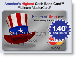
This time the story highlighted EmigrantDirect’s credit card, touted on its website as America’s Highest Cash Back Card, that now pays a cash rebate of 1.4% on all retail purchases, up from 1.25% earlier (see note 1). The fine print on the claim says that other cards may pay a higher percentage, but they require minimum purchase levels before the higher rebate kicks in (see note 2).

Analysis
Since the launch of EmigrantDirect a little over a year ago, the bank has raked in $6 billion in deposits and 225,000 accounts for an average balance of about $27,000. The direct-banking unit’s success essentially doubled the deposit base of the bank in a single year, halting a gradual decline in total deposits over the previous decade.

It will be interesting to see how Emigrant reacts as more banks enter the market such as Washington Mutual (NetBanker Nov. 18, 2005) and Puerto Rico-based Popular that is planning to go after U.S. deposits under its own name and that of its well-established E-Loan brand. For more information, refer to last fall’s report, Lessons from the High-Rate Marketers (OBR 120/121).

JB

Notes:
1. Interestingly, the higher rebate is retroactive to Jan. 2006, an unusual bit of financial services generosity.
2. Another bit of crucial fine print: The EmigrantDirect card requires a $10,000 average deposit balance FOR THE PAST SIX MONTHS in order to earn the rebate.

Online Card Receipts from American Express

Amex_print_options_boxDo you ever wonder why American Express, with fewer merchant outlets and higher prices, continues to command a 17% share of all U.S. debit and credit card volume (see note 1)?

Sure, the company’s powerful brand supported by vast and memorable advertising is a factor, but it’s also the product it delivers, optimized for business users and other big spenders. And the company never rests on its laurels. Even though I’m a light user, in 11 years of card ownership, I’ve received on average one card, letter, or email message every week, for a total of more than 500. The company does not let you forget about them.

Amex_printable_recieptAmerican Express also continually improves their product. For example, the latest innovation, announced in an email today (click on inset left), is a minor new twist in online delivery. Cardmembers can go online and easily print receipts, one page per transaction, to be used to match up with other paper records, invoices, expense-reimbursement requests, and the like.

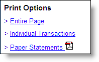
Simple instructions in the email message explain how to use the new option, one of three choices in the Print Options box (see inset upper left) located in the upper-right corner of the main Summary of Accounts page, the default shown after login (click on screenshot below for a closeup of the Summary page).

Amex_print_options Will handy, printable receipts win American Express any awards? Hardly. It barely rates a bullet point in a brochure. But these little things all add up when cardmembers make the decision as to which piece of plastic to pull out of their wallet or purse. 

JB

Note:
1. Market share of all purchase volume on MasterCard, Visa, Discover and American Express credit and debit cards during first half of 2005 (Source: The Nilson Report, Aug. 2005, #840)

Bank of America’s Preapproved Card Offer at Logoff

Bofa_instantcredit_atolblogoutBank of America is making it super easy for online banking customers to accept a new business platinum credit card. The preapproved offer is displayed after logging out from an online banking session. In this example, we had just finished paying our Bank of America credit card bill and were greeted with well-crafted page shown here (click on inset left for a closer view).

Analysis
Using the log-off screen is a great way to get your preapproved offers in front of users at just the time they are thinking about their finances. We also recommend offering a link to the offer within the online banking area. That way, if a user is running a bit low on cash, for example, while paying bills, he or she could click on the offer to obtain additional cash.

JB

Billeo Powers Bill Pay at Visa.com

Visa_billeo_searchboxLast week, Visa USA redesigned its direct bill-pay area using Billeo’s technology to power biller search and facilitate direct payments via credit card. It is a major coup for the fledgling direct bill-pay solutions provider Billeo, which earned an Online Banking Report Best of the Web last year for its innovative bill-pay toolbar (OBR 116/117).

The implementation at Visa bears careful review. It wisely uses biller search to engage users (see inset), then prompts them to save their personal biller list using Billeo. After registering, users download and install the toolbar directly into their browser, Billeo_visa_mainthen input credit card information to facilitate payments. After the initial setup, users can pay select bills directly from the toolbar using the saved credit card and biller info.

Next week, we’ll look at Visa’s implementation in more detail and share insights from our conversation with Billeo founder, Murali Subbarao. In the meantime, you might want to give it a spin yourself at Visa’s bill-pay site, <usa.visa.com/personal/using_visa/pay_bills_with_visa/> (click on screenshot right for a closer look).

Previous articles:

JB

Bank of America’s “Keep the Change” Banner on MSN

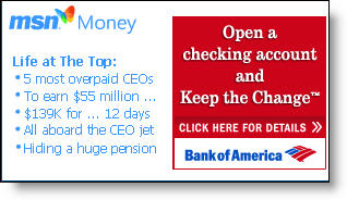
Bofa_msn_homepageAlthough we have concerns about the underlying program (see NetBanker Oct. 5, 2005), you have to tip your hat to the marketing execution of Bank of America’s Keep the Change campaign. Today a small but distinctive postage-stamp ad on MSN’s homepage, tied in with MSN Money headlines (see inset), invites readers to "Open a Checking Account and Keep the Change."

Bofa_msn_landingpageIt’s an intriguing headline and likely does well prompting clickthroughs. The landing page (click on inset right for a closeup) is also well done. A graphical explanation of the keep-the-change rebate is shown on the right, which helps alleviate the need for prospects to wade through the 479 words of fine print on the bottom of the landing page.

Another landing-page graphical element that you should immediately consider adopting: pictures of the three key banking products being pitched with simple checkboxes for selection (see below). However, in this case it’s used in a backwards fashion. Users are supposed to tell the bank which accounts they already have, rather than the ones they want to buy. This is counter-intuitive and should be redesigned.

Bofa_msn_landingpage_orderform_5

Bofa_msn_ddasav_appAfter selecting the BofA accounts already owned, users arrive on a secure Checking & Savings Account Application page that does a good job reinforcing benefits and referencing the original "Keep the Change" hook (click on inset left). A pop-up box offers live chat with a Deposit Specialist if desired.

Summary
The bank scores high for great online copywriting, superb graphics, and good ad positioning at MSN. We also like how Bank of America reinforces the benefits of automated savings. However, the offer is complicated and smacks of a gimmick that will do little to engender long-term loyalty or create a real savings ethic. Finally, the low 0.50 percent rate paid on the underlying savings account damages the program’s credibility and makes it less likely the account will be used to amass meaningful deposit balances.

Grades:
A+ for online advertising and sales (banner, landing page, application)
B+ for encouraging savings
C- for the debit card rewards program

Payment Cards Watershed – MasterCard IPO

This should be a watershed year for payments cards. The approaching MasterCard IPO, and Visa’s likely response, will likely reform the sector’s fundamental business structure. Meanwhile, First Data Corp. is undergoing profound changes, and it’s unlikely that either Discover or American Express will be twiddling their thumbs while the future of the card associations is decided.

The MasterCard IPO will likely have the greatest impact on the space, thinks David Evans, founder of Market Platform Dynamics. "It will force them to become a much more entrepreneurial and different organization than it’s been in the past, partly because of changes in the marketplace, but also because of organizational changes that will change the dynamic of that entity," because of the need to satisfy its new investors, he says.

Continue reading “Payment Cards Watershed – MasterCard IPO”

Low Value Payments & Stored Value Cards

In the coming year, low-value payments and prepaid cards will be increasingly mentioned in the same breath, especially in conjunction with off-line, contactless methods, says Gwenn Bezard, partner in Aite Group.

Pilots, and even some deployments of contactless payment cards, will be making a significant appearance, if only because banks are pushing them. The main sticking point from the merchant perspective, Bezard says, will be the cost of interchange, but he expects some banks to offer breaks on fees, if only to give the venue a running start. He is optimistic that big merchants will follow Starbucks’ model and offer rechargeable, merchant-specific stored-value cards as a means of gaining market share and promoting customer loyalty.

Continue reading “Low Value Payments & Stored Value Cards”