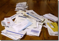
In 2006, 86% of credit card direct mail included online options

Advertising-monitoring firm, Mintel Comperemedia reported last week that nearly 9 out of 10 credit card solicitations in 2006 directed recipients to the Web, up sharply from 56% in 2003 (see note 1, 2). Several big mailers, namely American Express, still seem reluctant to use website response as an option, at least in the mailers we see at our house.

American Express tests must show a drop in response by offering too many choices. But if you don't have the budget of American Express, which can afford to drop a mail piece in every credit-worthy household every two or three weeks, you should add website options to your direct mail creative. That way, you can at least capture a lead at your website, even if they don't ultimately accept your credit offer. 

Total mailing volume for 2006 was 9.2 billion pieces (see note 1), or about 3 per week per credit-worthy household. Two of those were from the five largest mailers listed below which accounted for more than 60% of the volume, according to Comperemedia. JPMorgan Chase accounted for 18% on its own. 

In another data slice from Comperemedia, cited by Capital One in a Feb. 2006 investor presentation (PDF here), response rates have fallen from 1.4% in 1995 to 0.3% in 2004 (see note 3).

Here's a breakdown of the billion-piece club, and their percent change compared to 2005:  

1. Chase >>> 1.7 billion (down 4%)

2. Capital One >>> 1.2 billion (up 13%)

3. American Express >>> 1 billion

4. Citibank >>> 980 million (down 2%)

5. Bank of America/MBNA >>> 920 million (down 17%)

Other top-10 mailers: HSBC (up 25%); Discover (up 29%); Barclays Bank (190 million, up 70%)

Note:

1. Comperemedia tracks mailing volume for more than 150 large financial institutions. So the figures here do not include mailings from thousands of smaller banks and credit unions. In total, those probably account for less than 5% of the total from the top-150. 

2. Comperemedia press release is here. Interview of Comperemedia director Jenny Roock by MediaPost is here.

3. Credit card response rate slide from Capital One's investor presentation (PDF) at the Debt & Equity Conference, Feb. 2006; data from Comperemedia.
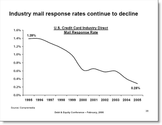
Credit card industry response rates

Chase Bank’s $25,000 Sweeps for Going Paperless

Chase Bank paperless sweepstakes logo Habits are hard to break. After 5, 10, 20 or more years of receiving paper statements, most mainstream banking and credit card users are reluctant to give them up.

Long-term online statement and transaction archives are key to creating paperless customers. But you'll still need an incentive to get most customers to move their mouse over to the "go paperless" button.

Chase Bank devotes prime homepage real estate, and $35,000 in prize money, to the effort today in a sweepstakes aimed at convincing customers to shut off their paper statements (see screenshot below). Every customer enrolled in electronic statements receives one entry per month through April in the contest which pays a $25,000 grand prize plus ten $1,000 runner-up prizes. 

Analysis
It's a good effort, but with $100 million or more in annual savings at stake, why stop the sweepstakes after just three months. A $1,000 prize should be awarded each month, or each week, for many years as the banking giant weans its customer base off paper.

Also, Chase should be more specific on the amount of statement storage available online. The landing page is vague, saying one can "gain access to several years of statements." What does "gain access" mean? Do you have to request old statements for future delivery or are they right there so that on April 14th, you can find that final piece of your tax return puzzle. Even checking the online banking area of the website won't answer that question. It merely says you can print 90 days' worth of transactions. This isn't enough reassurance to those reluctant to give up the paper trail.

Chase homepage (14 Feb 2006):

Chase Bank homepage with paperless statement sweepstakes CLICK TO ENLARGE

Sweepstakes landing page (14 Feb. 2006):

Chase Bank paperless sweepstakes landing page CLICK TO ENLARGE

Chase Attracts New Users with Catchy Button but Loses them on the Enrollment Form

Over the years, Chase Bank has made impressive design improvements on its homepage (see note 1). One thing they do better than most is attract the attention of their non-online banking customers.

A large blue square surrounding an orange button beckons users to "Get a User ID" (see inset). It's well positioned in the prime upper-left corner, and it has the ubiquitous "Web 2.0" orange working for it.

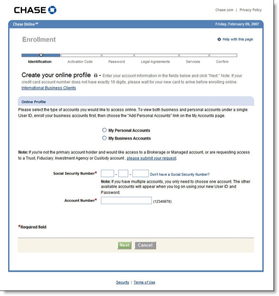
Unfortunately, after clicking the button you are transported back in time to a page virtually devoid of color and design (see screenshot below). In addition, the form immediately asks for info that many users may not want to reveal (SSN) or may not have access to at the moment (account number). 

Recommendations

  1. Redesign the page to make it more appealing.
  2. Add prominent links to customer service for help.
  3. Ask only easy questions on the first page: name and email address is enough to 
    engage the applicant and provide enough info for followup if the
    application is abandoned. 

Chase Bank first pag of online banking enrollment CLICK TO ENLARGE

Notes:

1. Here's the homepage today (left) vs. the busy look four years ago (20 Nov. 2002

Chase homepage 9 Feb 2007Chase homepage 20 Nov 2002 CLICK TO ENLARGE


Chase Fails to Design Email for Outlook’s Preview Pane

More than 70% of business-email users view most or all of their email messages in the preview pane.* Depending on screen size, resolution, and window sizing, the real estate available in the preview pane can be relatively small.

When designing messages, be sure to put the most important information in the upper-left corner to maximize visibility in the preview pane.

Here is a poorly designed email Chase sent to confirm posting of a credit card payment. It requires users to scroll right to view Chase's logo and log-in button. Here's how it looks on my 12-inch laptop screen running at 1024 x 768:

What not to do from Chase:

Chase email alert

Better design from Bank of America graphics flush left:

Bank of America email alert CLICK TO ENLARGE

(Note: BofA shows the last four digits of your account number; we changed them to xxxx in the screenshot above.)

Action Items
Even though it's just a routing email message, the poor layout makes it look like a phishing message. Chase could clean this up with just a few minutes of programming work. While they are at it, they should add a personal greeting and additional text disclosures to make it look less phishy. 

*For more information, read our Online Banking Report #129/139, Email Marketing for Financial Services.

Chase Bank Pioneers New Advertising Outlet

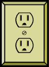
ImagesIn a novel advertising gimmick, Chase Bank affixed two-foot long banners, each pointing to one of 90 electrical outlets in the Indianapolis International Airport. The unique signage, which also includes four months of exposure on in-terminal flight-information monitors, will cost the bank $65,000 for the year, or just under $200 per day.

The signs and slogans are designed to appeal to traveling businesspeople. They include:

This outlet works. Now you can too.

You and your laptop may sigh with relief now.

Congratulations. You found a charge chair.

Analysis
We’ll leave the question of cost effectiveness of "outlet advertising" to the outdoor advertising pros. However, similar tactics could be used throughout a community to market online banking and small business services to users of WiFi-equipped cafes and coffee shops. For example, a bank could sponsor a WiFi directory that included names, locations, and hours of WiFi-equipped locations throughout town. For extra credit, include a map of electrical outlets, desired by many laptop owners so they don’t have to worry about having to rely on their batteries which are drained relatively quickly when going online.

Most coffee shops aren’t going to want a bank slapping advertising stickers on their walls. However, tent cards or brochures carrying the bank’s logo could provide WiFi instructions and locations of wall outlets.

With summer just a few months away, this would be a perfect task for a summer intern. Working with existing WiFi directories, the intern could scout out possible locations, map the electrical outlets, document contact information at each location, and post it all to the bank’s website. Alternatively, a bank could contract directly with an existing locator service to carry the bank’s advertising message.

–JB

Chase Launches Overnight Check

Chase_overnightcheck Question: What do you call a service that delivers a single consumer payment via fuel-hungry trucks and jets while requiring six or more highly paid technicians and drivers to get the job done?   

Answer: An online banking innovation featured in a page-dominating ad on Chase’s homepage today (click to view screenshot, links will not work).

The service, originally launched by Chase’s Bank One unit in January, is now available to all Chase online banking customers. Customers initiate payments online and UPS does the heavy-lifting, ensuring they arrive by the end of the following business day. Cost is $14.99 per payment which can be tracked via the UPS tracking number. Cut-off time is a user-friendly 10 pm eastern time.

Analysis
We like the service, even if the delivery mechanism of dead trees and fossil fuels is positively archaic. But given the realities of our complex payment and accounts receivable systems, it’s better than the alternative, a $39+ late fee and loads of additional interest. At least this way the user avoids getting in his/her car and spending a half-hour overnighting the payment themselves. And we applaud Chase for making the service available online.

However, despite the clever name and appealing graphic (see inset above); we have to question the homepage ad placement. For a marginally profitable service that appeals to a small niche of the truly disorganized online bankers (I qualify), that’s a LOT of screen real estate. One can only hope it’s only posted for a short time.

Chase_overnightcheck_pageSurprisingly the page that actually explains the service (click on inset for closeup), is sparse and virtually devoid of marketing punch. Anyone clicking on the homepage ad must wonder what the big deal is. If you decide to scream about a new feature on your homepage, make sure you at least spring for a Flash demo and/or thorough documentation of its benefits.

JB

Bank Websites Should Provide Secure Connections to Legitimate Fund-Raising Sites

Wachovia_homepage_graphicWhen natural disasters strike, such as the Southeast Asia tsunamis or Monday’s Hurricane Katrina destruction in New Orleans and the Gulf Coast, banks should use their considerable web reach to help their customers make safe and secure donations to sanctioned relief agencies such as the Red Cross.

With all the concern about online phishing and fraud, consumers need a trusted conduit to make donations. And the sooner the link is posted, the better. As bad as it is, for much of the country, it will no longer be top-of-mind in a few days or weeks.

Major banks fail to respond thus far
Granted its only been three days, but we were surprised to find that of the largest 50 U.S financial institutions only three, Chase (Chase.com and BankOne.com), Wachovia (Wachovia.com and Suntrust.com), and Washington Mutual (wamu.com), have posted links to the Red Cross to make online donations (see Wachovia banner above).

Seven others had hurricane-related information, but no links for donations:
Regions, AmSouth, Navy FCU, Compass Bank, and of course New Orleans-based Hibernia all had information on branch closings
USAA posted tips for dealing with the aftermath of a hurricane
Commerce Bank (NJ) ran a headline ticker on the top of the homepage offering to match donations up to a total of $50,000 (which strikes us as bit stingy if you are going to blast it across your homepage)

Action Items
The best response, from a customer service and PR perspective, is to announce a corporate contribution and provide secure links to the Red Cross and other relief agencies. Contributions should also be accepted via mail or in-branch.

Wachovia_redcross_1Wachovia does it right, with a small, but highly visible homepage link explaining its efforts and providing the important message, You Can Too (see inset above). Clicking on the link leads users to a landing page that explains Wachovia’s $250,000 corporate commitment along with two important links (click on inset for a closeup look):
1. Donate Now link to a Red Cross store established on Yahoo handle Katrina donations
2. Email this page to spread the word

Even if your bank is not prepared to make a corporate contribution, it can still support fund-raising efforts with a link to the official donation site.

JB

Chase Ends Last Major Experiment with Scan-and-Pay Bill Management

PaytrustEffective Monday, Chase Bank will end its four-year experiment with so-called scan-and-pay bill payment (download the email announcement below). Popularized in 1999-2000 by Cyberbills, PayMyBills.com, and PayTrust, the service allowed users to have their mailed bills redirected to the service provider where they were scanned and posted to a website. Users were alerted to the new bills and could pay them through a variety of methods.

Download final email announcing the termination of Chase Bank's "Premium Plan" total bill management service

As demand failed to materialize, the three service providers all ended up under Metavante ownership. Last year, Metavante sold the remaining PayTrust business to Intuit. Chase was the only major bank to offer the service, using it as the premium option in a three-level product line (see OBR 82, p. 8).

Analysis
This is a service that sounds great on paper, but is too complicated for the benefits provided. Winning electronic bill payment services need to provide quick payback with a minimal learning curve. That's what so nice about CheckFree's new system that allows users to add a new biller by simply entering the biller's phone number.

While the few users who took the trouble to redirect their bills and set-up automated payments were quite satisfied, it was just too much trouble for all but a fringe group of highly-organized computer-savvy types, the kind of person who is a long-term user of Quicken. So it makes a lot of sense that the sole remaining provider of the service is Intuit.

JB


2004 Online Financial Services Ad Spending

JP Morgan Chase and Citibank led all banking and lending companies in online ad spending according to the most recent American Banker survey of financial services spending (May 2005).

Chase’s $50 million in online advertising was 21% of its entire advertising expense, the highest among major banks, and considerably above the 11% online share across all financial services companies. In comparison, Citi’s $49 million spent online was only 9% of its total advertising expense, slightly below the industry average.

NetBank, the 16th biggest online advertiser, was the percentage leader, funneling all but $100,000 of its $4.9 million in advertising into online initiatives. Two other major online advertisers spent more than half their money online last year: ING Direct spending 60% of its $40 million total online, and MBNA spending more than half its $14 million online.

Lending Tree, Quicken Loans, HSBC, Sovereign and East-West Mortgage all devoted about one-third of their advertising into the online channel.

Top-20 Financial Institutions Online Advertisers*
2004 Online Advertising (% of total advertising)*
1. JP Morgan Chase  $50 million (21%)
2. Citigroup              $49 million (9%)
3. American Express $28 million (9%)
4. Bank of America    $25 million (9%)
5. ING Direct            $24 million (60%)
6. Lending Tree        $22 million (31%)
7. Ameriquest           $16 million (13%)
8. Quicken Loans       $10 million (33%)
9. Wells Fargo           $9.2 million (14%)
10. HSBC                  $8.3 million (39%)
11. MBNA                  $7.0 million (51%)
12. Wachovia            $6.3 million (7%)
13. E-Loan                $6.1 million (21%)
14. NetBank              $4.8 million (98%)
15. Discover             $4.7 million (6%)
16. GM                     $3.8 million (4%)
17. Royal Bank          $3.2 million (12%)
18. Sovereign           $2.8 million (33%)
19. East-West Mtg.    $2.7 million (32%)
20. WAMU                $1.9 million (2%)

*Banking, Lending, Mortgage, or Credit Card segments only, does not include online brokerage, insurance, or investments.

If you look at the brokerage and mutual fund category, the spending accelerates. Four online brokers Ameritrade ($65 million), Scottrade ($63 million), Schwab ($58 million), and E*Trade $52 million) each outspent even the largest financial institution, and Netstock Direct ($32 million) outspent all but Citi and Chase.

Top-10 Brokerage & Mutual Funds

2004 Online Advertising (% of total advertising)

1. Ameritrade   $65 (64%)

2. Scottrade     $63 (87%)                              

3. Schwab        $58 (35%)                              

4. E*Trade        $52 (77%)                              

5. Netstock       $32 (99%)                              

6. Harrisdirect  $24 (78%)                              

7. Vanguard      $12 (31%)                              

8. TD Bank        $10 (17%)                              

9. Fidelity        $5.3 (4%)                               

10. T.Rowe Price $3.8 (5%)

Download the Excel file with more details.    


JB