Best of the Web: Frost Bank Launches Actionable Two-Way Debit Card Alerts

imageFrost Bank is cool. The $25 billion regional bank has long been an innovator, pushing forward on multiple digital fronts (see notes 1, 2). Its latest innovation quietly rolled out to customers at the beginning of May, is the two-way actionable debit card alert. This service probably seems like a no-brainer to customers, especially those born after 1990, but it’s not at all easy for an FI to pull off.

imageWhile Frost is not the first to position alerts as a two-way communication channel (note 3), it is the first to allow customers to simply reply back to a text message to freeze their debit card against further charges. The action also triggers a call from a Frost banker to resolve the situation.  

Because this “raises the bar” for proactive customer communications around debit card use, we are awarding it our first Best of the Web for 2014 (note 4).

__________________________________

How it works now (v1.0)
__________________________________

image1. Consumer establishes alert thresholds and preferences (inset)
2. Bank sends triggered text-message alert
3. If the user suspects fraud, they reply back with the code provided in the alert (screenshot below)
4. Frost puts a temporary hold on the card
5. Frost banker calls customer and resolves (customer can also unblock account on their own)


image

___________________________________

What’s next (v2.0)
___________________________________

Frost Bank’s new feature is a great customer-centric solution that reinforces the bank’s position of consumer advocacy. It’s a perfect first step to a more proactive fraud-warning system.

But I do have some concerns there will be too many false alarms generated. It is so easy to forget pre-authorized debits; be surprised by charges made by your spouse; or legitimate, but strange-sounding merchant names.

Ideally, there would be a way to first ask for more info on a charge, rather than a black or white hold. It would be great to text back “huh?” and get a plain language explanation of the charge, for example:

  • This charge was made at 1:00 PM at the Subway near Northgate Mall. Are you sure you or someone in your family didn’t buy lunch there this weekend?

or

  • You began paying $9.95 per month to this merchant in February. This merchant markets a subscription music service. Did you, or anyone else in your family, start a subscription to it in the February timeframe?

BillGuard offers quite a bit of this “explanation layer” on card transactions, another reason to be looking at what they are doing (most recent post).

——————————-

Frost Bank’s debit alerts landing page (18 May 2014, link)

image

—————————————-

Notes:
1. We first covered Frost in 2005, when it was offering lifetime statement archives at a time when most banks dropped your data off the site after a few months (June 2005 post). We also loved their PFM-ish Momentum checking account launched in 2008, about the same time as Mint launched (July 2008 post). 
image2. Earlier this month, Jeffry Pilcher called Frost Bank “… one of the most beautiful brand identities … .” (see right, post)
3. In 2010 (post), Chase Bank won Best of the Web for its 2-way text-message alerts; however, that was limited to initiating funds transfers through its normal text-banking service.  
4. This is the first OBR Best of the Web for Frost Bank. Since 1997, our Online Banking Report industr
y newsletter has been periodically giving OBR Best of the Web awards to companies that pioneer new online- or mobile-banking features. It is not an endorsement of the company or product, just recognition for what we believe is an important industry development. In total, 91 companies have won the award. Recent winners are profiled in the Netbanker archives.

Capital One Launches SureSwipe for Gesture-Based Mobile Login

image

One of my pet peeves is mobile banking login. Entering an 8-character alpha-numeric password is clumsy and security overkill for 99% of mobile sessions. Four-digit passcodes used at Simple, Mint and others is a good compromise, but then you have yet another password to remember.

I’ve been especially envious of the no-login, read-only services from Southern Bancorp, Commonwealth Bank (Australia), Bank of the West, Westpac (NZ), City Bank of Texas, Barclaycard and others.

While none of my financial providers has done away with the password entirely, Capital One just rolled out something pretty close, a password substitute that uses a pre-set gesture on the touchscreen to log in (see screenshots below).

I updated my Capital One app (v4.3) over the weekend and am happy to report that it worked as promised. It takes less than a second, and due to its uniqueness, it’s incredibly easy to remember (that probably changes if everyone started using various gesture systems). It’s currently available only on the imageiPhone, but it’s going Android in 2014.

Bottom line: While I think the bank needs to expand its explanation of the new feature (see note 2), it’s a fantastic development for the mobile experience. And we hope it spurs more innovation on the login front. As a result, SureSwipe is receiving our OBR Best of the Web award, the third for Capital One (archives; note 3).  
______________________________________________

How it works
______________________________________________

1. At login, users are asked if they want to start using SureSwipe. If so, they press the “Create Your Pattern” button.

 image

2. Users create their login pattern by running their finger between the nine dots. A minimum of four must be used and a few simple patterns are not allowed.

image

3. The gesture is verified by repeating it, then confirmed by the bank.

image

4. Users have the option of turning it off or resetting the pattern. To change the gesture, users must enter their existing alpha-numeric password.

image

5. At login, users are presented with this screen.
Note: There is an option for alpha-numeric login (bottom left) and pattern help (bottom left).

image


————————–
Notes:
1. Capital One SureSwipe landing page (at top of post)
2. I’m a little surprised the bank didn’t address security concerns on its landing page or within its app. There is no “learn more” when the option is first presented to users. I was super excited to see it, but I’m not sure normal users will be so understanding. I think many will have questions about how secure a pattern is compared to a normal password.
3. This is the third OBR Best of the Web for Capital One, all since 2010, when the card issuer began to really push digital distribution. Since 1997, our Online Banking Report industry newsletter has been periodically giving OBR Best of the Web awards to companies that pioneer new online- or mobile-banking features. It is not an endorsement of the company or product, just recognition for what we believe is an important industry development. In total, 90 companies have won the award.  Recent winners are profiled in the Netbanker archives.

Square Cash Nails P2P Payments

image It’s been six months since we handed out an OBR Best of the Web award (archives; see note 1). Since then, many new enabling technologies and promising applications were launched. But with every passing year, it gets harder to raise the bar with a new digital financial product.

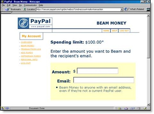
image But Square did it this week. The company took P2P payments — which PayPal commercialized in 1999 (see last screenshot below) and CashEdge/Fiserv bankified in 2009/2010, and which Google simplified in May — and distilled the payment scheme to its essence. Just email money directly (via debit card) from any client, web, mobile, tablet or any other email-enabled device (or from the Square mobile app). No third-party accounts needed, no login, no challenge questions, no selecting your payment method, no navigating various fee structures. Just send payment like you would any other email by adding a cc to Square. 

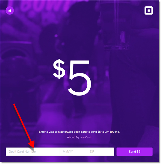
And amazingly, neither the sender nor recipient need be preregistered with Square. All it takes to send or receive small amounts ($250/week) is a U.S. based MasterCard or Visa debit card number, expiration date and ZIP code (see third screenshot; note 3). And once you’ve entered that the first time, you can literally send a P2P payment in two or three seconds (assuming you were already in your email client).

It’s hard to imagine P2P payments being any simpler. And Square is doing it all for free.

The biggest hurdle, as Walt Mossberg pointed out in the Wall Street Journal, is trust. The system is so easy to use, that it almost doesn’t seem possible. The other limitation is that users can register only one debit card per email address. There is no way currently to substitute a different card.

________________________________________________________

Analysis
________________________________________________________

Since this is Square (fintech’s Apple), the design is gorgeous and the user experience is outstanding (Jim Marous breaks it down here). But the pundits are scratching their heads a bit about why the company launched a service with negative margins (note 4) that isn’t solving any major consumer headache and is disconnected with its consumer wallet and Square Register-acquiring business.

I think they are doing it to get millions of debit cards registered with their service. Then when new customers show up at a Square merchant, the company will try to switch what would have been a credit card transactions over to debit. This could potentially save gazillions in interchange, especially when debit price controls are expected to lower the interchange into sub 10-cent-per-transaction territory. 

But how they accomplish this integration is still a mystery. The company is so far silent on the end-game for Square Cash. 

_______________________________________________________

Financial institution opportunities
_________________________________________________

Since Square is paying interchange to debit card issuers, financial institutions should be neutral about this service (note 3). Sure it takes P2P payments out of your control, but if your debit card is linked to the service, it increases usage. For those with a fee-based P2P offering such as POPmoney, Square Cash is a competitor, but with its transaction limits and other consumer uncertainties, it’s not on equal footing and initially shouldn’t be a huge threat.

In fact, banks and credit unions might consider integrating Square Cash directly into online/mobile banking. A script could write the payment email and send it directly from online/mobile banking. The primary drawback would be the confusing email confirmations from Square and the initial debit card signup on the Square page (screenshot #3), so it would take some customer education. But once customers got through that, it could be a minor profit center (see caveat, note 4).

——————————–

The simplest P2P payment process in the world

Three steps:
1. Choose email address from contacts (or type in)
2. CC cash@square.com
3. Type amount in subject line

Note: A message in the body is optional. It can just as easily be left blank.

image

Square customer announcement (2 PM, 17 Oct 2013)
Note: In this email to an existing Square Wallet customer, the company pushes users to download its new standalone Square Cash app

image

Signup/application process (webpage)

image 

PayPal “beam money” interface at its 1999 launch (15 Nov 1999)

image

———————————-

Notes:
1. Since 1997, our Online Banking Report has periodically given OBR Best of the Web awards
to companies that pioneer new online- or mobile-banking features. It is not an endorsement of the company or product, just recognition for what we believe is an important industry development. In total, 90 companies have won the award. This is the first for Square. Recent winners are profiled in the Netbanker archives.

2. In a Quora post, Brian Roemmele estimates Square pays between $0.10 to $0.25 per transaction to MasterCard or Visa and Chase, its acquiring bank (and Square investor).
3. Recipients can also deposit directly into a bank account if they don’t have a debit card.
4. It should be a net positive to the bottom line, unless there are unintended consequences, such as customer support or increased fraud.
5. For more info on peer-to-peer payments (P2P), see our Online Banking Report issue devoted to the topic (Dec 2009, subscription).

Feature Friday: Capital One 360 Offers Remote Check Deposit via Simple File Upload (no smartphone required)

image I don’t know how I missed this small, but meaningful, improvement to the remote deposit state of the art. Since last April, Capital One 360 (formerly ING Direct) has allowed customers to make deposit via the mobile phone app, and (drum roll) via file upload.  

Yes, you heard it right. Simply snap a picture of the check (front and back), save the files, upload to CapOne360, and your deposit is complete (see screenshot below). That means check deposit is available to everyone, not just those with smartphones or scanners.

Does that mean more work for Capital One operations? Sure, processing an uploaded .jpg will take more time. But for the relatively low deposit volume of its savings-account-heavy base, it’s probably not material. And the idea here is to get more deposits, not save on transaction costs.

Will there be more fraud? There will likely be more garbage (duplicate pictures, fuzzy images, and perhaps even a few suspicious attempts to deposit duplicate images). But will file uploads create a statistically significant amount of actual fraud losses? It seems unlikely, though I’m making an educated guess.

image Bottom line: The decision to accept any old .jpg was brilliant. Make it as easy as possible to do business with you. That’s been a driving force behind ING Direct’s success (that and the bouncing orange ball, RIP).

While it’s not going to make our Digital Banking Hall of Fame (note 1), it’s important enough to grab a belated OBR Best of the Web for “raising the bar” in remote banking (note 2). Nice work.

——————————-

Capital One 360 landing page for its CheckMate remote deposit service (22 Mar 2013)

Capital One 360 checkmate remote depost landing page

Step 1: Users must enter check amount ($) and which account to deposit to (and optional memo)

image

Step 2: Interim instruction page

image

Step 3: Agree to the terms and conditions

image


Step 4: Choose images for front and back of check
Note: Example images, since I didn’t have any checks on my machine

image

Step 5: Review images & click “Deposit Now”

image

——————————-

Notes:
1. The Digital Banking Hall of Fame is updated annually and published in our year-end Online Banking Report (subscription).
2.  Since 1997, our Online Banking Report has periodically given OBR Best of the Web awards to companies that pioneer new online- or mobile-banking features. It is not an endorsement of the company or product, just recognition for what we believe is an important industry development. In total, 89 companies have won the award. This is the second for Capital One (previous winner). ING Direct also won previously. Recent winners are profiled in the Netbanker archives.

First Financial, US Bank Launch First Photo Billpay Services

imageI started this post Monday, before I knew US Bank would be making headlines today as the first “major” bank with photo billpay. I got that news last night, when I updated my US Bank iPhone app (see inset).

But First Financial Bank (Abilene, TX; $3.7 billion deposits) actually imagebeat US Bank ($235 billion) to market by more than a month with its 22 Jan 2013 launch (press release; YouTube video). The bank said it had 12,000 bill uploads during the first 10-days of availability.

 US Bank mobile photo billpayBoth services use the Mitek engine to read the image and handle the OCR work. But First Financial also uses Allied Payment Network to process images that don’t get properly digitized on the first pass and Malauzai Software for app development. 

Like remote check deposit, the system will improve over time as it learns the nuances of the thousands of billing statements fed into the front end. But today, there is still work to be done on the minority of statements that don’t read correctly (see note 1).

First Financial features the new service front and center on its homepage (see first screenshot below) with a clever:

Tell your bills to say, “Cheese.”

US Bank has no mention of it on the front page (nor in site search), but if you navigate to its mobile banking page, you can’t miss it (third screenshot below).

image Bottom line: I’m not sure how many people will ultimately use photo billpay (though First Financial seems to be off to a good start). It’s an interim technology until we can convert the country to ebills.

But since that may be a decade from now, using your smartphone to snap-and-pay is the best answer for now. So, we are bestowing our first OBR Best of the Web of 2013 to First Financial  for raising the bar in remote delivery (notes 2, 3). And an honorable mention to US Bank for getting it out to a broader market.  

——————————————

First Financial features its new photo billpay on its homepage (6 Mar 2013)

First Financial Bank homepage featuring photo billpay powerd by Mitek


First Financial landing page (link)

First Financial Bank landing page for photo billpay

US Bank’s mobile page features photo billpay prominently (link)

US Bank mobile banking page featuring photo bill pay

—————————-

Notes:
1. Just today, the Chase ATM couldn’t read the amount on a computer-generated check we fed into its deposit slot. So we had to manually add.    
2. This Best of the Web goes to First Financial since it was first. Mitek already won when it introduced the technology in 2010 (see our Online Banking Report on Paperless Banking (subscription).
3. Since 1997, our Online Banking Report has periodically given OBR Best of the Web awards to companies that pioneer new online- or mobile-banking features. It is not an endorsement of the company or product, just recognition for what we believe is an important industry development. In total, 89 companies have won the award. This is the first for First Financial. Recent winners are profiled in the Netbanker archives.

Launching: KeyBank’s “myControl Banking” Provides Balance Forecasting via Mobile App & Online Dashboard

imageKeyBank is launching a new online banking and mobile service called myControl Banking. The mobile app became available today in iTunes (link).

The service is centered around myMoney Forecast, a real-time balance forecast shown at the top of the screen (see inset below). It’s a vital PFM function that looks a lot like Simple’s Safe-to-Spend.

But there is one significant difference. Key Bank users can make the forecast more accurate by manually entering Money In or Money Out transactions before they clear the bank (for example, a just-written check, see bottom of first screenshot). The bank automatically nets out any pre-scheduled bill payments, transfers, or ACH items and adds in recurring regular paychecks and transfers in.

Key Bnak mobile myMoney ForecastThe interface also includes a weekly cash flow calendar so users can monitor the flow of their funds. And up to five goals can be established and tracked within the app and/or online dashboard.

The mobile app does not (yet) replace Key Bank’s regular mobile app. Before using MyControl, customers must sign up for it within online banking.

Analysis: The introduction of MyControl Banking is a fantastic move. It delivers the key missing component of online banking, a peek at what’s about to happen with cash flow, without making users slog through a bunch of PFM features they don’t understand.

imageIt provides Key Bank with meaningful differentiation, and gives them a platform to add more PFM content in the future.

Because Key Bank’s MyControl raises the bar in digital delivery, we are giving it our OBR Best of the Web award (note 2). We are also retroactively naming Simple as a co-winner since they commercialized a similar balance forecast earlier this summer.

——————————————

Mobile checking & savings balance visualization with integrated transfer button (left) and goals (right)

Key Bank myControl Checking     KeyBank myControl Savings mobile

Key Bank myControl Banking landing page (link, 20 Nov 2012)

image

————————-

Notes:
1. This post was developed from info available within the app, in the product video at Key.com/mycontrol and in the FAQs. But I don’t have an account at Key Bank, and there is no interactive demo yet, so I haven’t used the service with live data.
2. Since 1997, our Online Banking Report has periodically given OBR Best of the Web awards to companies that pioneer new online- or mobile-banking features. It is not an endorsement of the company or product, just recognition for what we believe is an important industry development. In total, 88 companies have won the award. This is the first for Key Bank and Simple. Recent winners are profiled in the Netbanker archives.
3. For more on balance forecasting and other advanced PFM features, see our recent Online Banking Report: PFM 4.0 (June 2012; subscription).

Mint Launches Mac App: Mint QuickView

imageI’ve been a big fan of apps ever since I first pressed the weather button on the iPhone in 2007. After 12 years of http://www.blahblah.com/blah.htm, it was refreshing to just press a button and get the necessary information quickly, perfectly rendered and distraction free.

So I like Mint’s latest move, putting a similar user experience onto the desktop (see note 1) with an app for the Mac (link) that provides a quick overview of balances, transactions and alerts (see email announcement below).

Once installed, Mac users simply click on the Mint icon on the top and/or bottom of their desktop, and it immediately opens to a display of the latest balance-and-transaction info. Like iPhone apps, the icon also shows the number of unread alerts on the badge (see first screenshot). 

Other novel features:

  • A search bar along the top of the transaction search
  • Optional password protection: You can choose to look at your data without logging in (after the first time)
  • Timed password protection: Users can select how long they can look at the data before the password prompt is shown  

I’ve used it for only a few minutes, but it looks like it will become my primary method of accessing Mint. Unless you need to run a report, it has most of what you need available immediately, shaving 30 to 40 seconds or more off the time to retrieve info from the full website version.  

image Bottom line: Mint is the first PFM or banking app to hit the Mac store, beating all the major financial brands to the punch. And it’s been rewarded with “featured app” status which has propelled it to the very top of the Free Apps ranking in the Mac App Store (see inset above).

Because it raises the bar in the delivery of banking info, we are bestowing it with our fourth OBR Best of the Web award for 2012 (see note 2). 

———————————–

Mint QuickView app pops up after clicking on icon along the top

Mint QuickView uses dropdown from top icon on Mac


Transaction search from top line

Mint QuickView features prominent transaction search

Net income view

Mint QuickView


Email from Mint announcing Mac QuickView
(16 July 2012)

image

Notes:
1. We wrote about moving online banking info to the PC desktop in our Online Banking Report in 2002 (subscription).
2. Since 1997, our Online Banking Report has periodically given OBR Best of the Web awards to companies that pioneer new online- or mobile-banking features. It is not an endorsement of the company or product, just recognition for what we believe is an important industry development. If anyone knows of other financial institutions offering a similar feature, let us know and we’ll update the post. In total, 86 companies have won the award including Mint in 2007. Recent winners are profiled in the Netbanker archives.

Westpac NZ Makes it Mobile Savings Transfers Easy with Impulse Saver

image There are two schools of thought when it comes to mobile app design:

  1. Put everything in a single app for each platform (note 1), so your customers aren’t confused about which app to download
  2. Create specialized apps for various market segments and/or apps that focus on a single function

American Express (7 for iOS, note 2); JP Morgan Chase (3 for iOS); Zions Bank (3 for iOS); Southern Bancorp (2 for iOS); and a handful of other banks have launched multiple apps. But it’s still the exception: More than 99% of banks have no more than one app for each platform. 

Westpac NZ has joined the multi-app group, though oddly it has yet to launch a full-featured mobile banking app (note 3). Yesterday, we wrote about Westpac’s clever Cash Tank, that provides a no-login gauge to monitor account balances.

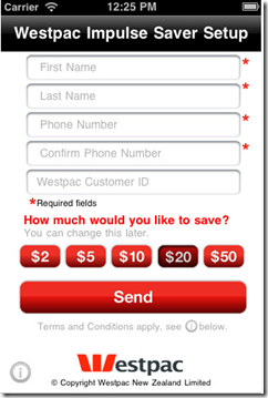
The bank has another cool single-use app, Impulse Saver, which is basically just one huge red button that users press to make a transfer from their checking account to a savings account.

obr_bestofwebThe amount of each transfer, from $2 to $50, is preset using the app settings (see second screenshot).

Bottom line: With Impulse Saver and Cash Tank, Westpac NZ has raised the bar for simple no-login mobile banking, earning an OBR Best of the Web (note 4).  
————————————-

Westpac’s Impulse Saver iPhone app (20 March 2012)

 image     image

———

Notes:
1. By single app, we mean one app per major platform, i.e., one app for iPhones, one for Android, one for iPad, etc.
2. In addition, American Express offers at least six more content apps through American Express publishing.
3. A number of reviewers in Apple’s App Store have been criticized for not having a full-featured app. For example, in June 2011 “crazfulla” wrote, “This is a great idea; however, we need a real app that has all the banking capabilities.”
4. Since 1997, our Online Banking Report has periodically given OBR Best of the Web awards to companies that pioneer new online or mobile banking features. It is not an endorsement of the company or product, just recognition for what we believe is an important industry development. If anyone knows of other financial institutions offering a similar feature, let us know and we’ll update the post. Westpac is is the 86th company to win the award and the third in 2012. Recent winners are profiled in the Netbanker archives.

Cash Tank from Westpac NZ, a Mobile No-Login Balance Display

image As mobile banking approaches its fourth birthday (note 1), we are starting to see the more interesting “version 2.0” builds from the major players. Last week, we looked at Commonwealth Bank’s Simple Balance, with its pull-down balance option.

Customers don’t want to spend more than a few seconds retrieving their balance when on the go, so the no-login option imagesignificantly improves the mobile banking user experience.

In response to that post, several readers pointed out the recently launched app from Westpac New Zealand unit. The app, Cash Tank, is an elegant solution to the same need. It’s a full standalone app that does just one thing, shows the balance in the selected account on a “fuel gauge” (see first screenshot below). 

Users set their own high and low settings so the gauge could show empty when there is still a cash cushion remaining. And users have the option of showing the actual dollar amount available or simply relying on the gauge reading for more privacy. The Cash Tank can show the balance from just one account.  

Under the gauge is a link to the bank’s mobile website where users must log in to conduct transaction. The bank does not currently offer a full-featured mobile app in New Zealand (note 2).

The app is available for iPhone and Android. 

Update Mar 20: We are awarding Westpac an OBR Best of the Web for its Cash Tank and Impulse Saver apps (Mar 21 post).

Update Mar 21: I neglected to mention that Southern Bancorp launched a no-login savings balance app a year ago called “Shake to Bank.”

————————————

Cash Tank from Westpac NZ is a standalone mobile gauge to your account balance (link)

image           image    

Cash Tank is featured on the Westpac NZ homepage (21 Mar 2012)

image

———-

Notes:
1. The dawn of the industry, at least in the United States, was in July 2008 when Apple opened the iPhone to third-party apps. There were huge strides made around the globe, e.g. M-Pesa, much earlier. But we’re referring here to the modern smartphone-based services.
2. A full-featured mobile banking app has been available to Westpac Australia customers since Dec 2008. But it does not offer the read-only Cash Tank option. 

Commonwealth Bank’s Kaching App Has No-Login Option, Simple Balance

imageThere are two problems with the current state of online/mobile login:

  • It’s too hard for customers to log in to their own accounts, especially using mobile keyboards
  • Yet, it’s too easy for crooks to log in to other people’s accounts

Since the dawn of online banking, the industry has struggled to balance user experience with security. And tiny mobile keyboards make the login experience even more frustrating.

But it doesn’t have to be that way.

A number of banks are using 4-digit passcodes making mobile login a breeze. But Commonwealth Bank (Australia) has gone one step further, with no-login pulldown access to account balances in its new Kaching (ka-ching) mobile app (note 2). 
(Update 16 Mar: New Zealand’s Westpac also has a no-login mobile option called Cash Tank). 

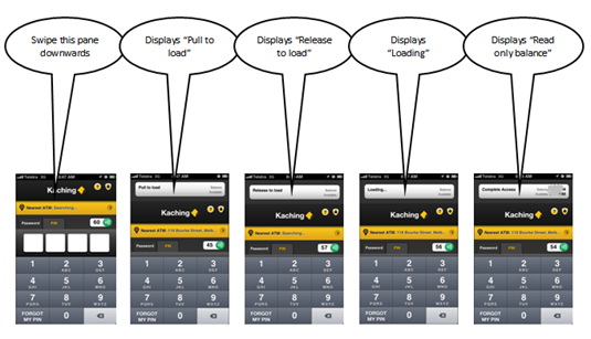
obr_bestofwebCommonwealth calls the no-login option Simple Balance. With a quick swipe users pull down a read-only account balance (see screenshot below). The no-login option must be  enabled within the app before the first use. See it in action here (at the 29-second and 54-second marks).

We are awarding Simple Balance our second OBR Best of the Web award for the year (note 3). While it may not be as novel as City Bank’s debit card on/off switch, it’s likely to be used 100x more.

Bottom line: Requiring full username and password to see your account balance is antiquated, or at least it’s rapidly headed that way. The four-digit PIN is a good first step. But ultimately, it needs to get even easier than that for low-risk activities (note 4).

—————————————–

A single swipe on the top of the Kaching app allows users to download their account balance (click to enlarge, see note 2)

Pull down Simple Balance on Commonwealth Kaching

———————————-

Notes:
1. Many thanks to Australian reader Saif Hazarika, Innovation Manager at Australia Post, for clueing us in on the Kaching feature and creating the illustration above.
Facebook integration into Kaching's P2P payments area2. The Financial Brand published a good overview of Kaching several weeks ago.
3. Since 1997, our Online Banking Report has periodically given OBR Best of the Web awards to companies that pioneer new online or mobile banking features. It is not an endorsement of the company or product, just recognition for what we believe is an important industry development. If anyone knows of other financial institutions offering a similar feature, let us know and we’ll update the post. Commonwealth Bank is is the 85th company to win the award and the second in 2012. Recent winners are profiled in the Netbanker archives.

4. USAA’s “stay logged in” option is another promising approach, though not quite as user friendly as the Kaching swipe.
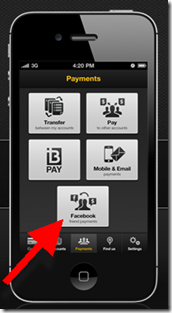
5. The Kaching app (inset, click to enlarge) includes integration to the user’s Facebook friends to facilitate P2P payments. A cool feature that I will add to the 50 or so discussed in last month’s Banking on Facebook report (OBR subscription).

The Debit Card On/Off Switch from City Bank of Texas

imageCity Bank of Texas has been a mobile innovator for more than four years, launching a ClairMail-powered mobile site in Oct 2008. I first heard its story at the Mobile Summit in June 2009. At that time, the bank already had 10% of its online banking base using mobile.

City Bank now offers a full range of apps including Android, iPhone and iPad, which make for a pretty impressive graphic. The new apps are powered by Malauzai Software.

And, in a world where most apps look pretty much the same, it has managed to pioneer several unique features:

  • Debit card on/off switch: If customers ever want to switch off their debit card, because it was misplaced, or if funds are running low, they simply move the toggle on the My Cards page of the mobile app (see inset).  
  • Reward-checking status: City Bank is a long-time rewards-checking client of BancVue. Its mobile app includes a rewards-tracking feature so users can see where they stand in the three-level program (see the Android screen in the lower right below).

imageBoth features are must-haves. But the on/off switch is brilliant both for its simplicity and value. And this tangible mobile feature/benefit likely to get talked about in the press and at the weekend barbeque. We are giving it an OBR Best of the Web award, the first of the year and 84th of all time (see note). 

 
The City Bank of Texas mobile lineup (link, 23 Jan 2011)

 City Bank of Texas mobile banking lineup

Note:
1. Since 1997, our Online Banking Report has periodically given OBR Best of the Web awards to companies that pioneer new online or mobile banking features. It is not an endorsement of the company or product, just recognition for what we believe is an important industry development. If anyone knows of other financial institutions offering a similar feature, let us know and we’ll update the post. City Bank of Texas is the 84th company to win the award since 1997 and the first in 2012. Recent winners are profiled in the Netbanker archives.

PSECU’s Remote Deposit Honor System Has Processed $1.4 Billion with Only $74,000 in Losses

image Sometimes the best ideas are the simplest ones. Ten years ago PSECU launched the Upost@home deposit service. It allows members to manually enter their deposits in the CU’s online banking system for immediate credit, then mail them to the CU in a postage-paid envelope.

obr_bestofweb The service, launched in late 2001, was little publicized outside of PSECU’s member base during the first two years. We first heard about it in late 2003 when a second credit union licensed the service. We gave it our highest honor, an OBR Best of the Web award (note 1), one of only five given during the post-bubble dark days of bank-tech innovation (2001 through 2004).

At the time, it seemed an almost crazy idea. An online/offline honor system for deposits. But the CU knew what it was doing. It limited the amount that could be deposited and which members were allowed to use the service.

Now the results speak for themselves (see annual totals in table below):

4.5 million items deposited worth $1.4 billion (avg. of $310 per check)
$74,000 in losses
= 0.0053% loss rate (0.5 basis points)
or 1.6 cents per item

Upost has turned into the least loss-prone method of accepting deposit, including the branch!

Another interesting data point: The CU is processing almost 50,000 Upost@home deposit items per month, about one per month per member enrolled in the service, a pace that’s stayed remarkably consistent over time.

Bottom line: We’ve listed PSECU’s Upost@home on our annual list of top online/mobile innovations of all time (it was ranked #24 of those invented in the past 10 years and #42 of all time). But in terms of “bang for your buck,” it’s probably in the top-5.

image

Source: PSECU, 5 July 2011

———————————–

Notes:
1. The original article published in Online Banking Report (OBR #103) is reprinted in the Netbanker archives here.
2. The list of top innovators was published in OBR #188.