Create Your Bank’s Facebook Page (before someone else does)

Is it just me or is it hard to keep up with all the developments at Facebook? I guess if you are worth $15 billion, you have to keep hustling.

Much of the news out of Facebook has little to do with retail banking. So, you may have overlooked this week's announcement of its new ad platform and promotional tools for businesses and organizations (for a concise, 340-word summary and analysis, see Wednesday's TechCrunch post here).

In the official Facebook press release (here), Chase is listed as one of 12 "landmark partners" in the advertising program. Other than the existing Chase +1 group, with an impressive 40,000 members, it doesn't appear the bank has launched a page yet.

But that shouldn't stop you. To create a Facebook presence, you don't need to be a landmark partner, a mega bank, or even have ten bucks left in your budget. The new company pages are free and you can set one up here in a just a few minutes .

As a test, I built an Online Banking Report page in about 90 seconds (here, screenshot below). It took an hour to show up in Facebook search, so don't panic if it's not there right away (see note 1).

Even if you post only your logo and website address, I recommend doing so right away. That will help ensure that you, and not some crook or prankster, creates the page that's associated with your brand at Facebook. For extra credit, add Facebook to your periodic Web searches to see if anyone is wrongly using your brand name.

As an added payback for my 90 seconds of work, an hour after creating my page, Online Banking Report is the one and only page shown for "banking" searches (see note 2).  

You also have the option of creating pay-per-view or pay-per-click ads to drive traffic to your page. Currently, the advertising is very affordable with prices starting at $0.15 per thousand impressions or $0.01 per click. Ads can be targeted to Facebook demographics.

Notes:

1. When I thought I'd lost my Online Banking Report page, I created a second page for NetBanker here

2. There are many other search results for "banking," but Online Banking Report is currently the only one under the new "Pages" designation. Overall, Facebook search is currently pretty weak, but with the $240 mil from Microsoft, it should be state-of-the art by this time next year.  

American Express Plum Card Uses "Scarcity Marketing"

As a financial services junkie, I've long been a fan of American Express (see note 1). During the past 20 years, as credit cards increasingly became a commodity with no annual fees, loss-leader teaser rates, and look-alike marketing, AmEx has done a superb job maintaining a premium image and pricing. I keep my Gold Card in my travel bag and use it once every year or so when I don't want to expose the numbers of my business MasterCard. But I would never cancel it, despite the $75 annual fee, or I'd lose my "member since 1989" status. That, my friends, is what brand loyalty is all about.

The latest product designed for small businesses, those with "6- or 7-figure revenues," is the Plum Card. I learned about it in a 2/3-page full-color burgundy ad in yesterday's Wall Street Journal (Oct. 31, p. A11). An identical ad appears today (Nov. 1, p. A10). Its standard teaser fare tells readers that the "application releases in 5 days" (today, 4). The bottom of the ad contains a special URL, <PlumCard.com> where prospective customers can get more info. The card was originally announced at an INC 5000 event Sep. 7 (see coverage here).

After seeing the print ads, I and another 100,000 people headed to Google to see what was going on. Wisely, the company purchased not only the top spot on Google for "plum card," but also supported the print buy with an additional twist, "Who's getting a Plum Card? Initial release of 10,000 cards." The novelty of a new financial services product with limited availability, a technique AmEx has used for years with Platinum/Black, should attract click-throughs.   

The landing page (here) continues the theme of anticipation and exclusivity, with get this, a WAIT LIST, to be one of the first 10,000 to receive the card. A countdown timer in the upper right lets me know exactly how much time I have to wait, in this case 3 days, 11 hours and 6 minutes. If I'm not mistaken, that's Sunday night at midnight Eastern time.  

I'm on the wait list, so I'll let you know what I learn on Monday when I receive my application.

Plum Card pricing
There's no argument the marketing is first class, but what about the card itself? Is there anything that AmEx or anyone can do to distinguish themselves in the crowded field of business charge cards?

Time will tell, but it has a unique cash flow and discount plan that could be very appealing to business customers. Users that pay their bill within 10 days receive the industry standard "net less 2%" discount (see note 1). Alternatively, users can pay just 10% of the total due and defer the balance for two months interest free. At that time, the balance is due in full. There is no information in the terms and conditions about an annual fee, but I'd expect one.    

Notes:

  1. If my wife would have been willing to move to NYC, I'd have tried very hard to get a job there after completing my obligatory MBA. 
  2. The 2% discount applies on spending of $5,000 or more; otherwise, the net-10 discount is 1%.

Advanta Creates Social Network Around Small Business Innovation: Ideablob

I don't know how I missed this one, but Advanta, a major credit card issuer with 1.2 million small business customers, launched a new Web 2.0 microsite on Sept. 24 at the high-tech DEMOfall conference (press release here). Just being there amongst the digerati was a coup for the card issuer, but they did much better, managing to come home with a coveted DemoGod Peoples Choice trophy at the conference.

The Web 2.0-laden site is called ideablob, and it's a place where entrepreneurs, inventors, and anyone else can post their business idea and compete for the monthly $10,000 prizes (contest rules here).

One month after launch, the site is generating a fair amount of activity. The eight October finalists showcased on the homepage (see below) have received the following: 

  • 691 total votes (must be registered to vote, can vote on more than one idea)
  • 216 total comments (must be registered to comment)
  • 10,300 total views (anyone can view the idea)

Traffic to the site should grow rapidly once word of the $10k prize circulates. That's a large incentive for the millions of Internet users who think they have a better idea. 

Advanta, which uses fairly subdued branding on the site (see small "inspired by Advanta" under the main ideablob logo), is positioned to gain in three ways:

  • By associating its brand with innovation, social networks, and a Web 2.0 attitude
  • Assuming a good viral kick, and $10k/mo should do it, the site could generate leads more cost effectively than through other channels
  • Publicity in blogs and traditional media

Bank of America launched a good business networking site recently, but without the fun of the $10,000 in prize money (see previous coverage here).

Advanta's ideablob main page (25 Oct 2007)

An idea page

Wells Fargo Launches CenterStage, a User-Generated Video Promotion

Tomorrow, Wells Fargo is expected to launch a user-generated video contest that will place the winning entry into a 30-sec commercial that plays during January's Rose Bowl, with an audience of 35 million or more. The winner will be chosen by public voting on the contest website. Entries are due by Nov. 26.

Although, this type of contest has been done before including last year's Super Bowl (see previous coverage of Intuit's TaxRap here and Lending Club here), it's the first time a major U.S. bank has launched such a high-profile effort. It should provide Wells with excellent publicity while supporting its social media and branding efforts.

The whole effort is first class, from the Center Stage website, to the pre-taped audio tracks in various genres, and the contest rules and prizes. And while the sample video's are cute, don't listen to them at bedtime. Trust me, you don't want "The Wells Fargo Wagon" running through your head as you try to get to sleep. 

Free iPods (again)

I’m not sure why I’m so drawn to the free iPod promotions. Maybe it’s because Citibank never sent me my free one in 2004. Granted, I didn’t jump through all the post-signup hoops, but I’m still sore about it. 

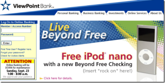
Today, Bank Deals blogged about the latest bank to offer the coveted music player, Plano, Texas-based ViewPoint Bank. This summer (here), I critisized Key Bank and TD Bank for using boring graphics to publicize the sleek device. ViewPoint perhaps does a bit better depending on your tastes (see screenshot below). You certainly can’t miss the promotion, but the bank is still missing an opportunity to showcase the sexy new video nano, rather than the oh-so-2006 version shown in its homepage ad.

The fine print: Like most banks, ViewPoint requires direct deposit to score the music player. And, it must be at least $600/mo, so students take your business elsewhere. But the checking account is free, so the qualifying bar is not set too high. The offer runs through year-end.

One more caveat: If you splash a $150 freebie across the homepage, you better have an answer when your current direct-deposit customers come in for their free iPods as thanks for their ____ years of loyal support. One helpful technique, use cookies so that you don’t even show the offer to existing customers.   

ViewPoint homepage (20 Sep 2007)

Eisenhower Bank Uses Dramatic Mobile Banking Imagery on its Homepage

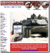
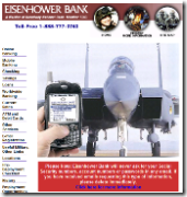
Link to Eisenhower BankOne of the best things about mobile banking is the cool graphics you can post on your website of people logging in while standing in front of dramatic objects. For example, Chase print ads have featured an appealing picture of someone reading an account alert from Chase in the stands of a baseball game (see post here).

We've also started seeing visuals on the websites of early adopter mobile banks and credit unions. And no one has taken it further than Eisenhower Bank, a division of Austin, Tex.-based Broadway Bank that caters to members of the military.

Currently, Eisenhower's home page is dominated by a rotating group of pictures with a leather-encased Treo with the Eisenhower Bank page superimposed over impressive backdrops, many with a military theme. See the series below.


Eisenhower's mobile banking is powered by Mobilearth, a Vancouver, Canada-based mobile provider. Thanks to guest blogger Brandon McGee for the tip.

LifeLock’s Engaging 2-Minute Television Spot

Today, I was home for lunch and my son was watching a recorded episode of Myth Busters, a great show as anyone with a pre-teen child knows. As he was fast-forwarding through the commercials, I happened to see a glimpse of a LifeLock spot (see inset).

My son knows I like the commercials better than the shows, so he graciously replayed the entire thing for me. It seemed to go on forever, he said, "like a sponsored program of its own." Which from him is actually a compliment, I think. I checked out the replay online and saw that it was a 2-minute spot (note 1).

It features street scenes of New York (I think). It plays like news coverage as the big "billboard trucks" drive through town plastered with CEO Todd Davis's social security number in red, 3-foot high numbers. Interspersed are man-on-the-street soundbites from astonished pedestrians and a great testimonial from a LifeLock customer who credit the company from saving him from having someone buy an $83,000 RV in his name. It also has Mr. Davis pitching the product through a bullhorn on a crowded Manhattan street.  

It's a real in-your-face commercial, but I really liked it. It does a great job of grabbing attention, reinforcing the benefits, and providing a can't-miss call-to-action. It's a good compliment to the over-the-top print ads featuring the CEO's social-security-number (see previous coverage here and note 2).

LifeLock uses two different URLs in the commercial, the normal <lifelock.com> and <lifelocktv.com>. Both point to the same page now, but the company must be considering a distinct landing page for the TV URL.

The video is available in the lower-left corner of the company's homepage (below). For more information on the market for credit report and identity theft services, see our most recent Online Banking Report here.

LifeLock 2-min television spot

Note:

1. The commercial doesn't appear to be on YouTube yet, so I was unable to post the actual spot here.

2. A half-page version of LifeLock's social-security-number ad was in a recent WSJ.

US Bank Pitches Electronic Statements at Login

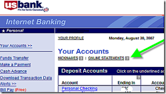
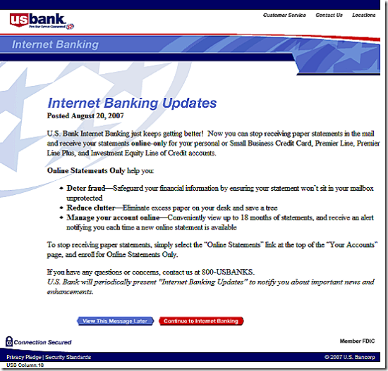
Using a splash screen after logging in to online banking (see screenshot below), U.S. Bank is asking customers to move to electronic statements, specifically for credit card and loan accounts, although the online-only option is also available for checking accounts. I saw the message, dated Aug. 20, for the first time today. I've been a customer of U.S. Bank through the entire online era (note 1) and this is the first time I recall being asked at login to go paperless. Unlike PayPal, BofA, and others, U.S. Bank rarely uses the login splash screen technique. 

Let's look closer at the bank's pitch:

Title: Internet Banking Updates
NetBanker comments: OK…but would be more effective if it directly mentioned the purpose of the message

Opening line: U.S. Bank Internet Banking just keeps getting better! 
NB comment: That's a bad opening line. This is not a new feature. Some U.S. Bank customers have had electronic statements available for 13 years now. Everyone customer has had them for at least 9 or 10 years. The only new thing is that you stop receiving paper statement, hardly the "bank getting better." Most customers know this is a cost savings move for the bank.

Benefit statement (bullets): Online Statements Only help you: Deter fraud, Reduce clutter, Manage your account online….
NB comments: Beside the grammatically challenged opening, the bank did a good job getting the anti-fraud message into the first bullet. The second bullet, "reduce clutter," is OK, but the third is pretty weak. Why are you telling online banking customers they will benefit from "managing your account online?" And only 18 months of archives is hardly going to give customers a good feeling about doing away with their paper statement.

US Bank's online statement signup Call to action: The bank provides specific instructions on how to turn off the paper statement.
NB comments: The specific instructions are good, but a small graphic of where to click would be more powerful (see the example at right). Also, the choice to view the message later is a user-friendly option.

Overall graphic design: The splash screen is laid out like a letter.
NB comments: That's OK, but a graphic image or two would give it a more modern and professional image.

Overall grade: C
NB comments: The bank does a good job getting right to the point. But the overall look and feel along with some of the specific copy points lower the score. This would have been an A- in 1997, but a decade later, Internet users expect and deserve a more sophisticated message.  

US Bank online banking splash screen

Note:

1. Full disclosure: I was the lead product developer on U.S. Bank's online banking system launched in 1994.

Green (Hybrid) Auto Loans from Star One Credit Union

In many ways, hybrid vehicles are the perfect antidote for guilt about our 21st century high-consumption lifestyle. Buy a Prius, and instantly feel better coasting around the city on self-generated battery power. Yet you still get to motor about in a relatively large, well-appointed and air-conditioned steel box (note 1).  

That's why politicians have jumped on this bandwagon in droves. And why it makes a great marketing statement to support energy-saving and/or low-emission alternatives with loan discounts. Not only does it position you as caring about the larger environment, there is a very real environmental education benefit to the efforts.

The most recent exampleStar One Credit Union <starone.org>, a $3 billion (assets), 71,000 member CU based in Sunnyvale, Californiahas a link on its homepage to its hybrid offer. Customers financing a new or used hybrid vehicle save 0.25% on their loan rate. On a $20,000 5-year loan, $139 is saved, enough to fill the tank three, maybe four times. The offer is spelled out here (screenshot below).  

Other financial institutions offering hybrid car loans:

  • UCB Bank (Miami, FL): no payments for 3 months offer here
  • Deedham Savings (Deedham, MA): offer here
  • Sound Credit Union (Tacoma, WA): 0.50% discount offer here
  • Tech CU (San Jose, CA): 0.25% discount offer here
  • Vancity (Vancouver, BC, Canada): Prime rate for low-emission vehicles here

Note:

(1) I'm not trying to be cynical here. As a former engineer, I think hybrid technology is fantastic. Using waste energy to fuel the car is both elegant and efficient, and I look forward to driving one soon.

Citi Mobile Makes the Homepage

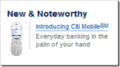
Link to CitiCitibank continues to press its lead in mobile banking services. The banking giant not only runs print and television ads, but also claims valuable left-side real estate on Citi's homepage (see inset for closeup of section; see screenshot below for context; and see note 1).

Since Citi's homepage is relatively cluttered with banner ads, the New & Noteworthy section supported by a small mobile phone graphic should grab a significant number of clicks. The landing page is the same as reported earlier (see previous coverage here).

Citibank homepage 7 Aug 2007

Note:

1. Citibank's homepage as viewed from a Seattle IP address, Aug 7, 3 PM Pacific, from a laptop that has previously visited Citibank.com but that has not accessed a Citi account.

Lending Club’s YouTube Contest Off to a Slow Start

Update July 30: I don't know if it was me or YouTube's search function (probably the former), but I missed at least six other entrants into the Lending Club contest. While I'm still surprised there are so few — as of 11 AM Pacific today, there are 10 total entrants here — that's MUCH better than three. What's more important: several are approriate and relatively clever. The current leader here, and probable winner, has nearly 5,000 views and will be hard to catch. Another thing I missed, the company DID put the contest in its blog here. I apologize for the errors.

Start-up, P2P lender Lending Club is sponsoring a user-generated video contest on YouTube. The most popular video wins $5,000, and in addition to its blog, the contest is also discussed in the lender's Facebook Group (screenshot below). Despite this exposure, the contest doesn't seem to be widely known. We read about it last week on a P2P lending blog called Prosper Lending Review.

Right now, it looks like someone's going to make off with an easy $5k. The contest, which began July 17, and ends on Aug. 10, has only two entrants posted on YouTube, at least using the correct tab "Lending Club." One is recorded so softly, you cannot understand a word of it, another features a guy reading website copy on his couch, and the last one is a dubbed-over 1-minute clip from the Hound of the Baskervilles. I don't want to skew the results by linking to them. Trust me, you don't need to watch them.

And since the winner is the video with the most cumulative plays on Aug. 10, new entrants have less than 2 weeks to rack up more than the 2,000 views of the current leader. 

A few lessons from this effort:

Lesson #1: While the contest is a great idea to generate low-cost buzz, and perfect for a Facebook-based app like Lending Club, the lesson here is that you need to run it longer so the contest can create its own viral momentum. Three and a half-weeks just isn't enough time for the word to get out to enough creative types and for them to get something interesting recorded, uploaded, and for it to catch on with YouTube viewers. In contrast, see our coverage of Intuit's TurboTax Rap which generated more than one million YouTube views (previous coverage here).

Lesson #2: Lending Club was apparently testing the power of FaceBook groups, creating a special one just for the contest called, "Lending Club Contest — Win $5,000." The lender did not mention the contest (see update above) on its website. But unfortunately, the Facebook club has only 57 members after two weeks and doesn't appear to have the horsepower to spike enough word-of-mouth buzz on its own. I'm sure they will do it differently next time.

Lesson #3: You might want to include a clause in the contest rules stating that videos containing pirated content or profanity, are unintelligible or not understandable, are not allowed. That would eliminate all three current entrants. Here's the official rules posted at Facebook.

Bank of America Advertising NSF/Overdraft Protection at TechCrunch

Along with 550,000 other followers of Web 2.0 happenings, I'm a regular reader of Michael Arrington's TechCrunch, although it's harder to keep up with these days as the blog has gone from a couple posts per day to seven or eight. Although I usually read it in an RSS reader, I visit the site once per week or so to read comments.

This week for the first time I noticed financial services advertiser Bank of America, a hardly newsworthy occurrence as Bank of America spent $43 million advertising online last year (here). But the content of the banner proved most interesting (screenshot below); here's what the bank's ad says:

A little knowledge is a powerful thing.
Online Banking Service: Check your balances and account activity so you can help prevent fees.

And the blue button on the right says "Know More Now."

The banner leads to a landing page (here) that discusses a number of topics, but opens to a discussion about overdraft-protection options in the middle of the page (screenshot below). It's very interesting to see a large bank take on this controversial issue in its advertising. It's a good sign that the banking industry is taking the criticisms seriously and is working to educate users on how to avoid fees, even if does impact short-term fee income (see my discussion of how mobile alerts can be used to keep users informed, here).

BofA landing page from TechCrunch ad