New Online Banking Report Available: Online & Mobile Banking Forecast through 2020

image The latest Online Banking Report: 2011 to 2020 Online & Mobile Banking Forecast is now available. It was mailed over the weekend to all OBR subscribers. It’s also available online here. There’s no charge for current subscribers; others may download it immediately for US$495.

The report includes our latest 10-year online & mobile banking and bill-pay forecast. While our reading of the tea leaves is unlikely to be perfect, it seems clear that the demand for online banking in the United States has reached a plateau (note 1); in fact, we are likely within a year or two of online banking penetration peaking and slowly heading down.  

How could that be? Mobile of course. In fact, through the end of 2020, we project an increase of 40 to 45 million U.S. households using mobile banking, to a total of nearly 60 million. During the same period, online banking penetration is actually expected to drop by a few million households.

If we are right, sometime near the end of the decade mobile banking will surpass online (note 2), although by then, the two will look pretty similar. 

The report also includes a revised 10-year forecast for U.S. peer-to-peer lending. After more than doubling in 2010, we expect continued strong growth of around 40% compounded annually through 2020.

__________________________________________________________________

Top innovations & trends of 2010
__________________________________________________________

The report includes a summary of the top ten innovations or trends during the past year (in alphabetic order):

  • In-statement merchant rewards goes from zero to 100 financial institutions
  • Loan preapproval wizards reduce uncertainty for applicants
  • Location-aware mobile services for banking debut
  • Mobile banking goes mainstream
  • Mobile capture removes the paper from commerce
  • Mobile payments gains real momentum
  • Online personal financial management (outside of the bank) struggles
  • P2P lending solidifies its niche
  • Social media proves it can have real impact in financial promotions
  • Transaction streaming and sharing gain a foothold

__________________________________________________________________

New entrants on the list of the top 43 innovations of all time
__________________________________________________________________

Each year we rank the top online/mobile innovations of all time (North America). There are a total of 43 products listed from 42 unique companies:

  • 15 banks
  • 5 credit unions
  • 9 non-bank financial services companies
  • 13 technology companies

The class of 2010, which was unusual for being all technology companies rather than financial institutions (note 3):

  • Blippy for its automated transaction-sharing network
  • Cardlytics for its merchant-funded in-statement online rewards service
  • Finsphere for its location-aware fraud-targeting service, PinPoint
  • Mitek Systems for its mobile photo bill pay

————————-

Notes:
1. The penetration of online banking into U.S. households is relatively flat going forward. However, because each households accesses a larger number of financial accounts, growth at individual financial institutions is still growing on average.
2. Forecast is for the United States. Mobile has already surpassed all types of banking in some developing countries.
3. Perhaps this can be explained by the necessary focus of financial institutions on getting through the global banking crisis beginning in 2008.

Chase Bank Uses QR Code in Homepage Banner

Here’s the first time I’ve seen a QR code used on a bank’s homepage. After an animation sequence (below) announcing Chase Bank’s new Android mobile banking app, the final graphic displays a code that Android smartphone users can scan to download the new app. Very clever.  

Chase Bank homepage (20 Jan. 2011)

Chase homepage announing android mobile banking app

Landing page (link)

Chase landing page for its new android mobile banking app

Animation graphic 1:

image

Animation graphic 2:

image

Animation graphic 3:

image

Self-Service: Bank of America’s MyFraudProtection Allows Online Review of Suspicious Card Transactions

imageThe reason bank call centers still field millions of calls from online banking customers is that most account problems cannot be solved online. It’s not that banks don’t have the technology or the business case, it’s just a priorities challenge. Effective self-service modules are time consuming to build, test and integrate, while employee and customer education pose an even bigger hurdle.

But slowly, as more and more consumers look to resolve issues with a mouse click or finger flick, financial institutions will add self-service troubleshooting wizards to online/mobile banking.

The latest example comes from Bank of America.

I’ve been a BofA cardholder for the better part of two decades, and every year spend an hour or so verifying flagged transactions via phone with bank-fraud reps. It’s an annoying, but necessary, part of making 50 to 100 charges every month for home and business. 

But my most recent experience was very different. When I went online to pay the bill, not realizing (but suspicious) that my card had been cut off, I was greeted with the following message underneath the card balance on the main Account Overview page (see screenshot 1):

Online access is not available for this account. Please go to
www.myfraudprotection.com and verify recent transactions. Or you may call
1-800-427-2449 for additional information.

_____________________________________________________________

How it works
______________________________________________________________________

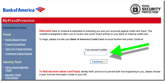
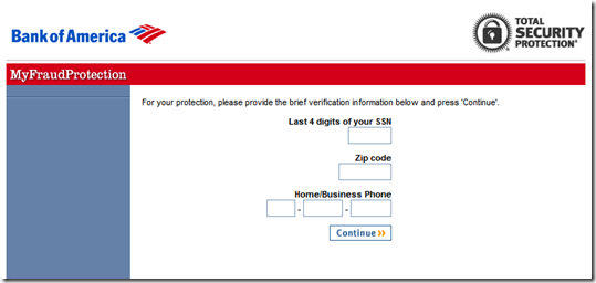
Step 1: Following the link, I ended up at an entirely new site, running outside online banking where I was required to re-enter my account number (screen 2), last 4 of SSN, Zip, and phone number (see screen 3).

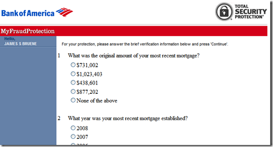
Step 2: I was then required to answer random questions pulled from the credit bureau to authenticate myself (screen 4).

Step 3: Finally, I was able to review and approve the transactions in question (screen 5). I was then thanked and told I could use my card again (screen 6).

However, after all this, I was still not able to pay my account online and had to call after all. The rep told me that it takes between two and 24 hours for online banking access to become available (note 1).

______________________________________________________________

Analysis
_______________________________________________________________________

All-in-all, I liked the system. However, it needs to be more integrated into online banking (see note 2). Given all the extra work required to authenticate myself, it would have been faster just to call the 800-number. If I were a normal customer, that’s what I’d do next time. I hate the stress of going through the authentication process: With everything on autopay, who can remember their exact payment amounts anymore?  

And worse, there is a security disconnect here. I log in to my credit card account only to be told it’s unavailable and that I should log in to some site I’ve never heard of (that doesn’t even have a Bank of America URL, note 3) and turn over personal info. It looks more like a crude phishing ploy than something from a major bank. And as far as I can recall, there was no customer education on this process.  

So, I applaud Bank of America for making transaction verification self-service. But there’s still much work to be done before it replaces the phone process. 

1. Main Bank of America Account Overview screen (14 Jan. 2011)

Main Bank of America Account Overview screen (14 Jan 2011)

 2. First screen at MyFraudProtection.com (link, note 2)Bank of America MyFraudProtection.com

3. Step 2 of 3 of authentication process

Step 2 at MyFraudProtection.com

4. Step 3 of 3 of authentication processimage

5. Transaction reviewimage

6. Confirmation message (and survey invitation)image

———————————-

Notes:
1. This was the weekend that BofA was having website trouble, so it may not always be delayed.
2. I realize the bank is using the fraud-protection site as a standalone system so it can direct any cardholder to it without first needing to log in to online banking, hence the authentication requirement. But for logged-in bofa.com users, it seems unnecessary. Although it does provide an extra measure of security, in case the cardholders’ online access had been breeched by the person attempting to use the card, that extra security comes at too high of a usability cost, in my opinion. 
3. The www.fraudprotection.com URL does redirect to myfraudprotection.bankofamerica.com, which helps.

Google Launches More Financial Product Comparison Pages: Savings Accounts, Checking, CDs, and Mortgages

image Today, I ran into Google’s new savings-account comparison chart for the first time (see notes 1, 2 and screenshot below, link). The search giant now offers separate pages with financial product comparisons for mortgages, credit cards, CDs, checking, and savings accounts. And the comparison matrices are at times positioned prominently on searches potentially reducing traffic to top advertisers and to organic results as well (see screenshot below).

Savings account search results
Let’s look at an example search today for “savings accounts.” The results include a blue-chip lineup of paid advertisers. Following is a list of the top 10 paid results compared to their position on the Google comparison page (note 3):

1. American Express (#1)
2. ING Direct (#7)
3. US Bank (#24, 30, 32, 33)
4. BECU (local advertiser)
5. Citibank (#19, 25, 26 )
6. Capital One (#10, 15, 31)
7. Navy Federal CU
8. TD Ameritrade
9. Zions Bank (#4, 5, 22, 23, 27)
10. Discover Bank (#2, 11)

Analysis
I still don’t understand why Google would risk antagonizing its financial advertisers by drawing traffic away from their ads and into the Google-powered comparison matrix. The company says its focus is on the user experience. So I guess they believe that long-term this approach will generate more traffic, more searches and ultimately more revenue, possibly from commissions for actual accounts generated, rather than just pay-per-click.

But in its current beta stage, there are some odd results. How would you feel if you are US Bank, bidding high enough to be number three on the search results page, but not shown until page three of the savings-account comparison page? Worse, three top-10 advertisers, BECU, Navy Federal CU, and TD Ameritrade aren’t even listed on the savings comparison page.

Which brings up a bigger question. How does Google determine which FIs are listed? The savings-product comparison indexes only 17 banks, of which five aren’t even playing the rate game at this point with rates of 0.25% or less (note 4). Furthermore, there’s not a single credit union and just one smaller bank (Bank of Internet) listed. 

I understand this is just a trial balloon from Google and that product comparisons could make it easier for users to find the best rate. But right now it’s unfair to any financial institution not in the chosen 17, and it doesn’t allow users to easily choose from criteria other than rate, monthly fee, and whether a branch is nearby.

It also looks like the system could be gamed. What’s to prevent one of these banks from launching ten, or 20 or 30 different savings accounts, all with temporary teaser rates, to soak up more space in the matrix?

Sure, Google will eventually build algorithms to prevent that, but that will take time. Meanwhile, it’s an odd transition time for the search engine and its financial advertisers. But if you rely at all on Google to deliver new customers, you better pay close attention to developments with its product-comparison pages.

Google search for “savings accounts” (12 Jan. 2011, 4:00 PM Pacific, Seattle IP address)

Google search for "savings accounts" showing new product comparison ad

Google’s “savings” comparison page

Google's "savings" comparison page

Offer details page for American Express High-Yield Savings

Offer details page for American Express High-Yield Savings

———————————

Notes:
1. According to MyBankTracker.com, Google started running the deposit-account comparisons in late December 2010 in the U.S. market.
2. We wrote about Google’s credit card comparison matrix in November.
3. Google’s savings-account matrix listed a total of 44 results, from 17 unique banks, displayed 10 per page
4. 14 of the 44 results, almost one-third of the matrix, were accounts paying 10 basis points or less.

USAA Promotes Teen Checking Accounts

image

In doing some initial research for a report we are planning for Q1 on “family bank accounts,” I started where I usually do, on Google. The only financial institution advertising specifically on the term “teen banking” was USAA (see note 1).

The top-of-the-page ad led to a well-designed landing page devoted to Teen Checking (see screenshots below) with a clever call to action: 

We won’t take any of your teen’s allowance.
Teen checking without hidden fees.

USAA even has a dedicated site with its own URL to support its youth-banking efforts: https://my.usaa.com

Relevance for NetBankers: Teenagers may be one of the most lucrative segments to attract to your financial institution. They not only spend billions themselves, but also could literally stick with you for a lifetime.

The thinking goes something like this:

  1. Attracting the children of your customers helps you retain the parents
  2. Retaining the parents helps you retain the kids as they become young adults
  3. Young adults become parents
  4. Repeat

This didn’t work so well in the old branch-based world because one of the first things the kids did when they moved away was open a checking account at the closest branch to their new apartment or dorm room. In an online/mobile-centric world, that no longer has to happen. 

Google search for “teen banking” (see note 1; search conducted at 5:00 PM on 11 Jan. 2011 from Seattle IP address)

Google search for "teen banking"

USAA’s “Teen Checking” landing page

USAA's "Teen Checking" landing page

Notes:
1. First-page organic results included (note, search was limited to items posted in past month) 
— Fremont FCU
— North Shore Bank
— Coast Hills FCU
— U.S. Bank (Visa Buxx)
— S.T.A.R Community Credit Union
— American Riviera Bank (my new favorite bank name)
2. If anyone wants to point out great examples of teen/youth/family banking efforts, please drop me an email jim@netbanker.com or leave it in the comments. Thanks.

Another Promising Mobile App that Does Away with Paper: Intuit’s SnapTax

imageI meandered into Intuit’s lab site today and ran across a nifty app released last year called TurboTax SnapTax. It allowed California residents to file simple tax returns by photographing their W-2 form, answering a few questions, then e-filing directly from the iPhone app (inset).

As you can see in the following video, the whole process could be completed in a few minutes. The app launched last year on Jan. 15, just in time for the 2010 tax season. The cost was $9.99 which included Federal and state e-filing. 

There’s no word yet on whether the company will be releasing a 2011 version (update: it launches Jan. 13, 2011 and is good in all 50 states). There is no entry in the iTunes store for SnapTax as of today. However, Intuit does have two tax tools available: TaxCaster to estimate your refund and MyTaxRefund to track it. 

Analysis: The Intuit app is part of a trend we expect to continue, using smartphone cameras to capture, store, and eliminate the need to store paper receipts and statements. And like Mitek’s Mobile Photo Bill Pay, Intuit’s Snaptax is much more than a dumb scanner. It takes the scan, reads the info, and assists in completing the transaction.

Opportunity for NetBankers: It’s probably too late for 2011 tax season, but if you can be the first one in your market to offer mobile-photo tax-prep next year, it should provide a healthy PR boost come April 2012. You might also consider offering a tax estimator and/or refund tracker to your mobile offering. 

Intuit’s SnapTax allowed California taxpayers to file directly from their iPhones in 2010.

Unitus Community Credit Union Charging $2 Monthly for Geezeo-Powered Online Financial Management (PFM)

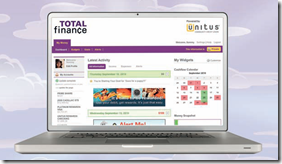
image In what I believe is a first in the United States, a financial institution has begun charging a small fee for online personal financial management (PFM) services.

image Portland, OR-based Unitus Community Credit Union, with 68,000 members and $800 million in assets, launched its new Geezeo-powered PFM Total Finance in late 2010. Members pay $2 per month for the service following a 30-day free trial.

According to Laurie Kresl, VP planning & biz development at Unitus, the CU has 661 members signed up for the service as of this week, or about 1% of its member base, which is a solid start considering the monthly fee is not mentioned on the public website, but is disclosed as members sign up for the service (note 1). 

Quick take: While online/mobile access will remain relatively fee-free, we’ll begin to see more fees for optional value-added services such as advanced financial management. Congratulations to Unitus for taking the lead on this one.

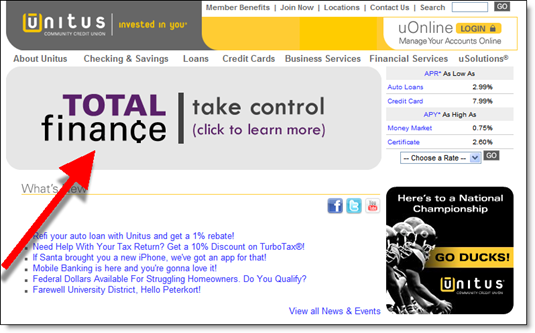
Unitus CU homepage features its new PFM offering (6 Jan. 2011)

image

PFM landing page (link)

Unitus Credit Union Geezeo PFM landing page

Note:
1. To sign up, customers first log in to online banking. The CU says it plans to add fine print to the landing page (above), disclosing the monthly fee.

Wells Fargo Remodels its Mobile Website, WF.com

image I just realized that I haven’t posted anything about non-app-based mobile websites (aka WAP) since the pre-iPhone days of early 2007, when I tried unsuccessfully to log in to ING Direct’s mobile site through my trusty Samsung Blackjack.  

Mobile banking has come a long way since then, primarily through native apps, now supported by more than 1,000 financial institutions in the U.S. alone. But a mobile-optimized website is still an important part of your overall mobile mix. Not everyone has a smartphone and not every smartphone user will download your app.

And some observers believe that the mobile Web, enhanced with HTML 5 and whatever comes next, will eventually run all the apps out of business. With 300,000 apps for the iPhone already created, I think that’s unlikely, but possible.

But whatever the future holds, today you need a good mobile-optimized website. And Wells Fargo, for one, hasn’t forgotten about it. Today they sent an email to customers announcing a remodeled mobile site at WF.com, its mobile URL (see screenshot below).

After logging in at the WF.com site, users are greeted with a menu button that opens up a new window of choices (note arrow in screenshot). It’s a nice way to navigate and makes the mobile website feel more like an app. The email also says there is more info on the page to minimize clicking, an important change. I still prefer the native app (note 1), but this is a nice improvement.

Wells Fargo email to customers announcing its redesigned mobile banking site, WF.com (5 Jan. 2011; landing page)
Note: The “Menu” button, when pressed, opens or closes the navigation choices (shown in open mode below)

Wells Fargo email to customers announcing its redesigned mobile banking site, WF.com (5 Jan 2011)

————–

Note:
1. Ironically, the native app doesn’t seem to be working on my iPhone 4 at the moment (update 6 Jan., it’s working now). Another reason you want to have a good mobile website alternative.

New Year’s Resolutions for Online and Mobile Banking

image Last year, one of my personal new year’s resolutions was published in the New York Times Bucks blog. That provided extra motivation to make it happen, though ultimately I still fell short in my goal to cancel one unused recurring service each month.

But I like the motivational benefits of making goals public, so in that vein I’m publishing my first annual list of new year’s resolutions for the online/mobile banking industry (roughly in priority order):

1. Make online/mobile banking a profit center: Cross subsidies work in many industries, e.g., giving away the razor to sell the blade. But with Congress determined to regulate the price of blades, it’s time to start pricing the razor for the value it delivers. Online/mobile banking provides enormous benefits for consumers and even more for businesses. It’s time to charge for it, at least for premium services.

2. Mobilize: Retail banks did a great job going mobile in 2010. And online-balance queries and transaction lookup are the all-important table stakes going forward. But that’s not the end of the project. Mobile is more important to your future than online, so work hard on your version 2.0 mobile service launching this year or next. 

3. Make it family friendly: Kids these days have grown up online and will do all their financial work via online/mobile services. Financial services companies should take a page from the telecom industry and start providing youth banking services via family bundles controlled by the parents.

4. Socialize: I’m in the camp that there is no such thing as a bad financial institution blog, Facebook page, or tweet. Boring? Yes. Lame? Sure. But, any reasonable effort is better than none. In 1996, there were a lot of bad Web pages. But was it better to get a page posted and learn from it or spend years developing a great “Web strategy” before doing anything? Early adopters are usually willing to cut you some slack on your first “beta version.” Just the fact that you are willing to get your feet wet automatically puts you above the competition.

image 5. Make it into a game: Over the holidays, I read a great article in Fast Company about how everything we do can, and probably will, be made into a game. And banking has a head start on other businesses looking to make a game out of everyday commerce. Frequent flyer points for credit card purchases started this movement more than 20 years ago. Now, everything a customer does financially can be rewarded with loyalty points all tracked through pervasive online/mobile connectivity.

I could go on, but then it would be harder to achieve my new year’s resolution of publishing an Online Banking Report on each of these topics.

Holiday Marketing at the Top 20 U.S. Banks

image For five of the seven Decembers I’ve spent blogging, I’ve perused the holiday Web-based marketing efforts of the 20 largest U.S. banks. This year, 10 jumped on the holiday bandwagon, an increase of 67% over the six last year. In 2004, only 4 of the 20 were running holiday promotions (on Dec. 21).

Previous posts: 2009 discussion, 2009 screenshots, 2007, 2006, 2006, 2004

_____________________________________________________________________

Big banks in the holiday spirit
(rated 1 to 5 bulbs)

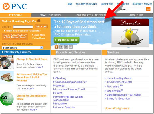
PNC: 12 Days of Christmas index (23 Dec. 2010, 1:00 PM Pacific)
Quick take: Rotating spot, prominent, seasonal graphics, unique, leads to microsite
Score: imageimageimageimageimage

image

TD Bank: gift cards
Quick take: Prominent spot, not rotating, seasonal graphics, fits in well with entire green homepage
Score: imageimageimageimageimage

image

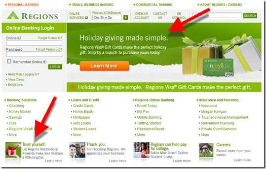
Regions: gift cards and rewards
Quick take: Rotating spot, prominent, seasonal graphics, small corner graphic
Score: imageimageimageimage

image

Fifth Third: gift cards
Quick take: Rotating spot, prominent, seasonal graphics, small graphic in upper right
Score: imageimageimageimage

image

Bank of the West (BNP Paribas): POP Money (p2p payments)
Quick take: The first promotion on a three-ad rotation, pushes P2P payments as a holiday gift-giving option, the first time we’ve seen that (updated 12/25 because we missed it the first time we looked at the site)
Score: imageimageimageimage

image

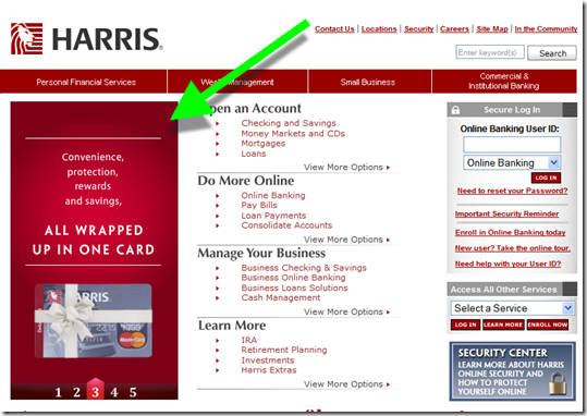
Harris (BMO): gift card
Quick take: Rotated with five spots, seasonal graphic, quick animation, not very prominent
Score: imageimageimage

image

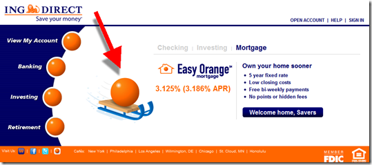
ING Direct: seasonal graphic
Quick take: Seasonal graphic, prominent location, leads to landing page
Score: imageimageimage

 image

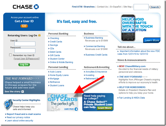
Chase: gift cards
Quick take: Small ad, minor seasonal graphics
Score:  image image

image

Key Bank: gift card
Quick take: Prominent position with no rotation, no seasonal graphic
Score: imageimage

image 

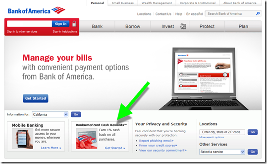
Bank of America: cash rewards card
Quick take: Small ad with seasonal graphic 
Score: image

image


The scrooge list (top-20 banks with no holiday promotions or graphics on Dec. 23): 
BB&T, Capital One, Citibank, Citizens (RBS), Comerica, HSBC, SunTrust, Union Bank (Mitsubishi UFJ), US Bank, Wells Fargo

—————————–

Note: I either have accounts with, and/or previous visits to, all 20 banks which could alter what’s shown on the homepage.

The 12 Days of Mobile Banking

image In the holiday spirit, I thought I’d lay out the perfect mobile banking/payments app for 2011 (note 1). These are the features I hope to be using on my smartphone at this time next year: 

Security

  • Option to log in with 4-digit PIN only
  • Authorize unusual and/or declined card transactions and unusual checks presented for payment

Bank account management

  • Banking data presented in order of importance with new transactions in bold (like Gmail Priority Inbox, previous post)
  • Quick view of current balance with predicted balance going forward based on known upcoming transactions

Paper management

  • Deposit paper checks via camera (remote deposit)
  • Pay bills by taking a picture of the billing statement (photo bill pay)
  • Scan-and-store paper receipts and statements

Payments

  • Use NFC or bar-codes at the point of sale to make payments directly via phone, without the plastic
  • Pay bills or individuals via their mobile phone number

Alerts & calculators

  • Receive important alerts via push messages to the phone’s main screen
  • Take action or adjust alert sensitivity by responding to messages via text messaging or within the app
  • Key financial calculators, such as loan/mortgage payments

And a partridge in a pear tree.

Enjoy the real thing here:

————————

Notes:
1. I’m missing important features, but I had to stop at 12 to fit the holiday theme. Thanks for bearing with me.  
2. For more info on mobile banking, see our previous Online Banking Reports.
3. Photo credit: Apple holiday promotion in United Kingdom <itunes12daysofchristmas.co.uk>

The Power of the Recognition

Everyone likes to be recognized for being a loyal customer. It cuts across all demographics and income levels.

Banks and card issuers, which have some of the most loyal customers in any industry, generally do little to reach out and thank long-time customers.

In my wallet, American Express, Discover, Wells Fargo, Chase and Bank of America imprint “member since” on their plastic credit cards. But that’s about the extent of the recognition for holding a long-time account with card issuers, sometimes as long as 20 years. 

In the pre-Internet days, it was expensive to create custom marketing programs for specific segments. But today, with the cost of communicating to online customers essentially zero, you should be sending messages to your customers at least once each year, thanking them for their continued business.

And on the bigger milestones, 5 years, 10 years, and so on, send something a little extra. It doesn’t have to be expensive. Find a special perk and offer an “upgrade” on their anniversary. It could be as simple as a 2-for-1 night at the movies, or as exotic as the recently launched PayPal Advantage program (previous post).

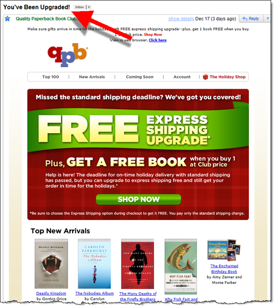
Even though the QPB message (below) I received last week was more of last-minute holiday shopping come-on than a loyalty reward, the subject of the email was irresistible and would work well for banking customers:

You’ve Been Upgraded!

Customer email from Quality Paperback Book Club (17 Dec. 2010)

image