Payments Innovation: doxo Adds "Autopay with Limits" to Ebilling

image Digital ebill storage and payment startup doxo announced an important new feature to its service today, the ability to automatically pay ebills that fall within preset maximum values. For example, as long as my family’s wireless bill is under $250, doxo will automatically pay it and send me a confirmation message. If it’s more, I get an alert advising me to take a look at my bill before it’s paid.

That feature would have saved me more than $1,000 two years ago when I gave an old mobile phone to a new employee without thinking to upgrade the calling plan. I ended up paying $400 to $500 monthly bills for several cycles before I noticed it on my credit card statement. I was using estatements (which I never look at) and had no idea the charges had mushroomed from the $40/mo I’d been paying. 

image Doxo also announced the addition of AT&T to the service, perhaps the biggest biller in the country, with nearly 100 million accounts. That should provide momentum that hopefully leads to more major billers supporting the platform. The only other national biller currently participating is Sprint.

Bottom line: Payment limits should help convince more consumers to enjoy the convenience of autopay, while still maintaining the control/peace of mind they are accustomed to when paying manually.

———

Notes:
1. Doxo added payments in February this year (see post) and demo’d at FinovateSpring 2011 (watch video here).
2. Hearst-backed Manilla is another ebilling & filing contender, with an interesting partnership with Citibank that could jump-start its service.    
3. See our recent Online Banking Reports: Paperless Billing and Banking and Email Banking: Revitalizing the Channel, for more info.

RIP Debit Fees: The Winners and Losers

image The debit card fee debacle was an interesting drama to watch. I’m sure there are lots of lessons here for a future biz school case study. But really, was $5/mo for a service that many consumers use daily, such a big deal that even Obama had to call BofA out? We spend two or three times that each month on extra pizza toppings alone, but I don’t see anyone bad mouthing the pepperoni industry.

While it’s clear in retrospect that BofA should have played this differently, rolling out the price increase gradually for instance, or upgrading its debit card product at the same time (note 1), the bank was at least being up-front with its pricing and reasons.

And the whole episode is not just a loss for BofA, but for the whole industry, as one its most popular products is turned into a regulated utility with Durbin controlling prices on the merchant side and public opinion squashing fees on the consumer side.    

Here’s the winners and losers from BofA’s capitulation on debit card fees:

Losers

  • Big banks/shareholders: Obviously, the big banks who were all (except Citi) testing various fee options, miss out on added revenues in 2011 and for however long it takes before they implement other less-transparent price increases. And of course, BofA loses the most as it took the brunt of PR damage and now every pricing move it makes will be put under a microscope. 
  • Small banks and credit unions: The $5 fee was a windfall for small FIs in their marketing war against the big banks. Now what’s the rallying cry for Bank Transfer Day? (And many small FIs would eventually have hopped on the fee bandwagon once the consumer backlash faded.)
  • Government/taxpayers: The big banks employ millions directly, and millions of other jobs are indirectly supported by banking revenues. If this leads to an industry-wide layoff (note 2), it could add hundreds of thousands to the unemployment roles just in time for the 2012 elections. And the whole anti-bank rhetoric from Congress and the Administration, along with the implied threat of more price controls, makes it harder for banks to raise capital, weakening an already fragile ecosystem. Does anyone really want to risk a repeat of 2008?

Winners

  • Merchants: Widespread debit card fees would likely have caused a reduction in their use and a corresponding increase in the use of cash, checks and credit cards which would have driven merchant costs up.

Mixed

  • Consumers: Short-term it’s a win. The grass-roots victory feels good and avoiding the $3 to $5 monthly fee is nice (it just about covers that Netflix price increase…so you can keep getting the DVDs in the mail). But longer-term, it’s probably a wash. Banks need to improve revenues, or they will either have to cut services, lay off employees, and/or find sneakier ways to raise prices ($40 overdrafts anyone?).

———————-

Notes:
1. We recently looked at optional fee-based services banks could build using remote banking value-adds. See our May 2011 Online Banking Report (subscription). 
2. I’m not predicting layoffs. Honestly, I have no idea. There are way too many factors at play to make a direct connection. But certainly, the one-two punch of interchange price controls combined with the fee backlash, make cost cutting seem the more palatable course of action to improve profits. And to the extent that smaller players pick up incremental business, they could hire a good chunk of those laid off.

Pageonce Adds Billpay; Showcases Multiple Mobile Apps on Single Page

image Last week, we looked at how Square makes a single webpage look great across various mobile platforms. Today, we look at the exact opposite problem. How to showcase your various mobile apps on a single webpage. 

Pageonce does it as well as we’ve seen, using a single showcase panel that includes all five of its mobile app platforms across the top: iPhone, iPad, Android, BlackBerry and Windows. Users can scroll horizontally to see two sets of screenshots for each platform.

The company also includes version number, date of the last update, and app size in the lower right corner. And of course, there’s a link to download the appropriate marketplace to download the app. The Android page uses a QR code instead of a link.

In other news, Pageonce added bill payment to its iPhone and Android app today, moving ahead of Mint in the features arm race. The new Gold service, which we haven’t tested yet, is priced at $4.99/mo, good news for fee-starved online financial providers. Mint says it has bill payment coming too. It will be interesting to see if they put a fee on it.

Relevance for Netbankers: The addition of transactional services such as bill payment makes third-party PFMs, or virtual banks such as BankSimple, bigger threats to mainstream banks and credit unions. As uber-consultant Richard Crone always says, "He who enrolls, controls."

————————– 

Pageonce iPhone app

Pageonce iphone app showcased on its website

iPad

Pageonce on ipad

Android

Pageonce on Android

BlackBerry

Pageonce on BlackBerry

Windows

Pageonce on windows phone

———————

Note: We cover mobile banking and payments periodically in our Online Banking Report (subscription).

ING Direct Read-Only Access Code for Third-Party PFMs

Ceramic Coffee Cup with Silicon Lid (530)To my knowledge, ING Direct is the only major U.S. bank blocking third-party PFM access. But users can direct their PFM around the gate with a special "read-only" access code.

How it works
It’s not particularly easy to find, buried three levels deep in MyAccounts | Preferences | Access Code.

The default setting is Blocked, as you can see in the first screenshot below.

But once you find the page, it couldn’t be simpler to set up. Simply press the blue Create Access Code button in the upper right, and in a split second, you have created a read-only access code and opened your account to PFM access.

To change back, you merely click the "Block" button in upper right.

The only thing missing is an explanation of what to do with the Access Code. Is it the username or password? While that’s explained in an link from the first page, it’s not on the second page where you need it. (BTW, it’s the password).

The bank also confirmed the new code via email right away (third screenshot).

—————————————————–

Access code main page (20 Oct 2011)

ING Direct create access code page

New access code

New read-only access created at ING Direct

Email confirmation

ING Direct access code confirmation email

———————————-

Note: OBR subscribers can access our previous reports on security at OnlineBankingReport.com (published in 1999, 2003, 2004, 2005, 2007 and 2008).

Design: Financial Websites that Work on PC Monitors, Laptops, Tablets and Smartphones

imageThe browser was supposed to make web design simple, at least in terms of page layout. But it’s always been tough to keep up with changing screen sizes, varying resolutions, and frustrating differences between browsers.

Liquid layouts that adjust automatically to the available screen real estate have been a huge help. But then along came the mobile browser, complicating everything both by their small size and by the two viewing modes, portrait and landscape. 

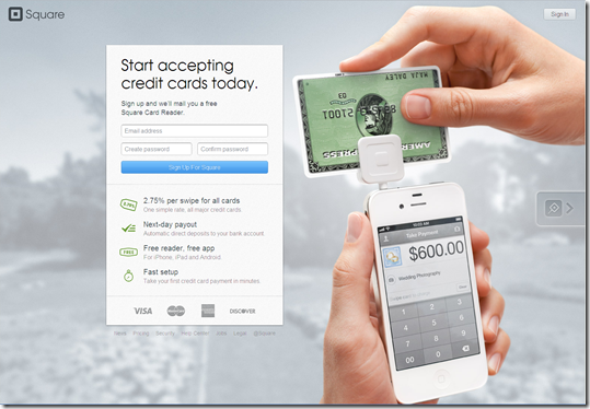
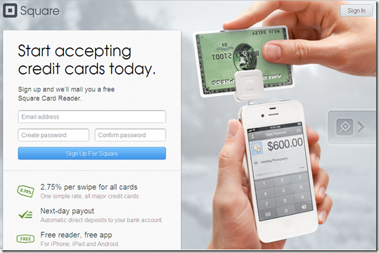
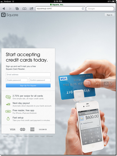
But it’s not an insurmountable problem. Square is one financial company that’s doing it right. It’s website looks just as good on a 10-inch iPad2 screen as it does on a 24-inch monitor (see screenshot #1 to 4 below).

To make it work, copy and navigation options must be kept to a bare minimum. Square uses a catchy background image of its reader in use, then has an info box that "floats" depending on the screen size. It even works in portrait mode on the iPad (screenshot #4).

Of course, it’s much easier to pull off for a one-product company like Square than for a commercial bank with dozens of business lines.

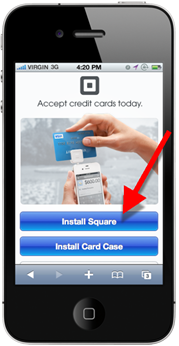
But even Square had to make compromises on its smartphone layout (see inset above). Instead of asking for contact info, the company simply instructs users to download one or both of its apps: Square or Card Case.

Relevance for Netbankers: We are about to see a flood of redesigned websites using new design and programming techniques (e.g. HTML5). Citibank was the first major U.S. bank to simplify its design. Discover just emailed users today with a sneak preview of its pared down design (screenshot #6). And it already had a relatively clean design (screenshot #5).

—————————-

1. Square homepage on 24-inch monitor

Square homepage on 24-inch monitor

2. Square on 12-inch laptop

Square homepage on 12-inch laptop

3. Square iPad landscape

 Square homepage on iPad landscape

4. Square iPad portrait

 Square on ipad (portrait)

5. Discover homepage (current)

Discover current homepage (18 Oct 2011)

6. Discover new (coming soon)

New Discover homepage

————————————–

Note: We cover financial website and mobile design issues periodically in our Online Banking Report (subscription).

Big Ideas from BAI’s Retail Delivery

imageEditor’s note: This guest post was written by Daniel Thomas, a 25-year strategy and product development veteran of the financial services industry. He is a principal consultant with Mindful Insights LLC.

BAI’s annual Retail Delivery was held this year in Chicago during Chicago Ideas Week. So, it only seemed fitting to hit the vendor expo floor with a single question:

“What is your company’s big idea in the financial services retail channel?” 

Here are a few of my favorite answers:

Access Softek
image CEO Chris Doner demonstrated a new location-based security feature of their mobile banking platform that he says none of the other mobile banking products have. Others protect against fraud when a mobile phone is lost or stolen by asking the traditional security questions based on what you know (username and password) and what you have (something in your wallet). However, depending on how the user retains these secrets on their phone, they may still be subject to having a bad guy figure it out and transfer money out of their account. 

Access Softek adds a third level of security that allows mobile bankers to designate geo-location “safe zones” where they are allowed to log-in to the mobile banking app. But when outside the zone they can not. Doner says that studies show that 98% of the time people log in to their mobile app from just 2 or 3 specific locations.  He believes that this feature will increase overall mobile banking usage as it helps overcome security fears holding back adoption.

Chexar
imageCEO Drew Edwards believes his company has the long-awaited solution to funding stored-value debit cards or other accounts. It teamed with Cachet Financial Solutions and several other mobile remote deposit capture (RDC) providers to provide guarantee checks deposited using photo deposit services. 

Edwards says Chexar’s guarantee allows the funds from the check to be available to the account holder immediately without fear that the transaction will be reversed should the check bounce.  Chexar claims that this will be especially meaningful to the underbanked who pay high fees to cash checks and then pay another fee to load the cash onto a debit card.

Chexar charges 1.5% to 3.5% fees to cover fraud losses and collections. But that’s considerably lower than fees charged by check-cashing companies.

imageClairmail
Chris Craver says their new idea is a service that allows FI customers to configure customized settings that trigger alerts. What’s so new about that? Instead of finding so-called alerts in your email box a day or two later, Clairmail sends real-time text messages which are much more likely to be noticed.

imageIn a world where FIs are fortifying their systems to defend against fraudulent card use, they neglect one of the most important parties helping them with the battle—the cardholder! Now, users can ask to be alerted when a transaction exceeds their unique limits. And users can make their issuer aware of suspicious purchases so the account can be monitored closely or frozen to reduce subsequent fraudulent charges.
Editor’s note: Love the cumulative transaction count on the Clairmail homepage (see inset).

Deluxe 
image Not every good idea has to be about online or mobile. Good old customer service goes a long way in maintaining a loyal relationship. Russ Belland at Deluxe Corporation explained that their new SwitchAgent is a high-touch service that FIs can offer new customers to solve one a big pain point when changing banks: Moving recurring debits/credits to the new account without incurring NSF fees in the old account.

This is no easy task even for savvy customers because it can be difficult to reach the right party at the company that initiates the recurring charges.

Belland says that Deluxe agents will personally contact the new customer and track down all the hidden “ACH skeletons” (it takes an average of 2.6 phone calls with users to find them all). The agent contacts all parties to ensure a smooth transition. Deluxe has thirteen banks live on the service and is ramping up for expected high growth. From someone who recently had to open a new account because of a stolen wallet, I can personally attest that this is a great idea!

Harland Clarke
image Scott Osman explained their great idea for making person-to person (P2P) funds transfers more ubiquitous in the US. Today, adoption is slowed because recipients outside the sender’s FI must register with the sender’s FI to get the funds. And recipients may need to belong to several P2P services to receive money from friends, family and colleagues. 

Harland’s hopes to solve that problem by offering the P2P user interface for its FI clients and to situate itself in the middle to form a national P2P network with a brand (Harland Clarke) that consumers
know and trust.

—————————————-

If you were at the BAI last week and heard of other ideas worthy of Chicago Ideas Week, feel free to add a comment to this post by clicking Comments above.

Best of BAI Retail Delivery 2011

image BAI held its giant banktech trade show, Retail Delivery, in its hometown this year, the first time it’s been held in Chicago since I began attending in 1993. It was a good year for announcing interesting FI partnerships:

  • PayPal and USAA for mobile P2P payments
  • Cardlytics and PNC for merchant-funded rewards
  • On Deck Capital and US Bank for small business alternative lending

And there was a merger of two popular Finovate alums:

  • oFlows and Andera

Finally, here are the highlights form my show notes, or what I call the Netbanker Awards (see note). Monday we’ll also publish more thoughts from our friend and crafty correspondent Dan Thomas from Mindful Insights.

_______________________________________________________________________

2011 Retail Delivery Netbanker Awards
_______________________________________________________________________

  • Biggest "aha" moment: Varolli shedding light on the huge win-win benefit from proactively managing customer communications across various channels for "financial events" (e.g, new account onboarding, collections, service issues, fraud issues, etc.)
  • Best mobile UI idea: USAA mobile app which toggles between "spending mode" and "personal finance management" mode
  • Best booth magnet: Fiserv’s blindfolded guy (mentalist I guess)
  • Best freebie: The massive "sucker statue" from FIS (I think)
  • Energizer Bunny award: Still going strong, even on day 3, the Yodlee crew
  • Most entertaining presentation: Jeremy Gutsche, Founder, TrendHunter.com.
    Note: Though not sure if "creating a cultural bond" with customers is realistic for most banks. Credit unions, maybe. TrendHunter also takes the dubious honor of having "the most blatant sales pitch in a keynote" for its last slide pitching workshops and special free offers <trendhunter.com/secret/bai> (see it worked!)
  • imageBiggest mixed message on delivery priorities: "I do 80% of my banking by mobile phone and I go to the branch every week" Randi Zuckerberg during keynote interview
  • Best idea for getting new revenues (deja vu): Merchant-funded rewards from Cardlytics, FreeMonee and others
  • Best demo: Alkami Technology which showed PC, iPad, and iPhone all at once (see inset)
  • Biggest tease: USAA’s Neff Hudson saying he "was going to show us screenshots of the new USAA mobile wallet," but it wasn’t quite far enough along in testing. (Later he told me that it shouldn’t be more than a few months out before he can show it.) But he did say that the wallet will hold more than just USAA cards, that it will be a separate standalone app (although it will likely be integrated into main mobile app at some point), and that it will have PayPal-powered P2P payments.
  • Most likely to "change the world": On Deck Capital’s small business credit/lending engine
  • Best free PR: President Clinton talking about On Deck Capital in his opening keynote
  • Bank that got the most attention (in a good way): USAA
  • Most surprising announcement: PayPal enabled ATMs from NCR and S1
    Comment: I did not see that one coming, but it makes sense, especially for international remittances
  • Best conference amenity: Wifi that worked throughout!
  • Best kept secret: The Starbucks hidden not more than 25 steps, but around a corner, from the exhibit hall entrance (hat tip to Susan Casella, a fellow Seattleite, and Varolii exec who bought me a much-needed Americano)
  • Coolest conference innovation: The QR codes in the printed program that opened up the powerpoint deck on your mobile (especially if you used iPad 2)
  • Best mobile positioning statement (tie): In back-to-back, but separate sessions, Neff Hudson, USAA and Bret King, Bank 2.0/Movenbank said almost the same thing: that banking has always been a destination (visit branch, call the VRU, or login in to online banking). And with mobile, banking goes direct to the customer.
  • Most though-provoking idea:  Brett King says Movenbank will have no product "applications", ever. The bank will never require customer to "apply " for any banking product. Movenbank will gradually ask for customer info and permissions and then will make appropriate products available  without formal application process.
    Comment: Even if you can’t remove EVERY application, this is a good direction to head in.
  • Best meal: Pizzanos Pizza with my brother and his family (thanks!)

_______________________________________________________________________________

Best stats
_______________________________________________________________________________

  • During last 10 days BECU has added 5,200 new accounts, more than 2x its normal pace of about 7,000 per month
  • BECU has processed $10 million in P2P payments and $10 million in remote deposits (didn’t say time period)
  • 92% of BECU transactions occur in remote channel (online/mobile)
  • 58% of online banking users at least look at one offer from Cardlytics during the first month the rewards program is offered
  • Cardlytics is only getting 14 support calls per month per million accounts (granted, banks are the first line of support, but few of those questions are getting escalated to Cardlytics)
  • Cardlytics clients are seeing 15% increase in online banking logins after deployment
  • Cardlytics has a 1.6% opt-out rate from the in-statement rewards program
  • Fiserv ZashPay has more than 1,000 FI clients
  • On Deck Capital is seeing under 5% loss rates in its $150 million small biz alt-lending portfolio
  • FI exec rating of branches as very/extremely important dropped 9 points, from 82% to 71% in past year (see inset)

________________________________________________________________________________

Best quotes
________________________________________________________________________________

"We were probably lucky that the Chicago chapter of "occupy wall street" didn’t know what BAI stood for."
     — Name withheld

"Mobile will be the primary (most-used) channel for transactions at USAA by 2015"
     — Neff Hudson, USAA

——
———————————-
Note:
These observations are based solely on the small part of the overall show that I personally took in. I talked to 25-30 companies out of more than 200 exhibiting. And I attended about 10 sessions out of 100 or so. My apologies to all the companies with cool stuff that I either didn’t see or didn’t comprehend.

Design: Bank of Internet Puts "Request More Info" on New Homepage

image Citibank wasn’t the only one with a new homepage this week. Bank of Internet also launched a new look today.

It’s more traditional than Citibank’s, which isn’t necessarily a bad thing. There’s more copy, but it’s still pleasing to look at it, easy to navigate, and focuses attention on two core products:

  • 1.25% APY rewards checking
  • 4.10% APR mortgage refinance

I like the bank’s new Request More Information box in the lower left corner. It allows visitors to quickly request more info on the following three topics simply by typing in their email address. 

  • Deposit accounts
  • Mortgage loans
  • Multi-family loans

Bottom line: While most financial institutions invite visitors to call, few make it easy to leave your email address for a future discussion. I’m not sure how many people will see this box tucked away in small type below the fold. But with a little more emphasis, it could be an effective sales tool.

————————

New Bank of Internet homepage (6 Oct 2011)

New Bank of Internet homepage (6 Oct 2011)

After submitting an info request the box changes to a thank-you message

after submitting info request, box area changes to thanks

Previous homepage (2 March 2011; Source: Internet Archive)

Previous Bank of Internet homepage (March 2011)

BillGuard’s Monthly Credit/Debit Card Scan Report

image We’ve been impressed with BillGuard since we first learned about it earlier this year. And they wowed the crowd at Finovate two weeks ago with a great demo, dynamic presentation and more importantly, a product that resonates with consumers across many demographic segments.

One great thing about becoming a trusted consumer watchdog, like identity theft monitoring services, is that your monthly emails are actually read by customers. And unlike FICO scores which usually don’t fluctuate that much month-over-month, there’s usually something new to look at when BillGuard scans a month’s worth of card transactions looking for oddities.

For example, my scan for September across two credit card accounts showed the following activity (see first screenshot below):

  • Green: 61 transactions that were identifiable as "normal" activity
  • Orange: 2 transactions that were "unknown"
  • Red: None were flagged red indicating suspected fraud

Clicking through to the website, I can mark legitimate transaction "OK" and that information is fed back to the network and disseminated to other via the Merchant Transaction Reliability score (see second screenshot). 

Bottom line: This is the kind of value-added service that FIs could bundle with other products, even a debit card for example, that could help justify a monthly fee. $5 perhaps? 
(Note: BillGuard is currently offering free of charge to expand the customer base.)

—————————-

1. BillGuard emails a monthly Scan Report to customers (4 Oct 2011)

BillGuard monthly transaction scan report

2. At the BillGuard website, each merchant’s score across all users is tracked
Note: Apparently, 17 BillGuard customers are using Quickbooks Online and none have flagged the transaction (which makes sense)

BillGuard Merchant Transaction Reliability score

Design: Citibank Remodels Main Consumer Homepage

image The folks in charge of Citibank’s website are sure brave. I’m not sure I’ve ever seen this dramatic of a change overnight in a major banking website (see before and after screenshots below). The bank rolled out the new site Sunday night and it seems to be running smoothly today.

My first impression is positive. Banking websites tend to be too cluttered. So they either overwhelm prospective customers or cause existing customers to tune the whole thing out. This seems like a step in the right direction, but only the company’s web analytics team knows for sure. I’m sure it’s been an interesting Monday for everyone involved.

The bank moved the majority of the previous homepage links (see last screenshot) into drop-down "mega menus" that are only displayed when clicking on one of the seven primary navigation items at the top of the page (see second screenshot). The drop-downs only appear after an actual click, so the don’t cover up the page when you accidently hover over them with the mouse.

Citi.com homepage in iphone While the new site is clearly less busy overall, the bank has actually added two new items on the main (top) navigation bar:

  • Rewards & Offers: Highlights the bank’s ThankYou rewards program, AAdvantage co-branded card, and other programs. Given the bank’s emphasis on rewards, this is a good addition.
  • Services: This is a catchall leading to sections on online banking, mobile banking, and unusual features such as PopMoney p2p payments. Most items are repeated in the main Banking navigation item. While it seems redundant from a navigation perspective, perhaps it’s a marketing tool for prospects looking for "banking services."

The new site renders nicely on an iPhone, displaying the login box, then navigation items in a vertical format (see inset). I’m not sure if this is a change from the previous site. Note the banner ad at the top promoting the bank’s @AskCiti Twitter site.

There are also numerous changes in the online banking area, notably the addition of PFM features powered by Yodlee’s FinApp development platform. I’ll look at those in a future post.

————————-

1. New: 3 Oct 2011
Note: The main graphic, a young woman feigning delight over a bag of gift cards from Citi, is the same in both the before and after shots. But the new version is a mirror image of the old. 

New Citi.com homepage 3 Oct 2011

2. New design with Banking "mega menu" displayed over graphic

Net Citibank homepage with Banking menu displayed

3. Previous: 30 Sep 2011 (from Google cache
Note: The yellow highlights are on Google’s cached copy only, they would not have appeared on the actual Citi website.

Previous Citi.com as of 30 Sep 2011

Out of the Inbox: ING Direct Provides Free Digital Magazine Subscription with Birthday Greeting

ING Direct Happy Birthday Email Sep 2011I like it when businesses I frequent remember a milestone. Typically, it’s the anniversary of our first transaction or my birthday. I prefer the former, because it’s unique to the business relationship and less cliche.  

Even though I know it’s just a bit of programming back at the home office, it still says something about an organization that they prioritized it over other pressing needs (like a new debit card fee, see note 1).

Unlike retailers or eateries, who can give customers a free desert and more than make up the cost with profit from the dinner, it’s hard for banks to deliver a freebie that has actual value. Last month, I wrote about Discover’s month-long double points birthday bonus. That was a winner.

This week, ING Direct came through with birthday present that has some perceived value. Delivered via email (see opposite) was a complimentary four-issue subscription to ODE Magazine plus a special issue devoted to savings. Granted, it’s only the digital edition (note 2), but it’s still better than nothing.

The bank also throws in a 15% discount at its online store. A nice touch, but not a huge value for most customers.

Landing page to redeem magazine subscription
Note: Here you can choose digital or printed version (note 2)

ING Direct offer landing page


———

Notes:
1. Actually, I’m pro debit-card fee. Why shouldn’t you charge for an optional-yet-super-convenient service that people use every day? I might have started out at $3/mo and bundled it with more value-adds, but even at $5 it’s about 17 cents per day for unlimited usage. So what’s the big uproar? Sure, it probably made more sense to have the merchants pick up the tab, but that got Durbined down the drain.  
2. The landing page offers a choice between printed and digital. However, it’s not clear whether that applies to the 4-issue subscription or just the special savers issue.