Out of the Inbox: Bon Voyage Email from Capital One

image Yesterday, I mentioned Capital One’s self-service travel notification process. Another aspect of the service is a follow-up email before you head out of town (see below).

I like the email for a couple reasons:

  • The well wishes make you feel good about the bank
  • The message provides helpful contact info in case of trouble
  • It’s an an additional fraud check to ensure that it’s really you traveling to Yakutsk next week

The bank even tells you to call collect. Nice.

Capital One could jazz up the message with more color and snappier copy (note 2), but it gets the job done.
—————————–

Capital One email to customers who’ve told them they are traveling internationally (31 Jan 2012)
Note: Sent the day before scheduled departure

Capital One bon voyage email

Notes:
1. Picture credit: Greeting card at Zazzle.
2. I’m surprised Capital One doesn’t use this opportunity to reinforce its travel rewards, mobile app, and zero FX fees. 
3. We’ve tackled remote banking customer service and messaging a number of times in previous issues of our Online Banking Report. The last one was Live Help earlier this year.

Service: The Value of a Search Box within Online Banking for the DIY Crowd

image I’ve always disliked toll-free (telephone) customer service. You have to find the number, identify yourself repeatedly, choose from confusing categories, then wait on hold until you finally get the honor of pleading your sorry case to someone who has all the power. I usually end up feeling like an idiot or a third grader asking for a bathroom pass.

Before the Internet, call center service was a necessary evil. Going forward, let’s get rid of it. Self-service, whether completely automated or “guided” by real humans, saves money, and done right, can be a more satisfying customer experience.

Back to my sample of one. When I have a question, I always look for the webform, email address, or even the live chat button; anything that keeps me from dialing 1-800-IMAFOOL.

But when you want to do something at your bank that’s relatively complicated, such as investigate a suspicious charge, change your credit limit, etc., it can be difficult to figure out how to do that on your own. That’s why I like Capital One’s “Ask a question…” box in the middle-right of all its credit card management pages (see first screenshot).

Today, I wanted to tell the bank I might be using its card internationally. I was already logged in to pay my bill, so I simply typed “travel” in the right-hand box (see first screenshot) and a link to the correct online form was delivered in the “answers” section (see second screenshot). It worked just like I expected.

So kudos to Capital One for making it easy to navigate to the right page, and more importantly, handling the entire travel notification process online. Of course, I’d prefer the bank just tracked me automatically via GPS (note 2), but we’ll get back to that another time.  

———————–

Capital One aids do-it-yourselfers with a prominent search box on every page (28 Jan 2012)

Capital One main account page with "site search" box

Search results for “travel”

Capital One site search results for "Travel"

Notes:
1. Western Electric ad from 1959 (from eBay)
2. At FinovateEurope next week, one of the presenting companies, Finsphere, offers just such a technology. Capital One, you should give them a call.

Suspicious Activity Messaging: When You Urgently Need to Contact Business Clients

image I get that multi-channel messaging is a mess. I understand that new regulation is creating huge backlogs in project queues. But 17 years into the Web-banking era, I should be able to service my bank account entirely online, if that is my choice. And more importantly, if I’ve signed on for alert services, there shouldn’t be any surprises when I go to log in to my account. 

Yesterday, <largebank> failed me on both accounts (see note 1).

With Finovate Europe less than two weeks away, we are wiring large sums to London to pay for it. My bank got a bit concerned about all this outbound activity, which is good. I’m glad they are paying attention.

But how they went about notifying me about their concerns was simply outdated. Here’s how it went down:

  1. The bank called me from a toll-free number and left a voicemail asking me to call them back. Despite the fact that I get every alert under the sun, the bank did not send an email or text message. I don’t know about you, but listening to voice messages from random 800 numbers is very low on my priority list. By mistake I did happen to hear it a couple hours after the fact. 
  2. As soon as I listened to the message, I first went to my email to see if I’d also received a message from the bank to verify the authenticity of the phone call. Seeing nothing there, I attempted to log in to online banking to verify the call and assure myself that my account had not been drained. But guess what? The bank had disabled my account access and gave me a vague error message with instructions to call a toll-free number. The number matched the one on the voice mail so at least I could confirm it wasn’t a vishing attack. There had been no mention in the voice mail of my account access being disabled.

Now, when you are 11 days out from an event and the cash in the bank is needed to pay for it, it’s beyond disconcerting to be locked out of your account for no known reason.

Luckily, we were able to quickly assure the bank that yes, we really did need to wire that much money. So we are back up and running and our patient vendor simply had to wait one more day. (Update: I wrote this post yesterday. Today, the same thing happened again with another wire. While it wasn’t a surprise this time, it’s annoying.)

________________________________________________________________________________

A Better Process
________________________________________________________________________________

Let’s repeat this scenario using an approach that preserves your customer’s sanity while making it more convenient for those that favor digital channels:

  1. Bank sees something odd so it freezes outgoing wire-transfer capability and sends me a text message, an email message, and also leaves a voice mail.
  2. Instead of shutting down my account access, they let me into my account so I can verify that the balances are still there. And for extra credit, the suspicious activity is highlighted.
  3. After confirming the transaction through an extra authentication step, the bank re-opens my outgoing wire capability.
  4. For extra credit, let me simply authenticate the suspicious items by replying back to the messages (at least on smaller dollar items).

Now that I can breathe again, I can lay out three rules to guide your “suspicious activity” messaging:

  1. Contact the customer via the channel of their choice (but also use others for backup in urgent situations).
  2. Allow the customer to authenticate transactions without moving out of that channel.
  3. Never completely disable online access (unless absolutely necessary). Yes, shut off transfer-out functions, but continue to allow “read only access.” And post a red warning graphic within the account to draw attention to the suspicious activity. 

————————–

Notes:
1. I’m not identifying the bank because my “data point of one” may not be indicative of what other customers experience. But I will disclose the name “off the record” if you email me jim@netbanker.com.
2. For more on messaging, small business, security and much more, see our Online Banking Report (subscription required).

The Debit Card On/Off Switch from City Bank of Texas

imageCity Bank of Texas has been a mobile innovator for more than four years, launching a ClairMail-powered mobile site in Oct 2008. I first heard its story at the Mobile Summit in June 2009. At that time, the bank already had 10% of its online banking base using mobile.

City Bank now offers a full range of apps including Android, iPhone and iPad, which make for a pretty impressive graphic. The new apps are powered by Malauzai Software.

And, in a world where most apps look pretty much the same, it has managed to pioneer several unique features:

  • Debit card on/off switch: If customers ever want to switch off their debit card, because it was misplaced, or if funds are running low, they simply move the toggle on the My Cards page of the mobile app (see inset).  
  • Reward-checking status: City Bank is a long-time rewards-checking client of BancVue. Its mobile app includes a rewards-tracking feature so users can see where they stand in the three-level program (see the Android screen in the lower right below).

imageBoth features are must-haves. But the on/off switch is brilliant both for its simplicity and value. And this tangible mobile feature/benefit likely to get talked about in the press and at the weekend barbeque. We are giving it an OBR Best of the Web award, the first of the year and 84th of all time (see note). 

 
The City Bank of Texas mobile lineup (link, 23 Jan 2011)

 City Bank of Texas mobile banking lineup

Note:
1. Since 1997, our Online Banking Report has periodically given OBR Best of the Web awards to companies that pioneer new online or mobile banking features. It is not an endorsement of the company or product, just recognition for what we believe is an important industry development. If anyone knows of other financial institutions offering a similar feature, let us know and we’ll update the post. City Bank of Texas is the 84th company to win the award since 1997 and the first in 2012. Recent winners are profiled in the Netbanker archives.

Square Looks to Have Secured the Square.com Domain

image Evidently, the owner of the domain “square.com” drove a hard bargain. How else could you explain a billion-dollar tech company, Square, using a domain name with “up” in it <squareup.com>?

Dorsey’s Square had all the Google juice around the word, so it wasn’t likely causing any lost sales. But for credibility, there is no choice but to own the basic .com version of your brand. (Plus, they would hate to get confused with the board game of the same name.)

It may not yet be a done deal. I don’t see any confirmation of a sale on the Web. Square.com is currently being redirected, very slowly right now, to squareup.com.  And the  Whois record still shows that square.com is owned by Square Enix Holdings Co. Ltd. in Tokyo, the makers of the popular video game, Final Fantasy. 

Op Ed: Rise of the Feenix

by Michael Nuciforo

Editor’s note: This post was written by Michael Nuciforo, a Mobile Banking Consultant at Keatan. He previously worked at ANZ on a number of developments, including goMoney, and more recently was Head of Mobile Banking at RBS managing the UK Retail portfolio.

image Banks has perfected what I refer to as the ‘negative pricing model.’ In simple terms, fees are charged when customers make mistakes. We are all familiar with it. It is the annoying cost of returning a DVD late, or staying too long in your parking space.

At present, banks rely significantly on revenue generated from fees when customers fall afoul of their terms and conditions. Amongst all the doom and gloom of regulatory pressure, the euro debt crises, and record low margins, could mobile banking be the right service to implement a ‘positive pricing model’?

Tiered charges for access to additional features and content have become common due to the popularity of games such as FarmVille and Sims. This is great news for banks as the market has likely reached the right point of innovation, access and acceptance to allow for the monetization of mobile banking.

Now that most banks have launched first-generation mobile services, new features are perfect for tiered pricing. Areas such as NFC payments and remote deposit-capture are a great place to start. They are tangibly more convenient than existing processes, and are designed to leverage the specific capabilities of a mobile device.

But can banks pull this off? Or will it just be seen as yet another annoying banking fee?

When implementing a pricing model, banks need to be clear about their strategy and objectives. For the model to work, it is critical that unique, mobile-specific services are delivered to warrant the cost. And banks shouldn’t charge for services that they already offer for free today. This will only anger existing users. They should also avoid charging for services available in other channels for free, although some exceptions could apply. Banks need pricing that is fair, transparent and that rewards loyalty as well.

Any new fee will disappoint some customers. Banks should also expect negative media attention at first. This will happen any time bank and fee are included in the same sentence. Banks need to be proactive about engaging regulators during the process and communicating actively to customers. It is important that fees are integrated seamlessly into the customer journey. Regular enhancements should also be made to the service. Success will ultimately rely on the quality of new features.

With traditional revenue streams under attack, and investment in mobile growing, pressure will come on mobile leaders to justify the costs. The honeymoon period for mobile banking will be tested at some stage. Customer retention and transaction migration are fine, but are they enough for your senior executives? And can they be accurately proven?

With customers now familiar with this pricing model in other facets of their everyday life, it is important that banks also take the opportunity to do this now. Otherwise mobile banking, like online banking, will become a free channel for life.

India’s ICICI Bank Launches Online Banking via Facebook

image You can really see how the global financial crisis has stunted banking innovation by looking at how little Facebook has been used as a delivery channel (note 1).

The first financial institution in the world to offer Facebook account access, KeyPoint Federal Credit Union (powered by MShift)  launched in Nov 2007 (post here), when the social network had “just” 50 million users.

In the ensuing 4+ years, despite an increase of 800 million more users, not a single major financial institution has followed in KeyPoint’s footsteps (see note 1).

Sure, there’s been some impressive Facebook marketing campaigns. Chase, American Express, and Capital One have all passed the 2-million “like” mark. But no one allows customers to check their balance/transactions right from within the social network (via a Facebook app).

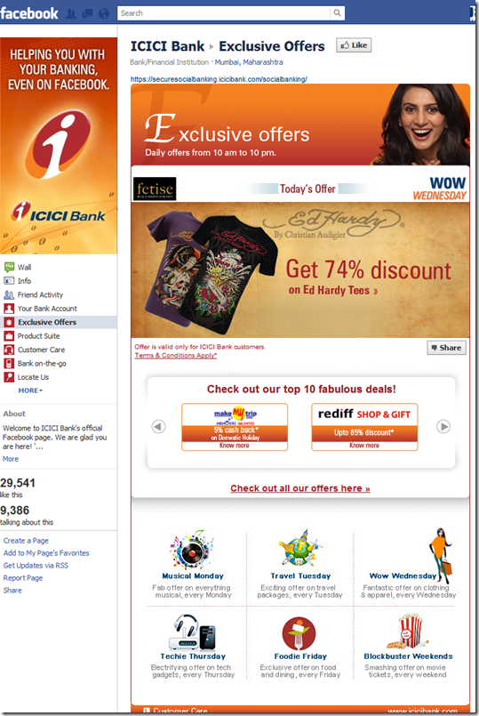
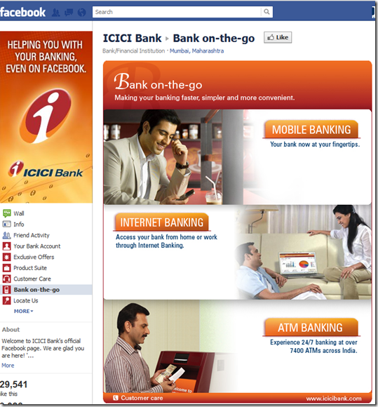
But the drought ended this week, when India’s second largest bank, ICICI Bank, launched comprehensive Facebook services including account info (screenshot #1), offers (see #2), and a general jump-page to the bank’s main website (#3).

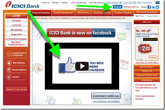
The new Facebook initiative is currently featured in the first promotion served by the bank’s homepage (#4, note 2).  
————————————–

1. ICICI Bank’s Your Bank Account page in Facebook (link, 17 Jan 2012)

ICICI Bank's Your Bank Account page in Facebook  

2. Exclusive offers Facebook page (link)

Exclusive offers Facebook page (link)

3. Bank-on-the-go Facebook page: Serves as a launching pad to the specific areas on the bank’s main website

Bank-on-the-go Facebook page: Serves as a launching pad to the specific areas on the bank's main website


4. ICICI Bank displays a Facebook promo when landing on its homepage

  ICICI Bank displays a Facebook promo when landing on its homepage

———————————————-

Notes:
1. Having been a product manger for several large banks, I get why the “Facebook project” hasn’t moved to the top of the queue; basically, lack of demand. Facebook may have nearly a billion users, but only a few percent are ready to bank there because it’s not seen as secure/private and it’s a place to connect with friends (see note 2). But despite the current lack of demand, we are confident that Web services, including banking & payments, have a promising future on the platform. 
2. ICICI Bank tackles security via a prominent mouseover on the main page:

The ‘Bank Account’ app is hosted on secured ICICI Bank servers and is made available on Facebook through a secure SSL connection. ICICI Bank has not transferred any data to Facebook. Your bank account information can only be accessed by you through your ‘Bank Account’ app on Facebook after successful registration which incorporates strong 2-factor authentication and setting up a personalized password. As long as you don’t share this information with others, no one can access your account through Facebook.

Currently through your ‘Bank Account’ app on Facebook you can view account details, mini statement and few service requests like applying for debit card.

This app lets you access your information only after authenticating your Debit Card Number and Password. As long as you don’t share this information with others, no one can access your account.

3. Viewing the page from a U.S.-based IP address.
4. We cover all the channels in our subscription newsletter, Online Banking Report.

Out of the Inbox: Betterment’s New Year’s Resolutions

imageThe new year is a special time for financial services. Many people throw their spending discipline out the window during December — buying gifts, entertaining, and hitting the sales for themselves. Then there’s the New Years Resolution game where you vow not to do for the rest of the year what you just spent the past month doing.

So it’s a good time for financial providers to remind customers about advanced tools available such as alerts, mobile banking, budget tools and so on.

You can also take the approach of Betterment, and provide a wide-ranging list of apps to assist in achieving goals for the new year. The investment startup sent an email to customers on Dec 27 recommending these 5 apps:

  • Runkeeper to track your exercise
  • Manilla digital file cabinet
  • Skillshare to pick up a new skill
  • Goodreads to help you find new books
  • Sonar for social and business networking

Betterment closed with a pitch for its own simple investment platform and a free webinar scheduled for Jan 5, and personal finance blogging roundup.

It’s a great effort, although maybe a little too much for a single email. I didn’t even see the pitch for the webinar and blog compilation until I posted it here. Overall though, a strong A.   

————————————

Betterment New Years email (27 Dec 2012)
Note: Google+ link on top

Betterment New Years email: top half
image    image

——————————-

Note: For more info on online investing see our 2008 report.

Design: Lose the Combined "Investments & Insurance" Navigation Category

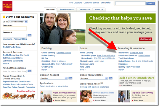
image I spent many hours in November looking at how banks and credit unions position insurance offerings online (our report here). Many banks don’t even mention insurance. And those that do often bury it under an “investments & insurance” tab. Wells Fargo is the most notable example (screenshot below).

While I understand the need to keep navigation choices to a manageable number, these two really shouldn’t be lumped together. It’s like Amazon having one tab for “Shoes and Goats.” It’s confusing for both the shoe buyer and goat shopper.

Although a number of investments contain an insurance component (e.g., annuities), for most shoppers, this is unclear. Usually investing comes first, so it’s unlikely the auto insurance shopper is going to pay much attention to a navigation item beginning with “investments.” That’s the furthest thing from the mind of someone trying to save a few bucks to keep the family fleet running.

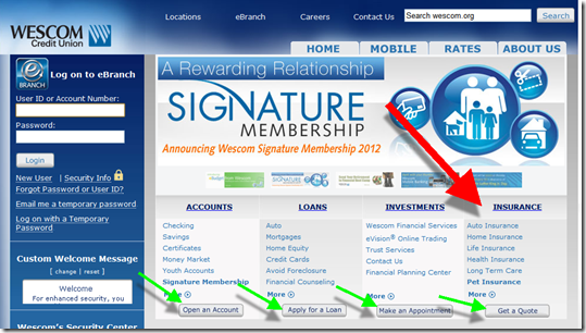
imageBottom line: If you are serious about selling insurance, it needs proper attention in website layout and navigation. Notice how Wescom Credit Union (Pasadena, CA) splits investments and insurance into two categories, with appropriate calls to action at the bottom of each column (second screenshot). The CU has some work to do on the landing page (it’s cluttered and hard to find the quote I was promised), but it’s still better than most.

——————————-

Before: Wells Fargo’s personal homepage with combined “Investing & Insurance” category (13 Jan 2012)

Wells Fargo homepage with combined "Investing & Insurance" category

After: Wescom Credit Union has separate columns for insurance and investments 

Wescom Credit Union homepage with both Insurance and Investment categories

Wescom CU insurance landing page (link)
Note: The only thing that stands out on this page is the Purina Care pet insurance. The all-important quote function is buried at the bottom.

Wescom CU insurance landing page

—-

Notes:
1. Image courtesy of 1st Guard Truck Insurance 
2. See last month’s Online Banking Report Selling Insurance Online (for FIs) for more info.

Is BancVue’s Kasasa to Checking What "Intel Inside" was to PCs?

image I just spent the better part of two days attending BancVue’s monthly client/prospect meeting called BTAN (note 1). I knew they would have high-energy presentations, great ideas, and outrageous antics; after all, I’ve seen them take home three Finovate Best of Show trophies. They know how to drive a point home.

But what I didn’t expect was to come home believing its Kasasa strategy might really work. Kasasa launched at FinovateFall 2009 (video here) and is the first major attempt to create a nationwide brand around the checking account. They are trying to do for checking what Visa/MasterCard did for the credit card or what Intel did for PC manufacturers with “Intel inside.”
Bancvue's about us page One very different element here is that BancVue is creating a national brand exclusively for use by community banks and credit unions. Large banks are viewed as the enemy (see inset from BancVue’s “about us” page) and are not allowed to “stock” the Kasasa brand.

On the surface it seems impossible. How could hundreds, if not thousands, of proud, local financial institutions — many who’ve been building a local brand for many decades — unite under a nutty brand called “Kasasa” of all things?

But is it crazy like the iPod was crazy? Smaller banks and credit unions are being taken to the cleaners by the big banks, losing more than half their market share in the past two decades. They have the local ties, the human connection, but it is usually hard to maintain the product set, marketing power, and online/mobile UI, of Bank of America or Chase.

But what if someone was able to level the playing field with best-of-class products and combine the marketing power of 1,000 financial institutions into a national brand? (note 3) Then the community banks/CUs could go ahead and compete on service, price, value and local connections.

It sounds too good to be true, really. And I was skeptical when I heard the pitch two years ago. But after seeing how BancVue has signed up more than 600 FIs for rewards checking, hit #23 in the Inc 500, and witnessing their passion in person, I think they have a real shot.

Bottom line: It takes a long time to build a national financial brand, especially one centered on lowly checking accounts. Other than PayPal, what’s the last one you can think of? Capital One, founded 1988, maybe. Discover Card, launched in 1985, perhaps (note 4). And I can think of a hundred reasons why it won’t work.

But Kasasa is definitely out of the gates and gaining traction. Having just finished my review of the most important trends of 2011, I have a feeling Kasasa could make this list in 2012 or 2013. 

——-

Kasasa product set (11 Jan 2012)

Kasasa product set

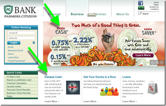
Kasasa products dominate the homepage of Farmers Citizens Bank (link)
Question: Do Kasasa ads clutter the Farmer’s homepage? No more than any other promotion. And they are at least attention getting. 
image 

Landing page at Farmers Citizens (link)

image

—————————

Notes:
1. I attended the event at the invitation of BancVue. But I am not consulting for them or their customers. BancVue is a customer of The Finovate Group for our event and our published reports just like hundreds of other companies. However, they did feed me really well, which, as my family will attest, is a powerful motivator in my life. So I can’t say I’m totally unbiased.
2. After hearing the detailed reasoning behind the branding decision, I actually think the Kasasa choice makes sense. But you’ll need to see the presentation to get it. The Financial Brand breaks it down here.
3. BancVue says that with 1,000 financial institutions offering Kasasa it would be bigger than the largest U.S. bank in branch network and marketing budget.
4. I can’t think of any major national banking brands that have appeared in the Internet age other than PayPal, and perhaps NetBank (RIP). ING Direct made it, but they were a spinoff of a powerful international brand, and even then they spent more than a BILLION in the United States alone during the past 12 years making ING Direct a household name. E*Trade, Ally also come to mind, but the former is more associated with brokerage and the latter is a name change from GMAC. Bank of Internet is doing well, but is hardly a household name.

New Online Banking Report Published: Online & Mobile Forecast Through 2021

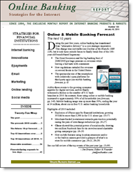
imageThe latest research is now available: Online Banking Report: 2012 to 2021 Online & Mobile Banking Forecast. The report includes our latest 10-year online banking, mobile banking and bill-pay forecast for the U.S. market. Online banking remains relatively flat, growing less than 5%, while mobile expanded by more than 40% last year (see note 1).

We still believe mobile is on a path to surpass online banking in the United Sates by the end of the decade (note 2). Although by then, the two will be very similar, if not identical.

The report also includes a revised 10-year forecast for U.S. peer-to-peer lending. After growing five-fold in two years (2011 vs. 2009), we expect continued strong growth of nearly 40% compounded annually through 2021.

Finally, we took one last look at 2011 and documented the top ten innovations or trends of the year (see below). We also updated our top-10 project priorities for 2012.

__________________________________________________________________

Top innovations & trends of 2011
__________________________________________________________

The report includes a summary of the top ten innovations or trends during the past year (in alphabetic order):

  • Ad-supported banking gains a foothold
  • BillGuard launches transaction-monitoring tool (screenshot below)
  • Capital One acquires ING Direct USA
  • Mobile banking goes Android
  • P2P lending doubles 
  • PFM turns its attention to debt management
  • Square re-engineers off-line POS
  • Social media-fueled banking backlash
  • Truly virtual banks arrive
  • Youth banking gets a powerful new entrant

__________________________________________________________________

New entrants to the OBR Hall of Fame 
__________________________________________________________________

Each year we rank the top online/mobile innovations of all time (North America). There are a total of 46 achievements listed from 45 unique companies:

  • 15 banks
  • 5 credit unions
  • 10 non-bank financial services companies
  • 15 technology companies

The class of 2011 included three new entrants:

  • BillGuard for creating a PFM application (transaction scanning) that provides tangible value to the mass market
  • Doxo launches first full-featured virtual billing file cabinet 
  • Mint for putting all the pieces together to create a compelling online personal financial management system (note 3)
  • Personal Capital, for doing for wealth management what Mint.com did for retail customers

__________________________________________________________________

About the report 
__________________________________________________________________

Online & Mobile Banking Forecast (link
The next 10 years: 2012 through 2021

Author: Jim Bruene, Editor & Founder

Published: 6 Jan 2012

Length: 40 pages, 27 tables, 14,000 words

Cost: No extra charge to OBR subscribers, US$495 for others here

————————-

BillGuard is one of four new companies added to the OBR Hall of Fame in 2011 (9 Jan 2012)
Note: Powerful homepage message: Protect Your Money


BillGuard's homepage has a powerful call to action

———–

Notes
1. The penetration of online banking into U.S. households is relatively flat going forward. However, because each household accesses a larger number of financial accounts, growth at individual financial institutions is still growing on average. 
2. Forecast is for the United States. Mobile has already surpassed all types of banking in some developing countries. 
3. Mint.com is being added four years past its 2007 launch. Since it didn’t pioneer any specific new features, we hadn’t put it on the list. But, we’ve decided its legacy of improving the user interface for online banking is worthy of making it into the OBR hall of fame.

Can Savings Accounts Be Social?

image I glanced at my ING Direct eStatement alert today (screenshot below) to see what they had to say in the new year. The soon-to-be-Capital-One direct bank is usually pretty creative in its copywriting. And I was not disappointed today. Here’s the pitch inside the alert:

image

I love the idea of a “Social Network…of Savers,” a Facebook-like place where friends help each other keep spending in check and achieve politically correct savings goals such as the down payment on a home, the college fund, or a rainy day reserve.

But I don’t think the Facebook model works in the real world (note 1). Even though it might be interesting to follow your friends’ drunk spending (note 2), most users want this info to be kept VERY private (note 3). And in most circles, money accumulation is never openly discussed. Who wants to read about someone’s “trip to Tahiti” savings goal when you are trying to get off unemployment?

In its recent email, ING Direct is NOT looking to create the Facebook of savings in any way. While the bank celebrates savings throughout its marketing (e.g., Wethesavers.com), this email offer isn’t about sharing with your network, it’s about selling to your network to earn a $10 referral fee per new account, up to $500. And that’s OK, because everyone loves to share “found money.”   
—————————-

ING Direct email (4 Jan 2012, 9 AM Pacific)

ING Direct estatement email alert 

Referral landing page (link)
Note: There’s even a Flash demo of the referral split for the math challenged.

ING Direct referral landing page

Notes:
1. I’m not saying that all sharing is a dead end. For example, sharing savings/spending goals can work very well within tight-knit groups such as extended families. And compiled/masked data about peer spending/savings is very promising (see Citi’s Bundle joint venture). Finally, there are numerous opportunities for “social investing” (our 2008 Online Banking Report on the subject), because it’s much more complicated and often openly discussed.  
2. There is room for “social savings” in the context of sharing discounts, money-savings tips, and so on. But that’s not what ING Direct is talking about in this message.
3. Hence the pivots by the two “class of 2010” startups, Blippy and Swipely, which were founded on a “transaction-sharing” model.
4. And the bank makes its win-win. The new customer gets the biggest share, $25 for a savings account, a 70/30 split of the $35 up for grabs. New checking customers get $50, from an 85/15 split of $60.
5. For info on family banking, deposit gathering, transaction sharing, social investing, and much more, see our subscription newsletter, Online Banking Report.