Mobile Banking Increases Need for Read-Only Account Access

image It had been a while since I’d logged in to Mint.com from my iPhone and I had forgotten just how easy it is. The online PFM pioneer has boiled the process down to the bare minimum (assuming you’ve enabled "passcodes," see note 1).

Logging in takes just four numerical "keystrokes." You don’t even have to press a login or done button (inset). As soon as you press the last digit, you are automatically logged in.

As an added bonus, PIN authentication is handled on the phone instead of the server, so you get an immediate error message if you type in the wrong one.It’s a great user experience, though I wish Mint still supported the stay-logged-in option, which is fine when accessing a "read only" data file (note 2).

This brings me to my main point (finally!). Banks need a "read-only" account access option (note 3). Than means no account numbers are shown. No check images are accessible. No personal info is available. And of course, you can’t perform any transactions (note 4). And the read-only password should be different than the "normal" one.

The read-only option would make customers feel more secure about banking online, especially from:

  • Mobile phones
  • Tablets
  • Wifi hotspots
  • Hotel rooms
  • Friend’s house
  • Public terminals
  • Home (if you don’t trust your own network)
  • PFM or third-party programs (note 3)

With read-only services, bank security folk can ease up on unwieldy password requirements for mobile access. And it might even prevent a crook or two from gaining full account access due.

———————

Notes:
1. The four-digit PIN option is for users that have enabled passcodes for login from the Settings area in the Mint.com app. Otherwise, users must enter their full Mint username and password.  
2. While it’s a privacy concern, read-only account access with no login should be an option for a PFM. Of course, you must make it absolutely clear to users the danger of non-password protected data.
3. ING Direct offers read-only access to PFM programs
4. Funds transfers among existing accounts or even to existing billers could be OK, but it muddies the waters a bit from the perspective of the user.

Can Banks Avoid Being Friends with Facebook?

image Last Tuesday, we published our first full report on how financial institutions can leverage Facebook for marketing, delivery and customer service. Then a day later, Facebook changed the rules for brand pages, forcing a redesign to the new "timeline" format (see third screenshot below for example; note 1).

It is largely a cosmetic change, akin to swapping out the window coverings in a branch. But it’s still annoying that the Internet giant only allowed 30 days to make the change. Obviously, the company still doesn’t know (or more likely care) how long it takes to revise marketing materials in the real world. 

While the timeline change doesn’t materially impact the tactics we looked at, it does illustrate a downside of developing on the Facebook platform (note 2):

  • Facebook sets all the rules and you must adapt to them
  • Facebook evolves faster than most brand marketing strategies, so it takes a commitment to keep up with the changes (this can be outsourced of course)
  • Facebook is so popular, and has so many ways to grow revenues, it’s not likely to listen business customers’ feedback (yet)

While those drawbacks may temper your investment for now, it doesn’t change the fact that you MUST pay attention to Facebook.

Why?

Whether you like or not, your bank is already on Facebook. Virtually every business entity of any size has a placeholder page on the social network (see the Fifth Third Bank placeholder below). These pages are closed, no wall posts, and generally pulled from Wikipedia company descriptions. So, they are relatively innocuous and are better than having users instead land on a random "yourbank sucks" page.

However, do you want customers or potential customers, evaluating you based on the intro to your Wikipedia page? And while there are very few (zero?) users searching inside Facebook for a bank, prospects will stumble on to your Facebook page from Google searches (see Astera CU search below).

___________________________________________________________

Bottom line
___________________________________________________________

While it’s not going to make a dent in your non-interest income shortfall, a few days spent sprucing up your Facebook page is a cost of running a consumer business in 2012 (see post-Timeline page at Oregon Employees CU below).

Larger investments are harder to justify (obviously). Consumers are not clamoring for "more bank" in their social networks. But based on the history of other media, consumers will put up with plenty of advertising noise as long as there is something in it for them.

We believe that eventually most banks will have at least a semi-sophisticated presence in Facebook (think website circa 2000). But given that the platform is still relatively unstable, there is no huge rush to go beyond the content basics.

————

Facebook placeholder for Fifth Third Bank (link)
Note: Surprisingly, 3,400 fans

Fifth Thrid Facebook "placeholder" page

Google search results for "Astera Credit Union"
Note: Astera’s "unmanned" placeholder Facebook page is the sixth link on Google organic search results. LinkedIn is second.

Organic search results for Astera Credit Union

Oregon Employees FCU has the first FI "timeline" page I’ve seen (link)
Note: Like activity is even more prominent than the old format

Oregon Employees FCU is one of the first FI timeline formated pages 
————–

Notes:
1. There are many resources available for brands looking for timeline tips for example here, here, and here.
2. Those of you with apps in Apple’s iOS store face similar ever-changing platform requirements. However, there is usually more lead time to make changes.  
3. Picture credit: Connect Media Blog

Landing Page Love: PerkStreet’s Facebook-like Testimonial Montage

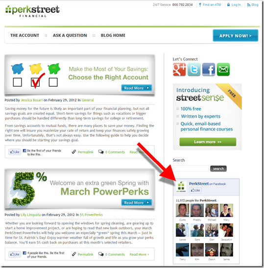
image Not surprisingly, Google served a PerkStreet Financial ad in my Gmail account tonight (8:30 PM Pacific). I barely remember clicking it, but I started paying attention when I saw the virtual bank’s  landing page (see first screenshot; note 1).

PerkStreet uses a clever visual technique, one that’s familiar to Facebook users (note 2; fourth screenshot), a montage of "friends." In this case, they are not actual friends but 53 thumbnail photos each containing a customer testimonial via either webcam (18 of the thumbnails; second screenshot) or static photo with caption (35 thumbnails; third screenshot).

The bank tops it off with two easy-to-see Apply Now buttons. Nicely done. I Like it.

—————————-

Landing page from Google Gmail ad (link)

Perkstreet landing page with "face montage" 

Clicking on a video testimonial launches a popup

Perkstreet customer testimonial (is that Alex?) 

Clicking on a static photo brings up a short written testimonial

Perkstreet static customer testimonial

PerkStreet uses Facebook’s "facepiles" social plugin on its blog (note 2)

Facepiles used on Perkstreet blog

———————————

Notes:
1. I am calling it virtual because they are a pass-through to a third-party bank that holds the funds.
2. See our latest report, Banking on Facebook, published yesterday.

Out of the Inbox: Prosper Markets to Small Businesses

image Everyone says that business startups are a huge driver for economic growth. So, when was the last time you received a solicitation for an unsecured loan to start a business (note 1, 2)? It may not be unheard of, but it’s rare, especially since 2008.

So today’s email from P2P loan pioneer, Prosper, really grabbed my attention (see screenshot below). Not only were they targeting a segment that’s generally overlooked, they were doing it an effective way. The direct subject line, striking graphic, and concise copy, are guaranteed to get the message out.

My only concern is the reliance on the super low, 6.59% rate showcased (for AA borrowers, see highlighted section below). While it’s not a teaser rate, it’s also one that’s not readily achievable for most people needing $25k to start a business. I’d rather see Prosper list the rate for a more typical borrower, or at least show a range of applicable rates.

Still, I give it an A-, because most borrowers savvy enough to start their own business understand that "….starting at" means something higher at the end of the process.

————–

Prosper email to registered users (1 March 2012; 1 PM Pacific Time)
Note: Social media call to actions at bottom of message.

Prosper email to business startups

Landing page
Note: Interested borrowers are dumped on a generic signup/login page. It seems like there should be some tie-in here to the email call to action.

Prosper landing page

————————-
Notes
:
1. Chase offered a great program in 2010 where business borrowers were given a lower rate for hiring new employees. However, it wasn’t targeted to startups.
2. I’m not on their mail list, but I know Silicon Valley Bank aggressively pursues startup businesses for financing deals.  
3. We’ve covered P2P lending a number of times in our subscription service, Online Banking Report including updated U.S. forecasts in our Jan. 2012 report.

New Online Banking Report Published: Banking on Facebook

image We just published our latest report, Banking on Facebook, which looks at why you should establish a presence on the social network. And more importantly, what you can do to make the effort pay off.

To some extent, this report was overdue. Facebook has been a major social force for four or five years. However, it wasn’t until recently that brands have taken the platform seriously.

And while soft drinks and social games may dominate Facebook brand pages now, every major brand will be there eventually, financial services included. The opening to our report lays out the opportunity:

If there was a neighborhood that 90% of your customers visited frequently, many every day, how much would you pay to have a presence there? If you were small, maybe $10,000; if you were Chase, maybe hundreds of millions.

But what if it cost almost nothing to set up shop there? Basically, that’s Facebook: a place most of your customers frequent and where brands can establish a page for exactly zero dollars.

clip_image002In the 56-page report we cover:

  • 12 main reasons you should invest in a Facebook brand page
  • 12 primary components of a Facebook brand page (see screenshot below)
  • 42 advanced tactics for your Facebook page
  • 47 financial institutions worldwide with more than 100,000 Facebook fans/likes
  • Consumer interest in viewing bank account info, spending info, and credit info within their Facebook page
  • The importance of Facebook’s new "Action" buttons for banks (inset)
  • 23 Facebook terms you need to understand (e.g. social plugins)

__________________________________________________________________

About the report
__________________________________________________________________

Banking on Facebook (link)
It’s time to set up shop in the dominant social network

Author: Jim Bruene, Editor & Founder

Published: 28 Feb 2012

Length: 56 pages, 10 tables, 12,000 words

Cost: No extra charge to OBR subscribers, US$495 for others here

__________________________________________________________________


Sample screenshot
: We use Lending Club to illustrate the basic components of a Facebook brand page

Sample Facebook brand page from Lending Club

Looking Forward to Ad-Supported Banking

Last week, Christophe Langlois @Visible-Banking tweeted a question about the value of in-statement rewards programs: 

image

And my answer:

image

My response was partly 140-character hyperbole. It’s Twitter after all. But after sleeping on it, I think what I said might actually be true. 

What’s the biggest problem facing online/mobile banking?

The cost to the bank. Always has been and always will be. And it’s not going to get less expensive anytime soon (note 1). Every time we write about the next must-have online bell or mobile whistle, it just gives bank CFOs another gray hair.

Up until recently there were only three ways to pay for these extra expenses:

  • Charge direct fees for the channel, which customers hate
  • Cross sell, which is hard to attribute solely to the online channel
  • Cover the costs with other revenue streams

The vast majority of banks, and every one in the United States, took the last approach. Unfortunately, this can lead to unwise pricing decisions such as the one that gave rise to the “$35  cup of coffee.”

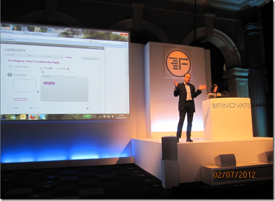
But thanks to Cardlytics, who recently took home Best of Show honors at Finovate Europe, and others, we are entering into a new era of advertising-supported banking. And that could finally make direct banking a revenue generator on its own. Not enough to pay all its costs, but enough to alter the game.

Let’s assume banking customers redeem 2 offers per month and the average commission to the bank is $1 each (note 2). That’s $2/mo in new revenues, almost entirely attributable to the online/mobile channel (note 3).

A bank with 25,000 online banking customers would earn about $600,000 annually. That will buy a several bells and a decent whistle.

———————-

Notes:
1. It can be argued that in the long-term support costs per banking customer will fall dramatically as branches and human customer support are downsized.
2. Using Aite’s forecasted $1.7 billion in-statement commissions in 2015 and dividing by 70 million online banking household (link).
3. You have to have the debit or credit card too, so the revenue might need to be shared with the card P&L.
4. We published a report on in-statement rewards in 2011 in our Online Banking Report.

Friday Fails: Banking Site-Search Edition

I was doing some research into banks’ Facebook sites and found a couple pretty terrible results when using each bank’s own search feature. Here are three samples. 

1. Citibank site-search results for “Facebook” (17 Feb 2012; 3 PM Pacific)  
The search results try to convince you to search for “fake book” instead (why?). Ironically, the second search result does lead to the bank’s Facebook page, but you’d never know it from the title, “Citibank Online – IMPORTANT INFORMATION.”

image

2. Chase Bank site-search results for “Facebook” 
Chase has more Facebook fans (3.4 million) than any bank on the planet, in fact almost 4x the nearest competitor. But you wouldn’t know if from their site search, which returns exactly zero useful results. 

image

3. US Bank site-search results for anything
It looks like US Bank’s site search is broken today. Every search comes up with the same error message. Too bad there isn’t a better error message. “We could not process your request” sounds a bit like they are shifting the blame to the user.

image

———

Note: We’ve covered banking site-search in our Online Banking Report industry newsletter (subscription).

Intuit Offers eBay Bucks Incentives for Mint, TurboTax Trial

image While I don’t use eBay for entertainment much any more, I still pick up the occasional used item now and then. And I love the rewards program which began about two years ago. It works like it should, with no qualification hoops to jump through or byzantine rules to discourage redemption (note 1).

Users accrue a 2% cash-back bonus, called eBay Bucks, for three months. Then they have 30 days to spend it on the site. When paying for a subsequent purchase, the eBay Bucks are automatically used first, with any remainder shunted off to PayPal for authorization.

It’s all well integrated and transparent. eBay even emails you multiple times as the spending deadline approaches.

They company also provides ways to earn extra eBay bucks. Today, for example, they offered an extra fiver if you bought something worth $100 or more.

In addition, outside brands can make offers on the rewards-summary page as well. The current featured offers (for me anyway) are from Intuit’s Mint.com and TurboTax units. Users receive one eBay Buck for signing up for Mint and two for using TurboTax. There are 36 offers altogether, paying up to 15 eBay dollars (People Magazine). All offers are powered by TrialPay. Two others are financial:

  • FreeCreditReport.com (Experian): 10 bucks
  • Credit Karma: 1 buck

Side note: The eBay rewards implementation is a good example to simulate when designing your own in-statement rewards program.

————————————–

Mint.com offer displayed in eBay rewards program area (16 Feb 2012)

Mint.com offer displayed in eBay rewards program area

Close-up of Intuit offers

Close-up of Intuit offers on eBay rewards page

Landing page powered by TrialPay (link)

Mint.com offer fulfillment page powered by TrialPay

———————–

Notes:
1. I did fail to redeem my cash-back horde the first time, because I didn’t realize there was a 30-day redemption deadline. But not before eBay sent multiple messages reminding me of the pending deadline. 
2. For more on in-statement rewards programs for banks, check out our Online Banking Report on the subject (published Feb. 2011).

Self-Serve: Chase Bank Allows Users to Create Their Own Billpay “Proof of Payment” Letters

image Last night, my son was having trouble convincing his college landlord that the Feb rent payment had been sent via online billpay. I was not happy, envisioning an extended conversation with bank customer service, something that is very, very low on my list of Monday night activities.

So I logged in to the Chase account to see if the check had cleared. At best, I expected to see that the payment had been sent via billpay, but no way to prove that the check had actually arrived. 

Bit I was pleasantly surprised. Not only could I see that the payment had cleared, the bank had posted an image of the check so I could see the landlord’s endorsement (see screenshot 1 and 2).

That was great on its own. But wait, there was more.

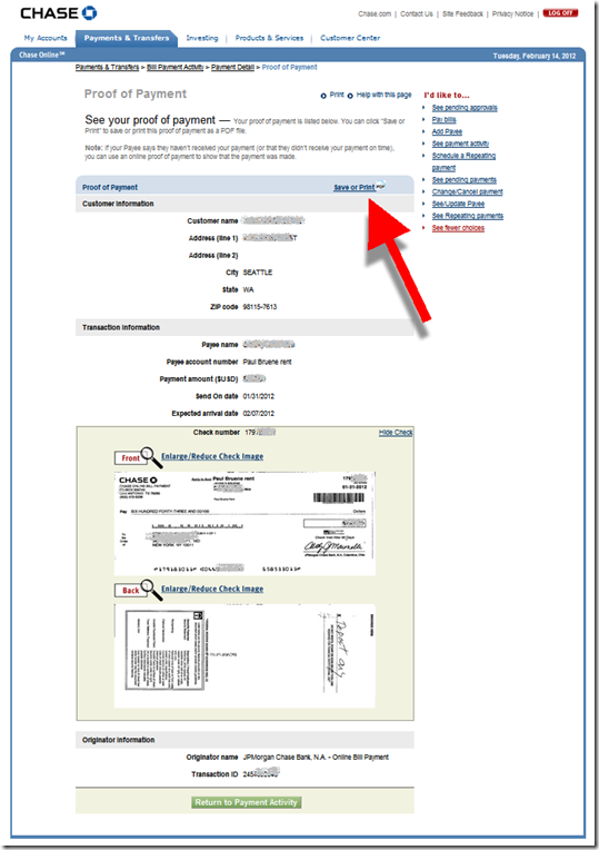
The bank offers a self-service “Note to Payee” function that automatically creates a letter to document payment details, including a copy of the check image (see screenshot 3). All you have to do is download the PDF and attach it to an email to the payee.

The only hitch in the system is finding these functions. They are located under the Payments & Transfers tab (see screenshot 1). That’s not bad, but it would be more intuitive to place a direct link from the the online statement (My Accounts) to the bill payment details. Also, the “Print to PDF” button is easily missed (screenshot 2).

Still, the entire process took less than two minutes. And I didn’t have to call customer service, a saving of 15 minutes of my time and $15-20 in customer service expense by the bank. 

The letter worked perfectly. Within an hour, the landlord had backed down, apologized for her error, and went back to her day job. This pretty much makes up for the unreadable bit of correspondence I got from the bank last week. 

——————-

1. Chase bill payment activity screen (14 Feb 2012)

Chase bill payment activity area within online banking

2. Chase proof-of-payment screen
Note: Print to PDF option

Chase bill payment details page


3. Chase automatically generated “Note to Payee” letter in PDF format

Chase proof of payment letter
——————————-

Note: See our Online Banking Report for more info on bill payment, messaging, customer service and much more.

Kickstart Your Banking Community with Crowdfunding

image

image If you read much tech news, you’ve probably heard about Kickstarter, or at least their most famous project that helped a budding entrepreneur make watches from iPod Nanos (above).

Kickstarter is the best known (note 1) of the so-called crowdfunding sites where the Internet is invited to help fund new projects in return for recognition and/or a tangible good related to the project. Kickstarter focuses on the arts world, helping connect artists, designers, publishers, and performers with patrons around the world, who kick in as little as a $1 to help get a project off the ground. There are dozens of others focusing on other areas as well. 

You're a Backerimage I used Kickstarter this weekend to fund publication of a new comic book called Steamfunk (screenshot below). I came across it when searching for local Seattle-area projects.

My niece is a steampunk fan, so I thought it would be a nice surprise for her. I dropped $15 into its pledge drive, and assuming the artist Zilla Doty receives at least the $3,000 he was seeking (note 2), in April I’ll have a signed copy of his inaugural edition to send to my niece (note 3).

Not only do I get a cool one-of-a-kind gift, I gain the satisfaction of helping a local artist get a project off the ground. Very gratifying.
_______________________________________________________________________

Bank Opportunity
_______________________________________________________________________

I bring this up, not because it’s a slow news day, but because I think leveraging crowdfunding could be a good way for community banks or credit unions to distinguish themselves in the local market. It would not be an easy project, getting people to part with their money never is, but it has the potential to attract new small business clients while supporting your community.   

Here’s how it would work (note 4):

1. Bank sends customers to a third-party crowdfunding site, which could be operated independently, or private-branded for the bank

2. Bank publicizes new community projects via its website, blog, Facebook page, and so on

3. OPTIONAL: Bank offers to match the crowd’s funding with a credit line/loan (if needed and assuming reasonable credit risks) or other banking services

For extra credit: Integrate crowdfunding with peer-to-peer lending. 

————————

Kickstarter project page
Note: This is how it looks after you’ve made a pledge

Kickstarter project page

———————————-

Notes:
1. According to Compete, Kickstarter had 750,000 unique U.S. visitors in Dec. 2011.
2. With 20 hours to go, the project has easily surpassed the $3,000 goal. 175 backers have pledged almost $5,000.
3. The pledge process is very smooth. Payment is made when you make the pledge and fulfilled through Amazon Payments. If the project fails to reach 100% funding by the end date, you get your money refunded. According to the company, 90% of the projects who make it past the 25%-funded mark end up with 100% funding. That’s an amazing stat.
4. No, I don’t have a clue what objections you might get from compliance, but I’ll bet it will be an interesting conversation.
5. We haven’t written specifically about crowdfunding at Online Banking Report, but we’ve covered P2P lending and small biz banking services.

Service: Even Business Customers Deserve Jargon-Free Correspondence

image After an inspiring trip to FinovateEurope, being completely immersed in new technology such as voice/facial recognition, intuitive UIs, and hassle-free mobile payments, I was jolted back to reality when I came home and opened a letter from my bank.

The bad news arrived in a plain-looking envelope, always a bad sign. I was told that Chase Bank was reversing a $6,000 check we’d deposited a week earlier. 

I’ve seen some awful customer correspondence over the years, but this may be the topper. The bank would never send something this illegible to consumers (I hope), but I guess they think small business customers are savvy enough to understand the jargon and ignore the bad design and inconsiderate copywriting.

The bank is wrong. They can’t just grab $6,000 from a small business owner and make no effort to apologize or explain what’s going on.

Here’s the backstory:

  • We deposited a check over the counter at a Chase branch that was made out in US Dollars, but drawn on a foreign bank.
  • It was accepted with no questions asked by the teller and credited to our account with next-day availability.
  • A week letter, the bank changed its mind, removed the money from our account, and sent the letter shown below. 

I can understand putting a hold on the funds, but the utter lack of courtesy in communicating the issue is inexcusable. Ideally, the teller should have warned us about the hold period. But since that didn’t happen, the bank should have sent me an immediate email apologizing for the delay and explaining the situation in simple vocabulary.  

Instead, I got an absolutely ugly letter (see below) that looks more like a Nigerian 419 scam than something a huge corporation would send.

Here are nine problems:

1. Mixed use of ALL CAPS and sentence case, bad spacing, and black & white logo, makes it hard to read, amateurish looking and potentially fraudulent.

2. "Convert Notification"
What does that mean? I’ve never heard the term before.

3. "Batch – 3040743 p. 1"
Huh?

4. Chase PO Box in Houston 
I deposited it in a Seattle branch, why am I getting a letter from 1,900 miles away?

5. "We are debiting your account"
Please no accounting jargon, just say that you took the money out.

6. "We are converting your 6000.00 item to collection"
What? You are sending a collector after me? What did I do? And why is it called an "item"? And where is the $ sign?

7. Reason: "Not eligible for immediate credit; new FX rate at PMT"
What? First off, stop with the abbreviations, FX and PMT. It won’t cost anything more to spell out the words. And even knowing the jargon, this particular "item" was written in dollars (but did come from an international company), so it’s a little hard to follow the logic here. 

8. "Industry standard for International Collections is 4-6 weeks"
What, I’m not getting the money for 4-6 weeks! Really? Why? Don’t you think we are good for it if it were to bounce. And why didn’t the person at the branch mention this in the first place?  

9. There nothing quite as user-friendly as a 16-digit alphanumeric confirmation number. It could at least have spaces or hyphens so I can read it. 

Bottom line: This is mostly an off-topic rant about one poorly written letter. However, had the message been delivered to me electronically, it could have included links back to the original check, links to FAQs covering international deposits, or even a direct form to ask questions.

——————————

Chase letter "explaining" a deposit reversal (27 Jan 2012)

 image

FinovateEurope 2012 Best of Show Winners Named

Ixaria CIO Tim Murfet & Marketing Dir Barbara Durand present at FinovateEurope 2012 

imageAt yesterday’s second annual FinovateEurope, 35 companies laid it on the line with in the grueling 7-minute demo format plus a day of networking in the old London fish market on the Thames.

For the first time ever, and much to our astonishment, every demo finished at or under the time limit. Thankfully, we never had to hear the bell signifying that time is up.

At the end of the last demo, eligible audience members (note 1) voted for their 3 favorite demos (note 2). All 35 companies received votes (employees of presenting companies cannot vote), but 4 stood out in the vote tally (alphabetic order):   

  • imageCardlytics (with Aimia) showed its in-statement ad platform and management tools (demo recap)
  • imageDynamics which launched it’s "chip and choice" card for
    the chip & pin world (demo recap)
  • imageeToro which launched its crowd-sourced "guru finder"
    to help located traders to follow/copy (demo recap)
  • imageNutmeg launched an investment service focused around the needs
    of the everyday investor (demo recap)

FinovateEurope networking hall was wall-to-wall bankers at mid-dayDynamics and eToro are previous Best of Show winners. You can read our live blog posts on each demo now. And in 2 or 3 weeks we’ll have the full demos available at Finovate.com.

Thanks to everyone who attended and presented. We are truly humbled by the support from the European financial community and we are already making plans for the 2013.

——————————

Notes on methodology:
1. Only audience members NOT associated with demoing companies were eligible to vote. Finovate employees did not vote.   
2. Attendees were encouraged to note their favorites as the day went on and choose 3 favorites from just the demos of that day. Ballots were turned in at the end of the last demo session each day. 
3. The exact written instructions given to attendees: "Please rate (the companies) on the basis of demo quality and potential impact of the innovation demoed. Note: Ballots with more than three companies circled will not be counted." 
4. The four companies appearing on the highest percentage of submitted ballots were named Best of Show.