Target Fee-Based Security & Control Packages to Small Business Owners

image A few days ago we published a new Online Banking Report: Delivering that Secure Feeling, arguing for the creation of fee-based subscription packages for those that need more security/privacy assurance than the typical consumer.

What we probably should have made clearer is that this is NOT a product strategy for the mass market. It’s geared toward high-end, wealthier customers and/or businesses that have a lot more to lose if their accounts are compromised.

The need for more security is especially acute for the small business owner, especially larger small businesses keeping five- and six-figure balances, sharing account access with accountants, bookkeepers, and partners, while making 100s of transactions per month.

In addition, business accounts generally operate without Federal consumer protections, so fraud losses may have to be absorbed by the business, unless they can prove negligence by financial institution. Litigating a major fraud loss is an ugly situation that should be avoided if at all possible.

That’s why it’s a win-win-win when a biz-banking client pays a fee for extra fraud protection:

  • Biz customers have fewer worries
  • Bank profits from the fee-based service
  • Fewer unreimbursed fraud losses save both parties time, money and potentially massive ill will

Take it from this small-biz owner. For 15+ years I have wished for more security/control and would be more than happy to pay for it, really! (see note 1). Every single day I dread opening the multiple email alerts from my biz bank afraid that one day I will join the the small but growing number of biz owners that have had their accounts looted (note 2).

Commercial customers have sophisticated tools at their disposal, but the smaller biz is often left using consumer-type controls. This is not how it should be.

———————–

Notes:
1. I’ve long said that I’d be willing to pay $500/mo for the perfect package of online business banking, payment, bookkeeping, and customer-management services. I stand by that statement (though I’d probably pay even more now that we have more international issues with the Finovate event). See our Online Bankin Report on micro and small businesses for more info.
2. Here’s one of the paradoxes of more communications, more “worry events.” In the past, I would have only dreaded opening my statement once per month. Now I have that little pit in my stomach several times each day. That doesn’t seem right.
3. Image licensed from Shutterstock.

Mobile Banking & Payments by the Numbers

Statement rewards provider and BillShrink parent, Truaxis, published a nice summary of mobile banking and payments on its blog (reprinted with permission below).

A few Industry Players metrics at the bottom of the infographic have recently been updated:

  • Starbucks said this week it has processed 42 million mobile payments, up from 26 million (Venture Beat, 9 April 2012)
  • Square has now shipped 1 million readers, up from 500,000; and is now processing $11 million per day, up from $4 mil (Splatf, 5 March 2012)

Mobile banking & payment infographic

Launching: SmarterBank, a Virtual Bank Aimed at Student Loan Holders

image Startups are advised to find pain-points, then build businesses to profitably solve them. Despite the current wave of very bad publicity around banks, especially the big ones, everyday banking isn’t a huge pain-point for the 80% of households currently served by existing players.

Sure, I’d like to have more security options, fewer unintelligible messages, and a Cash Tank. But most of these are feature/function improvements, not “must-have” issues that need to be solved.

What are the acute pain points in banking and personal finance?

  • Debt management, especially credit card and student loans
  • Home financing
  • Small business financing
  • Insurance
  • Retirement planning/saving

Three of these five have to do with the debt side of the consumer’s balance sheet. Yet, much of the talk about online/mobile banking innovations centers around spending management, payments, checking and savings accounts, and account access technology.

So I get pretty excited about innovations on the debt front. And last week, there was an interesting launch on the student-loan-management front, SmarterBank from Finovate alum, SimpleTuition. Its tagline says it all:

Smarterbank is "the bank that helps you pay down your student loans"

It’s a truly free, full-featured checking account, with debit card, paper checks and all the usual (but no branches, of course). And it’s powered by The Bancorp Bank, which has its hands in many of the new direct banking initiates we are seeing, including (bank) Simple.

But the special sauce is a built-in rewards program tied directly into student loan payback.

___________________________________________________________

How it works
___________________________________________________________

It’s actually two separate accounts, rewards and checking. You don’t need to buy the checking account to participate in the rewards program. But you must be in the rewards program before you can get a SmarterBank checking account.

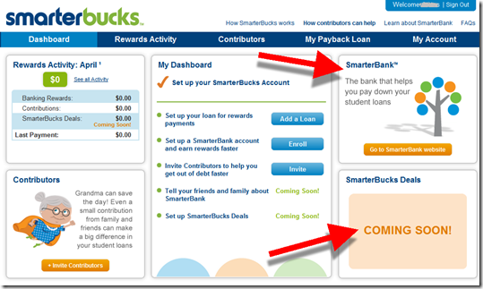
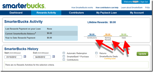
  • SmarterBucks: rewards piece (see first two screenshots below)
  • SmarterBank: the checking account

Users accumulate cash to accelerate student-loan payback in three ways:

  • Deals/offers (note 2)
  • Banking rewards (from linked SmarterBank checking account)
  • Direct contributions from family and friends

SmarterBucks dashboard (8 April 2012)
Note: (1) Link to SmarterBank in upper right
(2)The deals piece is marked “coming soon”

SmarterBuck dashboard with link to SmarterBank from SimpleTuition

SmarterBucks reward activity
SmarterBucks rewards activity screen from SimpleTuition

_________________________________________________________

Sign-up process
_________________________________________________________

1. Sign up for SmarterBucks, which as a non-financial account requires only name and email address

2. Add a student loan that SmarterBucks rewards are credited to

3. (Optional) Add a SmarterBank account so that non-PIN debit purchases earn SmarterBucks rewards

4. (Optional) Invite family to contribute money directly to the SmarterBucks account

SmarterBank application hosted by The Bancorp Bank (link)

Smarterbank application powered by The Bancorp Bank

______________________________________________________________

Analysis
________________________________________________________________

Marrying rewards, checking/debit, P2P family contributions, and student loan repayment is brilliant. It not only provides a tangible benefit for the 37 million Americans with student loan debt (see note 1), but also is a great customer-acquisition tool for a very important segment, recent college grads. Financial institutions looking for more twenty-something customers should consider building similar capabilities or partnering with SimpleTuition.

———-

Notes:
1. Figures are from the company. It also said that 10 million students owe more than $50,000, and 2 million owe more than $100,000.
2. Friends and family will also be able to link their own SmarterBucks account to the student’s.
3. We covered family/student banking nine months ago in our Online Banking Report (here).

New Online Banking Report Published: Delivering that Secure Feeling

image OK, let’s think this through. Consumers have been concerned about the security of online banking for more than a decade. Technology tools are available to ease their anxiety. So, why aren’t these tools readily available?

The answer is that most security enhancements don’t pay their own way in terms of reduced fraud. Therefore, these “nice to have” features languish in the priority queue with little hope of getting implemented.

So do we just let customers continue to needlessly fret about the security of their financial accounts?

No, that just irritates already fed-up customers and invites more independent competitors to the table to provide the missing benefits (e.g., BillGuard, Credit Karma, Mint).

Instead, why not move to the win-win solution: Charge an optional subscription fee for extra “peace of mind,” but only to customers who want it. Or offer the value-adds free of charge for customers who help you lower costs by using self-service channels and foregoing printed statements.  

But wait. Aren’t fees dead after the BofA debacle a few months ago?

While that was a very real customer backlash, optional fees are still possible. Just keep these rules in mind:

  • Fees for extra security should NEVER be mandatory; instead, offer a “security bundle” that goes above and beyond the normal state of the art
  • Do not charge a fee for any security feature you already offer free of charge (the big problem with the ill-fated debit card monthly fee)
  • Do not charge for a security feature that is typically delivered free of charge by others in the industry
  • It’s better to bundle a group of extra security features into a relative low-priced subscription bundle

In our new 48-page report we cover:

  • 12 design elements to make your website feel more secure
  • 7 potential positive elements for your business case
  • 5 talking points for staff education before implementing a subscription fee
  • 37 potential security enhancements to bundle into an “extra security” subscription offering
  • 72 additional security features to consider
  • 5 customer segments to target with a fee-based package account
  • Overview of three promising security services:
    — Anti-virus for transactions from BillGuard
    — Self-service suspicious activity reporting from Bank of America
    — Virtual safe deposit from Northwest FCU, powered by DigitalMailer

__________________________________________________________________

About the report
__________________________________________________________________

Delivering that Secure Feeling (link)
Help consumers reduce perceived risks (for a price)

Author: Jim Bruene, Editor & Founder

Published: 4 April 2012

Length: 48 pages, 8 tables, 12,000 words

Cost: No extra charge to OBR subscribers, US$395 for others here

__________________________________________________________________

Sample screenshot

: Barclays (UK) offers online banking customers free anti-virus software from Kaspersky

clip_image002

Marketing: Bank of America Offers $25 to Reactivate Visa Card

imageLast fall, my primary personal credit card from Bank of America was compromised, and I was issued a new one. While I was waiting for the new card to arrive, I got in the habit of using another bank’s card. When the replacement card arrived, I stuffed it in a drawer, unactivated and still stuck to the mailer, forgetting I’d ever received it.

Fast forward six months, and I get an email this morning from Bank of America, offering $25 if I spend just $250 on the moth-balled card before June 30 (screenshot below). Coincidently, I’d just run across the forgotten card while doing a little preliminary tax prep. 

The offer requires activation, a smart move that avoids paying out $25 to someone who never even noticed the offer. And I was pleasantly surprised that I had to do nothing more than click the Activate Now button in the email. Within a few seconds I was greeted with a confirmation delivered through a BofA webpage (second screenshot; see update below).

Bottom line: It worked. I’ve got the BofA card back in my wallet, and I’ll be using it tomorrow. And as I’m sure the bank knows, they are likely to make the $25 back within a month or two, assuming I resume my previous charging behavior. Well done, BofA card marketing dept. 

————————————————

Bank of America email offering $25 cash back to reactivate my credit card (3 April 2012)

  email from Bank of America offering $25 cash back

The one-click activation process* took us to this screen on the BofA website

Bank of America confirmation screen after offer acceptance

*Update 4 April (in response to comment): Although I didn’t test it, it looked as though the single click activated the offer only. I still had to phone BofA using the usual process to activate the card. It would have been nice to have been able to do both through the Activate button. 

Out of the Inbox: Mobile Banking Marketing Messages from Wells Fargo and Bank of America

image Yesterday was mobile day in my inbox. In the span of two hours, both Wells Fargo and Bank of America hit me up with email reminders of how great their mobile services were. 

Of the two, Wells Fargo’s was the more interesting, telling me about its revamped, mobile-optimized site, <wf.com> (see first screenshot). But since I’ve been using their iPhone app for three years, I’m not sure why I’d be super-interested in its mobile site.

In fact, the message is confusing for app users. Until I reread it for this blog post, I thought the bank was touting a new and improved app, which I was looking forward to checking out.

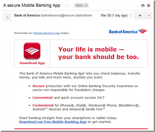
Bank of America’s message was completely generic, saying that mobile banking is secure, convenient, and customized. And the call to action was to download its app, which I did almost four years ago, so I’m not sure why I received this message (note 1). I have also used the bank’s iPad app and Kindle app.

Bottom line: The email messages were well-designed and short, so the creative scores well. But the targeting was sub-par, especially BofA, which seemed to completely miss the mark. And while Wells Fargo’s message could have been better adapted for app users, the bank gets points for acknowledging that I use the mobile channel (note 2). 

——————————————-

Wells Fargo customer email (28 March 2012, 11:37 AM Pacific)
From address: wellsfargo@wellsconnect.wellsfargo.com
Note: Account holder name blurred out.

Wells Fargo customer email

Bank of America general mobile banking customer email (28 March 2012, 1:34 PM)
From address: bankofamerica@emcom.bankofamerica.com

image

Notes:
1. A month ago I had to replace my BofA card (again!) due to fraud, so possibly this was a misguided on-boarding message.
2. The Wells Fargo message was clearly targeted to mobile users: “Thanks to suggestions from mobile users like you.”

Change Sciences Names PNC Virtual Wallet Best Bank PFM with Mint.com a Close Second

image Researcher Change Sciences has been doing outstanding work in financial user experience for more than a decade. In the last year alone, they’ve published deep dives in online, mobile, social media, mortgage, small business, investing, and account opening. The company counts most of the major players as customers; typical reports cost $5,000.

Its latest, published this week, contains a much-needed look at the UI of personal financial manager (PFM) services offered through major banks.

The winner? PNC Bank, which not only took top honors for its Virtual Wallet, but also claimed the number-three spot for Wealth Insight, a service geared to high-net-worth clients, launched last September. Both PNC PFMs were designed in conjunction with IDEO.

Mint.com came in a close second followed by the biggest surprise of the survey Bank Simple, which tied with USAA as the second-highest scoring bank. 

For more info, download the research fact sheet.

——————————

Overall PFM Ranking
points on Change Sciences scorecard

PFM ranking from Change Sciences
Source: Change Sciences, March 2012

———————

Notes:
1. Image from Italian band PFM <pfmpfm.it>
2. For our take on PFMs, see our May 2010 Online Banking Report.

Wells Fargo Shutters its Fee-Based Document Storage Service vSafe

Wells Fargo vSafe service closure message

Another innovation bites the dust.

I was a fan of Wells Fargo’s virtual safe-deposit service vSafe. Or at least the idea of it. The service launched in late 2008, before “the cloud” became an everyday term and companies such as Dropbox, Evernote, and Box.net made file storage a competitive business.

The bank was gutsy enough not only to launch a unique service, but also charge for it. I applauded the $4.95 (1 GB) to $14.95 (6 GB) monthly fee at the time, although I personally didn’t use it enough and let the service lapse after the free trial period.

But alas, the bank has apparently given up on vSafe. It’s still listed on the main online banking toolbar (see below), but the tab now leads to a terse statement saying that the bank is no longer enrolling customers (see above). And the product has been purged from the public website.

Wells Fargo vSafe last days on the online banking toolbar?

According to storage startup AboutOne, which is marketing a replacement service for vSafe users, all stored files in vSafe will be deleted on March 28.  
____________________________________________________________________

Analysis
____________________________________________________________________

Although Wells Fargo stuck with it for more than three years, even marketing it from the homepage, vSafe must have had little traction. That’s not a huge surprise. Even before Dropbox, fee-based secure file storage was a niche offering. And with the onslaught of better known, cheaper (note 1), and more comprehensive cloud-storage services, it was an uphill battle.

However, we still believe the virtual file cabinet is a good idea for financial institutions, especially as a way to speed estatement adoption.

Instead of charging a fee for basic online storage, make it a free place where bank customers can store their electronic bank statements (from you) for the life of their account. Then, consider upselling additional storage features for a monthly fee. Or bundle file storage with other value-adds into a premium online banking account.   

————————————

Notes:
1. Dropbox provides 2 GB free of charge, with 50 GB costing $9.99/mo.
2. In our Online Banking Report publication, we wrote about fee-based online services in May 2011; paperless banking and online storage in late 2010; and lifetime statement archives in 2005.

Westpac NZ Makes it Mobile Savings Transfers Easy with Impulse Saver

image There are two schools of thought when it comes to mobile app design:

  1. Put everything in a single app for each platform (note 1), so your customers aren’t confused about which app to download
  2. Create specialized apps for various market segments and/or apps that focus on a single function

American Express (7 for iOS, note 2); JP Morgan Chase (3 for iOS); Zions Bank (3 for iOS); Southern Bancorp (2 for iOS); and a handful of other banks have launched multiple apps. But it’s still the exception: More than 99% of banks have no more than one app for each platform. 

Westpac NZ has joined the multi-app group, though oddly it has yet to launch a full-featured mobile banking app (note 3). Yesterday, we wrote about Westpac’s clever Cash Tank, that provides a no-login gauge to monitor account balances.

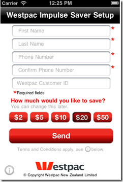
The bank has another cool single-use app, Impulse Saver, which is basically just one huge red button that users press to make a transfer from their checking account to a savings account.

obr_bestofwebThe amount of each transfer, from $2 to $50, is preset using the app settings (see second screenshot).

Bottom line: With Impulse Saver and Cash Tank, Westpac NZ has raised the bar for simple no-login mobile banking, earning an OBR Best of the Web (note 4).  
————————————-

Westpac’s Impulse Saver iPhone app (20 March 2012)

 image     image

———

Notes:
1. By single app, we mean one app per major platform, i.e., one app for iPhones, one for Android, one for iPad, etc.
2. In addition, American Express offers at least six more content apps through American Express publishing.
3. A number of reviewers in Apple’s App Store have been criticized for not having a full-featured app. For example, in June 2011 “crazfulla” wrote, “This is a great idea; however, we need a real app that has all the banking capabilities.”
4. Since 1997, our Online Banking Report has periodically given OBR Best of the Web awards to companies that pioneer new online or mobile banking features. It is not an endorsement of the company or product, just recognition for what we believe is an important industry development. If anyone knows of other financial institutions offering a similar feature, let us know and we’ll update the post. Westpac is is the 86th company to win the award and the third in 2012. Recent winners are profiled in the Netbanker archives.

Cash Tank from Westpac NZ, a Mobile No-Login Balance Display

image As mobile banking approaches its fourth birthday (note 1), we are starting to see the more interesting “version 2.0” builds from the major players. Last week, we looked at Commonwealth Bank’s Simple Balance, with its pull-down balance option.

Customers don’t want to spend more than a few seconds retrieving their balance when on the go, so the no-login option imagesignificantly improves the mobile banking user experience.

In response to that post, several readers pointed out the recently launched app from Westpac New Zealand unit. The app, Cash Tank, is an elegant solution to the same need. It’s a full standalone app that does just one thing, shows the balance in the selected account on a “fuel gauge” (see first screenshot below). 

Users set their own high and low settings so the gauge could show empty when there is still a cash cushion remaining. And users have the option of showing the actual dollar amount available or simply relying on the gauge reading for more privacy. The Cash Tank can show the balance from just one account.  

Under the gauge is a link to the bank’s mobile website where users must log in to conduct transaction. The bank does not currently offer a full-featured mobile app in New Zealand (note 2).

The app is available for iPhone and Android. 

Update Mar 20: We are awarding Westpac an OBR Best of the Web for its Cash Tank and Impulse Saver apps (Mar 21 post).

Update Mar 21: I neglected to mention that Southern Bancorp launched a no-login savings balance app a year ago called “Shake to Bank.”

————————————

Cash Tank from Westpac NZ is a standalone mobile gauge to your account balance (link)

image           image    

Cash Tank is featured on the Westpac NZ homepage (21 Mar 2012)

image

———-

Notes:
1. The dawn of the industry, at least in the United States, was in July 2008 when Apple opened the iPhone to third-party apps. There were huge strides made around the globe, e.g. M-Pesa, much earlier. But we’re referring here to the modern smartphone-based services.
2. A full-featured mobile banking app has been available to Westpac Australia customers since Dec 2008. But it does not offer the read-only Cash Tank option. 

Commonwealth Bank’s Kaching App Has No-Login Option, Simple Balance

imageThere are two problems with the current state of online/mobile login:

  • It’s too hard for customers to log in to their own accounts, especially using mobile keyboards
  • Yet, it’s too easy for crooks to log in to other people’s accounts

Since the dawn of online banking, the industry has struggled to balance user experience with security. And tiny mobile keyboards make the login experience even more frustrating.

But it doesn’t have to be that way.

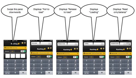
A number of banks are using 4-digit passcodes making mobile login a breeze. But Commonwealth Bank (Australia) has gone one step further, with no-login pulldown access to account balances in its new Kaching (ka-ching) mobile app (note 2). 
(Update 16 Mar: New Zealand’s Westpac also has a no-login mobile option called Cash Tank). 

obr_bestofwebCommonwealth calls the no-login option Simple Balance. With a quick swipe users pull down a read-only account balance (see screenshot below). The no-login option must be  enabled within the app before the first use. See it in action here (at the 29-second and 54-second marks).

We are awarding Simple Balance our second OBR Best of the Web award for the year (note 3). While it may not be as novel as City Bank’s debit card on/off switch, it’s likely to be used 100x more.

Bottom line: Requiring full username and password to see your account balance is antiquated, or at least it’s rapidly headed that way. The four-digit PIN is a good first step. But ultimately, it needs to get even easier than that for low-risk activities (note 4).

—————————————–

A single swipe on the top of the Kaching app allows users to download their account balance (click to enlarge, see note 2)

Pull down Simple Balance on Commonwealth Kaching

———————————-

Notes:
1. Many thanks to Australian reader Saif Hazarika, Innovation Manager at Australia Post, for clueing us in on the Kaching feature and creating the illustration above.
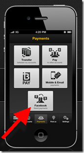
Facebook integration into Kaching's P2P payments area2. The Financial Brand published a good overview of Kaching several weeks ago.
3. Since 1997, our Online Banking Report has periodically given OBR Best of the Web awards to companies that pioneer new online or mobile banking features. It is not an endorsement of the company or product, just recognition for what we believe is an important industry development. If anyone knows of other financial institutions offering a similar feature, let us know and we’ll update the post. Commonwealth Bank is is the 85th company to win the award and the second in 2012. Recent winners are profiled in the Netbanker archives.
4. USAA’s “stay logged in” option is another promising approach, though not quite as user friendly as the Kaching swipe.
5. The Kaching app (inset, click to enlarge) includes integration to the user’s Facebook friends to facilitate P2P payments. A cool feature that I will add to the 50 or so discussed in last month’s Banking on Facebook report (OBR subscription).

Facebook Status Update: Financial Institutions Using New Timeline Format

image In our February report, Banking on Facebook, we identified 47 financial institutions worldwide with 100,000 or more Facebook Likes/Fans. With the clock ticking towards the month-end deadline for brands to move to the new Timeline format (previous post, note 1), we checked in with these 47 to see how many had made the switch.

So far nine of the 47 (20%) have implemented timeline including three of the top 5 (Progressive, Farmers, and American Express). But considering the companies have only known about it for two weeks, that’s good progress. The ranking shown below is based on their standing in late February 2012. The number of Likes below has updated as of today:

1. Progressive Insurance Flo, 3.4 million likes

4. Farmers Insurance, 2.3 million likes

5. American Express, 2.4 million likes

13. Garanti Bank (Turkey), 950,000 likes

18. Bank of Georgia, 320,000 likes

31. TurboTax, 210,000 likes

32. PayPal UK 200,000 likes

37. BBVA Continental 170,000 likes

40. TBC Bank (Georgia) 160,000 likes

—————————

Absa is using its timeline cover photo to promote electronic statements (12 March 2012)
Note: This may be a bit more "promotional" than Facebook was hoping for with its cover photo guidelines, but highlighting a product feature seems reasonable.

image

————————

Notes:
1. The Financial Brand published a helpful Timeline tutorial today (here)
2. No top-15 U.S. bank has implemented timeline yet.