Feature Friday: Ally’s Mobile Cash-Bank Finder & Call-Center-Hold-Time Meter

imageAlly Bank jumped into the mobile fray launching a pair of apps last week, one for customers with account access, and the other an "ATM & Cash-Back Finder," the anyone can use.

imageThe apps are well designed, as you’d expect from a direct bank with 1 million customers and $30 billion on deposit (note 1). But there were two novel features worth highlighting:

1. Real-time wait time in the call center: The mobile app contains a very prominent real-time indicator of just how long you’ll be on hold if you call Ally Bank. I’ve already raved about the Website version of this feature, so I won’t go into much detail. But it makes even more sense to place it front and center on an app on a mobile phone used to call the bank (see left screenshot below).   

2. Cash-back locations included with ATM finder: While I’m not sure if this is an industry first, but after a fairly extensive search in the Apple App Store came up empty, I know it’s not common. Ally combines ATM locations and places where you can get cash back at the POS into a single map and/or list view (see right screenshot below).   

Ally mobile banking app                  Ally ATM & Cash Finder app 
for customers                                              for anyone                           

Call Ally feature in mobile app      Mobile map from Ally shows ATM and cash-back POS locations

Ally also makes sure its website visitors know they’ve gone mobile with a clever graphic in the middle-right of the homepage.

Ally homepage featuring new mobile offering (3 May 2012)

Ally Bank homepage announces new mobile apps

————

Notes:
1. Ally announced the 1-million-customer milestone along with mobile apps (press release). Compared to a year ago, accounts were up 30% and deposits grew 25%.
2. While this could increase call-center calls, Ally must believe the customer advocacy positioning makes up for the increased costs.

Hot Topics at Next Week’s FinovateSpring

image We have a diverse bunch on stage at the fifth annual FinovateSpring next week. With 64 demos, many touching on multiple themes, it’s hard to boil down the topics to a few soundbites.

But that didn’t stop us from trying. We fed each presenter’s keywords into a nifty little software app and created our first ever "demo word cloud."

I don’t think anyone will be surprised there’s a bit of attention being devoted to "mobile payments." But who would have guessed (prior to last year), that "rewards" and "coupons" would get so much attention. Welcome to the new world of ad-supported banking.

FinovateSpring 2012 topic cloud
Here’s the geographic distribution of the 64 demoing companies (click to enlarge). It’s no surprise that we have 24 from California. But there’s almost twice as many from elsewhere around the country and world.

 FinovateSpring 2012 companies mapped

Finally, here’s a graphical representation of the job titles from our registration records:

 FinovateSpring 2012 attendee titles

And if you will be in the record-breaking crowd next week (thanks everyone!), here’s the demo schedule which lists each company. See you in San Francisco.

First Look: U.S. Bank’s New iPad App

image Yesterday, U.S. Bank became the fifth top-10 United States bank to release an iPad app and only the second  to include remote check deposit (Chase was first). The new app is not listed on the bank’s website yet, but became available in the Apple App Store on May 1.

I’ve been testing it for a day now and find it attractive, well laid out, and practical. It’s a genuine native tablet app, and not an enlarged version of its iPhone app. 

Here’s what I liked:

  • Remote deposit: A cool feature that creates a nice point of differentiation for now. 
  • Person-to-person payments (which I didn’t test because I needed to first enroll online)
  • Different portrait vs. landscape mode looks: The layout changes slightly depending on what position you use the app.
  • Built-in calculator and calendar: The lower-right corner contains a calculator/calendar widget.
  • Pinned account summary: Account balances are displayed in the upper-right corner on all pages.
  • Offers section: The bank has created an offers area in the middle of the page. Presumably this is where the bank will display card-linked offers from its partnership with FreeMonee, along with bank-product specials. Unfortunately, it’s empty, at least for my account (note 1). Unless, the box can be hidden, there should be at least one offer in it at all times (especially at app launch).
  • Contact info: The bank’s phone number and email address are prominently displayed.
  • Integrated location map: In landscape mode, the nearest US Bank branch and ATM locations are always displayed in the upper right corner (note 2).
  • Branding/advertising in front of login: Not everyone who downloads your app, is ready and/or able to login. Talk to them. Service them.
  • Full site access via button in right-hand column. 

What’s missing:

  • Simplified login: U.S. Bank’s table login is 25% harder than its desktop banking login. It uses full username and password. There’s no option to remember username. And unlike the desktop, where the curser is automatically positioned in the fields, tablet users must touch the empty box before typing.
  • Financial management/PFM: There is no ability to sort, annotate, or interact with the data in any way.
  • Chat: There is no way to interact in real time online.
  • Search: There is no way to search transactions or any other info.
  • Security assurances: No security section to assure users that it’s safe to bank via tablet.
  • Content (other than account info): There is little content outside bank account info and the ATM/branch locator. 
  • Visual interest: The app is attractive and functional. However, it’s fairly bland by iPad standards. Within the secure site, there are no photos, no interesting graphics, along with the aforementioned empty offers box.

Final grade: The app supports the brand, is easy to navigate and does a great job covering the important basics. Plus it has a few advanced features: offers, P2P payments, and remote deposit. Overall, I’ll give it an A-. Nice work. 

———————

U.S. Bank iPad app pre-login (2 May 2012)
Note: Graphical images promoting the bank and its remote deposit service

image

U.S. Bank iPad main "Accounts" page in landscape mode
Note: Empty "offers" box; link to full site; calculator in lower right

U.S. Bank iPad main "Accounts" page in landscape mode

U.S. Bank iPad main "Accounts" page in landscape mode
Note: Empty "offers" box

U.S. Bank iPad main "Accounts" page in landscape mode

———————

Notes:
1. I’m a long-time customer with six current accounts plus a closed home equity line.
2. While the map makes a nice visual, it doesn’t have much use for the 97% of the time the user is logging in to mobile banking from their home or work. So it might be too prominent. This is only an issue in landscape mode. In portrait mode, the map is not displayed.

Design: Three Fixes Needed to Make Mobile Banking as Widely Used as a Weather App

image Today I noticed something in Square’s latest Card Case app that I’d missed when it was announced last month. It’s a feature they call "tilt to map" which means that if you turn the phone sideways you see a map of nearby locations using Square (see inset, note 1).  

That’s one of those slick, mobile tricks (like remote deposit) that you can’t quite duplicate on the desktop. However, none of the mobile features have pulled me away from desktop banking, yet.

Why? Partly, it’s because I have a laptop with me 24/7 and am almost always in a wifi zone. But even so, I’ve switched to mobile for most other low-bandwidth information services such as weather, traffic, maps, sports scores, movie times, Twitter feed, flight tracking, concert calendar, renting movies, and so on.

What will it take to get banking on this list?

Three fundamental issues need to be solved (with relative magnitude in parenthesis):

1. Make it much easier to login (60%)
None of of the mobile info services I use regularly require any type of login (after initial registration). Banks often allow the username to be saved, which helps, but the typical 8+ digit alphanumeric password is still not a good user experience on mobile. A four or five-digit numerical PIN would solve 80% of this problem. Or even better, install read-only access to certain data. 

2. Make it easier to navigate (30%)
There should be almost no navigation required to see my balance and transaction stream. Square’s "tilt-to" function could be used by a bank to display account balances in portrait mode and a transaction stream in landscape.  

3. Provide security education & guarantees (10%)
This is not an issue for me. In general, I think mobile banking is more secure than desktop (see note 2). But the general public is still unsure about mobile security. You can change this by providing understandable security guarantees for mobile users.

—–

Notes:
1. ING Direct also uses the same trick, displaying links to its social media sites when the app is tilted to landscape mode.
2. For more improving security perceptions, see our latest Online Banking Report.

Feature Friday: Paying Online with Cash

imageI love headline alliteration and it’s good to have a shtick, so I will periodically post a “Feature Friday” here. It turns out I started last Friday with Capital One’s new mobile rewards feature, the ability to trade rewards points to pay for PAST travel (and they did it without resorting to time travel).

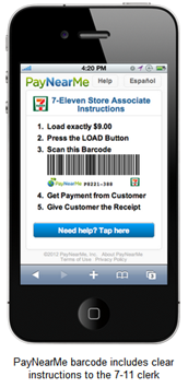
PayNearMe mobile option This week, old-school cash was in the news:

  • Finovate fan favorite PayNearMe launched a mobile version of its cash-based payment service that allows users to buy online then take the receipt to 7-11 to pay in cash (or card). Until now, the system relied on a printed receipt to hand over to the cashier. And printing is so 2009. The new mobile version (inset), does away with the printing, allowing users to show the cashier a barcode rendered on a mobile phone. From then on, the process is the same.
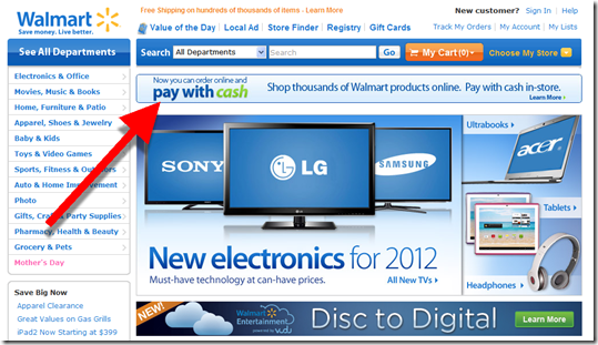
  • WalMart just launched a “pay with cash option” that works with its Walmart.com site (screenshots below). The company could extend the service to purchases at other ecommerce sites if it wants to drive more traffic to stores.

Relevance for Netbankers: While we don’t spend much time here discussing cash, it’s still important across most demographics. And banks have a huge stake in the game with their ATM bases and other cash-handling infrastructure.

Banks could do the same thing as PayNearMe, using their branch and ATM networks to take cash over the counter as payment. And many parents may prefer sending junior to the bank instead of the convenience store.

But I also wonder if we’ll see the reverse? Instead of handing cash over to the 7-11 clerk, parents can transmit a bar code to their kid’s mobile to allow them to walk out of the store with a crisp $20 for lunch and a bus ride home. And it would make sense to extend that capability to mobile-enabled ATMs and even branches.

Anyway, that’s all for this week, have a great one!

———-

Walmart homepage (27 April 2012)

Walmart homepage promotes pay with cash option

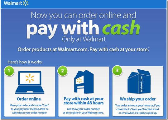
Homepage popup lays out how it works

Walmart.com popup lays out how it works


Walmart checkout

Choose “cash” icon under “enter a new payment method”

Walmart online cart with "cash" payment option

Pageonce Removes Billpay Subscription Fee in Favor of Per-Transaction Pricing

imagePageonce, the largest PFM from a company not named Intuit, is abandoning its $4.95/mo subscription for mobile billpay and moving to a yet-to-be-determined transaction fee for each bill paid (note 1). The change was revealed at Monday’s Future of Money conference and I confirmed yesterday with COO Steve Schultz.

image The company has been testing various price strategies and found that per-transaction prices were more popular with customers. Its model predicts a five-fold increase in volume with the new fee structure, moving from $40 million annually to $200 million (note 2).

Schultz speculated that customers are used to paying this way for financial services. And it helps that an electronic billpay transaction displaces an out-of-pocket cost of $0.50 or so (stamp & paper check).

Pageonce is positioning itself as a mobile wallet, starting from a position of strength on the billpay side, rather than POS transactions. Schultz says eventually they’ll be at the point of sale and P2P as well. Because those three activities are all part of the “wallet experience.”

But the company is not abandoning its PFM roots. Mobile wallets also need tools to manage and track spending. Pageonce is chock full of those. 

The company’s business model going forward largely focuses on offers and lead-gen, similar to Mint. But it’s also not completely subscription-fee averse. Its mobile credit score/monitoring service, Credit Guard, is priced at a very competitive $6.99/mo.

My take: While I can’t point to specific tests of my own, most banks that have experimented with transaction fees have found them to be quite unpopular (of course, so are subscription fees). My advice <cue broken record>, for banks anyway, is to bundle several value-adds popular with the target segment and sell the package for a monthly subscription fee (or a discounted annual fee for your fans) (note 3).

How they do it:

  • Billpay processing is powered by TIO Networks (note 4).
  • Account aggregation was built in-house
  • Credit Guard is powered by IdentityIQ

Pageonce showcases its apps for every major mobile platform (link, 25 April 2011)

image

—-
Notes:
1. The company is testing fees from $0.25 to $1.00 per bill. I see no reason to undercut the price of postage, so I’d guess they end up closer to $1.
2. Assuming $1,000 in monthly billpay volume per active user, that implies the company currently has only 3,000 active billpay users.  
3. For more information on subscription pricing for financial institutions, see our Online Banking Report (May 2011).
4. See TIO Networks demo at FinovateSpring May 8/9.

Launching: EFTGuard Provides $500k in Online Fraud Protection for Business Banking Customers

image That was fast. Just two weeks after my latest appeal to the industry to provide small business owners with more security options, a new product launched today aims to do just that. And it’s packaged as a turn-key, fee-based service that could be sold by banks at a $10+ per month profit (MSRP is $25/mo).  

That all sounds too good to be true. When I was first contacted by Greenway Solutions last week, I was more than a bit skeptical. But after speaking with CEO Jerry Tylman and Managing Consultant Jon Meyer, I was convinced they had something that as a business owner, I’d definitely buy.

The product, EFTGuard, is a joint venture between Greenway Solutions and Royal Group Services. They say it’s a “win-win-win” for banks:

  • Helps banks meet “UCC requirement for commercially reasonable security and their FFIEC requirement for customer education and awareness”
  • Provides peace of mind to bank clients
  • Protects both the bank and each client up to $500,000 in unauthorized online transfers
  • Helps differentiate checking and deposit offerings

____________________________________________

How it works
____________________________________________

EFTGuard provides protection against fraudulent online-account withdrawals of $100,000 per account (with no deductible), with a maximum of $500,000 per customer. And because it’s not true “insurance” (it just behaves like it), there is no underwriting hassle and the product can be purchased in just a few minutes via online form (demo here). There is, however, the usual list of coverage exclusions; for example, it doesn’t cover insider theft. 

The catch? To qualify, business customers must download and install anti-malware software from Trusteer, Iron Key, or Webroot. And every computer accessing the business account must be running these protective software programs. For the time being, that appears to leave out any mobile access. 

Initially, banks looking to offer EFTGuard will need to work with one of these three malware-protection vendors in order to qualify their clients for the fraud protection. Other than that, EFTGuard is turn-key and comes with marketing support, a co-branded signup page, and full claims management.

The $500,000 coverage is backed by Chartis Specialty Insurance Company.

__________________________________________

Bottom line
__________________________________________

Your business customers are rightly concerned about fraud. Offering them an option to protect themselves is a great way to differentiate your deposit offerings while preventing you from getting bogged down in messy litigation with your customers.

I still have questions about how often the list of exclusions will invalidate claims when actual fraud occurs. But the company assures me that the protections are very real.

Assuming EFTGuard delivers on its protection promise AND creates a small profit center, what’s not to like? I, for one, will be the first business owner in line to buy it. 

——————-

EFTGuard homepage (24 April 2012)

image

———-

Note:
1. I believe insurance is one of the best growth areas in retail banking, especially in niche lines that can be explained and delivered online (see our December Online Banking Report for more about banks delivering insurance online).

Capital One Add Rewards to Mobile App, Includes Ability to Redeem for PREVIOUS Travel

Capital One mobile rewards main page Although it was one of the last major banks to launch an iPhone app, Capital One is now positioning itself to be a leader in mobile. Its April 5 iPhone app update included a new rewards function that’s the best I’ve seen.

Rewards point totals are clearly shown on an old-school “flip number” display (see screenshot right). But the novel part, and this may be an industry first, is the ability to redeem rewards in real-time, for travel purchases you’ve ALREADY MADE. (You can also redeem for cash or gift cards.)

I thought this was some kind of typo when I first saw it in the marketing material. So I tested it myself this morning. And sure enough it does exactly what it says.

Previous travel purchases made on the Capital One card are displayed in the app. Users select the one(s) they want to redeem for mileage points and Capital One provides a statement credit to refund the user for the purchase. Brilliant!

———————-

Capital One’s mobile reward redemption for previous travel (20 April 2012)
Note: Select a transaction (below left), confirm (below right).

Capital One mobile rewards screen      Capital One mobile rewards redemption confirm      


imageI also like Capital One’s new app “home page.” Instead of forcing a login before users can do anything, the bank offers several non-secure content areas:

  • Browse our products
  • Find branch/ATM
  • Mobile banking FAQ
  • Contact us

These are useful for customers who can’t or don’t want to log in. And of course, for prospects kicking the “mobile tires” at the bank.

Launching: Circleup Taps Your Inner Shark Tank

image If you dream of being Mark Cuban, Mr. Wonderful, or one of other Shark Tank investors (note 1), a wave of new angel-investing platforms are springing up all over the world.

TechStars, a NY-based incubator, said it had more than 30 applications from crowdfunding startups for its summer 2012 class.

In the United States, the recently enacted JOBS Act has spurred interest since it is expected to expand the market to several million more investors. But more importantly, the new legislation will lift the ridiculous “quiet period” rules that are supposed to keep companies from openly soliciting investors (note 2).

Once companies can openly look for investors (expected by early summer), private-placement investment platforms have a lot more to offer to companies seeking capital, namely a marketing opportunity.

Think about it. If you need $500,000 to launch a new line of organic granola bars sold nationwide, would it be better to get it from a couple local angels, or from 100 investor-fans kicking in $5,000 each? The latter approach gives you 100 evangelists in all corners of the country. And with only $5,000 invested, each investor has far less ability to meddle in your affairs.

In the past, the paperwork involved in booking $5k investments made it prohibitively expensive, even if you could find the investors under the old quiet period rules. But the new investment platforms promise to standardize the paperwork, reporting, and sales of small blocks of company shares.

image So, who are the leaders in the space? AngelList certainly, but it focuses on tech only. Of the newcomers, CircleUp which is launching this week, seems to have the most traction, at least measured by press mentions. Co-founder Ryan Caldbeck has recently been featured in the WSJ, NY Times, TechCrunch and the other tech blogs (note 4).

I’ve been using the beta version for a week, and am impressed. Circleup is focused on consumer products, and three companies are currently featured within the site, raising $100,000 to $500,000 each. I’m itching to drop the minimum investment ($3,333) into one of them just for fun. However, my wife wonders if that will be the same “fun” we had the last time I thought I could pick stocks (note 5). So, I’m still just an observer for now, but a very interested one.

How it works
Circleup is a lot like a simplified version of P2P lending. Companies seeking capital post their investor deck, introductory video, and any other info they deem important to their story. An online forum allows investors to ask questions that the companies can answer publicly (though this was little used during private beta).  

Investing is as simple as clicking on a button, agreeing to the terms, and pledging the funds. Once the minimum investment round is reached, the money is taken from investor bank accounts.

Relevance to Netbankers
If it’s allowed to flourish without being crushed by the SEC when the inevitable scams appear, crowdfunding could eventually provide stiff competition in small business lending. Probably not in its current form, where the investments are speculative, ill-liquid equity bets. 

But fast-forward a few years and imagine a marriage of crowdfunding with P2P lending, and with the liquidity issue fixed through secondary markets. Small- and mid-sized businesses could use a crowdfunding platform as one safe source to get a mix of equity, debt, and receivables financing.

Banks should also consider getting involved in crowdfunding by partnering with the platforms to provide debt and other banking services to the small business participants. Banks could even start, or at least invest in, crowdfunding initiatives of their own.   

———————————-

Company info page
Note: Fictitious listing; note investment button in middle-right.

Circleup company info page

Investing page
Note: For $25,000 (the max allowed), I get 134,000 shares, or 0.51% of the company.
Actual company seeking capital through Circleup, name masked due to the soon-to-be-ending prohibitions against soliciting investors. 

image

Notes:
1. Shark Tank is the U.S. version of Dragon Den. It’s my favorite show on television, though I don’t like how founders are sometimes ridiculed by the celebrity investors, whose egos struggle to fit on the same soundstage.
2. Though Shark Tank, watched by millions on prime-time network TV, demonstrates it’s not a well-enforced rule.  
3. Ryan Caldbeck’s 10-minute discussion of the JOBS Act is worth watching if you want a quick overview of its impact. TechCrunch covers the launch 18 April 2012 here.
4. Our policy at The Finovate Group is to NOT invest in fintech companies.
5. For more ideas on innovating in the small-biz banking market, see lengthy report on the subject, written 2 years ago.

Merchant-Funded Rewards Summary with Infographic

image This guest post was written by David Brebner, a financial services product and program manager with more than 20 years’ experience in the United States, Europe and Australia. He is a principal consultant with Mindful Insights LLC.

image————————————–

Financial Institutions are always in search of new, innovative products for their customers. But finding an idea that passes the business case test is no small feat. Ideas must enhance the customer experience, provide new revenue streams or cut costs, and play nicely with the standing IT strategy.

A well-crafted Merchant Funded Rewards (MFR) program may be one of the ideas that passes all the hurdles. For the FI, the right MFR program drives new, incremental, net income.

For the merchant (remember, the one ‘funding’ the rewards program), they have the potential to gain access to highly targeted customers for a pre-determined cost. Plus, by teaming with an FI, merchants can avoid devaluing their brand with widespread coupons or discounts. Instead, the offers are positioned as “rewards” giving a lift to the brands of both the FI and merchant. 
______________________________________________________

Market size
______________________________________________________

Working with vendors and FIs, we’ve locked onto some interesting stats including:

  • Rewards can run to $100 to $200 annually per consumer, all funded by the merchant community
  • An active base of over 250,000 retailers already integrated with one or more MFR providers
  • More than $100 billion in transaction volume estimated by 2015
  • 1 in 3 consumers participating turn into repeat customers for the merchant
  • Average merchant transaction size increases by as much as 10%

_________________________________________________________

The rewards ecosystem
_________________________________________________________

We’ve crafted a view of the MFR ecosystem and the interactions among the players. This ecosystem makes a complicated delivery mechanism as simple as possible for FIs.

Rewards vendors offer a myriad of choices such as:

  • The location of the stored transaction information (in-house or third-party managed)
  • A choice of automatically enrolling customers or requiring an opt-in process
  • A choice of presenting offers via the online banking channel or a rewards portal
  • A wide range of analytics about purchase behavior that can be used for future programs

The FIs don’t have to go at this opportunity alone as the providers have worked to make their solutions feature-rich, while affording FIs the flexibility to deploy the solution to their unique needs.

There’s upside and value for the FI and its customers. There is a range of strong providers vying for the FI’s business. Now may be the time to review where your program is and get it moving.

—————————–


image 

———————————-

Note:
1. For more info, see our Feb. 2011 Online Banking Report, also authored by Mindful Insights.

A Less Taxing April 15 from America First Credit Union

imageLooking for a little Friday afternoon diversion, I visited the website of the recent winner in the humor category of CUNA’s credit union marketing awards, America First Credit Union.

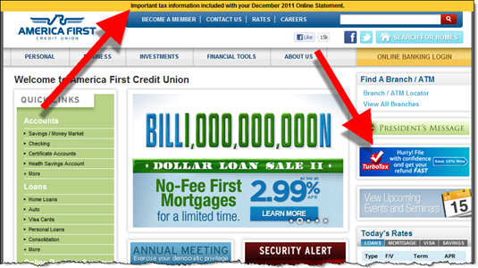
I liked the clever homepage graphic for its loan “billion dollar loan sale” (inset above). But what inspired this blog entry, was the credit union’s recognition that thousands of its members will be slogging through their Federal income tax returns this weekend (note 1).

America First put a prominent orange band across the top of its website (on all pages) reminding members where they could find 2011 tax info on their accounts (screenshot below). And like many financial institutions this time of year, the CU posted a link to TurboTax online for those needing last-minute assistance.

America First Credit Union homepage (13 April 2012)

image 

———–

Note: U.S. national income tax returns must be filed by April 17, 2012, by anyone in the country with any income last year. 

The Missing Tab at Banking Websites

image You can debate whether branches are dead or simply need a good pruning, but there is no argument about the importance of a well-designed website where prospective customers can learn about what you have to offer. 

Financial institutions do a good job showcasing products, rates, and available accounts. But shoppers, especially ones not already familiar with you, want to understand what it’s like to bank with you and whether you’ll be there for them if there’s a problem.

That’s something you can get a feel for when visiting a the brick-and-mortar branch. But try figuring that out online. Product info is everywhere, but what’s it REALLY like to bank there? 

So along with your usual product and line-of-business tabs, consider adding a tab on the primary navigation leading to a section highlighting the benefits of your bank or credit union. Many companies have an About page, but that’s often an afterthought and usually doesn’t make a strong case.

Here are two examples we found in a quick search, not coincidentally from web-only financial companies that don’t have the luxury of branch staff to explain their benefits:

  • Banking with Ally (first screenshot)
  • Get to know PayPal (second screenshot)  

Bottom line: It will be one of the more difficult sections to build. But also one of the more important.

—————————

Ally Bank “Banking with Ally” (see screenshot below):

 image


PayPal “Get to Know PayPal” (15 March 2012)

image