BankSimple Provides Sneak Peek of User Interface on iPad App

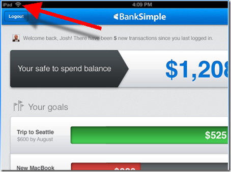
imageThe bank that everyone’s talking about, and no one is using, finally released a few peeks at its user interface. Based on these screenshots posted on the bank’s homepage (see last screenshot), it looks like a killer iPad app (note iPad logo in upper left of first screenshot).

image The startup also unveiled a new logo, moving from the trendy gray/red (left) to a bolder font in a very bank-like and comforting blue.
Finally, the startup has purchased the .com version of their URL, an important, albeit expensive, pre-launch move. Currently, banksimple.com redirects to the old .net version.

Screenshots

1. Safe-to-spend balance appears to incorporate future scheduled payments and displays goals to help users keep the bigger picture in mind, rather than spending the $1,208 on drinks and dinner out.

image

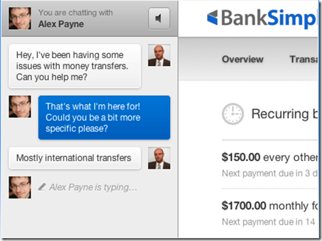
2. The bank’s customer service focus illustrated in chat screen with co-founder Alex Payne. On the right you can get a glimpse of the transaction flow.

image

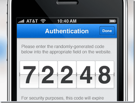
3. My favorite screenshot. It indicates the bank will use out-of-band authentication, a must-have these days. It also demonstrates that BankSimple is really thinking through the UI. Instead of tiny little digits requiring reading glasses, the bank provides the 5-digit code in big, bold numbers. They are also rendered in an attractive flipboard style.

image

———————

Note: HT to Keith Caswell @kthcswll for the tip.

PNC Virtual Wallet Redefines the Online Banking User Experience

image I have been using my new PNC Virtual Wallet account for a week now (previous coverage of the application process). The account takes a novel approach to core online banking and money management. Honestly, the user experience is so different, I’m still digesting it.

I think I love it, but I want to make sure it’s not just the novelty I’m attracted to. And that it really makes sense for users to interact with their bank accounts this way. I cover the PFM/OFM features in the most recent Online Banking Report and will publish a complete analysis in the future. But <spoiler alert>, I’ll reveal the account’s secret now.

Calendar view.

PNC did not invent the calendar approach to tracking finances. Most of the OFM/PFMs and online banking platforms we’ve had on stage in Finovate during the past three years, eg. Mint, Fiserv, Metavante, Intuit and others, have it. 

But Virtual Wallet (VW) defaults to calendar view. And they don’t let you change that. If you are a VW user, you will be managing your finances in calendar-flow mode. The designers took a risk here, but I think it pays off. They are targeting younger users, who have not grown up viewing reverse-chronological transaction lists, so why not train them from the get-go in how to manage the past, present, and future on a single page.

The first time you log in, the software asks when you get paid so it can add those happy events to your cash-flow calendar. Then as soon as you start making transactions they show up on the calendar along with your current balance in a blue bar at the top of each date (see screenshot below). Also, future events such as bill payments, are shown on the appropriate day to keep you from overdrawing your account.

It’s a good way to see what’s happening. But it also seems like a little more work. Like I said, I’m still evaluating the user experience tradeoffs here.

image

The Pig
image As much as I enjoy exploring the big-picture ramifications of this new user experience, the real reason I finally opened a VW account is for the pig. Maybe it’s the Iowa boy in me, but I’m a sucker for pigs.

VW has a cute feature, admittedly aimed at somewhat younger customer than your typical banking industry analyst, that allows you to make a checking-to-savings transfer by punching the pig graphic at the top of the screen (note 2). And the oinking sound, followed by a the cash register, kaching, punctuates the transfer perfectly.

But it was a little annoying to have to confirm each punch with a popup window asking if I really did want to send $1 to my savings account (see note 1). How about just building an undo button to protect those who get a little carried away clicking that little oinker (see the pig in the upper right in screenshot).  

Notes
1. Users can change the default transfer amount so that punches are equal to more than $1. 
2. Users can customize the look and sounds their pig makes. I switched mine to an orange flame motif, which I’m not sure my farming ancestors would approve of.
3. We awarded PNC’s Virtual Wallet with an OBR Best of the Web in our recap of the most important innovations of 2008 (OBR here).
4. For more on adding appropriate online financial management (OFM) features to your online banking offering, see our latest OBR published just yesterday: Online Financial Management 3.0.

What is Bank Simple?

image There’s a new “banking entity” in formation, Brooklyn, NY-based Bank Simple operating (temporarily I assume) at the .net version of its name <banksimple.net>. I chatted with the founders, Josh Reich and Shamir Karkal earlier this year and am anxiously awaiting more info on the launch.

From reading its trademark application, website, and blog, I have a feeling Bank Simple will launch as a banking front-end (eg. Mint, Obopay), and not as an actual bank. Given the market’s (and Washington’s) appetite for startup banks right now, they may have little choice. But who knows where they go from there. It sounds like they want tight control over the user experience, so they may eventually need to be a bank.

But from their FAQs and a few tidbits found through deep Googling, it sounds like Bank Simple will be much more than web-based software. Initially, it is launching a card-based service with combined debit/credit and rewards built in (de-coupled debit again?). Here’s what they say in the About section:

We will launch later this year with a simple card with in built checking, savings, rewards and a line of credit. As we add more competitive banking services, you can personalize your features as your needs change.

Bank Simple talks about customer service (answering the phone), taking deposits by mail (and this is a rumor, by mobile remote deposit) and other traditional banking activities. So that is much more than an online PFM (can we agree to call that OFM?).

They made the tech press this week when they added a new co-founder, Alex Payne, one of early engineers at Twitter. So expect streaming information, ala Blippy and Swipely, and social networking to be a crucial part of the mix.

The startup is looking for summer marketing interns, but there are no permanent jobs posted, another reason to believe they will not be operating a full-blown bank in the near term.

It sounds like a good plan. Marry the utility of PayPal with user experience of ING Direct. Throw in a little Mint-like design and some Twitter hype, and it’s a VC’s dream. 

Bank Simple’s pre-launch placeholder homepage (18 May 2010)
Note: Site is in closed beta, request an invitation through the “join” button

image

Note: In Online Banking Report, we have written about creating a virtual bank, sans the charter, several times in the past 15 years. The most recent full report was in Oct. 2000, Creating the Amazon.com of Financial Services. But we updated the tables (now called Creating the Facebook of Financial Services) last year in our 2010 Planning Guide.

U.S. Bank Previews Website Redesign

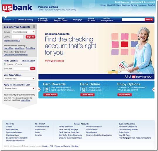
image Although U.S. Bank has long held a state-of-the-art online banking design, its homepage and public website haven’t kept up with modern standards. From the looks of the preview unveiled earlier this week, that will change when the bank rolls out on Friday a major site redesign.

The bank is wisely inviting online banking customers to take an advance peek at the new site. I learned about it Monday via a splash screen after logging in to online banking (see first screenshot below). The preview is also featured in the upper-left of the current homepage (see second screenshot below).

U.S. Bank is one of the last big banks still using a homepage dominated by a list of products and services. Presumably, the bank will move to flyout menus on the tabs across the top of the page (see third screenshot). Another expected improvement: liquid display.  

For existing online banking customers, the biggest change is the repositioning of the login box from the middle-right to the upper-left, the industry standard.

Lessons: It’s important to give online customers advance notice of login changes so they  don’t think they’ve arrived at a fake site. In fact, I think U.S. Bank should have gone further and simply included the preview in the splash page so everyone was forced to see it. Or at least the bank should have a prominent link to the preview within online banking. As it stands now, once you skip past the splash screen, there is no way back to look at the redesign (other than going to the homepage).    

Login interstitial ad announcing the coming redesign (12 April 2010)

image

Before: current site
Notes:
1. Upper-left announcement of coming site redesign, with link to preview shown above
2. Login box placed in non-standard location mid-page on the right

image

After: Preview of new site design coming April 16 (link)

image

Little Things Matter: Holiday Hours at the Top of Mercantile Bank of Michigan’s Homepage

Every year at this time, I poke around the financial Web looking for holiday themes. While Mercantile Bank of Michigan hasn’t posted a virtual Santa snow globe, it’s done something more useful: posted holiday hours on the top of its homepage. The bank should also note its telephone and online support hours, if different. 

Mercantile Bank of Michigan homepage (22 Dec. 2009, 2 PM Pacific)

image

The Missing Link for Small Businesses: Banking, Finance & CRM Dashboard

I finally finished our latest report on small business online banking last night. Just as I was about to upload it, I realized there was something missing in the “dream online banking solution” for small businesses.

So I stopped the “presses” and added it to the report. What was the missing piece? A financial and business management dashboard integrated with online banking.

I poked around the web today and found a few interesting products (see update below), none of which were quite what I was looking for, and had no direct connection to financial institutions:

  • image MyBizHomepage has a dashboard that integrates with QuickBooks and sounds pretty slick. But there website hasn’t been updated for more than a year, so not sure if this is a viable business or just a hobby site. I have an inquiry in to the owner.
  • image DreamFactory Software also offers QuickBooks-integrated dashboards. I found it in the new Intuit App Center for QuickBooks add-ins (here). It’s a powerful program, but not the kind of plug-and-play dashboard I’m looking for.
  • image iDashboards: Has impressive sample dashboards to view. None integrate directly with online banking, but many include financial data (see screenshot below).

So I’m still looking for financial institution examples. Know any? Comment below or email me. It’s too late to make our report, but we’ll report it here.

iDashboards mockup of a healthcare “billing scorecard” (link, 28 Oct 2009)

image 

Update (29 Oct 2009):

Here’s another QuickBooks dashboard from QuickGauge.com:

image

Cascade Bank Has a Business Banker Directory on its Website

image Isn’t business banking supposed to be all about the people? Then why don’t financial institutions use their websites to publicize their business banking talent? None of the several dozen business banking sites I recently reviewed allows prospective business clients to connect with an actual human being in advance of calling or emailing a general number for more info.

The only bank I’m aware of that actually puts its business bankers on its website is Cascade Bank headquartered in Everett, WA, a few miles north of Seattle. The bank has posted the following info for years (see screenshot below):

  • Headshot
  • Name, title, location
  • Short mission statement/bio (note 1)
  • Phone number and email address

That’s a respectable start. But with today’s virtually free Web-based tools such as Twitter, blogs, and Linked:In (note 2), every business banker should have their own online presence. Sure, the bank or credit union will need to provide guidance and oversight, but it’s not like these sales folks don’t know how to put their best foot forward.

Cascade Bank Commercial Banker Directory (link, 20 Oct 2009)

image 

Notes:
1. Unfortunately, the bio area is blank for 3 of the 12 business bankers listed. That looks pretty bad, especially with 2 of the first 3 blank. Come on Lar, Cynthia and Patrick, get those bios over to marketing ASAP.
2. Those Cascade listings would look much more impressive with Linked:in links by each name.

Mobile Banking Awareness at Financial Institutions: The Grades Are In

image Two days ago (here), I wrote about Citibank’s smartphone banking awareness campaign on its homepage. Coincidentally, ABI Research yesterday published a rating of 17 U.S. major retail banks plus a dozen community banks (see note 1) on “discoverability” and “accessibility” of their mobile banking services (press release).

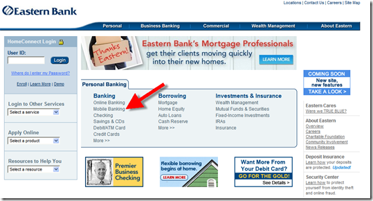
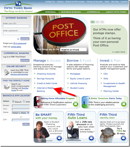
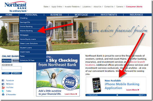
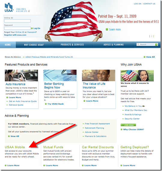
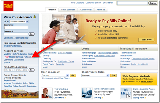
Surprisingly, ABI rated Citibank “average.” I’m not sure what Citi did wrong (note 2) to get a “C,” but one common technique of all ABI’s A-students (see table below), is a “mobile banking” link on the homepage (see screenshots below).

Observations:

  • Wells Fargo is the only bank to publicize a short mobile URL, wf.com (see final screenshot)
  • USAA is the only one of the six with an iPhone-optimized page rendered for users visiting its regular URL (see note 3) from the iPhone browser; this would be a minimal requirement for an A on our scorecard (if we were to make one)
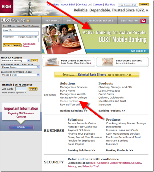
  • Two of the six A-rated banks, BB&T and Northeast Bank, were also rotating a mobile banner ad on the homepage (see screenshots below).

Here are the ABI Research ratings:

Grade Bank Names
A BB&T, Eastern Bank, Fifth Third Bank, Northeast Bank, USAA, Wells Fargo
  B+ Bank of America, Chase Bank
B Capital One, US Bank, Huntington Bank
C America First, Bancorp South, Citibank, PNC, Wachovia
D Carolina First, 1st Bank, IBC Bank, Mercantile Bank, Regions Bank, SunTrust, Synovus
F M&T Bank, Provident Bank

The A students (all screenshots from 10 Sep 2009)

BB&T

image

Eastern Bank

image

Fifth Third Bank

image

Northeast Bank

image

USAA

image

Wells Fargo

image

image Notes:
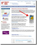
1. Another community bank with great mobile awareness is Farmers State Bank (click on inset right for a larger screenshot). Thanks to Laurie Goodlock at the bank for the tip.
2. We’ve requested the full report.
3. wf.com visitors also see a mobile-optimized site in their iPhone browser
4. Reference: Online Banking Report on Mobile Banking (Feb 2007) and Online Banking Report: Mobile Banking via iPhone (Mar 2009)

Mobile Awareness: Let Your Customers Know They Can Bank Online via Smartphone Now

image Yesterday, Apple announced it has shipped 50 million iPhone/iPod Touches in the past two years. And they are not even the smartphone leader. You can bet that many (most?) new smartphone-owning-online-banking-using customers haven’t a clue how to connect to their financial institution through their mobile. And even if they know how, there’s still that nagging doubt as to whether it’s a safe/smart thing to do.

Therefore, if you want to drive significant mobile usage, there are a number of steps to take (see note 1). But one of the most important is user education, especially through online information, screenshots, and demos. 

Citibank recently elevated general smartphone awareness to its homepage (see first screenshot below). Yesterday, the bank was rotating an “Introducing CitiMobile for Smartphone” banner across the top of the homepage. The banner led to an educational page (see second screenshot, note 2), that led to clear instructions on how to bank via a mobile browser:

  • Open browser
  • Go to citi.com (note 3)
  • Log in using your same online banking credentials

While brevity is admirable, I think customers need a little more info than that. For a non-user, the process sounds almost too good to be true. The bank should elaborate on some key questions such as:

  • Is it secure? (see update below)
  • What does it cost?
  • Does it work on my phone?
  • What if I lose my phone?

Luckily, interested users can go to the well-designed demo that takes users through a semi-guided tour of the mobile banking functions. The Flash-based demo is partially interactive, allowing users to click buttons on a smartphone emulator (see third screenshot). After clicking on a new function, the demo takes over, completing the data entry and going forward to the next screen. Check it out here

Update (22 Sep 2009): An email from a Citi Mobile employee pointed out that I missed the security and other info in the right-hand column of the landing page below. I apologize for the omission. 

Citibank homepage (9 Sep 09)

image

Citi Mobile for Smartphones landing page (link)

image

Citibank mobile demo with interactive emulator

image

imageNotes:
1. For more info, see Online Banking Report on Mobile Banking (Feb 2007) and Online Banking Report: Mobile Banking via iPhone (Mar 2009)
2. The bank has separate pages for: Citi Mobile for iPhone and Citi Mobile for Other Models
3. Citi still has some work to do on optimizing the mobile Web experience (see update below). I navigated via my iPhone to its homepage (see inset) which looks terrible: The page is rendered impossibly tiny (requiring finger zooming), and because the two Flash-based animations don’t work on iPhones, the top of the page is dominated by two empty boxes.

Update (22 Sep 2009): The site is now rendering perfectly on my iPhone. I see a mobile-optimized site similar to the Citi iPhone app. I’m not sure what was going on Sep 10 when I took this screenshot. It’s possible I got the wrong page by navigating to Citi through the Google app. 

American Express "Take Charge" Campaign Launches with Powerful Full-Page Ads but Weak Online Support

imageEvidently, there is still a disconnect between the print and online advertising groups at major advertisers.

Case in point: American Express kicked off a new campaign (press release) with an impressive full-page ad (p. A9) in Tuesday’s WSJ (see inset) and other print media (note 1). It was a timely ad, playing on money fears and overall security concerns. It concluded with the company’s new tagline:

Don’t Take Chances. Take Charge.

The call-to-action uses a new URL <takecharge.com> that leads to a new microsite (see second screenshot below). Wanting to look at it, I did what I always do, typed “take charge” into Google. Nothing (see first screenshot). I even Binged it. Again, nothing. Searches at Twitter and Facebook also came up empty. Even at American Express’s own website, site-search results do not include the microsite (note 2).

It’s hard to understand why AmEx would spend millions on a new campaign and microsite without Google AdWords support to help people find it, at least until the microsite starts appearing on the first page of search results (note 3).

But after looking at the Take Charge microsite, I can see why the company might not be ready to direct search traffic there. The site is a good example of what NOT to do. The Flash-based site is slow-loading (note 4) and sparsely filled with ten testimonial videos (notes 5, 6), a list of seven benefits for using a charge card, and a couple links out to the main AmEx site.

So far, the microsite looks like a pure branding play. There’s little there that would motivate someone to apply for a card on the spot. But with millions being spent on other media using that URL, it seems like a wasted opportunity, so far. It will be interesting to watch it evolve.

Google search results for “take charge” (9:30 AM Pacific, 1 Sep 2009 from Seattle IP address)

 image

AmEx Take Charge microsite (1 Sep 2009)

image

Notes:
1. Here’s the initial media buy according to the company’s press release:

The marketing campaign launches (Sep. 1) with print advertisements in national newspapers, including The Wall Street Journal, The New York Times, and USA Today. On September 2, print advertisements will run in major regional newspapers, including Boston Globe, New York Post, Los Angeles Times, San Francisco Chronicle and the Chicago Tribune. Television advertising will begin to air on major broadcast and cable stations such as CBS, FOX, NBC, TNT, A&E and the Discovery Channel breaking during the U.S. Open on September 5.

2. The search results do provide relevant links, just not to the microsite.
3. I haven’t tested it on other computers, but AmEx’s TakeCharge.com site just about brings my 3-year-old Thinkpad to a grinding halt. It’s not a good first impression. The company either needs more server bandwidth or a less demanding page, or preferably both. There should also be a link to a lower-bandwidth version.
4. Currently, the AmEx site does not come up within the first 10 pages. There’s also a remote possibility that Google won’t let AmEx use “take charge” in search ads due to the similar-sounding TakeCharge Financial. But I have to think AmEx lawyers have worked through that issue already. 
5. There are small “apply now” links displayed at the end of each video.
6. Once it loads, the site is visually interesting (see screenshot above).

PNC Bank Does a Great Job Packaging Business Banking Benefits into its CFO Account, but Misses Mobile

imageToo often we don’t give online business banking the coverage it deserves, both here and in Online Banking Report (note 1). Online services can be far more valuable for a business customer than for the average consumer. But consumer services, with bigger advertising budgets and much more press coverage, tend to be more visible when we search for examples of financial innovations.  

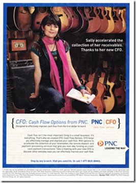
image That’s why I was especially intrigued with the PNC Bank ad in the Aug/Sep issue of BusinessWeek SmallBiz magazine. Not only had PNC Bank shelled out for a full-page ad (p. 20, see inset; note 2), the creative was interesting and included a tease for the CFO product combined with easy-to-recall URL <pnc.com/cfo>.  

The new account, cleverly dubbed PNC|CFO, an acronym for Cash Flow Options, covers all the major headaches of business owners:

  • Accelerate accounts receivable
  • Improve your outgoing payments
  • Invest your cash wisely
  • Access information online
  • Ensure access to cash (note 3)

Analysis
Naturally, I was most interested in the second-to-last bullet, online information. The audio-visual online banking demo is thorough, but surprisingly neglects mobile banking services. The only mention of mobile banking is at the end of the last paragraph on the online banking landing page. With business owners increasingly tethered to their businesses via Blackberry or iPhone, mobile capabilities should be front-and-center. 

The other thing missing from the web-based marketing: a human connection. The main call-to-action is the big orange Contact Request button (see screenshot below). Presumably a biz banker will quickly get on the horn and make that connection. However, the bank should make it clear that they have a bevy of qualified bankers available to usher new clients into the CFO account.

Simply changing the button to Contact a Business Banker would be an improvement. But I’d also like to see a bullet point that talks about customer  service. The only thing I saw was a few generic screenshots in the online demo which talked about responding to most questions “within 24 hours.” That doesn’t make the reader feel particularly special.

Finally, a small rant about the bank’s contact form. I received error messages the first three times I attempted to submit it. Evidently, commas are not allowed in the company name or address fields. That not good programming and creates a needless poor first impression. There’s is also no space in the form for comments from prospective customers. PNC Bank has been on the web for 14 years, it should have flawless forms (note 4).

Grade: Overall, I really like what PNC is doing so I’ll give the marketing site an A for design and B- for execution.

Landing page for PNC’s Cash Flow Options service (link, 19 Aug 2009)

image

PNC new account “contact me” form with error message

image

Notes:
1. Our last report on Online Small Business Banking is available here (June 2004).
2. Key Bank (p. 9) and Bank of America (p. 29) also bought full pagers.
3. The bank is referring to credit lines and loans; I’m not sure why they didn’t state that more clearly. Access to cash sounds more like a checking account feature.
4. While I’m at it, here are a few more minor flaws: (a) Even though I made two errors in the form, the error message only identified the first one; (b) When an error is made, the form automatically clears the checks in the bottom column of boxes; (c) The bank has neglected to turn off auto-fill (at least in Firefox 3.0) in the “confirm your email” field.