Out of the inbox: Great call-to-action from E*Trade, “Re-Plan your Retirement”

imageOver the years, E*Trade has been consistently innovative in both product development and marketing, two areas that provide natural synergies. The company didn’t disappoint with its latest missive to existing customers. 

An email arrived yesterday afternoon (Thurs., 11 June 2009) and immediately grabbed my attention with its clever and timely subject line:

Re-plan Your Retirement with E*TRADE and Get Up to $500

Analysis
One thing I’ve heard consistently from my friends, no matter how secure their jobs, is that they will “be working forever” now that the Great Recession has slammed their net worth with the double whammy of a bear market and home-price declines.

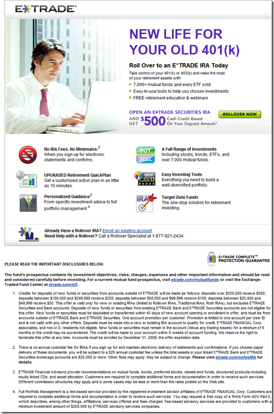
So this is a great time to get in front of customers with new efforts to help them re-plan retirement with new investment ideas, asset rebalancing and just a general reboot of their portfolio. And it’s also an excellent time to discuss 401(k) rollovers, as E*Trade did in this message, with an “up to $500” (see note 1) incentive to roll over a retirement account to the company (see landing page, third screenshot below). As Americans change jobs by necessity, there will be millions of retirement accounts in play. 

Security features in email
E*Trade also demonstrates another best practice to improve trust in customer emails: personalization. The company includes customer name and last four digits of their account number to help distinguish the message from fraudulent phishing attempts. E*Trade draws attention to the feature with a Security Enhanced icon on the top-right (see first screenshot below).

Clicking on the Learn More link drops readers to the bottom of the email message where product URLs provide direct-navigation alternatives to paranoid readers (see second screenshot below). I hadn’t seen that before, a nice touch.

E*Trade email promoting 401(k) rollovers (received 11 June, 3 PM Pacific)

image

Security “fine print” at bottom of above message

image

Landing page for email offer (link)

image 
Note:
1. Detail on the rebate:

  • $500 for rollovers of $250,000 or more
  • $250 for $100,000 to $250,000
  • $100 for $50,000 to $100,000
  • $50 for $25,000 to $50,000

Out of the Inbox: U.S. Bank Pushes E-statements with "Go Green with Online Statements"

imageOn Friday, I received a marketing message from U.S. Bank attempting to convince me to turn off my paper statements and adopt online statements. In 2007 (here), I wrote about its similar effort at login. 

The graphic design and layout are wonderful with splashes of green throughout and a peaceful, sunny forest scene. It’s a nice bit of branding for the bank. So far, so good.

However, in terms of direct-marketing effectiveness, where the goal is to get the reader to take action, the message leaves a lot to be desired.

Turning off your paper statement is a relatively major change in behavior (previous post), so readers need clear information and/or incentives to move to less-costly paperless delivery. This message is lacking in both.

Benefit statements
Here are the supposed user benefits touted in the email:

Online statements help you:

– Deter fraud
– Reduce clutter
– Manage accounts
– Get real-time updates

Let’s look at the benefits from the standpoint of the end-user:

  • Deter fraud: Can the average reader make the leap to how online statements will cut down on fraud? I doubt it. This bullet point needs more detail.
  • Reduce clutter: This is pretty self explanatory. But do people really think of their monthly bank statement as “clutter.” Some do, but it’s not a particularly compelling argument.
  • Manage accounts: This wording leaves a lot to be desired. How does turning off your paper statements help you manage your accounts better? Presumably, those who sign up for online statements have more info available online. If that’s the case, the bank needs to say so.
  • Get real-time updates: What do online statements have to do with real-time updates?  This is probably meant as a generic benefit for banking online, but it’s out of place here.

On the other hand the environmental benefits are much more tangible. However, for the cynical reader (and there are a LOT of cynical bank customers these days), there should be footnotes explaining the derivation or source of the green benefits. For example, at the bottom of the message there’s prominent claim:

Save nearly 7 pounds of paper yearly by Going Green.

That sounds impressive, but if you think about, it doesn’t jive with experience. Unless you get your checks back, most statements come in at under an ounce. And that includes a significant amount of bank advertising flyers. So how do we get from 12 ounces saved annually to the 7 lbs cited in the email? Readers will never know because there is no additional info available to substantiate the claim. You would think the bank would explain the claims on the landing page, but it has even less info (see below).

Call to action/incentives
The message includes tangible, albeit unsubstantiated, environmental benefits which are compelling. However, customers know that all these benefits spell significant cost savings for the financial institution. For some customers, especially of  member-owned credit unions, that may be enough to get them to take action.

However, many customers are going to feel this is a pretty one-sided deal. If they are going to give up the comfort of their paper statements, there should be something in it for them.

That’s why we recommend an incentive of some sort. It could be a periodic giveaway, a one-time thank-you gift ($5 at Amazon), or an extra online benefit they wouldn’t otherwise get, such as long-term archives, premium customer service or a free-overdraft card. For example, Key Bank offered a low-cost and effective incentive in the fall (post here). Chase had an even better promotion in 2007 (post here).

Landing page
Granted, there isn’t much room in a one-page HTML message. So it’s understandable that the benefits are abbreviated. Usually, a marketer will use the landing page to expand on the key features and benefits. However, U.S. Bank’s landing page offers little additional help (see screenshot below).

The page doesn’t connect back to the email in any meaningful way. Benefits are neither reiterated, nor explained. Within the page, a brief explanation tells how to enroll, but surprisingly the Enroll Today link on the right has nothing to do with estatements and leads to a page explaining online access options.

Grades

  • Design: A
  • Copywriting: B+
  • Content: C+ (could be A- if benefits were explained on the landing page or FAQ)
  • Landing page: D
  • Overall effectiveness: A- for brand building; C- for driving estatement enrollment

U.S. Bank email marketing message, “Go Green with Online Statements” (23 Jan. 2009)

image

image

U.S. Bank landing page for online statements (link, 27 Jan. 2009)

image

Note: See our Online Banking Report on Email Marketing and Online Banking Report on Emessaging & Statements for more information.

Out of the Inbox: Virgin Money’s Thanksgiving Fundraiser "Pass the Thanks"

image While the SmartMoney example below is simple and inexpensive, it won’t win any marketing awards or new customers. Virgin Money USA, on the other hand, could do both with its clever Thanksgiving email (sent the Friday before) to registered users (see below).

The message from Virgin has a dual purpose:

  1. Holiday well wishes if you simply read the header or glance at the message
  2. Viral fundraiser and user-generated content device if you follow the link labeled, click the sauce to pass the thanks

Sauce clickers are sent to a landing page (see second screenshot below) that encourages them to send their own Thanksgiving greeting to friends. The greeting includes a short message superimposed on an uploaded picture. The company donates $1 to Give a Drop for every message sent and posted 200 of the well wishes on a Picasa Web-album page (here) which are streamed back to the original microsite (second screenshot).

And of course, it wouldn’t be a Virgin production without an irreverent component. Users can choose whether their cranberry sauce is canned (pictured) or homemade.

The Pass the Thanks campaign was also featured on the company’s homepage during the Thanksgiving time period (see third screenshot below).

Grade: A+ for simultaneously engaging customers, doing good, and creating a viral marketing message

Virgin Money USA Thanksgiving email message (21 Nov 2008)

image

Virgin Money USA Thanksgiving landing page (link, 2 Dec 2008)

image

Virgin Money USA homepage (2 Dec 2008)

image

Note:
1. For more on Virgin Money and peer-to-peer lending, see our Online Banking Report on P2P Lending

American Express Plum Card Update

As promised in its teaser print buy, American Express delivered my Plum Card invitation in the wee hours Monday morning (2:06 AM Pacific time, see screenshot below). The message, with my first and last name in the salutation, was short and sweet and directed me back to the main website to apply at <plumcard.com>.

It's all first class work, but the generic call-to-action surprised me a bit since I'd put my name on the "wait list" last week (see post here). I expected a more personalized invitation and link. The website doesn't appear to recognize me either (see screenshot below).

Email Invitation (1 Nov 2007)

American Express email invite for Plum Card 

Plum Card homepage (5 Nov. 2007)

American Express Plum Card homepage

E-Mailbag: InsWeb Auto Insurance

Personalization of the subject line is less common in financial services marketing. Although the technique doesn't guarantee a response lift, it's a good variable to test (note 1).

InsWeb encourages customers to review their insurance coverage every six months with an eight-minute survey that begins within the body of the email.

The company creates interest by claiming a $301 average savings on a six-month policy. If accurate, it's a great ROI on the eight minutes required to complete the online form. It would be interesting to see a bank or credit union use this technique to market other financial services, such as deposits or home equity loans.

Email Characteristics

Date: Mon. 8 Oct, 2007

Time: 3:02 PM Pacific

Subject: Bruene Auto Insurance Review

From: InsWeb Customer Care InsWeb@mailer.insweb.com

To: jim@netbanker.com

Personalization: Subject line

Full Message

 Landing Page 

Note:

1. See our Online Banking Report on Email Marketing.

E-Mailbag: Everbank Addresses Falling Rates with Three Deposit Options

With the personal finance news full of reports of falling deposit rates, EverBank strikes back with an eye-catching email overview of its high-yield deposit choices:

  • Yield Pledge Money Market
  • Yield Pledge CDs
  • FreeNet Checking

The bank's yield pledge, to always offer a rate in the top 5% nationwide, helps take the customer's mind off the actual rate itself, which may not be as high as they'd like (see screenshot below). Not that EverBank isn't competitive on rates. The bank still offers 5% APY's in a number of key deposit products including its Money Market account and most CDs. And it sweetens the pot for new customers with 3-month introductory rates of 6%.

Analysis
Nicely done email with an appropriate, and eye-catching graphic, to-the-point copy, personalization, the yield pledge, and links to all the right places.  

Grade: A

Email header 

Sent: Tue 9/25/2007 2:04 PM
From: EverBank News [service@everbank.com]
To: <your email address>
Subject: 3 high-yield accounts – to fit your style

Personalization: First name in salutation

Email body

Everbank’s Latest Multi-Currency CD: World Energy Index

Some companies are so innovative, you take them for granted. Five that come to mind, in no particular order:

  • Yodlee: account aggregation, credit card-based bill payment, mobile banking
  • Vancity (Canada): microcredit, green banking, blogging, community involvement
  • Wells Fargo: simple expense tracker, blogging, Second Life
  • PayPal: email-based payments, confirmation via twin deposits, integration into eBay (before it was part of eBay)
  • Prosper: Social lending, open API to most of its aggregated data, groups, auction style, Facebook app (game)

These companies are all relatively famous, but one that doesn't get nearly as much press, but has long pushed forward on a number of fronts is Everbank. From its website design (here), product marketing (here), to its foreign-currency certificates of deposit (here), the Jacksonville, FL-based bank continues to shine in an increasingly crowded online space (all previous coverage here). 

My inspiration for this post (see note) was the bank's marketing email today announcing its World Energy Index CD, a multi-currency certificate pegged to the currency of four western countries with better-than-average energy resources: Norway, Canada, UK, and Australia. I have no idea if this CD is a good investment, but I do know that Everbank has proven that even the narrowest niches can be profitable using the reach of the Internet.

Everbank Email

Header:
   Date/Time received: July 17, 4:07 PM (Pacific)
   From: Everbank News [service@everbank.com]
   To: James [jim@netbanker.com]
   Title: A new CD with a powerful combination – energy and currencies

Customer type: Current checking account customer

Personalization: First name in salutation

Landing page: none (homepage link only) 

Other offer: Third-party investment newsletter offer (link on right-hand side goes directly to newsletter publisher, Agora Financial Publications, landing page here)

Note: I have had an account for ten years at Everbank. Therefore, I see more of their marketing material and tend to write about them more frequently.

Mobile Identity Theft Protection from Intersections

This week, I took a two-day break from writing the next issue of Online Banking Report, an update to our popular report on Credit Bureau Monitoring and Identity Fraud Protection (2002 report here), to attend the Mobile Commerce Summit

Much to my surprise, an email received today nicely integrates those two topics. The offer sent was sent with the subject, "Mobile Identity Theft Protection," and it came from WireFly an online wireless reseller where I'd previously purchased a Blackberry.   

Very interested to see the mobile connection, I looked at the full message (below), a well-crafted offer for Identity Guard services from Intersections. The seemingly to-good-to-be-true offer: a full year of credit monitoring, with SMS alerts, free of charge.

Apparently, Intersections, like PayPal and SunTrust, is using free credit report monitoring as an introduction to its full-service credit report and ID theft protection services. It's an aggressive move that has repercussions for the industry. We'll look at its strategy in detail in the new report to be published in July.

Email offer from Wirefly for mobile identity theft protection

Email: Bank of America’s "Ring in the New Year" Credit Card Balance

Here's a timely email from Bank of America, inviting its credit card customers to start the year off with a 3.99% balance-transfer offer. But the savings won't last long, since the rate resets after August 2007.

Here are the specs:

  • Subject: Use your Bank of America® credit card today.
  • From: Bank of America [BankofAmerica@loyaltyemail.bankofamerica.com]
  • To: jim@netbanker.com
  • Product type: Credit card balance transfer
  • Offer: 3.99% through August 2007 (cash advance fee NOT waived)
  • Customer type: Mailed to current credit card customers
  • Personalization: Full name and last 4 digits of account number

Screenshots:

Email body


Bank of America email with 3.99% credit card balance transfer CLICK TO ENLARGE

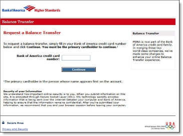
Landing page

Bank of America landing page from credit card email CLICK TO ENLARGE

Boeing Employees Credit Union Email: "BECU Gift Cards Make the Perfect Holiday Gift"

Boeing Employees Credit Union <becu.org> starts the holiday shopping season off with an email pitch for its prepaid MasterCard gift card. At $2.50 each, they are a bit less expensive than one hanging in Safeway for $4.95. However, the CU neglected to disclose dormant account fees, a significant issue with consumer advocates.

It's too bad you can't order the cards online. Ideally, members should be able to order with a single click (or two) right from within the online banking function. Maybe next year.

Screenshot (click to enlarge)

Boeing Employees Credit Union (BECU) email CLICK TO ENLARGE

Classification

Type: Marketing email for prepaid debit
Product: Prepaid debit cash card (MasterCard)
Offer: None (cost is $2.50 plus the cash value)
Customer Type: Sent to nonmembers
Personalization: None
Links: None
Call to action: Toll-free phone, branch

Header

Date received: Tues 11/28/2006 6:08 AM
From: BECU [reply27974@enews.becu.org]
To: Jim Bruene
Subject: BECU Gift Cards Make the Perfect Holiday Gift

Comments

  • Even if gift cards cannot be ordered online, the credit union should include a link or URL for more information. Since many email recipients will automatically go to BECU's website to purchase, it would be helpful to specifically mention the cards cannot be ordered online, and why.
  • The opt-out and CAN-SPAM disclosures could be better designed.
  • Add disclosures for any monthly fees that kick in if the value is not used by a certain date.

Chase Fails to Design Email for Outlook’s Preview Pane

More than 70% of business-email users view most or all of their email messages in the preview pane.* Depending on screen size, resolution, and window sizing, the real estate available in the preview pane can be relatively small.

When designing messages, be sure to put the most important information in the upper-left corner to maximize visibility in the preview pane.

Here is a poorly designed email Chase sent to confirm posting of a credit card payment. It requires users to scroll right to view Chase's logo and log-in button. Here's how it looks on my 12-inch laptop screen running at 1024 x 768:

What not to do from Chase:

Chase email alert

Better design from Bank of America graphics flush left:

Bank of America email alert CLICK TO ENLARGE

(Note: BofA shows the last four digits of your account number; we changed them to xxxx in the screenshot above.)

Action Items
Even though it's just a routing email message, the poor layout makes it look like a phishing message. Chase could clean this up with just a few minutes of programming work. While they are at it, they should add a personal greeting and additional text disclosures to make it look less phishy. 

*For more information, read our Online Banking Report #129/139, Email Marketing for Financial Services.