Bank of America Offering Trusteer’s Rapport Plug-in to Protect Online Banking Customers

image If there was any question as to whether Trusteer  had become the industry standard in online banking protection, it was answered this week. Bank of America is now offering the optional Rapport protection to its 29 million online banking customers. Ann Carrns in the NY Times Bucks blog wrote about it a week ago, but I guessed I missed it in all the April Fools Day commotion.

ING Direct was first to offer the program, launching in May 2008. Since then dozens of financial institutions have followed including Zions, PSECU, CIBC, PayPal, Santander, RBS and about 70 more (see full client list below in note 2).

In total, Trusteer says it’s been downloaded more than 20 million times.

Analysis: It’s a good move by Bank of America. While Rapport does not protect from all possible threats, it does seem to provide material improvements. The bank gets a double benefit: less fraud and improved perceptions from customers concerned about security.

The program is not without downsides, however. It requires a download and installation, though thankfully not a full reboot (see second screenshot). And like any software program, there are real and perceived compatibility and performance issues (see the comments on the NY Times blog entry).

Bank of America would be wise to make it easier for customers to find out more info on the program. There is only a tiny link buried at the bottom of the interstitial ad for more info. And that screen goes away after you press the download button.

Users who are surprised by the download warning, and even worried that they’ve been attacked by a virus, will find it difficult to find more info at that time. Rapport is not yet mentioned in the bank’s security area accessible from online banking. Only by going back to the public site and searching for “Rapport” was I able to find the page offering more info (third screenshot).

Many users are going to need more hand-holding and reassurances before they install the program (note 1). The bank could save itself, and its customers, from thousands of harried support calls, by adding a detailed a “how it works” tutorial integrated into the interstitial.

Bank of America interstitial ad after online banking login (7 April 2011, 2 PM):

Bank of America interstitial ad after online banking login

To use the service, users must download and run an executable file (Windows version below, there is also a Mac version)

To use Rapport, BofA users must download and run an executable file

Bank of America Trusteer Rapport info page (link)

Bank of America Trusteer Rapport info page

——————–

Notes:
1. For more info on Trusteer and other security topics, see Online Banking Report: New Security Techniques (Sep. 2008)
2. Trusteer financial clients (per company)

Self-Service: Bank of America’s MyFraudProtection Allows Online Review of Suspicious Card Transactions

imageThe reason bank call centers still field millions of calls from online banking customers is that most account problems cannot be solved online. It’s not that banks don’t have the technology or the business case, it’s just a priorities challenge. Effective self-service modules are time consuming to build, test and integrate, while employee and customer education pose an even bigger hurdle.

But slowly, as more and more consumers look to resolve issues with a mouse click or finger flick, financial institutions will add self-service troubleshooting wizards to online/mobile banking.

The latest example comes from Bank of America.

I’ve been a BofA cardholder for the better part of two decades, and every year spend an hour or so verifying flagged transactions via phone with bank-fraud reps. It’s an annoying, but necessary, part of making 50 to 100 charges every month for home and business. 

But my most recent experience was very different. When I went online to pay the bill, not realizing (but suspicious) that my card had been cut off, I was greeted with the following message underneath the card balance on the main Account Overview page (see screenshot 1):

Online access is not available for this account. Please go to
www.myfraudprotection.com and verify recent transactions. Or you may call
1-800-427-2449 for additional information.

_____________________________________________________________

How it works
______________________________________________________________________

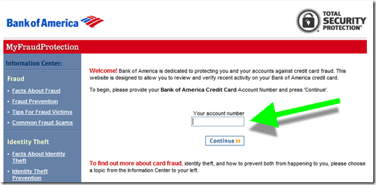
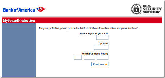
Step 1: Following the link, I ended up at an entirely new site, running outside online banking where I was required to re-enter my account number (screen 2), last 4 of SSN, Zip, and phone number (see screen 3).

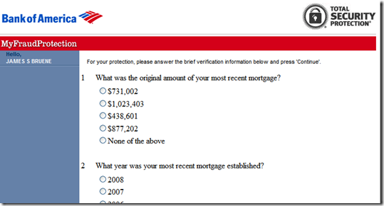
Step 2: I was then required to answer random questions pulled from the credit bureau to authenticate myself (screen 4).

Step 3: Finally, I was able to review and approve the transactions in question (screen 5). I was then thanked and told I could use my card again (screen 6).

However, after all this, I was still not able to pay my account online and had to call after all. The rep told me that it takes between two and 24 hours for online banking access to become available (note 1).

______________________________________________________________

Analysis
_______________________________________________________________________

All-in-all, I liked the system. However, it needs to be more integrated into online banking (see note 2). Given all the extra work required to authenticate myself, it would have been faster just to call the 800-number. If I were a normal customer, that’s what I’d do next time. I hate the stress of going through the authentication process: With everything on autopay, who can remember their exact payment amounts anymore?  

And worse, there is a security disconnect here. I log in to my credit card account only to be told it’s unavailable and that I should log in to some site I’ve never heard of (that doesn’t even have a Bank of America URL, note 3) and turn over personal info. It looks more like a crude phishing ploy than something from a major bank. And as far as I can recall, there was no customer education on this process.  

So, I applaud Bank of America for making transaction verification self-service. But there’s still much work to be done before it replaces the phone process. 

1. Main Bank of America Account Overview screen (14 Jan. 2011)

Main Bank of America Account Overview screen (14 Jan 2011)

 2. First screen at MyFraudProtection.com (link, note 2)Bank of America MyFraudProtection.com

3. Step 2 of 3 of authentication process

Step 2 at MyFraudProtection.com

4. Step 3 of 3 of authentication processimage

5. Transaction reviewimage

6. Confirmation message (and survey invitation)image

———————————-

Notes:
1. This was the weekend that BofA was having website trouble, so it may not always be delayed.
2. I realize the bank is using the fraud-protection site as a standalone system so it can direct any cardholder to it without first needing to log in to online banking, hence the authentication requirement. But for logged-in bofa.com users, it seems unnecessary. Although it does provide an extra measure of security, in case the cardholders’ online access had been breeched by the person attempting to use the card, that extra security comes at too high of a usability cost, in my opinion. 
3. The www.fraudprotection.com URL does redirect to myfraudprotection.bankofamerica.com, which helps.

2010 Saw 40-Fold Growth in the Number of Financial Institution iPhone Apps

image As hard as it is to believe, last year at this time only 30 financial institutions had apps in the U.S. iTunes App Store (note 1). And that was a full 18 months after Apple’s phone had opened its OS to third-party programs. A few in the industry still questioned whether smaller banks and credit unions would ever need a native iPhone app.

I think that question has been answered: In the past 12 months, the total financial institution app-count has rocketed upwards to more than 1,200, a 40-fold increase. That’s 100 new apps per month for the past 12 months.

In raw numbers, the past seven days have been relatively unremarkable with just 17 new FI apps. But it’s been one of the biggest weeks in terms of major launches:

  • BofA Merrill Lynch research library for iPad only (note 4; iTunes)
  • Capital One, whose app was released on Sunday, went to #5 Monday and is up to #4 when I checked a few minutes ago (see inset; note 2; iTunes)
  • NetSpend (iTunes)
  • Schwab, both v1 of its iPhone app (iTunes) and an iPad version of its On Investing magazine (iTunes)
  • SmartyPig (pending Apple approval)
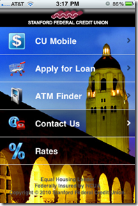
  • Stanford Federal Credit Union, which used a striking background for its app home page (see below; iTunes)

imageAnd while it’s not nearly as crucial as the iPhone, we are waiting for a slew of iPad apps. Apparently, BBVA Compass demo’ed a cool unreleased iPad app at a mobile conference (note 4). And just today, Schwab released its monthly magazine in iPad format, an industry first.

——–

Notes:
1. See Online Banking Report #176, Table 18 (link subscription required)
2. Rank is of free apps in the Finance category in the U.S. store. The apps above it are #1 Bank of America, #2 Chase, #3 PayPal
3. HT David Eads in Mobile Manifesto
4. At the same conference as note 3, Bank of America revealed it hit the 6-million mark in active mobile banking users.

Don’t Forget to Give Thanks

image I’ve critiqued hundreds (thousands?) of financial websites, emails, and other marketing messages. And one area that continues to be overlooked is the simple thank-you after your customer completes a transaction. I was reminded again today when testing Bank of America’s paperless statement process (see note).

After following the simple one-click form to go paperless (see first screenshot), I received a confirmation screen (second screenshot). While it was relatively well designed, the bank neglected to thank me for saving them $10+ annually by going green.

Bottom line: The overall experience was good, so the lack of a final thanks isn’t a big deal. However, all these little things add up into an overall brand impression.  

Bank of America’s simple process for switching to paperless credit card account management (24 Nov. 2010)

image

Confirmation screen neglects to thank customer

image

Note: In the next few days, we’ll have a new Online Banking Report available dealing with paperless banking: electronic statements and ebilling.

Financial Companies Dominate Groundswell Awards in North American B2C Category

imageIt’s not often that financial services companies take home multiple trophies in a cross-industry retail-marketing competition. But last week, they took home almost half the top prizes in Forrester’s Groundswell competition for the best use of “social” techniques in their marketing efforts.

Financial companies won nine of 20 possible honors including three of seven category winners and six of 13 runner-up awards (called “finalists“). Four of the winners were in tax prep, a surprisingly social activity.   

The financial category-winners:

Financial runner-ups (aka finalists):

  • Listening (of 3 total)
    — Listening to the Student Pulse by Bank of America and Communispace
  • Talking (of 2 total)
    — American Family Insurance on Facebook by American Family Insurance
  • Energizing (of 2 total)
    — TurboTax Embraces Customer Reviews for Viral Growth by Intuit, Inc.
    — USAA Implements Ratings and Reviews by USAA
  • Supporting (of 2 total)
    — Get it Right Community by H&R Block
    — Taxes on Twitter: @TeamTurboTax Provides Customer Support and Resources by Intuit Inc.

Intuit’s TurboTax division alone accounted for three of the nine financial winners. USAA bagged two awards and H&R Block, Chase, Bank of America and American Family each received one Groundswell award.

Bank of America Redesigns Email Alerts

image On August 9, Bank of America redesigned its email alerts (note 1). The biggest change came in repositioning, renaming, and highlighting a security feature, “last login time.” The info is now in a prominent gray box at the top called the Security Checkpoint. Previously, it was buried in the middle of the left-hand column (see Before screenshot below).

While the Security Checkpoint is a nice bit of security marketing (note 2), I’m not sure how much additional fraud it will thwart, if any. But it’s good for the bank to appear to be doing all it can to protect customers.

Bank of America already had one of the best alerts in the business, earning an A in our most recent report (note 3). So I’m not sure why they needed a new design; perhaps, it’s just to keep things fresh. However, the redesign did nothing to fix our one criticism of the bank’s alert, the lack of meaningful info in the preview line.

Bank of America email alert preview in Gmail

After: New Bank of America email alert design (17 Aug 2010)

Bank of America email alert with new Security Checkpoint

Before: Previous email alert design (8 Aug 2010)

image

Notes:
1. At least, that’s the first day the new style landed in my inbox.
2. For more info, see Online Banking Report: Marketing Security.
3. For more on email alerts, see last month’s Online Banking Report: Email Alerts & Transaction Streaming.

Can Banking Income Woes Be Fixed with a $5.95 Fee?

imageWhen I see large numbers, say a billion or more, I mentally divide it by the number of people impacted to make it more meaningful. In Seattle, we are about to embark on our very own Big Dig, replacing the 1953 waterfront viaduct with an underground tunnel. The $2 billion cost estimate comes out to about $1,000 per person in the Seattle metro area, and that’s before the “expected” cost overruns (see note 1).

Bank of America announced yesterday that due to the just-passed financial reform, its revenues will drop by $4.3 billion annually (WSJ article), more than two waterfront tunnels every year. But across 55 million customers, that’s only $78 per person. Coincidently, that’s exactly two $39 debit-card overdrafts.

To make up for the lost revenue, the bank needs about $6 per month in fees across the entire customer base (note 2). I can envision a package of new and existing benefits pitched to customers to convince them to pony up the $5.95/mo in new fees. For example:

  • Real-time mobile/desktop alerts
  • Lifetime data backup in the cloud
  • Linked OD protection
  • Instant bill pay with guaranteed delivery  
  • Remote deposit capture
  • No-hold customer service with guaranteed same-hour call back
  • Custom fraud tools with fraud-loss guarantee
  • Online financial management tools
  • Desktop/mobile apps fine-tuned for specific customer segments
  • Rewards program for self-service/estatements
  • Two-way alerts
  • Monthly credit score

It will take years to make the transition. But in the end, consumers will get used to paying modest monthly fees instead of facing $39 overdraft-fee shocks several times per year (note 3). And banks/credit unions can spend less time soothing exasperated customers. It could be a win-win.   

Notes:
1. Luckily, we have municipal debt, so we can pay this off at $75+ per person, or coincidentally again, about $5.95/mo for 30 years. And the state is helping out too, so the Washington population will be pitching in to help lower the actual cost to Seattleites.
2. This is an extremely simplistic example to make a point and does not factor in cost cutting, commercial banking revenues, etc. 
3. Since banking is highly competitive, any new fees will work only to the extent the overall price/value of the services remains competitive.
4. For more ideas, see our annual planning report, which includes a section on potential fee-based online/mobile services.

Debit Card Overdraft Protection: 2 Steps Forward, 1.9 Back

image So far, I’m underwhelmed with the industry’s online marketing response to the new opt-in debit card OD protection regulations. I expected to see new pricing models transforming small overdrafts into a value-add for debit card users, rather than the onerous penalty they had become over the past few years.

On the positive side, the elimination of OD charges for small transactions is a good first step. Three of the five FIs in our mini-survey have dropped fees on ODs of less than $5 (PNC and GTE Federal) or $10 (U.S. Bank). And Wells even makes a bit of a game out of it: Customers who cover the OD during the same day incur no fee.

And Bank of America has just thrown in the towel on the whole notion, running full-page ads (p. A11 in today’s WSJ; Overdraft Control landing page) saying they’ll just deny any attempt to overdraw via debit card. The retail giant joins Citibank and ING Direct, which already followed the same approach.

But financial institutions are missing an opportunity here. Take Wells Fargo, for example. When I ran across the bank’s new homepage ad for debit card OD protection (see first screenshot), I expected to click through and find a novel take on the new federally mandated opt-in requirement (see second screenshot).

Wells does a good job explaining how the new rules benefit customers (the two steps forward): 

  • The bank’s website copy is understandable and nicely outlines the lower-cost credit line, and savings account transfer options are offered
  • The toll-free number to sign up is prominent, although where’s the online signup option? 
  • Great to see online and mobile balance-tracking tools offered up to help avoid overdrafts in the first place
  • My favorite: Customers are allowed to cover the overdraft during the same day and avoid the charge

But much of that uptick in consumer goodwill is negated when you get to the pricing:

  • Debit card overdrafts are $35 each, with a maximum of 4 per day, or a $140 daily penalty if you opt in and make a mistake coffee-shop (or more likely bar-) hopping some weekend.

In a spot check of other financial institutions, it’s clear that Wells Fargo is far from alone in the $30 per item price range:

  • US Bank will charge $10 per overdraft of $20 or less and $33 for all others; it will charge for up to 3 ODs and 3 returned items for up to 6 per day; there’s a $25 fee if you don’t pay back within a week, but no charge for any item that results in less than $10 in total negative balance.
  • Fifth Third Bank will charge $25 for the first overdraft each year, $33 for the next three, then $37 each after that; maximum of 10 per day; $8 per day after the third day it’s not paid back; no OD charge if negative balance is $5 or less.
  • PNC Bank charges $36 per item up to 4 per day, plus $7/day the account is overdrawn for a maximum of 14 days.
  • GTE Federal Credit Union is charging $29 each, with no charge on under-$5 items (blog post, Facebook post)

I just don’t see customers being too pleased with the price/value here. Wouldn’t customers, and shareholders, be better served with a value-based pricing strategy? How about $5 each for an under-$100 mistake? Or follow the telecom model and sell debit card overdraft protection as a $4.95/mo subscription.

By my simple math, a million customers paying $5/mo is a whole lot more revenue than a few thousand paying $35 a pop. Then there are all the side benefits: customer goodwill, reduced customer service headaches, positive word-of-mouth, and the PR/marketing value of making debit overdrafts into a real service.

Debit card OD link on Wells Fargo homepage (13 July 2010)

Wells Fargo homepage showing debit card OD ad

Landing page (link)
Click to enlarge

Wells Fargo debit overdraft landing page

image Note: Upper-right graphic from Horizons North Credit Union, which is charging $25 per item, with no limit on the number. The opt-in ad is a huge part of its current homepage (inset, click to enlarge).

Bank of America Promotes Text Message Banking at Login

image Logging in to my Bank of America credit card account today, I received a full-page promotion for the bank’s new text-messaging service.

Even though my mobile phone was already enrolled, the bank served the following interstitial encouraging me to to enroll:

Bank of America interstitial 11 June 2010 
Bank of America’s interstitial promotion after logging in to online banking (11 June 2010)

I chose the “enroll now” link in the lower left above and was taken to this page:

image
Mobile enrollment landing page (secure site)

Evidently, I’d already enrolled, which I should have remembered considering I’d blogged about it two months ago.

However, if you arrive at this page, as I did, expecting to enroll in text banking, it’s a bit confusing. It would be helpful to see a bolder statement that “you are already enrolled.” It would also be nice if they provided the short code (692632) to quickly test your phone to verify enrollment. To find that info, you must click the small “Text Banking Guide” link.

Relevance for NetBankers: If you are unable to screen out existing users, make sure you communicate clearly so customers don’t waste their time re-enrolling. 

Note:
1. I don’t know if BofA’s text messaging is down, or if it’s something related to my account, but I am getting no response to my text-message queries (bal, menu) to the bank’s short code (3:41 PM, 4:12 PM, and 4:32 PM Pacific time, June 11). 
2. For more information, see our Online Banking Report: Selling Behind the Password (published April 2009).

Bank of America Launches Text Banking

image Your best excuse to delay your text-banking project ended today. Bank of America launched the mobile service via an interstitial ad to online banking customers (see below).

imageThe new service may be rolling out in waves since it’s neither mentioned in online news sites, nor featured on the BofA site. And there is only a single Twitter message posted three days ago. 

The signup process required the entry of a mobile number and a YES response from that mobile device (see screenshots below). While that’s not much to ask, it did seem unnecessary since I was already signed up for mobile banking through that number. 

After responding yes from my mobile, I received a welcome text from the bank (see iPhone screenshot right).

That seemed like a nice touch until I clicked on the link and was taken to the regular webpage, rendered impossibly small on my first-generation iPhone, where I first had to select my state. That took me to another page full of barely readable mouse-type regarding text options (see last screenshot).

Action item: If you don’t support text banking yet, it’s time to move it up the priority list. 

Bank of America online banking login splash screen (12 April 2010, 6 PM Pacific)

image

Landing page when selecting “Enroll now” above

image

Enrollment page (within online banking)

image

Page displayed while waiting for activation via mobile phone

image

Page displayed after activating via mobile and clicking “Check Activation Status” button (above)

image

Mobile help screen as viewed in first-generation iPhone

image

Note: For more on the importance of mobile banking and payments, see the most recent issue from Online Banking Report.

Bank of America Finally Forces Username Change, No More Social Security Numbers

image When I first started banking online with Bank of America, ten or more years ago, no choice in username existed: it was set to your Social Security Number (SSN). But that was back in the days before hackers had become proficient in stealing usernames.

While I’ve been advised to change the username a few times over the years, the bank finally laid down the law in January. I had two more logins available with my SSN, and then I was required to change. The message was delivered via splash screen after login (see #1 below).

The process was simple and took just a few seconds (screenshot #2). The bank’s interactive script helps users make good username/password choices (screenshots #3-4).

While this change isn’t likely to do anything to help the bank’s bottom line (it probably just drives up tech support calls as users adjust to their new usernames), it’s the right thing to do. Helping customers protect their own privacy should be part of every financial institution’s mission.

#1: Bank of America splash screen at login (13 Feb. 2010)

image

#2 Landing page after choosing “update” button above

image

#3 Interactive help for creating an allowed username

image

#4 Confirmation when all is well

image

Bank of America’s Launches Personal Finance Tips Site

image Bank of America’s latest online effort is a personal finance educational site at <learn.bankofamerica.com> that includes consumer polls, money savings tips, videos and articles. Bank products are sprinkled throughout but the marketing is relatively restrained.

It’s a solid effort. Good, concise copy married to an attractive graphical layout. And for a bank the size of Bank of America, it makes perfect business sense. The site moves a little product, builds the brand, shows off the bank’s consumer-friendly side, provides material for PR campaigns, and gains some CRA credit (note 1). 

But I’m not sure how much usage it will get other than the curious driven to it from banners within online banking. That’s how ended up there today after paying my BofA credit card bill online (see second screenshot below).

Given Bank of America’s 30 million online banking customers, they must not be driving much traffic to the site yet. According to Compete, traffic surpassed 100,000 for the first time in October. July was the first month that traffic was registered at the site.

Unique monthly visitors to BofA’s personal finance tips site (July through October, 2009)

image
Source: Compete

Other than enabling an RSS feed for article updates, the site has no Web 2.0 or social media features. No blog. No forum. It’s just a very pretty face on personal finance 101 material. It will be interesting to see where they take it.

Learn.BankofAmerica.com homepage (link, 13 Nov. 2009)
Note: I completed the poll on the middle of the page, so the results are shown rather than the poll question.

image

Logoff screen (13 Nov 2009, 3 PM Pacific)

image

Note:
1. CRA = Community Reinvestment Act which requires banks to help meet the financial and credit needs of low- to-moderate-income consumers.