Marketing: STAR Bank Scores with March Madness Debit Card Promo

Marketing: STAR Bank Scores with March Madness Debit Card Promo

star bank home

I’m not sure whether I like current-events-themed promotions because they are effective or because they make for timely blog posts (probably the latter, but I’ll continue to believe in the former).

While it seems that banks have been dropping the ball on the year-end holidays, I was pleasantly surprised to find a bank doing a full-court press around March Madness. It’s an annual tradition of binge sports watching as the top 68 U.S. colleges play a single elimination tournament during the last 3 weeks of March.

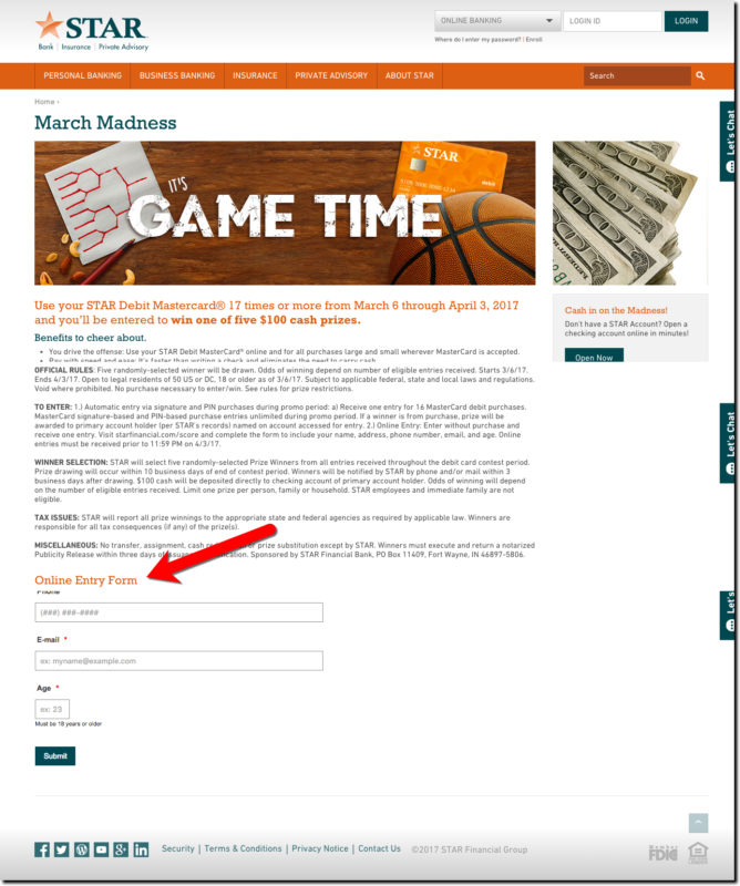
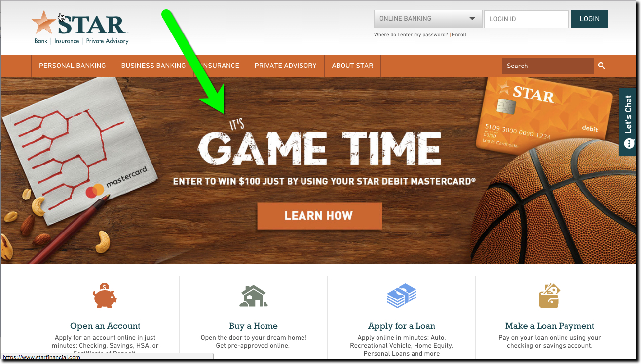
STAR Bank ($1.6 billion in deposits) has a homepage-dominating ad for Game Time, a debit-card sweeps during march (see above). Cardholders that conduct at least 17 transactions are automatically entered to win one of five $100 statement credits. Customers can also enter the contest online, a user-friendly way to comply with U.S. sweepstakes rules (see bottom of landing page below).

Bottom line: The graphics are eye catching, the timing is perfect, and it’s easy for customers to participate. My only concern would be the size of the prize pool, which is only $500. For a month-long sweeps, there should be a bigger grand prize. How about this? A sweet sixteen earning $100 each, a final four winning $500 each and a champion taking home $1,500.


Promotion landing page (link, 16 March 2007)

star bank march madness landing


Author: Jim Bruene is Founder & Senior Advisor to Finovate as well as
Principal of BUX Advisors, a financial services UX consultancy. 

Holiday Spirit Missing at Big Banks (redux)

Holiday Spirit Missing at Big Banks (redux)

tex-tech-cu-xmas-2016

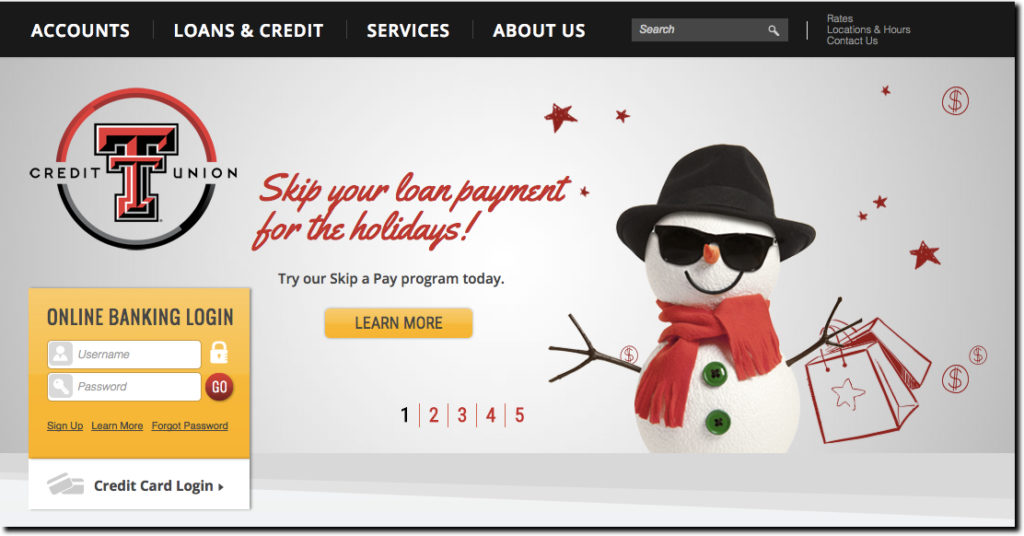
Happy holidays everyone! The holiday spirit is everywhere, except it seems, at the big U.S. banks. I get that budgets are busted, employees on vacation, and you don’t want to offend anyone by mentioning (or NOT mentioning) Christmas. Still, how hard would it be to throw a couple non-denominational snowflakes on top of your logo and wish everyone a happy holiday? Or better yet, how about a little bonus, like the holiday skip-payment offer similar to that featured on Texas Tech Federal Credit Union’s homepage (see above).

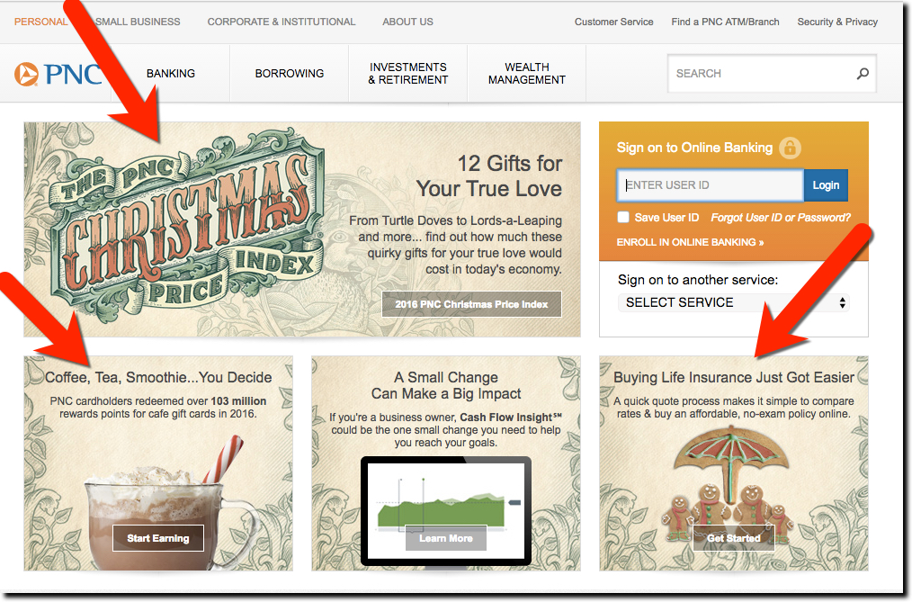
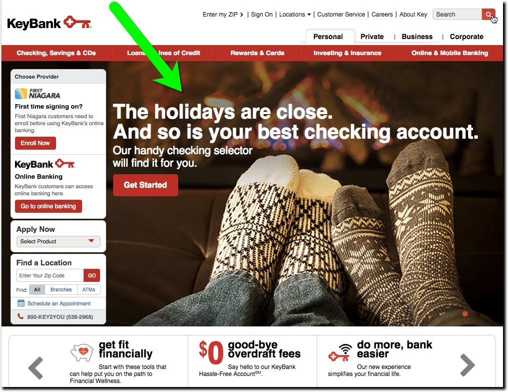
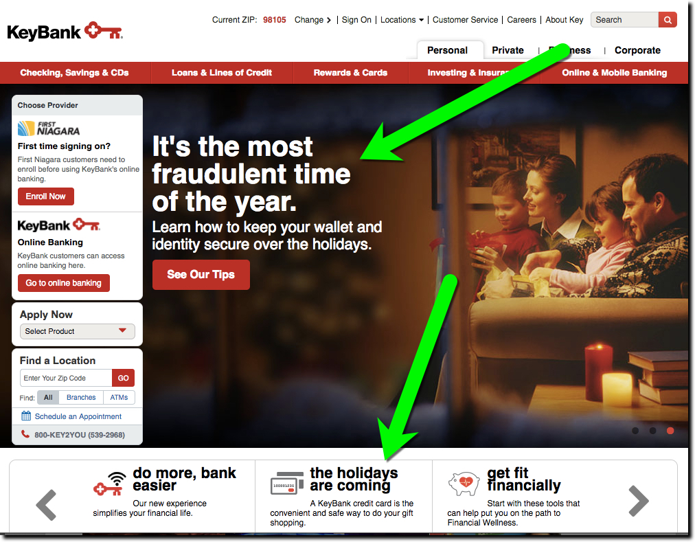
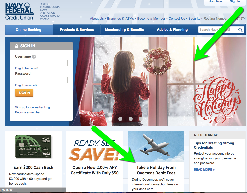
In our annual holiday survey of the 25 largest banks, we found only two, PNC Bank and Key, that acknowledged the year-end holidays on their homepages. And while they are just barely outside the 25 largest, Navy Federal FCU was in the holiday spirit as well.

That’s a pretty poor showing, dramatically down from the 8 to 10 participants in years past (see links below). Caveat: The historical comparison is not perfect due to timing. I was tardy this year and didn’t take my holiday tour until 27 Dec, so I may have missed some decorations that had already been stored in the banks’ virtual attics.

Previous year-end holiday posts: 2015, 2014, 2013, 2012, 2011 (big banks); 2011(credit unions/community banks); 2009 part 1, 2009 part 2, 2007, 2006, 2006, 2004.

———-

Holiday 2016 messages

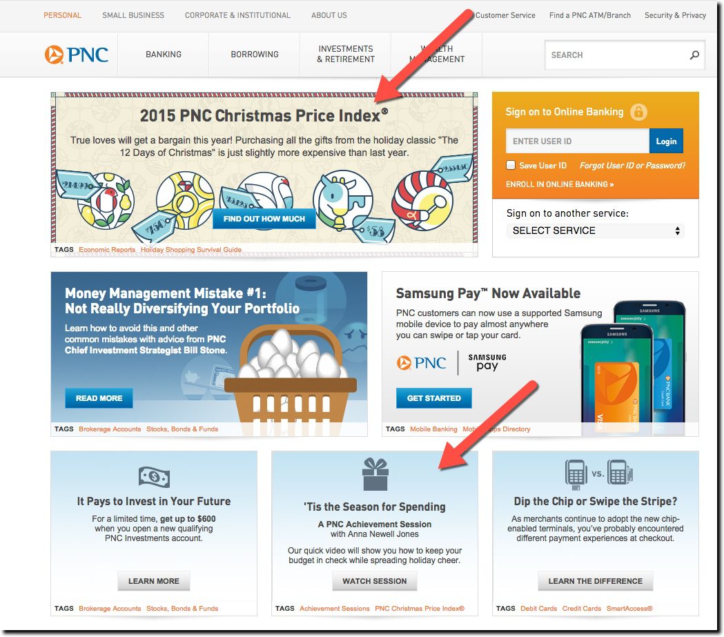
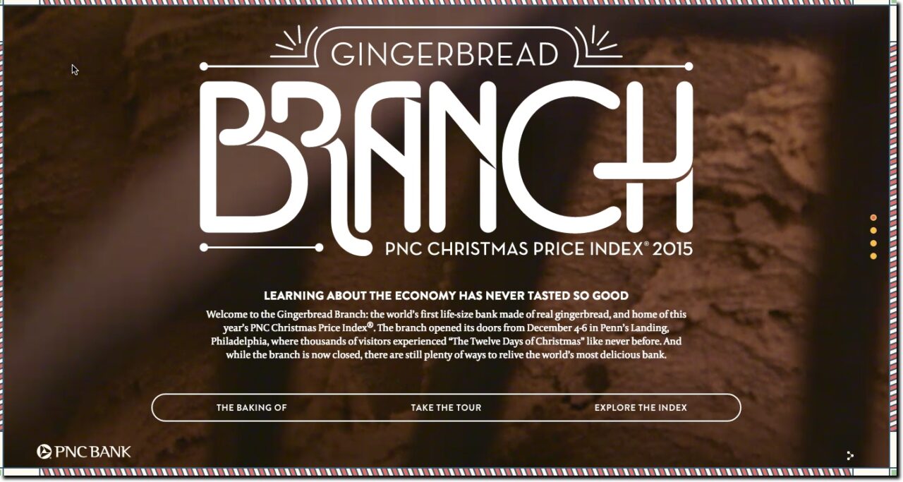
PNC Bank: PNC continues to go all-in with its long-running and clever cost analysis of the items from the 12 Days of Christmas song.

pnc-12-days-2016

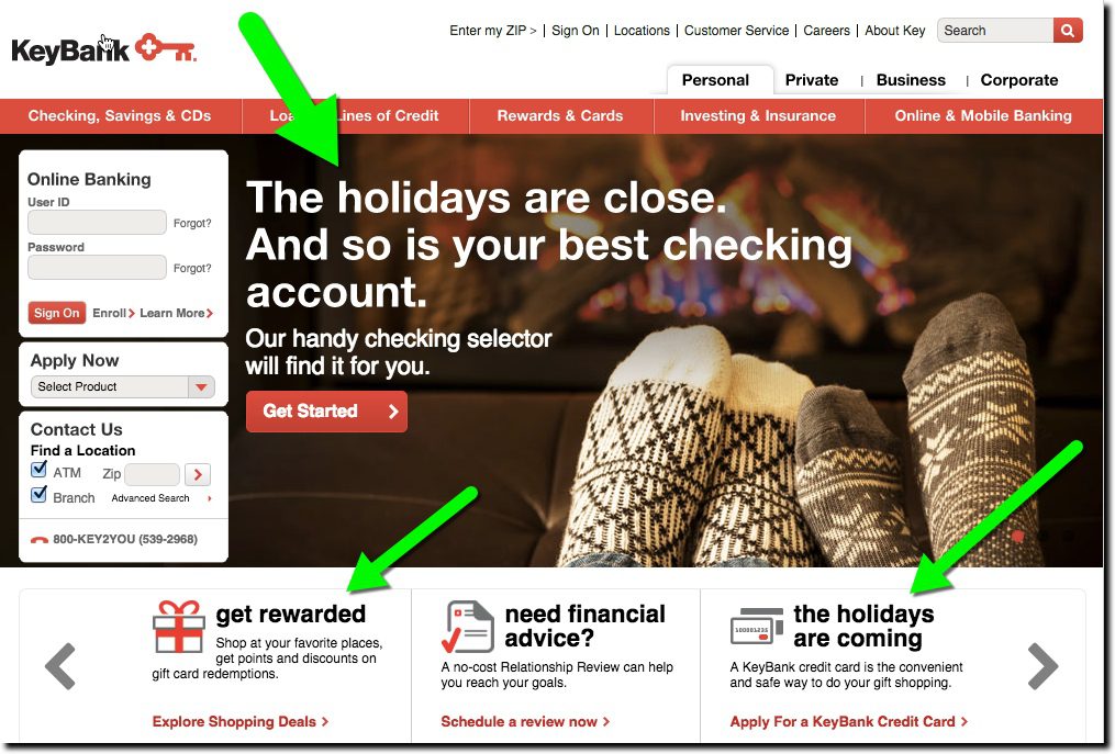
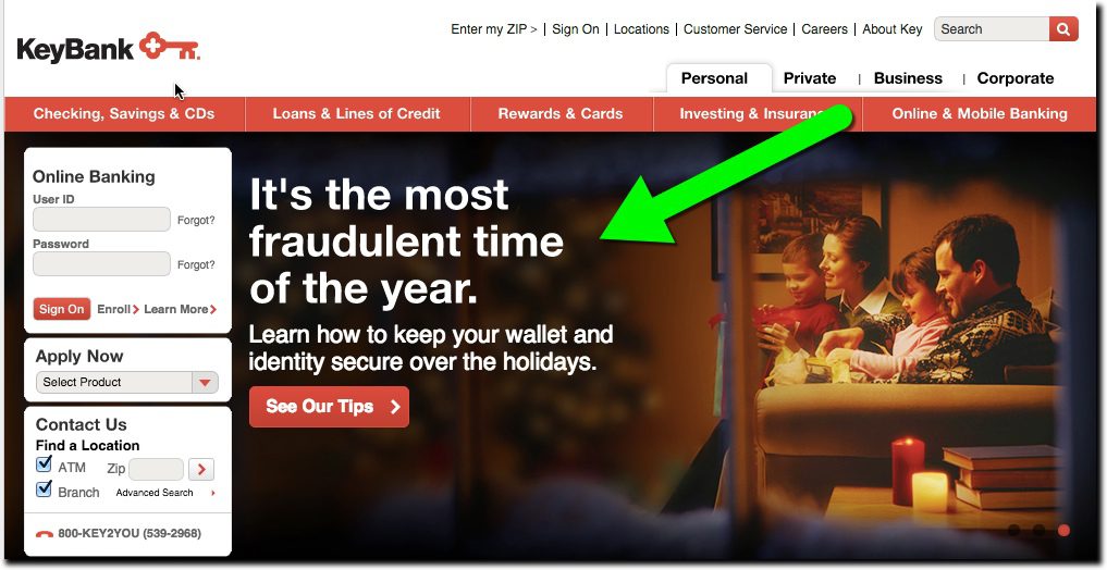
Key Bank: Key has also consistently added holiday bling to its website. This year, running two holiday-themed items, one for checking and the other a broad security warning.

key-xmas-2016-2


key-xmas-2016

Honorable mention: While just outside the top-25 in size, Navy Federal FCU showed its holiday spirit with a classy page-dominating graphic along with a nice message about lack of fees on international purchases.

navy-fcu-xmas-2016


It’s Holiday Loan Time

It’s Holiday Loan Time
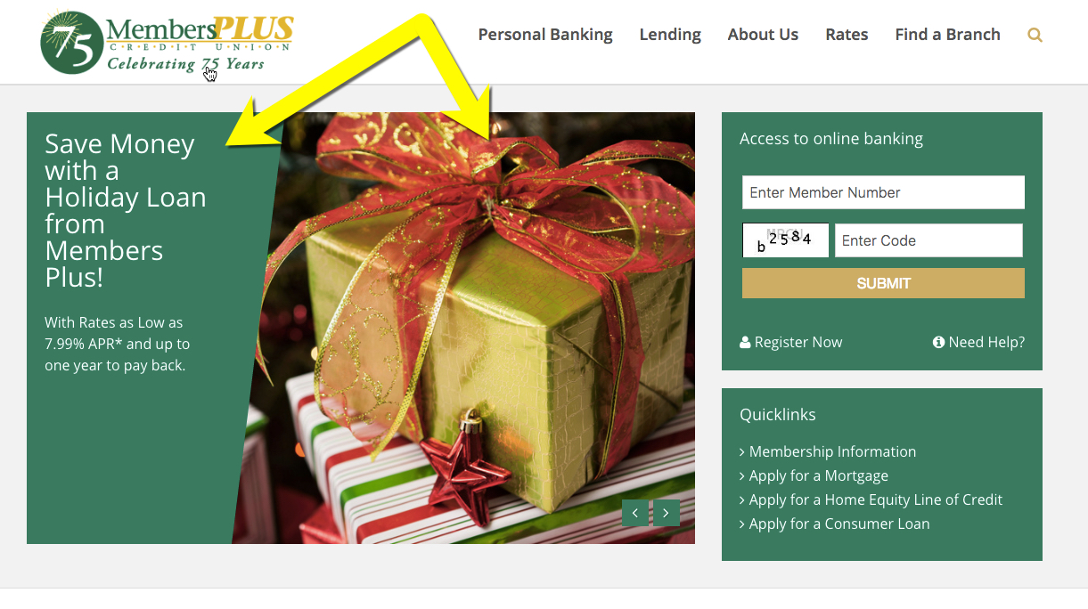
MembersPlus Credit Union Holiday Loan Promotion (#2 of 3 in rotation)


I’ve been slightly obsessed with holiday-themed marketing, actually the lack of it, over the years. It’s not that I think putting a bow on your website will magically improve your return on equity (ROE). It’s that by not doing anything, it seems like you are just not trying. You put holiday decorations up in branches, why wouldn’t you extend that same thinking to your digital look and feel?

And it doesn’t have to be an extra cost (like those in-branch decorations). You can push holiday-themed promotions to cover the costs of the website changes and then some. One example, primarily offered by U.S. credit unions, is the so-called Holiday Loan (see other examples in our past coverage). These are small (usually under $5,000, sometimes just $1,000) unsecured installment loans to help families with surging holiday expenses. These loans typically must be repaid within 12 months so they are not outstanding next Christmas.

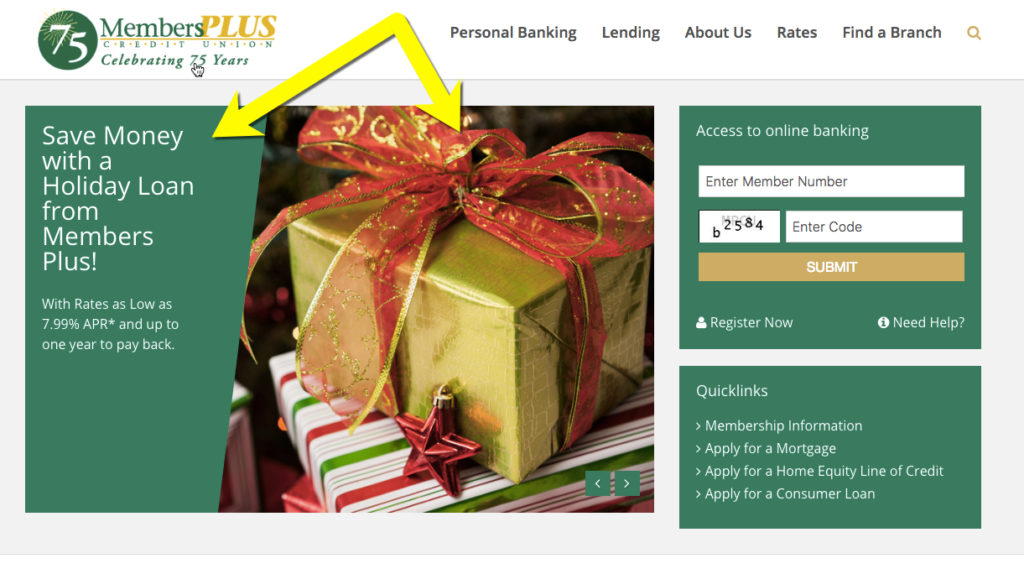
In poking around the web this afternoon, we saw a number of examples at credit unions (and the lone bank). My favorite was this promotion from MembersPlus Credit Union, a 10,000-member CU in the Boston area. Its Holiday Loan is currently featured on the homepage with a good supporting holiday graphic. The 7.99% APR is fair and undercuts most bank revolving credit and the 1-year payback schedule is good for helping members repay the debt before it becomes a burden a year from now. The maximum loan amount is $5,000.

Have a great weekend and don’t forget the hot chocolate!

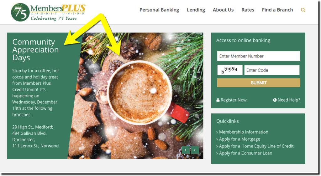
The MemberPlus homepage currently display an eye-catching promo for its upcoming Member Appreciation Days (promo #1 of 3 in rotation).
The MembersPlus homepage currently displays an eye-catching promo for its upcoming Member Appreciation Days (promo #1 of 3 in rotation).

Lessons from Startups: Leveling Up the Waitlist at Zero Financial

Lessons from Startups: Leveling Up the Waitlist at Zero Financial

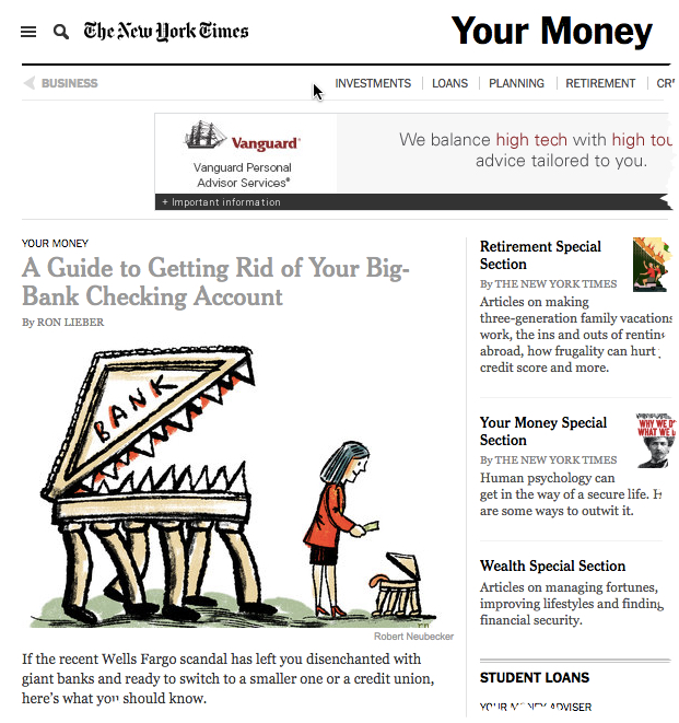
nytimes_yourmoneyOn 8 Oct Ron Lieber’s NY Times column Your Money discussed alternatives for consumers looking to move from major banks (thanks, Wells Fargo). He started with credit unions, touched on community banks and then finished with a major shout-out to an unlaunched fintech startup Zero Financial.

Not being familiar with Zero (other than its recent $2.5 million funding), I visited online, taking the bait to sign up for early access. This is a now-familiar ritual for me. During the past four or five years, startups have made a game of the launch process. Here are the primary elements:

  1. New visitors willing to provide their email address (and sometimes more) are entered into the queue and informed of their numerical spot in line. In my case, I was #26,405 on Friday afternoon (shortly after the Saturday column was made available at NYTimes.com).
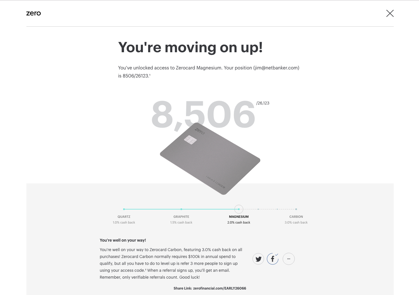
  2. Newly wait-listed customers are invited to move up the queue by tweeting, posting on Facebook or otherwise driving signups. I posted a message to Facebook and was immediately moved up 18,000 spots to #8,506.
  3. To supercharge the viral nature, prospective customers are given something of value to incent them to drive referrals. Coin famously offered $10 off the price of the hardware (which otherwise cost $50) for each referral. It worked almost too well as Coin amassed a 6-figure wait-list that grew pretty feisty as the hardware was delayed for a year. Zero’s twist is to boost the level of your cashback rewards. Everyone starts with 1% (called Quartz level), but if you tweet or post the offer on Facebook, you move to the 2% cashback level (Magnesium level). Then, if you get 3 people to sign up with your referral code, you move to the maximum 3% level (Carbon). Apparently, my posting on Facebook drove one referral, because today I’m up another 4,000 spots to #4,099 and have to get only 2 more to move up to the 3% cashback level. (Side note: The total number in the queue rose 6,600 over the weekend, to 33,023 as of 2:00 p.m. Pacific Time, Monday, 10 Oct 2016).


Spot in Zero Financial's waitlist after moving up via Facebook post
Spot in Zero Financial’s waitlist after moving up via Facebook post


Lessons for FIs:

  • Gaming is a great retention device: Across all demographics, consumers like to win. And it’s been proven time and time again, they’ll go out of their way to earn points or even extra chances to get points. FIs have a built-in scoring mechanism, the dollar value of accounts or transactions, so it’s pretty easy to build games with those inputs.
  • Scarcity/exclusivity are powerful marketing tools: Although your FI is unlikely to be a startup, you could play the same game with a snazzy new account or special offer.
  • Pay attention to Zero’s credit/debit card hybrid. Unless (until?) this type of interchange arbitrage is outlawed, look for credit-card sweepstakes-type accounts to gain popularity (read about it near the bottom of last week’s post).


—–

findevr-sv16Note: Looking for more inspiration for your technology stack? Don’t miss our third annual FinDEVr Silicon Valley next week (18/19 Oct 2016).

Marketing: Alliant Credit Union Pitches Kids Account on Logoff Screen

Marketing: Alliant Credit Union Pitches Kids Account on Logoff Screen

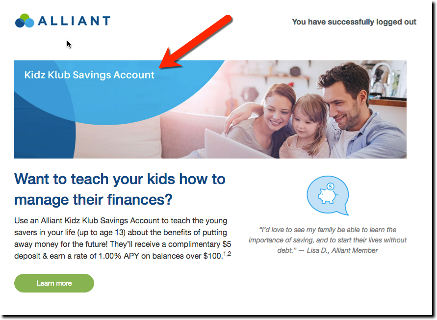
The logoff page that pops up following a secure session is one of the choicest real-estate parcels in a financial institution’s inventory. Typically, this logoff page is seen on a desktop pc, but the same opportunity exists on mobile. Earlier this summer (late June), we spotted Chicago-based Alliant Credit Union pitching its Kidz Klub savings account with a 1% APY (adults get the same rate).

alliant fcu logoff kidz klub

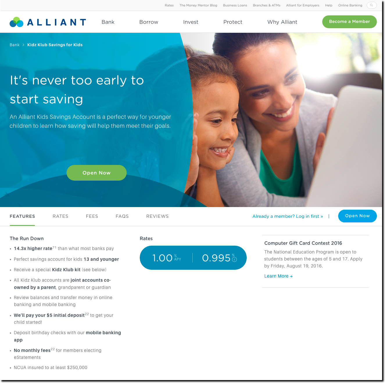
Bottom line: The logout screen is well-designed and the green call-to-action button is easy to see. The button leads to an attractive Kidz Klub landing page (see screenshot below). While The Klub is a savings account that mirrors rates available for adult members, the thrill for kids is that each Kids Klub member receives an individual member’s card and account kit.

Given that today’s 10-year-old could be a bank/CU customer for the next 70 or 80 years, it makes sense to cater to members’ children with a dedicated account.  But it needn’t be a fancy standalone account. The primary goal is to get kids (and their parents) to start saving together and that can be done with a repurposed basic savings account.

alliant kidz klub lander

Friday Fun: Banking with Coffee

Friday Fun: Banking with Coffee

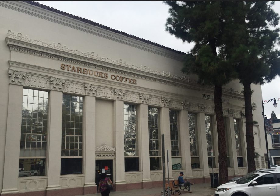
starbucks_wellsfargo_side


The connection between banking and coffee is tenuous at best; however, a number of banks (especially in the United States) have underused lobbies and there appears to be an infinite appetite for caffeine. So when demand meets supply, there are opportunities.

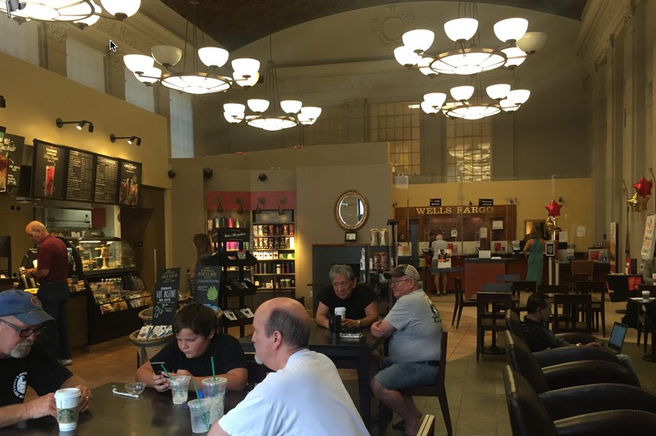
I know you’ve heard this all before from me 11 years ago (yikes), The Wall Street Journal last year (Capital One) and The Financial Brand numerous times. But it’s Friday and I’m sitting in the best example I’ve personally experienced, a big, old Southern California Wells Fargo branch in Orange that turned the main part of the lobby over to Starbucks, but kept the teller windows and offices along the side. It’s a great spot for coffee, and banking, if you are into popping into a branch (or just the ATM).

starbucks_wellsfargo_inside

Unless you are a major, it may be difficult to get Starbucks on board, but working with an independent has a lot of benefits, even if they can’t pay Starbucks-level rent. To name a few:

  • Branding: You may have a trusted brand, but adding good coffee, wifi and pastries to the mix can’t hurt.
  • Traffic: There is almost no reason a non-customer will just wander into a bank unless they have already decided to open an account. Coffee will bring people in. Converting them is another matter (that we are avoiding today).
  • Rewards: Everyone likes free stuff. Linking transactions, account opening, savings levels, and so on, to points-redeemable in your branch could be a good retention vehicle.
  • Crowdsourcing: One area with which coffee shops struggle is providing an experience that differentiates them from others. Using the bank’s customer base to crowdsource entertainment, book/magazine exchange, food ideas, and so on could help build community.
  • Meeting space: Small businesses love to meet in coffee shops. However, privacy is an issue. Turn over that under-used conference room to select small-biz customers and community groups, with priority to clients of course. (Extra credit: web-based reservations).

Bottom line: There are many drawbacks to sharing your space—hours, staffing, strange visitors, and so on—but it’s Friday and it’s still summer, so I’m not going to get bogged down in the details. Enjoy the last week of August!

Gamifying Mobile Banking with Usage-Based Sweepstakes

Gamifying Mobile Banking with Usage-Based Sweepstakes

starbuckforlife

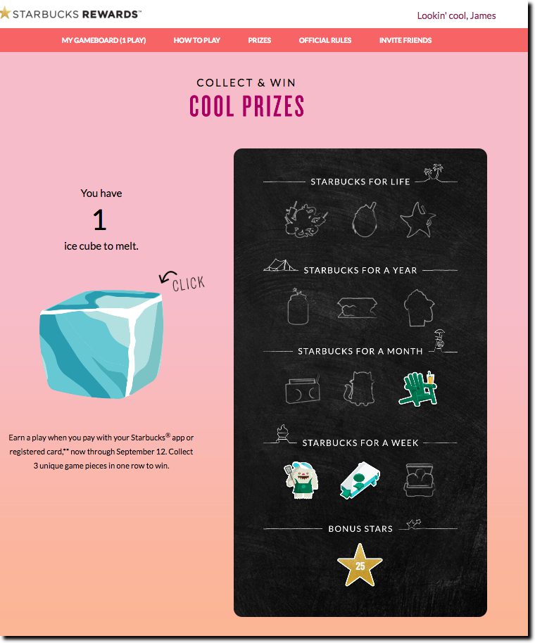
Just when I thought I’d shaken my Starbucks habit after their April devaluation of rewards for my relatively low-cost Americano, they reprised their Starbucks for Life game which last appeared around the year-end holidays. And I’ve been there four days in a row.

Starbucks for Life is no Pokemon Go, but it’s a lot simpler. Customers earn a virtual game piece with every purchase through 12 Sep ’16 (see inset, rules here). In the summer version, it’s an ice cube that melts away with a mouse click to reveal game pieces that fit on a virtual bingo card.

The main prize is free Starbucks for the rest of your life (30 years max). Or you can win a year, month or week’s worth of caffeine as well. And just to keep people interested, there are 2 million 25-star bonuses, which are worth about $0.50 in your chase to a free drink. My only complaint is lack of integration with the mobile app, but I’m sure they’ll get to that next time.

Sweepstakes are a tried-and-true method of encouraging usage, and costwise, they needn’t break the bank. Merchant partners can supply the prizes, and your mobile app provides a low-cost way to amplify the effectiveness with alerts, redemptions, and extra features. And email keeps pulling customers back to the game.

I’d like to earn a game piece with every:

  • Credit/debit card transaction
  • Bill payment
  • ACH debit
  • Recurring ecommerce transaction (e.g., Uber, Amazon, Apple iTunes, etc)
  • ATM visit
  • Customer self-service session
  • Check reorder
  • Increase in my savings account balance

Bottom line: Sure, you may not have anything quite as addictive as coffee to maintain interest. But people are pretty happy with free anything, so don’t shy away from gamifying your mobile banking. It’s a marketing tactic that works across a variety of demographics and is flexible enough to support multiple bank goals.

Pokemon Banking for Fun (and Profit?)

Pokemon Banking for Fun (and Profit?)

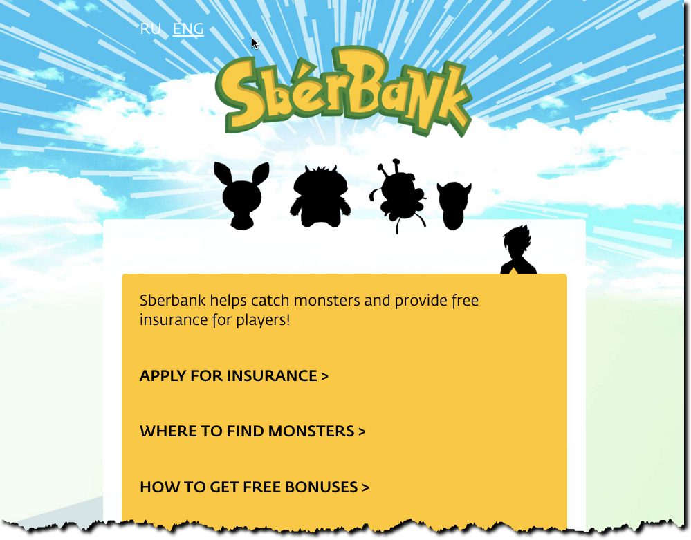
sberbankgo facebook page

The Pokemon Go craze doesn’t surprise me at all. Both my boys grew up with the little beasts so I get their appeal, especially with the AR boost. But what I didn’t expect to see were multiple financial institutions jumping on board, during the first week no less. And one, SberBank, that would pull off a clever product tie-in that might actually have a positive ROIsberbank go site.

Coinciding with the official countrywide Pokemon Go release (expected any day now), the Russian bank and insurer (and Finovate alum) is offering free accident insurance for anyone while they are playing the game. Users must register with the bank first (nice monetization through lead-gen) and provide evidence in the case of a claim (and some big costs).

The bank plans to use special game pieces called Lures, to drive players to branch locations. They are also providing additional bonuses for anyone catching a Pokemon in the branch.

SberBank created a special website just for the promotion at SberBankgo.com which explains the offer in both Russian and English (screenshot right). In addition, they’ve added a Facebook page to support the promotion (screenshot above).

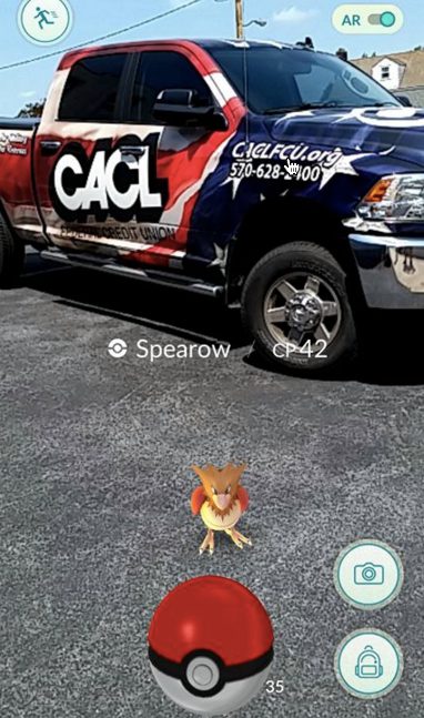
pokemon go cu brandedWhile the free insurance promo is probably too costly to work in litigious U.S. markets, banks can still use the game to drive traffic. For example, Florida’s CenterState Bank has already experimented with lures at its branches (see full writeup on its promotion). Or if you just want to have a little fun on social media, drive your branded truck into the background while capturing one of the little critters. Kudos to CACL FCU in Pottsville, Pennsylvania, for acting on that first.

Bottom line: Jumping on the Pokemon Go bandwagon isn’t going to replace anything in your 2016 marketing plan; however, it could be a  low-cost way to:

  • Provide interesting content for your social media outlets
  • Gain some free PR (limited to first bank/CU that does it in a given market)
  • Provide leads for certain products (youth bank accounts, insurance, mobile banking)

Friday Fun: Bank of America’s New Llama Videos #LLOVEYOURAPP

Friday Fun: Bank of America’s New Llama Videos #LLOVEYOURAPP

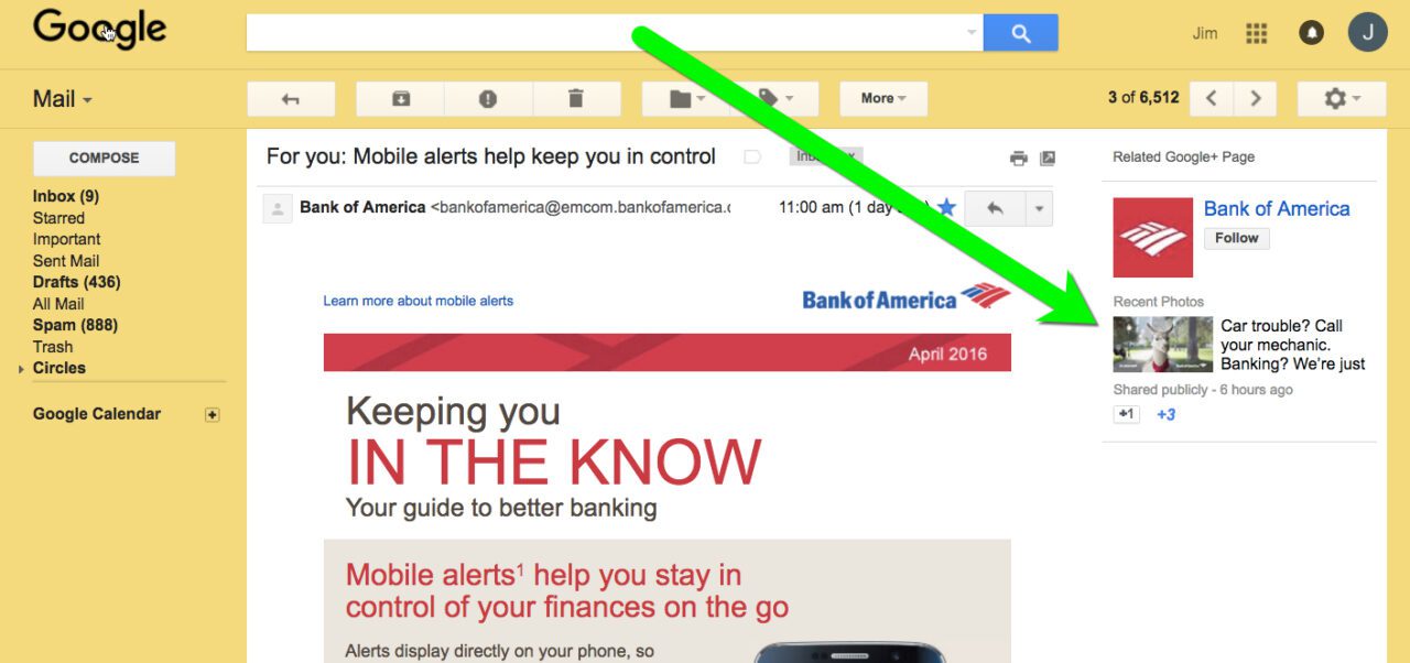
Bank of America on Wednesday dropped a set of 12 clever video segments called #LLOVEYOURAPP. You can see them all on the BofA YouTube channel. Most have 100 to 200 views, so they are virtually unknown so far. I’m guessing that is about to change as they are pretty clever. For one, a cud-chewing llama is demoing features of the BofA mobile app; for two, they remind me a bit of E*Trade’s baby series that for many years ran in the Super Bowl and elsewhere.

I don’t know what the plan is for them, whether they are to remain a social media play or will eventually run on TV (each one is either 15 or 30 seconds, so made for TV). I first spied them this afternoon via a Google+ promo next to a BofA email newsletter I received yesterday (see screenshot below). And the bank tweeted it once today and replied to a few more with the #LLOVEYOURAPP hashtag.

bofa_googleplus


Happy New Year! Webster Bank Jumpstarts Financial Resolutions

Happy New Year! Webster Bank Jumpstarts Financial Resolutions

newyearbanner_SFFCUWhile I have taken banks and credit unions to task for basically ignoring the December holiday period, the real missed opportunity is not Christmas, but New Years. The annual calendar reboot is the time when people are most likely to be thinking about their long-term finances.

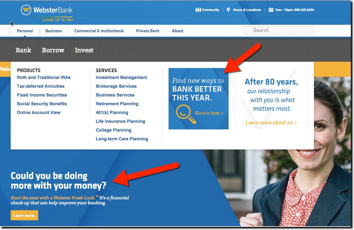
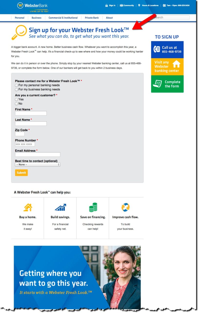
Three years ago, I found only one example of a new year’s message among the largest 80 banks and credit unions. This year I looked at a few dozen websites more or less at random and again found just a single “look at your finances” message. Webster Bank not only showcased a page-dominating “financial checkup” spot, but also incorporated the message into their main pull-down (mouseover) “Bank” navigation (see first screenshot below).

The promotion is designed to get Webster customers into the branch, or on the phone, for a financial checkup. The service appears to be free of charge, although the bank doesn’t reveal specifics. Customers are asked to complete a contact-me form (see second screenshot below) with just a single qualifying question, whether the appointment is to discuss business or personal finances.

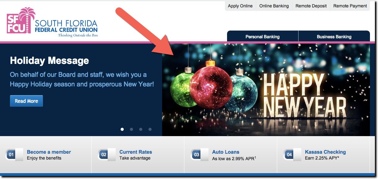
While Webster was the only FI playing the “new year resolution” card, South Florida Federal Credit Union gets an honorable mention for its timely Happy New Year graphic, one of four rotating promotions running at year-end (see last screenshot below and inset above).

——–

Webster Bank homepage (31 Dec 2015)
Note: The pull-down menus shown here also carries a similar message

websterbank_newyear_2016


Webster “Fresh Look” landing page (link)

webster_newyear_2


South Florida FCU homepage
(31 Dec 2015)

southfloridaCU_newyears

2015 Holiday Marketing Efforts from the Top-20 U.S. Banks

2015 Holiday Marketing Efforts from the Top-20 U.S. Banks

The end of the year provides a unique challenge to banks. Customers are busy buying gifts, finishing year-end projects at work, and preparing for holiday travel, meal prep and/or extended family time. There isn’t an abundance of deep thought about long-term financial plans, other than how to pay down inflated December credit card bills.

For banks, it’s a good time to run a few simple messages:

  1. Thank customers for a great year
  2. Wish them happy holidays and/or a wonderful new year
  3. Help customers deal with holiday overspending and planning for the new year
  4. Provide last-minute gift assistance via prepaid MasterCard/Visa cards
  5. Detail holiday branch hours and service options (extra credit for an online/mobile banking plug)

This is not a tall order, yet only 9 of the 20 largest banks managed to do even 1 of the above 5 during the week leading up to Christmas. While that may not seem like a great performance, it was more than double the measly four last year. And it’s back in line with historical norms of 9 banks 2013; 8 in 2012; and 10 in 2011. It looks like 2014 was an anomaly.

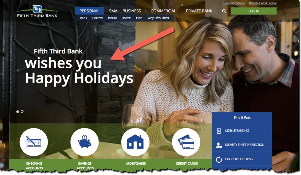
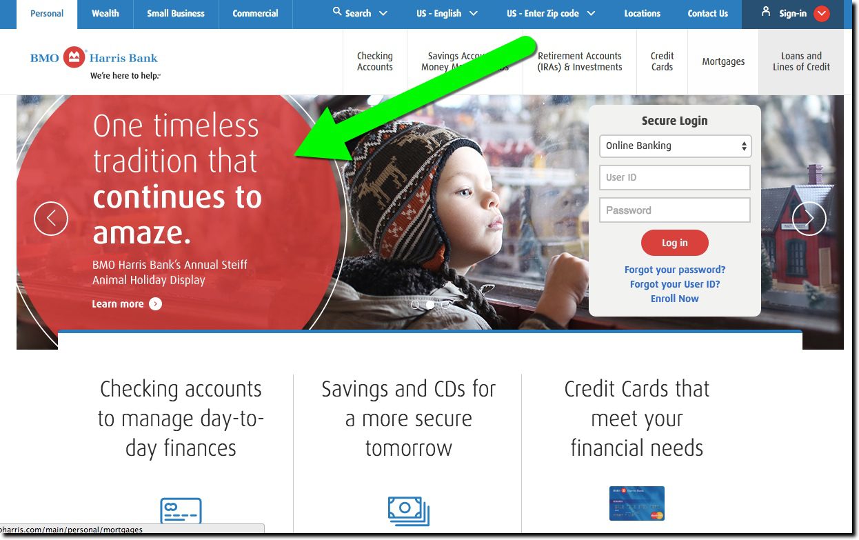
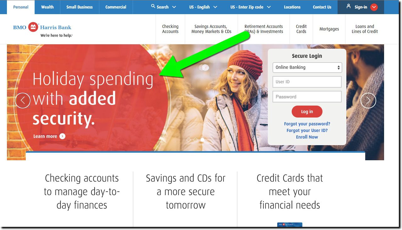
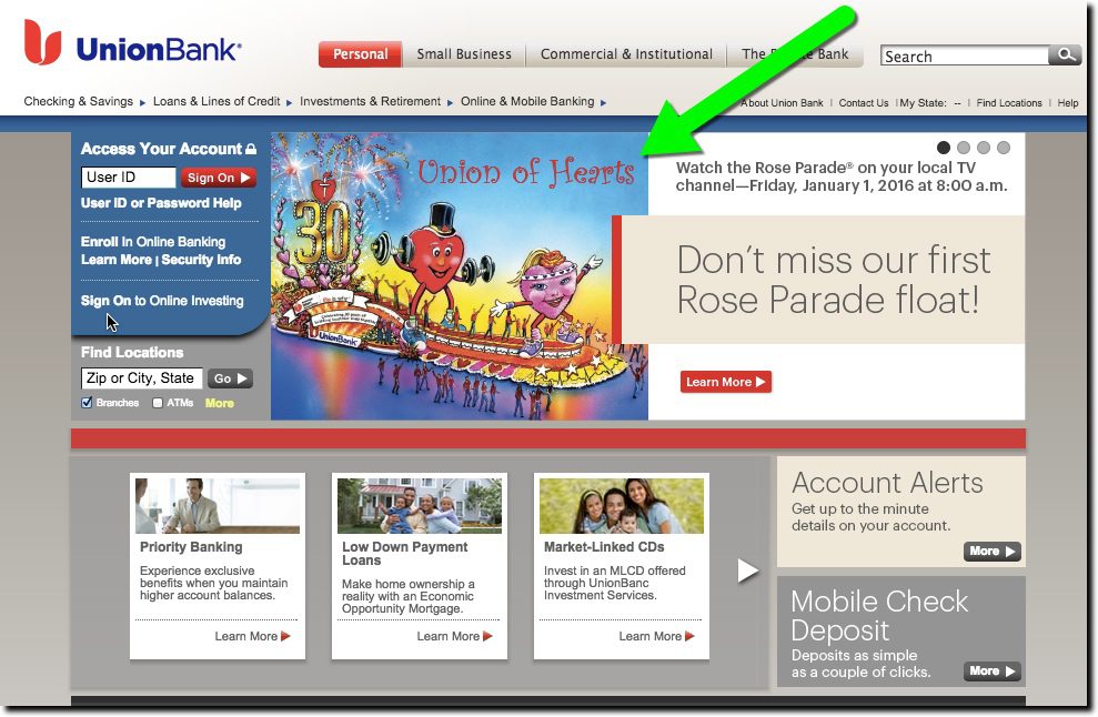
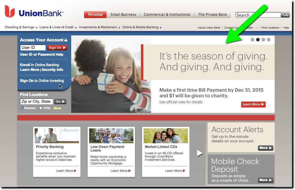
Congrats to PNC Bank, which once again, proved it was the holiday champ thanks to its long-running 12 Days of Christmas Index, earning a full 5 bulbs on our 1-to-5 light bulb scale. Runner-up Key Bank moved up to an impressive 4-bulb performance with four holiday promos. And we had three 3-bulbers (Fifth Third, BMO Harris, Union Bank) who posted impressive holiday graphics.

The scrooge list: Top-20 banks with no holiday promotions or graphics on 23 Dec 2015:
Bank of America; Bank of the West (BNP Paribas); BB&T; Capital One & Capital One 360 (formerly ING Direct); Chase (note 2); Citizens (RBS); HSBC; SunTrust; US Bank; Wells Fargo; Zions Bank.

Following is a quick overview of the promotions, including a 1- to 5-bulb rating.

Previous year-end holiday posts: 2014, 2013, 2012, 2011 (big banks), 2011(CUs/community banks), 2009 part 1, 2009 part 2, 2007, 2006, 2006, 2004.

_____________________________________________________________________

Large U.S. banks show holiday spirit

PNC Bank

Score: imageimageimageimageimage

Homepage (23 Dec 2015):

pnc_holiday2015
PNC Christmas Price Index page:

pnc_holiday_2015_2

———–

Key Bank

  • Checking account promo with holiday imagery (1 of 3 rotating promos)
  • Security tips related to holiday spending (2 of 3 rotating promos)
  • Rewards promo with holiday image (lower left on homepage)
  • Credit card promo with holiday copy (lower right on homepage)

Score: imageimageimageimage

Homepage promo #1 (23 Dec 2015):

key_holiday2015
Homepage promo #2:

key_holiday2015_2

———-

Fifth Third Bank

  • Page-dominating “wishes”

Score: imageimageimage

Homepage (23 Dec 2015):

53_holiday2015

———-

BMO Harris

  • Community service announcing a Milwaukee holiday display (#2 of 3 rotating promos)
  • Security message related to holidays and its new chip card (#3 of 3 rotating promos)

Score: imageimageimage

Homepage promo #1 (23 Dec 2015):

bmoharris_holiday2015

Homepage promo #2:

bmoharris_holdiday2015_2

———

Union Bank

  • Rose Bowl parade float (#1 of 4 promos)
  • Billpay offer with charity tie-in (#2 of 4 promos)

Score: imageimageimage

Homepage promo #1 (23 Dec 2015):unionbank_holiday2015
Homepage promo #2:unionbank_holiday2015_2

———–

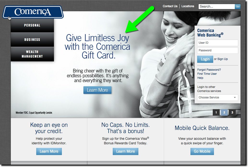
Comerica

  • Gift card promo integrated into main image (promo 2 of 3 rotating)

Score: imageimageimage (2.5)

Homepage (23 Dec 2015):

comerica_holiday2015

———-

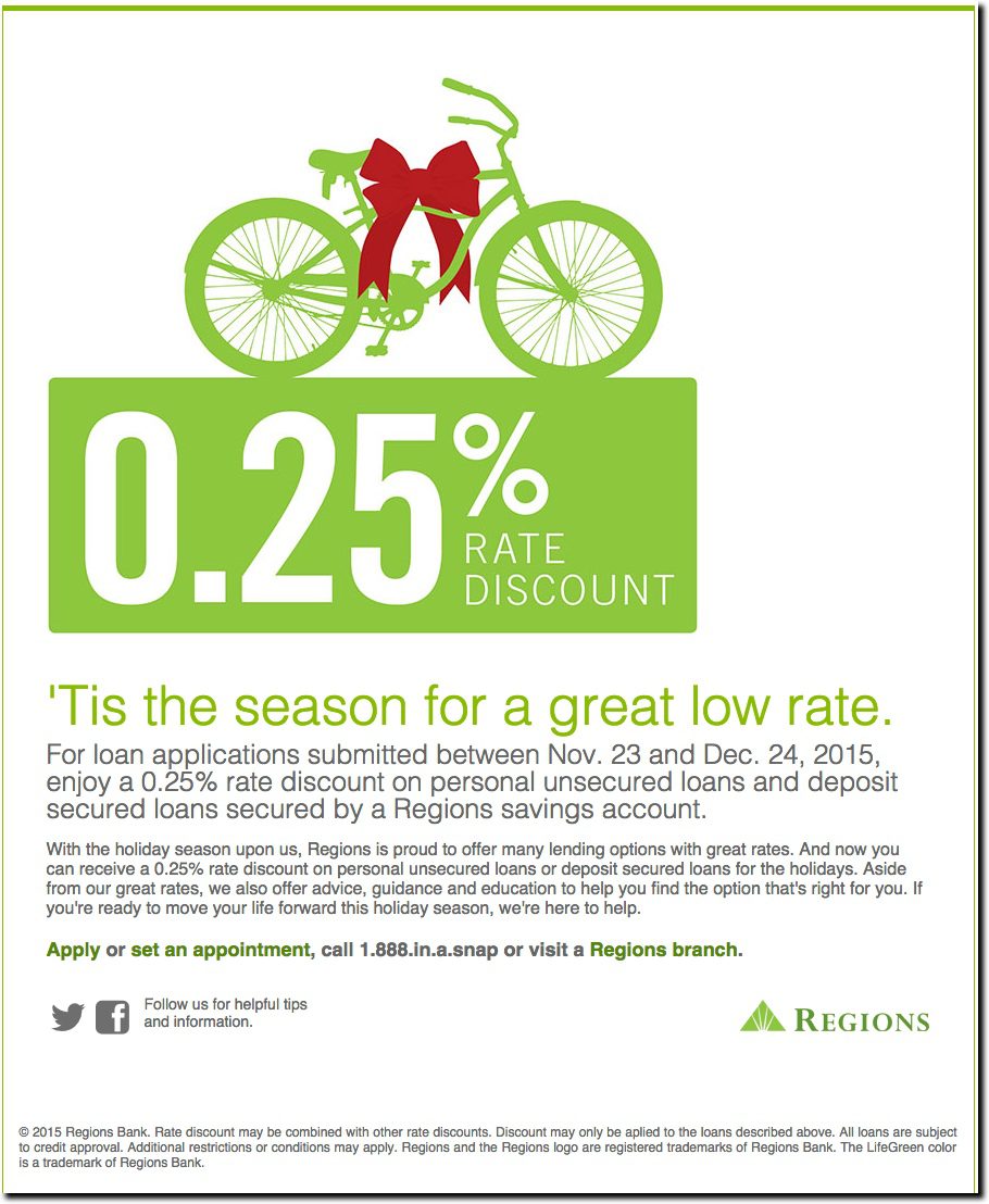
Regions Bank

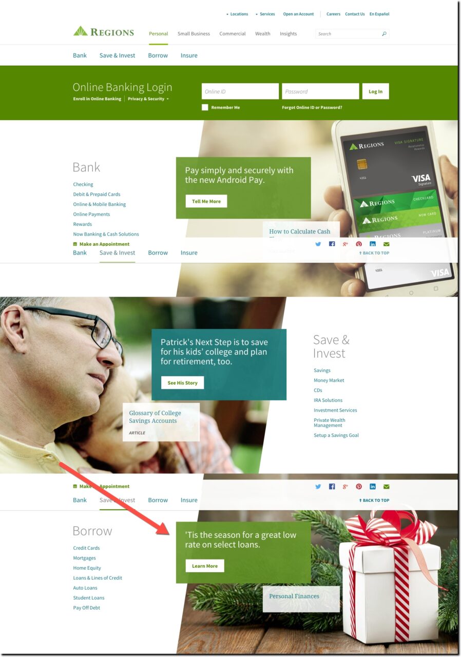
  • Loan discount with holiday copy (well below the fold)

Score: imageimage

Homepage with loan offer (23 Dec 2015):
regions_holiday_2015
Landing page for loan offer:

regions_holiday2015_2

——–

TD Bank

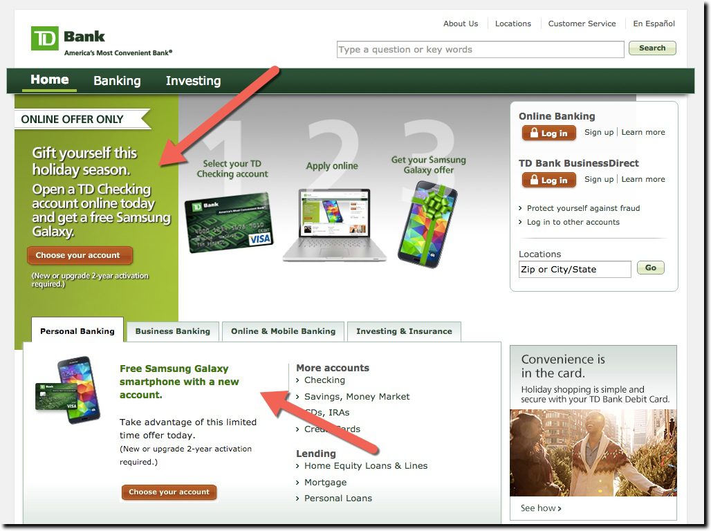
  • Checking account promo with holiday imagery and Samsung giveaway (main promo)

Score: imageimage

Homepage with checking promo (23 Dec 2015):
tdbank_holiday2015

———-

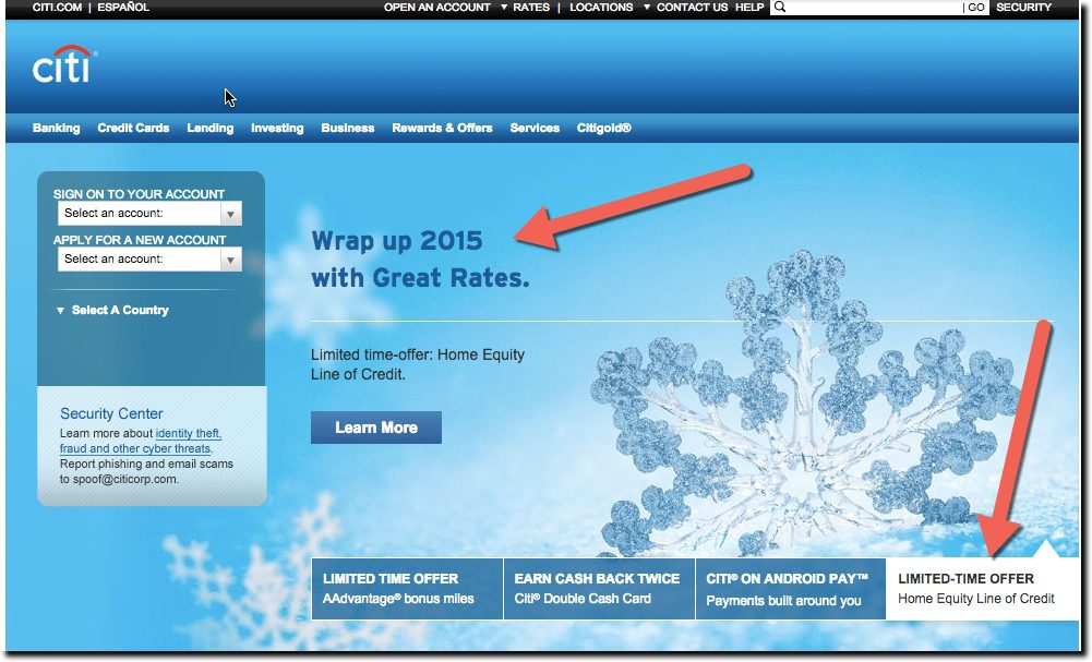
Citibank

  • Year-end home-equity promo with winter imagery

Score: image

citi_holiday_2015


————————-

Notes:
1. Observations taken between 7:00 a.m. and 8:00 a.m. Eastern Time on Wed, 23 Dec 2015, from a Florida IP address, running Mac Chrome browser with cookies cleared.
2. Chase is running a series of newish articles/posts below the fold, one of which covered holiday budgeting. But it wasn’t prominent enough to move them off the scrooge list.
3. Animation from
http://www.millan.net/anims/christmas.html#
Website Design: 10 Reasons to Love the Homepage of City National Bank of West Virginia

Website Design: 10 Reasons to Love the Homepage of City National Bank of West Virginia

city_national_WV_home

Sometime serendipity leads you to great places. Looking for inspiration this morning, I did a random search on Google for “banks in West Virginia.” The top organic result was City National Bank, an 82-branch bank headquartered in Charleston, West Virginia. If they were a fintech company, we’d be talking about how close they are to becoming a unicorn (current market value is just under $750 million).

And more importantly for our blog, City National has an awesome website. The overall look and feel is great, the polished graphics grab your attention, and it’s limited it to about 60 words of copy. Here’s 10 more reasons why it clicks with us:

  1. Easy-to-find site search: Placed in the upper right with a purple magnifying glass to give it a little extra polish.
  2. Four key items limit the main navigation: Personal | Business | Mortgage | Wealth Management
  3. Functions on personal drop-down menu easily accessible (not shown) includes: “Online and Mobile Banking” and “Online Account Opening” two important functions that are often difficult to find. It also lists “Avoiding overdrafts” first (see #10)
  4. Well designed promo area: The four rotating promos are beautiful, with great visuals and dramatic color.
  5. Visible call to action: The promo includes a specific call to action: “Add your card.”
  6. New-user help within login area: I really like how they split the button into thirds with Login | Demo | Enroll
  7. Account opening choices: It’s important to showcase the ability to open online since that’s still not widely understood. But extra points go to City National for also not forgetting that many (most?) still like the support of opening in branch.
  8. $5 e-statement credit: Great to see the bank sharing the cost savings by ridding the system of paper
  9. Overdraft avoidance: The bank not only uses the O-word (on the homepage no less), but also helps customers avoid overdrafts (see also #3 above) (see note 1).
  10. Suggestion box: After #9, I’m not surprised, but it’s also rare to see this level of encouragement to provide feedback to the bank.

Grade: A

—–

Note:
1. If you go deeper into the overdraft-avoidance advice, it’s not as consumer friendly as I expected. The bank could do more to promote overdraft-protection options.