 I’ve participated in dozens of online banking and technology conferences over the years, first as a banker, then as an analyst, and now as the host. Each time, I try to walk away with not only specific action items, but also overall themes that will drive product development over the next few years.
With 32 new products and services being unveiled next month at our Finovate Conference (see note 1) and with planning season just around the corner, I thought it would be a good time to review the themes taking shape this fall:
- Control: More and more tools are being invented to help consumers and small businesses take better control of their finances, both on the credit and deposit side. The tools vary from very focused tools to manage health care expenses or 401(k) allocations, to broad tools that manage the big picture. This trend is expected to continue well into the next decade.
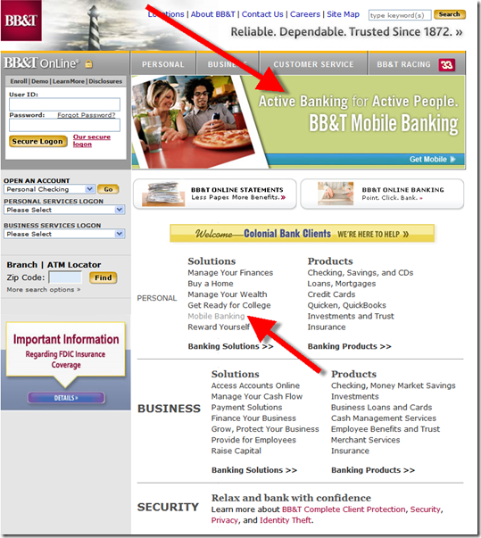
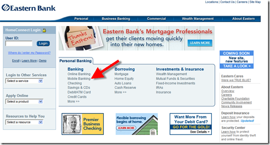
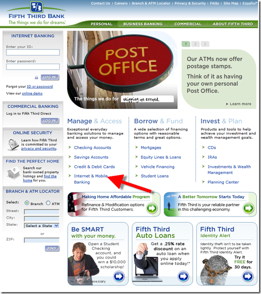
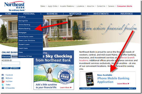
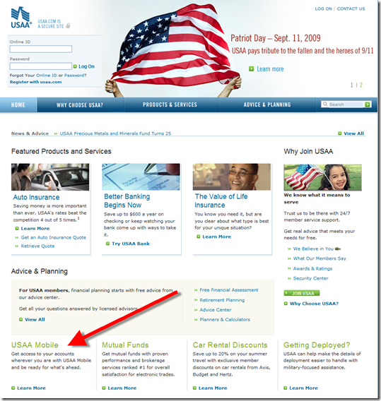
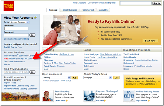
- Mobility: Most simple financial management tasks, such as checking balances, authorizing purchases, and so on will move to mobile devices, another huge trend that will play out over the next 20 years.
- Peer-to-peer: You can’t really cut out the middleman entirely in financial services; a trusted third-party is needed to authenticate both parties. However, the third-party may not always be a traditional financial institution.
- Safety & security: This one never goes out of style. But more so than usual, consumers are seeking safe havens for their savings and investments. And they expect more from their financial service providers. It will be a long time before risk-taking reaches levels seen much of the past 10 years.
- Segmentation (online): For the most part, online banking has been a one-size-fits-all service, since it came on the scene in the mid- to late-1990s. That’s not good enough going forward. There will be online, and mobile, services tailored for distinct segments. Initial efforts rolling out this year target youth markets, small- and micro-businesses, and savvy investors among others.
Guide to FINOVATE Companies
The following 30 companies (plus two more in stealth mode) will show their latest and greatest innovations in 7-minute demos at Finovate on 29 Sep in NYC. Here’s how our presenting companies describe themselves.
Backbase
 Backbase enables organizations to leverage their understanding of valuable customer data into highly personalized eBusiness Portals and Applications. Branding, content, applications, and tools can be targeted to customers using profile-based personalization. Guidance and expertise can be proactively offered based upon specific customer needs. Customers can even be empowered to tailor their own user experience based upon their individual preferences.
BancVue/First ROI
 These successful sister companies provide innovative checking accounts backed by dynamic marketing, data-driven consulting and powerful software to community banks and credit unions. BancVue and FIRST ROI aim to change the world of banking by launching a whole new product-delivery model for consumer deposit accounts and community financial institutions.
Billeo
 Billeo gives consumers a fast, easy and intelligent way to exercise choice and control over their online purchases and payments. Billeo functions as the catalyst to make online purchases and bill paying as easy and financially rewarding as possible. Billeo was founded by experts from the EBPP, card issuer, banking, ecommerce and technology industries.
BillShrink
 BillShrink is an unbiased, free online service that saves people money by continuously updating personalized recommendations on everyday bills. BillShrink monitors millions of wireless plans, credit cards and gas prices across the country to provide an apples-to-apples comparison of the best options available on the market.
Bling Nation
 Bling Nation brings mobile payments to consumers and merchant points of sale, offering lower costs, increased efficiency and improved security compared to credit cards, debit cards, checks and cash. The Bling Nation service also enables financial institutions and merchants to offe
r consumers robust rewards programs and real-time redemptions, promoting loyalty and convenience and supporting “shop local” initiatives.
BrightScope
 BrightScope is an independent data analytics firm that quantitatively rates 401k plans and gives employers, employees, and brokers tools to enhance plan performance and maximize retirement outlook. The BrightScope Rating™ developed in partnership with leading independent 401k fiduciaries, reviews more than 200 unique data inputs per plan and calculates a single numerical score which defines 401k plan quality at the company level.
Canopy Financial
 Canopy Financial provides innovative technology solutions that power the Consumer-Directed Healthcare (CDH) programs of some of the world’s largest healthcare and financial institutions. Ranked #12 on the 2009 Inc. 500 list, Canopy empowers millions of consumers to take greater control of their healthcare dollars, enables price transparency for routine medical services, and increases the speed in which healthcare providers are paid.
CashEdge
 CashEdge is the leader in Intelligent Money Movement™ services that enable financial institutions to engage customers in new ways. CashEdge’s Intelligent Money Movement services provide a single point of access, through an online banking or mobile application, for multiple easy-to-use consumer and small business transfer routes.
Credit.com
 Serving as an educator, advocate and facilitator, Credit.com empowers consumers with easy-to-understand information about money, credit, loans and more. Credit.com is partnered with trusted financial experts and select companies in order to offer online consumers insightful tips, helpful tools and excellent deals.
Fidelity National Information Services
 Fidelity National Information Services, Inc., a member of the S&P 500 Index, is a leading provider of core processing for financial institutions; card issuer and transaction processing services; and outsourcing services to financial institutions and retailers. FIS has processing and technology relationships with 40 of the top 50 global banks, including nine of the top 10.
Firethorn (Qualcomm)
 Firethorn, a Qualcomm company, is the crucial link in the emerging mobile commerce ecosystem. As a pioneer in mobile banking, Firethorn is transforming the traditional wallet into a streamlined, efficient and protected mobile revenue channel that will bridge relationships among financial institutions, retailers, wireless carriers and consumers.
Fiserv
 Fiserv, Inc. is the leading global provider of information management and electronic commerce systems for the financial services industry, driving innovation that transforms experiences for financial institutions and their customers.
Home-Account 
Home-Account is a web-based mortgage finding service helping America’s 75 million homeowners take control of their largest asset– their home via their ‘home-account’. The service grades and analyzes homeowners and their mortgages, presents scenarios to improve their financial situation and then pinpoints the best realistic mortgage options in the market.
Infosys
 Infosys defines, designs and delivers IT-enabled business solutions that help Global 2000 companies win in a Flat World. These solutions focus on providing strategic differentiation and operational superiority to clients. With Infosys, clients are assured of a transparent business partner, world-class processes, speed of execution and the power to stretch their IT budget by leveraging the Global Delivery Model that Infosys pioneered.
Intuit
 Intuit Inc. is a leading provider of business and financial management solutions for small and mid-sized businesses; financial institutions, including banks and credit unions; consumers and accounting professionals. Their financial institutions division, anchored by Digital Insight, provides on-demand banking services to help banks and credit unions serve businesses and consumers with innovative solutions.
iPay Technologies
 iPay Technologies is the leading independent provider of Internet bill payment services. Founded in 2001, iPay develops and fully supports consumer and small business online bill pay solutions for more than 2,800 financial institutions nationwide and in Puerto Rico. iPay offers a 99.93% payment success rate with more than 1,200,000 bill pay customers, and over 4,000,000 payments processed each month.
Kapitall
 Kapitall is a rich web application that makes investing easy for everyone. Inspired by game design, Kapitall combines an intuitive and engaging graphic user interface with powerful tools that make it easier than ever to research companies, build portfolios, share ideas and get smarter about the market.
MShift
 MShift, Inc. provides Mobile Banking solutions that offer the widest array of features, including Bill Payment, Presentment, Transfers, Account Summaries, History, ATM locators, and much more. MShift also provides the only available Facebook Banking application – online banking directly tied into the Facebook environment. MShift’s Facebook banking application won the Online Banking Report’s “Best of the Web” award for 2007.
On Deck Capital
 On Deck Capital offers fair and fast financing to small businesses that do not meet traditional bank lending criteria. The company’s proprietary underwriting and loan processing platform looks deeper into the health of small businesses, focusing on the overall business performance, rather than the owner’s personal credit history.
Outright.com
 Outright.com is incredibly simple, online bookkeeping specifically created for the 20 million Americans who work for themselves. Outright offers a streamlined, online solution, with the bookkeeping needs of the small business owners first. Outright’s goal is to keep financial records as simple as possible, helping small businesses accurately track all of their income and expenses to estimate and prepare their taxes. And yes, it works on a Mac too.
PayByMobile
PayByMobile is a virtual wallet that will let anyone text to pay when shopping online. Shoppers load money on their wallet at the same shops where they top up to buy airtime and then simply text to pay when shopping at their favorite online store. PayByMobile uses familiar prepaid mobile usability to deliver a simple yet secure online payment alternative for everyone who has a mobile phone.
People Capital
 People Capital underwrites students without credit history by projecting individual income levels and ability to pay. Their Human Capital Score™ incorporates merit data such as GPA, standardized test scores, college and major to provide a true and unbiased, data-driven measure of economic value of an education. Their peer-to-peer lending platform allows students to finance their college educations through improved access to private student loans.
S1 Enterprise
 More than 100 banks
and three million consumer, small business, and corporate users worldwide rely on S1 Enterprise solutions to access and manage their financial information. A division of S1 Corporation, S1 Enterprise is a leading provider of integrated banking solutions that deliver financial service providers a holistic view of their customers whether online, in the branch or in the call center.
Silver Tail Systems
 Silver Tail Systems provides next generation fraud prevention to protect against business logic abuse – a rising threat on application logic costing financial institutions hundreds of millions of dollars and significant loss of trust. Silver Tail products use real-time behavior analysis to detect and alert on known threats and new behaviors, then enables the business to disrupt these attacks in real-time.
SimpliFi
 SimpliFi is a free online financial planning and advice service that lets anyone plan for their financial future. The company was founded in 2004 as a tenant company in Wake Forest University’s Babcock Demon Incubator. SimpliFi is headquartered in Winston-Salem, NC, and has been providing white label financial planning services to credit unions since 2005.
Skill-Life
 Skill-Life, Inc. began as CentsCity, LLC in January 2007 with the goal of building financially healthy youth and communities. Their initial vision of employing online gaming to teach financial skills has evolved into a more interactive, game-based, and comprehensive resource for awarding incentives and building life skills.
SmartyPig
 SmartyPig allows customers to open goal-based savings accounts and to invite their friends and family to contribute to their goals. The system is based on proprietary, patent-pending technology and the latest in security standards. SmartyPig’s U.S. banking partner is West Bank, a subsidiary of West Bancorporation, Inc. The company’s Australian banking partner is Australian New Zealand Banking Group Limited (ANZ).
Strands
 moneyStrands is an innovative, easy-to-use online personal financial service that goes beyond providing financial analysis tools, with personalized money-saving advice and recommendations, and lets people anonymously compare themselves with people with similar backgrounds and financial goals. The interface is widget-based and highly customizable by the end user. moneyStrands is accessible via a full-capability mobile web version and a native iPhone application.
Yodlee
 Leading financial institutions trust Yodlee to power critical online financial applications. Yodlee’s personal financial management, payments, and customer acquisition solutions unify all personal financial account information to deliver a simple, centralized and secure source for consumers to manage all of their financial tasks anytime, anywhere. Yodlee makes financial institutions’ websites essential to their customers and generates new revenue opportunities.
———————————————————————————-
Note: You still have until the end of the week to register for the conference and save $100. Current Online Banking Report subscribers can save even more. Email [email protected] for more info.
 The rumors broke yesterday and the confirmation came today. Intuit is buying two-time Finovate Best of Show winner, Mint for $170 million (see note 1). Few people are surprised by this move or the price. Mint’s latest VC investors had just invested at a $140 million valuation a few weeks ago, so $170 mil is in line with that. It’s also a 5x return to the total VC investment of $32 million, so everyone associated with Mint has to be pretty happy, especially in an environment where most assets have fallen by double digits in the past two years.
 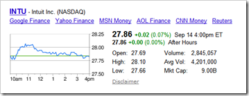 The bigger question is whether the startup is worth $170 million? To Intuit, I think the answer is definitely yes (see below).