A Look at Mint’s Twitter Aggregation Site: Money Tweets

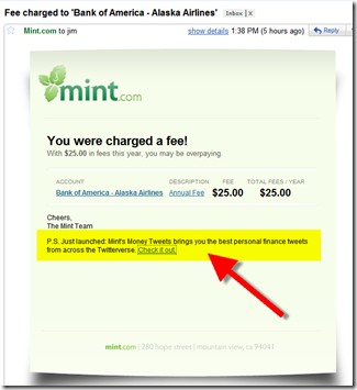
image Leave it to Mint to make 140 characters of personal finance chatter sexy. Yesterday, I noticed a link to a new feature called Money Tweets tucked away at the bottom of an account-alert (see inset below; note 1). The site launched in November (press release), but I was all wrapped up in P2P payments at the time (note 2) and never looked at it.
imageMint’s effort is the best use I’ve seen of Twitter as a content-creation tool (see screenshot #1, below; note 3). And once established, the site basically runs on autopilot, making it a cost-effective way to bring fresh, real-time content to your customers. 

Money Tweets has five content areas:

  • Aggregated tweets from 20+ writers on five subject areas: savings, investing, budgeting, loans, and retirement
  • Tweets about Mint using Twitter search
  • Tweets from Mint using its Twitter stream
  • Tweets from anyone answering the company’s Question of the Day such as today’s topic, “Is now the time to buy a house?” (upper right in screenshot below)
  • Tweets from anyone using keywords taken from personal finance trending topics

Bottom line: Aggregation of the tweets from personal finance experts (with extra credit for adding your own voice to the stream) is a promising tactic for your online marketing plan. But most (all?) financial institutions will want to steer clear of streaming unmoderated tweets from anyone mentioning your company’s name. That’s going to cause way too many internal headaches as it attracts spam and customer complaints. 

Main page at Mint’s Money Tweets (link, 8 Jan. 2010)

image 

Notes:
1. As an aside, Mint’s superb graphic design extends even to its email alerts, which look like a sticky note on the screen.
2. For more on the P2P payments market, see our latest Online Banking Report, published earlier this week, Making the Case for Person-to-Person Payments
3. For more on using Twitter, see our May report, Connecting to Customers with Twitter.

Another Bank Unleashes Remote Deposit for the iPhone: Royal Bank America

image Another bank is about to join USAA (post), WV United FCU  (post), and Randolph-Brooks FCU (post) in the smartphone-enabled deposit sphere. Royal Bank America, a $1.3 billion (asset) Philadelphia-area institution, is in final testing of its new deposit-taking iPhone app called RoyalRDC (iTunes link).

image The new app appeared in Apple’s iTunes store on Monday, but currently the bank is accepting only beta testers (see screenshot below). The app, said to be coming “within weeks,” allows a check to be deposited within 30 seconds using any model iPhone.

The bank is currently promoting the benefits of remote deposit on its home page (see screenshot below). Not only can RDC users skip the trip to the branch, they have 2 additional hours to make a deposit for same-day credit (6 PM instead of 4 PM). That’s an enticing additional benefit nicely highlighted through the shaded-clock image below. 

Royal Bank America homepage (7 Jan. 2010)
Note: This is the homepage view after refreshing the page once; yellow highlight is mine.

image

Royal Bank call for beta testers (link)

image

Note: For more info on mobile banking on the iPhone, see our March Online Banking Report.

Nobel Winner Calls for First National Bank of Innovation

image Perusing the newsstand at the Minneapolis airport last night, I picked up the latest Harvard Business Review issue entitled Reinvent. One article in particular prompted me to shell out the $16.95 for the double issue: Wanted: A First National Bank of Innovation by Edmund Phelps, a 2006 Nobel winner in economics, and Leo Tilman, a Columbia prof and author of Financial Darwinism.

Their case was laid out at the beginning of the article:

Ever since Alexander Hamilton, the U.S. economy has been about ideas, experimentation, and exploration: businesspeople imagining new concepts and launching new ventures; entrepreneurs engineering new products or methods based on new ideas; marketers conceiving of niches for new products or new niches for old ones; managers and consumers assessing novel products; and financiers with strategic vision judging which innovations to back.

The authors argue that it’s the funding of new ideas, not arbitrary pet stimulus projects, that really drives our economy in the long-term. And with credit and venture funding difficult to obtain, the government should step in with a new GSE (government-sponsored entity), their so-called First National Bank of Innovation, to help fill the funding gap.

My take: After the recent debacles with the major GSEs, Fannie and Freddie, I’m not so sure that we need more taxpayer guarantees on our nation’s books. But the economy would probably be better off long-term if some of the money flowing to housing and roads was invested in entrepreneurial-driven activity.

But, I’m not about to get involved (again) in telling the government what to do. Instead, I’d rather see the private sector step up and implement the ideas presented by Phelps and Tilman. Why not create your own in-house Bank of Innovation, where local startups could go for support, banking services, and help in finding financing. Umpqua Bank has been trying some interesting things in this area (see Umpqua Lab screenshot below).

Pulling ourselves back up from The Great Recession is no easy task. And banks, rightly or wrongly, are currently seen as part of the problem. Wouldn’t it be great if people started seeing the financial industry as part of the solution? That’s a New Year’s resolution I think we can all get behind.

Umpqua Bank labs microsite <umpqualab.com> (6 Jan. 2010)

image

Note: See our recent Online Banking Report for more ideas on how to serve small- and micro-businesses through the online and mobile channels.

Discover Card’s User-Generated Card Design Contest

image Personalized card designs have been offered by Capital One and others for years. But I’ve yet to see the idea turned into a contest. Discover Card is running a promotion for the best design submitted through its microsite or Facebook page.

The winner will pocket $1000 and the design will be featured on the next Discover Card Student Card. There is also another $1000 split among five runner-up designs.

To enter the contest, users must log in at the Discover microsite using Facebook connect (see screenshot #2, below). After creating the design, users end up on a Facebook page where they can provide optional personal information (screenshot #3). 

The promotion is powered by the Graffiti Facebook app.

As you can see by my handiwork (inset), most card designs are pretty crude. But there are also some pretty creative entrants. There is only one design tool available, a brush you run with your mouse. The only variations are color, brushstroke width and opacity. No uploads are allowed, so you cannot add any fancy graphics created in other apps.

The contest ends tomorrow and so far there are nearly 5,000 entries. 

Bottom line: It’s a drop-dead simple contest with excellent Facebook integration and a link to apply for Discover’s Student Card. It’s a great idea, with good execution, and the card issuer will end up with a cool new card design for a relatively small cost. Grade A+ 

Thanks to Payments News for the link.

1. Discover Card microsite (31 Dec. 2009)
Note: Homepage showing the 10-most recent entries with our lame effort in the lower-right.

image

2. Discover Card design creation page

image

3. Facebook optional personal info page

image

4. Designs appear on the Discover Facebook page under the Graffiti tab (link)
Note: Considering the crude input tool, some of the designs are amazing. As you can see, I will not be in the running for prize money. 

image

image

Banking the Holidays: 2009 Edition

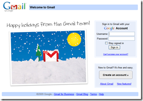
imageIt’s a bit of a holiday tradition at Netbanker (note 1), checking out the top-20 banks to see if they’ve upped their retail game during the year-end holiday period. Or at least pushed out a holiday greeting to visitors, such as Google’s greeting to Gmail users yesterday (inset). 

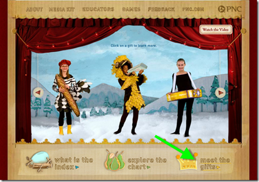
It was pretty much business as usual at most large bank sites. The only top-10 bank with any major holiday message this week was PNC Bank, with its clever Christmas Price Index, which values the items listed in the 12 Days of Christmas song. The total this year: $21,500, up 1.8% over 2008 (press release).

PNC has calculated the price index for 26 years and displays a bar graph at their CPI microsite (below). It’s been online for a number of years; we first blogged about it in 2004.

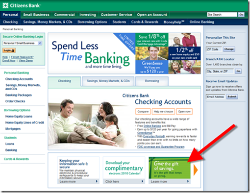
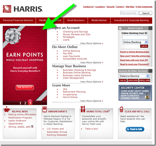
This year, we surfed the 20 largest U.S. banks on Dec. 22 and Dec. 24 (screenshots are in the next post; note 2). On the first visit, we found six top-20 banks with a holiday mention on the homepage (rank in parenthesis). We took a tour again this morning expecting to find a few more holiday messages. There was only one newcomer, ING Direct, and surprisingly, three of the original six had pulled down their holiday ads already. In all only four top-20 banks have a holiday message today (24 Dec., 9 AM Pacific time). 

December 22 December 24
5. PNC Bank 5. PNC Bank
13. TD Bank 15. Regions Bank
14. Citizens (RBS) 16. Fifth Third
15. Regions 17. ING Direct
16. Fifth Third  
20. Harris Bank (BMO)  

Luckily, an astute reader emailed yesterday to let us know that their bank was decked out in the holiday spirit, $2 billion (deposits) Union Bank and Trust (below) headquartered in Bowling Green, Virginia.

Union Bank & Trust (24 Dec. 2009)

image

Note:
1. Previous Netbanker December holiday-marketing posts (2007, 2006, 2006, 2004)
2. Rankings based on deposits on 31 Dec. 2008 (list here)

Screenshots of Holiday Promotions at Top-20 US Banks

Here are the screenshots that support our previous blog entry.

Holiday Promotions and Themes from Top-20 Banks

5. PNC Bank (22 Dec. 2009)

image_thumb[7]

Landing page <pncchristmaspriceindex.com>
Note: According to Compete, received 25,000 unique visitors in Dec. 2008

image28_thumb

 13. TDBank (22 Dec.)
Note: The promotion was gone when we checked back today (24 Dec.)

image4_thumb

Landing page

image7_thumb

14. Citizens (RBS) (22 Dec.)
Note: The gift ad was gone when we checked back today (24 Dec.), but the free electronic calendar (to the left of the gift ad) was still running.

image13_thumb

Landing page

image10_thumb

15. Regions (22 Dec.)

image16_thumb

16. Fifth Third Bank (22 Dec.)

image22_thumb

17. ING Direct (24 Dec.)

image_thumb[6]

20. Harris Bank (BMO)
Note: The points ad had been pulled down when we checked back this morning (24 Dec.)

image25_thumb

Note:
1. Previous Netbanker December holiday-marketing posts (2007, 2006, 2006, 2004)
2. Rankings based on deposit on 31 Dec. 2008 (list here)

Out of the Inbox: ING Direct’s Year-End Pitch for IRAs

image This is one of the better times of year to market tax-deferred accounts. ING Direct targets consumers plotting New Year resolutions with this intriguing headline:

————————————————
Subject: Is an IRA on your “to do” list?
From: saver@ingdirect.com
Received: 22 Dec 2009, 5:07 PM Pacific
————————————————-

There’s not much to the message. No offer. No graphics. No tease. Just a solid message reiterating the potential tax benefits and emphasizing ING Direct’s no-fee options.

Grade: B+

Email screenshot
Note: This message was sent to an existing customer with a savings account and Sharebuilder account, but no IRA.

image

Landing page (link)
Note: Landing page URL is <retirement.ingdirect.com>

image

Little Things Matter: Holiday Hours at the Top of Mercantile Bank of Michigan’s Homepage

Every year at this time, I poke around the financial Web looking for holiday themes. While Mercantile Bank of Michigan hasn’t posted a virtual Santa snow globe, it’s done something more useful: posted holiday hours on the top of its homepage. The bank should also note its telephone and online support hours, if different. 

Mercantile Bank of Michigan homepage (22 Dec. 2009, 2 PM Pacific)

image

Out of the Inbox: Costco Email Gives PayPal’s Bill Me Later Top Billing

imageI rarely open emails from retailers, especially around the holidays. As someone who has checked the “send me offers” box on registration forms for a decade, I’m inundated. But every once in a while I check out the Costco email to see what outrageous deals they are offering and, more importantly, whether any financial services are being showcased. For example, in March we wrote about the $90 Sharebuilder promo from Costco

Last Friday, the big-box giant did not disappoint. It had two financial offers above the fold:

  • Extended-payment option: A surprisingly large and prominent pitch for PayPal’s extended-payment program, Bill Me Later (see inset and upper-right corner in screenshot below). The BML option allows Costco customers to defer payment for an unspecified amount of time interest-free if paid in full by the due date (typically a few months out), or to pay the amount back over time at an 18.99% APR.
  • Costco cash cards: While it’s no surprise that the retailer is pitching store cards 7 days out from Christmas Day (see landing page below), I was surprised they weren’t merchandising them more aggressively. The problem was that even with rush delivery, the plastic card wasn’t guaranteed to arrive before Christmas, so it wasn’t a great gift option. The retailer could use an online giftcard option for instant delivery.

Costco holiday email (Friday, 18 Dec. 2009)

Costco email 18 Dec 2009

Bill Me Later landing page (link)

BillMeLater landing page

Costco prepaid card landing page (link)

image

Stanford Federal Credit Union Readies Launch of Geezeo-Powered MyMo PFM

image It looks like we are just days away from the launch of the first Geezeo-powered private-branded online PFM. Fifty-thousand-member Stanford Federal Credit Union, one of the first financial institutions in the world to offer Internet banking in the mid-90s, has been promoting the soon-to-be-launched personal financial manager for several months.

The service, called MyMo is currently in final testing with SFCU employees. It will run both online (screenshot 1 and 2, below) and through a mobile app (inset).

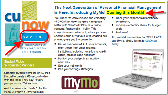
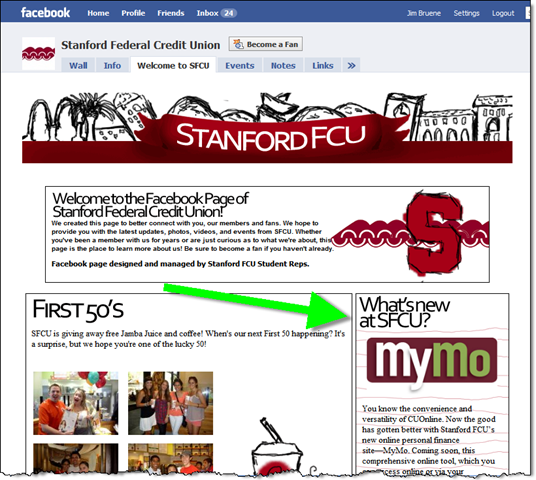
imageMyMo has been the lead story in the CU’s in-house newsletter for two months running (see screenshots 3 and 4). In November, the service was said to coming “this month.” Then in December, it hedged with a “coming soon” message. There’s still no specific info on when MyMo will launch, but there’s a promotion running on the middle of the SFCU’s homepage and Facebook page (see screenshots below), so it must be soon (note 1).  

The future: While private-branded online PFM is not new, Bank of America has several million users of its Yodlee-powered solution, the concept appears to be gaining momentum. Intuit/Digital Insight are now powering hundred of FIs while Wesabe and Jwaala have also made in-roads into the CU world. We’ll see lots of innovation in this area in the coming decade (see note 2).

1. MyMo desktop: Dashboard view (link)

image

2. MyMo desktop: Add a goal

image

3. SFCU’s November 2009 newsletter (link)

image

4. SFCU’s December 2009 newsletter (link)

image

5. SFCU homepage (17 Dec. 2009)

image

6. SFCU Facebook page (link)

image 

Notes:
1. While I think it makes sense to run a teaser campaign for a new product, SFCU should provide more detail on when the service will launch and why it’s been delayed. Members want the service to be fully tested, so they won’t mind waiting a bit longer as long as the CU is upfront with them about the timing.
2. For more information on the PFM space, see our Online Banking Report on Personal Finance Features.

Blippy: Do We Really Want to Automatically Tweet our Purchase Transactions?

image I love startups. Just when you think you’ve seen everything, along comes someone doing something that no one would have ever thought of five years ago, or in this case one year ago.

image The latest inspiration: Blippy. The service allows you to automatically broadcast your credit or debit card purchases using the Twitter/Facebook model (see screenshot below; note 1).

The first question everyone asks is why? (see comments at TechCrunch) But really, it’s not much different than broadcasting personal details via Twitter or your whereabouts via Foursquare, especially if you limit viewing to friends. The founder, serial entrepreneur, Philip Kaplan explains in the TechCrunch interview, that he has one credit card for “social purchases” broadcast on Blippy and another for purchases he prefers to keep private.

Blippy will contain privacy controls that allow users to share everything or keep it within a closed loop of friends. The company also envisions many other privacy controls to turn the service off and on, allow users to approve transactions before publishing, suppress certain merchants, or merchant categories, and so on.

The use cases shown so far are centered around media purchases, for example using it to automatically tweet (blip?) what song or movie you bought on iTunes or social “check ins” where the service lets people know you just bought coffee at Starbucks. But I can see where it would be helpful for spouses to “broadcast” purchases only to each other. Or for a salesperson to broadcast their purchases to their assistant to build expense reports on the fly. 

The service is in closed alpha (only in use by a handful of friends and family, note 2) as the three-person company gears up for a launch. You can follow Kaplan on Twitter (@pud) for more info.

My take: I like the idea of easily sharing purchases with joint-account holders or a bookkeeper. But many (most?) online banking systems and PFMs already allow this through the alerts system. You may want to boost education efforts on this capability.

imageAs for Tweeting about songs downloaded via iTunes, wouldn’t most users prefer to maintain more control over that by simply using Twitter or Facebook to directly type a short note? But we know from experience, if there’s a way to do something with less effort, it stands a good chance of succeeding.  

I’m not expecting widespread adoption any time soon, but I think there is a market for sharing spending transactions.

Here’s something for innovative FIs to consider: Add a “share this” button next to credit/debit card transaction and let users send the info via email, Twitter or Facebook with a couple keystrokes (see inset from FiLife).

I know it sounds far-fetched, but it might be just the thing to make your card stand out with heavy users of social media.

Blippy homepage showing spending stream (16 Dec. 2009)

image

Note:
1. For more info in Twitter, see our Online Banking Report on the technology published in May.
2. Twitter’s Evan Williams is using Blippy as shown in screenshot taken by CNET’s Rafe Needleman in his article earlier this week.