New Online Banking Report Available: The Case for Mobile Banking

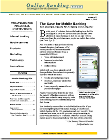
image The latest Online Banking Report: The Case for Mobile Banking is now available. It will mail next week to OBR subscribers. It’s also available online here. There’s no charge for current subscribers; others may download it immediately for US$395.

There is little doubt that mobile is the next online, not just in banking, but with many information-rich, time-sensitive services. Even in the online-centric United States, we expect mobile banking to eclipse online by the end of the decade. 

Another way to look at it: Starting from essentially zero just three years ago, more than half of the U.S. online banking population will be using mobile banking, by 2015. That’s zero-to-40 million households in just eight years.

Most financial institutions should be making their mobile bets during 2010/2011. The report outlines ten ways that mobile banking supports overall strategic goals at financial institutions. It also includes our ten-year forecast for U.S. mobile adoption (note 1).

This report is number four in a series we’ve published on the mobile area during the past three years:

Num Date Title
177 Mar. 2010 The Case for Mobile Banking: Ten strategic reasons for investing in the channel
163/164 Mar. 2009 Mobile Banking 2.0 the iPhone Edition: How to build a smartphone app even your CFO will love
140/141 Apr. 2007 Mobile Money & Payments: Why credit & debit card issuers should embrace mobile delivery now
138/139 Feb. 2007 Mobile Banking: Leveraging the third screen

Note:
1. The mobile forecast was originally published last month in our year-end recap.

Are You Still Frustrating Your Banking Customers to Save a Few Pennies?

image Have you ever had a flat tire because you forget to look at your tire pressure? I have, more than once, but not since I installed these handy little valve caps with the “green is good to go” visual signal. And they only cost about $6 per set.

Not only do they save you from the hassle and cost of a flat tire, they could save hundreds of dollars over the car’s life with better fuel economy running on properly inflated tires. And flat tires on the freeway are a serious safety issue. 

This begs the question: Why don’t car companies install these on all cars (note 1)? Is it really worth the potential thousand-dollar cost to your customers to save a buck or two in the manufacturing process? 

Relevance for Netbankers: What things does your financial institution do to save a few pennies that could end up costing your customers similar financial pain?  Here are my three pet peeves:

Rant over. Have a great weekend.

—————————

Note: Yes, I know that higher-end cars have tire-pressure idiot lights. And I’m sure there engineering-related costs and liability issues makes the price tag bigger than an outsider would imagine.

Mobile Firsts: State Farm Offers Auto Insurance Discounts to Graduates of its Steer Clear iPhone App

imageLast week I talked about how USAA is making the mobile experience better than online thanks to the magic of mobile remote deposit and PIN-based login. For the sake of discussion, I’m defining magic as anything you could not have imagined doing on your mobile phone two years ago (note 1).

The latest novel financial app: State Farm’s Steer Clear program that provides auto insurance discounts “up to 15%” for new drivers (under age 25) that pass its safe driving program. Users can undergo the self-assessment program online or off, but the app makes it easier and with a built-in stopwatch (screenshot below) to track the required 20 practice drives. See how it works in the company’s video below (press release here; iTunes link here). 

image As much as I like it, the State Farm app doesn’t quite make it into the magical category. Had it used GPS to automatically track the 20 practice drives, it might have passed the bar. I’m sure that’s in a future version.

Regardless, it’s clever, unique and positions the company well with the youth market and their parents that often foot the insurance bills. That’s a good return on the small investment needed to port the program over to a mobile app (note 2).

Notes:
1. I am using two years, since that predates the opening of the iPhone App Store in July 2008.
2. Read more about the strategic advantages mobile banking can give your financial institution in our latest Online Banking Report published today.

Launching: HelloWallet is First New PFM of 2010

image During 2008, we tracked more than a dozen new PFM launches. But it’s been quiet since then. The last major launch was Thrive (now part of Lending Tree) at Finovate 2008. However, with Mint exiting with a $100+ million gain late last year, the space is bound to heat up again. 

It’s not like there isn’t room for quite a few entrants. The United States supports 15,000 banks and credit unions; there’s no reason why there won’t be dozens of successful PFMs.

imageThe latest entrant, HelloWallet officially launched today (press release). While its features are similar to others, it has one claim to fame that’s tough to beat, an endorsement from a former U.S. president. According to a Sep. 2009 BusinessWeek article, Bill Clinton, singled out HelloWallet in his address to the $20,000-per person Global Initiative event in September.

The for-profit site founded by former Brookings Institute fellow, Matt Fellowes (Brookings archive; inset with Bill Clinton), has attracted the attention of both politicians and foundations with its mission to:

…democratize access to honest, high-quality financial guidance for everyone.

HelloWallet appears to be an advertising-free business model with moderate $5/mo (or $48 annually) fees covering its costs. It’s also being distributed free-of-charge through institutional partners such as The Rockefeller Foundation.

The startup has pledged to give away one subscription to a lower-income family for every five paid ones. That’s a smart strategy, especially when what is being given has essentially zero marginal cost to deliver. HelloWallet’s features include:

  • full account aggregation so you can track all your financial accounts from one dashboard
  • financial tools for investing, saving, reducing bank fees, and so on
  • banking price comparisons
  • budgeting tools
  • bank-fee and credit-card-APR monitoring services
  • goal-based savings

My take: I kicked the tires a bit, successfully setting up automated access to my checking account, and manually adding a few more assets. But the site was a little buggy today, hitting me with error messages and delivering dead links, so I’ll hold off judgement until they get things stabilized. But it looks like a well-funded and promising effort so far.

HelloWallet homepage on launch day (8 Mar. 2010)

image

Note: For more information on the PFM space, see our Online Banking Report on Personal Finance Features.

USAA Makes Mobile Banking Better than Online Banking

image Here’s a test that tells you when you’ve built a successful mobile app:

  1. Place your laptop next to your iPhone/Android
  2. Choose a task
  3. Reach for the device that’s easiest to use for that task 

If you don’t reach for the mobile phone first, you still have work to do on the user experience. 

I’ve always chosen the laptop for banking, even though I’ve ported more than a dozen other routine tasks to the iPhone (note 1). The hassle of logging in with those tiny iPhone keys pushes me to the laptop. But as of Tuesday, USAA’s latest iPhone app, version 2.2, has changed the equation, and there’s no looking back. 

Mobile vs. online banking
The key to making mobile a profitable channel is to make the user experience BETTER than online. And USAA is the only U.S. financial institution doing that today.

USAA’s biggest mobile “wow” is mobile check deposits (see Deposit@Mobile screenshot below) introduced six months ago for the iPhone. While it may not seem novel to those in the industry familiar with scanner-based remote deposits, the average consumer considers an iPhone check deposit to be almost magical. Other than a few small credit unions, no other major banking competitor offers it, so USAA continues to own mobile magic.  

imageBut with Bank of America rumored to be readying a launch mobile deposits, which will no doubt be featured in Apple TV ads, (see latest one here), USAA needs to keep innovating. 

And this week, USAA delivered with a single-PIN login with authentication powered by VeriSign VIP service. The optional 4-digit sign-on process is available now on the iPhone and will be available in April for Android and “shortly thereafter” for Blackberry (note 2).

In a time when it’s more tedious and less secure to log in online, USAA takes us back in time to a simpler day, when you could log in with just a few digits.

And by using techniques that authenticate the mobile phone during login, the bank says that mobile access is more secure than online.

Think about that for a moment. Mobile is MORE SECURE than online. With tens of millions of customers deathly afraid of logging in via their virus-laden PCs, imagine what that could do for mobile adoption.

It will take time to educate the market. Currently, most consumers believe the mobile channel is far less secure. But if they can be convinced the opposite is true, many will kiss online banking goodbye forever.

Notes:
1. According to yesterday’s release, USAA has 1.3 million mobile users, 17% of its 7.4 million customer base.
2. Previously, USAA users were required to sign on with username, password and PIN. The simple sign-on process is optional for those not trusting the simpler process.
3. For more info on financial services opportunities on the iPhone, see our March 2009 Online Banking Report.

What the Real-Time Web Means for Banking

imageOne of the most important trends in the online/mobile world is the so-called real-time Web. Here’s how Wikipedia defines it:

…technologies and practices which enable users to receive information as soon as it’s published, rather than requiring that they check a source periodically for updates.

Online banking should have gone
real-time long ago, but privacy concerns and a legacy of batch
processing — not to mention the 100-year credit crisis — have kept
info delivery in very non-real-time at most financial institutions (note
1
).

As balance/transaction email alerts appeared on the scene in 1996/1997, the perfect solution to keep consumers informed on a timely basis seemed assured. But for most users, financial alerts have not lived up to their promise. Why?

1. Users must remember to establish alerts while they are banking online

2. Users must establish proper parameters so they are not overwhelmed with alerts, or receive too little info

3. Those parameters must be tweaked as necessary

4. Users must select the proper email inbox(es) for the alerts

5. Users must read the alerts in a timely fashion

6. And of course, act on them if necessary

Frankly, that’s just too much work for most online bankers. Sending alerts to a mobile device may help since it is typically more immediate than email. But that depends on the user and whether they really want banking messages in their text-message stream.

But we think many users, now accustomed to viewing a stream of info all day from Facebook, Twitter, FriendFeed, RSS, and so on, will want similar delivery of financial info. Some will want their financial info to stream into their overall news feed (e.g., via Facebook, Twitter, etc.), others will prefer a separate dedicated channel (e.g., Blippy note 2, Strings). And the old-school folk will still prefer email or text-message feeds.

Once the feed is established, users will want to interact with the data, for example:

  • Tagging entries for budgeting/tax purposes
  • Sharing specific transactions with friends, spouses, accountants
  • Forwarding transactions to bookkeeping or managers for reimbursement
  • Replying to the bank/merchant regarding incorrect transactions  
  • Flagging transactions for later review

The real-time Web turns online banking on its head. Creating a daily dialogue with customers, rather than one-time sessions where users log in every few days, then hope nothing goes wrong before their next login.

There are advantages in both models, but it’s not really your choice which one to offer. The world has gone real-time: You can either join in or have your customers migrate to Mint/Blippy/Wesabe to tap their financial feed.

Notes:
1. This is characterization of the U.S. situation; many other countries are much further ahead, and have been operating under real-time info-flow for years. 
2. We believe there are a number of practical applications for Blippy’s technology; see our previous post.
3. For more info on financial messaging and alerts, Online Banking Report subscribers should review our 2003 report on the subject.

Twittering Vantage Credit Union Taps Geezeo for Online PFM

imageLast October, Vantage Credit Union launched one of the most novel banking services of 2009 (or ever for that matter), transactional banking through Twitter direct messaging (see note 1). The CU earned our OBR Best of the Web designation for its creativity.

Unfortunately, it doesn’t appear the service has gained much traction yet. The 103,000-member St. Louis, MO-based CU has 322 Twitter followers on its public feed and about 200 on its protected TweetMyMoney feed where the t-banking takes place (Note: Updated per comment). The majority of public feed followers are analysts, bloggers, and other credit unions.

But Vantage’s Twitter move isn’t about number of users. It’s about keeping its brand relevant with its social networking members. And splashing Twitter across your homepage is a great way to do that (see screenshot below).

Now Vantage is back at it, partnering with Finovate-alum, Geezeo to offer state-of-the-art online personal financial management (press release). It will be fun to see what VCU EVP Eric Acree, a Filene i3 member, does with the Geezeo platform. I think it’s safe to say that they will put a novel spin on PFM.   

VCU is Geezeo’s fourth white-label credit union client; the other three are Stanford Federal Credit Union (previous post, note 1), Alliant Credit Union, and 1st Advantage FCU. The company is also working with 1st Mariner Bank (updated March 1 per comments).

Vantage CU continues to promote its Twitter features on its homepage
(26 Feb. 2010)

image

Notes:
1. Stanford FCU’s website still says Geezeo-powered MyMo is “coming soon” (link to the Oct. 31, 2009, dated announcement), but the link to the new service has been pulled from the SFCU homepage. 
2. For more info, see our Online Banking Report: Leveraging Twitter (May 2009)

Great Recoveries: Major Banks Respond to Negative Blog Items Immediately

image Twice in the past few weeks, I’ve written blog posts that had one or more criticisms about specific experiences with a bank’s product. My complaints weren’t Huff Post calls to arms or anything particularly serious, just small things that had gone wrong (previous posts here and here). And our blog, while well-read in the banking industry, is just a rounding error in terms of mainstream readership.  

But in both these examples, the bank reached out to me almost immediately, offering to help solve the problem. In one case, I received a phone call (several actually) from the bank’s PR department and the other bank left a message on our home phone (note 1) from the “executive office.” 

My take: I am shocked to have heard not once, but twice in the same month from mega-banks looking to solve small, albeit public, customer-service issues. In 15 years of covering the industry, including three with a public blog, I have never had a single “official” call from a bank about a problem I’ve written about (note 2).

Businesses have long debated how to handle negative conversations in social media (see note 3). Do you stay on the sidelines, anonymously participate in the conversation, or reach out with offers to help?

Clearly, offering to help is the way to go. However, you must choose your words carefully because everything you say can and will be used against you by a blogger bent on revenge or ridicule.

But I can tell you now from experience that it’s powerful to be contacted by the business you’ve written about. My reaction goes something like this:

  • “Uh oh, now I’ve offended a reader; I’d better think twice about posting negative comments again.” At the very least, I’ll certainly make sure my coverage is extremely balanced in the future. No potshots, that’s for sure.
  • “Wow, this bank really cares about its customers and reputation.” That makes me feel much better about them.
  • “Seriously, a big bank that calls its customers when it hears about a problem; impressive as hell!”

So going forward:

  • I’m more likely to look for something good to say about the bank to make up for the negative item. 
  • I may post an update to the original entry, or even an entire post like this, complimenting the bank on reaching out to resolve the problem.
  • I’ll probably tell my friends the story, either privately, or more publicly via Twitter, Facebook, etc.

These are pretty good results from a relatively low-cost phone call. Sure, my problems were fairly simple and easily resolved, and it may be harder to appease a blogger whose home was recently foreclosed. But why not try? As long as you stay calm and try to keep things constructive, there’s very little downside and a lot of upside.

So congratulations Citibank and Capital One, your performance has been truly remarkable. (Are we good now?) 

Note:
1. The bank must have looked at our actual account info to get the home phone number.
2. I have received the occasional email from a subscriber, but no proactive effort to provide help.
3. For a wonderful overview of the ins and outs of responding to bloggers, read the two-part post (here and here) from Vancity’s MVP and third-ranked innovator on the planet, William Azaroff. 

Mint.com Traffic Soars Under Intuit Ownership

image I don’t know if it has anything to do with the publicity Mint received in recent months following its acquisition by Intuit or the promotional links from Quicken’s website, but the online PFM juggernaut just blew the roof off its monthly traffic. According to Compete, in January, Mint had 1.7 million unique visitors, 600,000 more than a year earlier.

To provide a little context, not counting the Dec. to April tax-time traffic spike at Intuit, Mint’s traffic is now slightly HIGHER than that of its parent company (see chart #1 below). That gives you a little understanding of why Intuit coughed up $170 million for the startup.

Another way to look at it: Mint now has as much traffic as the tenth largest U.S. retail bank, BB&T (see chart #2).

The interesting question for 2010: Now that Mint is part of the establishment, what startup will rise up to challenge it? Or will the banks, back on a path to profitability, fill the need going forward? 

Chart 1: Mint’s traffic is now similar to Intuit’s non-tax-time traffic

image
Source: Compete (link)

Chart 2: Mint now has about the same number of visitors as the tenth largest U.S. retail bank, BB&T
Note: Mint is blue line below

image 
Source: Compete (link)

Note: For more information on the PFM space, see our Online Banking Report on Personal Finance Features.

Bank of America Finally Forces Username Change, No More Social Security Numbers

image When I first started banking online with Bank of America, ten or more years ago, no choice in username existed: it was set to your Social Security Number (SSN). But that was back in the days before hackers had become proficient in stealing usernames.

While I’ve been advised to change the username a few times over the years, the bank finally laid down the law in January. I had two more logins available with my SSN, and then I was required to change. The message was delivered via splash screen after login (see #1 below).

The process was simple and took just a few seconds (screenshot #2). The bank’s interactive script helps users make good username/password choices (screenshots #3-4).

While this change isn’t likely to do anything to help the bank’s bottom line (it probably just drives up tech support calls as users adjust to their new usernames), it’s the right thing to do. Helping customers protect their own privacy should be part of every financial institution’s mission.

#1: Bank of America splash screen at login (13 Feb. 2010)

image

#2 Landing page after choosing “update” button above

image

#3 Interactive help for creating an allowed username

image

#4 Confirmation when all is well

image

Amplify Credit Union Ready for Valentine’s Day

image If you’ve read Netbanker for awhile, you already know that I’m a little obsessed about the lack of imagination most financial institutions display when it comes to dressing up their websites for major holidays.

It’s not that big a deal, but still, unless you are purposefully trying to project an image from the late 1990s (maybe not such a bad idea for many banks, given the current backlash), you might consider investing in a few graphical tweaks to keep up with other Internet retailers (see our Dec. 24 post).

Today, while looking for mobile banking examples, I happened across Amplify Credit Union, one of my favorite examples of financial marketing. They didn’t have mobile on the homepage, but they were sure decked out for Valentine’s Day, which is just 48 hours away.  

The CU not only swapped out their normal background graphic on its homepage, but also sweetened its logo with a heart, ala Google, and changed its tagline:

From: Bank Less. Live more.

To:    Bank less. Love more.

These are three alterations I’ve not seen from a financial institution. In addition, the Valentine’s theme was carried out with:

  • Red shading to the sides of the page, providing a very professional finish
  • A “share the love” promotion for the CU’s $25 refer-a-friend promo

Overall, it’s very clever and supports the credit union’s innovative brand image.

Amplify CU altered its homepage and logo for Valentine’s Day (12 Feb. 2010)
Note: Pause button in upper-right keeps the promotion from automatically cycling to the next one.

image

Share the Love landing page (link)

image