Certificate of Deposit Renewal Letters in the Digital Age

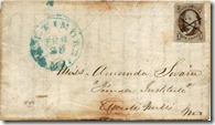
image Today I received a letter from a large credit union (note 1) informing me that my certificate of deposit was up for renewal. I was given six choices at the bottom of a form (note 2) along with a postage-paid return envelope. 

Had I received that letter in 1988, I would have considered it state of the art. But in the modern world of instant communications and researching rates via Google, the communication was inadequate and reflects poorly on the CU’s brand:

  • No current rate info: I realize that rates are subject to change and are miserably low, but at least tell me what they are today so I have some idea of what’s going on. While you are at it, remind me of what my rate was. Avoiding naming the specific rate is a huge red flag that yours is probably not so competitive. Plus, it’s irritating when it’s obvious how easy it would be to program current rates into the form letter. The CU did at least direct me to its website and call center to find current rates. However, the call center had no main menu option for rates, so you had to guess which number made the most sense. 
  • No email/call center option for choosing: The only way to communicate my investment choice is to return a postage-paid envelope. How about an email address, phone number of even a simple URL?
  • No email notification: I signed up for this account online, and the bank’s marketing messages arrive via email. Why didn’t I get an email asking me which option I prefer?
  • No clear info on what happens next: According to the fine print buried in the accompanying Truth-in-Savings disclosure, my certificate will automatically renew if I take no action. But nowhere in the main letter does it say that, nor is the deadline for taking action spelled out. The “current maturity date” is provided, but that’s using banking lingo that could be clearer.
  • No niceties (or even a sales pitch): The letter was bare bones with just two sentences and an info box about my CD (note 3). There was no salutation, no signature, no thank-you, no names of anyone at the CU, no local branch info, no encouragement to renew, and so on. 

————————————————–

Notes:
1. As previously noted, we generally avoid posting the name of financial institutions that we criticize here; but we’ll privately tell readers so long as it’s not posted online (email me if you are curious).
2. The choices:
     A. Change term to 6, 12, 24 or 36 months (it was already 12 months, so that was a
          bit confusing, too). 
     B. Deposit to another account with a blank for writing in the account number
         (and no instructions on whether that had to be an account at the CU)
     C. Send a check for the balance (but with no ability to take a partial payout)
3. My CD is small ($500) and was set up online through a now-defunct third-party. So it’s very possible that there are different communications sent to larger CD holders, and/or those that were acquired by a specific branch.

Google Testing U.S. Credit Card Comparison Ads

image Today, when searching Google for “credit cards,” a small Comparison ad appeared on the top of the results page, above the individual paid spots (see first screenshot below; note 1). The title was “Credit Card Offers” and clicking on it delivered me to the following URL: google.com/comparisonads/uscredit (see second screenshot).

Google had previously disclosed United Kingdom tests for credit card and mortgage comparison ads, but this is the first I’d heard of them in the United States (note 2). The comparison page had 101 credit card offers that could be searched based on certain card attributes such as “no annual fee” and/or by the user’s self-evaluation of their credit quality.

Clicking on one of the offers delivered a page that summarized the salient points, but according to the fine print at the bottom of the page, Google isn’t currently being paid for these credit card ads. However, there was a source code in the URL that delivered me to the U.S. Bank application, so Google may be banking referral fees for completed applications.

If this practice becomes widespread, card issuers will need to adjust their Google search buy and figure out how to gain better exposure on the comparison-results page. Right now, APR (interest rate) is the default sort mechanism.

1. Google search for “credit cards” brings up comparison ad (10 Nov. 10)

Google search for "credit cards" brings up comparison ad

2. Credit card comparison page includes sort and search options

credit card comparison Landing page includes sorting and search refinement options

3. The offer page provides detailed price info
Note: Clicking on the “application form” button takes users to the issuer’s site to complete the application

Google credit card comparison Offer page

3a. Fine print at bottom of the page

image

———————————————-

Notes:
1. Searching from a Seattle IP address on 10 Nov. 2010 at about 5:00 PM Pacific Time via Firefox 3.6 on WinXP.
2. Apparently a few others have seen them; for example, Search Engine Journal reported on the practice in an October post (here).

Ebilling Startup Doxo Launches First Client: Sprint

image A few weeks ago, I wrote about Doxo, a newly launched startup, building what Microsoft, Checkfree, and others were unable to achieve a decade ago: an ebilling hub that consumers actually used. A number of the comments, and private emails I received, were skeptical given that history.

But today the startup put itself on the map with the launch of its first biller, Sprint, with nearly 50 million customers (press release). Interestingly, Sprint has been relatively successful in converting customers to paperless billing with 23% adoption (note 1). But that still means the company generates around a half-billion bills annually.

Because Doxo charges Sprint a fraction of what it saves when its customers turn off the paper statement (a requirement to use the system), the telecom giant has little risk in partnering with Doxo.

Co-branded landing page for Sprint customers (link; 9 Nov. 2010)

 image

Note:
1. Many billers have found it difficult to drive paperless adoption beyond the 20% to 30% mark.

Charging More for Branch and Call-Center Transactions Compared to Online Ones

image Recently, I spent 34 frustrating minutes in a branch completing a single international wire transfer. And 22 minutes of that was with the branch manager. How much did that cost the bank compared to the same transaction online? 2x more? 5x more? 50x more? 

And more importantly, what’s the customer experience?  How much happier would I have been to do the transaction online in the comfort of my own home? 2x? 5x? 1000x?

In this particular case the question is moot, because my primary bank does not support online or call-center wires unless I upgrade to a much-pricier commercial checking account.

But for those financial institutions that do offer a choice, the math is pretty clear. It costs WAY less to complete a transaction online and (most) customers are WAY happier to complete routine transactions online, assuming sufficient security is in place.

Yet, many banks still price the services the same regardless of the channel. While this is understandable from a simplicity standpoint (and you don’t want to alienate branch/call center users), it’s time to start using price to reward self-service.

For example, in my most recent Chase business checking account statement, I noticed that the bank is instituting a new fee structure for stop-payment requests. Beginning Nov. 13, each request made in branch or over the phone will cost $32. In comparison, online requests will be $25 each, a 22% savings. Wires are also $5 cheaper online than in the branch (see below).

image

The downside is that customers may be outraged by a $20/$25 fee for a transaction they initiate themselves online. But the discount, combined with the time savings, should help ease the pain.

Do "High-Touch" Branch Experiences Help Your Brand?

image I honestly don’t think branches will be extinct anytime soon. Yes, I think they will drastically shrink in size/staff as transactional activity is eliminated. But they are part of the American landscape, provide a convenient place to open accounts, and reinforce your brand.

Or do they?

I spent 34 minutes in a branch today and came away with a number of brand impressions, none of them good. Here’s the blow-by-blow account (skip to the Bottom Line section if you, too, have recently sent a wire from a bank branch). 

Yesterday, I went to a small branch of a major bank to send a $20,000 international wire, something I’ve done only once before. I missed the “12 or 12:30” cutoff time and was told I’d need to come back tomorrow (note 1). They were nice about it, but it was 15 to 20 minutes wasted, although I did grab a tasty Americano across the street, so it wasn’t all bad.

Today, I was near a much larger branch, so I decided to give it a try, hoping that the process would go faster with more staff available. It was mid-morning on a Friday (note 2) with only two or three customers in the branch and at least six employees, so I thought I’d made a good decision. Unfortunately, the only person available that could process an international wire was the busy branch manager (note 3), and I was directed to a seat on the couch where I waited for 12 minutes watching the six employees handle a trickle of customers.

No one approached me during this time to offer an update on the wait. Finally, the harried branch manager stepped over and apologized for being “slammed” (even though the branch was nearly deserted) and went on to explain his staffing woes that would soon be over since there were “three job offers out at that moment.” 

At that point, I had to turn over my driver’s license, tell him my Social Security Number, and then wait another 22 minutes as he hammered away on the computer to complete the wire. At least once I’m pretty sure he was typing an email to someone, and he also made a quick phone call about another matter. Along the way, he asked me for the symbol for British pounds. Since I didn’t know, he proceeded to the back room (where more employees were hidden, note 4), and since they didn’t know, he said he would Google it. And he did. 

Next, he handed me all the info on the transfer so I could proof his work. And, like the last time I sent an in-branch wire, an error popped out. The form stated payment was for a boat, which, besides being incorrect, was especially interesting since the money was headed to London. He blamed the autofill on the computer (why would autofill be enabled on wire transfer forms?).

I said I wished this could be done online, and he said it had to be done in branch to reduce fraud and money-laundering. While that may have been an okay answer, he then contradicted himself and said if I did more than two wires per month, I should consider the bank’s $100/mo commercial service. So much for the fraud problem, I guess.

imageFinally, he walked across the room to call in the wire (why didn’t he use the phone on his desk?). He completed the process by scratching in pencil on the back of his business card my confirmation number and U.S. dollar equivalent of the transfer (see inset). Apparently, the branch’s wire system doesn’t provide an automated receipt.

Bottom line: Branch proponents say that consumers value the “personal touch” and hand-holding that branches provide on major transactions. And that those warm feelings create trust and positive brand associations. 

So what were my takeaway “brand impressions” after my experience today? (And I’m not saying these things are necessarily true, but they are my very real perceptions). 

  • They do not value my time: First, I had to make a second trip since I’d missed the cutoff. Then on the second trip, it took 34 minutes to complete the process.    
  • The bank is inefficient: The branch manager had to spend 22 minutes with me to generate $50 in fees. And I was in a huge, 10,000 square-foot structure with a large parking lot and 30-foot ceilings, that was serving a trickle of customers with a bevy of staffers. 
  • The staff is poorly trained and/or lack tech support: The branch is “slammed” with 3 customers across 6 employees! The branch manager has to use Google to fill out the wire transfer form.
  • The systems are cobbled together: Employees have to find currency abbreviations on their own. The wire had to be “called” in by the branch manager.  My “receipt” was handwritten on a business card. 
  • They made me feel less than secure: I had to tell him my Social Security Number out loud, which is always unnerving when you don’t really know who’s listening. And they left me scratching my head about wire fraud.
  • It must be a crappy place to work: They were down 3 employees, despite a 9+% unemployment rate.  

On the plus side: The staff was very friendly, cookies were on the counter, and I got a blog post out of it. That helps. A lot.

——————————————–

Notes:
1. I’m not sure why they couldn’t take my info today and send the wire tomorrow, something they had done before on a domestic wire. 
2. He did mention something about an “operational audit” going on, so this might not be the normal experience. Although the last time I sent a wire at another branch, it took even longer because that manager “was learning the new system.” 
3. The astute reader will notice that today is Wednesday, not Friday. I wrote this a few weeks ago on a Friday afternoon and held it until today. Frankly, I wasn’t sure whether to publish another “analyst whines about customer service” post. I promise it’s my last one of the year.
4. I’m not naming the bank, because this is a story about two visits to two branches which may or may not reflect what goes on in other parts of the bank. But I will name the bank via private email if you promise not to publish it. Just drop me a line.
5. Graphic upper right: Kinesis

Financial Companies Dominate Groundswell Awards in North American B2C Category

imageIt’s not often that financial services companies take home multiple trophies in a cross-industry retail-marketing competition. But last week, they took home almost half the top prizes in Forrester’s Groundswell competition for the best use of “social” techniques in their marketing efforts.

Financial companies won nine of 20 possible honors including three of seven category winners and six of 13 runner-up awards (called “finalists“). Four of the winners were in tax prep, a surprisingly social activity.   

The financial category-winners:

Financial runner-ups (aka finalists):

  • Listening (of 3 total)
    — Listening to the Student Pulse by Bank of America and Communispace
  • Talking (of 2 total)
    — American Family Insurance on Facebook by American Family Insurance
  • Energizing (of 2 total)
    — TurboTax Embraces Customer Reviews for Viral Growth by Intuit, Inc.
    — USAA Implements Ratings and Reviews by USAA
  • Supporting (of 2 total)
    — Get it Right Community by H&R Block
    — Taxes on Twitter: @TeamTurboTax Provides Customer Support and Resources by Intuit Inc.

Intuit’s TurboTax division alone accounted for three of the nine financial winners. USAA bagged two awards and H&R Block, Chase, Bank of America and American Family each received one Groundswell award.

PayPal Announces a Slew of Developer Tools and Two Major Banking Partners: USAA and Discover Financial

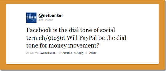
After seeing The Social Network and reading yet another post about the ramifications of Facebook’s ubiquity, I sent this out via Twitter last week:

image

Today, the “PayPal dial-tone” got louder with the launch of a handful of new initiatives at the company’s second annual developer’s conference in San Francisco (which drew 2,500):

  • PayPal for Digital Goods: Two-click checkout for low-value digital goods eliminates the hassle of logging in
  • PayPal Embedded Payments: Pay without leaving the merchant’s app
  • PayPal Apps: Allows companies to embed applications into the PayPal website: Finovate alums Credit Karma, Expensify, and Bill.com are participating
  • PayPal Business Payments: Electronic payments (non-credit card) of any size for just $0.50 per transaction 
  • PayPal Mobile enhancements:
    — Express Checkout provides similar two-click process
    — VeriFone integration
    — v3.0 iPhone app

Unless you are a developer, most of those programs mean little to you other than it’s obvious that PayPal is really pushing on the gas right now. But the banking alliances revealed today are quite interesting, assuming they make it to market:

I’m sure there will be much speculation on whether these powered-by-PayPal services will disrupt payments, or even catch on for that matter. But it’s clear that PayPal has made important new alliances in the banking world. The dial-tone appears to be catching on, even with the establishment.   

Update: More context on these announcements from Russ Jones, Glenbrook Partners, here.

Why Mitek’s New Photo Bill Pay Could be a Way Bigger Deal than Mobile Deposit

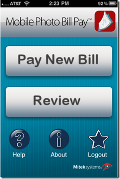
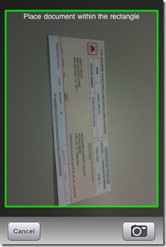
imageFor the second time in three years, Mitek completely wowed me on the floor at BAI Retail Delivery. In 2008, I was amazed to see them deposit a check with their mobile phone; this year, the trick was similar, but with a bill.

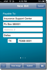
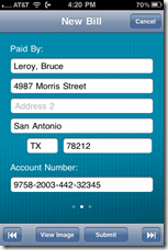
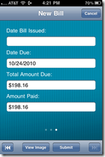
Mitek CEO James DeBello demonstrated the new systam to me at their booth (press release). He grabbed a bill from a pile, took its picture via the Mitek iPhone app, and sent it off via 3G connection to servers which read the characters through OCR and queued it up for payment. The billing and payment-due info was presented in an easy-to-read table for the user to verify before hitting the “pay” button (see screenshots below). I coveted it for my checking account … now. 

Analysis
While the deposit of a paper check has a little more of a “wow” factor (as in wow, I don’t have to go to the branch anymore), the mobile scan-and-pay of a bill is actually far more useful. The potential market for mobile deposit-capture is limited by the shrinking number of personal checks in use, especially by iPhone-wielding early adopters. I’d guess the total U.S. market for mobile deposit is no more than 10 to 15 million households and shrinking.

And even though paper bills will eventually be eliminated by Doxo or someone, they are still a fact of life for just about everyone with a checking account. And even if consumers start accepting ebills from their major payees, most will still have a few paper bills every month for at least another decade or two.

So not only is the market for photo bill-pay about 10x that of mobile deposit, but the service also solves a peskier problem for most end-users: getting bills paid on time, something that has far more financial consequences than processing the occasional paper check gathering dust in the drawer. 

And for financial institutions, photo bill pay provides several important benefits:

  • Helps get customers started with online bill pay by eliminating the data-entry task of setting up new billers
  • Helps convert customers from other bill pay providers by eliminating much of the conversion hassle of re-establishing payees at a new bill pay service
  • Provides a tangible, value-added mobile service to differentiate from the competition
  • Provides a fee-revenue opportunity from either monthly subscriber fees and/or expedited payment fees

The downsides:

  • Cost
  • Tech support/customer service
  • Potentially harder to wean customers off the paper bill, if it’s so convenient to just point-and-shoot to get it paid

Bottom line: Without knowing costs, what type of back-office integration hurdles the app faces, or even personally testing the user experience, I can’t say for sure how popular it becomes. If the scanning is finicky, it could be a non-starter. But, if it works like it did in the demo, Mitek may have figured out how to finally eliminate the data entry from the electronic bill payment process, a HUGE win.

1. Main screen                               2. Scan with mobile camera

image     Mitek photo billpay camera view

3. Verify data (3 screens)

 Mitek photo bill pay verify data    Mitek photo bill pay verify data    Mitek photo bill pay verify data

Note: For more info on mobile banking, see our mobile banking series in Online Banking Report.

Launching: Will Ebilling Startup Doxo Become a Household Word?

image The Internet has already yielded some great solutions for a number of modern-day consumer problems.

  • Finding info: Google
  • Purchasing and organizing music: Apple iTunes + iPod
  • Keeping track of your friends: Facebook
  • Booking travel: Expedia and others
  • Getting rid of stuff: eBay and Craigslist
  • Paying for it: PayPal
  • Tracking your money: Online banking

But despite all these advances, does anyone feel like they are more organized today than they were 10 or 15 years ago? Most of us still deal with stacks of paper bills, receipts, statements, privacy notices, along with emails, alerts, and the occasional voice message from our service providers. And if we forget to pay someone, the financial consequences can be huge. So, it’s no wonder we decide to keep the paper statements coming to help us remember to pay each bill. 

The company that solves the paper-based “organizational mess” could be the next big thing online. While it’s way too early to project a winner, a Seattle-based startup launching this week has as good a chance of taming the paper beast as anyone I’ve ever seen. The company is Doxo, which I wrote about briefly this summer (see note 1 for invites). The company’s DNA is Qpass, an early billing and payments company sold to Amdocs in 2006 for $275 mil. Co-founders Steve Shivers, Mark Goris and Roger Parks all worked at Qpass.

Here’s Doxo’s service in a nutshell, using the Facebook metaphor:  

  • Create a secure place online where bills can be stored; let’s call it Facebills.com
  • Allow authorized biller “friends” to communicate directly to their customers via Facebills.com, this includes sending the bill itself, plus customer service and marketing communications
  • Once the biller and end-user are friends, turn off the pesky paper statements and store everything forever, for free, on the platform

The business model:

  • Consumers pay nothing
  • No advertising (other than marketing message from biller “friends”)
  • Billers pay for the entire platform since it costs them a fraction of what they pay today sending paper bills and processing payments

Why would billers pay for it?

  • It’s a fraction of the cost of paper + postage
  • Adoption of estatements has stalled at 10% to 15% of consumers even for billers who’ve worked relentlessly to get rid of paper; and the easy way to get adoption, charging for paper statements, gets both consumers and politicians all worked up
  • The Doxo platform provides a direct, secure communications path to end users, including marketing messages
  • No advertising from competitors makes Doxo more desirable than other third-party systems where billing info might end up residing (e.g., Google/Gmail, Mint, etc.)
  • The network effect; managing multiple bills in one place is the carrot to get consumers to give up the paper

What’s missing?

  • Billers are not yet on the system in this private-beta release (note 1). Users can set up pages for each biller and populate it with their account info and uploaded statements. This is a temporary limitation; I’ve been assured that some big-name billers are on the way.
  • It’s currently a read-only system, meaning there’s no way to pay the bill. Eventually, it makes much more sense to allow customers not only to receive the bill, but also to pay it from within Doxo.

Why it could be huge: This is a classic “network” play. The more billers on the system, the more the consumer benefits and vice versa. Whoever gets this system to scale first will enjoy an enormous “eBay” network effect which will be difficult to dislodge. CheckFree/Fiserv and others have been down this road but have not achieved critical mass, leaving the door open for an aggressive startup to fill the void.

I like what I see at Doxo. And not just its slick UI. I’ve interviewed company execs several times and they have this thing nailed, at least in theory. The user-experience is great, assuming the startup brings in the billers. And the biller’s business case is a no-brainer, if Doxo scores the end-users. We’ll know it has a good shot when a half-dozen big-name billers come on board.   

Why it could lose: Consumers are absolutely not looking for another place to manage their bills. And very few care enough about it to do a lot of work populating a website with account info. Finally, until the portal develops a recognized brand, users won’t trust it. It’s critical that a few big billers endorse Doxo to get it jump-started. Even then, end-users may simply not be willing to spend the few minutes it takes to get set up on Doxo. 

Bottom line: I love it and want all my bills to go here now. So here’s to being able to “doxo” statements to me sometime very soon.    

————————————

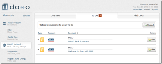
Electronic biller page at Doxo for fictional Goliath Bank (21 Oct 2010)
Note: The “To Do” tab is where account statements are delivered

Electronic biller page at Doxo for fictional Goliath Bank

Doxo inbox for receiving statements and other communications

Doxo in-box for receiving statements and other communications

Doxo storage area for filed statements
Note: Users can upload their own electronic documents to supplement (or in lieu of) those received through the Doxo platform

Doxo storage area for filed statements

Note:
1. The company has tweeted that it will hand out invites to its followers on Twitter.com/doxo. Update: Doxo sent us some invite codes, use “netbanker” as your access code. 

Best of BAI Retail Delivery 2010

image For bank-tech geeks, it doesn’t get much better than the annual trade show in the desert, BAI Retail Delivery.

Although able to take in only a tiny fraction of the show’s offerings, I’m still jazzed to be offering my annual list of personal favorites from Tuesday and Wednesday’s lineup in Las Vegas (note 1):

The Netbanker Awards (note 2)

  • Best new product: Mitek mobile bill capture via scan-and-pay using iPhone camera (blog entry to follow) 
  • Best mobile innovation: See above
  • Biggest marketing opportunity: Marketing via Facebook
  • Best year-over-year gainer: Cardlytics going from 0 to 100+ bank deployments since its statement rewards programs launched a year ago
    Runner up: ClariMail was up sixfold in mobile-transaction volume and revenues (press release)
  • Best self-service idea: Customer service popup chat after customer incorrectly enters password several times, but BEFORE they are locked out (credit to Sykes VP Marketing, Mike Clarkin)
  • Best celebrity general session: Tom Kelley, GM IDEO, who made me laugh and made me think; the perfect keynote recipe 
    Biggest conundrum (from above): Tom Kelley pointed out that the top of the value pyramid is selling the “experience” (commodity >>> product >>> service >>> experience). Is this something that banking can aspire to or does the retail experience realistically stop at the “service” level?
  • Best presentation by an FI: BBVA Compass with SmartyPig
  • Best mobile evangelist: Drew Sievers, mFoundry CEO
  • Best place to hang out on the show floor: Yodlee’s booth (again)
  • Best schwag: Squeeze “ball” in the shape of an ATM from uGenius
  • Best tease: The “huge announcement” coming next week from PayPal
  • Missing in action: No espresso giveaways on the show floor

Things seen on the show floor that I want on my personal accounts now (in order of importance):

  • An automated phone call to authorize high-value transactions (see PhoneFactor)
  • PayPal integration within online banking
  • Mobile bill capture (see Mitek)
  • Contactless payment sticker for my phone (see Bling Nation)
  • In-statement offers (see Cardlytics and Billshrink)

Best stats:

  • 80% of Western Union payment customers have a bank account, it’s just too much of a hassle to use it for international remittances (per Dan Schatt, PayPal)
  • SMS messages have a 70% open rate (per Carl Tsukahara, CMO ClairMail)
  • $1.4 billion in savings goals have been established on SmartyPig’s platform
  • Active mobile banking users will grow fivefold in next four years, from 10 mil at YE 2009 to 53 mil at YE 2013 (per Tower Group in study commissioned by ClairMail)

Best quotes:

“Most major banks are doing something on Facebook. Most just got started (and aren’t live yet).”
         — Brad Smallwood, Facebook

“(PayPal) believes it can take risk out of the banking system”
          — Dan Schatt, PayPal

“(Users) are more likely to achieve financial goals that they have shared with friends”
         — Bob Weinschenk, SmartyPig

——————

Notes:

1. I jetted back last night, and missed today’s partial-day closing. So these observations are based on what I saw Tuesday and Wednesday. Again, I talked to only a couple dozen companies of the 200+ on the floor, and attended nine or ten sessions of the 100+. My apologies to all the companies with cool stuff that I either didn’t see or didn’t understand.
2. The “bests” excludes the 56 launches at Finovate 2010 two weeks ago
3. I’ll post the links from my presentation, “Six Big Ideas from Finovate 2010” in a separate entry.

Links from my Oct 19 BAI Retail Delivery presentation

Thanks BAI, what a great week at Retail Delivery again (see my personal highlights from the show). This year, I had the honor of presenting six key ideas from Finovate 2010 at an afternoon breakout session.

Following are the ideas and the Finovate 2010 companies used to illustrate them. Videos of all FinovateFall 2010 demos will be available free of charge at Finovate.com soon. Videos from earlier events are already available. 

1. Mobile everything (note 1)

2. Simpler is Better (includes paperless)

3. Youth Banking

4. Advanced payments at the POS (for on- and off-line)

5. Selling behind the password (aka Marketing via OLB)LeadFusion

6. App Stores

—————
Note: I showed just three mobile apps because my presentation preceded a 45-minute panel on mobile apps. Also in the intro, I showed mobile apps from USAA, PayPal, Amazon, Y-12 FCU, and StateFarm.