Southern Bancorp Launches "Shake and Bank" iPhone App Aimed at Youth

image It’s been more than six months since we last featured a new mobile app from a financial institution (see Arvest Bank’s financial calculators). It’s not because of lack of activity, or importance. In that time, more than 1,000 financial institution apps have been introduced and the market has really heated up.

But we focus on what’s new and different. And for the most part, the class of 2010 and 2011 have been “me-too” entries. Which is exactly as it should be. Every mid-sized and larger bank and credit union needs at least one app in the iTunes store, so the last 18 months have been about gaining competitive parity. 

But things will start to get more interesting again as financial institutions:

Southern Bancorp’s new mobile app, Shake and Bank, ticks all four boxes. It’s an iPhone/iPod Touch app designed to give kids (or any account holder) a quick look at the balance in their account. As you can see below, Shake and Bank is pretty much self-explanatory:

1. Open app (note 1)

2. Shake iPhone

3. See balance

The app requires a setup code to launch. According to the iTunes entry, the code can be obtained through the bank’s website or at a branch. But as of today, I see no mention of Shake and Bank, or mobile banking for that matter, at their website.

Bottom line: I’m a sucker for pigs, so obviously I like it. But more importantly, Southern Bancorp makes it easy to monitor account balances with a simple kid-friendly approach. And parents will appreciate the help reinforcing the savings habit (note 1).

Southern Bancorp has $1.1 billion in assets and 40 branches in Arkansas and Mississippi.
————————

Southern Bancorp’s iPhone app targeted towards kids (link, 25 April 2011)

Southern Bancorp's iPhone mobile banking app targeted towards kids      image 

—————————

Notes:
1. Since I couldn’t test the app without an account, I assume there is no subsequent login requirement once you’ve entered the setup code. And more importantly, I hope that it oinks when shaken. 
2. For more info on mobile banking, see our previous Online Banking Reports.

Homepage Hits: Bank of America Promotes Image ATMs

imageI look at banking sites a lot, and sometimes a page or promotion strikes me as a cut above the  rest. For example, today’s Bank of America promotion of its image ATMs is eye-catching and must be gathering substantial clickthroughs (more on that below). 

Technically, everything about the promotion is first-rate, from the color to the typography to the copy. But what I really like is how this positions the bank as the place for anyone who appreciates elegant technology solutions to their everyday problems. 

Bank of America personal homepage (21 April 2011, Seattle IP address, customer cookies)

Bank of America homepage (21 April 2011, Seattle IP address, customer cookies)

However, the landing page (below) leaves a lot to be desired. A video of someone using the ATM would be perfect. How about links to an FAQ for those with more questions about the technology, risks, costs, guarantees, availability and so on? And a link to the checking account signup form would seem appropriate. But at least BofA did direct people to its ATM finder (in two places). 

Landing page

image

Bottom line: This BofA effort reminds me of the advertising adage that the worst thing you can do is put out good advertising for a bad product. Before the bank put such an appealing visual on its homepage, it should have put together more content for those clicking through. It’s not bad, just a bit of a wasted opportunity. 

30 Most Popular iPad Apps from U.S. Banks and Other Financial Services Companies

image Apple tweaked its propriety algorithm that ranks apps in terms of popularity (Cnet article). Evidently the changes had an impact on overall rankings, but little or no effect on intra-category ranks.

That holds true with my casual observations within the finance category. Regardless, it seemed like a good time to visit the App Store and document which financial iPad apps are currently most popular (see Table below).

Note: The first column below is the rank among all financial institutions (as defined below). The second column in the app’s rank within the entire App Store “finance” category.

Observations:

  • The highest rated bank is Chase at number 9 in the finance category
  • There are only two banks (Chase & USAA) in the top 20
  • There are only seven consumer banks in the top 200 (Chase, USAA, Bank of Oklahoma, Trustmark, BB&T, BBVA, Bank of Texas)
  • There are more credit unions (8) than banks (7) in top 200 in the finance category
  • Still missing some huge banking names (Amex, BofA, Capital One, Citi, Discover, Mint, PayPal, US Bank)

My methodology: Using an iPad and iPhone, I accessed the finance category of the App Store and sorted by “Most Popular.” I am including only apps from any U.S. financial institution or from third parties that tap directly into financial institution data using account aggregation (e.g., from Yodlee, CashEdge, etc.). Pure content apps, like Schwab’s On Investing magazine, were not included even if from a financial institution.

FI Rank Finance Rank Company App Name
(+ company)
1 1 Pageonce Money & Bills (free)
2 2 Square  
3 3 Maximo Cavazzani (works with
TD Ameritrade)
iStockManager
4 9 Chase Bank Mobile
5 10 Pageonce Pro – Money & Bills
6 11 E*Trade Mobile Pro
7 15 TD Ameritrade Mobile
8 20 USAA  
9 21 Fidelity Investments  
10 22 Thinkorswim (TD Ameritrade)  
11 29 Expensify Expense Reports
12 49 Mercedes-Benz Financial My MBFS
13 50 Wescom Central Credit Union Mobile
14 59 TDECU Mobile
15 67 BofAML (BofA Merrill Lynch) MyMerrill
16 68 Bank of Oklahoma Mobile
17 74 MACU (Mountain America) Mobile Banking
18 88 Trustmark National Bank  
19 96 thinkMoney (TD Ameritrade)  
20 97 BofAML (BofA Merrill Lynch) Merrill Edge
21 98 JP Morgan Mobile
22 107 BB&T Banking
23 114 thinkorswim (TD Ameritrade) VEO Mobile
24 131 BBVA Compass Mobile Banking
25 169 NASA FCU Mobile Banking
26 170 DATCU Credit Union Mobile Banking
27 182 SCU (Scott Credit Union) Mobile Banking
28 188 Bank of Texas Mobile Banking
29 193 GWCU (Goldenwest Credit Union) Mobile Banking
30 194 American Eagle FCU Mobile Banking

——–

Note: For more info on mobile banking, see our previous Online Banking Reports.

Links from My April 13 FIS Customer Conference Presentation

image Thanks again to FIS for allowing me to speak at its annual customer confab in Milwaukee. And thanks to everyone who attended.

Here are the links from my presentation in the order presented:

image 2010/2011 highlights:

 imageMobile does new tricks:

imageOnline information management:

Merchant-funded rewards:

image

Family banking:

———

* Will be demoing at FinovateSpring 2011, May 10 & 11

Bank Website Redesigns are Back: Salem Five Outdoes Itself

image Unless it was mission critical, or compliance mandated, there is a good chance your pet project was put on hold during the 2008-2010 financial crisis. Most website-redesign projects, despite good ROI, drop into that “discretionary spending” bucket.

But as we approach the one-third-mark of 2011, we are starting to see the results of design projects green-lighted in the last budget cycle. Bank of America, the most-visited financial website, rolled out its new design late last year.

But smaller financial institutions are also doing great work, ofttimes offering a better user experience than the big brands, which must be all things to all people. The Financial Brand rounded up a half-dozen great examples in a March 23 post.

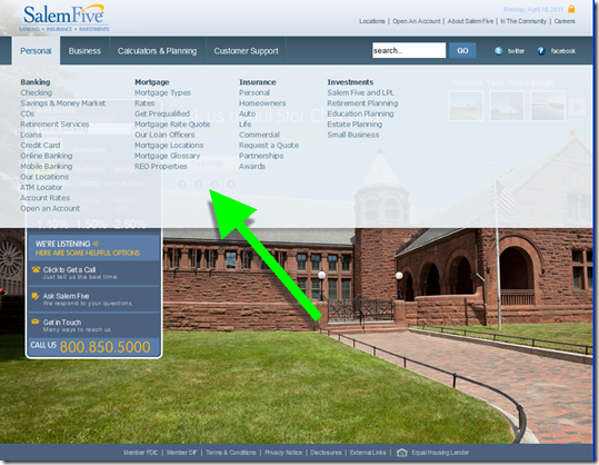
One that I particularly liked (note 1) is Salem Five’s new homepage (shown below). Not only is it gorgeous, the navigation is outstanding with a large box containing key info (see points A and B below) and drop-down mega-menus (second screenshot) for everything else.

A few highlights of the new design (letters correspond to those shown on the screenshot):

A. The small outlined box on the left contains important info including the online banking login and current rates for key products.

B. The bank makes it easy to find contact info by listing the toll-free number at the bottom of the box. The bank also features LivePerson-powered click-to-call, one of the recommendations from our most recent report (note 3).

C. Despite the minimalistic design, the bank still has four low-key, text-based promos running across the screen.

D. Users can choose from 19 background themes to use as the backdrop (note 2).

Salem Five homepage with customizable backgrounds (18 April 2011)

Salem Five homepage with customizable backgrounds (18 April 2011)

Salem Five uses drop-down “mega menus” to help users navigate to the far corners of its website

Salem Five uses drop-down "mega menus" to help users navigate to the far corners of its website

Notes:
1. I’m a bit biased because I’ve been following Salem Five since the summer of 1995 when we both spoke at the first-ever conference on Internet banking.
2. I’m not sure many users really want to choose their homepage backdrop; I personally prefer that the images be randomly rotated. However, it does show considerable web-savvy that the bank offers a customizable design option. After Salem Five is done showcasing the feature, the option to change pics should probably be taken off the homepage. It’s taking up prime real estate in the upper-right corner. 
3. For more info on click-to-call and other “live help” techniques, see the most recent Online Banking Report (March 2011).

Ally Bank Posts Real-time Call-center Wait Times on Homepage

imageAlly Bank made news this week as one of the few major banks offering consumer PC/scanner-based remote deposit (USAA and US Bank also offer it, note 1). But that new feature has not yet filtered out  to its website. While disappointed in not finding what I was searching for, I did notice something even better:   

imageThe wait time for its call center, updated in real-time, right at the top of every page (see screenshot, below). 

The first few times I checked the site, it always said zero and I wondered if the bank left it permanently there to demonstrate its call-center prowess. But now the wait-time has moved out to six minutes (11 AM Pacific time on a Thursday…a couple days in front of the U.S. tax deadline).

But that’s even more important for public acknowledgement. When wait times stretch to several minutes, customers can decide to call back later or spend a few minutes checking Facebook before a banker comes on the line. It also gives Ally’s customer service department a big incentive to keep the queue at a reasonable level. It’s a complete win-win.

The bank should also add a click-to-call feature so customers can skip the queue and simply request a call-back, a technique that can potentially cut support costs by shortening average call time (see note 3). Ally does offer live chat on its Contact Us page. However, it must be a lower staffing priority as I found intermittent availability on a Friday morning (8:30 AM Pacific) even though wait times for the call center were zero.

imageBottom line: Ally’s real-time availability is so much better than simply plopping a smiling face in the corner of your website and inviting calls. The estimated hold time demonstrates the bank’s respect for its customers’ time, something rare at large consumer brands in any industry. It’s a great tangible benefit to the “ally” positioning.

Because it raises the “state of the art” in online support, we are awarding it our first OBR Best of the Web for 2011 (see note 2).  

Ally Bank homepage with real-time call center wait time monitor (14 April 2011)

  Ally Bank homepage with real-time call center wait time monitor

————————————–

Notes:
1. Post updated at 10 AM: Originally I said the new Ally service was
“mobile” remote deposit, Ally let me know that it was PC-based online
remote deposit (previous post on US Bank’s service)
2. Since 1997, Online Banking Report has periodically given OBR Best of the Web awards to companies that pioneer new online or mobile banking features. It is not an endorsement of the company or product, just recognition for what we believe is an important industry development. If anyone knows of other financial institutions offering a similar feature, let us know and we’ll update the post. Ally is the 81st company to win the award since 1997 and the first in 2011. Recent winners are profiled in the Netbanker archives.
3. For more information on delivering “live help,” see the most recent issue of Online Banking Report.

Bank of America Offering Trusteer’s Rapport Plug-in to Protect Online Banking Customers

image If there was any question as to whether Trusteer  had become the industry standard in online banking protection, it was answered this week. Bank of America is now offering the optional Rapport protection to its 29 million online banking customers. Ann Carrns in the NY Times Bucks blog wrote about it a week ago, but I guessed I missed it in all the April Fools Day commotion.

ING Direct was first to offer the program, launching in May 2008. Since then dozens of financial institutions have followed including Zions, PSECU, CIBC, PayPal, Santander, RBS and about 70 more (see full client list below in note 2).

In total, Trusteer says it’s been downloaded more than 20 million times.

Analysis: It’s a good move by Bank of America. While Rapport does not protect from all possible threats, it does seem to provide material improvements. The bank gets a double benefit: less fraud and improved perceptions from customers concerned about security.

The program is not without downsides, however. It requires a download and installation, though thankfully not a full reboot (see second screenshot). And like any software program, there are real and perceived compatibility and performance issues (see the comments on the NY Times blog entry).

Bank of America would be wise to make it easier for customers to find out more info on the program. There is only a tiny link buried at the bottom of the interstitial ad for more info. And that screen goes away after you press the download button.

Users who are surprised by the download warning, and even worried that they’ve been attacked by a virus, will find it difficult to find more info at that time. Rapport is not yet mentioned in the bank’s security area accessible from online banking. Only by going back to the public site and searching for “Rapport” was I able to find the page offering more info (third screenshot).

Many users are going to need more hand-holding and reassurances before they install the program (note 1). The bank could save itself, and its customers, from thousands of harried support calls, by adding a detailed a “how it works” tutorial integrated into the interstitial.

Bank of America interstitial ad after online banking login (7 April 2011, 2 PM):

Bank of America interstitial ad after online banking login

To use the service, users must download and run an executable file (Windows version below, there is also a Mac version)

To use Rapport, BofA users must download and run an executable file

Bank of America Trusteer Rapport info page (link)

Bank of America Trusteer Rapport info page

——————–

Notes:
1. For more info on Trusteer and other security topics, see Online Banking Report: New Security Techniques (Sep. 2008)
2. Trusteer financial clients (per company)

Watching the Mobile Payments Battle Unfold

Editor’s note: This guest post was written by Daniel Thomas, a 25-year veteran of the financial services industry and a principal consultant with Mindful Insights LLC. He’s been involved in strategy and product development for Online Resources Corporation, ARINC, and TeleCheck. He recently authored a report on merchant-funded in-statement rewards for Online Banking Report.


image The Alternative Payments Systems Innovations (APSI) conference held in San Francisco last week may want to change its name to Mobile Payments Systems Innovation. It seems that all things mobile has totally eclipsed any interest in non-mobile untraditional payments.

And for good reason, the speakers and a hundred or so fully engaged attendees at the second annual APSI summit, seemed unanimously to agree that the convergence of virtual and physical purchasing, social networking, rewards and promotions will be solved by the use of mobile phones. And that is saying a lot given the mix of technology companies, payment companies, merchants and financial services companies represented in the room.

However, there is uncertainty on what exact form the eventual solutions take. But each company with an innovation is positioning themselves to be on the winning side when the dust settles and at least one prediction by chip maker INSIDE Secure Corporation’s COO Charles Watson says “it will unfold in the next 18 to 24 months to see who are the winners and losers.”

imageFor us payments geeks, it’s a little like being one of the people from the Virginia countryside who brought lawn chairs to watch the first battle of Manassas in the Civil War. We have an opportunity to witness payment history before our very eyes. For those companies that are on the battlefield, well, some will win and others will become what Steve Klebe, VP, business development and strategy at BilltoMobile calls “alternative payments roadkill.”

The key issue is control of the consumer. This is not a new issue, of course. Richard Crone’s (president of Crone Consulting, LLC) timeless mantra, “The one who enrolls (is the one who) controls” is as true with m-payments as it was with e-payments and bill payments before that. However, no longer is this control of the consumer limited to a tug-of-war between the banks and the merchants. Mobile Network Operators (MNO), handset manufacturers and even social networks are all investing in innovative new technologies and functionality to be in the best position to do the enrolling.

The technologies that are being developed to win this control tend to fall into three main categories:
___________________________________________________________

NFC-enabled phones (and stickers)
___________________________________________________________

Mohammad Khan, president of ViVOtech, the NFC payment and promotion solution provider says that 2011 is the year of NFC and that “by the end of the year, 60-70 million NFC-enabled phones are expected to be released–mostly in North America.” The presumption here is that consumers equipped with this new functionality will be looking for a place to use it and will ultimately drive merchants to upgrade their POS equipment to accept tap-and-go payments.

Indeed, INSIDE Secure’s Watson predicts that NFC enabled smart phones will generate the next generation of phone apps that have nothing to do with payments but will get consumers hooked on tapping (think: tapping posters to receive coupons, tapping labels on store shelves to learn about products, tapping when you walk into a store to check-in and receive offers, tapping phones with someone you meet instead of exchanging business cards, etc.) and that this acceptance by consumers will drive their demand for tapping to pay at the point of sale.

Yet other companies fail to see the value in NFC to consumers. Chris Hylen, VP and GM, Intuit Payment Solutions Division says Intuit is banking on its Go Payment card swipe system that attaches to the iPhone. They believe that in the future everyone that wants to receive money will be able to receive credit card transactions. To prove it, Hylen played this adorable video clip of girl scouts accepting payments with their device. What could be easier?

He went on to say that “NFC is a solution looking for a problem” since it is much easier for a consumer to pull out their card than it is to open their phone, go to the appropriate app, enter a password, select a payment type and then tap the phone to a POS reader. This sentiment was echoed by Vince Kadar, CEO of Telepin Software who asserted that NFC means “Not For the Consumer”.
___________________________________________________________

Virtual Wallets
___________________________________________________________

Okay, so maybe virtual wallets are the answer? After all what could be easier for a consumer to understand? Their phone now contains all of the information that used to be in their leather wallet. But which wallet will we use? The one promised by the group called ISIS led by AT&T, Verizon, T-Mobile, Discover and Barclays Bank? Or the one developed in the future by the partnership of Google, Citi and Verifone? Or the neutral and agnostic wallet announced and demoed at the show by Zenius Solutions President John Weise, the Zenius Mobile Wallet?

Since control of the consumer is the goal, every large merchant, mobile network operator, handset manufacturer and card issuer is going to be developing a wallet that they will want you to use as your primary wallet. How is that going to work? I can smell a new business opportunity for data aggregators like Yodlee and CashEdge a mile away, but won’t that defeat the purpose of gaining control? Somehow I can’t get the vision of George Costanza’s wallet out of my head.
___________________________________________________________

Carrier Billing
___________________________________________________________

The simplest solution, deemed the only “frictio
n-less” mobile payment type by the service providers that offer it, is the concept of paying for items with a charge to the phone carriers’ monthly bill. The concept is inherently secure since the payment providers have real-time access to the phone company database (and they know where you live!) and a second factor of authentication, a text message to your phone that you need to reply-to.

The companies leading the charge in this space include PaymentOne, MoPay, BilltoMobile, and BOKU. And while its true that they don’t have the problems that NFC and wallet providers have, there are currently clear boundaries to the types of items that can be bought with carrier billing services.

Purchases today are limited to small dollar (micropayment) virtual goods such as ring tones, wallpaper, game purchases (if you are one of the millions of people that like to pay to throw virtual sheep) and the like. However, you cannot buy a refrigerator at Sears. At least not until these companies work out the issues between the merchants and the carriers about who pays for fraud losses, how often funds are settled with merchants (remember you only pay your phone bill once a month and Sears isn’t going to want to wait a month to get paid for their refrigerator!) and how customer service will be handled for things such as charge-backs.
___________________________________________________________

Summary
___________________________________________________________

The conference concluded with a focus on major merchants and explored their needs and wants for new payment types. Representatives from Walmart, 7-Eleven, Inc., Macy’s and SUBWAY Restaurants each explained how they were looking for reduced costs, reduced lines, reliability, security, easy implementation and low maintenance associated with any new payment mechanism they deploy. In addition, they want the system to include the ability to offer rewards and promotions near-store and in-store.

That’s a pretty tall order for any new payment solution. Are the merchants being unreasonable? After all, each has tens of thousands of POS locations to worry about, employee training, employee turnover, software changes to make, capital decisions on hardware, and so on. Looking at it from that perspective, one can see why these retailers are among the many that brought extra comfortable lawn chairs to the battlefield sidelines. Maybe it won’t be such a quick war after all.

———————–

Notes: 
1. The conference was expertly organized by Strategic Solutions Network. Many thanks to CEO Aron Barkan along with Sara Sturman, Paula Haggerty and Debbie Bernbaum for an informative, interactive two days.
2. Picture credit: Prince William Conservation Alliance 
3. For more info on mobile banking, see our previous Online Banking Reports.

New Online Banking Report Published: Delivering "Live Help" Online

image At Online Banking Report we’ve written a few reports about online customer service over the years (see note 1). However, we’d never looked in-depth at so-called “live help,” (note 2) which includes:

  • Live chat: predominantly audio, but can also be one or two-way video
  • Click-to-call: a button used to request a call-back from an agent
  • Co-browsing: sharing a screen between user and agent

Co-browsing is still a little too out there for most customers, so we focused primarily on live chat and click-to-call, both relatively widely adopted and proven money makers for online retailers.

clip_image002Bottom line: After reviewing dozens of white papers, talking to a number of industry experts, looking at a hundred websites, and live chatting with service reps in the wee hours, I’ve come to a definitive conclusion on the value of live chat.

It depends. 

Clearly, live chat delivered perfectly can cut costs and lift revenues. But it can also confuse customers, drive up support costs, and get in the way of moving from point A to point B on a website.

clip_image002[10]But as generation text moves into their prime banking years, banks will be chatting more and more with customers, both online and via mobile messaging. So eventually, most financial institutions will need to offer some variation of Live Help to remain competitive (note 3).

______________________________________________________________

About the report
______________________________________________________________

Delivering “Live Help” Online (link)
Live chat and click-to-call promise to increase sales, make customers happy, and save money; what’s not to like?

     Published: April 5, 2011

     Authors: Jim Bruene, editor & founder, Online Banking Report 
                    with Philip Britt, founder, S&P Enterprises

     Length: 60 pages (12,000 words), 14 Tables

     Cost: No extra charge for OBR subscribers, $495 for everyone else here

—————————————————–

Notes:
1. The most recent Online Banking Report on email customer service is here (2004)
2. Our inspiration for the latest issue was Jeffry Pilcher’s post in The Financial Brand (Jan. 2011).
3. However, the first order of business remains turning email into the valued support tool it needs to be. See Email Banking: Revitalizing the Channel (Aug. 2010)

Chase Bank Plays the Ecommerce Card: Offers $100 Bonus for its "Instant Storefront" Solution

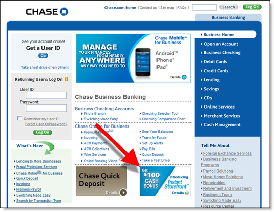
image Chase Bank is aggressively pushing its latest small biz initiative, Instant Storefront, billed as a way for old-school “9 to 5” businesses to sell online 24/7. Here’s where I ran across it last week: 

  • A radio ad a few days ago (in Seattle)
  • Full-page ad in the San Francisco Business Times (p. 24 of March 25-31 issue)
  • On the main account management page within online banking
  • Small ad on Chase’s business banking public page today (see last screenshot, note 1)
  • Email yesterday offering a $100 bonus to give it a try (see first screenshot, note 2). 

The email is short and sweet with a good subject line and appealing design. The green button leads to a landing page with more info (second screenshot). The page includes an old-school, and very effective lead-gen technique, offering to email the $100 coupon to interested visitors (third screenshot).

The cost is $30 per month, and the bank throws in a $350 POS terminal and waives $150 in startup fees for new Chase Paymentech merchant customers.

To redeem the offer, customers must visit with a business banking specialist in a Chase Branch. Ecommerce website development seems like a bit of a stretch for a business banker to be conversant with, but hopefully it’s very turn-key. And I like how the service positions Chase as an online partner to small biz, so it may be a brilliant branding tool.

Using a browser with cookies removed (note 1), I don’t see any mention of the new service on Chase’s website and searching for “storefront” in its site search returns nothing (note 3). So Instant Storefront may be a western market test.

———————————-

Chase Bank email to business customers about Instant Storefront (30 March 2011)

Chase Bank email to business customers about Instant Storefront (30 March 2011)

Landing page for Instant Storefront (link)

Landing page for Instant Storefronts

Lead-gen page where users enter their email address to get the $100 coupon

Chase Lead-gen page where users enter their email address to get the $100 coupon

Chase public business banking site (with Washington state customer cookie)

Chase public business banking site (with Washington state customer cookie)

—–
Notes:
1. The ad appears only on the browser I use to access my Chase account. On browser with cookies disabled, I do not see the Instant Storefront ad.
2. The print and radio ads also offer the $100 bonus.
3. The bank uses the URL: chase.com/storefront in its radio ad.
4. For more info, see Online Banking Report: Micro- and Small Business Online Banking (published Oct. 2009)

BankSimple’s Vision Statement is All About High-Touch

image Over the years I’ve published more than a million words and this is the first time I can remember using the term “vision statement,” and in a headline no less. I’ve spent enough time in large companies to know that when you hear “vision statement” it’s time to run for the exits. Usually, even the employees don’t buy it, let alone the customers it’s supposed to impress.

However, BankSimple’s vision statement is not only believable, but also sets a great tone for the startup’s upcoming launch. It’s also cleverly positioned on the homepage to “jump up” above the fold as you scroll down.

Why does it work? Everyone knows that BankSimple, with its Twitter DNA and $3 million in venture funding, will have good tech. So the startup focuses on people and service in its vision statement to make it clear that it’s not some aloof, high-tech company where it takes a search warrant to find the customer support number, but an actual human-powered organization (see details below). Nice touch (note 1).

image

____________________________________________________________________________

Breaking “the vision” down point by point
____________________________________________________________________________

image

It’s no surprise that the non-bank bank is tackling the fee issue. It’s in the news and it’s always high on the list of customer dissatisfaction. But notice they are not using the word “free” or saying “no fees.” They are just saying they will be transparent with pricing and will not surprise with penalty fees when you can least afford them.


image

Everyone talks about service, so this isn’t particularly novel. But the use of “prioritize” and “real” will resonate with the segment they are targeting.


image Grabbing the mobile positioning is brilliant. That’s absolutely where the market is headed, so you might as well make it a key differentiator. And while no one knows what “true mobile banking” means, it sounds good.


image

I’m not sure this adds a whole lot to the vision. In the text by this point, the bank talks about “plain, simple language.” Sounds OK, but not as compelling as the other points. I’d have nixed it and kept it to a tidy four-point vision instead.


image

The tagline for this point is, “You’re a real person, not an account number.”

Bingo. Here’s a pure-play online bank run by uber-techies, but they are saying they are really all about the people. High tech. High touch. Love it!

———————————————————–

Note: Yes, I’m aware that BankSimple abbreviates to BS. And no, I’m not its biggest fanboy. See this self-proclaimed “love letter to Bank Simple.”