Bank Opportunity: Online/Mobile Travel Insurance Sales

imageWhen your core business has been around for hundreds of years, it’s harder to find new sources of revenue. One area ripe for expansion at many banks is insurance. Wells Fargo, for example, put more emphasis on the area by separating insurance from investments in its June 8, 2013, homepage remodel. See our full insurance report for more info on the market size and opportunities for banks.

While auto, life, health and home are the biggest in terms of overall premiums, they are also highly competitive with hundreds of thousands of established sales agents in the U.S. alone. But dozens of niche insurance-markets exist that might make it easier to find a foothold.

Take travel insurance.

You’ve seen these policies pitched when you are checking out at Expedia or other travel sites. While it’s tough to compete with the convenience of buying during the travel-booking process, financial institutions still have an advantage that Expedia doesn’t: Trust.

I’ve been using Expedia for 15 years and have booked 100+ trips there with few problems. So I trust them with travel arrangements. But does that trust extend to insuring my travel? Not so much. It’s hard to understand exactly what is included/excluded in their insurance upsells. And the one-size-fits-all approach rarely covers what I’m looking for in travel insurance (which is “no questions asked” cancellation). And often I’m exhausted after making complicated travel arrangements and have no energy left to figure out whether their insurance makes sense.

I’d much rather purchase a policy from a trusted source where I can get answers to specific questions, review policies after the fact, and be able to come back year after year for consistent choices. And since I don’t have a direct relationship with an insurance carrier (everything is bought through a small broker), I would be very interested in buying from my bank.

imageI’m not sure how many U.S. financial institutions offer travel insurance, but I suspect it’s a small number. But there is one major player with a comprehensive travel insurance offering, BB&T (see screenshots below).

Getting a quote is easy. You simply tell the bank how many travelers you have, their age, travel date and cost. Within seconds, three options are presented (screenshot #1) covering basic trip interruption to one that covers medical evacuation and much more (screenshot #2, note 2). It even allows you to upgrade to “cancel for any reason” for a reasonable additional fee ($63 per person for my hypothetical $3,000 per person trip).

Actually buying the insurance requires a few more fields to be completed (see screenshot #3). But at that point, I already know that it’s worth my while and am not put off by additional data entry. And if I was already logged in, these fields should mostly be prefilled.

Bottom line: With a captive audience of authenticated online and mobile users, banks and credit unions could be the biggest providers of travel insurance. And with the added advantage of seeing travel-reservation charges appearing on debit and credit cards, you can cross-sell the service while the trip-reservation process is still fresh in the customers’ mind. 

————————–

1. BB&T produces three options for travelers (24 June 2013)
Notes:
1. Live Chat option in lower right
2. Total cost shown for two travelers going on a $3,000 trip that begins 60 days from now

image


2. Detailed coverage of BB&T Deluxe Protection Plan

 image

3. Complete application for each traveler

image

4. BB&T is one of a few financial institutions to include “insurance” as a primary navigation item

image

———————————–
Notes:
1. See our full Online Banking Report on “Banks in Insurance” here (Dec 2011, subscription)
2. To earn my business, I’d want to mix and match some of these benefits. The policy I want is basic interruption, but with the ability to cancel for any reason and with a deductible to bring the premium down.   
3. Picture credit: 1938 vintage travel poster at eBay

Metrics: Mobile Traffic at Six Large Prepaid Card Sites

image In March, we reported on the mobile traffic at the 10 larget U.S. banks. Across all ten banks, an average of 20% of users were mobile-only.

Today, comScore provided similar numbers (note 1) for major prepaid card issuers in Q1. And the mobile lift was even more dramatic. Across the six major issuers, the incremental traffic through mobile browsers (not including native apps) ranged from 23% at WalmartMoneyCard.com to 80% at Netspend. The weighted average lift across all six was 43%.

Bottom line: While we need conversion rates to gauge channel profitability, it’s clear that mobile users are a large potential market for prepaid issuers.

—————————–

Table: U.S. desktop and mobile browser traffic at six large U.S. prepaid card sites
millions of unique visitors, age 18+ (Feb 2013)

Q1 2013 Total Desktop Mobile* Mobile Only Mobile Incremental**
netSpend 1.4 mil 790,000 670,000 630,000 80%
WalmartMoneyCard 1.1 mil 930,000 230,000 210,000 23%
Rush Card 980,000 710,000 290,000 270,000 38%
Green Dot 820,000 560,000 270,000 260,000 46%
Account Now 600,000 450,000 150,000 140,000 31%
Amex Bluebird* 370,000 240,000 130,000 130,000 54%
  Total*** 5.3 mil 3.7 mil 1.7 mil 1.6 mil 43%

Source: comScore, monthly unique visitors in Q1 2013 (methodology)
*Includes traffic only from mobile browser, except American Express BlueBird, which also includes native app
**Mobile-only divided by desktop base
***Includes some overlap of users visiting multiple prepaid issuers

——————————

Note:
1. The banking numbers in March included native app traffic. The prepaid card traffic estimates exclude any native app traffic, except for American Express Bluebird which has both native and mobile browser traffic.

The Simple Finance Game or “Hiding PFM in Plain Sight”

image I’ve written thousands and thousands of words about personal finance management (PFM) including seven deep dives in our Online Banking Report (see note 1) and 130 131 blog posts. However, I’ve never articulated the behavioral aspects as well as NY Times software developer Andre Behrens who pens the occasional post at NYTimes.com.

In his Tuesday article, Gamification Done Right, he uses (Bank) Simple as an example of a great use of game mechanics:

Simple.com is the most beautiful bank site I’ve ever seen…but aesthetics are just a baseline. Because what Simple actually wants to do is get you to play a game. The game is called “Master Your Finances”….

HPFM lite: Bank Simple safe-to-spend balancee then describes a key part of this game, which Netbanker readers will recognize as Simple’s Safe-to-Spend balance:

If there’s one number you’re guaranteed to see on a bank site, it’s your balance…I take this number for granted…what other number could there be? But once you start playing the Simple Game, you realize this is a number that matters to the bank much more than it matters to you. What you care about is how much money you can use right now.

He goes on to write about how Simple encourages users to keep savings in unique buckets associated with goals:

…saving has always felt to me like denying myself fun spending opportunities. In the Simple Game, the opposite has proven true. Because every goal has a name and a committed plan, and because the transactions are presented in small increments, saving has become an anticipatory pleasure.

Bottom line: Read the whole article. It may help reinvigorate your efforts to infuse basic PFM concepts directly into everyday online/mobile banking. Every customer should be able to reach the first level of the finance game simply by logging in. How do you take it to the next level? That sounds like the makings of post #132, 133, 134 …..

——————————-

Note:
The OBR PFM library consists of three reports penned a decade ago on account aggregation, the PFM enabling technology pioneered primarily by Yodlee. Then four reports in the modern PFM era looking at features, benefits and bundles (subscription required):
— June 2012: PFM 4.0 here
— May 2010: PFM 3.0 here
— June 2007: Social Personal Finance here
— Aug 2006: Personal Finance Features for Online Banking here
— July 2003: Account Aggregation 3.0 here
— Aug 2000: Account Aggregation 2.0 here
— Oct 1999: Account Aggregation

Op Ed: MRI Study Finds Consumer Interest in Fee-Based Bundles

by Dr. Dan Geller

Dr. Geller is EVP of Market Rates Insight, which provides competitive research and analytics to financial institutions. He can be reached at dan.geller@marketratesinsight.com.

——————————-

imageOne of the most significant findings from our  latest study on banking fee-revenue optimization (see note 1 below) is that the majority of consumers say they will pay monthly subscription fees for value-added financial services (see chart below and list right).

The average monthly fee that more than half (55%) of consumers are willing to pay ranges from $2.17 to $5.06 per month for each service. Of course, these stated amounts are an indication of relative perceived value rather than a pricing guide.

Furthermore, we found that consumers are willing to pay a higher overall monthly fee for the bundle than they would for each of the services individually. For example, study respondents indicated they are willing to pay $3.07 per month for a credit score report, $2.43 for account alerts and $4.27 for prepaid card for a total of $9.77. However, when the three were offered as a bundle, respondents valued them at $10.51, an 8% premium.

Bottom line: We believe there is a path for financial institutions to move customers "from free to fee" by bundling services in the optimal way.  

—————————-

Chart: Consumer Interest in Value-Added Banking Services

image 
Source: Market Rates Insight, June 2013

——————————

Note:
1. For more info on these finding, MRI is offering a free webinar on Tuesday June 18 from 2:00 PM to 3:00 PM Eastern Time. Click here to reserve your space. The full report will be available for purchase beginning June 21 at <marketratesinsight.com>.

TD Bank Launches Dynamic Login Page

image It’s no secret that a first-time online banking visitor has far different needs than the power user returning for login #1,712. But most banking sites provide the same visual login treatment for all users.

That forces new users to search out buried "getting started" or "register" links. Or they will make time-consuming, and expensive, phone calls to customer service for guidance.

And the one-size-fits-all approach is not optimal for experienced users either. As they skim by the static boilerplate in the banking version of banner blindness, power users miss the chance to learn more about new features and promotions.

The new design unveiled last week (4 June 2013; see old look in last screenshot below) from TD Canada Trust aims to solve both problems: 

  • After selecting login on the homepage, new users are shown a page with prominent help on how to get started along with links to register, take a tour, get help and so on (see first screenshot below).
  • Previously logged in visitors see a page featuring a banner below the login box emphasizing a single online banking feature and contextual links on the right (see second screenshot).

Bottom line: I like the concept. And eventually the bank can segment even tighter showing different looks for intermediate users, mobile-primary customers, French-speaking customers, and so on. Even in this first iteration, TD could make it better by:

  • Greeting/welcoming the customer
  • Providing more detailed instructions (e.g. What’s the optional "description" box for?, Why are they asking for access card number or username?)
  • Adding more graphical emphasis to draw the user’s attention

For reference, see how Chase Bank handles new and existing visitors.

——————————————

TD Canada Trust login page: First-time user (4 June 2013)
Note: Getting started info placed in right column

TD Bank login page: new user

TD Canada Trust login page: Existing user
Note: Online banking tips are displayed under the login box and contextual links are shown on right, in this case a link to the mobile app

TD Canada Trust login page: Existing user

Previous login page (3 June 2013)

Previous login page prior to june 4 2013

UW Credit Union is First to Tap the Mobile Browser for Remote Deposit Capture

imageimageThere are a few dozen financial institutions I follow closely for inspiration. And one of my favorites is University of Wisconsin Credit Union. The 180,000 member, $1.6 billion asset CU, always seems to be at the forefront.

Its latest feat: Remote deposit capture from the mobile web <m.uwcu.org>. That’s not a typo. Mobile deposit capture WITHOUT a (native) app!

UWCU is the first in the world (as far as we can tell), that allows smartphone users to deposit checks right from the mobile web (see the CU’s blog post for more info). The CU taps new controls in mobile browsers (iOS and Android) to operate the mobile camera to capture paper checks. Image processing and fraud detection technology is powered by Ensenta (with Mitek IP).

The in-house UWCU dev team so far has eschewed downloadable apps in favor of mobile-optimized designs that work cross platform. They are working towards full responsive design, so any user can visit the UWCU site from any size device and receive the optimal design, complete with touchscreen controls when applicable. They are targeting year-end completion for the full package.   

But as much as Eric Bangerter (VP Ecommerce & Internet Services) and his team believe in the mobile web, they plan to bow to member pressure and offer a simple native app so they have a presence in the app stores (note 1). As Bangerter notes in a recent interview at BankInfoSecurity.com, “Not being in an app store today is kind of like not having a Google (search) result.” 

Bottom line: I’ve been a huge believer in native apps. It’s how legions of smartphone users have been trained to access services (see note 2). Many normal people don’t even understand the “browser construct” in a mobile phone. That said, I see the logic in UWCU’s approach. Like most businesses, they must prioritize their investments. And now that the mobile browser can tap the camera (and GPS), it makes sense to push its mobile power users to the mobile web. But I’m glad the CU is also creating a lightweight native app to satisfy the rest.

————————————-

UW Credit Union’s mobile-browser based deposit capture in action (4 June 2013)
Note: Watch the full 90-second demo posted in the UWCU online banking blog, Source Code.

 image       image   

———————————
Note:
1. The lack of a native app has seemingly not slowed down its mobile growth. The CU has 36,000 mobile users, an impressive 20% of its member base.
2. For more info, see our recent Online Banking Report: Digital & Mobile Wallets (published Feb 2013, subscription).

Op Ed: Banks, Shop So Your Profits Don’t Drop

by Michael Nuciforo

Michael Nuciforo is a Mobile Banking Consultant at Keatan. He previously worked at ANZ on a number of developments, including goMoney, and more recently managed the UK retail portfolio as Head of Mobile Banking at RBS. Follow him @TheBoldWar.

——————————-

image There were 2,277 of them last year totaling $45 billion. And no, that’s not last year’s football salaries. It was the volume and value of tech startup acquisitions. Yet banks barely participated. Could acquisitions be the mechanism for banks to rapidly innovate? Is it time for banks to shop before their profits drop?

Mergers and acquisitions have been part and parcel of the technology sector for over three decades. The industry wouldn’t be what it is today without it. Google Ventures invests over $400 million annually in a wide variety of startups. Facebook has already acquired over 35 businesses, with Instagram being the most notable at nearly $800 million alone. It’s big business indeed.

Why do the biggest, most successful and talented tech businesses, feel the constant need to acquire? It feels counterintuitive, but it makes perfect sense. The industry is so competitive that one day you’re My Space and the next day…well, you’re My Space. If executed correctly, acquisitions have four core benefits:

  • New Capabilities: Acquisitions are the quickest way to shift the dial or plug gaps in your offering
  • New People: It is a great way to bring on fantastic talent
  • More Protection: By buying the competition you can protect the status quo.
  • New Revenues: Acquisitions of cash-flow-positive businesses can immediately improve the bottom line

But where are the banks? Why do they seem to ignore the opportunity to acquire or partner? Of the 2,277 acquisitions in 2012, only three were by banks. We believe banks must start protecting their position by using strategic acquisitions to implement the new products and services.

image For inspiration, banks needn’t look far. Capital One, which has the sixth-largest deposit portfolio in the US, is already taking up the fight. Off the back of Capital Labs, its own start-up investment venture, the bank has established three offices in the United States. Startups can work there, obtain support and use Capital One API programs. Oh, and of those three bank start up purchases last year, Capital One completed two of them.

image In May 2012, Capital One acquired BankOns, a small San Francisco start up that won Best of Show at FinovateSpring 2011 (demo video here). It also purchased Bundle in late December (demo video).

BankOns provides a sophisticated offers and coupons program and Bundle is a data analytics and PFM platform. Besides acquiring the technology and intellectual property, CapitalOne has also had to find room for a new corner office. BankOns founder Joshua Greenough was installed as Director of Innovation immediately after the acquisition. Finally, Capital One has already made at least one acquisition this year, picking up Verifone’s Sail mPOS unit, and renaming It Spark Pay.

image The other big banking acquisition came from Chase which spent $40 million late last year on Bloomspot, an offers and coupons platform. Bloomspot comes with a 100-strong team instantly boosting the Chase Offers service. Chase had plans to hire substantially over 2013, and through the Bloomspot acquisition, they filled that gap instantly.

While these deals represent some progress by banks, it will be interesting to see if they pay off. There are numerous risks and considerations for banks looking to play in the tech M&A game:

  • Talent retention: Banks may have challenges integrating and retaining new talent. Entrepreneurs and startup talent may not find hierarchical banks the most exciting long-term place of employment. Banks should therefore place a premium on acquiring smaller start-ups with management teams with previous banking experience. They are more likely to take the step back into the industry and stay.
  • Risk aversion: Banks typically only like to work with recognized quantities, hence the fast follower mentality. Banks may struggle to commit to deals considered high-risk. Therefore, it may be better to invest in a small portfolio of smaller businesses rather than a single large deal.
  • Proving return on investment: It’s not easy to measure the true cost and revenues from a new business endeavour, especially within a large hierarchy of overlapping services. But showing that the deal paid off is the first step towards doing a sequel.

Ultimately, it is important to ensure that the vision and aspirations of both businesses are aligned. While fintech startups may not initially aspire to be acquired by a bank, money and scale talks loudest. Many of the giant payment companies such as American Express, Visa, and MasterCard have made numerous acquisitions.

With FinovateFall just three months away (Sep. 10-11), there is still time for banks to think strategically. Don’t go to just look around and swap a few cards. Don’t just think,”Can we replicate that?” Instead, go with a different point of view and figure out what businesses you could acquire or exclusively partner with. Decide whether you are looking for a particular capability, skillset, or to simply protect your turf. Look out for your own BankOns, Bundle or Bloomspot. In the banking industry, sometimes all you need is one other bank to do it and everyone follows. Oh, that’s already happened…

Crowdfunding via Facebook: Puddle’s P2P Platform Allows Friends to Pool Funds to Loan to Each Other

image When Prosper launched seven years ago, much of it’s initial promise revolved around the notion that people would be more likely to repay loans made by their peers. To  create peer pressure, borrowers were encouraged to join loosely affiliated "groups" (see note 1). Over time, groups with good repayment performance would be rewarded with lower borrowing costs.

It was brilliant on paper, but early repayment behavior didn’t follow the model. Had there been more runway (funding and/or regulatory tolerance), it might have worked. But the wicked combination of adverse selection (many initial borrowers were financially desperate and/or quasi-fraudulent, despite all the heart-warming stories posted) and the Great Recession pushed Prosper, and it’s contemporary, Lending Club, into more standard unsecured lending procedures. And it seems to be working. The two are on track to do more than $2 billion this year, with revenues of $100 million or more (Note: 85% of current volume is from Lending Club, see latest numbers here).

Fast-forward five years: With the ubiquity of Facebook, it makes sense for newcomers to test the waters of the original Prosper/Lending Club hypothesis (note 2). That friends can lend to friends (F2F) at a far lower cost. And that a third-party platform is needed to facilitate lending relationships, which can become tense if borrowers fall behind or default on their obligations.

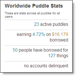
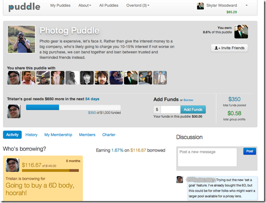
imagePuddle (formerly Puddle.io) is a new startup from Kiva CEO & Co-founder Matt Flannery and early Kiva developer Skylar Woodward along with Jean Claude Rodriguez. It uses Facebook bonds to create pools of money that friend groups can share amongst themselves. With suggested interest rates in the 4% range, it’s a win-win, assuming the money is repaid. Borrowers save 10% or more from credit card rates and lenders get a return much higher than bank savings accounts.

___________________________________

How it Works
___________________________________

1. Register with the company using your Facebook credentials

2. Connect a PayPal account or debit card to the platform (Wells Fargo holds the money)

3. Start a new "puddle" by setting the rate from 0% to 20% (current average is 4.7%, see inset) and the maximum leverage rate (you can only borrow a multiple of what you put into the pool, the allowable range is 2:1 to 10:1 with the recommended rate of 8:1).  

4. Invite Facebook friends to throw cash into the pool

5. Borrow from the pool (if that is your intent). Currently, loan sizes range from $300 to $3,000 with repayment on an installment schedule spread over a maximum of 12 months (current average outstanding is $320 across 50 borrowers). You can only borrow a max of 40% of the entire pool.

6. Puddle manages the repayment process, including assessing late fees (the late penalty is equal to the interest owed on the previous month’s installment, i.e., you pay double interest if late)

7. As funds are repaid, they become available to other members of the pool to borrow.  

________________________________________________________

Analysis
________________________________________________________

Like Prosper/Lending Club in 2006/2007, the Puddle model sounds great in theory. But should friends be encouraged to lend to their friends online? I can see this ending badly, with unfortunate borrowers losing more than just the $1,000 they took out of the pool. With a public default to your (ex)friends, will a bad situation just get worse?

But given the founders experience at online microfinance leader Kiva, which has spread $440 million around the globe from nearly 1 million lenders, they fully understand the pitfalls. They also know that affordable credit can change lives.

Bottom line: I think it’s a great experiment (and it is an experiment, the founders admit to not knowing how they will monetize or how regulators will react). But I’m not sure it scales without more financial controls (underwriting, collections, income verification) at which point it becomes nuch like Lending Club in 2007 (though not a bad outcome…given the P2P pioneer’s recent $1.6 billion VC valuation).

I’d like to see financial institutions (or accredited investors) stepping in to backstop the loans (perhaps keeping the default confidential). For example, for a 4% to 5% annual fee, investors would agree to reimburse the pool for 80% to 90% of losses from any defaulting borrower. The fee would vary depending on the credit profile of borrowers in the pool. While borrowing costs would be significantly higher, down-on-their-luck borrowers would be less likely to lose their friends just when they needed them most. 

——————————–

Puddle dashboard (active user)

Puddle dashboard

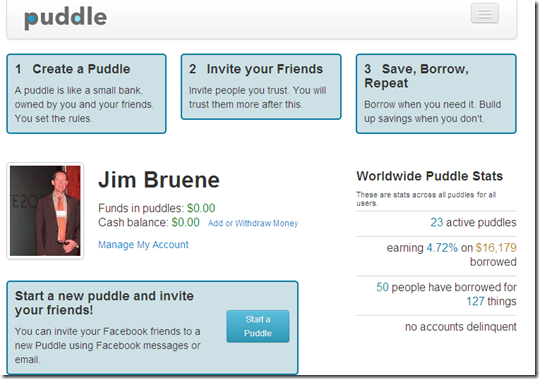
The Puddle dashboard through the eyes of a new user
Note: The great definition in box 1, "A puddle is like a small bank owned by you and your friends. You set the rules."

Puddle new user "get started" screen

————-

Notes:
image1. For a review of circa-2006 Prosper
"groups" see our March 2006 report on P2P lending (subscription).
2. Lending Club initially launched as a Facebook-only p2p lending service (our original 25 May 2007 post). The original Lending Club Facebook page is shown at right (click on inset). 
3. For the latest on crowdfunding, see our latest Online Banking Report on Crowdfunding (subscription).

New Online Banking Report Published: Crowdfunding Small Businesses

clip_image002We believe crowdfunding has the potential to materially impact banking market share in the next 20 years. Tapping the massive capital and higher risk tolerances of institutional and individual investors, these platforms will provide funding to segments currently underserved by traditional lenders (e.g., small and micro businesses).

We’ve written extensively about the consumer debt-based crowdfunding, which we’ve called P2P, or peer-to-peer, lending (note 1). Now, we turn to the new crop of startups arranging funding for small businesses and startups.

The report covers the three variations that promise financial returns to investors (note 2): 

  • Debt-based financing (crowdlending)
  • Equity-based funding (crowdinvesting)
  • Receivables-based funding (crowdfactoring)

Sixteen crowdfunding platforms are profiled, eight in the United States and eight in the United Kingdom:

Debt:

  • Abundance Generation
  • Bolstr
  • Funding Circle
  • Mosaic
  • RealtyMogul
  • Relendex
  • Sofi
  • SoMoLend
  • ThinCats

Equity:

  • AngelList
  • CrowdCube
  • FundersClub
  • Seedrs

Receivables:

  • Market Invoice
  • P2Binvestor
  • PlanetBlack

Finally, we look at specific opportunities for retail banks to leverage the new technology.

__________________________________________________________________

About the report
__________________________________________________________________

Crowdfund Investing Platforms: Debt & Equity (link)
Payments in the smartphone era

Author: Andy Davis, U.K. Financial writer

Editor: Jim Bruene, Editor & Founder

Published: 21 Feb 2013

Length: 68 pages, 24,000 words, 5 tables

Cost: No extra charge to OBR subscribers, US$495 for others (here)

—————————-

Notes:
1. We have published three reports in this area (OBR 127 in 2006, 148/149 in 2007, and SR-5 in 2009). In addition, we’ve created a 10-year forecast for U.S. P2P lending in each of our last six year-end reports.
2. We do not cover the donation or rewards models, such as Kickstarter. While those are effective ways for businesses to raise money and/or visibility for new products, they have fewer parallels and opportunities for retail banks.

First Look: Google Wallet "Pay by Gmail" (and the Pain of Authentication)

image As you probably already know, last week Google launched P2P payments via Gmail (and through the Google Wallet mobile/online interface). Once authenticated, users simply “attach” funds to an email message (see inset).

Bank transfers (e.g., ACH) are free while card-based payments will cost senders 2.9% of the amount, with a $0.30 minimum. However, all transactions are free for an unspecified time during the launch period.

With an estimated 400 to 500 million global Gmail users, the service has the potential to become an important method of sending money (it’s only available to U.S. users at this point). However, like all U.S.-based P2P services, it’s easy to send money, but not always so easy to receive it.

In my first test, I was able to claim the funds relatively easily with my four-year-old Google Wallet account. There was a short authentication process with a login, name, address, birth date and last four digits of my Social Security Number (SSN). After claiming the funds, I was then able to send money out of the system (note 2).

After sending my two cents over to Larry Page, congratulating him on the launch (see screenshots below), I then sent money to my work email account. While it was deceptively simple to send the money, I was unable to claim the money, despite already having an active Google Wallet associated with that email address.

After receiving the email notification, I went through the same authentication process as above. But after logging in and providing my personal info, I was hit with four additional out-of-wallet authentication questions, apparently pulled from public databases (I think NOT my credit bureau due to the errors..see below).

But apparently there was an error in the out-of-wallet Q&A served to me. The first two questions obviously pertained to me, and I answered them correctly, but the final two did not (note 6), so I answered “none of the above.” But Google didn’t believe me, and I was told my answers were “inconsistent” and that I could not be authenticated online.

I was invited to upload three pieces of documentation since I failed the Q&A (all required):

  • Picture ID (e.g., drivers license)
  • Proof of address (e.g., utility bill)
  • Social Security card

Unfortunately, I haven’t laid eyes on my Social Security card for several decades and haven’t a clue where it is. And in 18 years of testing online account opening, no one has ever asked for it. So I’m stuck. Had someone sent me a real payment, I would be extremely frustrated, and would have to either ask for a check to be sent, or use PayPal.

Bottom line: This is a brilliant play by Google, taking everyone by surprise. However, P2P payments (in the USA anyway) are still a pain to receive the first time which dampens their viral growth (note 7). I understand the reasons for good authentication, though it still seems like overkill given that I was only claiming a one-cent transfer via a pre-existing and active Google Wallet account (used for more than $400 worth of purchases this year). And especially after I provided the correct name, address, birth date, SSN and two additional out-of-wallet questions.

But I know the folks from Mountain View, Calif., will work the risk-procedure kinks out quickly (there is a reason it’s called “beta”). And if they stick with it (RIP Google Reader), Google should be able to build a critical mass of financially authenticated users, making “gpay” as easy as using PayPal.

————————-

How Gmail Pay works

Step 1: Craft email message and click on the “$” icon at the bottom of the compose screen

Step 2: Attach funds via Wallet balance, bank transfers, or card; then add memo if desired

image

Step 3: Press send

image

Step 4: Final chance to review

image 

Final: Confirmation copy is placed in your inbox (note 8)

image


—————————-

Notes:
1. During the beta test, you can become a P2P user only by first receiving funds from an existing user.
2. I have two Google Wallet accounts, one set up in 2009 and the other established in January 2013 when I got a Nexus NFC phone with built-in Wallet support. The credit card associated with both accounts was stolen earlier this year, and I had to add a new card to both wallets before I could use them. This could have triggered additional authentication requirements on the second Wallet account.
3. The payment appears as a “card” within a Gmail. There is no indication in the title of the message that it might contain money (user controls the rest of the email).
4. The transaction fee was waived for my Discover Card-based payment. I assume it would be on other card types, but I didn’t test that.
5. Users have the option to add a memo to the payment (in addition to what’s included in the email message).
6. Ironically, if the recipient was mobile-deposit-enabled, it would be easier the first time to send a high-resolution image of a check that the user could take a picture of and then deposit via mobile banking. Or, for Capital One 360 users, the emailed image could simply be
uploaded directly into their account (see post). 
7. Though I suspect the last two questions could have been drawn from online info about my brother, who has a different first name and lives 2,000 miles from me.  
8. Yesterday, confirmation emails went to my inbox when I sent a payment. Tonight, I am not seeing that: It’s only showing in my Sent messages.
9. For more info, see our recent Online Banking Report: Digital & Mobile Wallets (published Feb 2013, subscription).

Mobile Marketing: USAA Embeds Preapproved Loan Offers within Mobile App

usaa_mobile_preapproved.jpg

Now that the U.S. personal credit crisis of 2008 to 2010 is in the rear-view mirror (but still visible), banks and credit unions are getting more aggressive with credit. And guess what new marketing vehicle is available in 2013 that didn’t exist five years ago? Yep, mobile this and mobile that.

So far, the sales component in mobile banking has been minimal. Generally, users must already be a customer of the bank and even pre-registered with online banking. And cross-selling? About the only thing you can buy remotely is an ATM withdrawal.

But that will change as more customers only deal with their bank and cards through mobile apps, a number that is already pushing 30% of the online banking base of Bank of America (see previous post).

Eventually, most financial products will be sold through the mobile app. Not convinced? Look internationally where mobile was a thing even before the iPhone. I still remember Bankinter’s 2007 BAI Retail Delivery presentation where they said 20% of their retail interest-rate swaps were done via mobile phone.

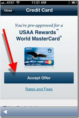
In the United States, we are starting to see banks pushing the envelope. USAA has been the leader in most areas. So no surprise that they are the first (that I know of) to place preapproved credit offers within their mobile app (see screenshots below).

In the bank’s Dec. 2012 update (see inset), it added the ability to:

  • Accept pre-approvals in the app
  • Apply for checking and savings accounts in the app
  • Apply for life insurance after getting a quote in the app

Bottom line: The power of the pre-approved credit offer is well known. Traditionally, snail mail has been the medium of choice. But that’s expensive, time-consuming, and oftentimes not delivered at the optimal moment. Delivering offers via mobile phone can solve all those problems.

And as an added bonus: The sales results will create a better business case for your entire mobile initiative.

——————–

USAA delivers preapproved credit card offer within its mobile app (Dec 2013)
Note: Screenshots shown are from a customer with an existing USAA life insurance relationship.
Price disclosures (right screenshot) displayed after clicking “Rates and Fees” under “Accept Offer” (left screenshot)

image         image

Source: comScore Q4 2012, Mobile Financial Services Advisor

————————–

Note: We cover online mobile delivery and marketing in depth in our subscription-based Online Banking Report.

Metrics: Mobile Banking, Payments, Insurance and Investment Usage

imagecomScore is compiling a wealth of digital usage data, both for desktop and mobile (see previous post). And luckily, they have agreed to let me share some of it here (see note 1).

The following chart is financial services usage data across 230 million U.S. mobile phone users aged 18 or older (note 2) in the United States as of year-end 2012. It includes any type of financial content, secure or public (i.e. this is not limited to secure access by account holders).

The data shows that 62 million (27%) of mobile users accessed financial content during the prior month (Dec. 2012 figures). The vast majority of those (87%) accessed bank content. Credit card or electronic payments (e.g. PayPal) were each used by about half the segment. And brokerage or insurance content was accessed by about 20% of mobile financial users.

Observation: The banking numbers have been widely circulated, but I hadn’t seen recent breakouts in insurance and brokerage. Both were surprisingly high, especially insurance. If you assume there is generally one mobile financial user per household, that means that about 10% of all U.S. households are using mobile insurance info. Same on the brokerage side.

image
Source: comScore, compiled Dec. 2012

————————————

Notes:
1. If you have requests, drop me a line and I’ll see what I can find.  
2. Users of any type of mobile phone, smartphone or otherwise. Also includes text-message queries.