New Online Banking Report Published: Opportunities with Prepaid & Gift Cards

image Many pundits like to talk about how banks have dropped the ball in digital (online/mobile). We take a different view. Banks, especially in the United States, have lost essentially zero market share to Internet-based incumbents (note 1). It’s a hyper-competitive market and banks have pushed forward to defend their turf from other big traditional brands. Way to go capitalism.

Of course, it’s easy to find things that could have been done better. That keeps us in business. But if you compare the pre- and post-Internet market share in banking to almost any other industry, it’s amazing just how well the big brands have fared, at least against web-based upstarts (note 2). 

But there are certain product areas where traditional financial institutions have lagged. And one of the most obvious is prepaid/gift cards. Banks have understandably clung to the checking/debit card model with its river of fees, penalty and otherwise. But new regulations are severely restricting the revenue flow, so it’s time to look elsewhere. 

There is a multi-hundred billion market for prepaid and gift cards globally, and banks have just scratched the surface. Partly, it’s because Safeway and other large bricks-and-mortar retailers have more foot traffic to sell the plastic. But it’s also because banks just aren’t geared to sell things that don’t require a 30-minute session at the new-accounts desk.

But as prepaid card sales, distribution and account management moves to mobile, banks can put themselves back into the picture in a big way. We encourage you to download our latest report to help you make the case to boost your investment in prepaid. Good luck!

__________________________________________________________________

About the report
__________________________________________________________________

New Opportunities with Prepaid & Gift Cards (link)
How banks can best tap into this massive market

Author: Ray Graber, Graber Associates

Editor: Jim Bruene, Editor & Founder

Published: 8 Aug 2013

Length: 28 pages, 9,000 words, 15 tables

Cost: No extra charge to OBR subscribers, US$395 for others (here)

Companies mentioned: American Express, BlackHawk Network, Chase Bank, Chemical Bank, GoBank (Green Dot), MasterCard, Navy Federal, Credit Union, netSpend (TSYS), State Credit Union, U.S. Bank, Visa, WalMart

—————————-

Notes:
1. ING Direct is the one exception on the deposit side. Before being acquired last year by Capital One, they’d built an impressive franchise through the online channel. However, they were also an offshoot of a very traditional European bank, so you can’t really call ING Direct an upstart.
2. Crowdfunding/P2P lending may well be an area that finally begins to impact traditional banking revenues. But that’s still a ways away. See our May 2013 report for more info (subscription).

Why I Want My Auto Insurance Company to Track My Every Move

imageOur family has been lucky. Extraordinarily lucky. Eighty-plus years of mostly city driving, combined across four drivers, and not a single auto insurance claim (note 1). That means we’ve paid more than $100,000 (2013 dollars) in premiums for nothing, so far (note 2).

Actually, that’s not at all fair to the insurance providers. We’ve paid $100k for the peace of mind and potential financial help had we needed it (not to mention staying on the right side of the law). And it’s been worth it.

That said, I wouldn’t mind paying less for the same peace of mind. And that’s why I love the idea of mileage- and behavioral-based insurance (note 3). I haven’t always been a model driver, but I was the first person in my extended family to regularly wear a seat belt and I’ve grown to be a relatively conservative driver, especially after becoming a parent.

And I’d love to be compensated for that.

That’s why I’m all for the next generation of “smart auto insurance” that connects to your on-board computers to measure:

  • Speed
  • Miles driven per day
  • Time of day driven
  • Acceleration
  • Braking
  • How hard turns are taken
  • Seat belt usage
  • GPS tracking

And eventually, even more difficult concepts such as:

  • Driver distraction
  • Driver impairment

Not only will I qualify for lower premiums (hopefully), the feedback from the tracker will be interesting (e.g,. historical maps of your routes) and could have a significant impact on the quality of your driving (since it will directly impact your rate).  I know there are serious big-brother concerns here, especially in light of the NSA scandals of the past few months. But it can all be opt-in, though eventually, those not opting in will face higher premiums.

Progressive Insurance is an early leader in this area. It’s opt-in Snapshot tracking device (inset) has been used by more than one million customers (see screenshot below). Prospective customers can install the device free of charge for 30 days and track their potential savings online. You don’t even have to be a Progressive customer to get the free trial. 

Bottom line: Unless regulators get in the way due to privacy concerns, it’s inevitable that auto insurance, along with other types of property/casualty, will use behavioral metrics to price the risk. That will be a big change for the industry and will likely provide good openings for new entrants. 

——————————

Progressive has 1 million drivers using its plug-in tracker (7 Aug 2013)

image

Snapshot tracking log (via RoverGuide.com here)

image

———————————-

Notes:
1. There have been a few altercations with concrete pillars and such, but nothing severe enough to involve the insurance company. 
2. I know that I’ve now completely jinxed this, sorry family, and whomever we collide with.  
3. See previous post on Street Owl’s safe driving app and Metro Mile’s pay-as-you-go insurance.
4. For more on banks opportunities in insurance, see our full report here (Dec 2011, subscription)

Financial Innovation Marches On, Even in July

image I subscribe to about 800 blogs/alerts and usually find one or two new fintech companies, potential Finovate presenters, every single day. But July was slower, with the pace of new companies dropping to a few per week. Even though I know summer tends to be quieter, I always start wondering if we’ve finally invented everything…then I wake up to my RSS feed this morning and find two clever new services launching today:  

  • Crowdsourced home values: Everyone who owns a home wonders how much it’s worth. But unless you have a real estate agent in the family (and even then, they are probably biased to the high side), it’s a time-consuming and not-so-exact science to get a professional appraisal. Enter Redfin’shome price whisperer” service. Participants simply submit their house address and target price, and the company will have 250 others users give the valuation a thumbs up or thumbs down. While it won’t put realtors out of business, it’s a great way to get a quick handle on where you stand on what can be a key part of your financial security. (Another new startup, Trov, just landed $6.8 mil to help value less liquid assets).
  • Scam-protection geared to the elderly: Ever since Y-Combinator (YC) spawned a pair of billion-dollar companies during the Great Recession (AirBnB, Dropbox), I’ve been watching closely to see what its graduates will offer up to the financial services world. At FinovateSpring last May, we saw 2012 YC graduate LendUp (watch its Finovate demo here) wow the audience (and win Best of Show) with its service to lift consumers out of the payday lending cycle into less-expensive bank credit products. In a similar vein, 2013 YC graduate True Link Financial just announced a service to protect consumers, especially the elderly, from getting scammed by misleading or downright fraudulent charitable solicitations and other gray charges (it’s like BillGuard, but trying to block the questionable charges first, rather than dispute later). It’s basically a $20/yr prepaid card with customizable spending controls.

image So, it looks like we have officially moved into the second half of the year and all the fintech excitement that will bring. I’d be remiss if I didn’t put in a plug for the upcoming FinovateFall, where we’ll have 72 demos (full list here) offering up a plethora of new ideas. The early-bird deadline is Aug 2. So register now and save. 

BBVA Compass Bundles Microbiz Checking with PAYware Mobile Card Processing

imageI rarely get a chance to write about checking accounts, so I was glad to see the BBVA Compass announcement on the wires yesterday.

The bank launched a Business Mobility Bundle which has checking, mobile card processing and a free Galaxy Tab 3 Android tablet (wifi-only), a $200 value (note 1). It’s a soft bundle (note 2) of the bank’s existing e-Business Checking Account and its Merchant Mobility Pack, powered by Verifone PAYware

imageThe checking account is fee-free up to a certain level of activity (note 3). But the optional card-acceptance piece is $24.95/mo, which is waived in this promo for 12 months. The offer is not currently visible on the bank’s website, but a link in the press release leads to a landing page with the offer (see first screenshot).

Myimage take: The Business Mobility positioning is excellent, nicely tying two key business products together. The underlying accounts seem to be solid values, and the free Samsung tablet is sure to spark sales. 

However, my initial enthusiasm from the press release was somewhat tempered by the realities of the fine print (see second screenshot, note 1) and overall execution. For example:

  • No online application, it’s a call-me form (albeit a good one)
  • Mobile deposit is limited to $1,200 every 30 days
  • Both the free e-Business Checking and the 12-month fee waiver for mobile card acceptance are currently available on the bank’s website. There are no added benefits to the Business Mobility Bundle, outside the tablet premium
  • The free tablet is wifi only and sells for $199 online (it’s no iPad)

The offer is not currently visible on the BBVA website, even through site search, presumably so it doesn’t irk existing customers who cannot get the free tablet.

Bottom line: I like the promotion, although I wish the bundle had more features. For example, mobile banking pre-loaded on the Galaxy; customer service available via Skype; or even higher mobile-deposit limits for those using card processing (note 4).

—————————

BBVA Business Mobility landing page (link, 30 July 2013)

image

Fine print (positioned directly below the screen shown above)

image

————————————-

Notes:
1. Fine print: (A) New small business customers only, 1 per household/biz; (B) Must perform 10 transactions, not including intrabank funds transfers, within 30 days of account opening; (C) $100 minimum opening deposit
2. I just made up that term, but what I mean is that the customer is not required to add the Merchant Mobility piece to qualify for the free Samsung tablet. The checking account alone earns the premium.
3. Transaction limits before fees kick in:
– 50 items processed
– 2 in-branch deposits
– 5 processed checks and/or in-branch withdrawals
– $5,000 cash processing
In addition, mobile deposit has stingy initial limits of $500 max per item and only $1,200 max every 30 days  
4. The landing page could use more powerful visuals showing the BBVA mobile app and/or PAYware dongle in use.

Will mobile finally make PFM popular?

image In the online desktop era, we’ve seen only one direct-to-consumer PFM mega-hit: Mint (see note 1).

But looking at recent rankings in the U.S. Apple App Store (iOS) it looks like that may be changing. There are currently five specialty PFMs in the 13 most-downloaded free finance apps, including Mint of course. Is the mobile device finally what will make PFMs popular with consumers? Or are these apps just being downloaded by curious smartphone owners who will never register for the service, let alone become active users? 

My Take: Mobile is, and will be, a huge driver for specialty PFM apps. App stores help consumers find the services, and mobile makes them less daunting to use. But it’s not just the mobile platform driving usage at these four challengers (see below), it’s the way they have positioned themselves with tangible consumer benefits (e.g., save money by spotting fraud charges) rather than the nebulous (e.g., “manage your spending for a better life”).

Parsing this list a little closer, only Mint is positioned as a pure PFM. The challengers are all backing into PFM from various niches:

  • imageBillGuard (#5) is positioned as a fraudulent charge protector
    and accomplishes that through account monitoring. It appeals to
    those concerned about losing money to fraudsters and greedy merchants.
  • imageLemon (#7) is positioned around mobile wallets and payments, but it also offers account monitoring as a premium service. It appeals to early adopters wanting to use their smartphones for payments and all things financial. 

  • imageManilla (#12) revolves around billing and financial statements, but obviously aggregated bank and credit card statements is a core PFM feature. It appeals to those wanting better management of their mess of paper bills, receipts and records. 

  • imageCredit Karma (#13) focuses on credit scores and debt management, but recently extended into full account monitoring. It appeals to those wanting to improve their credit scores and better manage debt.

Because most consumers have no interest in looking at a bar chart of their spending, it makes sense to sneak in the PFM piece through more compelling, benefit-laden service offerings. For banks, all four of these approaches are worth a look. 

—————————

Table: 20 most popular free finance mobile apps in U.S. Apple App Store 
Does not include several non-financial apps

  Name Primary Type
1 Capital One Bank/card
2 Chase Bank/card
3 Bank of America Bank/card
4 PayPal Payment
5 BillGuard (note 2) PFM: cards
6 Wells Fargo Bank/card
7 Lemon PFM: cards
8 Mint PFM: general
9 American Express Card
10 Scottrade Investing
11 USAA Bank
12 Manilla PFM: billing
13 Credit Karma PFM: debt
14 Discover Card
15 Citi Bank/card
16 Xoom Money Transfer Remittances
17 TD Bank Bank
18 Venmo (Braintree) Payments
19 Fidelity Investing
20 US Bank Bank/card

Source: U.S. Apple App Store accessed via iPhone 5 from Seattle, WA on Fri. July 26, 2013 at 11 AM PDT 

——————————–

Notes:
1. Not counting bank-branded PFMs from Intuit, Yodlee, Geezeo, Money Desktop, et al. And not counting the packaged-software stalwarts from the 1990s, Microsoft Money and Quicken.
2. BillGuard moved up to the #1 position over the weekend and remains there as of 6:00 PM PDT today
3. Check (formerly PageOnce) should also be considered in this discussion. It has been a top-20 finance app for the past few years, despite currently running in the lower 30s, probably due to its recent rebranding to an entirely new name
4. For more info, see the Online Banking Report PFM library (subscription required): PFM 4.0 (June 2012); PFM 3.0 (May 2010); Social Personal Finance (June 2007); Personal Finance Features for Online Banking (Aug 2006).

The Contactless Sticker as a Mobile Wallet Trojan Horse

imageI’ve had Discover’s Zip contactless sticker pasted to the back of my iPhone for a few years. Although I don’t run across very many places to use it in Seattle, I enjoy the user experience when it works. It’s not a huge time saver, but it’s easier to wave my phone than dig the right card out of my “analog wallet.” And it usually is interesting to the clerk, since “paying by phone” is still a novelty. 

Whether Discover has benefited from issuing me a sticker is debatable. Stickers are issued only by request (at least on my account). Discover not only had to pay an extra $3 or $4 for the sticker (note 1), but also paid a customer service rep to answer the phone and take my request. Assuming they incurred an admin cost of $7 to $10 to process and mail the sticker would make the total cost to Discover $10 to $15. Therefore, my measly $300 in incremental spending hasn’t yet given them a positive return. But if more terminals were around, I’d have put thousands on it, and they’d be ecstatic.

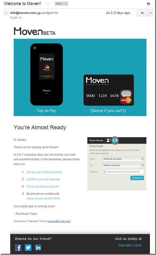
The reason I’m writing about stickers again, is that my Moven card and sticker package arrived last week (see pictures below; previous post; note 2). And I thought how much more impressive the startup’s card mailer looked with the Moven sticker (and supporting mobile banking graphics) than the typical bank card mailer (Simple excluded, of course).

I know the extra $3 to $5 it would cost to toss a sticker into the card mailer is a huge expense. But I think the potential benefits makes it worth considering, at least for a portion of your customer base. (And if you add the sticker as part of a premium package, you might even convince customers to pay for it.)

Financial institution benefits:

  • Increased POS transactions: Move your card to the top of wallet instantly when users are at a working, contactless terminal.
  • Increased online transactions: If you print the card number, expiry date, and security code on the sticker, cardholders would turn to your card more often when arriving at check-out at ecommerce sites. It also would work for mobile commerce, although not as well since users would have to flip the phone around to read the numbers.
  • Increased loyalty/referrals: Once that sticker is placed on a phone, it’s a constant reminder of your bank and card. It also makes it easy to show off to a friend.
  • 1st gen mobile wallet: The sticker, combined with your mobile banking app and/or SMS alerts, provides a fairly solid “mobile wallet experience” to compete with Google and others.
  • Seamless transition to NFC (or whatever): When the day arrives that the contactless capability is embedded in most handsets (yeah, Apple, we are looking at you), you simply tell customers to pull off the sticker and keep on waving that phone at the terminal. 
  • Competitive advantage: You differentiate yourself and earn referrals from a certain group of customers who are impressed with tech innovations.

Bottom line: Increasing costs with a contactless sticker is not for everyone. But if you are looking for a tangible point of differentiation that also builds your tech-cred, this is one possible solution. Moven, for one, is banking on it. 

————————————

Moven outside envelope (13 July 2013)
Note: I know this is good for security reasons, but I was expecting something a little snazzier. Luckily, the inside card carrier was the best I’ve ever seen (see below).

image

Moven card carrier
Note: Sticker is on left, plastic on right

image

————————————

Notes
1. I’ve seen a wide range of prices quoted for contactless stickers, but I believe the relevant range for most issuers is $3 to $7 each, depending on quantity.
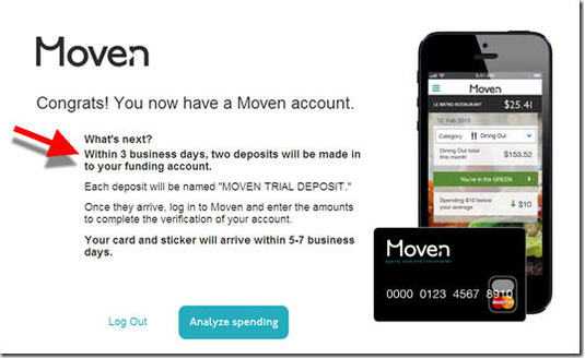
2. I can’t report on actual Moven account transactions because I haven’t verified the trial deposits. While this is a clever and relatively simple authentication technique, it does require users to log in to another bank account days later, so it is easy to neglect. Moven sent me a reminder two days after my application, but that was two weeks ago. Clearly, they will have to follow up with procrastinators like me again.
3. For more info on fee-based banking services, our Online Banking Report on fee-based online services (subscription, May 2011). For more info on the “near bank” or “meta bank” phenomena see our  report on Truly Virtual Banks (subscription, Oct 2011).

Tablet vs. Smartphone Mobile Banking Usage Data from Malauzai Software

image I’ve always been a numbers junkie, so it’s much appreciated when companies send along snippets of proprietary data to share with readers. I have a few more items in the pipeline, so keep your slide decks handy.  

Today, we get a look at tablet vs. smartphone usage, courtesy of Malauzai Software. The data is from June 2013 (note 1) aggregated across 99 smaller banks and credit union clients with 98,000 total active mobile users (note 2). Some user behavior is significantly impacted by the Malauzai-powered app’s specific design while other behavior is more applicable to mobile banking users in general (see the comments below from Malauzai).  

  • Login frequency: In June, 1.2 million total logins occurred across 98,000 active iPad and smartphone (iPhone/Android) users. Both types logged in at the same rate of 3x per week.
  • Login failure: Surprisingly, the login failure rate is higher on iPads, 27% vs. 15%. 
    Why? It is mainly due to “fat-fingering” as most users are successful on their second login attempt. Malauzai believes that tablet users are less comfortable with their keyboards.
  • Session duration: iPad users spent 50% more time per session (105 seconds on average) compared to smartphone users (70 seconds).
  • Logging off:  On the smartphone, 21% regularly log off the device vs. 80% on the iPad. 
    Why? It may be due to the iPad being more of a shared device in a family or household. Also, the logoff button is more prominently displayed on the iPad.
  • Internal funds transfers: iPad users made transfers valued at 2.3x that of smartphone users. The average iPad user transferred just under $900 vs. about $400 via smartphone. 
    Why? Malauzai speculates (although they do NOT have customers’ balance-data to verify) that iPad users tend to keep higher balances and therefore have higher transfer volume. 
  • Transaction history: Transaction details are used by 73% of iPad users vs. 37% for smartphones. 
    Why: Malauzai believes it is caused by the transactional data being more readily available on the iPad due to its more-prominent display and larger text.
  • Branch/ATM lookup:  iPad users look up branches/ATMs 3x more frequently than smartphone users. 
    Why? The Locator on the iPad UI is more prominent, more user-friendly and has bigger graphics.

——————————

Notes:
1. Malauzai has been publishing metrics for five months; see previous months here.
2. Clients include Air Academy FCU, Ameriana Bank (see inset), Centier Bank, City Bank of Texas, First Financial, Greater Texas FCU, and Walden Savings Bank. See our most recent post for more info.

PFM: Playing the Trust Card

Having been involved in the PFM industry for two decades, I’ve long taken the position that it was the bank’s business to lose. While consumers may not always like their bank, most continue to trust them with their money. And that’s an advantage not easily overcome by newcomers. 

imageI was reminded of the trust factor when I looked at Change Sciences latest report on PFM usability (subscription). As you can see at right, the researcher charted Trust (horizontal axis) vs. Likelihood (to use the service).
The two most trustworthy PFM offerings, by a significant margin (+20%), were operated by banks:

  • PNC Virtual Wallet
  • Chase Blueprint

It was less clear how trustworthiness correlated with trial. In this 12-company study, users were most likely to try the most trusted site, PNC Virtual Wallet, after sampling it. But Chase, with the second most trusted site, was tied with less-trusted sites Mint and newcomer Pocketbook (headquartered in Singapore) for likelihood to try. Not surprisingly, many factors besides trust will impact trial. 

Bottom line: With only two bank-run PFMs in the chart, there isn’t nearly enough data to conclude that banks have an inherent trust advantage in personal financial management. And even if they do, it’s difficult to prove that trust actually LEADS to more usage (trust could simply be correlated, without causation).

Nevertheless, these two data points are encouraging for banks. Both PNC and Chase, who have invested millions on personal financial management, have managed to wow consumers with their offering. PNC Virtual Wallet has also previously finished on top of the Change Sciences UX scorecard.

————————-

Note:
For more info, see the Online Banking Report PFM library (subscription required): PFM 4.0 (June 2012); PFM 3.0 (May 2010); Social Personal Finance (June 2007); Personal Finance Features for Online Banking (Aug 2006).

New Online Banking Report Published: Finovate Quarterly

FinovateQuarterly Q2_2013.jpg

We’ve just published our latest report, Finovate Quarterly: Q2 2103. It focuses on the latest fintech developments, especially the innovations presented at FinovateSpring and the Best of Show winners.

We also look deeper at several recent industry developments including:

  • Bitcoin & Digital Currencies
  • The Authenticators (digital security)

The report contains a rundown of the quarterly highlights and milestones of Finovate alums and other fintech companies.

The Finovate Quarterly is complimentary for our Online Banking Report subscribers and is automatically delivered to them via mail. Anyone else can purchase here.

________________________________________________________

About the report
________________________________________________________

Finovate Quarterly  (link)
Highlights of Q2 2013, including a look at the best new products from FinovateSpring

Author: Julie Schicktanz & David Penn, Finovate Group Research Analysts
Editor: Jim Bruene, Finovate Group Founder

Published: 30 June 2013

Length: 75 pages; 16,000 words

Cost: No extra charge to OBR subscribers, US$175 for others here
The printed version will be mailed to subscribers this week.

Top 11 U.S. Financial Services Advertisers and their Online Spend

image The annual U.S advertising spend-report just arrived from Advertising Age. As usual, financial brands were big spenders. Eleven financial brands were in the top 100, including two in the top 10 (JP Morgan Chase and American Express).

Internet spend (note 1): Experian was the #1 spender online among all companies in all industries with a reported $350 million. That amounts to more than 3% of the entire $10 billion spent online in the United States last year across all industries. The credit-reporting giant didn’t spend enough offline to crack the top 100 in total advertising, which means at least 80% of its total spending is online.  

Among the big overall spenders, estimated Internet spending varies widely. American Express, BofA, Capital One, and State Farm all spent a bit more than $100 million.

In terms of percentage of all advertising, the totals varied widely. On the low end, JP Morgan, Discover and Visa devoted 2% to 3% of their budget to online advertising. On the other side, Capital One, Citi, and Progressive all placed around the 9% mark.   

————————

Table: U.S. advertising spending
Total of measured media and estimated unmeasured*

Company** 2012 2011 %Chg Internet % Internet Top-100 Rank
1. JP Morgan $2.1 bil $2.4 bil (11%) $46 mil 2.1% 8
2. AmEx $2.1 bil $2.1 bil (3%) $120 mil 5.7% 9
3. BofA $1.6 bil $1.7 bil (5%) $110 mil 6.9% 18
4. Capital One $1.3 bil $1.0 bil +22% $110 mil 8.5% 26
5. Citi $930 mil $980 mil (5%) $81 mil 8.7% 41
6. Progressive $800 mil $800 mil $77 mil 9.6% 51
7. Allstate $790 mil $740 mil +8% $52 mil 6.6% 54
8. State Farm $780 mil $800 mil (3%) $110 mil 14% 55
9. Discover $600 mil $460 mil +30% $12 mil 2.0% 68
10. Wells Fargo $580 mil $610 mil (5%) $21 mil 3.6% 70
11. Visa $480 mil $490 mil (1%) $12 mil 2.5% 83
Total $12.1 bil $12.1 bil $750 mil 6.2%
Experian INA INA INA $350 mil 80%+ NA

*Source: Advertising Age, 24 June 2013; methodology; The % change number was calculated with more precise annual spend numbers than what appears above
**We did not include Warren Buffet’s conglomerate Berkshire Hathaway which owns Geico and had the following numbers: 2012 = $1.6 bil; 2011 = $1.4 bil; +13%; Internet $31 mil, 1.9% of total

————–

Note:
1. Internet spend covers desktop display/search only. Does not include mobile or video ad units. 

Before and After: Wells Fargo’s New Website Design

image Two weeks ago, Wells Fargo rolled out a new homepage design. Based on a quick Google news search, it doesn’t seem to have received any negative comments. And that’s good.

Wells Fargo has maintained its overall good design for almost ten years (see previous versions below), so most visitors are accustomed to the bank’s no-nonsense approach to content and navigation. The new site maintains the look and feel of previous generations, while overhauling top-level navigation. While it may not win design awards, the new layout works really well, and that’s very good.

The most noticeable change shows that Wells finally eliminated its mid-page “link farm” navigation, in use since 2004 (see screenshots). It was replaced by fly-out “mega menus” that expand over the top half of the page when a cursor hovers over a primary navigation item. While these menus can be annoying when they hide content you were looking at, most website users are accustomed to them, and they are a good way to expose the broad offerings of a large commercial bank.

The other big change is something more unique to Wells Fargo: the “financial needs ribbon” (Wells calls it a “carousel”). It’s a swipe-able/clickable link to seven major financial topics:

  • Home Lending (see arrows, example below): Mortgages and first-time buyer education
  • Banking Made Easy: Pitching checking, savings and online/mobile banking
  • Borrowing and Credit: Promotes entry-level credit services
  • Retirement: Savings, IRA, etc.
  • Protect What Counts: Insurance
  • Fraud Information Center: Security and identity-theft protection
  • Going to College: Budgeting, scholarships and student loans

On a desktop, my first impression of the ribbon was that it cluttered the page with redundant links. But the more I looked at it, especially after being briefed by the Wells Fargo homepage team this week (note 1), the more it makes sense.

The drop-down menu and/or the search box are efficient for visitors who know exactly what they are looking for. But for those that are not thinking in specific banking-product terms, the needs-based terminology may strike a chord, e.g., “Protect What Counts” instead of “Insurance.” The ribbon also allows the bank to showcase important services more prominently and more thoroughly.

But to truly appreciate the new approach, you must open the site on a tablet (I tested on full iPad). On a touch-screen, the ribbon, and the underlying content, are smoothly swiped from left-to-right or right-to-left, making for a very professional looking tablet-website.

Bottom line: While the homepage is still slightly cluttered for my tastes (do they really need 4+ “happy family” shots on the homepage?), I think the bank has done a good job managing the tradeoff between simplicity and exposing all that it has to offer. And the touchscreen-friendly content-ribbon is a design innovation I think we’ll see at other financial institutions in the future.

———————————–

New Design: Launched June 8, 2013

image

Before: June 2012

image

Before: June 2008

image

Before: June 2004

 image

—————————

Notes:
1. For a more thorough recap of the Wells Fargo redesign, see Mary Wisniewski’s American Banker interview of Shannon Lundgren, Wells Fargo VP Product Management of Digital Sales & Service.     
2. Hopefully, I can convince my friends at comScore to send over some before-and-after data once they’ve had a few months to measure the new site’s performance.  
3. We continually look at website design and UX in our industry subscription service, Online Banking Report. All-Access subscribers are entitled to a complimentary high-level website review each year.