Is it Time for Digital Banking Subscription Fees?

image Now that we are 30 years into the online banking era (and nearly 20 years of web banking), it’s time to start making the channel pay its way (or at least contribute something). Even though your customers might think otherwise, there is no rule that says all your online and mobile banking must be free of charge.

Yet, across 10,000 U.S. banks and credit unions, only a handful are still charging for digital value-adds (other than expedited and/or P2P payments). The biggest outliers (all previously covered):

  • Regions Bank’s variable mobile deposit fee dependent on speed of funds availability (post)
  • MyVirtualStrongbox (from DigitalMailer) deployed at 11 credit unions including Belvoir Credit Union; generally free, with optional fees for extra storage (post)
  • US Bank’s per-item $0.50 charge for remote deposits (post)
  • Mercantile Bank’s $4/mo consumer positive-pay service (post)

Please tweet new examples to @netbanker.

________________________________________

Make Digital Banking a Profit Center
________________________________________

Most digital innovations of the past 15 years have been justified with a combination of soft dollar benefits (aka intangibles) such as retention, customer satisfaction, competitive pressure, etc. Those are vitally important. But without profits/revenues, customer satisfaction is moot. 

So let’s put an end to the “100% digital banking subsidy” and start charging something to those most likely to pay — your digital power users.  If that segment coughed up an optional $3.95/mo for your Digital Gold account, you’d be earning a half-million dollars annually per 10,000 subscribers. That’s money that’ll come in real handy when the CFPB caps ODs at $15 each.  

What type of services might be included in this “gold/platinum/VIP/premium” account? It depends on your brand and market, but these could be relatively cost effective:

  • Priority service (4-hour turnaround time)
  • Dedicated email/text message address
  • Expanded “Help” hours/availability
  • Expedited funds availability
  • Higher limits
  • Additional security assurances/alerts/monitoring
  • Lengthier statement/image archives
  • Free intra-family transfers
  • Special edition (different skin) mobile banking app
  • Random membership perks (local deals, 2-for-1 dining, etc.) 

Check out more ideas in the Netbanker archives or refer to our annual planning report (subscription).

————————

Note: I run a variation of this topic every year or so, along with the occasional full report.

Best of the Web: Frost Bank Launches Actionable Two-Way Debit Card Alerts

imageFrost Bank is cool. The $25 billion regional bank has long been an innovator, pushing forward on multiple digital fronts (see notes 1, 2). Its latest innovation quietly rolled out to customers at the beginning of May, is the two-way actionable debit card alert. This service probably seems like a no-brainer to customers, especially those born after 1990, but it’s not at all easy for an FI to pull off.

imageWhile Frost is not the first to position alerts as a two-way communication channel (note 3), it is the first to allow customers to simply reply back to a text message to freeze their debit card against further charges. The action also triggers a call from a Frost banker to resolve the situation.  

Because this “raises the bar” for proactive customer communications around debit card use, we are awarding it our first Best of the Web for 2014 (note 4).

__________________________________

How it works now (v1.0)
__________________________________

image1. Consumer establishes alert thresholds and preferences (inset)
2. Bank sends triggered text-message alert
3. If the user suspects fraud, they reply back with the code provided in the alert (screenshot below)
4. Frost puts a temporary hold on the card
5. Frost banker calls customer and resolves (customer can also unblock account on their own)


image

___________________________________

What’s next (v2.0)
___________________________________

Frost Bank’s new feature is a great customer-centric solution that reinforces the bank’s position of consumer advocacy. It’s a perfect first step to a more proactive fraud-warning system.

But I do have some concerns there will be too many false alarms generated. It is so easy to forget pre-authorized debits; be surprised by charges made by your spouse; or legitimate, but strange-sounding merchant names.

Ideally, there would be a way to first ask for more info on a charge, rather than a black or white hold. It would be great to text back “huh?” and get a plain language explanation of the charge, for example:

  • This charge was made at 1:00 PM at the Subway near Northgate Mall. Are you sure you or someone in your family didn’t buy lunch there this weekend?

or

  • You began paying $9.95 per month to this merchant in February. This merchant markets a subscription music service. Did you, or anyone else in your family, start a subscription to it in the February timeframe?

BillGuard offers quite a bit of this “explanation layer” on card transactions, another reason to be looking at what they are doing (most recent post).

——————————-

Frost Bank’s debit alerts landing page (18 May 2014, link)

image

—————————————-

Notes:
1. We first covered Frost in 2005, when it was offering lifetime statement archives at a time when most banks dropped your data off the site after a few months (June 2005 post). We also loved their PFM-ish Momentum checking account launched in 2008, about the same time as Mint launched (July 2008 post). 
image2. Earlier this month, Jeffry Pilcher called Frost Bank “… one of the most beautiful brand identities … .” (see right, post)
3. In 2010 (post), Chase Bank won Best of the Web for its 2-way text-message alerts; however, that was limited to initiating funds transfers through its normal text-banking service.  
4. This is the first OBR Best of the Web for Frost Bank. Since 1997, our Online Banking Report industr
y newsletter has been periodically giving OBR Best of the Web awards to companies that pioneer new online- or mobile-banking features. It is not an endorsement of the company or product, just recognition for what we believe is an important industry development. In total, 91 companies have won the award. Recent winners are profiled in the Netbanker archives.

UI: Chase Bank Remodels the All-Important "Account Summary Alert"

image Here at Netbanker/OBR, we love to write about the digital future. But we know it’s even more important to address the digital now. If you don’t leverage current technology to your advantage, the future doesn’t much matter, since someone else will be running your business.

Today’s topic, one that we used to harp on constantly, is alerts (see previous “Alerts” posts).  Alerts are the way you maintain the relationship with customers between logins. But too many banks and credit unions take email alerts for granted, and are still using a template from 2004! Those templates were created prior to webmail, and, more importantly, before mobile viewership skyrocketed.

One bank whose messaging template was too long in the tooth is Chase (it’s looked the same since at least 2010; see note 1). But as part of their continued digital remodeling, the bank changed it last week. It’s not going to be confused with Simple or Mint, but it communicates the important information efficiently. And that’s enough for most brands. 

The Improvements 

_____________________________

Following are the before-and-after shots on the desktop. As you can see, the old version was too wide for smaller laptops and lower-resolution computers. On my Mac it looked fine, but on my trusty old ThinkPad, it required horizontal scrolling to see the “total withdrawals.”

What changed:

  • All the information is lined up on the left side so it can be easily read on any screen size; this is especially important on mobile which was previously impossible to read (on iPhone) without pinching and zooming.
  • Got rid of the Go Paperless! banner. Talk about banner fatigue. I understand that it’s a great benefit to convert users to paperless, but really, four-plus years with the same banner? MIX IT UP, please!
  • Changed headline to position “Chase” as the first word instead of the last. That helps users scanning subject lines see that it’s from their bank. 
  • Added light blue background at top to give it a better look.
  • Cleaned up the data table for better readability.
  • Made the website URL more visible.
  • Added toll-free contact number.
  • Added more fine print and caveats (the only item that is a step backwards).


——————————— 

Desktop 

Before (viewed through Gmail, 3 May 2014)

image


After (viewed through Gmail, 12 May 2014)

image

———————————-

Mobile (screen captures from iPhone 5)

Before                                                          After

image        image

—————————————

Notes:
1. The UI described here is for a Chase checking account in Washington State (converted from WAMU). This email alert template may be different in other regions or for other account types.
2. For more info on alerts and messaging, see our 2010 Online Banking Report (subscription).

New OBR Published: Mobile Account Opening

image One of the biggest debates in banking today is the role of the branch, and especially its significance in new account opening. Many analysts, this firm included, see remote account opening as a better experience for the customer and potentially much cheaper for banks (though it requires downsizing branch networks to achieve meaningful cost savings).

But so far, most of the debate has been around the pros and cons of online/desktop account opening vs. the human-guided experience in branch. What’s missing in this discussion is the key role that MOBILE account opening will play going forward.

With superior technology (think OCR via smartphone camera, instant funding by taking a picture of your debit card, and real-time access to new deposits) mobile opening is much more compelling than desktop alternatives. And the technology is here today, from the likes of Mitek, Jumio and others.

Now, it takes hard work to execute via mobile channels. This report will help you get started.


About the report


Mobile Account Opening (link)
Port online account opening to smartphones to reach the sizable mobile-only segment

Author: Jeanne Capachin, Principal & Founder, CAPACHIN Research  
Jim Bruene, Editor & Founder, Online Banking Report

Published 9 May 2014

Length: 28 pages

Cost: No extra charge for OBR subscribers, USD $395 for others (here)


Report excerpt (p. 12 of 28)

image

Call Centers Still Integral to Digital Banking

Guest post by Jeanne Capachin, Founder & Principal of CAPACHIN Research.

————————-

image What do you do after you’ve led the call center for the White House? For Les Boothby, you run an amazing contact center for Elevations Credit Union, headquartered in Boulder, Colorado. There are several things about Les and what he does that point to the future of banking in a digital-first world.

First, Les is passionate about his people and about member service. At Elevations, the contact center is a vibrant, engaging place to work. Les and his leadership team’s attitude and Elevations’ focus on service are in full view. This focus is borne out by the Just Say Yes attitude of the staff. Even if it means calls that last over an hour, or visits to a member’s home, they own the relationships and are prepared to do what it takes to solidify relationships.

A great demonstration of Elevations’ commitment came during my visit with Les and the Contact Center team last month. I was a few minutes early, and Les ended up being a few minutes late. Why? Because he was working with a member of his team and with a gentleman who couldn’t get into his online banking application. The call was escalated to Les when the inquiry became technically complex. The member had updated his operating system and anti-virus software which changed some advanced browser settings. They worked with this member for over 90 minutes checking software version updates and changing browser configuration settings and eventually succeeded. The payoff was a satisfied member able to continue banking online through his preferred browser.

While the credit union’s service may be above and beyond what other institutions provide, this is what it takes to serve members and customers in a digital world. A significant portion of call center volume is about online, mobile, and tablet banking. At Elevations, technology-related calls were just 8% of the total in 2011, now they are 25%.

But when members call, they don’t want to talk to the Geek Squad. They are looking for a sympathetic person who can explain to them in plain English how to solve their problems. Elevations call center staff aren’t divided into technology and/or product specialists. Members have just two choices when they dial in: Member Services or Loan Information. With generalist call center staff focused on relationships, members needn’t navigate through a complex decision tree.

In addition to telephone support, the contact center also supports secure chat through the online channel. But the CU finds that members prefer picking up the phone. So as members embrace new technology for transactions, they turn to the oldest remote channel, the telephone, for more complex queries.

In its mission to serve its members anywhere and anytime, Elevations has also opened two new branches that are less branch, and more member advice/support center. These branches look more like a hotel lobby. There are tablets to walk members through digital banking services, an ATM, and a counter with a cash handler and two terminals. Through conversation and social interactions, the branch staff learn more about their member’s financial needs, and can introduce them to financial or technology products. If staff are in their offices, they happily bound out to greet members. The credit union embraces an omni-channel experience, and is using their physical locations to subtly transition members to digital channels.

__________________________________

Bottom line
__________________________________

As we build out omni-channel banking, the call center still plays a central role. It has long been the catch-all for complex issues, both technical and transaction related. Contact center representatives, like those at Elevations, must be able to think on their feet and make judgment calls. They must understand when to waive fees, when to offer additional services, probe to find root issues, and really own the problem.

At Elevations, hiring for attitude is key, and they empower their staff to solve problems. The CU has a comprehensive, month-long training program to educate all staff on member service, products, and technology. Contact center staff are briefed on all marketing programs before they are conducted, and educated on all digital solutions before they are introduced to the member base. Metrics in the contact center focus on enhancing and stabilizing relationships. Call volume is important, but more critical is the ability to retain members and sell appropriate products.

As institutions examine their omni-channel strategies, a refresh of the contact center should be part of the effort. If Elevations is an example of where we’re headed, we’ll be in good hands.

—————–

Figure 1: This is a Call Center?

Macintosh HD:Users:jeannecapachin:Pictures:iPhoto Library.photolibrary:Masters:2014:04:03:20140403-154230:photo 1.JPG

Figure 2 Genius Bar at an Elevations Branch

Macintosh HD:Users:jeannecapachin:Pictures:iPhoto Library.photolibrary:Masters:2014:04:03:20140403-154214:Genius Bar.jpg


—————–

Author: CAPACHIN Research founder and principal Jeanne Capachin has been working in the financial services industry for more than 30 years. Working with financial institutions, research providers, and technology vendors, Ms. Capachin educates and informs her clients and helps them grow their businesses. You can reach her at jeanne@capachin.com.

Billpay: After 20 Years as a Loss Leader, Check/PageOnce Shows Path to Profitability

image

In the United States, banks have squandered $10+ billion providing free billpay during the past 12 years. But that’s about to change, if the model from Palo Alto-based Check (formerly PageOnce) takes hold.

First, a history lesson for anyone born after 1980.

For the first few years of the online era (mid-1990s), “electronic bill payment” was offered by banks and credit unions with monthly fees of $5 or $6. That made it roughly breakeven, at least if you didn’t count the sometimes heavy burden on customer service to solve problems caused by the very analog back-end of the so-called “electronic” service.

But then in 2002, Bank of America ruined even that by offering free billpay and advertising it widely on television (note 1). It even released internal data purporting to prove that what the bank gave up in fee income was more than compensated by intangibles such as higher deposit totals and lower customer churn (note 2). I like to think that if Bank of America had read their OBR more closely, it would be booking an extra $300 million per year in fee income (note 3), but I digress.

Back to present day: American consumers have grown accustomed to free billpay, and I don’t think that will change. But that’s what makes Silicon Valley’s mobile-billpay upstart so intriguing.

Let me introduce you to Palo Alto-based Check (still better known as PageOnce) which originally launched as a personal scheduler (hence, the original name). It quickly morphed into the first native mobile PFM, landing on the scene in 2008, just a year after Mint launched.

But given the difficulty of monetizing budget-and-spending PFM, Check has tried several ways to earn revenue including offers, credit bureau monitoring, subscription billpay, and now transaction-fee-based billpay. Apparently, the last has the most promise, so the company rebranded as Check (with URL check.me), a big risk given the prominence of its PageOnce brand.

_______________________________

How it works
_______________________________

1. Choose biller from previous entries or add a new bill (see screenshot #1)

2. Enter account number with biller OR enter username and password and a check will download for you (screenshot #2)

3. Choose amount (screenshot #3)

4. Choose speed of payment (screen #4):
– Scheduled
– Send now: Standard
– Send now: Expedited

5. Choose payment type: Credit card, debit card or bank account (screen #5)
(Note: credit card option is not available for paying other credit cards, which is a Visa/MasterCard rule according to the company).

6. Confirm and pay (screenshot #6)

And now for the twist. Were you imagining this service displayed across your spacious desktop browser? No way. This is mobile-only and works like a charm, though the fees are a little confusing (see below).

The mobile interface is great, using state-of-the-art technology tricks to cut down on data entry:

  • Mobile camera used to import card details, powered by Card.io (see screenshot #8)
  • Account aggregation to gather billing info (note 4)
  • Comfortable mobile layout for selecting payment options

____________________________

Pricing
____________________________

Check has free billpay of course. Just enter your bank account details, schedule the payment at least a week in advance, and you are good to go. However, for those not quite as organized, or who don’t like revealing their checking account number, users can choose to pay a 4% fee (min. $4.99) to pay via credit/debit card within two to three days. Or for $6.99 (flat), the payment can be made the next day.  

Here’s the freemium pricing model:

   3-to-5 day ACH >> Free for any size payment (subject to account-specific maximums)
   2-3 day debit/credit card >> 4% service fee (minimum $4.99)
   Next-day debit/credit card >> $6.99 flat-rate service fee (note 5)

_______________________________

Analysis 
_______________________________

Check’s billpay system is designed for the mobile channel. For the most part, it works. Allowing users to easily choose payment source and delivery date (including next day) is critical to making billpay valuable. Banks would be wise to use a similar design (or license from Check), to increase fee revenues. I think it’s entirely possible that billpay becomes a stand-alone profit center under this model (note 6).

That said, with three or more payment sources combined with three payment speeds, scheduling new payments can get confusing, especially trying to determine tradeoffs between speed, source and price. When I originally set up the account, it seemed relatively straightforward. But when I went back the next month, it was hard to re-engage.

The company also needs to help users choose the payment method providing the best bank for the buck (optimizing price, speed and convenience). The company recently added a pop-up box (screenshot 7) that helps. And the applicable service fee is clearly shown at every step of the process, albeit in fairly small type (screenshot 6). I understand the company needs expedited and/or card-based payments to make a profit (similar to how PayPal defaults users to bank transfers instead of credit card payments). But users need to fully understand their options throughout the process (note 7).

Long-term, the Check service is more valuable if its users become accustomed to paying all their bills from the site, even if most are free bank transfers. That way Check becomes the go-to spot for billpay, and are more likely to be remembered when users need expedited payments or a credit card charge when funds are low.  

_______________________________

Screenshots
_______________________________

#1 (left) Bills due list
#2 (right) Add a biller form

image           image 

#3 (left) Choose amount
#4 (right) Choose payment speed

  image          image


#5 (left): Choose payment source/type
#6 (right) Confirm payment screen (with fee disclosed)

image          image

#7 (left) Clicking on “?” on screen 6 launches a box with the fee schedule
#8 (right) Add credit and debit cards via scan

 image          image

——–

Notes:
1. For more details of the history of billpay pricing, see our post from 2004 and OBR #109, Pricing Online Services (subscription, Aug 2004).   
2. I have read dozens of these case studies, and I still don’t believe that anyone has proven that billpay CAUSES those results. Everything I’ve ever seen proved CORRELATION. Yes, billpay customers are more profitable and more loyal. But they would have been anyway without without subsidizing them with a costly, trouble-prone service. I still maintain that lifetime statement archives would be a better retention device, and far less expensive than free billpay (see OBR 118, Lifetime Statement Archives (subscription, June 2005).   
3. Assume Bank of America would have 5 million active billpay customers paying $5 per month x 12 months = $300 mil 
4. Hopefully, it’s only a matter of time (and a licensing deal with Mitek), before Check imports the billing statement directly into its app.
5. Due to its various payment-provider contracts, Check’s expedited payment pricing doesn’t always seem logical. For example, the company charges a flat fee of $6.99 for next-day delivery of any size payment. But for 2- to 3-day service, the charge varies by payment size (4%) with a minimum of $4.99. So, for any payment above $175, it’s cheaper to send overnight than via the slower 2- to 3-day service. On a $500 payment, that’s a savings of $13 to send overnight. To pay my current statement balance, it cost $90 to send via 2- to 3-day service or $6.99 overnight, a whopping $83 savings. And Check does not mention this when you cue up a $2,000 payment.    
6. Besides fees based on transaction speed and payment source, we also believe there are significant potential revenues from credit lines used to cover payment-account shortfalls and the newest fee-income opportunity, expedited mobile check deposits (see IngoMoney, believed to be powering Regions Bank among others).
7. In the month I’ve spent testing the service, Check has made the service fee much more transparent, so I believe they are moving in the right direction. 

Fintech Unicorns

Gilt statue of a unicorn on the Council House,...

Gilt statue of a unicorn on the Council House, Bristol (Photo credit: Wikipedia)

In January, we identified the billion-dollar fintech unicorns (post), but William Mougayar went deeper looking at the tech companies founded since 2000 valued at $250 million or more. He compiled a list of 235 companies around the globe. Seventeen of those (7%) we consider fintech (15 if you don’t count real estate specialists Zillow and Trulia). The list is not yet complete (more companies are being added by readers), but it’s an interesting data point.

Highlights:

  • Square has been the alpha unicorn (oxymoron?) since it burst on the scene five years ago. But it looks like Lending Club is closing the gap, valued at, $3.8 billion, just (!) $1.2 billion less. However, the peer lender seems to be on the rise and headed to an IPO, while media reports indicate Square may be struggling a bit to maintain its valuation and has scuttled its own IPO plans for this year.  
  • This is the first time we’ve seen Paydiant mentioned in the billion-dollar club, but we are not surprised.
  • Of the still-private companies listed here, all but two are Finovate alums (note 1). 

Table: Fintech companies valued at $250 mil or more (founded 2000 or later)

Company Finovate Alum? Founded Valuation
Square No 2009 $5.0 bil
Lending Club Yes 2006 $3.8 bil
Zillow No 2005 $3.8 bil (public)
Xero Yes 2006 $3.5 bil (public)
Klarna Yes 2005 $2.5 bil
Wonga Yes 2007 $2.0 bil
Stripe No 2011 $1.8 bil
LifeLock No 2005 $1.5 bil (public)
Trulia No 2004 $1.2 bil (public)
Paydiant Yes 2010 $1.0 bil
Climate Corp No 2006 $930 mil (acquired)
Braintree (Paypal) Yes 2007 $800 mil (acquired)
BazaarVoice Yes 2005 $540 mil
Cardlytics Yes 2008 $500 mil
Payfone Yes 2008 $500 mil
Prosper Yes 2006 $500 mil
Vitrue No 2006 $300 mil (acquired)

Source: StartupManagement.org (link), 20 April 2014

—————————————-

Note:
1. Come see the latest unicorn candidates at FinovateSpring next week (29 & 30 April 2014) in Silicon Valley.

Mobile PFM: Tracking Automobile Trips

imageLast week, MileIQ cracked the top-50 in Apple’s “Finance | Free” category. Think of it as Fitbit for cars, running in the background automatically logging all car trips (and killing battery life). 

At the end of each trip, users categorize the trip by swiping left for personal or right for business (see screenshots below). Users can also annotate transactions by “flipping” them over and typing basic details (see screenshot 2 below).

That’s basically all there is to the mobile part. Users go to the companion desktop dashboard (screenshot #5) to further categorize trips, stitch the various segments into a single trip, delete items, add parking and toll fees, edit the tags, manually add a trip and create reports.

You can also create a quick email report at the push of button from within the app (screenshot #6).

It’s free for 40 trips per month, but then costs $5.99/mo or $60 annually. It could make for a nice auto loan/lease premium item.

___________________________

Relevance for FIs
___________________________

This feature would be a nice, fee-based value-add for personal financial management (PFM) programs. But the more interesting aspect is the UI. Banks could provide a similar function for handling all transactions. Users swipe to the left to categorize a transaction as tax-deductible/business or right if not. Later, just the left-swiped transactions could be tagged with more specific categories (business travel, charitable contributions, etc).

This simple approach ever so slightly “gamifies” mobile-transaction processing, helping users save money and better manage their finances. 

———————-

Screenshots
Mobile UI

#1 (left) Main page shows drive(s) to classify
#2 (right) Annotation available on the “back” of each drive card

 image        image

#3 (left) Congratulations for handling all transactions  
#4 (right) Pricing options

 image       image

#5 Desktop dashboard

image

#6 Quick email report, generated by button in mobile

image

————————

1. We’ve tackled PFM numerous times over the years in our Online Banking Report. Most recently here (subscription).

UX Lessons for Card Issuers from the New Starbucks Mobile App

image When I moved to Seattle, Starbucks had just four locations. So I’ve had a ring-side seat in their climb to worldwide ubiquity. Though not a huge fan of their coffee, I greatly admire their business model, technology, and payments innovations.

I have been paying with the Starbucks mobile app for the past few months (note 1) as have 14% of its customers. It’s great as long as there is a queue. That gives you plenty of time to go through the 9-step mobile payments process (10 steps with tipping):

1. Dig out your phone
2. Enter the smartphone passcode (if applicable) 
3. Locate the app
4. Open it
5. Press pay
6. View balance to ensure there is enough cash available
    (not applicable if auto reload is enabled)
7. Wait for cashier to press the correct key on terminal
8. Position your phone under the QR reader
9. Wait for cashier to give you the OK
10. (Optional) Dig in your wallet/purse/pocket for tip money

While this process seems ridiculously time-consuming compared to a card swipe (or cash), if you are waiting in a queue (typical), you can take care of all that before your turn to order (especially if you already have your phone out and are logged in).

__________________________

The new Starbucks app
__________________________

image The latest version of the Starbucks mobile app (iOS released 20 March 2014) cuts two steps from the 10-step process. More importantly, the crucial “hit pay” (step #5 above) has been replaced by a shake of the smartphone to signal it to display the Starbucks QR code needed at the point of sale. While not a huge timesaver, it pretty much eliminates navigation within the app before payment, quite an improvement in UX once you get the hang of it (note 2).

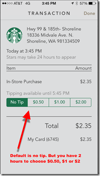
The new app also offers electronic tipping, a welcome improvement for the staff, since the move to no-signature card-transactions many years ago took away credit-card tips.  

The app integrates four components into the homescreen (see screenshot #1 right):

A. Top navigation with choice of:
— Pay: Opens up QR code (in lieu of shaking) (see screen #2 below)
— Stores: Starbucks store locator with map and list
— Gift: Opens to virtual gift-card function with integration to iPhone contacts (see screen #3)

B. Loyalty program: A screen-dominating donut shows exactly where you stand on the path to the next loyalty level.

C. Messages: Links to a “feed” of available offers (screen #4) including:
— discounts
— free iTunes song and app downloads (with integration to iTunes for easy redemption) (screen #5)

D. Account history (see screen #6)
— purchases and reloads 
— tipping function allowed for two hours after purchase (screen #7)

__________________________

Lessons
__________________________

There are some lessons here for card issuers:

  • Focus: Go to Starbucks.com on your desktop browser, and you’ll see about 150 navigation choices delivered via mega-menus across six main tabs. It’s worse than most bank websites. However, the mobile app has just three primary navigation choices (Pay | Stores | Gift), plus rewards, messages and transactions on the main screen. Starbucks rightly chose to concentrate on exactly what customers need when they are on the go. 
  • Integrate rewards/loyalty: Despite the “shake to pay” process improvement, the Starbucks mobile payment experience is still cumbersome and by no means easier than paying by card. However, because the app is integrated with rewards, all of sudden it becomes compelling, both for early adopters (certainly) and the mass market (note 3). 
  • Annotate the transaction: Besides the new tipping function, the transaction history includes both a feed of the transactions (screen #6), plus the ability to click through to a full receipt (screen #7). While not super interesting at Starbucks, when so-called “level 3” data is available for more complex purchases, it becomes an important part of the value delivered. 
  • Mobile first: If you offer information or services consumed on the go, mobile services (app & website) are the key interaction point going forward. Starbucks CEO Howard Schultz understands this (note 4). Does your CEO?

__________________________

Screenshots
__________________________

2. QR code (scanned at POS)             3. Virtual gift cards

image     image

4. Offer stream                                5. iTunes integration to redeem

image       image


6. Transaction history                &nb
sp;     7. Transaction detail with tipping

image        image

—————————–

Notes:
1. Previously, I was paying with Square Wallet since no reloading is required. But now I’m on the quest for Gold Status at Starbucks, so Square will have to take a backseat.    
2. Since users are not accustomed to shaking their phone to make it do something, it may take a while for everyone to figure out this shortcut. Luckily, the Pay button has been moved to a position of great prominence, for those that prefer to use the old navigation process.   
3. The Starbucks app is now on my wife’s iPhone. Besides the map, weather, Yelp, and French translations, it will be only the fifth app she uses frequently.
4. Starbucks CEO Howard Schultz is a genius and seems to genuinely care about his employees and the world. If he had only stayed out of pro sports ownership (go Sonics!), his record would be virtually untarnished.

Launching: 2,000 Bitcoin/Crypto-currency Startups

English: Looking north up Eleventh Avenue (Man...

Jacob K. Javits Center (Wikipedia)

The bitcoin logo

Bitcoin first passed the $200 mark a year ago (vs. $450 today). I didn’t know much about it then, figuring it was a fad best left to the speculators to debate. But I was wrong. Bitcoin, or something similar, appears to be here to stay.

Case in point: There is a 2,000-person Bitcoin event in NYC today and tomorrow, Inside Bitcoins, at the Javits Center no less. But don’t worry if you miss it, the event is scheduled to travel the globe with stops in Hong Kong, Melbourne, Tel Aviv, London, Singapore, Berlin, before landing back in NYC a year from now.

In the keynote, Circle CEO Jeremy Allaire estimated 2,000 startups globally are working on crypto-currency products and services. That alone makes it more than a fad (bubble perhaps, but not a fad). There is no putting the crypto-currency genie back in the bottle. The technology is too compelling. The demand for alternative stored value is so huge that I don’t see it being regulated away, at least outside the west.

Relevance for Banks: U.S. financial institutions will steer clear until regulatory uncertainties are cleared up. While regulators ARE paying attention (even the IRS recently weighed in), don’t expect banks or credit unions here to be accepting Bitcoins for deposit anytime soon.

However, I do expect U.S. prepaid-card based “near banks” (Moven, Onbudget) to work with Coinbase and others to make it easy to move Bitcoin value onto their cards (see note 1). For inspiration, check out the Bitcoin debit card launched today by Hong Kong-based Cryptex Card (press release).

———————-

Notes:
1. Both Coinbase and Onbudget will demo separately at FinovateSpring, three weeks from now.       
2. For more, see our Feb 2014 OBR report on alt-payments, Money 3.0 (subscription).

Fintech Funding Bubble: April Fool’s Day Edition

Fintech Funding Bubble: April Fool’s Day Edition
Bubbles

Photo credit: pedrosek

To prove that last week’s post where 10 fintech fundings were announced in a single day, I submit for evidence yesterday’s April Fool’s Day activity. 


Seems as if companies might want to avoid announcing new fundings on April 1, but that sometimes inauspicious date didn’t faze the pace yesterday as seven fintech players revealed total equity investments of $33.5 million. Adding to that figure is $22.5 mil in debt, for a total of $56 million in new capital. 

  • $22 million to BIMA Mobile to expand its mobile micro-insurance services in developing markets. The company says it already has 7 million customers. 
  • $20 mil in post-IPO debt to Identive Group to further its identity-management platform (NASDAQ: INVE)
  • $4 mil to Citizen.VC in advance of its April launch of an AngelList-like service for funding startups (link to temporary launch page)
  • $4 mil to OpenFin to expand its financial trading platform 
  • $2.5 mil Series A for WealthForge to build out its securities-issuing platform, currently used by Realty Mogul among others
  • $2.5 million in debt to ID.me to expand its digital identity network
  • $1 mil seed-round to PayStand, a Santa Cruz-based digital POS system that accepts credit cards and Bitcoin (of course)
Again, I’m not saying this is a bubble, but it certainly is a LOT of activity. Then again, if you count insurance (not including health), the financial sector is 8.4% of U.S. GDP in 2011, up from 4% in the 1970s. And it’s ripe for improvement in many, many areas. 

Fintech Funding Bubble?

When we first started Finovate in 2007/2008, during the depths of the financial-services sector collapse, there were maybe a half-dozen major venture fintech fundings per quarter. In comparison, yesterday (25 March 2014), in a single day, 10 fintech fundings were announced totaling nearly $60 million (according to Crunchbase).

Yes, you read it right. TEN in 24 HOURS! And that doesn’t even include ThreatMetrix, whose latest $20 mil round didn’t make it into the database by today’s noon (Eastern Time) cutoff. 

What are the drivers? As you can see from the list below, the digital currency craze attracted nearly half the amount, with $23.5 million sent to three companies. Crowdfunding and other alt-lending has been absorbing large amounts of capital of late, and yesterday pulled in another $20 million in three fundings. The other four ran the gamut from $12 mil into a prepaid card company and $1+ million each in insurance, healthcare payments and stock analysis.

Is it 1999 again? That’s not for me to say. I hope not (obviously). But it’s hard to believe that there is enough revenue to sustain even a small portion of these startups. Clearly investors believe there are major disruptions ahead in all things financial. 

——————————–

Table: Fintech Fundings Announced March 25, 2014

Amount Company Market Segment
$17 mil Circle Internet Financial Digital currency/bitcoin
$14 mil CircleUp Equity-based crowdfunding
$12.2 mil SpendSmart Payments Co Prepaid cards for youth
$5 mil Payward (Kraken) Bitcoin
$4 mil BlueVine Small biz alt-lending
$1.6 mil RealCrowd Crowdfunding real estate
$1.5 mil GoCoin Bitcoin
$1.4 mil SeniorQuote Insurance Insurance lead gen
$1.2 mil FlexMinder Healthcare payments
$1.2 mil Estimize Earnings estimates for stocks
$59 mil TOTAL

Source: Crunchbase, 26 March 2014