Online Banking Report Releases its Annual Planning Issue

Our sister publication, Online Banking Report, released its latest report, 2007 Online Banking Planning Guide. The 60-page report is packed with more than 1,000 ideas, tactics, and strategies for use by banks, credit unions, mortgage companies, credit card issuers, brokerages and insurance companies.

The report includes the following sections:

  • Consumer product planner
  • Small business product planner
  • Fee-income planner
  • Messaging planner

Online Banking Report subscribers may download the free report here. Others may purchase the report for US$495 here.

For more information, download the table of contents here.

Is PayPal the Largest Bank in the World?

Yes and no.

PayPal offers a full range of payment services that includes debit and credit cards, a savings account paying more than 5%, and loan options on major eBay purchases. Sounds pretty much like a bank, doesn't it?

But are they the biggest? According to eBay's earning release yesterday, PayPal ended the quarter with 123 million accounts, 36 million MORE than they had a year ago (41% growth). The new accounts alone would dwarf almost any financial services company in the world; for instance, American Express has 74 million accounts worldwide (as of June 30), up 7 million since a year earlier.

So yes, by number of accounts, PayPal is clearly the global leader in financial services. However, by most other measures, PayPal's size is more modest.

For example, unlike most financial companies, the majority of PayPal's accounts were inactive. During third quarter, less than a quarter of its accounts made a payment.

Those 31 million active accounts made an average of 5 transactions during the quarter, resulting in a total of 146 million payments worth $9.1 billion (an average of $62 per payment). Across the entire 123 million base, that amounts to just $73 in spending per account. In comparison, American Express cardmembers spent 15 times more, $141 billion in second quarter, an average of $1,900 per card.

In summary, PayPal is an enourmous financial services company, growing far faster than most rivals. But it's still a niche service for online purchasing, primarily at eBay. However, with more than 100 million accounts and one of the most widely recognized online brands, PayPal is in a position to compete with major banks around the globe. 

Zopa Emphasizes Community with New Homepage

Although you may have little interest in the niche market for person-to-person loans (previous coverage here), you should keep tabs on the websites of Zopa and Prosper to see how they build a community of borrowers and lenders.

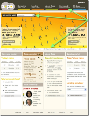
The new Zopa homepage (see screenshot below) features several interesting community-involvement devices:

  1. "I'd like to meet…" tool in upper left
  2. Community factoid ticker running across the middle of the screen (see list of factoids below)
  3. Community tab in primary navigation (top)

Zopa home 18 Oct 2006 CLICK TO ENLARGE

"I'd Like to Meet" tool
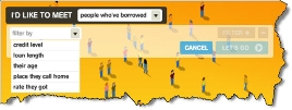
This tool, placed in one of the most-viewed areas of the homepage (upper left), allows users to find like borrowers and lenders. Using drop-down boxes, users may narrow their search to just borrowers in a single city, oI'd like to meet tool CLICK TO ENLARGEr those of a certain age or age range, and so on (see inset). 

Unfortunately, we were unable to see the results since our search queries just showed an endless "search in progress" graphic image.

Community factoid ticker
Even though scrolling tickers are annoying, they do draw attention. Since Zopa must make prospective users comfortable with its novel service, it makes sense to be mildly annoying to get the point across that Zopa is a vibrant and fast-growing community. However, the 3-minute cycle time (before stopping) is too long; a 30-second scroll along with a link to more factoids would be better.

In our test at 7:00 PM London time Oct. 18, there were 17 items running across the screen in this order: 

  • 1,571 Johns have joined since we launched …
  • 4,350 members have registered so far this month …
  • 480 Zopa members have logged into their accounts today …
  • 553 Sarahs have joined Zopa so far …
  • Adrian from HULL has just joined …
  • In the last hour, 8 new members joined …
  • Lorraine just offered 50 to Zopa borrowers …
  • Mark from OXFORD just had a loan reserved in the B market …
  • More members come from London than anywhere else …
  • The average age of a Zopa member is 36 …
  • The last member from the Isle of Wight to lend was Laurence …
  • The last person to join from Aberdeen was Clare …
  • The most common name amongst Zopa members is David …
  • There have been 4,875 requests for loan quotes in the last 24 hours …
  • Thomas recently paid in using their debit card …
  • We have 595 members from Leicester …
  • Yesterday, 251 new members signed up …

Community tab
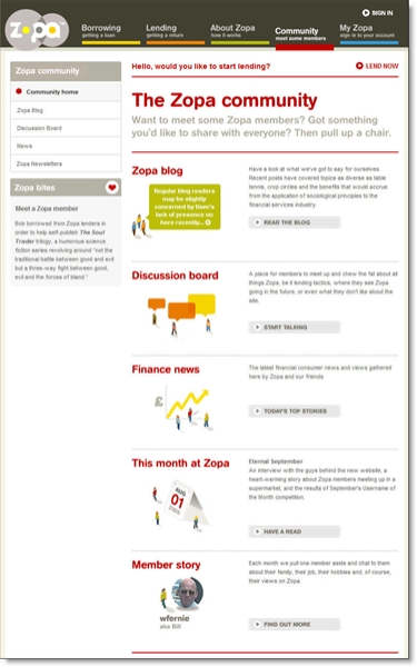
The Community tab in the site's main navigation leads to a page jammed with more community-building features and tools including (see screenshot below):

  • Company blog
  • Member discussion board
  • Finance news as gathered by "Zopa and friends"
  • Zopa newsletter
  • Member story (monthly feature)

Zopa vmain community page CLICK TO ENLARGE

Summary
A good effort by the person-to-person lending pioneer. We look forward to the company's U.S. launch while passing along our regrets to the recent passing of its founder Richard Duvall (memorialized in this Oct. 17 Zopa blog entry).

Bank of America Pitches Identity Theft Protection at Logoff

While there's nothing unusual about the product or offer, with 50% market share in online banking, everything Bank of America does at its website is news.

After reviewing my credit card balance online today, I was greeted with a 30-day free trial offer for Bank of America's Privacy Assist Premier, a daily credit-monitoring, three-bureau service priced at $12.99/mo.

Below is the splash screen displayed after logging out from online banking:

We were a bit surprised at the lack of disclosure on this screen; not a single word about the eventual $156 annual cost, to which even the most well-heeled BofA clients may take exception.

Another surprise: Clicking the Accept button simply dropped us back on the home page with not a word of thanks or any confirmation that our selection was accepted.

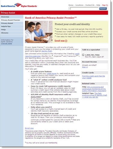
However, most users will be smart enough to choose Learn More before signing up. On that landing page the cost is well documented appearing in the first bullet point in the shaded box (see below).

Truly Virtual Banking in Second Life

We've come a long, long way since the dawn of the commercial Web, which in banking began in May 1995 when Wells Fargo posted the first customer statement on a website.

Back then, when we talked about virtual banking, we meant Internet banking. Now, there's the very distinct possibility that banks and credit unions will set up shop in virtual worlds such as Second Life from Linden Lab <secondlife.com>.

Let's call it truly virtual banking. Second Life, with more than 940,000 users, allows the exchange of virtual Linden dollars for real greenbacks, currently at a rate of L$273 to US$1. Due to the possibility of real profits from virtual activities, this metaverse has attracted more than 10,000 businesses including Starwood Hotels and others (see Analysis below). 

Apparently, the first real-world bank with a truly virtual presence is none other than Wells Fargo, whose Stagecoach Island debuted in Second Life late last year. However, after a few months the site was moved to a standalone site with no connection to Second Life <stagecoachisland.com> (see screenshot below).

Wells Fargo Stagecoach Island game CLICK TO ENLARGE

In Second Life, the private island was accessible only to Wells Fargo customers who received an invite from the bank. Normal Second Lifers could not gain entry. Users were given a $30 stake in virtual cash. Although the island tempts them with various ways to spend it, the goal is to save, with interest paid at the rate of 10% per day. Users can earn additional cash by taking finance-oriented online quizzes.

The stated purpose of Stagecoach Island is financial education. It is part of a larger program aimed at younger adults. The We Take the Fun of Money Seriously program was piloted in Austin and San Diego last year. Here's an excerpt from the Sept. 14, 2005, press release:

Wells Fargo is hosting a series of live "We Take the Fun of Money Seriously" events throughout Austin and San Diego during September and October where young adults can participate in various activities — from karaoke and trivia games to athletic challenges and photo booths — and win prizes while learning about banking basics. Event participants will receive the Web address and a unique log-in code for the Stagecoach Island software and will have the opportunity to play the online game at home for 30 days.

Apparently, the pilot was successful. This year, the program was used at summer rock concerts, primarily a dozen venues of The Warped Tour, and at 19 college campuses this fall. The first stop was Aug. 20 at the University of Nebraska and the tour ends Nov. 1 at Central Washington.

The bank was assisted by Swivel Media, a San Francisco-based marketing firm which hosts a Web page and short video devoted to the game at <www.swivelmedia.com/fun_money.htm>. According to a July blog post at Clickable Culture, the company paid $17,000 to Second Life freelancers to build the game.

Analysis
Online gaming, or advergaming as it's sometimes called, is a good way to make an impression with younger users, even though it may be difficult to create a game not considered totally lame by the target audience. We recommend keeping it simple, and bribing the target audience with numerous prizes.

The bigger issue, whether to create a presence in Second Life and/or other metaverses, is more complicated. Several major brands have recently taken the plunge including American Apparel, Starwood Hotels, and others.

The Starwood's program is interesting. They are using the Second Life hotel project, aloft, to create a buzz for a real-world brand they intend to introduce in 2008 under the same name. The hotel's Second Life effort is chronicled in its own blog, <virtualloft.com>, which includes a virtual grand opening featuring Ben Folds scheduled Oct. 19.

Financial institutions, looking to create some buzz, should consider a presence in Second Life. With an expected population of one million by year-end, the marketing opportunities within the metaverse are intriguing. But more importantly, a Web-based blog and marketing campaign could yield millions of free impressions for online and offline media.

However, this is not as easy as it seems. There are numerous risks and obstacles that must be overcome. The largest banking operation in Second Life, Ginko Financial <ginkofinancial.com> which lends Linden dollars at 44% interest, has been plagued with accusations of fraud, specifically of being a Ponzi scheme (read Reuters article here). There have also been recent incidents of Second Life hacking that have caused problems.

But the biggest risk is to your reputation. Not only are you vulnerable to the whims of the game players, you also risk being associated with the more adult-themed activities in Second Life. Before taking the plunge, you should have a staffer join the metaverse and consult with seasoned players for advice on proper "game etiquette" (remember "netiquette" ten years ago?). You want to make sure you position yourself as "less lame" than the average financial institution.

But those risks are manageable; in fact, they are similar to the problems you deal with in the real world. And given the potential buzz from a successful Second Life brand, it's worth your while to investigate the potential.

P.S. If you think this is all a fad, consider the source of the Ginko Financial article cited above. It was written by a new full-time reporter from Reuters who works IN Second Life (see NY Times story here).

Resources:

Heritage Bank Posts PDA Version of Homepage

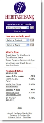
Minnesota-based Heritage Bank <heritagebankna.com> has added a simple feature that can make all the difference to mobile users, a link to a PDA version in the upper-left corner of its homepage (see screenshot below).

I tested it on my Blackberry 8700g, and it worked pretty well. The regular homepage takes a long time to load, but once it does, you see the PDA link and Heritage logo. Clicking on the link loads a slim, 15k page with just the basics (see inset):

  • Logo
  • Online banking login
  • Help drop-down
  • What's new (with 3 subjects)
  • Featured rates (with 2 loan products and 2 deposits including its 5.2% high-yield savings account)
  • About
  • Careers
  • Contact Us

At right is what the PDA homepage looks like in an IE6 browser window which, as all you PDA users know, is far more attractive than the Blackberry rendition. 

Analysis
Bank-account access is a relatively robust application to use on a portable device. The most recent M:Metrics research found that an average of 23 million U.S. mobile subscribers, nearly 12% of the total, accessed news and information from their phones (monthly average in June/July/August).

So it makes considerable sense to post a PDA link. Once users bookmark the URL, it will be relatively easy to navigate within the tiny PDA real estate. However, it would also be helpful to create a shorter URL pointer to the PDA version, for example, <hbmob.com>, <hbpda.com>, or <hbmobile.com> (only the first domain name is available, however).   

Everbank’s Latest Email Newsletter

Everbank <everbank.com> has been an active emailer, sending a newsletter every few months for the seven years I've maintained an account there. The newsletters have always been chock full of content, from general finance topics to detailed discussions revolving around the bank's unique currency- and commodity-related products.

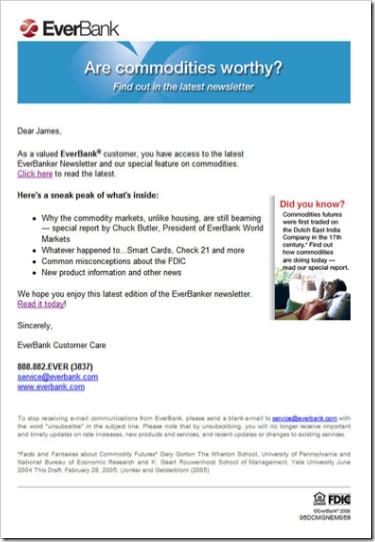
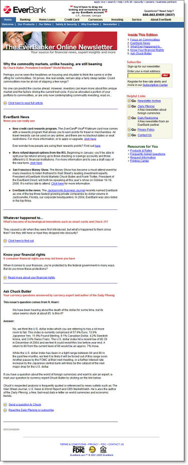
The newsletter design has evolved with the times, from plain text in the 1990s to the well-designed HTML missive we received last night (see below). The short headlines letter encourages customers to click through and read the full document at the Everbank website (see End Notes).

Email Sample
Date/Time: Oct. 11, 2006, 8:59 PM (received 10:24 PM Pacific Time)
From: EverBank [service@everbank.com]
To: James
Title: Are commodities worthy? Find out in the latest EverBanker newsletter
Personalization: Dear <firstname>
Signature: EverBank Customer Care

Everbank Oct newsletter CLICK TO ENLARGE

Analysis
Email
There is little to criticize. The short email is direct and to the point. Its layout lends itself well to viewing within the preview pane. The small "did you know" box adds an element of interest, and the drop-shadow makes it stand out. 

With four major articles, it makes sense to send just the headlines and ask the reader to click through to the website to read the full article. However, the bank should use the standard convention of hyperlinking each article directly to the appropriate place on the website.

The bank does include two hyperlinks to the Web-based newsletter, a "click here" in the first paragraph and a "read it today" at the end. However, for even better usability, the bank should add a big shiny button that leads directly to the Web version.

Web-based Newsletter
The website demonstrates good usability in its layout and content. A synopsis of each article is provided on the main page and users click through to read the complete article. It's useful and well-written information, better than a lot of what you read in mainstream consumer-finance publications. We especially liked the "whatever happened to" look-back at some recent initiatives, such as Check 21, and the overview of consumer-protection laws.

As good as the newsletter is, we couldn't stop thinking that it would work much better as a blog. That way, readers could pursue subject threads and more easily peruse all that Everbank provides. The bank could also experiment with accepting comments to make the whole experience more interactive.

Overall grades:
Content: A+
Email design: A-
Website (newsletter) design: A

End Notes
Click on the following link to see a screenshot of the newsletter landing page.

Newsletter Landing Page (here's the link)

Everbank_newsletter_11oct06_landing_1

U.S. Bank Adds Payday Loans to Online Banking

Here's something we hadn't expected, payday loans from a major bank delivered through its online banking program. Minneapolis, MN-based U.S. Bank, not known for its pioneering work in online banking, quietly added payday lending to its platform recently.*

How it works
Users are alerted to the feature through a green link at the top of their checking-account transaction detail (see below).

DDA trans detail CLICK TO ENLARGE

Clicking on the link returns the well-designed "advance" pop-up screen where users can elect to take an advance from their next paycheck or from one of their pre-existing credit accounts (see below).

After selecting payday advance, users choose the amount and then follow the instructions to complete the loan. Funds are moved in real-time with no credit check. Since we don't have a direct-deposit paycheck, we didn't expect to qualify for an advance. However, we did receive a token "advance limit" of $80 (see "Available Credit" in lower-right box below).

Pricing & Disclosures
The advances are priced at 10% of the advanced amount, with a $20 minimum advance. Advances are automatically deducted from the checking account in one month if not already repaid. The APR if the amount is outstanding for the full month is 120%. Only one advance can be outstanding at a time.

In our example below, we chose a $20 advance and were required to repay $22.

The program is well-disclosed with a lengthy FAQ and Disclosure Statement (click on the continuation link at the bottom to see these documents).

Analysis
Putting an advance button at the top of checking-account transaction data is a great idea. However, at least in our case, the bank's implementation was questionable. Although we maintain as low a balance as possible in this checking account, we often run $10,000 or more through it. Also, we have an open credit limit of $20,000 on a U.S. Bank credit card linked to this account. Offering us an $80 advance limit is ridiculous.

Also, we're not sure that online payday lending is strategically very smart. Why charge 120% APR on small advances of one-month duration, risking customer and press backlash, when you could instead upsell an overdraft line of credit with a reasonable APR? 

The bank would stand to make much more on a reasonably priced overdraft line of credit, which could be delivered nearly as seamlessly. For example, a $2,000 outstanding balance on an 18% line of credit would provide $200 or more of annual profit vs. about $40 for a pair of $200 advances. And the customer will likely be more satisfied with the credit line. 

Although the bank demonstrates in its disclosures (see notes below) that its program is less expensive than an NSF fee or a typical payday loan, the 120% APR will likely create a bit of a furor with consumer advocates lambasting the bank in the press. It appears to have escaped notice so far.   

U.S. Bank deserves a pat on the back for its innovation, but without more consumer-friendly pricing, the payday-advance program may backfire on them.

*We have several accounts at U.S. Bank and noticed it this week for the first time.

End Notes (click on the following link for more information):

Program Disclosures

Usbank_ddaadvance_terms

Program FAQs

Usbank_ddaadvance_faq

Will Google Create an Online Quicken Clone?

Google_docs_logoGoogle hit the news today with a modest improvement to its online word processing and spreadsheet services, combining them in an umbrella offering called Google Docs (see TechCrunch analysis here).

Clearly, the Web giant hopes to convert millions of casual users from Microsoft Office to its ad-supported services. If they make headway in word processing, it's only a matter of time before they offer more specialized software applications. One area likely to be seriously considered is personal finance management, dominated today by Intuit's Quicken and Microsoft Money.

Budget_snap_logopig It would be relatively easy for Google to jump into the market. For a few million, it could acquire one of the personal finance startups such as BudgetSnap (see Sep 12) or Foonance (see Aug 10). Or it could build a service by licensing Yodlee's MoneyCenter (see July 5).

Analysis
What impact would this have on financial institutions? For banks with basic "plain vanilla" online banking, it could be a major threat if users began storing their banking transactions at Google, especially if the company offered automatic pre-scheduled downloading, which is likely. Users would log in to their banks far less often, diminishing the opportunities to cross-sell and service customers. And with the transaction archives stored elsewhere, it would be much easier for consumers to switch banks, reducing the relationship value of online banking and bill pay.

To avoid being marginalized by online personal-finance services, banks should boost their feature-set to include basic financial-management features, such as payment categorization, long-term storage, and reporting. Consumers have little desire to store confidential information with a Web-based company; however, if you don't provide obvious features, such as transaction storage, users will look elsewhere.

For more information
Our previous coverage is here. And for those wanting a detailed look at online personal finance, read our recent Online Banking Report #131/132, "Personal Finance Features for Online Banking" (subscription required).   

Majority of Banks Offering High-Yield Savings are Traditional Brick-and-Mortar Institutions

Bankunited_savingsSavings accounts paying 5% or more are a sweet spot for consumers by allowing them to beat inflation with little risk. According to Bankdeals blog, <bankdeals.blogger.com>, 22 U.S. banks are currently paying 5% or more on consumer savings accounts (see BankUnited's "Sweet Rate" in inset).

While there's been much talk about online-only banks and their competitive threat, only 4 of the 22 fit this definition. The other 18 are traditional branch-based banks, often marketing the higher yielding accounts through direct banking brands such as HSBC Direct (see 26 Aug 2005), MyBankingDirect from New York Community Bank, or the latest entrant Grand Yield Direct from Apple Bank for Savings (see Sep 27). 

The traditional banks are evenly split on how they market the higher-yield product. Ten use a separate brand which is often not mentioned on their main website. Six of the ten simply append a "direct" to their main brand. The other eight market high-yield accounts online under their normal brand, but two (Zions and Wamu) hide the higher rate accounts from users of their main websites. 

Here's the list as posted Oct. 7 at BankDeals:

Pure direct banks with little or no branch network (minimum balance to earn rate, if more than $1,000):

Direct brands of traditional banks (parent):

Traditional banks with links to the high-yield account from its main website:

Traditional banks with "secret" online-only offer (not linked to regular product pages):

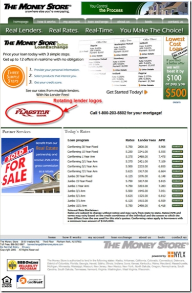
The Money Store’s Comeback Marred by Flawed Website

Flipping through a pile of American Bankers on the plane last night, I came across a page one story on The Money Store <themoneystore.com>. If you've been in the business at least ten years, you probably remember the sub-prime lender that created a household name for itself with heavy TV and print advertising featuring baseball great Jim Palmer and others. But shortly after First Union (now Wachovia) paid $2.1 billion for it in 1998, its sub-prime portfolio tanked and the bank shut it down in 2000.

Why First Union/Wachovia didn't use the famous Money Store brand for other lending pursuits is a mystery, but I'd wager that after blowing a couple billion dollars on the acquisition, senior management, and shareholders, didn't want to hear that name ever again. 

Fast forward five years. MLD Mortgage, a NJ-based lender founded by former Money Store Vice Chairman Mortan Dear convinced Wachovia to sell him the Money Store brand name. The brand was then repositioned as an online loan exchange along the lines of LendingTree, brokering mortgages for 50 lenders including Washington Mutual, NetBank, and Flagstar Bank

Analysis
The use of the Money Tree name is good, although they absolutely must secure the <moneytree.com> domain name. The online loan-exchange business model is sound, and its lending partners offer good credibility. However, the company's website execution is deplorable.

The busy home page doesn't even mention the product it sells (see screenshot below). We could write an entire report on what's wrong with the site, but we'll review just one small section here to give you an idea of the problems.   

At first glance, the "three simple steps" graphic in the upper-left looks promising, although the type should be bolder for readability (see inset).

As users struggle to understand what the company offers, many will start here due to its location, color, and shape. Unfortunately, most users will become even more confused after reading it due to three significant usability errors:

Mistake #1: Scaring off potential customers. The goal of a financial website is to make users confident in transacting there. Money Tree does the opposite. The very first thing users see is step 1, "Provide your personal information." In today's paranoid times, that's a huge red flag from a relatively unknown website. Before you cause even a smidge of user-apprehension about the application process, you must make visitors want your product. Try starting with a benefit statement such as "lower your mortgage payment" or similar.

Mistake #2: Amateur copywriting with no benefit statements. Always use a professional copywriter, even for bullet points. The Money Store is obviously cutting corners here. For instance, the first line above says "price your loan today." That makes almost no sense to a consumer. It's industry jargon. It should be a benefit statement, like "lower your mortgage rate today" or something similar that can be easily grasped. My fifth-grader could have come up with a better opening line.

Mistake #3: Steps that lead to the wrong product. For the life of me, I can't figure out what the company was thinking with its third step. Here's a synopsis of the three: 
1. Provide personal info.
2. Select product
3. Get your credit score
Huh? Are they selling credit scores or saying you need to go somewhere else, find your credit report and then finish the process? Either way, they are going to lose just about anyone that's gotten this far.

Instead, the steps should lead to a recognizable benefit such as:
1. Tell us what you want
2. Compare all the great prices we'll provide
3. Choose the deal that saves you the most money
4. Enjoy your extra cash!!

The Money Store homepage (Oct. 9)

Bank Blogging Coming to Corporate America

While the number of external blogs at U.S. banks and credit unions can be counted on your fingers today, that won't last. Here's the eight we've heard about:

Source: OpenSourceCU.com, Online Banking Report

Trends
First Tech CU blog CLICK TO ENLARGE The New York Times reported last Wednesday on the expected explosion of business blogging. Citing statistics from Nancy Flynn, director of the ePolicy Institute and author of Blog Rules, it is estimated that only 4% of major corporations operate external blogs today. However, 85% more plan to do likewise. Among small business, 10% have already incorporated blogs into their marketing plans. 

Bank blogging forecast
We are in the process of developing a blogging forecast for release in November's Online Banking Report. Our preliminary estimate is that within two years, there will be at least 500 bank and credit union blogs.

It's no suprise that credit unions would jump on this trend; it fits right in with their membership and community focus. For example, Seattle's Verity CU has been blogging for almost two years (see 29 Aug 06). The unexpected first mover among major financial institutions is Wells Fargo (see 23 Sep 06), which has two blogs and six months' experience under its belt.

Action Items
If you pride yourself on having a state-of-the-art website, you'll want to add a blog in 2007. You can start with something relatively simple, such as First Tech Credit Union's news and announcement service. Then you can graduate to the more advanced versions with real personality, such as Verity Credit Union's and Wells Fargo's Student Loandown.