Online Lending Still an Afterthought

BAI's Retail Delivery Conference continues to offer an excellent array of speakers on almost every delivery topic, from the "branch experience" to "optimizing multi-channel delivery." But one area that's barely covered is loan originations. 

Only one session, out of 36 total, dealt with lending issues this year. And it was a last-minute replacement, not even in the program guide, substituting for NetBank and UPS's Banking on Brown, scrubbed after the announcement last week that the effort was being shuttered (see our coverage here).

Cornerstone Advisor's Steve Williams presented Consumer Lending: It's Not Just a Transaction Anymore. Although lightly attended, due to its placement at the closing moments of the show, he discussed a number of great ideas for improving loan originations, both online and in other channels. We'll look at some of them in more detail in coming weeks.

The presentation is available via email from swilliams@crnrstone.com

Verity Credit Union Website Hacked

Update (Nov. 12, 10 AM PST): Twenty-two hours later, the Verity website has been taken offline, but the blog is still running. However, there are no new posts since the original, although Verity's Shari Storm has responded to several member comments. From information in the comments, it sounds like Verity's log-in page was redirected for up to four hours on Saturday morning beginning about 6:00 AM. At least one member said they answered "screening questions" including mother's maiden name.

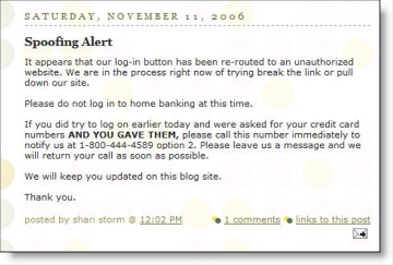
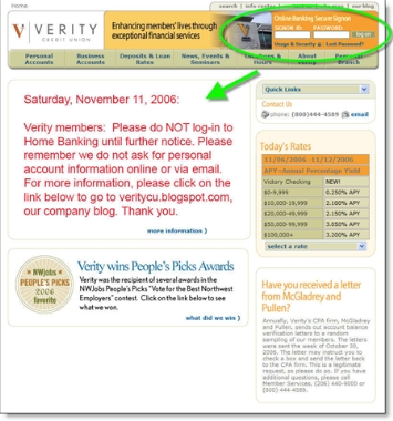
Seattle-based Verity Credit Union is in the midst of a major website spoof that began earlier today. The credit union is reporting that the log-in function to online banking, located on its homepage (upper-right below), has been redirected by a hacker.

Apparently, only the log-in function was hijacked. The credit union has control of its homepage and plastered a large warning over the front. The link after the warning, "more information," linked to the Verity blog for updates (see below).

Verity CU home page with warning CLICK TO ENLARGE

It appears the log-in process is back under the credit union's control, although the warning is still there. When attempting to log in at 3:15 PM with a test name (I do not have a Verity account), I was redirected to an error message at <https://secure-veritycu.com/Common/SignOn/SignOnError.asp>, which appears to be a legitimate Verity secure page. There was no follow-up question asking for my credit card number as mentioned in the blog post (see below).

The incident was first posted to their blog at 12:02 PM today (see post below).

Blog post on the hack

The silver lining
As bad as this is, Verity should be applauded for the rapid response, using both its website and blog to get the word out. Presumably, they also emailed customers, but those messages may or may not be believed in this day of rampant phishing.

You can follow the ongoing drama at the Verity blog, where customers have been redirected for the latest news. We'll keep you posted.

NetBank for Sale?

After a string of divestitures and the shuttering of money-losing operations, NetBank is returning to its core retail banking roots (see coverage here and here).

Whether the company remains an independent entity is up to its management and shareholders, but at least one analyst is speculating about a 2007 sale.

While not in a position to judge the value of the entire enterprise, I do know the brand itself has considerable value. The URL alone is worth millions. It could make a nice entry point into the U.S. market for an international bank looking to capitalize on the direct banking model, e.g., ING Direct.

The bank was launched in 1996 as Atlanta Internet Bank and went public in mid-1997. It was renamed NetBank in 1998 after securing the rights to the domain name for a reported $150,000.

NetBank was the second Internet-only U.S. financial institution, the first to go public, and the first to become relatively well known.

Chase Fails to Design Email for Outlook’s Preview Pane

More than 70% of business-email users view most or all of their email messages in the preview pane.* Depending on screen size, resolution, and window sizing, the real estate available in the preview pane can be relatively small.

When designing messages, be sure to put the most important information in the upper-left corner to maximize visibility in the preview pane.

Here is a poorly designed email Chase sent to confirm posting of a credit card payment. It requires users to scroll right to view Chase's logo and log-in button. Here's how it looks on my 12-inch laptop screen running at 1024 x 768:

What not to do from Chase:

Chase email alert

Better design from Bank of America graphics flush left:

Bank of America email alert CLICK TO ENLARGE

(Note: BofA shows the last four digits of your account number; we changed them to xxxx in the screenshot above.)

Action Items
Even though it's just a routing email message, the poor layout makes it look like a phishing message. Chase could clean this up with just a few minutes of programming work. While they are at it, they should add a personal greeting and additional text disclosures to make it look less phishy. 

*For more information, read our Online Banking Report #129/139, Email Marketing for Financial Services.

Bank of America Uses Radio to Drive Website Credit Card Applications

At 8:30 AM today, we heard an unusual advertisement on classic rock radio for the Bank of America Alaska Airlines affinity card.

It wasn't the ad itself that was so spectacular, although it's not every day that you hear credit cards being pitched on radio. And it wasn't the offer that made the ad stand out, although 20,000 bonus miles is a pretty good perk.

What made it memorable was the call to action, "visit myalaskacard.com." They didn't even bother to throw an 800 number into the spot.

It's hard to say whether a radio spot will prove cost effective, but using a memorable URL should help. It's far easier to remember than a telephone number, and prospective applicants can be immediately greeted with an effective sales pitch reinforcing the product benefits and bonus offer.

Analysis
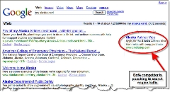
Google results for "my alaska card" However, once again BofA stumbles with its search engine support (see previous article). Searching on Google for "my Alaska card" brings up a single ad for a Web-based portal site, CreditStep.com (click on inset for closeup).

In fact, we tested every variation of "my" + "alaska" + "airlines" + "credit" + "card" and BofA was nowhere to be seen UNLESS we dropped "my" from the search query. Interestingly, Chase was an aggressive advertiser on several of the search terms offering a competing airline card with 15,000 bonus miles. BofA showed up as an advertiser only when we dropped the "my" from the search query.

The lack of advertising against "my alaska card" is especially damaging because the first few organic search results do not link to BofA or Alaska Airlines. Also, if you type a similar URL, such as www.alaskacard.com or www.alaskaairlinescard.com you either end up at a generic link site or an error page. At this point, potential prospects will either apply at the wrong place or give up on the search. 

If you correctly input the exact URL, you end up at the following landing page. It's OK, but should reinforce the impressive benefits of applying now, a free ticket right away and a $50 companion ticket every year on renewal (see screenshot below).

Action Items
Here's what you should do to ensure better search-engine support for your offline advertising:

  1. Advertise at search engines on likely search terms that would be used by consumers responding to your advertising
  2. Create a memorable URL that is not easily mistyped
  3. Register or purchase domains similar to the advertised URL (including common misspellings), or pay the owner to refer traffic to your landing page
  4. Design a landing page that boldly supports the benefits in your advertising and includes a prominent "Apply" button

BofA landing page for myalaskacard.com

Finding New Subscribers for Your Email Newsletters and Alerts

How do you convince already-registered users to sign up for your latest email newsletter? One way is to offer an incentive. Earlier this week, the Seattle Supersonics offered users the chance to win a $500 shopping spree if they logged into their account and opted-in for the latest email newsletter.

An even more effective method was demonstrated by the New York Times today in the online version of its Business Section. In the upper-right corner, the user's existing email address is shown, along with a sign-up button (see screenshot below). All it takes is a single click to begin receiving the daily DealBook email.

The newspaper also provides a link to view a sample of the newsletter, a proven strategy for increasing response, and links to its Privacy Policy and back to account preferences to change the email address.

New York Times email signup CLICK TO ENLARGE

Once users click on the sign-up button, the text is changed to a thank-you message along with a link to change email preferences (see inset above).

The One-Million Club: 31 U.S. Financial Institutions with Seven-Figure Site Traffic

Go to Compete's website There's finally a simple and free resource for determining website traffic at most domains. Compete Inc. uses its panel of two million users to estimate traffic at hundreds of thousands of websites.

Compete's Snapshot service shows the traffic trend over the past 12 months plus a more detailed snapshot of the current month that includes pages viewed and length of stay (see Emigrant Direct example below).

Emigrant Direct traffic trend CLICK TO ENLARGE

Using Snapshot, we found 31 financial institution sites with one million or more unique users in September:

Rank/Unique Visitors (millions)
1)   17.1  Bank of America
2)   16.7  PayPal
3)   11.9  Chase
4)   11.4  CapitalOne
5)   11.3  Citibank
6)   10.0  Wells Fargo
7)    6.2   Discover Card
8)    5.6   American Express
9)    5.3   WAMU
10)   5.0   Wachovia

11)   4.1   LendingTree
12)   4.0   Fidelity
13)   3.8   US Bank
14)   2.9   Geico
15)   2.3   ING Direct
16)   2.2   Countrywide
17)   1.9   Progressive
18)   1.8   National City
19)   1.8   MBNA (Bank of America)
20)   1.8   Vanguard

21)   1.7   USAA
22)   1.6   FirstUSA (Chase Bank)
23)   1.5   Allstate
24)   1.4   Fifth Third
25)   1.3   Suntrust
26)   1.3   State Farm
27)   1.2   E*Trade
28)   1.2   Schwab
29)   1.0   Navy FCU
30)   1.0   HSBC
31)   1.0   BB&T

Also, PNC Bank and Key Bank both had just under 950,000 unique visitors. 

Source: Compete Inc., 6 Nov. 2006, <snapshot.compete.com>

Royal Bank of Canada Launches New Blog Supporting its "Next Great Innovator Challenge"

Royal Bank of Canada (RBC) launched a blog Tuesday, becoming the second largest North American bank in the so-called blogosphere. Wells Fargo was the first (see coverage  here). Thanks to Colin at BankWatch for the tip.

The RBC blog is part of a larger effort, The RBC Next Great Innovator Challenge, a marketing campaign aimed at rewarding innovation among Canadian college students (see main page below, note the Second Life-like avatar on the right).

The team of college students that develops the most innovative idea in the area of "teens and financial services," in 2,500 words or less, wins CDN$20,000. The top five teams will present their ideas to RDC management. Runnerups receive CDN$1,500 to $10,000 (total prize pool is CDN$40,000). Registration closed Oct. 31, with final presentations scheduled for early 2007.

RBC's student innovation challenge main page CLICK TO ENLARGE

Analysis
From a marketing perspective, there is much to like about this effort that:

  • Positions the bank as innovative and striving to be even more innovative
  • Generates a tremendous amount of positive press, both at the outset of the program and later as finalists are selected, then as winners are announced
  • Drives traffic to its website
  • Brings in new student accounts (it is no coincidence that the program launched during back-to-school time)
  • Impresses the parents by rewarding creative teamwork by their kids
  • Provides a large number of ideas that RBC can use in future bank products and student banking efforts
  • Identifies potential future employees among the contestants
  • Impresses Canadian businesses with the bank's support of young entrepreneurs

It's surprising that the bank didn't start a blog until the content closed, but better late than never. The blog will still serve as a great way to continue the momentum as the contest moves through the selection process. We'll take a closer look after it's been running for a few weeks.

Bank-Anywhere.com Launches Branch Locator Mashup

For some time now, branch/ATM locators have been standard feature on banking websites. They began in the late 1990s as crude lists providing an address and maybe a phone number.

Today, locator tools are more robust, with branch hours, maps, pictures, and more. Still, many provide a simple listing instead of the locations pinpointed on a map. 

Sovereign Bank branch locator CLICK TO ENLARGEFor example, here's the output from a search at Sovereign Bank for all branches and ATMs in zip code 10019 (click on inset for closeup).

The list is well laid out, but you must wade through it to find the closest branch, then drill down through the links to find more details and a map.

Compare that to the tool at Bank-Anywhere.com <bank-anywhere.com>, a mashup of Google Maps and the FDIC branch location database <www.fdic.gov>. Here's a list of all banks in my zip code 98115. Clicking on the bank icon or the list on the right side triggers a pop-up callout with additional info.

Bank-Anywhere.com tool CLICK TO ENLARGE

Branch-Anywhere is in public beta after a Sept. 15 launch (see its blog). The company behind it is Dash Space, a Vancouver, BC-based developer with such a low profile they don't appear on Google searches. They did respond promptly to our email questions (email here).

Analysis
Financial institutions should consider using a similar approach on their websites and either program the function themselves, or outsource it to Bank-Anywhere.com or others. It is important for this logical link to make a good first impression with potential customers of your bank. The Ajax-based map not only looks more sophisticated and up-to-date, but also is easier to use.

PayPal Email: Simple Steps to Protect Against Fraud and ID Theft

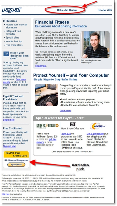
Despite calls for banks to stop marketing via email (see here) to help reduce fraud, PayPal, probably the most phished brand in the world, shows that the technique can still be effective. 

It requires a professional layout, good personalization, and behind-the-scenes fraud monitoring to nip phishing attempts in the bud.

Here's the latest from PayPal. Note the 30-second credit card button (bottom left) and personalized greeting at the top of the message.

PayPal email

Classification

Type: Marketing email with educational focus

Product: Payments with credit card cross-sell

Customer Type: Active customer

Personalization: Hello <yourname> at top of message

Header

Date received: Wed 11/1/2006 9:38 AM
From: PayPal [paypal@email.paypal.com]
To: Jim Bruene
Subject: Simple Steps to Protect Against Fraud and ID Theft

Prosper Books its 4,000th Loan

Nine-month old Prosper announced its results to date (press release here):

$20 million in loans originated
4,000 loans booked ($5,000 average)
100,000 registered users

It's a good start for the person-to-person lender, running about 25% to 30% ahead of our projections made when the company launched (see Online Banking Report #127).

However, they are a long way away from profitability, booking just $200,000 in loan fees during the first nine months, plus less than $50,000 in servicing fees and some pocket change in late fees, which are shared with lenders.

The company may need to consider hosting advertisements to prop up the bottom line. With high CPMs in the loan and personal finance market, Prosper could potentially make more on advertising than it does on the loan originations.