First Direct Bank’s Holiday Pop-up Marketing

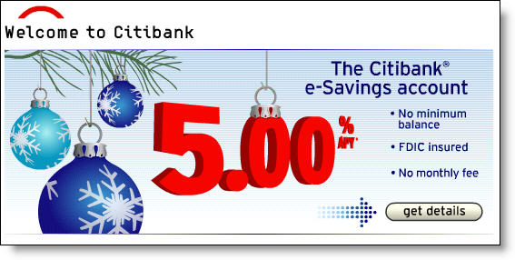
Citibank_holiday_homepage_esavings_1I am a sucker for holiday graphics on websites. It doesn't have to be dramatic, a few snowflakes or candy canes in the background is fine. For example, Citibank's e-Savings banner on its homepage today (see inset, click to enlarge). Just like a holiday wreath on the door of the branch, it shows your customers and employees that you have some holiday spirit.

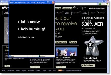
Unlike two years ago (see prior post here), this year many banks and credit unions are running holiday promotions for gift cards and other products (see rundown here) and/or have dropped holiday sprinkles into their websites. The most dramatic is the popup from U.K.'s First Direct <firstdirect.com>. This is over-the-top, but it brings a grin, not a bad thing during the end-of-year rush.

First Direct homepage with popup showing (click to enlarge)

First Direct home page with holiday popup CLICK TO ENLARGE

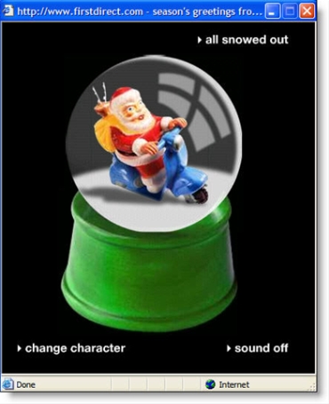
Close-up of popup after choosing "let it snow" option
The loud holiday music that accompanies the snow globe can be turned off with the button in the lower right. Selecting "all snowed out" or "bah humbug!" from the first screen displays a brief "seasons greeting" message before automatically closing the popup.
Citibank Teams with mFoundry for True Mobile Banking

Link to mFoundry I spoke with mFoundry CEO/Founder Drew Sievers last week. If you want to get energized over the possibilities of mobile commerce, this is the guy to talk to.

Although mFoundry already has more than 100,000 users of its mobile application, we were most interested in its recently announced deal with Citibank. The bank is set to launch a full mobile banking application in Q1 2007 that encompasses both SMS-based banking and what we call True Mobile Banking (TMB), a banking application running on the mobile device (see definitions here).

While mFoundry's CEO cannot confirm which functions Citibank will use, the vendor's mBanking platform includes the following: 

  • account inquiry
  • transaction summary
  • funds transfer
  • bill payment
  • ATM/branch locator
  • password generator

The platform also supports advertising and service functions (download spec sheet here).

How it Works
The mFoundry approach uses both text messaging for alerts and simple inquires and a complete downloaded application that mimics Web-based online banking (i.e., True Mobile Banking). With True Mobile Banking, the user's phone carries a unique identifier that is registered with the bank (factor one); and before receiving data or initiating a transaction the user must log in with a password or PIN (factor two).

When the user logs in, current balance and recent transactions are automatically downloaded and displayed, satisfying most user needs within seconds. The application times-out after a certain length of time and more importantly, no data is retained on the device itself, so security is nearly perfect. If the phone is lost or stolen a call to the bank will deactivate the service, although as long as the password or PIN has not been revealed, there is little security risk. 

Analysis
As mentioned in our post three weeks ago (here), it's taken nearly a decade for me to jump on the mobile banking bandwagon. Earlier efforts were too hard to use and had limited appeal, primarily to a small group of PDA-toting geeks.

However, now that even basic mobile phones can use the service (see note 1) and top brands such as Citibank, Cingular, and MasterCard are poised to pump millions into educating the market, mobile finance should take off rapidly (see note 2). 

End Notes
:

  1. mFoundry says its service works across more than 200 different phones at the five major carriers, AT&T, Cingular, Sprint, T-Mobile, and Verizon. Sure enough, even our relatively inexpensive 2-year-old Sanyo is on their list of supported phones.
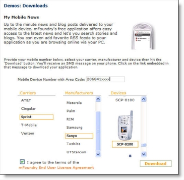
  2. In order to download the mobile application, users select their carrier and phone type from sliding menus (see screenshot below, from mFoundry's My Mobile News).

Downloading the mobile application at mFoundry

2. The next issue of our Online Banking Report will contain a mobile banking forecast.

billQ Uses Account-Specific RSS Feeds for Bill Payment notices

For the past few months, I've been more or less obsessed with RSS feeds (see our latest full report on the subject here). All of a sudden every information-delivery problem seems solvable with a feed.

And there is enormous potential for feeds in everyday banking which primarily involves simple information queries: What's my balance? Did my check clear? Was my mortgage paid? 

The first account-specific financial feed
I've been on the lookout for the first financial institution with account-specific feeds. That search continues, but a non-bank has been using feeds for bill-payment-status updates: previous OBR Best of the Web winner billQ <mybillq.com> (see previous coverage here).

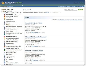
The company has an "RSS Feed" option on its list of automated bill-payment-tracking mechanisms which also include an iCalendar subscription, an Apple OS X widget, or a toolbar applet (see screenshot below for billQ subscription options).

billQ bill subscription options CLICK TO ENLARGE

When using the RSS feed option, bills automatically appear in the user's newsreader software. Below is an example using the Newsgator Web-based reader:

Mobile Banking & Payments Terminology

In 2007, we'll be spending more time researching mobile banking, payments, and finance applications. So that we all understand each other, here are some of the key terms that will be used:

General terms/acronyms:

SMS >>> Short message service (also known as text messages, texts, SMSes, txts): A service available on most newer mobile devices that permits the sending and receiving of text-only messages; also can be sent to and from personal computers or even landline phones

MMS >>> Multimedia messaging service: An evolution from SMS, allowing messages to contain multimedia objects such as images, audio, video, and rich text 

CSC >>> Common short codes: Special short telephone numbers of just four to six digits used typically by businesses to make it easier to send text messages their way (the Mobile Marketing Association has a helpful primer here)

WAP >>> Wireless Application Protocol: An open, international standard for applications that use wireless communication; primarily used to enable Web access from mobile devices

Mobile IM >> Mobile instant messaging: Similar to desktop instant messaging, but slimmed down to fit on a much smaller mobile device screen

Banking & finance terms:

SMS or text alerts: Simple one-way messages from the financial institution or payments provider to the mobile user with account-specific information

Mobile payments: Payments initiated through a mobile device, could be via SMS, WAP, or a device-specific application

Mobile banking: Online banking functions performed via a handheld mobile device (PDA, cellphone, etc.); the general term that encompasses WAP Banking, SMS Banking, or True Mobile Banking (see below)

WAP banking: Accessing secure online banking functions through a mobile device's browser

SMS or text banking: Two-way messaging; for example, using text messaging to query the server for account-specific information and have it returned to the mobile device, or responding to a bank-initiated text message to initiate a transaction

True mobile banking: Our term for banking functions delivered through a downloaded application run locally on the mobile device

Sources: Online Banking Report, Mobile Marketing Association, Wikipedia

Wells Fargo Launches Two More Blogs

Evidently, Wells Fargo has found blogging religion. Not only is it the only major U.S. financial institution with a blog, but it now has not one, not two, but FOUR public blogs.

Here's the lineup:

Previously reported:

  • Guided by History: The bank's first blog, a community service resource that began in March.
  • The Student LoanDown: An excellent blog launched in September to support the bank's student loan business. We've reported on it here and here.

Launched in August, but not previously reported:

  • Commercial Electronic Office (CEO) Blog: This B2B blog supports the bank's Commercial Electronic Office business portal. It launched August 10, but is not listed on the bank's blog index page <blog.wellsfargo.com> or on the bank's main website. Our initial reaction: The CEO Blog is an all-business affair with 39 posts in four months, a good rate for a business blog (see screenshot below). We'll take a closer look in a future post.

Wells Fargo CEO blog CLICK TO ENLARGE

Newcomer:

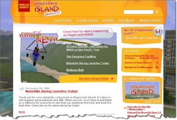
  • Stagecoach Island Community: Another good-looking blog (see screenshot below) launched Nov. 27 supporting the bank's Second Life-inspired virtual world Stagecoach Island (see our coverage here).

Wells Fargo Stagecoach Island blog

USAA Offers Nationwide Remote Deposit Capture for Consumers

In a press release yesterday, USAA, which serves many of its 5.6 million members remotely, announced the availability of its Deposit@home remote deposit capture service. It's the first major remote deposit capture service geared towards consumers. There are no fees for the service.

Previous services have been targeted to businesses who could justify the $300 to $700+ cost of a dedicated on-location paper-check scanner (see prior coverage here). USAA's service USAA remote deposit in actionworks with any 200 dpi or better scanner hooked to a Windows 2000/XP computer, so households with a dedicated scanner or multi-function printer will not be required to add hardware.

Deposit@home has been rolling out to selected customers since mid-November. To reduce risk, the service is only available to credit- and insurance-qualified checking account customers.

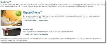
It's being positioned as a replacement to the UPS/NetBank QuickPost service that was abruptly discontinued by NetBank in a cost-cutting move (previous post here). QuickPost allowed USAA customers to overnight deposits free-of-charge from any UPS Store. There is no word on when or if it will be available to all USAA checking account customers.

Because of its limited availability, it has not been featured on USAA's website. Invitations were sent by email and the option was added to the menu within online banking. However, the feature was used in an online promotion for the Lackland Airfest 2006 a month ago (see mention in upper-left here). 

Here's a screenshot posted on the USAA thread at FatWallet:

QuickPost alternatives at USAA CLICK TO ENLARGE

Analysis
Assuming the service works as promised on in-home scanners, the ability to submit deposits remotely should help financial institutions compete for checking accounts outside their geographic footprint.

Winners: Direct banks, credit unions, and smaller banks with limited branch networks; also, remote deposit technology providers and printer/scanner manufacturers

Losers: Any financial institution that doesn't offer remote deposit options; branches

Vehicle Auctions Hit the Homepage at Houston Federal Credit Union (HFCU)

Many financial institutions sell or auction repossessed vehicles to the public. However, not many use this by-product of installment lending as a prospecting tool on their homepage.

We came across this novel approach at Houston Federal Credit Union <houstonfcu.org> while putting together a presentation titled "Extreme Website Makeovers" for an upcoming American Bankers Associate conference. The first place we looked for inspiration was the client list of Trabian, a talented new website designer concentrating on the credit union market (grab a feed to their outstanding blog, OpenSourceCU here). 

Trabian's client, HFCU, includes a link to its vehicle auctions on the right-side of its homepage (see screenshot below). Clicking on the box takes users to the main auction page where any registered user may bid on the vehicle (in this case, just a single motorcycle was up for auction).   

Houston Federal Credit Union homepage CLICK TO ENLARGE

Analysis
Everyone loves a good deal, and unlike retailers who can drop a loss-leader on their homepage to generate excitement, financial institutions have far fewer options. Vehicle auctions provide an interesting way to encourage members to check back periodically to see if they could get a smoking hot deal on a used sedan, truck, or bass boat.

It's also a good prospecting tool. Nonmembers are allowed to register on the site and bid. This provides the credit union an immediate opportunity to make a sales pitch such as the "Wish your auto loan was at HFCU instead?" in the center of the page.

The email address supplied by the bidder also enables the CU to market to the nonmember in future emails. Finally, anyone who buys the auctioned vehicle is a great candidate for an HFCU loan, which are positioned in the upper-right of the auction page (see screenshot below).

Houston Federal Credit Union auction page CLICK TO ENLARGE

Making it even better
We love the idea, and it works well even in its relatively simple form. It would be even better with a few additions:

  1. It would drive even more traffic with an email and RSS feed option for receiving information on new auction items and for monitoring bids.
  2. The credit union would generate more interest by including a variety of vehicles (even if they bought a few at auction to seed the site). Today's sole entry was a 2005 Suzuki motorcycle with a buy-it-now price of $6300.
  3. The auction format and tools are relatively crude by today's standards. For example, it wasn't obvious who the other bidders were, how long it had been up for auction, or what the next bid needed to be. There are numerous auction services that could provide a more eBay-like experience.
  4. It would be helpful to integrate the auction more closely with the loan center so users could easily calculate monthly payments, insurance costs, etc.

Top 25 Web 2.0 Financial Websites

Since its September launch,  Your Credit Advisor <yourcreditadvisor.com> has posted several trendy lists to attract traffic to its credit card application portal. The latest entry, "Top 25 Web 2.0 Apps for Money, Finance, and Investment."

The article includes helpful summaries of each site's capabilities. It's a good jumping-off point to do a little outside-the-box thinking about Web-based finance (see also, Online Banking Report #135/136, "How to Web-2.0 your Online Banking").

This list includes:

  • Two loan sites: Zopa and Prosper (see previous coverage here)
  • Six personal finances sites: Three we've covered: Dimewise, foonance, ioweyou (see our previous coverage here) and three new entrants: NetworthIQ, MedBillManager and Wesabe, a fascinating social money site we'll cover later this week
  • Five real estate sites: Homethinking, iiProperty, Rentometer (owned by iiProperty), Trulia, and Zillow (see our Zillow coverage here)
  • Two miscellaneous sites: PayScale, cFares
  • Ten investment sites: BullPoo, Motley Fool's CAPS, DigStock, FeelingBullish, GStock, MoneyTwins (foreign currency), SaneBull, StockTickr, WikiFinancial

Yet Another Direct Bank: WT Direct from Wilmington Trust

Link to WT Direct website It may be premature to give the direct banking trend a cynical acronym such as YADB, meaning "yet another direct bank" (see Note 1). However, it's getting more difficult to distinguish one 5% high-yield offer from the 27 others (see Note 2).

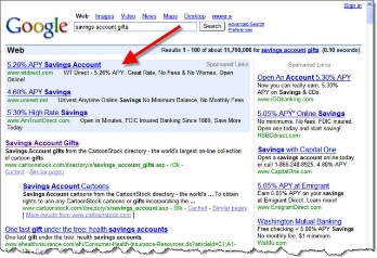
The latest top bidder on Google (see End Notes) is WT Direct <wtdirect.com>, a new direct banking brand from Wilmington Trust. Its sole product is a 5.26% APY savings account. To encourage trial, the bank pays the advertised rate on any balance for the first 60 days. On day 61, the rate drops 466 basis points to 0.60% unless you've stored $10,000 or more in the account. The bank clearly discloses both rates.

The homepage is direct and to-the-point (see Note 3). While not as flashy as ING Direct or iGObanking, it communicates the benefits in an efficient manner. The landing page from its top-ranked Google ad (see Note 4) is better, with a chart showing how it beats ING Direct.

The application is well conceived (see below), with few of the problems identified in our earlier critique of iGObanking's online app (see previous post here). The one improvement we'd recommend: Divide the personal info section into two steps, first getting the "public" info (name, address, email address), then asking for the private stuff (SSN, driver's license, etc.).

WT Direct savings application CLICK TO ENLARGE

End Notes

1. Modeled after YASN, a term used in tech circles for "yet another social networking site."

2. In BankDeals' weekly high-rate summary, 27 banks were identified as offering 5% or more APY on online savings accounts (see post here).

3. WT Direct homepage screenshot (click to enlarge)

WT Direct homepage CLICK TO ENLARGE

4. WT Direct search ad on Google (4 Dec. 2006 search on "savings account gifts" from Seattle P.I. at 3 PM PST)

Google results for "savings account gifts" CLICK TO ENLARGE

Holiday Gift Ideas From My Bank?

Link to ING Direct store Who'd have guessed banks would become a popular source of holiday gifts, other than good old-fashioned greenbacks of course?

Now that niche audiences can be targeted with online promotions during the holidays, many financial institutions are marketing financial products packaged as gifts. Prepaid Visa/MasterCards are the hottest item, but there's also potential in other areas. 

Gift cards
The second most popular gift item this year, after apparel, is expected to be prepaid cash cards. While the majority of the $20+ billion purchased will be direct from retailers, hundreds of banks and credit unions, such as Boeing Employees Credit Union (BECU) have joined the fray (see email below). If marketed right, financial institutions could gain a significant share of total sales. See our previous post here about integrating gift cards into online banking for more information.

Boeing Employees Credit Union gift card email BECU CLICK TO ENLARGE

Credit reports
Equifax
is taking advantage of the giving season to market credit reports and/or FICO score gift certificates. The cost is $20 for a three-bureau credit report, $15 for the FICO score and explanation, or $30 for both (see email below). An even better gift would be a year of credit monitoring.

Equifax email for credit report gifts CLICK TO ENLARGE

Investment accounts
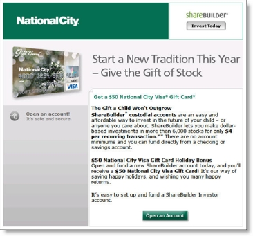
For years, ShareBuilder has marketed "the gift of stock" during the holidays. This year, many of its partners, such as National City Bank, are offering a $50 gift card as a bonus for new accounts (see screenshot below). That way grandma and grandpa can give junior something that's good for him, an investment account for the future AND something he'll actually like, $50 to spend at the mall.

National City Sharebuilder landing page CLICK TO ENLARGE

Piggy bank 2.0
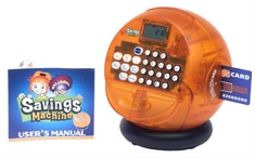
The Savings Machine from ING Direct For the younger set, ING Direct has for a year been selling The Savings Machine, a toy bank/calculator/ATM machine. And judging from the note on its website,* it's proving to be a popular Deal of the Month with a lower $17.95 price tag which includes free shipping (see inset). Several years ago, ING Direct reported nearly a million dollars in sales from its online merchandise store <shop.ingdirect.com>, an inexpensive way to get its name on the street.

*Note by the "Savings Machine" product page today: All orders placed from 4 Dec to 11 Dec will be shipped out the week of 11 Dec due to the large amount of backorders.

Intuit’s Billion-Dollar Online Banking Play

Intuit merger graphic on its fi.intuit.com website Intuit's bold move to purchase online banking pioneer Digital Insight came as a surprise, both to analysts and shareholders. Reactions were mixed, with shares drifting downward after the 8 AM EST announcement Thursday, ending the week off 3% (see chart here; Intuit presentation on the acquisition here).

Although the software developer has made a few forays into selling bank technology, including owning a bill payment processor in the mid-90s, it has generally stayed focused on packaged software for consumers and small businesses.

Just two weeks ago, I met with Intuit execs at the coming out party for its financial institution services unit at the China Grill down the hall from BAI's Retail Delivery Conference in Las Vegas. They were excited about several new services built on the Teknowledge unit purchased last year (see previous post here).

Analysis
Only time will tell whether the acquisition makes sense for Intuit. It's a savvy company that understands the personal finance space as well as anyone, so I tend to believe they know what they are doing.

Regardless of what it does for Intuit's share price, the merger is bound to shake up the online banking product offerings at banks and credit unions, especially for smaller businesses, the Quicken and QuickBooks crowd.

In September, we published a report predicting significant growth in personal finance functionality in online banking services (see Note 1). This merger should further accelerate that growth. As Intuit integrates Quicken, TurboTax, and QuickBooks features into the Digital Insight line, other platform providers will feel pressured to keep up.

This is good news for U.S. consumers who've generally NOT been able to enjoy the benefits of tightly integrated personal finance and online banking.

End Notes:

(1) See Online Banking Report #130/131, Personal Finance Features for Online Banking: Why MySpendingReport Trumps Free Bill Pay

The iGoBanking/CashEdge New Account Application Needs Improvement

Link to iGoBanking home page As mentioned earlier this week (previous post here), Flushing Financial's new Internet offering iGoBanking features a great price, modern homepage design, visible rates, and an overall good user experience.

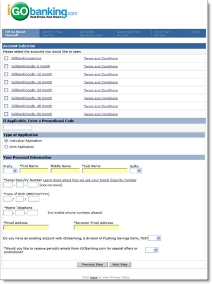
iGoBanking application hosted by CashEdge CLICK TO ENLARGEAt least until prospective customers decide to buy. Once the user clicks the grammatically challenged link, "iGo Open a New Account," things go downhill quickly. The application (see screenshots right and below), hosted by CashEdge (see related post here), fails to maintain the user experience from the bank's homepage.

In fact, the application is a circa 1999 all-text affair that leaves you wondering if the graphic designers at CashEdge are on strike. Here are a few of the problems:   

  • No Customer Service or Help on the application
  • No telephone number
  • No way back to the homepage, the bank's logo is NOT clickable
  • Overall lack of design and graphics, even the logo in the top looks like a low-resolution version
  • The application steps are hardly visible because the white font is too thin to be easily read through the blue background
  • Social security number required on first page
  • Application is massive in length for a simple savings account (see screenshots below); we realize the need for regulatory compliance and security, but it should be either shortened or broken into smaller steps to maintain

For more on best practices in application design, refer to Online Banking Report (#104).

Screenshot: iGoBanking application page 2 (click to enlarge)

iGoBanking/CashEdge application page 2