Online Banking Helper Bubbles

Ebay_bubble_helper_1Here’s a little technique we haven’t seen before, helper bubbles that popup to highlight new and/or underutilized features.

For example, in My eBay, this yellow bubble appeared on the screen pointing to a relatively new feature on the site, a drop-down box that allows the user to take various actions on items they are tracking.

Note: eBay allows you to turn off the bubble with a "Don’t show me this again" link.

Analysis
A great way to highlight important features of online banking.

JB

Intuit’s RockYourRefund.com Makes Tax Prep (almost) Fun

Step 1: It’s tax time
Step 2: Then it’s play time

Intuit_rock_your_refundSo starts one of the most interesting financial services websites to come along in a long time. Leave it to Intuit to come up with a way to make submitting your tax return seem almost fun. It’s RockYourRefund.com website is basically a jazzed up portal into TurboTax for the Web, a service that’s been around for more than five years.

Analysis
Sometimes it seems futile trying to make boring financial services interesting. Well if Intuit can do it with tax prep, you can do it with your financial products.

Take a minute to look at it yourself, but the premise is you get a 10% coupon at Best Buy or up to $200 off a trip after you’ve completed your tax return online via the TurboTax website. Cost for the online service is $5.95 for federal plus $9.95 for state tax returns.

Action Item
This approach would work wonderfully with bill payment. Offer coupons and offers that users would receive after paying their bills. A benefit for saving time and money using your super-convenient epayment service. (For more information on how to build a killer bill payment service, see Online Banking Report #80, 81, 82, 86, and an update on the market in #115 published three days ago. )

JB

Improve Bank Website Usability with Popup Sales Assistance

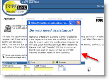
National_interbank_popup_1 Even with popup blockers wreaking havoc with this marketing technique, it still makes sense to program a popup when users abandon an application or any other important sales page. It’s also possible to program a popup after the user lingers in one area for a certain amount of time.

The popup should ask if assistance is needed and provide at minimum a telephone number and email address. Here’s an example from National Interbank.

JB

Virtual Open House for your Bank

Open_houseHow many times per month would you look at your bank’s website, other than online banking, if you didn’t work there?

Zero would be pretty close, I’d wager.

Case in point: I have far more interest than the average consumer, but I can count on one hand the times I’ve looked at my bank’s website during the past seven or eight years since its been online.

Sure I login most weeks, but my visit consists of finding the login button as soon as it loads, then moving into online banking to take care of my business. (Don’t tell my website usability collegues I said this, but it might be worth moving the login button around from time to time to "force" users become engaged with your homepage.)

Zero visits per month makes it tough to introduce new products, promotions, and features. Or to get customers to use self-service.

Action Item
To encourage visits, how about an old-fashioned Grande Re-opening or Open House celebration? Make it an annual event on the anniversery of your website launch. Publicize it with signs in the branch. Issue a press release. Drop a statement insert.

Decorate your homepage with balloons or something festive, and just like a real-world open house, offer virtual donuts (Krispy Kreme downloadable coupon), free coffee (Starbucks coupon), and door prizes after customer fills out an online entry form.

To encourage visitors to click further into your site, you could sprinkle freebies deeper in the site, or use an online scavenger hunt. And the great thing about this open house is there’s no cleaning up afterwards.

If you’d like to explore more about the interactive bank marketing ideas, check out the Interactive Financial Marketing Database from our sister publication, the Online Banking Report.

Adding Sales Punch to Bank Homepages

Alliance_home_page

UK-based Alliance & Leicester doesn’t accept the premise that banking websites should be drab and colorless. Their orange-and-blue effort shouts "pay attention," perhaps a bit too loudly.

But there are more things to like in this homepage than there are to criticize.

Like

  • Prominent login on left side
  • Strong benefit statements in headlines, for example, 50 times more credit interest than other banks
  • Interactive loan calculator

Dislike

  • Too much animation competing for the eye, for example, four of the banners feature animation, three of which continue to endlessly cycle (if you use animation, make it stop after one or two cycles)
  • Overwhelming, where do you look first?
  • Everything looks like a come-on, where’s the content?

But whether one likes the design or not, the proof is in the results. And I bet the bank pulls in more new business from its home page than its more staid competitors.

However, a bit more restraint might make it work even better.

JB

Making Online Chat Pay for Financial Websites

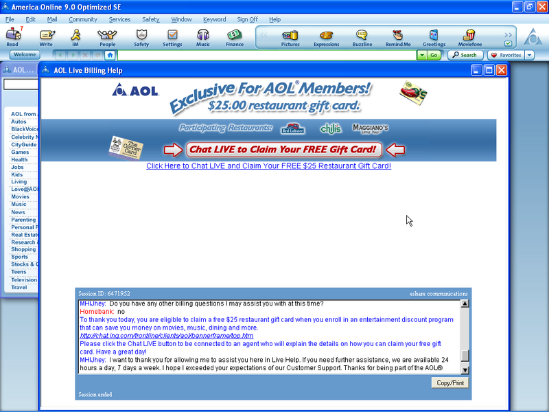
Aol_chat_xsell_click_to_enlarge After giving AOL for Broadband a try, we decided to switch back to our old $4.95/mo plan we’ve been on for the last 5 or 6 years. Since it wasn’t listed as a choice in the normal pricing plan area, we clicked on the "live chat" button.

Within in few seconds we were live with an AOL rep, and within another minute or two, the rep had us switched back to our old plan. It was a very satisfactory experience.

Action Items
During the chat process we noticed two things that financial institutions should consider adding to their live chat functions:

1. Copy/print button in the lower-right allows users to print or save a transcript of the chat session. A great tool for satisfying the finicky customer who wants a record of their customer service interactions.

2. End-of-the-session cross-sell: After fixing our problem, the chat session automatically presented us with an opportunity to purchase an ancillary service at a special discount. The offer was delivered both in text in the chat window and through a banner above the chat area (click on the screenshot above to see more detail). This could be an effective sales technique so long as it’s delivered in the spirit of helping the customer.

JB

ING Direct Fundraising ($320,000) for Tsunami

Ing_donations_stmt_click2enlarge_2

ING Direct posted a Tsunami Relief Fund button on its main account view page (see above). So far, customers have kicked in $320,000. It’s less than a buck an account, but it’s still a sizable contribution in total. ING as a company has also pledged more than $1 million.

Lessons

  • The donation function is completely integrated, so it couldn’t be easier.
  • A link is provided to learn more about the organization that will administer the donations.
  • Customers get feedback on results, in this case $320,000 raised, so that customers can take pride in the total amount raised.

Note also: The pitch in the middle of the screen (above) to sign up for electronic statements to be entered into prize drawings including a plasma TV. Refer to our Jan. 18 article for more on that sweeps.

JB

Pay Your Better Business Bureau Dues!

We like the idea of posting selected third-party endorsements on your website, for example, FDIC, Better Business Bureau, VeriSign and so forth. However, make sure you don't let your membership expire, otherwise you get a very bad result.

Bbb_expired_click_to_enlargeIn reviewing the eSmartLoan website, purchased last month by Capital One (see Jan 20 post), we clicked on the Better Business Bureau logo on its home page and were greeted by a pop-up explaining that the company was no longer a member, either because they failed to pay their dues or failed to comply with BBB policies.

Ouch!

JB

Website Usability (part 2): Card Application

In part one of our series on website usability, we looked at the
all-important homepage. But the best homepage won’t do you much good unless
you can convert visitors into paying customers. For that you need an
effective sales process capped by an easy-to-use application. Online credit
applications have evolved considerably during the past five years and are
now relatively painless to complete, usually far superior to their paper
counterparts, which are plagued with missing data, illegible markings, not
to mention transcription errors in your own back office.

At OBR, we’ve looked at online application-form design on a number of
occasions, finding a wide variety in quality (see Table 11, below). This
time, we are using a more rigorous approach applying our proprietary OBR
WebCheck criteria www.webcheckanalysis.com
 and scoring Citibank’s application across 54 criteria. Although the
bank’s application is very good, there is still much room for improvement,
as witnessed by its sub-50% score.

Citibank credit card application

Card application

Table 12
Citibank Credit Card Application Process

OBR analysis using WebCheck* criteria


Source: Online Banking Report, 2/04 Wt = weight with 5 the highest
importance