How Bank of Montreal Puts an Orange RSS Feed Icon in the Browser Address Bar

Over at BankWatch (post here), Colin Henderson, who recently stepped down from his exec post at Bank of Montreal, wrote that his old company recently became the first bank to add an important line of code to their websites (see note 1).

Bank of Montreal RSS feed indicator in Internet Explorer IE 7 CLICK TO ENLARGE

The feature is called RSS Auto-Discovery, and it alerts Firefox, Safari, and IE 7.0 users to available feeds by placing an orange RSS feed indicator below the address bar (see IE 7 above) or on the right-hand side of the address bar (see Firefox, first, and Safari address bars below, source Soxiam).  

RSS Auto Discovery in the address bar

At Bank of Montreal, the icon shows on most pages, but NOT on the homepage. While Bank of Montreal may have been the first major bank to use RSS Auto Discovery, two Canadian credit unions had already implemented it, including:

  • North Shore Credit Union <nscu.com> which has used it for 2 years
  • VanCity <vancity.com> which began using it in November (see screenshot below)

Analysis
Financial institutions are encouraged to add this code since there is no major downside (see note 2). However, it should not be the sole method for publicizing feeds. Most consumers have no idea what an RSS feed is, much less that they can add one by clicking on an orange icon by the address bar.

We like how VanCity has added the RSS feed icon to the right-hand navigation and also included an important link to an explanation of what an RSS feed is (see screenshot below).

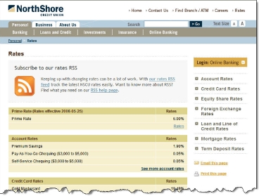
In comparison, North Shore publicizes its feed only on the rates page. Although, it is certainly prominently displayed there (see screenshot below).

North Shore Credit Union RSS feed on rates page CLICK TO ENLARGE


Notes:

  1. According to software engineer Peter Freitag (link here), it requires just a single line of code, plus a few attribute tweaks, to add RSS Auto-Discovery to your website.
  2. The only downside is a small amount of customer confusion on what the icon means. Banks should address this in its FAQs or Help screens and brief website tech support reps in how to answer customer queries.

Website Maintenance Tip #1: Update Your Website Copyright Notices

Up-to-date website copyright notices are one of those little details that seem hardly worth mentioning. But, like cleaning the branch windows, when left unattended they can create a poor impression over time.   

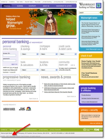
Most commercial websites carry copyright notices on the bottom of the page with the current year or a range of years listed. It looks sloppy if you don't show the current year, even 2006 is OK for a while. But you certainly don't want to follow the example of Main Street Bank <mstreetbank.com>, which still shows 2004 at the bottom of its homepage (see screenshot below).

And kudos to anyone who's already added 2007. One winner, Wainwright Bank <wainwrightbank.com> already displaying (copyright) "2005 to 2007" on Jan. 2. And not so coincidently, Wainwright has an absolutely gorgeous website, something I don't say very often, especially in the financial services arena (see screenshots below).

Wainwright Bank home page CLICK TO ENLARGE

First Direct Bank’s Holiday Pop-up Marketing

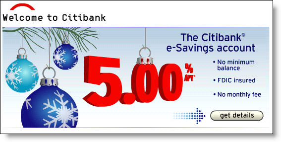
Citibank_holiday_homepage_esavings_1I am a sucker for holiday graphics on websites. It doesn't have to be dramatic, a few snowflakes or candy canes in the background is fine. For example, Citibank's e-Savings banner on its homepage today (see inset, click to enlarge). Just like a holiday wreath on the door of the branch, it shows your customers and employees that you have some holiday spirit.

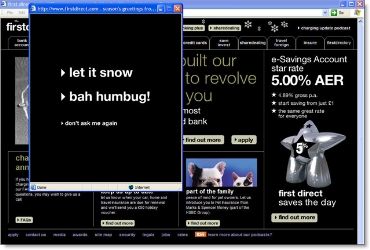
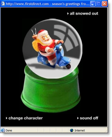
Unlike two years ago (see prior post here), this year many banks and credit unions are running holiday promotions for gift cards and other products (see rundown here) and/or have dropped holiday sprinkles into their websites. The most dramatic is the popup from U.K.'s First Direct <firstdirect.com>. This is over-the-top, but it brings a grin, not a bad thing during the end-of-year rush.

First Direct homepage with popup showing (click to enlarge)

First Direct home page with holiday popup CLICK TO ENLARGE

Close-up of popup after choosing "let it snow" option
The loud holiday music that accompanies the snow globe can be turned off with the button in the lower right. Selecting "all snowed out" or "bah humbug!" from the first screen displays a brief "seasons greeting" message before automatically closing the popup.

Vehicle Auctions Hit the Homepage at Houston Federal Credit Union (HFCU)

Many financial institutions sell or auction repossessed vehicles to the public. However, not many use this by-product of installment lending as a prospecting tool on their homepage.

We came across this novel approach at Houston Federal Credit Union <houstonfcu.org> while putting together a presentation titled "Extreme Website Makeovers" for an upcoming American Bankers Associate conference. The first place we looked for inspiration was the client list of Trabian, a talented new website designer concentrating on the credit union market (grab a feed to their outstanding blog, OpenSourceCU here). 

Trabian's client, HFCU, includes a link to its vehicle auctions on the right-side of its homepage (see screenshot below). Clicking on the box takes users to the main auction page where any registered user may bid on the vehicle (in this case, just a single motorcycle was up for auction).   

Houston Federal Credit Union homepage CLICK TO ENLARGE

Analysis
Everyone loves a good deal, and unlike retailers who can drop a loss-leader on their homepage to generate excitement, financial institutions have far fewer options. Vehicle auctions provide an interesting way to encourage members to check back periodically to see if they could get a smoking hot deal on a used sedan, truck, or bass boat.

It's also a good prospecting tool. Nonmembers are allowed to register on the site and bid. This provides the credit union an immediate opportunity to make a sales pitch such as the "Wish your auto loan was at HFCU instead?" in the center of the page.

The email address supplied by the bidder also enables the CU to market to the nonmember in future emails. Finally, anyone who buys the auctioned vehicle is a great candidate for an HFCU loan, which are positioned in the upper-right of the auction page (see screenshot below).

Houston Federal Credit Union auction page CLICK TO ENLARGE

Making it even better
We love the idea, and it works well even in its relatively simple form. It would be even better with a few additions:

  1. It would drive even more traffic with an email and RSS feed option for receiving information on new auction items and for monitoring bids.
  2. The credit union would generate more interest by including a variety of vehicles (even if they bought a few at auction to seed the site). Today's sole entry was a 2005 Suzuki motorcycle with a buy-it-now price of $6300.
  3. The auction format and tools are relatively crude by today's standards. For example, it wasn't obvious who the other bidders were, how long it had been up for auction, or what the next bid needed to be. There are numerous auction services that could provide a more eBay-like experience.
  4. It would be helpful to integrate the auction more closely with the loan center so users could easily calculate monthly payments, insurance costs, etc.

Wells Fargo to Redesign its Homepage

In our opinion, the Wells Fargo homepage has been the gold standard for the past three years, ever since the launch of its tabbed navigation in June 2003. It was one of four large-bank homepages earning an A in our Report on Financial Homepage Design in October 2003 (see Online Banking Report, 101/102). The navigation, copywriting, and usability are still top-of-the-line, but the look and feel is a bit dated, especially the banners running along the bottom.

According to a small-text warning at the top of the page, the site is being refined, and users "may see a different homepage for the next few months" (see screenshot below).

Analysis
The bank's homepage design has been essentially unchanged for more than three years, so it's about time for a remodel.

What we don't quite understand is the reasoning behind the cryptic message at the top of the page. With spoofing a continual problem, the bank may not want users to be concerned if they see changes. However, this message probably does more harm than good. 

The main problem is lack of information. The bank doesn't say what type of changes to expect, or even when they might happen. Most importantly, they fail to communicate why they plan to dribble out incremental changes instead of launching a redesigned site all at once. (And a quick search on "home page redesign found nothing at the bank's site.)

There may be very good technical and/or marketing reasons for the iterative process, but they should be explained. At minimum there should be a link to an FAQ page. As it stands, users can't be sure if an odd-looking Wells Fargo is a spoof or a new design. 

Don't leave users hanging! It creates only more uncertainty, not to mention additional emails and calls to customer service. 

Bank 2.0: Remaking Your Financial Website for a Web 2.0 World (OBR 135/136)

The latest research from Online Banking Report is now available here for purchase ($395) or for subscribers to download here (Online Banking Report is our sister publication).

The 32-page report lays out the toolkit for building your own so-called "Web 2.0" banking site. It delves more deeply into the important tactics of blogging and RSS/XML feeds. Download the full Table of Contents here

Bank-Anywhere.com Launches Branch Locator Mashup

For some time now, branch/ATM locators have been standard feature on banking websites. They began in the late 1990s as crude lists providing an address and maybe a phone number.

Today, locator tools are more robust, with branch hours, maps, pictures, and more. Still, many provide a simple listing instead of the locations pinpointed on a map. 

Sovereign Bank branch locator CLICK TO ENLARGEFor example, here's the output from a search at Sovereign Bank for all branches and ATMs in zip code 10019 (click on inset for closeup).

The list is well laid out, but you must wade through it to find the closest branch, then drill down through the links to find more details and a map.

Compare that to the tool at Bank-Anywhere.com <bank-anywhere.com>, a mashup of Google Maps and the FDIC branch location database <www.fdic.gov>. Here's a list of all banks in my zip code 98115. Clicking on the bank icon or the list on the right side triggers a pop-up callout with additional info.

Bank-Anywhere.com tool CLICK TO ENLARGE

Branch-Anywhere is in public beta after a Sept. 15 launch (see its blog). The company behind it is Dash Space, a Vancouver, BC-based developer with such a low profile they don't appear on Google searches. They did respond promptly to our email questions (email here).

Analysis
Financial institutions should consider using a similar approach on their websites and either program the function themselves, or outsource it to Bank-Anywhere.com or others. It is important for this logical link to make a good first impression with potential customers of your bank. The Ajax-based map not only looks more sophisticated and up-to-date, but also is easier to use.

South Carolina Federal Credit Union Fails to Simplify its Homepage

It's not often that a press release leads directly to a Netbanker post, but here's an example. We received an announcement last week that South Carolina Federal Credit Union <scfederal.org> was launching a complete rebranding under the "life simplified" theme (press release here).

We eagerly headed to its homepage, expecting to find a site that did for banking what Google did for search. In other words, a website that instantly lays out the critical tasks for online banking customers.

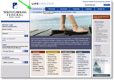
What we found was good, and light years ahead of its old homepage (see End Notes below), but it was not revolutionary. The homepage design follows most best-practices including the left-hand log-in area, tabular main navigation, and site search and other utilities in the upper right.

The first navigation tab is Convenience. That's an unusual choice that could help the CU differentiate its member benefits. However, the laundry list of electronic and online banking features cited have been industry standards since 1997.

Google homepage CLICK TO ENLARGE Website visitors are not going to walk away thinking "that credit union really saved me time." If anything, the homepage is somewhat cluttered with 80 hyperlinks, many in small type, plus another dozen or so in two lefthand, drop-down boxes. Five choices are simple (see Google above). Eighty are not. 

The credit union missed a great chance to build a website that clearly directs users towards what they most want from their credit union: online access, customer service, and research.

Grades
Homepage design: A- (a bit cluttered)
Navigation: B (too many choices)
Homepage fit with "life simplified" branding effort: C-

South Carolina FCU CLICK TO ENLARGE

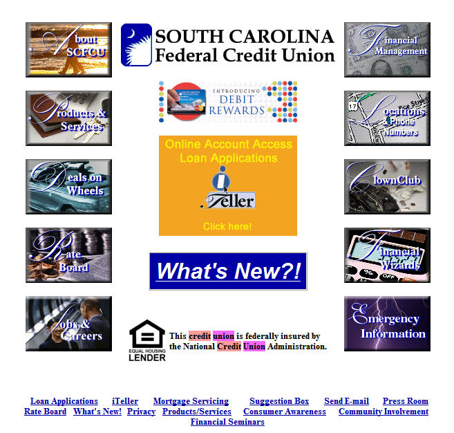
End Notes (click on the link below to see the old homepage)

Previous homepage (from Google cache, Oct. 3)

Southcarolinacu_home_old

Bank of America Pitches Identity Theft Protection at Logoff

While there's nothing unusual about the product or offer, with 50% market share in online banking, everything Bank of America does at its website is news.

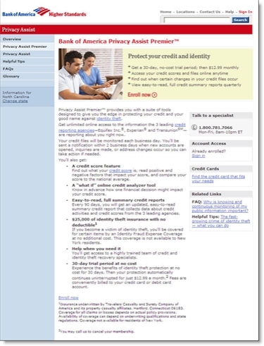
After reviewing my credit card balance online today, I was greeted with a 30-day free trial offer for Bank of America's Privacy Assist Premier, a daily credit-monitoring, three-bureau service priced at $12.99/mo.

Below is the splash screen displayed after logging out from online banking:

We were a bit surprised at the lack of disclosure on this screen; not a single word about the eventual $156 annual cost, to which even the most well-heeled BofA clients may take exception.

Another surprise: Clicking the Accept button simply dropped us back on the home page with not a word of thanks or any confirmation that our selection was accepted.

However, most users will be smart enough to choose Learn More before signing up. On that landing page the cost is well documented appearing in the first bullet point in the shaded box (see below).

Heritage Bank Posts PDA Version of Homepage

Minnesota-based Heritage Bank <heritagebankna.com> has added a simple feature that can make all the difference to mobile users, a link to a PDA version in the upper-left corner of its homepage (see screenshot below).

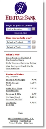
I tested it on my Blackberry 8700g, and it worked pretty well. The regular homepage takes a long time to load, but once it does, you see the PDA link and Heritage logo. Clicking on the link loads a slim, 15k page with just the basics (see inset):

  • Logo
  • Online banking login
  • Help drop-down
  • What's new (with 3 subjects)
  • Featured rates (with 2 loan products and 2 deposits including its 5.2% high-yield savings account)
  • About
  • Careers
  • Contact Us

At right is what the PDA homepage looks like in an IE6 browser window which, as all you PDA users know, is far more attractive than the Blackberry rendition. 

Analysis
Bank-account access is a relatively robust application to use on a portable device. The most recent M:Metrics research found that an average of 23 million U.S. mobile subscribers, nearly 12% of the total, accessed news and information from their phones (monthly average in June/July/August).

So it makes considerable sense to post a PDA link. Once users bookmark the URL, it will be relatively easy to navigate within the tiny PDA real estate. However, it would also be helpful to create a shorter URL pointer to the PDA version, for example, <hbmob.com>, <hbpda.com>, or <hbmobile.com> (only the first domain name is available, however).   

The Money Store’s Comeback Marred by Flawed Website

Flipping through a pile of American Bankers on the plane last night, I came across a page one story on The Money Store <themoneystore.com>. If you've been in the business at least ten years, you probably remember the sub-prime lender that created a household name for itself with heavy TV and print advertising featuring baseball great Jim Palmer and others. But shortly after First Union (now Wachovia) paid $2.1 billion for it in 1998, its sub-prime portfolio tanked and the bank shut it down in 2000.

Why First Union/Wachovia didn't use the famous Money Store brand for other lending pursuits is a mystery, but I'd wager that after blowing a couple billion dollars on the acquisition, senior management, and shareholders, didn't want to hear that name ever again. 

Fast forward five years. MLD Mortgage, a NJ-based lender founded by former Money Store Vice Chairman Mortan Dear convinced Wachovia to sell him the Money Store brand name. The brand was then repositioned as an online loan exchange along the lines of LendingTree, brokering mortgages for 50 lenders including Washington Mutual, NetBank, and Flagstar Bank

Analysis
The use of the Money Tree name is good, although they absolutely must secure the <moneytree.com> domain name. The online loan-exchange business model is sound, and its lending partners offer good credibility. However, the company's website execution is deplorable.

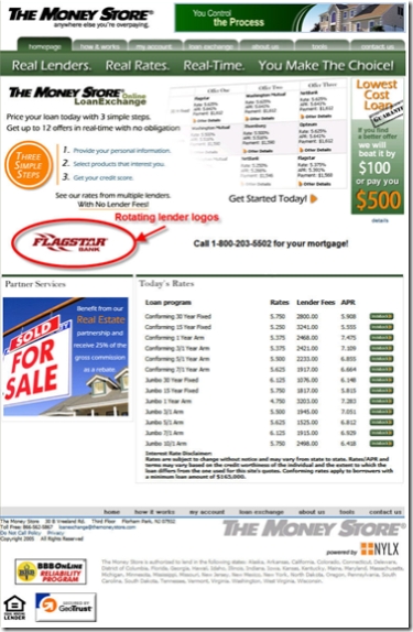
The busy home page doesn't even mention the product it sells (see screenshot below). We could write an entire report on what's wrong with the site, but we'll review just one small section here to give you an idea of the problems.   

At first glance, the "three simple steps" graphic in the upper-left looks promising, although the type should be bolder for readability (see inset).

As users struggle to understand what the company offers, many will start here due to its location, color, and shape. Unfortunately, most users will become even more confused after reading it due to three significant usability errors:

Mistake #1: Scaring off potential customers. The goal of a financial website is to make users confident in transacting there. Money Tree does the opposite. The very first thing users see is step 1, "Provide your personal information." In today's paranoid times, that's a huge red flag from a relatively unknown website. Before you cause even a smidge of user-apprehension about the application process, you must make visitors want your product. Try starting with a benefit statement such as "lower your mortgage payment" or similar.

Mistake #2: Amateur copywriting with no benefit statements. Always use a professional copywriter, even for bullet points. The Money Store is obviously cutting corners here. For instance, the first line above says "price your loan today." That makes almost no sense to a consumer. It's industry jargon. It should be a benefit statement, like "lower your mortgage rate today" or something similar that can be easily grasped. My fifth-grader could have come up with a better opening line.

Mistake #3: Steps that lead to the wrong product. For the life of me, I can't figure out what the company was thinking with its third step. Here's a synopsis of the three: 
1. Provide personal info.
2. Select product
3. Get your credit score
Huh? Are they selling credit scores or saying you need to go somewhere else, find your credit report and then finish the process? Either way, they are going to lose just about anyone that's gotten this far.

Instead, the steps should lead to a recognizable benefit such as:
1. Tell us what you want
2. Compare all the great prices we'll provide
3. Choose the deal that saves you the most money
4. Enjoy your extra cash!!

The Money Store homepage (Oct. 9)

Webby Award Deadline Oct. 27

Webby_logoThe 11th annual website beauty contest, The Webby Awards, is accepting entries for the best websites and interactive advertising campaigns. Financial institutions may compete in any of the advertising categories, or one of the three website categories:

  • Best Banking/Bill Pay
  • Insurance
  • Financial services (everything other than banking or insurance)

Allstate_nowwhat_1Last year the winners were Bank of America in Banking/Bill Pay; PayPal in Financial Services; and Allstate's nowwhat.com in the Insurance category (see inset).

Early entry deadline is Oct. 27. Fee is US$125.