Using Mint (part 1): First Impressions

link to mint.comEver since receiving a private beta-invite a month ago, I've been meaning to run new personal finance site Mint through its paces. Then, after it won Best of Show at TechCrunch40 and our FINOVATE conference, I really wanted to see if the product could possibly live up to the expectations created while watching CEO Aaron Patzer give a demo (see previous coverage here, see note 1 below).  

But it takes time to really analyze a website, and I hadn't got around to it until today, when I was inspired by Ron Lieber and his team at the new Dow Jones/IAC site FiLife (press release here) as they reported on their individual results using the Mint's online personal finance tools (see coverage here).

I will file a series of reports as I use the program over the coming weeks. Today, we begin with the first impressions.

First Impressions
Homepage: One thing you notice when you visit Mint.com is that it looks nothing like a banking site (see first screenshot below). That can be good or bad. It's good because it sets the site apart from a normal financial services site. But that can also be a problem because the first, second, and third things users care about at a new financial site is whether it's secure or not. And a bankish "look and feel" can increase consumer trust.

But Mint does an admirable job walking the fine line of creating an engaging look while still reassuring visitors that it fiercely protects their data and privacy. The three large benefit statements in the middle create interest in the product, while the bank logos and the TRUSTe at the bottom provide visual clues that Mint is a serious player.

And the graphic design, leveraging the clever "Mint" name, combined with the light green color scheme, create an inviting site that should do well converting lookers into registered users (active users is another matter, more on that later).

Copy is concise, just 60 words above the fold (see note 2), and completely benefit oriented. Learn more button allows users to drill deeper, and you can't miss the call to action, Sign Up Now in the middle of the page.

Features page: Navigating to the feature page is simple, either click on the "Learn More" blue button in the middle of the page or use the "Features" tab at the top. The page does a great job laying out the key benefits with good use of headers and concise, bulleted lists supplemented with clear, attractive screen-captures of key points (see second screenshot below). Also note the prominent placement of big-name financial brands, Chase, Discover, and E*Trade, to increase trust.  

While the page does a good job highlighting features, it doesn't provide any interactive way of learning about the tool before signing up. Video and audio help goes a long way in demonstrating the features (see Jwaala/Amplify CU Money Tracker video here).

Mint.edu: A nice touch. Instead of calling it "education" or "blog" or something else no one would ever click on, Mint uses the clever Mint.edu (see third screenshot below). That's a URL that will resonate with its younger members and anyone familiar with higher education domain names. And once at the .edu site, engaging blog entries allow users to dig deeper into what is going on with the company and read about personal finance topics in general. RSS and email subscription options are clearly presented in the right-hand column.

Grade: A+

Mint Homepage (19 Oct 2007)

Mint.com homepage

Mint Features page (also accessible via "Learn More" button on homepage)

Mint.com features page

Mint.edu page (19 Oct 2007)

Mint blog page

Notes:

1. The video of Aaron Patzer's FINOVATE demo will be online within the next week at FINOVATE.com. In the meantime, you can see him on the Channel 5 SF news here.

2. Red line in screenshots 1 and 2 indicates the bottom of the screen using 1024 x 768 display on 13.3-inch laptop screen.

Bank of America’s Electronic Statement Icon

Is there anyone left in America that doesn't have an account at Bank of America? Probably a few, maybe even some of our readers. But if you haven't logged into your account lately, you might have missed the subtle "green marketing" the bank is using to encourage customers to go paperless.

In the screenshot below and closeup above, you can see the little green leaf next to the words "Go Paperless." It's subtle, as good green marketing should be. The leaf not only makes the link stand out, it provides a small reminder that customers can do a little something for the environment, and the bank's bottom line, while they are online.  

Also of interest (by the second arrow), since I only have a credit card, is link cross selling a free "MyAccess Checking Account." 

BofA "account overview" page (23 Aug 2007, Washington state credit-card-only customer)BofA main account page

Finally, the bank doesn't ignore the important logout page, a often-forgotten piece of real estate that can be far more effective than a homepage banner ad. This month, the bank is promoting it's No Fee Mortgage Plus.

BofA logout page (23 Aug 2007, Washington state credit-card-only customer)

BofA logout advertising

PayPal Unveils New Homepage (beta)

link to paypal PayPal is offering visitors the option of using a newly designed homepage, calling it a beta version. A small link notched into the top of the screen handily allows users to switch back to the original look.

The design change was needed. PayPal's homepage, which had been so good I often used it as an example of how to focus on user needs, became cluttered over the years. The company now uses "personal" and "business" tabs, a common banking convention that allows the very different constituencies to more easily find what they need. 

The new homepage (below) is dominated by a safety theme, with a large blurred image of a credit card number meant to reinforce its point of being a "safer, easier way to pay without exposing your credit card number." It's a good idea, but the huge blurred image makes me feel like I'm having eye trouble. 

PayPal has also pulled the credit card logos out of the main graphic and put them on their own line. They are easier to see now and will help new users understand they can use PayPal with their existing payment cards.

They also made two subtle changes in the login area:

  • Changed the wording from "member login" to "account login," a more accepted phrase. Most people don't really feel a membership bond from their payment device, and it probably confused a few infrequent users.
  • Added "PayPal" in front of "password," again to make it more obvious to novice users as to what to enter here.

Finally, PayPal finally added a search box (top right), ending its reign as one of the last major holdouts for this common website utility.

Overall, it's a great improvement. And should help with navigation, sales, and support. Given its position as one of the busiest financial destinations on the Internet, we recommend taking a look and comparing it to your own website design. 

For more info on financial institution homepage design, see our Online Banking Report on the subject here.

New PayPal homepage (beta)

New Paypal homepage beta

Current PayPal homepage

Current Paypal homepage

Update on iPhone Banking

iPhone banking ideas Last week, we published an article about how a bank could leverage all the hoopla surrounding Apple's iPhone (here). Surprisingly, Steve Jobs made that job much easier this week, when he told the Apple Worldwide Developers Conference that standard website coding that works on its Safari browser will work on the iPhone out of the box. No special development tools are necessary.

However, at this time Apple is NOT allowing programmers to develop applications that run directly on the iPhone without launching the browser. Every application must run through Safari.* Here's a post from Salon discusses the pros and cons. All-in-all, good news for financial institutions wanting iPhone compatible offerings.  

So go ahead and start building your Safari-optimized 336 x 168 by webpage. Make sure you drop a few nifty icons on the page so Mac users feel at home (see inset). Extra credit if you launch the page on 5:59 PM EDT June 29, 1 minute before the iPhone goes on sale on the East Coast.

—-

*And to make life a bit easier, Apple will produce a Windows version of Safari.

P.S. For those of you who want to understand the broader mobile banking trend and how the iPhone fits into it, check out the new mobile banking report from Online Banking Report.

Everbank Previews its New Homepage

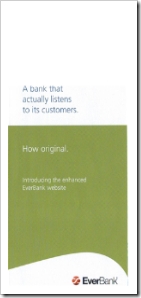
Everbank brochure front Everbank customers received snail mail today (see inset) announcing a newly designed website and multi-factor login procedure that debuts May 20. The company also changed its corporate "look," adopting a sage green and slate blue that looks modern, but more serious than the lime-green and orange Web 2.0 pallet.

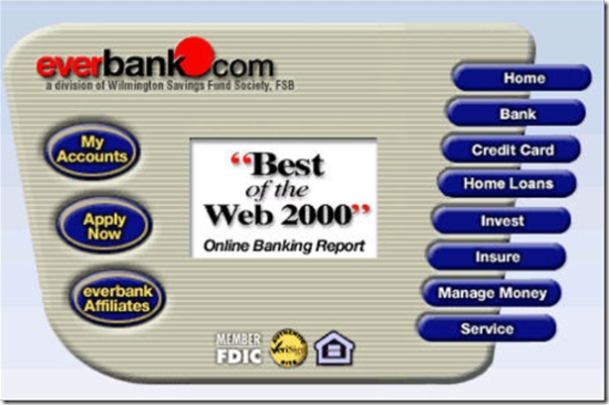
While we'll miss the old look, which featured our Online Banking Report Best of the Web logo in two places (see screenshot below), it was time to move forward. The old look not only was a bit dated, but also too cluttered.

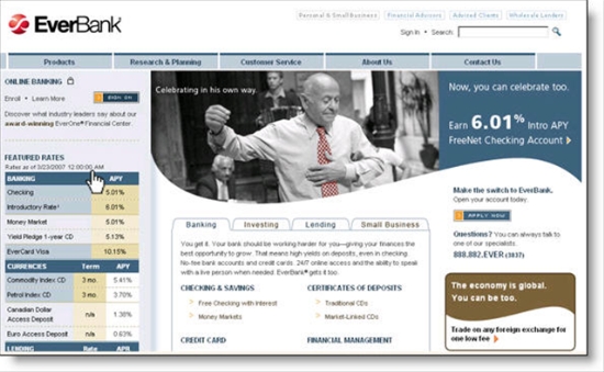
The new design can be previewed now via a well-done, though slightly too long, video at <everbank.com/preview>. The key functional change in the new design is the move from a product-oriented main navigation to a more take-oriented approach. The five main navigation choices in the top bar are:

  • Products
  • Research & Planning
  • Customer Service
  • About Us
  • Contact Us

Secondary navigation is provided by tabs in the middle of the page.

From a marketing perspective, the homepage now features a single product in a highly visible spot. The upper graphic stands out well with the sweeping lower border (reminiscent of the famous Nike swoosh), while the three lower "banner ads" have been eliminated. The overall effect is a much more focused homepage which should drive more applicants to the core offer, which in the preview is the bank's 6.01% FreeNet checking 

A few other details Everbank cleaned up with the new design:

  • Single sign-on button instead of choice of four
  • Site-search box, instead of a link to the search function
  • Exposure to more rates across more products
  • Site map added in to link at bottom of page (not shown below)

One thing that surprised me about the new design was the removal of the toll-free telephone number which is prominently displayed in two spots on the about-to-be-replaced homepage (in the top-right corner and in a bold red font, about halfway down the right side). Perhaps, the bank is attempting to "right-channel" more visitors into the online application. It will be interesting to see if the bank brings the number back after a few months with the new design.

Grade: Overall, it looks like it will be an A or A-, but I will hold off final judgement until it goes live and can be fully evaluated. Maybe it's just me, but I still like the page they used six years ago (see last screenshot). It was short-lived, so it must not have driven enough sales, but it sure was a refreshing look compared to the typical bank website, especially six years ago. For more info, see our Online Banking Report on homepage design here and previous coverage of the topic here.  

New Everbank homepage design

New Everbank homepage coming 20 May 2007

Previous design

Current Everbank homepage 26 April 2007

Everbank circa 2001 (April)

Old Everbank homepage April 2001

Snail mail brochure (inside)

iKobo and Nationwide Insurance Use Website Videos, with Very Different Results

With the majority of U.S. banking customers accessing the Internet via broadband, there is no longer any reason to restrict content to simple HTML. The success of YouTube and other video sites shows that consumers are more than willing to watch online video under the right circumstances.

Here are three ways to use video in your online marketing:

1. Viral marketing: Financial institutions are unlikely candidates to make a great impression on YouTube. More likely, any video involving a bank that happens to make the most-watched list will be satire. For example, the BofA/MBNA merger cover of U2 was big last year, with more than 500,000 views if you count the parodies of the original (here). But "good" viral marketing can happen. As we reported last week (here), Intuit's winning Tax Rap video has more than a quarter-million views.

2. How-to educational clips and demos: Flash animations and other interactive techniques have long been staples of online demos. Although they can cost a bit more, adding audio and video explanations to a screenshot-based demo can make them more effective. For example, CashAdvance.com does a good job explaining the process of requesting an online advance with the spokesperson at right (see here). CashAdvance provides the ability to "turn the guide off," an important option for those who prefer a quicker trip through the demo.   

3. Video as primary navigation: This is an entirely new use of video we haven't seen much in the financial services area. Instead of burying video and flash deep in "learn more" areas a few clicks off the main drag, companies such as consumer money-transfer specialist iKobo (see screenshot below) have replaced much of the HTML in their websites with audio-visual presentations. It's riskier, but if done right, it can be very effective, especially for more difficult financial information, such as international remittances, the core of iKobo's online money-transfer service.


How to do it right (or not)

The key to good Web-based video is speed. YouTube has forever altered the perception of how long one should wait for on-screen video to play. Even during the middle of the day on a popular clip, the first visual appears in less than a second and about a second later, the video starts; it's basically instantaneous. It's not DVD quality, or even close, but speed is generally far more important that screen resolution or size, especially for a sales pitch or demo. That's why the iKobo site (above) works so well. The mid-page videos usually take no more than a second to begin playing, less time than it would take for a new static HTML page to load.

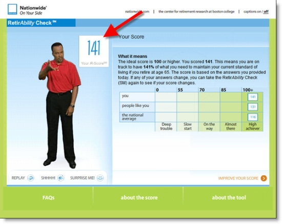
Nationwide RetirAbility check banner in Retirement section of its website Compare that experience to the Nationwide Insurance's new RetirAbility Check. The new tool was discussed last week at the Net.Finance conference (see our coverage here and screenshots below) in a joint presentation by Susan McManus, AVP Internet Corporate Marketing, and Eric Cantini from its rich-media vendor, Brulant

The tool is well conceived and looks stunning in a Powerpoint demo. And for those willing to commit up to 10 minutes to the process, it should help them learn more about the important topic of retirement planning. Depending on their answers along the way, eight short video clips are selected from a library of 235 and played for the user. Users are matched with an on-screen educator that coincides with their age and gender.  

The video clips are well done with believable dialogue and good acting; however, I found the entire thing a bit too slow and too cumbersome. Had I not been researching for this blog, I don't know if I would have made it all the way through. But the insurance company has added a clever incentive that might have kept me at it. Users receive a "score" at the end of the process designed to show how will prepared you are for retirement. It adds a bit of intrigue to the tool, motivating the highly-competitive American to keep at it to see if he or she is a retirement "winner."

And despite my reservations, it seems to be working. The company said that 68% of users who click START end up completing the tool even though it can take as long as 10 minutes to complete, and rarely less than 5 or 6 minutes. However, during a 6-week period after its 20 Oct 2006 launch (press release here), the company awarded more than $100,000 in prize money, including a $50,000 grand prize, for those completing the tool and entering the sweepstakes (see contest rules here). That has likely goosed the "finishing" number considerably. Currently, the tool is reached via a link on a homepage list (left side), or from the Retirement section. 

Unfortunately, the results of the RetirAbility Check cannot be stored online. Nationwide will email the results, but there is no way to come back later and see how your score has changed. Nor can you go back into the tool and change your answers to do "what-if" calculations on your savings or income. The company says it hopes to upgrade the tool so that it ties d
irectly into a secure area where users can return and see how their score changes over time.

The company might want to consider a low-bandwidth version for those with slow Internet connections and/or short attention spans. I doubt I'm the only one who would prefer to run through the retirement calculator in the more normal 45-second pace and skip the video rah-rah.

Nationwide RetirAbility final results page with score

Advice on improving your score

Orbitz Alert Ticker Could be Used in Online Banking

I've been an Expedia regular for 10 years, so I only check Orbitz on occasion. But I was there today and was impressed with what they are doing in mobile alerts. You'll have to read the next Online Banking Report for all the details (note 1), but I wanted to pass on one idea that could be used by banks and credit unions today.

I call it an alert ticker. What it does it track the number of OrbitzTLC alerts sent to customers (see it in action here). The odometer-like counter rolls over about once per second and currently reads 87,794,309 (see inset). ING Direct has done the same thing for many years with the total interest earned by its savings customers. 

Below the ticker is another feature that financial institutions supporting voice-mail alerts should consider, a quick trial entry form. Users can type in any phone number, landline or mobile, to receive a sample voice message alert (note 2). Those entering a mobile number can also receive a sample text message by checking the lower box (note 3).

Notes:

1. Online Banking Report #140 will be available in early April.

2. They didn't ask for mobile phone carrier, so Orbitz must send a message to all the major carriers, e.g., yourphone#@cingular.com, yourphone#@verizon.net, and so on figuring the right one will get through eventually.

3. It's been three hours and I've received neither a voice message or text message. 

4. Banks should also take a page from Southwest Airline's Ding service (see coverage here and here).

Safe Credit Union’s Clever Homepage Rate Comparison

How do you compete with Bank of America, WaMU, and the other majors that saturate the market with fancy branches and large ATM networks backed by nine-figure marketing budgets? Increasingly, financial institutions are taking the battle to the Web, where a community bank or credit union can build an equally impressive website, gain the attention of prospective customers, and tell their story. 

An important part of that story is the rate advantage, especially when major banks continue to pay nearly zero interest on balances under $5,000 in standard checking and savings accounts. But few institutions actually show direct competitive comparisons, and when they do, they are usually buried three or four screens off the homepage.

Safe Credit Union rate before expanding to comparisonNot so at Sacramento-based Safe Credit Union <safecu.org>. The 120,000 member CU posts its rates on the upper-right side of its homepage (see screenshot below). And each product includes a one-click rate comparison to the right of the APY (see above right). Users can select rate comparison on a $1, $2000, or $10,000 checking account balance.

Expanded Safe CU rate comparisonClicking Compare causes the box to expand within the home page to show a numerical and graphical comparison to three key competitors, BofA, WaMU, and Wells Fargo (see lower right).

This is a great way to showcase your rate advantage, while not overly cluttering your homepage. Along with the Progressive Insurance comparison "ticker" (here), this is the one of the best rate comparison tactics we've ever seen.

Deposit rates are provided by Market Rates Insight, a long-time provider of deposit rates to more than 1,000 U.S. financial institutions.

Safe Credit Union home page with rate comparison and anti-toaster banner

Note: The Safe Credit Union homepage is currently running a clever flash-based promo comparing the toaster you get with "their checking" to the chance you could win a LCD television with a Safe account (screenshot taken, 2 March 2007, 10 AM Pacific).

BB&T Pushes Intuit’s TurboTax on its Homepage

Branch Banking and Trust (BB&T), <bbt.com> has one of the better-looking bank homepages. Although a bit cluttered for our taste, the colors, fonts, and other design elements are well conceived (see screenshot below). It's certainly far better than the previous version, which was replaced in late 2003.

One area that's a bit unusual is the prominence of the TurboTax cross-promotion. On Saturday, Feb. 24, the BB&T website displayed a prominent start button in the upper-right PLUS a medium-size (250 x 125) banner along the left side (see screenshot below). Update: The TurboTax banner is NOT displayed today; it appears to have been replaced by the bank's $50 bonus for a new checking account. The start button remains.

I'll give BB&T credit for timeliness, but for the few buck-per-return in fees, I'm not sure online tax prep warrants so much attention. It's especially surprising to see a major bank dropping users into a third-party site with no warning message about impending transfer. Also, although TurboTax's co-branded site carries three links back to BB&T, it's primarily Intuit-branded with separate registration and login required (see second screenshot below).

While millions will use Turbotax online during the next seven weeks (see 2005/2006 sales right), there is still an underlying security concern that keeps many users from entering their family's social security numbers and intimate financial details into a website at a software company.

We'd like the co-branded TurboTax site a whole lot better if it was integrated into online banking, especially with an automated data-import function and security assurances.*

If you are thinking about promoting TurboTax this tax season, here are the pros and cons to consider:

Pros:

  • Positions your bank and website as useful for everyday financial tasks
  • Associates your brand with a powerful, positive personal finance brand which sold more than 12 million copies of TurboTax/TurboTax online last year
  • Reminds customers to get started on their taxes; reinforces the role of the financial institution as a consumer advocate
  • TurboTax online is an excellent program that simplifies a complex task about as much as possible

Cons:

  • Raises security concerns about the submission and storage of ultra-sensitive financial info online
  • Could be bank liability if a phishing scheme or website takeover results in exposure of sensitive data
  • Generates customer service calls to ask questions about BB&T's involvement or about taxes in general
  • Necessitates tech support if customers have questions or problems with TurboTax 
  • Competes with other bank promotions for users' attention
  • Users may be disappointed to discover they have to undergo a completely separate registration, username, password, and so on at the TurboTax site

What do you think? Do homepage references to other service providers reinforce the bank's brand while providing some fee income, or should financial institutions concentrate on their core services?

BB&T Homepage, 24 Feb. 2007 <bbt.com>

BB&T new homepage design with TurboTax links

BB&T Intuit TurboTax co-branded screen

*Interestingly, BB&T is silent on the security issues inherent in the co-branded site. They neither display the typical "you are leaving our site" warning, nor provide any disclaimers about the use of a third-party site.   

Links from My ABA Presentation

As mentioned yesterday (post here), I participated on a panel entitled, Extreme Online Makeovers, at the American Bankers Association National Community Bank Convention in Palm Springs. 

Presenters included:

  • Clay Morgan, creative services manager, Digital Insight
  • David Rubini, product usability director, Digital Insight
  • Richard Carlisle, CIO, Valley National Bank of New Mexico
  • The discussion was expertly moderated by the ABA's own Doug Johnson, senior policy analyst, American Bankers Association

I promised attendees a list of the links used in my portion of the presentation. Here they are in order, along with my highly subjective letter grade of their homepage design:

1. Upcoming.org upcoming.org: Web 2.0 design/functionality (A-)
2. Wesabe wesabe.com: Quicken meets Zagat (A-)
3. Billq mybillq.com: Award-winning bill payment tracker (A)
4. Google google.com: Focus on what matters (A++)
5. Bank of America bankofamerica.com: Good design, but too much clutter (A-)
6. Wachovia wachovia.com: Not-so-great design, and even more clutter (C+)
7. ING Direct ingdirect.com: Great design, no clutter (A)
8. U.K. montage: smile.co.uk, egg.co.uk, alliance-leicester.co.uk
9. Prosper prosper.com: Interesting new P2P lender with modern design (A-)
10. E*Trade Bank etradebank.com: Great at selling key products (A)
11. High-yield savings montage: emigrantdirect.com (A), hsbcdirect.com (A), mybankingdirect.com (A)
12. Progressive Insurance progressive.com: Great comparisons to competition using scrolling summary of other users' search results (A-)
13. NextCard: No longer online (A+)
14. PayPal paypal.com: Task management built into the design (A-)
15. Countrywide Financial countrywide.com: Integration with the phone channel (B)
16. Wells Fargo blogs blog.wellsfargo.com: Look especially at the StudentLoanDown (A), which demonstrates how to communicate with a Web-savvy niche audience

Valley National Bank of New Mexico Triples Website Traffic in Two Months with Redesign

Yesterday, I participated on a panel that delivered a program called Extreme Online Makeovers to community bank execs at ABA's National Community Bank Convention in Palm Springs. The star of our panel was Valley National Bank of New Mexico <vnbnm.com> CIO Richard Carlisle.

He described how his 25,000-customer bank took their website from an IT-designed animation-heavy site to a slimmed down, Web 2.0-inspired gem with the help of Digital Insight. See below for before and after screenshots.

The redesigned website, quietly launched online at the first of the year, has already tripled site visits, increased online banking registrations by 20%, and increased average time on the site by 50%. The bank is so happy with the website they intend to feature it in multi-media advertising campaigns later this year.

Before                                                                      AfterValley National Bank homepage before redesign  Valley National Bank homepage AFTER redesign


Analysis
Here's what we like about the new site:

  • Extremely limited use of text on the homepage, about 50 words. That's a few more than Google, but still 75% less than a typical banking homepage.
  • Good use of color: The blues are very soothing, and the restrained use of two shades of orange add life to the site while directing attention to the key area for most users, the online banking login.
  • Fits easily on a single screen: This is a no-scroll homepage on nearly any computer, and the liquid design means it will shrink or expand to fit most-common monitor sizes and resolution scenarios.  
  • Rotating image: Today, the site rotated through four different graphical images, each connected to a different area or bank promotion. And they are not all just "happy family" pics, but make good use of local imagery to showcase its position as the home-town bank (see after screenshot above).
  • Large and prominent search box: Although the site-search box is not located in the standard, upper-right corner, its large size and prominent position make it much easier to find for most users.

There is still work to be done (Business Banking, Giving Back and Community Calendar are all under construction), but overall, it's an excellent example of why you should consider making your homepage simpler and more focused. 

Valley National Bank of New Mexico homepage

Chase Attracts New Users with Catchy Button but Loses them on the Enrollment Form

Over the years, Chase Bank has made impressive design improvements on its homepage (see note 1). One thing they do better than most is attract the attention of their non-online banking customers.

A large blue square surrounding an orange button beckons users to "Get a User ID" (see inset). It's well positioned in the prime upper-left corner, and it has the ubiquitous "Web 2.0" orange working for it.

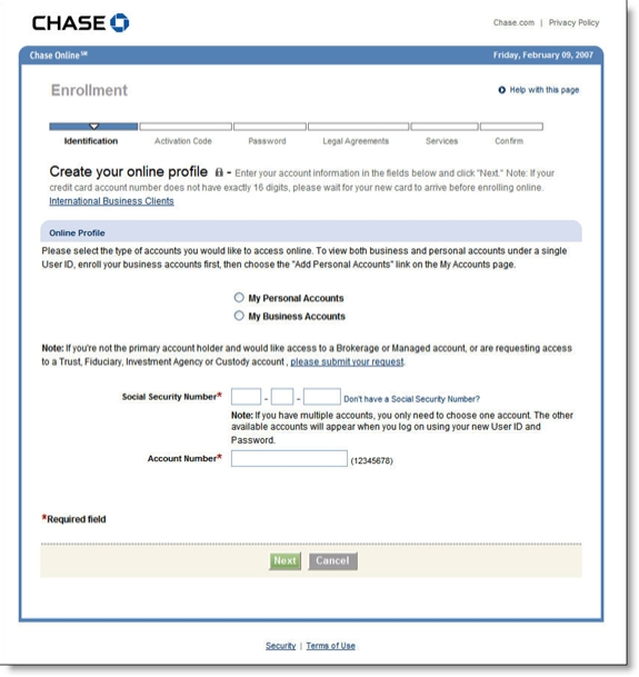
Unfortunately, after clicking the button you are transported back in time to a page virtually devoid of color and design (see screenshot below). In addition, the form immediately asks for info that many users may not want to reveal (SSN) or may not have access to at the moment (account number). 

Recommendations

  1. Redesign the page to make it more appealing.
  2. Add prominent links to customer service for help.
  3. Ask only easy questions on the first page: name and email address is enough to 
    engage the applicant and provide enough info for followup if the
    application is abandoned. 

Chase Bank first pag of online banking enrollment CLICK TO ENLARGE

Notes:

1. Here's the homepage today (left) vs. the busy look four years ago (20 Nov. 2002

Chase homepage 9 Feb 2007Chase homepage 20 Nov 2002 CLICK TO ENLARGE