ANZ’s Mobile Banking App is So Well Integrated, it Almost Feels Like Apple Built It

image image I look at lot of mobile banking apps. But there are several thousand in the U.S. alone, so I’m not going to claim that I know which one is “best” or even who should be in the top-100.

But I will say, of the mobile banking apps I’m familiar with, ANZ Bank’s is right up at the top. Kudos to the bank and Fiserv’s M-Com unit that helped with development.  

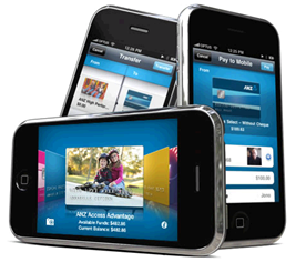
Why is it so good? It’s full featured, of course. But it’s the first banking app that feels like it runs WITHIN the iPhone instead of being bolted on. It’s almost like what Apple would have done if it was building a banking app right into the operating system (notes 1, 2, 3).  

I especially like how the person-to-person payments function integrates with iPhone Contacts. And how iPhone’s photo gallery can be used throughout the app to illustrate goals and payees with your pictures (click on inset above for a better view) and to store bill payment-receipts (see screenshot below).

But never mind what I think, look at actual customer usage. According to a July 15 investor presentation, in the year since it was released, the ANZ goMoney already accounts for 26% of the bank’s total online traffic. If ANZ mobile can continue that pace for another 12 months, it will surpass regular PC-based online traffic by this time next year.   

———————————————

ANZ goMoney demo video is definitely worth two minutes of your time
Note: Clickthrough below to ANZ website and play the video (the version on YouTube is the older version of the app)

Demo video of ANZ goBanking iPhone app

Notes:
1. Hyperbole alert. It’s Friday afternoon, so I may be getting a bit carried away. But I stand by the opinion.  
2. I don’t have an ANZ account, so I’m basing my observations on the superb demo video, complete with Apple-esque soundtrack (see screenshot above).

Mobile Banking Changes Everything, or Nothing

image

I’ve been thinking about mobile delivery a lot in the last few years. Two years ago, I opened presentations with “mobile is the new online.” But lately I’ve changed that line to: 

Mobile is the new a better online

Equating mobile banking to online is selling it short. Really, it’s much better than online. I believe that in the not-too-distant future (i.e., 10 years out), we’ll come to look at online as an extension of mobile, not the other way around.

Here’s why mobile is not only better than online, but also changes everything about remote delivery: 

  • Mobile knows where you are
  • Mobile is with you all the time
  • Mobile has a voice option (duh)
  • Mobile can be more secure
  • Mobile can interrupt you (text message, on-screen alerts)
  • Mobile can use the accelerometer (shake to log in)
  • Mobile has a camera and an input device
  • Mobile will be able to communicate directly with other devices (NFC)
  • Mobile will allow you to pay at the POS and be your primary wallet and ID too

No doubt, your product folks have their work cut out for them integrating mobile into all that you do. Yet, despite all the hype, mobile changes nothing about your underlying banking business:

  • Everyone will offer it, so you won’t gain market share
  • Everyone will price it the same, so you won’t gain incremental profits
  • Customers will expect it, so you won’t improve customer satisfaction

Bottom line: Ultimately, banks will win or lose based on how well they execute on gathering deposits, making loans, facilitating transactions/payments, servicing customers effectively, and pricing it all correctly (note 1). 

——————————————

Notes:
1. Graphic image from Chase (click on it to go to the site)
2. And I thought of adding, “keeping regulators happy.” But that probably goes without saying these days.

MoveNbank: Can it Out-simplify BankSimple?

image I’ve been accused of falling for the Bank Simple hype. Just to prove that I don’t discriminate, I bring you MoveNBank, a mobile-optimized banking startup founded by Bank 2.0 author and consultant Brett King.

From what little is disclosed on its Facebook page, Twitter feed and Startuply profile I’ve assembled the following facts:

Timeline:

  • Founded July 2010
  • Private beta to begin soon (per 1 July 2011 Tweet)
  • Soft launch scheduled for July 2012

Company:

  • Global startup with HQ in NYC (Madison Square Park, 25 W. 31st)
  • Founder and Chairman is Brett King
  • 8 employees

Product description:

  • Mobile only, with no paper or plastic
  • NFC-enabled app
  • Incorporates “gamification” in UX
  • According to Startuply, “reinventing credit scores and more with an open, social transparent, and viral model” (sounds P2P lending-esque)

Bottom line: MoveNbank is looking to leapfrog the competition by removing all vestiges of old-school banking. No branches (of course). No paper (no surprise). And no plastic (what?).

That’s how ING Direct got its start (they did have paper statements), so it’s not unprecedented. But if MoveNbank plans on offering payments, it will be harder to pull off. But with a soft-launch still a year away, it should be able to ride the NFC wave expected to roll across the globe in the next five years.

Are there any other remote banking startups I’m missing? Drop me an email (jim@netbanker.com).

————————————–

MoveNbank placeholder page (11 July 2011)

image

TD Bank Uses Interactive Online Banner Ad to Capture Mobile Numbers

image I was reading one of my favorite personal finance blogs today, Lazy Man and Money, and I noticed an intriguing ad from TD Bank. Actually, the blog is covered in TD ads, with the faces of spokescouple Regis & Kelly peering out from every corner.

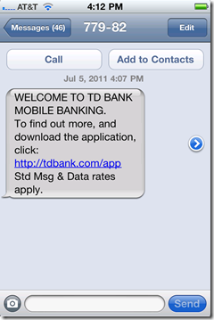
But originally I noticed only the ad in the upper-right corner (see first screenshot below). The mobile interactivity, along with the 10 spaces asking for my number, grabbed my attention. 

The text-message campaign is powered by Cielo Mobile, whose URL was displayed in the browser status bar after I clicked the banner.

________________________________________________________

How it works 
________________________________________________________

1a. Users type their mobile number into the interactive banner ad (upper-right).

image

1b. The banner returns this thank-you message:

image

2. The link in the text message (left) opens the mobile webpage (right).

image     image

3. The app is downloaded from the iTunes App Store and this is the first screen at launch:

image

_________________________________________________________

Analysis
_________________________________________________________

Apparently, I’m not the target audience for this banner ad since I don’t have an account at TD Bank. But if inclined to change that, I’d like a little more help opening an account. The bank does better than most by including links to its call center and webpage on the first screen of its native iPhone app (see #3 above), but there should be a direct call to action, or even a different app, for non-customers. 

TDECU Posts 50% Growth in Mobile Banking Users in 2 Months

This guest post was written by Daniel Thomas, a 25-year strategy and product development veteran of the financial services industry. He is a principal consultant with Mindful Insights LLC.

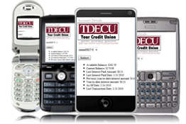
imageBack in April, we showed you the list of the 30 most popular iPad apps from U.S. banks and other financial services companies listed on iTunes. The list featured the usual big names, but one surprise was #14, Texas Dow Employees Credit Union (TDECU), a 132,000 member, 19-branch, $1.6B credit union headquartered in Lake Jackson, TX.

The app, UniFI, available on iPad, iPhone and Android platforms, was developed by startup FI-Mobile. The full-featured offering includes:

  • All the banking functions offered in online banking
  • Linkage to Facebook and Twitter
  • Branch locations
  • Rates
  • Advertising capabilities
  • Analytics

FI Mobile says it can launch the app in three weeks for FIs that already have a mobile banking application, and seven weeks if they have to develop a native app.

_____________________________________________________________

Features
_____________________________________________________________

TDECU mobile login screen Clicking on Mobile Banking from the home screen launches the WAP service developed by Q2ebanking (note 1).

TDECU mobile rate lookup Both the Locations screen and the Check Our Rates page fetch real-time content from tables that the bank or credit union maintain in FI Mobile’s advanced-content management system (admin tool). 

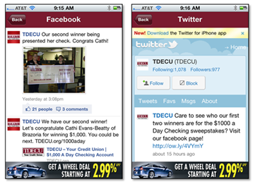
TDECU mobile intergration with Facebook and Twitter

TDECU has an active social network presence, so Facebook and Twitter integration facilitates more frequent views and comments.

The app also includes contact information, rates, and access to TDECU credit cards through gotomycard.com.

__________________________________________________________

Results
________________________________________________________________________

According to Brad Clutter, Online Banking Product Manager at TDECU, in the first two months after the app’s launch in March, mobile subscribers grew 50% (their target was 10%) and the number of mobile transactions (balance inquiries, transfers, etc.) grew 30% compared to their existing WAP-only, mobile-banking program. He said, “We have been blown away by the results we’ve seen, and they have more than justified the cost.”

Thanks to FI Mobile’s analytics, TDECU can now see that their app is being used by members in all 50 states and in 16 different countries. They know that 84% are returning users and use of Android devices outnumbers Apple iOS nearly 2-to-1.

———————-

Note:
1. UniFI is vendor agnostic and will launch the mobile banking program developed by any vendor. And if you don’t have one, FI Mobile will develop one.

Chase Bank’s Jot App Shows the Future of Mobile Transaction Processing

image image I’ve been waiting for something like Chase Bank’s Jot (see note 1). It’s part of the "second wave" of mobile apps that demonstrate why mobile banking will soon be better than online banking.
_________________________________________________________________________________

Mobile banking phase 1: 2008 through 2011
________________________________________________________________________________

Mobile’s first wave was all about porting the most-used online functions, balance inquiry and statement viewing, to a smaller screen. That was convenient for smartphone owners on the go, but it didn’t add much to the overall user experience. 

The test of whether you’ve nailed the mobile UX is if that even if you are within arm’s reach of your laptop, you still pick up the mobile to perform a function. Most mobile banking systems fail that test, i.e. you only use mobile banking when online access is inconvenient or insecure.
________________________________________________________________________________

Mobile banking phase 2: 2011+
________________________________________________________________________________

The second wave is much more interesting. Your mobile phone can do financial chores that simply cannot be accomplished online, for example:

  • Deposit a paper check via mobile camera (USAA, Chase, PayPal and many more)
  • Transfer money to your friend by "bumping" phones (PayPal, ING Direct)
  • Alert you to special merchant offers in your exact location that are redeemable simply by using your bankcard (BankOns)
  • Pay your bill automatically by scanning the billing statement (Mitek)
  • Upload paper receipts and append them to expense reports (Expensify)

And the latest addition to that list:

  • Receive feed of transactions and tag them with categories for future reference and reporting (Chase Jot)

________________________________________________________________________________

How Jot works
________________________________________________________________________________

Chase’s new app (announced 1 June 2011) may not be as cool as remotely depositing a check, but it’s much more useful for most cardholders. The iPhone and Android app, which is currently available only for the bank’s Ink business credit card, sends push notifications of each transaction (see inset) and enables users to (relatively) quickly append transactions with category information, i.e. "tag" transactions. 

image One key Jot feature, missing in most mobile banking services, is a running list of the transactions waiting to be tagged (see right).

That way, when the business owner has a few spare moments, they can quickly get caught up with their categorizing work. This ongoing attention will reduce the quarterly game of "what’s that transaction" played when finalizing the company books.

So not only does Jot save time, it potentially improves the quality of the accounting data, always a good thing for business management. 

The app also includes other business credit card management functions such as basic reports by tag, the ability to change employee credit limits, and info on outstanding balances and payment due dates.

While the functionality is still pretty basic (e.g., there is no way to add more than one tag to a transaction), there are only 60 days of transactions available, and login needs to be simplified, overall Jot is a winner. We are tagging it with an A-.

—————————————————-

Notes:
1. The Jot landing page is well done and includes a series of four short demo videos.
2. For OBR subscribers, see our previous Online Banking Reports on mobile banking and payments.

First Look: Bank of America’s Just-Launched iPad App

image A little more than a year after the iPad launched, Bank of America finally made it their own with a native app. It appeared in the iTunes store around midnight last night and has already climbed to #42 on the list of most popular free apps across all categories (5 PM Pacific; see update below and notes 1, 2).

I took it for a spin a few minutes ago and it’s about what you’d expect for the first version. The most important functions are all there: view recent transactions, transfer funds, pay bills, find ATM/branch locations, and contact customer service. It also includes the ability to apply for a new account within the app, something that is still relatively rare (and not included in the bank’s iPhone app).

Analysis: Overall, it’s a solid, if somewhat tardy, initial effort and will be adequate for most users. However, BofA has a reputation for being an online leader, and there is nothing in the app so far that supports that brand positioning. But, then again, simply having an iPad app puts it ahead of most competitors (see list of top banking apps as of last week).

A few other notable features:

  • Users have the option to store their username, so subsequent logins can be accomplished by simply entering a password (screenshot 1)
  • Pressing anywhere on a line item in the statement brings up a small popup with additional transaction detail (screenshot 2)
  • While it won’t win any design awards, the app gets a passing grade with an overall look and feel that is consistent with other iPad apps with relatively intuitive navigation. At least it’s not simply an expanded version of its iPhone app (like the Chase iPad app)

It also disappoints in a few areas:

  • I tried to pay my credit card bill, but the iPad app doesn’t support payment via external checking account (regular online banking does)
  • It times out after 10 minutes (good), but leaves your account balances visible until you dismiss the popup (screenshot 4)
  • I was not able to access business credit card statement data (system unavailable) but was able to get personal card data
  • The squares didn’t quite fit the screen right in portrait mode (screenshot 4)

Update: At 11 PM Pacific, the BofA app has reached #22 among all free iPad apps.
——————————————-

1. Initial iPad app sign in (3 May 2011)

 Bank of America iPad app login screen

2. Transaction details popup

  Bank of America iPad app transaction details

3. New account app

Bank of America iPad app: New account app

4. Time-out warning still shows account balances

image 

Notes:
1. The app still shows up as #32 in the finance category. So clearly, the top list among all apps is refreshed more often than the individual category lists.  
2. There is no mention of the app on the bank’s website as of 5 PM.
3. For more info on mobile banking, see our previous Online Banking Reports.

ING Direct Adds Phone-to-Phone Mobile Payments Powered by Bump Technologies

imageI’ve always admired ING Direct’s focus on deposit accounts primarily sold and serviced through the Internet. While the bank has diversified into checking accounts, mortgages, and investments during the ten years since it launched, the core website look and feel is virtually unchanged (see 2001 version here). 

So I was more than a bit surprised to learn this weekend that ING Direct became the second U.S. financial institution to add Bump-powered phone-to-phone payments to its iPhone app. PayPal was first, adding the feature more than a year ago.

Bottom line: Evidently, with “high-yield savings” stuck at 1%, the giant direct bank needs to be a little more creative on the feature side to attract new business. While bump-to-pay will eventually be replaced with direct communications via NFC or other technologies, it’s a nice addition that positions ING Direct as a mobile leader.

Bump is now one of two choice on the P2P menu on ING Direct’s iPhone app (2 May 2011)

Bump is now one of two choice on the P2P menu on ING Direct's iPhone app (2 May 2011)      Bump is now one of two choice on the P2P menu on ING Direct's iPhone app (2 May 2011) 

Bump is now one of two choice on the P2P menu on ING Direct's iPhone app (2 May 2011) 

——-

Note: For more info on mobile banking, see our previous Online Banking Reports.

65 Most Popular iPhone Apps from U.S. Banks and Other Financial Services Companies

image This is a followup to last week’s 30 most popular iPad apps. Unlike the iPad, most major financial institutions have had an iPhone app for a year or longer. So the most-popular list reads pretty much like a who’s who of U.S. banking.

Observations:

  • Only 16 (25%) of the top-65 also have iPad apps
  • 36 (55%) apps are from banks representing 29 unique banks (i.e., 7 apps are second or third ones from the same bank)
  • 15 apps (23%) are from credit unions
  • Banks/card issuers command 6 of the top 10 spots (7 if you count PayPal)
  • The highest credit union is #23, Navy Federal Credit Union; Suncoast Schools FCU is second highest at #35

Methodology: Using an iPhone in the late afternoon today, I accessed the Free apps in the Finance category of the Apple App Store and sorted by “Most Popular.” I included apps only from U.S. financial institutions or from third parties that tap directly into financial institution data using account aggregation (e.g., from Yodlee, CashEdge, etc.). Pure content apps, like ING Direct’s ATM Finder, were not included even if from a financial institution.

Note: The first column below is the rank among all financial institutions (as defined above). The second column in the app’s rank within the entire App Store “finance” category. And the third column is the rank of that company’s iPad app, if they have one.

Table: 65 Most-Popular U.S. Banking Apps

FI Rank Finance Rank iPad Rank Company
1 1 Bank of America
2 2 4 Chase bank
3 3 Wells Fargo
4 4 PayPal
5 5 Capital One
6 6 1, 5 Pageonce
7 9 Mint.com
8 10 American Express
9 12 2 Square
10 14 8 USAA
11 15 Citibank
12 17 Regions Bank
13 18 Discover
14 19 TD Bank
15 20 PNC Bank
16 21 9 Fidelity Investments
17 23 6 E*Trade
18 24 ING Direct
19 25 SunTrust
20 26 US Bank
21 27 Schwab
22 30 PNC Virtual Wallet
23 32 Navy Federal Credit Union
24 35 7 TD Ameritrade
25 43 Barclaycard
26 44 22 BB&T
27 47 ShareBuilder (ING Direct)
28 48 Citizens Bank (RBS)
29 52 Vanguard
30 58 JP Morgan
31 66 M&T Bank
32 67 24 BBVA Compass
33 70 11 Expensify
34 78 15 Merrill Lynch, My Merrill
35 82 Suncoast Schools FCU
36 89 TCF Bank
37 93 Arvest Bank
38 103 SchoolsFirst FCU
39 105 14 TDECU
40 108 Charter One (RBS)
41 109 10 thinkorswim (TD Ameritrade)
42 110 RBFCU
43 113 Wings Financial Credit Union
44 121 20 Merrill Lynch, Edge
45 122 Union Bank
46 124 Safe Credit Union
47 125 Service Credit Union
48 140 Comerica Bank
49 141 BECU
50 143 Zecco
51 151 DCU
52 158 NetSpend
53 160 Tyndall FCU
54 161 Golden 1
55 162 America First Credit Union
56 174 12 Mercedes-Benz Financial
57 178 Woodforest National Bank
58 179 TradeKing
59 182 M&I Bank
60 189 Wells Fargo, CEO
61 190 First Tennessee Bank
62 195 16 Bank of Oklahoma
63 196 SFEFCU
64 201 IBC Bank
65 205   VyStar Credit Union

——

Note: For more info on mobile banking, see our previous Online Banking Reports.

Southern Bancorp Launches "Shake and Bank" iPhone App Aimed at Youth

image It’s been more than six months since we last featured a new mobile app from a financial institution (see Arvest Bank’s financial calculators). It’s not because of lack of activity, or importance. In that time, more than 1,000 financial institution apps have been introduced and the market has really heated up.

But we focus on what’s new and different. And for the most part, the class of 2010 and 2011 have been “me-too” entries. Which is exactly as it should be. Every mid-sized and larger bank and credit union needs at least one app in the iTunes store, so the last 18 months have been about gaining competitive parity. 

But things will start to get more interesting again as financial institutions:

Southern Bancorp’s new mobile app, Shake and Bank, ticks all four boxes. It’s an iPhone/iPod Touch app designed to give kids (or any account holder) a quick look at the balance in their account. As you can see below, Shake and Bank is pretty much self-explanatory:

1. Open app (note 1)

2. Shake iPhone

3. See balance

The app requires a setup code to launch. According to the iTunes entry, the code can be obtained through the bank’s website or at a branch. But as of today, I see no mention of Shake and Bank, or mobile banking for that matter, at their website.

Bottom line: I’m a sucker for pigs, so obviously I like it. But more importantly, Southern Bancorp makes it easy to monitor account balances with a simple kid-friendly approach. And parents will appreciate the help reinforcing the savings habit (note 1).

Southern Bancorp has $1.1 billion in assets and 40 branches in Arkansas and Mississippi.
————————

Southern Bancorp’s iPhone app targeted towards kids (link, 25 April 2011)

Southern Bancorp's iPhone mobile banking app targeted towards kids      image 

—————————

Notes:
1. Since I couldn’t test the app without an account, I assume there is no subsequent login requirement once you’ve entered the setup code. And more importantly, I hope that it oinks when shaken. 
2. For more info on mobile banking, see our previous Online Banking Reports.

30 Most Popular iPad Apps from U.S. Banks and Other Financial Services Companies

image Apple tweaked its propriety algorithm that ranks apps in terms of popularity (Cnet article). Evidently the changes had an impact on overall rankings, but little or no effect on intra-category ranks.

That holds true with my casual observations within the finance category. Regardless, it seemed like a good time to visit the App Store and document which financial iPad apps are currently most popular (see Table below).

Note: The first column below is the rank among all financial institutions (as defined below). The second column in the app’s rank within the entire App Store “finance” category.

Observations:

  • The highest rated bank is Chase at number 9 in the finance category
  • There are only two banks (Chase & USAA) in the top 20
  • There are only seven consumer banks in the top 200 (Chase, USAA, Bank of Oklahoma, Trustmark, BB&T, BBVA, Bank of Texas)
  • There are more credit unions (8) than banks (7) in top 200 in the finance category
  • Still missing some huge banking names (Amex, BofA, Capital One, Citi, Discover, Mint, PayPal, US Bank)

My methodology: Using an iPad and iPhone, I accessed the finance category of the App Store and sorted by “Most Popular.” I am including only apps from any U.S. financial institution or from third parties that tap directly into financial institution data using account aggregation (e.g., from Yodlee, CashEdge, etc.). Pure content apps, like Schwab’s On Investing magazine, were not included even if from a financial institution.

FI Rank Finance Rank Company App Name
(+ company)
1 1 Pageonce Money & Bills (free)
2 2 Square  
3 3 Maximo Cavazzani (works with
TD Ameritrade)
iStockManager
4 9 Chase Bank Mobile
5 10 Pageonce Pro – Money & Bills
6 11 E*Trade Mobile Pro
7 15 TD Ameritrade Mobile
8 20 USAA  
9 21 Fidelity Investments  
10 22 Thinkorswim (TD Ameritrade)  
11 29 Expensify Expense Reports
12 49 Mercedes-Benz Financial My MBFS
13 50 Wescom Central Credit Union Mobile
14 59 TDECU Mobile
15 67 BofAML (BofA Merrill Lynch) MyMerrill
16 68 Bank of Oklahoma Mobile
17 74 MACU (Mountain America) Mobile Banking
18 88 Trustmark National Bank  
19 96 thinkMoney (TD Ameritrade)  
20 97 BofAML (BofA Merrill Lynch) Merrill Edge
21 98 JP Morgan Mobile
22 107 BB&T Banking
23 114 thinkorswim (TD Ameritrade) VEO Mobile
24 131 BBVA Compass Mobile Banking
25 169 NASA FCU Mobile Banking
26 170 DATCU Credit Union Mobile Banking
27 182 SCU (Scott Credit Union) Mobile Banking
28 188 Bank of Texas Mobile Banking
29 193 GWCU (Goldenwest Credit Union) Mobile Banking
30 194 American Eagle FCU Mobile Banking

——–

Note: For more info on mobile banking, see our previous Online Banking Reports.