Bank of America Launches Text Banking

image Your best excuse to delay your text-banking project ended today. Bank of America launched the mobile service via an interstitial ad to online banking customers (see below).

imageThe new service may be rolling out in waves since it’s neither mentioned in online news sites, nor featured on the BofA site. And there is only a single Twitter message posted three days ago. 

The signup process required the entry of a mobile number and a YES response from that mobile device (see screenshots below). While that’s not much to ask, it did seem unnecessary since I was already signed up for mobile banking through that number. 

After responding yes from my mobile, I received a welcome text from the bank (see iPhone screenshot right).

That seemed like a nice touch until I clicked on the link and was taken to the regular webpage, rendered impossibly small on my first-generation iPhone, where I first had to select my state. That took me to another page full of barely readable mouse-type regarding text options (see last screenshot).

Action item: If you don’t support text banking yet, it’s time to move it up the priority list. 

Bank of America online banking login splash screen (12 April 2010, 6 PM Pacific)

image

Landing page when selecting “Enroll now” above

image

Enrollment page (within online banking)

image

Page displayed while waiting for activation via mobile phone

image

Page displayed after activating via mobile and clicking “Check Activation Status” button (above)

image

Mobile help screen as viewed in first-generation iPhone

image

Note: For more on the importance of mobile banking and payments, see the most recent issue from Online Banking Report.

Why You Should Build an iPad Banking App (Even Though You Don’t Need To)

One week into the iPad era there are still no banks or credit unions with iPad-specific apps (note 1). There also aren’t any major PFM or other financial brands present, other than Square and E*Trade. Mint’s not even there yet.

What’s going on? On Friday, The Financial Brand’s Jeffry Pilcher tweeted the question that’s on a lot of bankers’ minds:

                     image

While I suspect Jeffry is mostly being provocative, it’s a question worth discussing. Should financial institutions build an iPad app?

The Web experience on the iPad is outstanding. It has a lightening-fast Safari browser built in. It loads my bank’s webpage as fast or faster than my MacbookPro or Thinkpad X41. The iPad virtual keyboard makes it easy to type username and password. And for the most part (Flash is a problem), websites look and perform perfectly on the iPad (use ipadpeek.com if you want to see what your webpage looks like in an iPad layout).

So yes, online banking works fine on iPads. But you can say the same thing about most evolutionary products. Telephone calls work fine on corded phones. Cars work fine without cup holders. Refrigerators work fine without ice makers. And so on.

An iPad app isn’t about utility, it’s about a great user experience. The ability to click on a banking button on the main iPad screen and launch a perfectly sized online banking app shaves 30 to 45 seconds off the traditional browser-based approach (open Safari, navigate to my bank, and find the login button). There are also things you can do with an app, such as location-aware ATM/branch finder, that make it a better experience (note 2). 

So here’s why most major financial brands should have an iPad app now:

  • Free publicity (part 1): As of today, there are only 39 iPad apps in the Finance category. Each of the 562,000+ iPad owners, and millions of others browsing the iTunes App Store, would see your brand showcased there.
  • Free publicity (part 2): There was, and is, a tremendous amount of hype around the iPad. Being the first bank/CU in your country/state/region/city/neighborhood with an iPad app will net you numerous mentions online and in print.
  • It’s cool: While financial institutions are rightly focused on the basics right now, there is still considerable value in being seen as a technology leader.
  • It’s inexpensive: Building a basic iPad/iPhone app is a relatively simple project. If it did nothing more than connect to online banking and show nearby ATMs/branches, you’d receive most of the benefits listed above.
  • It’s the future: Apps and widgets will play a large role in banking info delivery going forward, especially in mobile banking. You should be designing apps for every significant platform. In the U.S. that means the iPhone and Android, then iPad and Blackberry after that (see note 3).

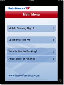
And one final note for the 67 U.S. financial institutions that already have iPhone apps. Yes, you still need an iPad one. While the iPhone app runs fine, it is displayed in a small window the size of an iPhone. Users can press a button in the lower-right corner to doublesize the app, but images and text become fuzzy, and it just doesn’t look right (although it is functional as you can see in the screenshots below).

Bank of America’s iPhone app displayed on iPad screen (5 April 2010)
Note: Click on the images below to see the quality difference

              Normal size                                                             Double sized

 image      image

Notes:
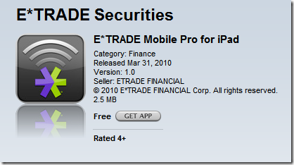
1. As of 11 PM Pacific April 10, the only major financial brand with an iPad app is E*Trade MobilePro, which is more about stock trading, not banking.
2. For more on financial apps and the iPhone, see our March 2009 Online Banking Report.
3. For more on the importance of mobile banking and payments, see the most recent issue from Online Banking Report.
4. Hat-tip to Banking Kismet for blogging on the subject.

Banks Shutout on iPad Opening Day, But Square is There

image After months of hearing about the iPad, I finally got my hands on one Saturday afternoon. It’s a great piece of technology, but if you have an iPhone, you pretty much already know what it’s like.

While the iPad runs all 150,000 apps available for the iPhone, developers are encouraged to produce iPad-optimized versions to take advantage of the significantly bigger-screen real estate.

When you open the App Store on the iPad, it focuses almost entirely on iPad apps. You have to do a specific keyword search to find non-iPad apps that work on the iPhone.

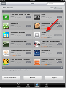
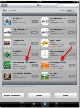
And I was surprised that neither banks nor credit unions are represented among the 30 Finance category apps available on April 3 (see screenshots below), a situation likely to be rectified with a flood of banking and credit union iPad apps during the next few months. It’s definitely a place you want your brand represented (note 1).

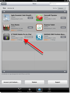
imageThe only big financial services brand that made it to bat on opening day was E*Trade MobilePro (which hit the store last Thursday), and another trading app, iStockManager, to be used with TD Ameritrade.  Bloomberg, too, had its popular info app available on day 1 (see screenshots below for all 30 finance apps).                                       

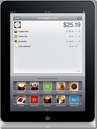
The biggest surprise in the iPad Finance category was Square, the much-touted card-to-card payments service from Twitter’s founder, which released its iPad app on April 1 (see inset). We’ll be testing Square this month and hopefully using it to take last-minute credit card payments at our upcoming FinovateSpring Conference.                                                                                  Square’s iPad app

The 30 iPad finance category apps available on the launch day (3 April 2010)
(Note: Organized by “featured”)
Page 1: Apps 1-12                                                     Page 2: Apps 13-24image   image

Page 3: Apps 25-30

image

Note: For more coverage of mobile banking and payments, see the most recent issue from Online Banking Report.

First Finance Apps for Apple iPad Unveiled

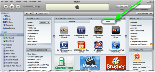
image Apple loaded iPad apps into the main iTunes store today (see screenshot below). Search is limited and apps by category are not yet available, but you now can browse the iTunes store for iPad-optimized apps.

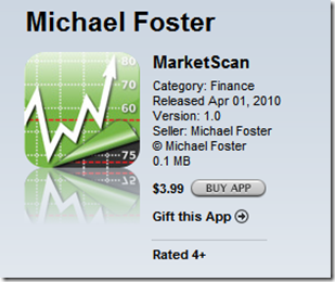
I looked at all 2,400 and spotted three financial titles — a credit card merchant terminal, a stock-info tracker (see below), and E*Trade’s Mobile Pro — plus a few calculators

I was disappointed that no banks or credit unions were represented. But the iPad launch is still 36 hours away, so I may still win my bet that Bank of America will be there on the morning of April 3.  

Apple iTunes App Store now features iPad apps (1 April, 5 PM Pacific)

image

E*Trade Mobile Pro for iPad (iTunes link)

image 

Credit Card Terminal for iPad from Inner Fence
(for Authorize.net users; iTunes link)

image

MarketScan by Michael Foster (iTunes link)

image 

Note: For more coverage of mobile banking and payments, see the most recent issue from Online Banking Report.

Mobile Firsts: PayPal Launches Bump to Pay

imageThis month we’ve explored several new features that promise to propel mobile banking into the mainstream market. Unlike developing nations, where mobile is the ONLY way to conveniently bank, in the U.S. and other online-centric countries, mobile has to compete with online for awareness and usage.

There doesn’t seem to be a single killer app for mobile. But a growing list of things that mobile does better than online will eventually tip the scales in favor of the new channel. Here’s what we’ve seen so far:

  • Location-based ATM/branch finders (here)
  • Remote check depositing (here)
  • Simple login with 4-digit pin (here)
  • Insurance discounts after graduating from iPhone-based program (here)

The latest addition to the list:

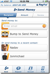
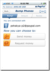
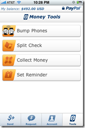
  • PayPal’s Bump to Pay (see video below): Users of PayPal’s latest iPhone app can transfer funds to each other merely by entering the amount and moving their phones within close proximity of each other (see screenshots below).

As David Eads points out at Mobile Manifesto, bumping to pay has some drawbacks in the real world:  

…..most of the time I want to send money to someone, I’m not standing beside them. And if I am, most of the time I would feel awkward actually touching the person. Imaging bumping someone for admission to a high school football game. Imagine bumping a street vendor for a newspaper or flowers. Imagine bumping a scalper for tickets outside the game.

My take: I agree with David that physically placing iPhones next to each other seems awkward today. But then again, so was writing paper checks back in the day when everything was paid for in cash/coins.

If so-called bump pay is super-convenient, fairly priced, and the perceived security issues are overcome, there’s no reason why it couldn’t become the predominant method of person-to-person payments. While it’s way too early to make any kind of prediction, I’m just saying, don’t dismiss it yet.

David’s closing remark is spot on:

The key for P2P is getting people comfortable with the idea of transacting electronically between individuals. Bumping and Zooming makes it more fun.

Bumping is now an integral part of PayPal’s iPhone app

image   image   image

—————————–

Off-topic addendum: As much as we like new bells and whistles, bump pay pales in comparison to the really big news at PayPal this week: the announcement that it’s teaming with China UnionPay and Singapore’s DBS Bank to offer payment services. The 2-year DBS deal will put PayPal in the hands of the bank’s four million customers, 1.3 million of whom are currently banking online.

How big are these deals? A good indicator is PayPal’s plan to double its staff in the region to 2,000 employees. Wow, has any financial company anywhere in the world added 1,000 to its staff in the past two years?

——————————-

Note: For more coverage of mobile banking and payments, see the most recent issue from Online Banking Report.

New Online Banking Report Available: The Case for Mobile Banking

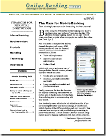
image The latest Online Banking Report: The Case for Mobile Banking is now available. It will mail next week to OBR subscribers. It’s also available online here. There’s no charge for current subscribers; others may download it immediately for US$395.

There is little doubt that mobile is the next online, not just in banking, but with many information-rich, time-sensitive services. Even in the online-centric United States, we expect mobile banking to eclipse online by the end of the decade. 

Another way to look at it: Starting from essentially zero just three years ago, more than half of the U.S. online banking population will be using mobile banking, by 2015. That’s zero-to-40 million households in just eight years.

Most financial institutions should be making their mobile bets during 2010/2011. The report outlines ten ways that mobile banking supports overall strategic goals at financial institutions. It also includes our ten-year forecast for U.S. mobile adoption (note 1).

This report is number four in a series we’ve published on the mobile area during the past three years:

Num Date Title
177 Mar. 2010 The Case for Mobile Banking: Ten strategic reasons for investing in the channel
163/164 Mar. 2009 Mobile Banking 2.0 the iPhone Edition: How to build a smartphone app even your CFO will love
140/141 Apr. 2007 Mobile Money & Payments: Why credit & debit card issuers should embrace mobile delivery now
138/139 Feb. 2007 Mobile Banking: Leveraging the third screen

Note:
1. The mobile forecast was originally published last month in our year-end recap.

Mobile Firsts: State Farm Offers Auto Insurance Discounts to Graduates of its Steer Clear iPhone App

imageLast week I talked about how USAA is making the mobile experience better than online thanks to the magic of mobile remote deposit and PIN-based login. For the sake of discussion, I’m defining magic as anything you could not have imagined doing on your mobile phone two years ago (note 1).

The latest novel financial app: State Farm’s Steer Clear program that provides auto insurance discounts “up to 15%” for new drivers (under age 25) that pass its safe driving program. Users can undergo the self-assessment program online or off, but the app makes it easier and with a built-in stopwatch (screenshot below) to track the required 20 practice drives. See how it works in the company’s video below (press release here; iTunes link here). 

image As much as I like it, the State Farm app doesn’t quite make it into the magical category. Had it used GPS to automatically track the 20 practice drives, it might have passed the bar. I’m sure that’s in a future version.

Regardless, it’s clever, unique and positions the company well with the youth market and their parents that often foot the insurance bills. That’s a good return on the small investment needed to port the program over to a mobile app (note 2).

Notes:
1. I am using two years, since that predates the opening of the iPhone App Store in July 2008.
2. Read more about the strategic advantages mobile banking can give your financial institution in our latest Online Banking Report published today.

USAA Makes Mobile Banking Better than Online Banking

image Here’s a test that tells you when you’ve built a successful mobile app:

  1. Place your laptop next to your iPhone/Android
  2. Choose a task
  3. Reach for the device that’s easiest to use for that task 

If you don’t reach for the mobile phone first, you still have work to do on the user experience. 

I’ve always chosen the laptop for banking, even though I’ve ported more than a dozen other routine tasks to the iPhone (note 1). The hassle of logging in with those tiny iPhone keys pushes me to the laptop. But as of Tuesday, USAA’s latest iPhone app, version 2.2, has changed the equation, and there’s no looking back. 

Mobile vs. online banking
The key to making mobile a profitable channel is to make the user experience BETTER than online. And USAA is the only U.S. financial institution doing that today.

USAA’s biggest mobile “wow” is mobile check deposits (see Deposit@Mobile screenshot below) introduced six months ago for the iPhone. While it may not seem novel to those in the industry familiar with scanner-based remote deposits, the average consumer considers an iPhone check deposit to be almost magical. Other than a few small credit unions, no other major banking competitor offers it, so USAA continues to own mobile magic.  

imageBut with Bank of America rumored to be readying a launch mobile deposits, which will no doubt be featured in Apple TV ads, (see latest one here), USAA needs to keep innovating. 

And this week, USAA delivered with a single-PIN login with authentication powered by VeriSign VIP service. The optional 4-digit sign-on process is available now on the iPhone and will be available in April for Android and “shortly thereafter” for Blackberry (note 2).

In a time when it’s more tedious and less secure to log in online, USAA takes us back in time to a simpler day, when you could log in with just a few digits.

And by using techniques that authenticate the mobile phone during login, the bank says that mobile access is more secure than online.

Think about that for a moment. Mobile is MORE SECURE than online. With tens of millions of customers deathly afraid of logging in via their virus-laden PCs, imagine what that could do for mobile adoption.

It will take time to educate the market. Currently, most consumers believe the mobile channel is far less secure. But if they can be convinced the opposite is true, many will kiss online banking goodbye forever.

Notes:
1. According to yesterday’s release, USAA has 1.3 million mobile users, 17% of its 7.4 million customer base.
2. Previously, USAA users were required to sign on with username, password and PIN. The simple sign-on process is optional for those not trusting the simpler process.
3. For more info on financial services opportunities on the iPhone, see our March 2009 Online Banking Report.
What Does the New Apple iPad Mean for Banking?

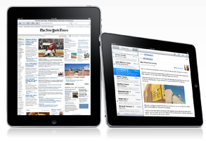
image_thumb11Apple today introduced its latest invention, a gigantic $499 iPod Touch called the iPad (inset shows iPad, Kindle, vs. iPhone; note 1).

It’s a gorgeous piece of technology that will soon be the movie-watching, ebook-reading device of choice for the rich and famous. But what does it mean for the average financial institution?

Tactically, it should have almost zero impact. Your iPhone/iTouch app should work pretty much the same on the iPad. There may be some design tweaks your programmers will need to understand, but the basic functionality is the same.

It would make a wonderful giveaway item, either as part of a high-end business/private banking package (note 2), or as a sweepstakes prize.     

So those of you who already have an iPhone app launched, or in the pipeline, can stop reading now. But read on if you haven’t yet hopped on the app bandwagon.

___________________________________________________________________________

ipad_portrait_landscape.png

The movement to apps, and away from old-school “browsing,” is unstoppable. The iPad joins a growing list of new devices (Android, Kindle, etc.) that are app-primary, browser-secondary (note 3).

It’s a massive shift that’s happened in less than two years, beginning in July 2008 when Apple opened the iPhone platform.

The popularity of apps is changing how users tap online info. Even power laptop/desktop users are making dramatic changes in their information consumption. For example, within a few months of the Apple app store launch, I had already moved 12 of my routine info-gathering tasks to the iPhone. The speed/convenience of pressing a single button vs. navigating to a website via the browser is a significant improvement in user experience. More than a year later, my habits have changed little. 

The change from serving customers who were “online browsers” and are now “mobile app users” has profound implications for banking. Instead of talking to your customers in batch- mode with built-in time delays, you are now real-time, feeding data to customer on the go, where they need up-to-the-minute status on their cash situation.   

In many ways, the ROI for real-time banking (and here) is more dramatic than online-batch banking. The ability to stamp out POS fraud, to nip budding customer service nightmares, and just plain get closer to the customer, all bring nice returns on the mobile investment (note 3).

Notes:
1. Photo credit: TechCrunch post today.
2. For more info on using a dedicated device for small business customers, see our October Online Banking Report.
3. Groundswell author and Forrester analyst Josh Bernoff calls this the “splinternet.”
4. For more info on financial services opportunities on the iPhone, see our March Online Banking Report.
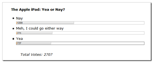
5. Initial response online was mixed, 2,700 readers of CrunchGear, voted “thumbs sideways” today (link, results at 4PM Pacific below)

ipad_poll.png

Nationwide Insurance is Fourth Financial Institution with Multiple iPhone Apps

image In November, we predicted that large financial institutions would each offer dozens of mobile apps targeted to various lines of business and/or customer segments (previous post). PNC Bank, Wells Fargo and Chase each have two apps in the iPhone store.

Three weeks ago, a fourth financial company added its second app: Nationwide Insurance.

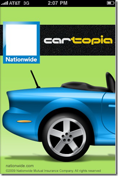
The company originally launched an app (inset) geared towards its insurance customers in April 2009 (press release; iTunes store link). This app is designed to assist its insurance customers when they have an accident. The most recent version includes a toolkit, auto claim form, agent finder and even a flashlight.

Then in mid-December, the company released a second app geared towards automobile shoppers, Cartopia (screenshots below; iTunes link; press release). It helps buyers research prospective cars on the go.

By inputting a vehicle identification number (VIN), consumers can quickly access the following info on a prospective vehicle:

  • Car specs (fuel economy, dimensions, weight, etc.)
  • Average retail and wholesale prices
  • 5-year cost-of-ownership estimates
  • Original warranty info
  • Safety info
  • History of the VIN number, powered by Experian’s AutoCheck (similar to Carfax report; limited to six free lookups each month; note 1)

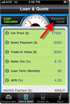
In addition, users can calculate monthly loan payments with a built-in loan calculator. Nationwide also provides links for customers to call in to apply for vehicle financing and or receive an insurance quote. Unfortunately, there is no online loan application or insurance price quote engine.

Finally, the app contains space to keep notes and rate the cars you are considering purchasing.

Relevance to Netbankers: If you are in the auto loan and/or insurance business, getting your name in front of car buyers as they shop is the ultimate marketing coup. While you may not be able to emulate all the functions in Nationwide’s app (note 2), even a simple loan calculator and note-taking area, along with links to your call center, could drive incremental business.

                                                                                    Cartopia #2 Main Loan info with link to
     Cartopia #1: Splash screen                          insurance quote (via voice call)

image            image

Notes:
1. I was unable to access the report on my test vehicle; the error message said it was temporarily unavailable.
2. Although the app is loaded with features, its UI is a bit clunky and the app is only rated two stars in Apple’s App Store. Consequently, a slimmed down, simpler app, would appeal to many users.  
3. For more info on financial services opportunities on the iPhone, see our March Online Banking Report.

Sneak Peek at Mercantile Bank’s Powered-by-PayPal Mobile P2P Payments

image

Mercantile Bank of Michigan is riding the wave of free publicity from being first to market (probably) with iPhone-based P2P payments powered by PayPal. That’s a triple play in both imagealliteration and PR value. See the teaser ad on the bank’s website below (first screenshot).

The new service, a joint effort from PayPal and S1, is expected to go live in early 2010. It will allow customers to send money directly from their iPhone to any other individual on the worldwide PayPal network. All the sender must know is the recipient’s mobile phone number or email address. According to the five-question FAQ on the landing page (see second screenshot), the service will be available to all MercMobile customers and will be free of charge.

Mercantile Bank has become one of the most innovative banks we follow. Congratulations to CIO John Schulte and his team for leading the industry on several fronts and providing great material for Netbanker (previous posts here; note 1).

————

For more on the P2P payments market, see our latest Online Banking Report, published earlier this week, Making the Case for Person-to-Person Payments

Mercantile Bank’s powered-by-PayPal mobile P2P app (7 Dec. 2009):

image   image   image

Mercantile Bank of Michigan homepage (8 Dec. 2009):
Note: MercMobile P2P Payment teaser in lower left and home-based remote-deposit capture on the top banner.

image

P2P payments landing page (link)

 image

Note:
1. Mercantile even earns its very own category at Netbanker: <netbanker.com/mercantile_bank_of_mi>. 

Citibank Ends its Three-Year Test with Obopay

imageIt appears that the Obopay/Citibank co-branded service is being shut down. From the sparse note on the webpage <citi.obopay.com> (see screenshot below), it doesn’t sound like a temporary hiatus: 

As of Dec. 22, 2009, “Citi Obopay” will no longer be available.
If you would like to use the Obopay service go to www.obopay.com.
The service available at www.obopay.com has no affiliation with Citibank.

The companies have been working together on Obopay-powered mobile payment for more than three years.

Citi Mobile SVP Marylou Dowd said on Thursday in American Banker that the Obopay tests were concluded this summer. Not coincidently, Citi’s mobile joint venture MMV announced last week that it was partnering with CPNI Inc. of Toronto to build a mobile P2P payments service.

Obopay’s website still shows Citi Obopay on its Financial Institutions page (see inset above). But Citigroup, which invested at least twice in Obopay in the July 2007 C-round and April 2008 D-round, is not listed on Obopay’s investors page.

The site was never publicized by Citibank. Traffic peaked at 7,000 unique visitors in Feb. before falling so low that Compete could not measure it after April 2009:

image

Source: Compete, 3 Dec 2009, link

For future reference, we’ve archived the website screenshots below.

Citi Obopay homepage (3 Dec 2009, 4 PM Pacific)
Note: The <citi.obopay.com> URL now redirects to the Obopay homepage.

image

How Citi Obopay Works page <citi.obopay.com>

image

Get Citi Obopay page <citi.obopay.com>

image

Citi Obopay Fees page <citi.obopay.com>

image

Note: For more info on mobile banking, see our Online Banking Report: Mobile Banking via iPhone (March 2009) as well as our earlier reports on Mobile Banking (Feb. 2007) and Mobile Payments (April 2007).