Marketing: Alliant Credit Union Pitches Kids Account on Logoff Screen

Marketing: Alliant Credit Union Pitches Kids Account on Logoff Screen

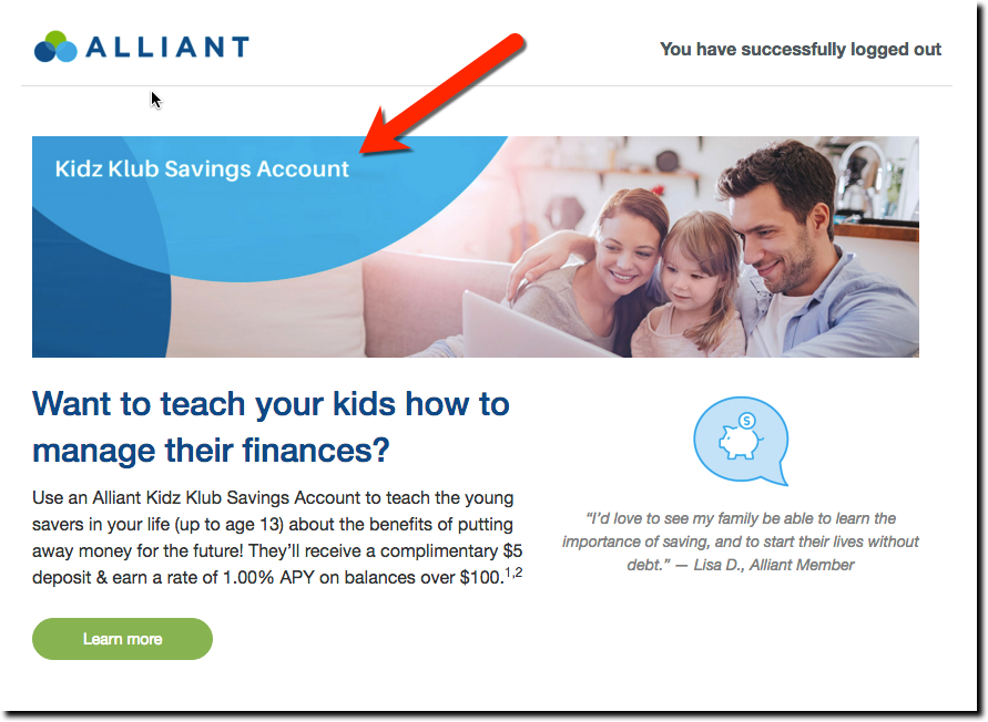
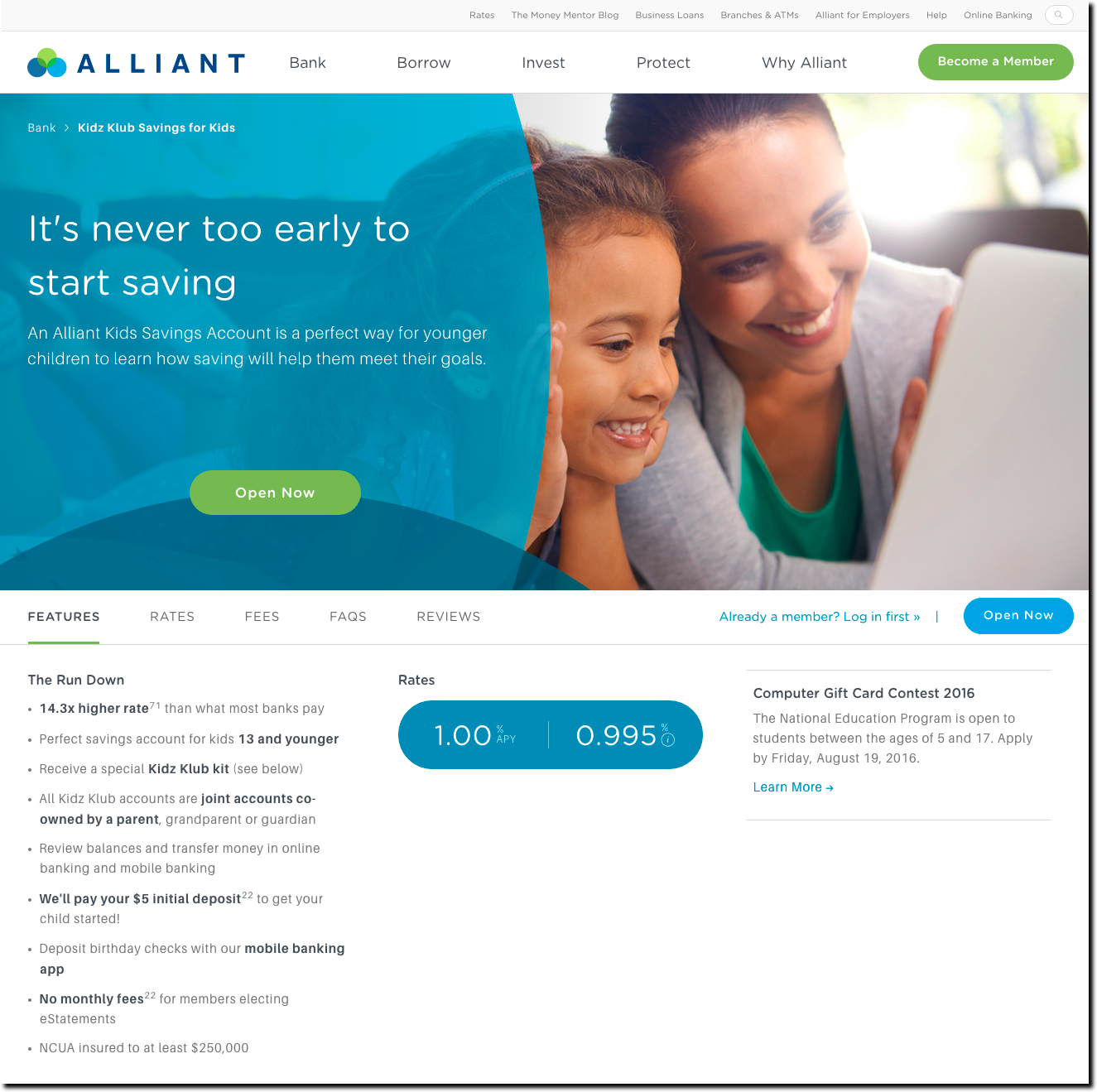
The logoff page that pops up following a secure session is one of the choicest real-estate parcels in a financial institution’s inventory. Typically, this logoff page is seen on a desktop pc, but the same opportunity exists on mobile. Earlier this summer (late June), we spotted Chicago-based Alliant Credit Union pitching its Kidz Klub savings account with a 1% APY (adults get the same rate).

alliant fcu logoff kidz klub

Bottom line: The logout screen is well-designed and the green call-to-action button is easy to see. The button leads to an attractive Kidz Klub landing page (see screenshot below). While The Klub is a savings account that mirrors rates available for adult members, the thrill for kids is that each Kids Klub member receives an individual member’s card and account kit.

Given that today’s 10-year-old could be a bank/CU customer for the next 70 or 80 years, it makes sense to cater to members’ children with a dedicated account.  But it needn’t be a fancy standalone account. The primary goal is to get kids (and their parents) to start saving together and that can be done with a repurposed basic savings account.

alliant kidz klub lander

Bank of America Pitches Mortgage Refi Upon Logout

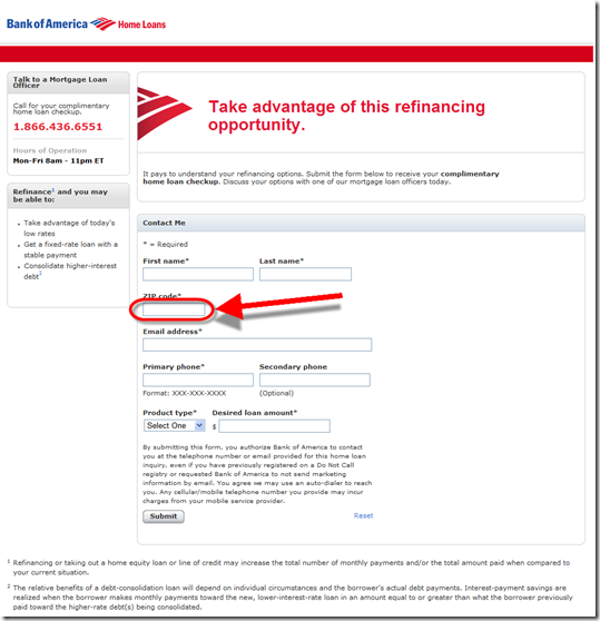
image It’s been awhile since I wrote about a logoff marketing offer (note 1) as they all start to look the same after a while. But after signing out of my Bank of America credit card account today, I noticed its eye-catching graphic promoting mortgage refi (first screenshot below).

But as usual, I was underwhelmed with what followed after the first click. I was taken to a generic lead-capture screen so I could get a call back (second screenshot). There were no chat or online options.

The form didn’t even pre-fill my state or that I was interested in a refi. And it was a dead end. No links, product info, rates, or incentives. I could submit the form to receive a call-back or dial myself right now. (Granted, the bank may have determined from testing that this approach yields the most ROI, but it sure doesn’t work for me.)

It all seems so 1990s. I’ve had a BofA credit card for 20 years, business and personal. They know more about me than my wife does. It’s surprising it doesn’t use at least a sliver of this data to personalize the pitch and/or streamline my request for more info.

—————————————–

Bank of America logoff screen promoting mortgage refinance (6 Sep 2012)

image


Blank refi landing page
(link)

image
———————–

Note:
1. For more information and examples of login/logoff marketing, see our Online Banking Report: Selling Behind the Password (April 2009). 

Wells Fargo Pitching Wachovia’s Way2Save Account at Login

imageWells Fargo generally does a good job with its login product pitches. I like how the bank provides a "Remind me later" and "No thanks" option next to "Apply Now."

However, in today’s pitch for the rebranded Wachovia Way2Save account (see old logo, inset), the bank seems to have forgotten an important part of consumer decision process: explaining what the account is. There is no Learn More button to be found on the ad or landing page.

I had to leave the app and search the Wells Fargo website to determine the rate and unique features of Way2Save (see note 1). The main benefit: users receive a 3% APY on the first $500 in the account for one year, provided they use one or these automated savings features:

  • $25+ per month or $1+ per day transferred from Wells Fargo checking (outside accounts not an option, except for initial account funding)
  • Automatic $1 transfer from WF checking to savings with every debit card purchase or pre-authorized debit  

After one-year interest drops to the prevailing rate, currently just 5 basis points, 1/60th the premium rate. 

Online application process: Choosing Apply Now on the interstitial drops users directly into the bank’s generic online app where’s it’s difficult to even confirm what you are applying for (see upper right corner of second screenshot). 

Since I only have a Wells Fargo credit card, the bank offers me a $5/mo checking account, which is free if I have direct deposit or $1500 on deposit. But the checking account is not required. You can setup a standalone savings account, though it won’t qualify for the interest rate bonus or be able to use the automation tools.

On the final page users can fund the account with a transfer from a Wells or non-Wells deposit account or they can deposit up to $500 via credit or debit card. 

Bottom line: Automatic savings are a win-win. And offering a $15 interest bonus is a good way to improve signups. But Wells needs to explain the offer better so that customers customers are motivated to complete the application.    

————————–

Wells Fargo interstitial login ad for Way2Save (10 Nov 2011)

Wells Fargo interstitial login ad for Way2Save


Landing page, which is the first page of the online application (link)

Landing page, which is the first page of the online application

Wells Fargo online application (page 2)
Note: The bank is still disclosing at $3 debit card usage fee

image

—————————-

Notes:
image1. Way2Save was inherited from Wachovia (previous posts). Here’s the cached 6 Nov page from Google. The page now redirects to Wells Fargo savings.
2. Wells Fargo acquired Wachovia in 2008.
2. For info on online account opening, deposit gathering and much more, see our subscription newsletter, Online Banking Report.

Chase Bank Offers 0% Balance Transfer and Easy Online Transfer

(Ed. note: The original promotion shown below was made by Chase in early April, right before U.S. income taxes were due. But the bank is still offering similar balance-transfer options, as outlined below).

imageWhen I logged in to my Chase credit card account, I was greeted with an imageattractive interstitial ad promising to save me money if I transferred a credit balance to the bank (see Figure 1).

The bank offers two or three choices of terms and rates. Obviously, you can’t beat 0%, but evidently some customers prefer to lock in a lower rate longer. Last week, we had the following choices:

  • 0% for 11 months (thru June 2012)
  • 1.99% for 17 months (thru Dec. 2012)
  • 5.99% for 22 months (thru May 2013)

Each choice also required an immediate 1% fee on the transferred amount (note 1).  
_____________________________________________________________________

Analysis
_____________________________________________________________________

The interstitial ad grabs your attention and the pricing is aggressive, so I expect Chase is getting good takeup. More interesting to me is the actual online transfer process which appeared flawless, though I didn’t actually move any money. My only major criticism is that the prices are a little hard to find, especially the transfer fee.

It’s a great offer and lets the customers see the total price right away. Overall, I give it an A-.

Good:

  • Great, eye-catching graphics
  • Copy is very concise, passing the 25-word “Google homepage” mark
  • Clear benefit, “save/saving” used twice in the 15-word ad
  • Clicking through leads directly to the transfer page where users can accept the offer (see Figure 2 and 3)

Not so great:

     On interstitial ad (Figure #1):

  • Not super clear where to click to take advantage of savings
  • The actual value of the “Great low rate” is not disclosed until after you click-through to transfer page (second screenshot)
  • The laptop graphic image is not particularly interesting

    On the transfer page (Figure #2), :

  • Two choices are virtually identical (0% though Feb. 2012 or 0% through March 2012) and one that’s clearly less appealing (2.99% through Aug. 2012).
  • There is no specific disclosure on the first page of the transfer fee (which I believe is 4%), just the famous “additional terms apply” (the fee comes in step 3, Figure 5)

Recent offers: On my original April 1 test (Figure 1 & 2), I didn’t go through the entire process. So I went back last week to see when Chase discloses the transfer fee. The user is told about the 1% transfer fee (see note 1) during the second step (Figure 5) when they are asked to agree to terms and conditions. The go-to rate after is also listed.
——————————————-

Figure 1: Chase interstitial ad at credit card login (1 April 2011, 8 PM Pacific)

Chase login ad

Figure 2: Landing page to begin balance-transfer process (1 April 2011)

Landing page after login

—————————————————–
Retesting the service
(21 July 2011; 10 PM Pacific)
Figure 3: Step 1 — Select an offer

Step 1: Chase credit card balance transfer process

Figure 4: Step 2 — Enter transfer details (card number and amount)

Step 2: Chase credit card balance transfer process

Figure 5: Step 3 — Agree to the terms and conditions

Step 3: Chase credit card balance transfer process

——

Note:
1. Chase’s 1% transfer fee is much lower than the 4% seen in most other offers. The bank should highlight that number since it’s a selling point.
Discover Card Pushes Paperless with $30k Sweeps after Login

image Getting customers to go paperless is not easy. That’s why only 15% have enrolled even though more than three times that number pay the bill electronically. 

Discover Card is working to change that with a well-executed sweeps. The graphics are impressive (see below) and the dollar amount ($30,000) is enough to get your attention. But what I really like are the three benefits of going paperless listed at the bottom of the screen:

  • View online statements 3-5 days earlier than paper
  • Get an automatic email reminder 6-7 days before your payment is due
  • Access and download up to 24 months of password-protected statements

Analysis
While this is a great effort (Grade = A), I think Discover would be better off dividing the prize pot into ongoing monthly prizes for anyone who is paperless. That reinforces the behavior over time.

Also, I’d add one more benefit to the three listed above:

  • Go back to paper statements with a single click if you ever change your mind

Customers want control of their statements (and payments). So even if they agree to full automation, they need to understand that it’s easy to reverse directions even if few will.

Discover Card interstitial (splash page) when logging in to an account (12 Feb 2011)

Discover Card interstitial (splash page) when logging in to an account (12 Feb 2011)

Landing page

Discover card paperless statement signup

Confirmation screen

Discover Card confirmation after signing up for paperless statements

Side note: On my relatively new account (started in December), Discover prompts me to complete my profile.

Discover Card prompts to complete profile
———————————-

Note: For more information and examples of login/logoff marketing, see our Online Banking Report: Selling Behind the Password (April 2009).  

PNC Bank Pitches Rewards Program at Logout

image The logoff page is one of the most important marketing platforms available to financial institutions (see note). The latest example: PNC Bank’s logoff screen delivered last week after leaving my Virtual Wallet (VW) account (see first screenshot below).

I like the two-column design with useful info on the left side for someone who’s just logged out and on the right a simple eye-catching advertisement for the bank’s free rewards program, PNC Points. A single Enroll Today button makes it easy to figure out what to do next, although that direct approach is not carried through on the landing page (second screenshot).

Overall, it’s a good effort, but I noticed something slightly off — the lack of VirtualWallet branding after logging out. The page is branded PNC Online Banking, and the two choices in the left box are:

  • Return to PNCVirtualWallet.com
  • Return to PNC.com

At minimum, the second choice isn’t worded correctly since I just left my VW account. Worst case, it leaves customers wondering why the bank doesn’t know where they came from. I assume the bank is using the same logout screen for both regular and VW customers and that everyone is accustomed to it by now. Still, it would be better to continue the VW experience all the way through logout.

PNC Bank logoff screen (24 June 2010)

image

Landing page (link)
Surprisingly, after choosing Enroll Today on the logout page above, users go to another sales page, with a less prominent Enroll button buried in the lower right. Instead of this roundabout process, users should go directly to the enroll page. 

image

Note: For more information on login/logoff marketing see our Online Banking Report: Selling Behind the Password published April 2009.  

Bank of America Promotes Text Message Banking at Login

image Logging in to my Bank of America credit card account today, I received a full-page promotion for the bank’s new text-messaging service.

Even though my mobile phone was already enrolled, the bank served the following interstitial encouraging me to to enroll:

Bank of America interstitial 11 June 2010 
Bank of America’s interstitial promotion after logging in to online banking (11 June 2010)

I chose the “enroll now” link in the lower left above and was taken to this page:

image
Mobile enrollment landing page (secure site)

Evidently, I’d already enrolled, which I should have remembered considering I’d blogged about it two months ago.

However, if you arrive at this page, as I did, expecting to enroll in text banking, it’s a bit confusing. It would be helpful to see a bolder statement that “you are already enrolled.” It would also be nice if they provided the short code (692632) to quickly test your phone to verify enrollment. To find that info, you must click the small “Text Banking Guide” link.

Relevance for NetBankers: If you are unable to screen out existing users, make sure you communicate clearly so customers don’t waste their time re-enrolling. 

Note:
1. I don’t know if BofA’s text messaging is down, or if it’s something related to my account, but I am getting no response to my text-message queries (bal, menu) to the bank’s short code (3:41 PM, 4:12 PM, and 4:32 PM Pacific time, June 11). 
2. For more information, see our Online Banking Report: Selling Behind the Password (published April 2009).

Wells Fargo Bank Offers $25,000 to Go to Paperless Statements

image Full disclosure: I’ve always liked sweepstakes. Even though I’m a Diet Coke addict fan, I’ll gladly grab a different cola if it has an “instant win” cap. It’s like a free lottery ticket.

So when banks try to save a few coins switching customers over to estatements, I think it’s the perfect time to give some of it back in the form of a sweepstakes. You’ve created a little excitement in online banking and likely made it all back with a lift to the estatement response rate. ING Direct, Chase and many others have taken this approach in the past (previous coverage).

Wells Fargo’s current sweeps is pretty straightforward (link to details). For every account switched to paperless statements, customers get one entry in the sweepstakes. Ten customers will win $2500 each and one will get $25,000. A relatively small, but effective $50,000 prize pool.

The contest runs from April 12 through June 4.

Login splash screen (interstitial) (19 May 2010)

image

Landing page after choosing “Switch now” above
Note: Link to View Samples (see below)

image

Sample statement (click to enlarge)

image

Logout Marketing: PayPal’s 20-Word “Bill Me Later” Sales Pitch

image Although it usually takes me 40 pages or more to get my points across in Online Banking Report, I am a strong believer in succinct online copy. I especially love online pitches that take no more words than Google’s homepage (the gold standard).

Today I found a great example after logging out from my PayPal account:

You are Pre-Approved to use Bill Me Later!
One Click. Two Questions. No Third Degree.

Choose Bill Me Later when you checkout with PayPal.

20 words. Point made. Give the copywriter a bonus.

PayPal’s logout pitch (14 May 2010)

image

Landing page (link)

image

Note: I’m counting Bill Me Later as one word since it’s a brand name.

U.S. Bank Previews Website Redesign

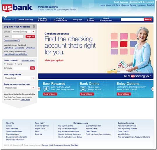
image Although U.S. Bank has long held a state-of-the-art online banking design, its homepage and public website haven’t kept up with modern standards. From the looks of the preview unveiled earlier this week, that will change when the bank rolls out on Friday a major site redesign.

The bank is wisely inviting online banking customers to take an advance peek at the new site. I learned about it Monday via a splash screen after logging in to online banking (see first screenshot below). The preview is also featured in the upper-left of the current homepage (see second screenshot below).

U.S. Bank is one of the last big banks still using a homepage dominated by a list of products and services. Presumably, the bank will move to flyout menus on the tabs across the top of the page (see third screenshot). Another expected improvement: liquid display.  

For existing online banking customers, the biggest change is the repositioning of the login box from the middle-right to the upper-left, the industry standard.

Lessons: It’s important to give online customers advance notice of login changes so they  don’t think they’ve arrived at a fake site. In fact, I think U.S. Bank should have gone further and simply included the preview in the splash page so everyone was forced to see it. Or at least the bank should have a prominent link to the preview within online banking. As it stands now, once you skip past the splash screen, there is no way back to look at the redesign (other than going to the homepage).    

Login interstitial ad announcing the coming redesign (12 April 2010)

image

Before: current site
Notes:
1. Upper-left announcement of coming site redesign, with link to preview shown above
2. Login box placed in non-standard location mid-page on the right

image

After: Preview of new site design coming April 16 (link)

image

Bank of America’s Launches Personal Finance Tips Site

image Bank of America’s latest online effort is a personal finance educational site at <learn.bankofamerica.com> that includes consumer polls, money savings tips, videos and articles. Bank products are sprinkled throughout but the marketing is relatively restrained.

It’s a solid effort. Good, concise copy married to an attractive graphical layout. And for a bank the size of Bank of America, it makes perfect business sense. The site moves a little product, builds the brand, shows off the bank’s consumer-friendly side, provides material for PR campaigns, and gains some CRA credit (note 1). 

But I’m not sure how much usage it will get other than the curious driven to it from banners within online banking. That’s how ended up there today after paying my BofA credit card bill online (see second screenshot below).

Given Bank of America’s 30 million online banking customers, they must not be driving much traffic to the site yet. According to Compete, traffic surpassed 100,000 for the first time in October. July was the first month that traffic was registered at the site.

Unique monthly visitors to BofA’s personal finance tips site (July through October, 2009)

image
Source: Compete

Other than enabling an RSS feed for article updates, the site has no Web 2.0 or social media features. No blog. No forum. It’s just a very pretty face on personal finance 101 material. It will be interesting to see where they take it.

Learn.BankofAmerica.com homepage (link, 13 Nov. 2009)
Note: I completed the poll on the middle of the page, so the results are shown rather than the poll question.

image

Logoff screen (13 Nov 2009, 3 PM Pacific)

image

Note:
1. CRA = Community Reinvestment Act which requires banks to help meet the financial and credit needs of low- to-moderate-income consumers.

Bank of America Offering 1 Year Free McAfee Internet Security at Online Banking Logout

image This is one of the most valuable freebies I’ve ever been offered simply for being a customer. Bank of America online banking customers, new or existing, are being given a one-year free subscription to McAfee, worth $70 at retail.

The fine print is relatively clear (reprinted below, after the screenshot). The main “catches:”

  • Must not have a current McAfee subscription (see Results below)
  • The subscription auto-renews at $34.98/yr, a 50% discount
  • While in progress, the BofA offer never mentions number of users covered (the normal $69.99 subscription from McAfee covers three users, see note 1); however, during checkout, after accepting BofA’s offer, the product description confirms three users are covered with the subscription

Bank of America is also publicizing the offer on its main website (here). To accept, users must log in to online banking first.

Results: I signed up for the account this morning and was surprised to find that you are not required to use Bank of America for payment. In fact, BofA is never mentioned again after leaving the original landing page (see second screenshot). The McAfee cart offered the usual choice of Visa, MasterCard, American Express, PayPal and others. 

Opportunity for financial institutions: Assuming you can swing a deal with McAfee that requires no out-of-pocket expense, offering your customers a year’s worth of anti-virus protection is a win-win. The primary downsides are a few extra calls to customer service and a few irritated existing McAfee customers who do not qualify for the freebie.

Bank of America logout screen (21 Oct 2009; 7 AM Pacific)

image

Fine print on bottom of page above:
This exclusive offer is available only to Bank of America Online Banking customers. Online Banking customers receive McAfee Internet Security for PC free for 12 months, a $69.99 value. At the end of the 12-month period, Online Banking customers are eligible to renew for another 12-month period at 50% off MSRP or $34.98. Customers with a current McAfee subscription are not eligible for this offer. Bank of America reserves the right to modify this offer and eligibility requirements at its discretion.

Landing page (link)

image

Same offer on BofA website (link)

image

Notes:
1. The service is currently offered at a discount at Intel’s software store for $32.95 for one year for three users. Intel’s offer was positioned via paid ad at the number-one position on a Google search for “McAfee Internet security.”
2. For more information on online banking security, see Online Banking Report: New Security Techniques (Sep 2008)