Feature Friday: Getting Phygital with Fintech Startup Root Banking

Feature Friday: Getting Phygital with Fintech Startup Root Banking

Phygital may not be heading for inclusion in the Oxford Dictionary anytime soon. But it does attract attention to your fintech startup, especially when you are specializing in integrating digital and physical channels.

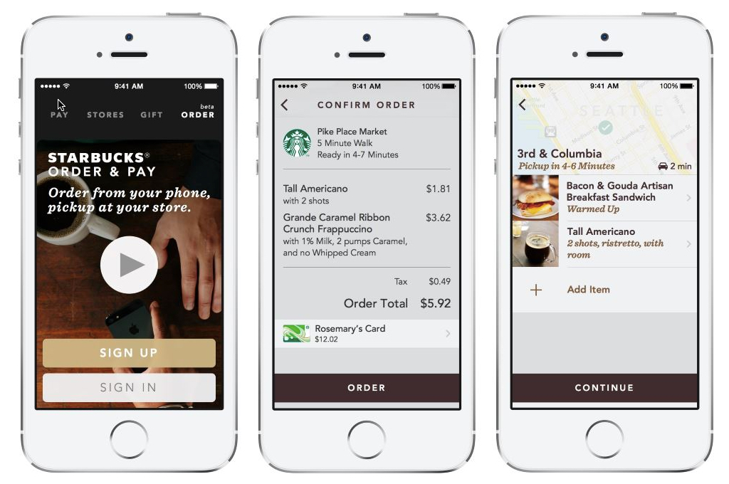
Enter Root Banking, a San Francisco-based startup from industry veteran Matt Krogstad (see note 1). I met Matt when he was at mobile banking pioneer M-Com (acquired by Fiserv in 2011). Fast forward six years, and after stints at Bank of the West and First Republic, Matt is back in the fintech startup world, with a service designed to bring Starbucks-level channel integration to banking.
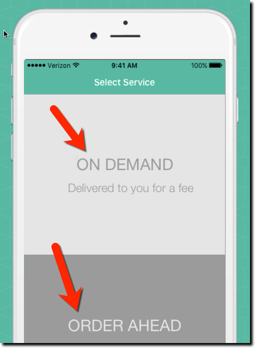
Root Banking’s service connects mobile customers to their branch to order ahead. For example, last Friday I needed a money order to pay a local tax bill when my ACH was inadvertently returned. This was double frustrating. First, my bank fumbles the electronic transaction, then I had to make a trip to the branch and wait in line, then wait at the teller station while they printed up a money order. Had I been able to order it in advance, and just picked it up, the whole thing would have been less unpleasant.

The other primary use cast for Root Banking is mobile delivery. Imagine if my bank would have dropped the money order off at my home (or better yet, mailed it to the City of Seattle treasurer). I probably would have opted to avoid a delivery fee, but it would be nice to have the option.

The startup hopes to integrate their phygital services into the FI’s existing mobile app. But Root will make a standalone app available if necessary. Several banks are piloting the service and are not yet integrating the requests into branch systems, instead simply delivering the requests through secure digital channels.

Bottom line: To me, the order ahead use case is most interesting. Most times I’ve needed to visit the branch (usually for small business matters), there is paperwork that could have been uploaded in advance to reduce my time at the branch by an order of magnitude. Not only is that good for customers, it potentially drives costs out of the system at the branch level. A win-win.


Contributor: Jim Bruene (@netbanker) is Founder & Advisor at Finovate as well as Principal of BUX Certified, a financial services user-experience accreditation program. 


Note:
1. For reference, see Penny Crosman’s 10 January article in American Banker 
Feature Friday: Sweep Accounts for the Mass Market

Feature Friday: Sweep Accounts for the Mass Market

Does anyone remember when sweep accounts were all the rage? They were disruptive technology in the 1980s. The idea was to automatically sweep idle cash from non-interest bearing accounts to savings or investment accounts with higher yields. It’s still a core feature in treasury management accounts for large businesses, but you don’t hear much about it these days on the retail side.

Why? The small differential between checking and savings or money markets hardly justifies the trouble. If the average annual amount swept to savings was $2,500, it would only net an extra $1 or $2 annually (after tax) from a typical large U.S. bank, or up to $10 in a “high interest” account from a community bank or credit union.

But if instead of sweeping idle cash into savings, what if you could use it to pay down, even temporarily, a personal loan or revolving credit balance? All of a sudden, that $2,500 cushion is worth $300 or more annually (assuming 12% APR), 150x the return of sweeping to a bank savings account. That’s enough to get your customers’ attention.

Some overdraft credit lines work this way. You can freely transfer money between credit line and checking to minimize interest charges. I had the feature at US Bank years ago. During cash-strapped times, I would keep $0 in checking and every time I wrote a check it would trigger an automatic (and fee-free) credit line advance. It was a great system, but when the bank started charging fees on each automatic transfer, I abandoned my “sweep account” hack.

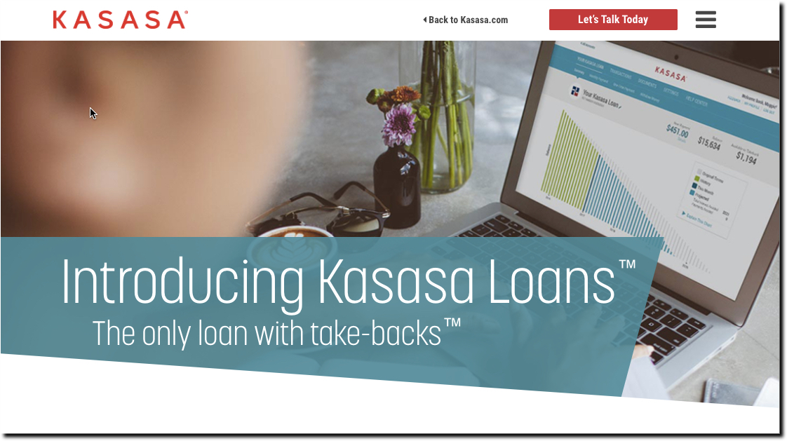
Fast-forward 10 years and Kasasa has reinvented the credit-line sweep with its hybrid loan product launched today. Kasasa loans offer a “take back” feature which allows consumers to pay down their loan balance at any time, and then get those extra funds back at any time in the future free of charge. Basically, in banking jargon, it’s a fixed-rate installment loan (with a repayment schedule), married to a credit line that allows you to move money in and out up to the extra amount you’ve paid in (see note 1). One sees this in the home equity space, but not in the personal loan arena.

A key part of the account’s appeal is the Loan Management Dashboard. Without the dashboard, the changing balances and available “excess” would be a customer services nightmare to explain and track. The dashboard makes it (relatively) simple to move money back and forth. There will be some customer service questions, but they should primarily be one-time only.

Bottom line: Kasasa’s hybrid loan is a winning concept, especially for its community bank and credit union clients looking to differentiate themselves from the big banks and online lenders. It’s a user-friendly approach that should play well with their loyal customer/member bases. The laon does have the downside of cannibalizing deposits while lowering loan balances. But with proper marketing, a Kasasa speciality, the incremental loan balances (and customers) should far outweigh the lower deposit totals.

Author: Jim Bruene (@netbanker) is Founder & Senior Advisor to Finovate as well as Principal of BUX Advisors, a financial services user-experience consultancy. 


Note:
(1) Unlike a credit line where you can always borrow to the maximum credit line, in the Kasasa Loan, you can only borrow back your excess contributions. This is a benefit for consumers who prefer the discipline of a fixed repayment period rather than an open-ended credit line.

Friday Feature Request: Banking/Card Transaction Annotation via Email

Friday Feature Request: Banking/Card Transaction Annotation via Email

simple_annotation

On Fridays, I try to post a new digital banking feature I’ve recently discovered. But with nothing to report this week, I will instead take the easy route and make a request for a new feature:

Feature: Transaction annotation by email

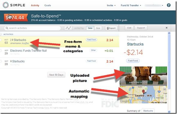
BBVA’s Simple has been a leader in adding richness to transaction detail. We reported here on its web-based solution for annotating transaction in late 2012 (see screenshot at top of post). Basically, that capability needs to be ported to email for, forgive me, simpler access.

The specs:

  1. After each transaction that hits my account (preferably ALL my aggregated accounts), I get an email confirmation of each transaction with whatever data the bank/PFM can already provide on it (amount, date, merchant, category). Using a free-form field, I add whatever text I want to the description, attach a photo or file (if I so choose), and categorize it (if I’m that kind of a user).
  2. Depending on how the feature is implemented, I press enter or hit reply and my annotations are recorded into my permanent transaction archives at the bank/PFM. Note: You must have a long-term archive solution in place for this feature to have value.
  3. The transaction details must be in the email message itself so that I can use my email client to forward the message to others, flag for later attention, or file.
  4. The same thing could be done via text (with a link) or notifications, but email is the key for me.

Bottom line: For me, this would be one of the best things a bank, card issuer or PFM could do to cement my loyalty—and perhaps even cough up a modest subscription fee. I want my transaction history to be both a personal diary, e.g., traveling or dining out; a tax record, for business or charitable transactions; and a searchable resource for future questions, e.g., What did I pay last month for cable?

——–

Note: Hit me on Twitter (@netbanker) if you know someone already offering this.

Feature Friday: Capital One Offers $20 Incentive to Try ShopSavvy Mobile Wallet

image I have been fascinated with mobile wallets for a while (note 4). They’ve been “just a few years out” since the first Finovate (Oct 2007), where multiple mobile banking pioneers laid out their product roadmaps. And now we are starting to see real implementations. Not just Square and Starbucks. But financial institutions are moving forward. 

ShopSavvy app with single-slide purchasingThe latest rollout, the Capital One and ShopSavvy deal, was announced last month (press release). Capital One has already partnered with several major card-linked offers providers (and acquired one), but apparently it is still looking to boost its mobile efforts (note 1).

ShopSavvy is a San Francisco-based startup which has built a mobile wallet, shopping and deals apps. It has raised $11 million, two-thirds from Facebook co-founder Eduardo Saverin.

The company has integrations with a number of online merchants including Walmart, Barnes & Noble, Overstock.com, Target, Best Buy and others (note 2). Those links allow users find online prices, either by scanning a bar code in-store or in-app search, then purchase online with a single slide (see inset).

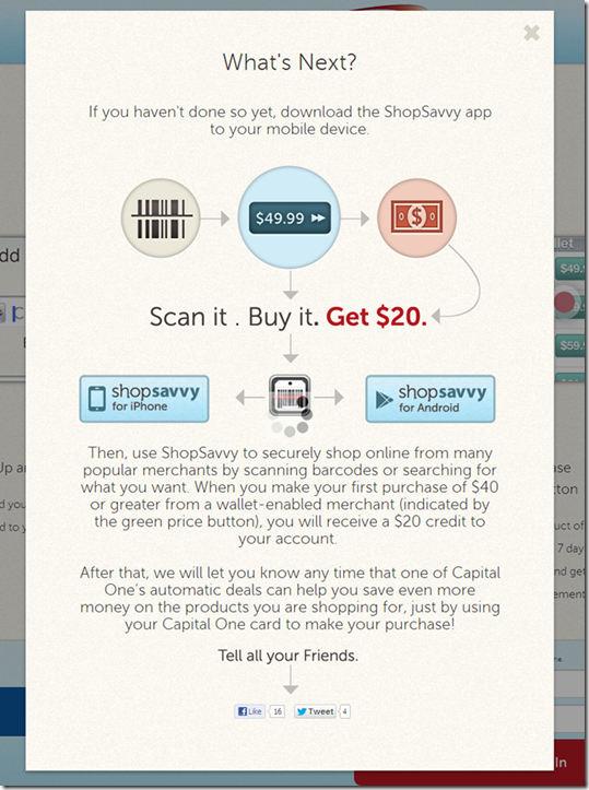
I got the invite from Capital One Wednesday morning with an eye-catching $20-off offer (see first screenshot below). But this wasn’t like a straightforward card-linked offer where cardholders activate the deal and then buy. 

To bank this savings, users had to power through a three-stage process:

1. Sign up for an account at ShopSavvy using the link in the email. It’s a relatively painless process, taking just a minute or two. None of my personal info was prepopulated (see screenshot #3-5 below).

2. Add the app to your mobile phone by locating the ShopSavvy app in the App store, downloading and opening.

3. Activate the ShopSavvy app by entering your username and password and repeating the info you’d entered online to set up your profile.

Altogether, it’s a somewhat convoluted 5- to 6-minute process, but one that is probably acceptable for early adopters. I did have intermittent problems with the app, network errors, crashes and bizarre search results (note 3). But it seems to have stabilized now after the initial usage spike. 

Bottom line: Once it started working properly, the ShopSavvy features were impressive. The simple search combined with one-click purchasing would make a nice addition to a bank or card issuer’s mobile app. I’m still a little surprised that Capital One is endorsing a third-party wallet. But by getting its card “top of e-wallet,” the giant issuer boosts charge volume, mobilizes its card-linked offers, and gets a foothold in the wallet space.

——————————

Capital One email to customers offering a $20 statement credit to use the ShopSavvy wallet (12 March 2013)

Capital One email offering $20 discount forthe first use of ShopSavvy wallet

Landing page at ShopSavvy (link)

ShopSavvy Capital One landing page

Step 1: Join ShopSavvy

ShopSavvy signup process

Step 2: Add Capital One credit card

ShopSavvy signup, enter Capital one card

Step 3: Locate, download and activate the ShopSavvy mobile wallet app

ShopSavvy download instructions

——————————–

Notes:
1. Or perhaps this is more of a straight revenue-play for Capital One, with ShopSavvy paying the card issuer for each new customer.
2. Unfortunately, ShopSavvy’s one-click experience does not extend to Amazon.com, but the app does display Amazon prices and it’s just a few more clicks to buy there.
3. Initially, I tried the app with a few barcodes I found at home and it worked, but only on the media stuff. Since I didn’t want to buy anything I already owned, I went to the last remaining bookstore in northeast Seattle and gave it a try. Unfortunately, this store covers the regular barcode with its own, which are not indexed in the ShopSavvy database. But when I tried it again last night, the search function was working so I was able to easily find a DVD set and buy it from Target.com for a competitive price (even before the $20 statement credit). 
4. For mo
re info on mobile wallets, see our most recent Online Banking Report: Mobile & Cloud Wallets (Feb 2013, subscription)

Feature Friday: Fifth Third Combines Debit & Credit on DUO Card

image Transactional banking is fairly straightforward. There are electronic payments, ATM withdrawals, debit card payments, credit card charges, and checks.

When a technology comes along that offers to combine three of those in a familiar form factor (plastic card), you would think it would catch quickly. 

But combined credit/debit cards have not gained much of a following yet. With one big exception: Fifth Third Bank.

In 2011, the Cincinnati-based bank, the 15th largest U.S. retail bank with $120 billion in assets, launched a combined credit/debit card called DUO. According to American Banker this week, “(DUO) has recently accounted for about 25% of new credit card accounts” at the bank.

My take: That may or may not be a large number depending on the bank’s overall card marketing efforts, but it’s a good indication that there is at least some consumer demand for the so-called hybrid card. Personally, I stopped carrying an ATM card years ago, so I would love having ATM access added to the credit cards I tote around. I would even pay a modest fee for the convenience (note 2).  

True, the mobile wallet holds the promise of combining everything into one grand app. However, it’s a long, long road to mass adoption. Seventeen years into online banking, it’s still used regularly at less than 60% of U.S. households (note 3).

So bring on the hybrid cards, but make sure there is also a killer mobile app supporting them.

————————

Fifth Third landing page for its combo DUO card (link)

Fifth Third landing page for its combo DUO card

——————————

Notes:
1. It’s been 17 years since Web access was first launched by Wells Fargo (May 1995). Dial-up online banking predates that by more than a decade, but it was used by such a small group that it doesn’t really rate a mention.
2. “Modest” would be in the $1/mo neighborhood, unless there more features were added.
3. Source is our annual forecast (subscription, Jan 2012) which we are in the process of updating and will be available in a few days. 

Feature Friday: Branch Wait-Time Widget

image The inspiration for today’s installment is from The Financial Brand which wrote about a new app from branch automation provider, Better Branches. The widget shows the real-time queue at various branches so customers can better time their visit. The company offers a mobile and online version (screenshot below; see note 1).

While, I’m not convinced the branch feature would be used that often (Really? How many branch-centric customers are going to query their iPhone or hit the website before heading out?), I like the overall concept for these reasons:

  • Differentiates your online/mobile services
  • Shows your concern over the customer’s time
  • Reinforces your branch footprint
  • Demonstrates your tech chops

What is much more helpful for most online/mobile customers is call-center wait times, something Ally Bank positions clearly on its homepage and recently launched in its mobile app.

————————————

Better Branches wait-time mobile app and desktop widget (29 June 2012)

image

—————————–

Note: No financial institution users were cited in the article. But according to a comment left by Brett King, of Bank 2.0 fame, RBS offers this feature in the UK.

Feature Friday: Universal Checkbook from Personal Capital

imageOne of my favorite features unveiled last week, was Universal Checkbook from Personal Capital. And apparently I wasn’t the only one. Attendees voted the startup Best of Show (again) and hit Twitter with positive comments such as the one below from Brad Leimer (@leimer) of Mechanics Bank,.

Universal Checkbook (see inset) allows users to move money directly between any linked bank/brokerage accounts, providing they have check-writing capabilities.

imageWhile many banks also support interbank transfers, they usually require funds to move in and out of the host bank account. To move money between two third-party accounts requires two separate transfers. And it would take 5 or 6 days (via U.S. ACH system) if you waited for the funds to arrive in the host account before sending them elsewhere. 

In the demo, Personal Capital showed how easy it is to enroll a new bank accounts using deposit capture to grab a check image from that account. However, this enrollment option is not yet available in the production iPhone app (note 2, 3).

Pricing: There is no word on pricing, but it looks like there may be a fee eventually. On the bottom of the pay screen it says, "Try Universal Checkbook FREE for three months!" Because Personal Capital offers basic PFM services ad- and fee-free, it will likely need fees for money movement, at least for users not committing any assets to the startup.

————————–

Tweet from Bradley Leimer (@leimer) during Personal Capital demo at FinovateSpring (8 May 2012)

image 

————
Notes:
1. We took an in-depth look at truly virtual banks (Personal Capital, Bank Simple, and PerkStreet) in our Oct 2011 Online Banking Report.
2. The app doesn’t yet explain how to enroll new payment accounts, evidently the image capture capability is still in process.
3. Universal Checkbook has not yet been incorporated into Personal Capital’s iPad or desktop versions.

Feature Friday: Wow! More City Bank Texas Mobile Controls for Debit Cards

imageLuckily, I ran into Jim Simpson, SVP IT at City Bank Texas, at Finovate Tuesday, or I might have missed his bank’s significant new app update this week.

imageI am so impressed with what they are doing down there in Lubbock. First, it was the debit card on/off switch a few months ago. And now they just added three new control switches (see inset):

  • Increase daily withdrawal limit at the ATM
  • Increase daily debit card purchasing limit
  • Allow foreign transactions

All three controls temporarily increase limits so customers can easily approve their own authorization exceptions (within limits). 

Bottom line: Putting more control into the customers’ hands is what mobile banking is all about. And City Bank has taken the lead.

But they are just getting started. From what Jim told me this week, they have plenty of other ideas in the hopper. Keep an eye on these guys. 

Update 17 May: I neglected to mention that the software is from Austin, TX-based Malauzai Software.

Feature Friday: Paying Online with Cash

imageI love headline alliteration and it’s good to have a shtick, so I will periodically post a “Feature Friday” here. It turns out I started last Friday with Capital One’s new mobile rewards feature, the ability to trade rewards points to pay for PAST travel (and they did it without resorting to time travel).

PayNearMe mobile option This week, old-school cash was in the news:

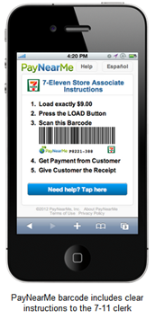
  • Finovate fan favorite PayNearMe launched a mobile version of its cash-based payment service that allows users to buy online then take the receipt to 7-11 to pay in cash (or card). Until now, the system relied on a printed receipt to hand over to the cashier. And printing is so 2009. The new mobile version (inset), does away with the printing, allowing users to show the cashier a barcode rendered on a mobile phone. From then on, the process is the same.
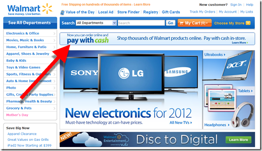
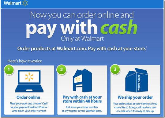
  • WalMart just launched a “pay with cash option” that works with its Walmart.com site (screenshots below). The company could extend the service to purchases at other ecommerce sites if it wants to drive more traffic to stores.

Relevance for Netbankers: While we don’t spend much time here discussing cash, it’s still important across most demographics. And banks have a huge stake in the game with their ATM bases and other cash-handling infrastructure.

Banks could do the same thing as PayNearMe, using their branch and ATM networks to take cash over the counter as payment. And many parents may prefer sending junior to the bank instead of the convenience store.

But I also wonder if we’ll see the reverse? Instead of handing cash over to the 7-11 clerk, parents can transmit a bar code to their kid’s mobile to allow them to walk out of the store with a crisp $20 for lunch and a bus ride home. And it would make sense to extend that capability to mobile-enabled ATMs and even branches.

Anyway, that’s all for this week, have a great one!

———-

Walmart homepage (27 April 2012)

Walmart homepage promotes pay with cash option

Homepage popup lays out how it works

Walmart.com popup lays out how it works


Walmart checkout

Choose “cash” icon under “enter a new payment method”

Walmart online cart with "cash" payment option

Capital One Add Rewards to Mobile App, Includes Ability to Redeem for PREVIOUS Travel

Capital One mobile rewards main page Although it was one of the last major banks to launch an iPhone app, Capital One is now positioning itself to be a leader in mobile. Its April 5 iPhone app update included a new rewards function that’s the best I’ve seen.

Rewards point totals are clearly shown on an old-school “flip number” display (see screenshot right). But the novel part, and this may be an industry first, is the ability to redeem rewards in real-time, for travel purchases you’ve ALREADY MADE. (You can also redeem for cash or gift cards.)

I thought this was some kind of typo when I first saw it in the marketing material. So I tested it myself this morning. And sure enough it does exactly what it says.

Previous travel purchases made on the Capital One card are displayed in the app. Users select the one(s) they want to redeem for mileage points and Capital One provides a statement credit to refund the user for the purchase. Brilliant!

———————-

Capital One’s mobile reward redemption for previous travel (20 April 2012)
Note: Select a transaction (below left), confirm (below right).

Capital One mobile rewards screen      Capital One mobile rewards redemption confirm      


imageI also like Capital One’s new app “home page.” Instead of forcing a login before users can do anything, the bank offers several non-secure content areas:

  • Browse our products
  • Find branch/ATM
  • Mobile banking FAQ
  • Contact us

These are useful for customers who can’t or don’t want to log in. And of course, for prospects kicking the “mobile tires” at the bank.