E-Mailbag: Everbank Addresses Falling Rates with Three Deposit Options

With the personal finance news full of reports of falling deposit rates, EverBank strikes back with an eye-catching email overview of its high-yield deposit choices:

  • Yield Pledge Money Market
  • Yield Pledge CDs
  • FreeNet Checking

The bank's yield pledge, to always offer a rate in the top 5% nationwide, helps take the customer's mind off the actual rate itself, which may not be as high as they'd like (see screenshot below). Not that EverBank isn't competitive on rates. The bank still offers 5% APY's in a number of key deposit products including its Money Market account and most CDs. And it sweetens the pot for new customers with 3-month introductory rates of 6%.

Analysis
Nicely done email with an appropriate, and eye-catching graphic, to-the-point copy, personalization, the yield pledge, and links to all the right places.  

Grade: A

Email header 

Sent: Tue 9/25/2007 2:04 PM
From: EverBank News [service@everbank.com]
To: <your email address>
Subject: 3 high-yield accounts – to fit your style

Personalization: First name in salutation

Email body

Password Reset Alert from American Express

I received an email from American Express late last night after resetting my password earlier in the day (see screenshot below). I can never remember my AmEx password, because I can't use my usual one due to the company's surprisingly short field of just 8 characters that also doesn't support special characters. I have it written down somewhere, but I can never find that either.

I went online late Friday afternoon to pay my overdue bill at AmericanExpress.com. I was pretty sure it was one of three possibilities, but after two unsuccessful attempts, and with the website warning me the third attempt would cause a lockout (note 1), I decided to go through the online reset process instead. 

That was easy. I just needed the card number, the code on the front of the card, and the answer to a security question. At that point, AmEx displayed my username and let me reset the password. It's one of the easier reset processes I've tested. That's a benefit to customers and helps cut customer service costs for AmEx. 

But the thing I liked most was the email message sent later that night informing me of the password reset (screenshot below). But I don't understand why it was sent more than six hours later. Why not send it right away? That would be way more impressive to customers, and would help reduce any potential fraud or privacy violations. Better yet, send a text message right to the customer's mobile, so they have real-time knowledge of the account changes.

Email Critique
Personalization: The company uses two pieces of personalization, cardmember name and the last five digits of the account number, to differentiate this message from the average phish. Excellent.  

Subject line: Your American Express Forgotten User ID is good and right to the point

From: "American Express" using an American Express email address. Good.  

Headline: Verify Your Account Transaction is a little confusing. All I did was reset my password. I'm not sure that average person views that as a "transaction."

Copy: The copy is short and to the point, but it could use a little editing for clarity. The third sentence, "If you did contact us…." seems unnecessary. And "If you did not complete the retrieval…." is not very user friendly language.

Design & Layout: Excellent.

Overall Grade: A- for the message, B- for timeliness

Note:

1. We recommend allowing more than three attempts before lockout. It's pretty easy to forget a digit or make a typing mistake. See our Online Banking Report on Security (#119) for more information.  

Everbank’s Latest Multi-Currency CD: World Energy Index

Some companies are so innovative, you take them for granted. Five that come to mind, in no particular order:

  • Yodlee: account aggregation, credit card-based bill payment, mobile banking
  • Vancity (Canada): microcredit, green banking, blogging, community involvement
  • Wells Fargo: simple expense tracker, blogging, Second Life
  • PayPal: email-based payments, confirmation via twin deposits, integration into eBay (before it was part of eBay)
  • Prosper: Social lending, open API to most of its aggregated data, groups, auction style, Facebook app (game)

These companies are all relatively famous, but one that doesn't get nearly as much press, but has long pushed forward on a number of fronts is Everbank. From its website design (here), product marketing (here), to its foreign-currency certificates of deposit (here), the Jacksonville, FL-based bank continues to shine in an increasingly crowded online space (all previous coverage here). 

My inspiration for this post (see note) was the bank's marketing email today announcing its World Energy Index CD, a multi-currency certificate pegged to the currency of four western countries with better-than-average energy resources: Norway, Canada, UK, and Australia. I have no idea if this CD is a good investment, but I do know that Everbank has proven that even the narrowest niches can be profitable using the reach of the Internet.

Everbank Email

Header:
   Date/Time received: July 17, 4:07 PM (Pacific)
   From: Everbank News [service@everbank.com]
   To: James [jim@netbanker.com]
   Title: A new CD with a powerful combination – energy and currencies

Customer type: Current checking account customer

Personalization: First name in salutation

Landing page: none (homepage link only) 

Other offer: Third-party investment newsletter offer (link on right-hand side goes directly to newsletter publisher, Agora Financial Publications, landing page here)

Note: I have had an account for ten years at Everbank. Therefore, I see more of their marketing material and tend to write about them more frequently.

Mobile Identity Theft Protection from Intersections

This week, I took a two-day break from writing the next issue of Online Banking Report, an update to our popular report on Credit Bureau Monitoring and Identity Fraud Protection (2002 report here), to attend the Mobile Commerce Summit

Much to my surprise, an email received today nicely integrates those two topics. The offer sent was sent with the subject, "Mobile Identity Theft Protection," and it came from WireFly an online wireless reseller where I'd previously purchased a Blackberry.   

Very interested to see the mobile connection, I looked at the full message (below), a well-crafted offer for Identity Guard services from Intersections. The seemingly to-good-to-be-true offer: a full year of credit monitoring, with SMS alerts, free of charge.

Apparently, Intersections, like PayPal and SunTrust, is using free credit report monitoring as an introduction to its full-service credit report and ID theft protection services. It's an aggressive move that has repercussions for the industry. We'll look at its strategy in detail in the new report to be published in July.

Email offer from Wirefly for mobile identity theft protection

ING Direct Offers 1% Cashback for 60 Days

Email from ING Direct announcing cashback bonus I just received an email (inset) from ING Direct announcing a 1% cashback promo for its Electric Orange debit card. Not surprisingly, the rebate applies only to signature debit, where interchange fees cover the cost.

Initially I thought it was a permanent feature of the bank's new paperless checking account. But after clicking through to the landing page (see screenshot below), I discovered it's just a two-month promotion, running June 1 through July 31.

Given ING Direct's staunch consumer advocacy positioning, I am a little surprised it is not a bit more upfront about the two-month time period. Perhaps it's just an oversight, or maybe they are testing different copy treatments.

The 1% offer is also shown on the bank's main Electric Orange product page (here). Again, there is no mention that it's a promotion until you click through the "1% cashback" banner.

Analysis
Overall, it's a good promotion. A clear benefit for the customer and limited duration for the bank. And it helps build awareness that ING Direct supports debit card use at the point of sale, a relatively new feature for the direct bank. See previous coverage here.

Landing page (here)

Zopa Provides Update on U.S. Launch Plans

Zopa email 19 April 2007 update on US launch plans Without providing specific dates, Zopa sent an email to its house list today providing a progress report on its upcoming U.S. launch (see inset). The person-to-person lending exchange now expects a national launch rather than the state-by-state approach previously announced.

The company said it's completed its site redesign, underwriting system, ID verification system and product lineup. And signaling the importance of its U.S. launch, Zopa named a new CEO, Doug Dolton, who will run both the U.S. and U.K. operations out of San Francisco.  

The email raised more questions about the exact business model to be employed, saying only that it's "made adjustments to Zopa necessary for launching in the U.S." Zopa has been talking to credit unions about partnering, but no announcements have been made (previous coverage here).

Email: Bank of America’s "Ring in the New Year" Credit Card Balance

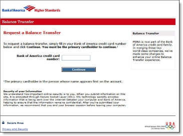
Here's a timely email from Bank of America, inviting its credit card customers to start the year off with a 3.99% balance-transfer offer. But the savings won't last long, since the rate resets after August 2007.

Here are the specs:

  • Subject: Use your Bank of America® credit card today.
  • From: Bank of America [BankofAmerica@loyaltyemail.bankofamerica.com]
  • To: jim@netbanker.com
  • Product type: Credit card balance transfer
  • Offer: 3.99% through August 2007 (cash advance fee NOT waived)
  • Customer type: Mailed to current credit card customers
  • Personalization: Full name and last 4 digits of account number

Screenshots:

Email body


Bank of America email with 3.99% credit card balance transfer CLICK TO ENLARGE

Landing page

Bank of America landing page from credit card email CLICK TO ENLARGE

Boeing Employees Credit Union Email: "BECU Gift Cards Make the Perfect Holiday Gift"

Boeing Employees Credit Union <becu.org> starts the holiday shopping season off with an email pitch for its prepaid MasterCard gift card. At $2.50 each, they are a bit less expensive than one hanging in Safeway for $4.95. However, the CU neglected to disclose dormant account fees, a significant issue with consumer advocates.

It's too bad you can't order the cards online. Ideally, members should be able to order with a single click (or two) right from within the online banking function. Maybe next year.

Screenshot (click to enlarge)

Boeing Employees Credit Union (BECU) email CLICK TO ENLARGE

Classification

Type: Marketing email for prepaid debit
Product: Prepaid debit cash card (MasterCard)
Offer: None (cost is $2.50 plus the cash value)
Customer Type: Sent to nonmembers
Personalization: None
Links: None
Call to action: Toll-free phone, branch

Header

Date received: Tues 11/28/2006 6:08 AM
From: BECU [reply27974@enews.becu.org]
To: Jim Bruene
Subject: BECU Gift Cards Make the Perfect Holiday Gift

Comments

  • Even if gift cards cannot be ordered online, the credit union should include a link or URL for more information. Since many email recipients will automatically go to BECU's website to purchase, it would be helpful to specifically mention the cards cannot be ordered online, and why.
  • The opt-out and CAN-SPAM disclosures could be better designed.
  • Add disclosures for any monthly fees that kick in if the value is not used by a certain date.

Chase Fails to Design Email for Outlook’s Preview Pane

More than 70% of business-email users view most or all of their email messages in the preview pane.* Depending on screen size, resolution, and window sizing, the real estate available in the preview pane can be relatively small.

When designing messages, be sure to put the most important information in the upper-left corner to maximize visibility in the preview pane.

Here is a poorly designed email Chase sent to confirm posting of a credit card payment. It requires users to scroll right to view Chase's logo and log-in button. Here's how it looks on my 12-inch laptop screen running at 1024 x 768:

What not to do from Chase:

Chase email alert

Better design from Bank of America graphics flush left:

Bank of America email alert CLICK TO ENLARGE

(Note: BofA shows the last four digits of your account number; we changed them to xxxx in the screenshot above.)

Action Items
Even though it's just a routing email message, the poor layout makes it look like a phishing message. Chase could clean this up with just a few minutes of programming work. While they are at it, they should add a personal greeting and additional text disclosures to make it look less phishy. 

*For more information, read our Online Banking Report #129/139, Email Marketing for Financial Services.

PayPal Email: Simple Steps to Protect Against Fraud and ID Theft

Despite calls for banks to stop marketing via email (see here) to help reduce fraud, PayPal, probably the most phished brand in the world, shows that the technique can still be effective. 

It requires a professional layout, good personalization, and behind-the-scenes fraud monitoring to nip phishing attempts in the bud.

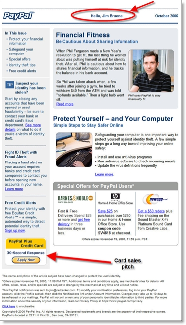
Here's the latest from PayPal. Note the 30-second credit card button (bottom left) and personalized greeting at the top of the message.

PayPal email

Classification

Type: Marketing email with educational focus

Product: Payments with credit card cross-sell

Customer Type: Active customer

Personalization: Hello <yourname> at top of message

Header

Date received: Wed 11/1/2006 9:38 AM
From: PayPal [paypal@email.paypal.com]
To: Jim Bruene
Subject: Simple Steps to Protect Against Fraud and ID Theft

TrueCredit Email: "Credit is Scary"

I'm a sucker for holiday-themed messages. There's something about a big, well-timed graphic that makes an email stand out from the crowd.

Here's the latest from TrueCredit, a prolific emailer to ex-customers such as myself. I usually hear from them every week or two.

Date: Tue 24 Oct 2006 9:27 AM
From: TrueCredit [truecredit@email.truecredit.com]
Subject: Autumn Special: James's 3 credit scores

Personalization used: My first name in the subject and message body

TrueCredit Oct. 24 email to ex-customers CLICK TO ENLARGE

Everbank’s Latest Email Newsletter

Everbank <everbank.com> has been an active emailer, sending a newsletter every few months for the seven years I've maintained an account there. The newsletters have always been chock full of content, from general finance topics to detailed discussions revolving around the bank's unique currency- and commodity-related products.

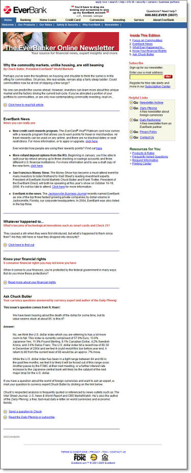
The newsletter design has evolved with the times, from plain text in the 1990s to the well-designed HTML missive we received last night (see below). The short headlines letter encourages customers to click through and read the full document at the Everbank website (see End Notes).

Email Sample
Date/Time: Oct. 11, 2006, 8:59 PM (received 10:24 PM Pacific Time)
From: EverBank [service@everbank.com]
To: James
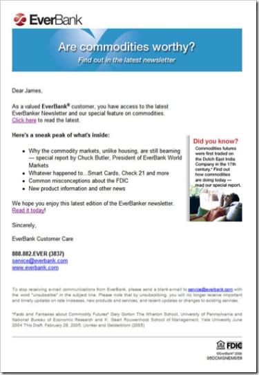
Title: Are commodities worthy? Find out in the latest EverBanker newsletter
Personalization: Dear <firstname>
Signature: EverBank Customer Care

Everbank Oct newsletter CLICK TO ENLARGE

Analysis
Email
There is little to criticize. The short email is direct and to the point. Its layout lends itself well to viewing within the preview pane. The small "did you know" box adds an element of interest, and the drop-shadow makes it stand out. 

With four major articles, it makes sense to send just the headlines and ask the reader to click through to the website to read the full article. However, the bank should use the standard convention of hyperlinking each article directly to the appropriate place on the website.

The bank does include two hyperlinks to the Web-based newsletter, a "click here" in the first paragraph and a "read it today" at the end. However, for even better usability, the bank should add a big shiny button that leads directly to the Web version.

Web-based Newsletter
The website demonstrates good usability in its layout and content. A synopsis of each article is provided on the main page and users click through to read the complete article. It's useful and well-written information, better than a lot of what you read in mainstream consumer-finance publications. We especially liked the "whatever happened to" look-back at some recent initiatives, such as Check 21, and the overview of consumer-protection laws.

As good as the newsletter is, we couldn't stop thinking that it would work much better as a blog. That way, readers could pursue subject threads and more easily peruse all that Everbank provides. The bank could also experiment with accepting comments to make the whole experience more interactive.

Overall grades:
Content: A+
Email design: A-
Website (newsletter) design: A

End Notes
Click on the following link to see a screenshot of the newsletter landing page.

Newsletter Landing Page (here's the link)

Everbank_newsletter_11oct06_landing_1