Design: Pelican State Credit Union Reinforces Auto Loan Mailer with Homepage Notification

image Integrating offline marketing with online fulfillment is a promising way to improve ROI. Pelican State Credit Union grabs member attention with a temporary yellow bar across the top of the page (see screenshot below). It directs members that received an auto loan direct mailer to an online application.

I like this approach. It garners attention for the offer, but the narrow banner disappears permanently once users click the X in the upper-right corner. 

However, this extra attention can be a mixed blessing. It’s great for those members that received the offer (and remembered they did). But for everyone else, they are left scratching their heads after clicking "more info." 

The landing page doesn’t mention how to check whether you were one of the chosen recipients or how you might otherwise qualify for the deal. It also does nothing to reinforce the offer, which apparently was for an auto refinance. The slim copy simply points everyone to the generic online application. 

Bottom line: The yellow bar across the top is a great way to grab attention. But, you need to answer basic questions about the promo or you risk irritating members (see note.

————————————

Off topic: The CU is nicely decked out for the holidays with three timely messages among its five rotating promos: 

  • Visa Gift Cards, which unfortunately, require a trip to the branch to purchase (see first screenshot)
  • Double rewards points for using its Visa card in December
  • General holiday greeting, which leads to a YouTube picture collage with music

——————————————

Pelican State Credit Union adds an Auto loan promo reminder at top of page (18 Dec 2012
Note: The CU also is nicely decked out for the holidays.

image

Landing page for Auto Loan Refinance mailer
Note: Blank box on left makes the page look like something is broken.

image

———————————
Note:
1. The CU has a prominent "chat now" button, so interested members could potentially get a quick answer there, assuming CSRs manning the chat are equipped to determine eligibility.

Financial Direct Mail Drops 10%, Still Delivers 40 Offers to Every U.S. Household

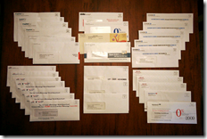
image Did your recycling bin feel a bit lighter last quarter? According to Mintel Comperemedia, financial service direct mail was down 10% in the latest quarter:

Total
Q1 2008:  4.2 billion pieces  Down 10%
Q1 2007:  4.6 billion pieces

Credit cards
Q1 2008:  2.6 billion pieces  Down 14%
Q1 2007:  3.1 billion pieces

I’d like to think that online marketing has turned the corner and is finally making a dent in traditional direct marketing. But it’s probably more likely that card companies, using stricter underwriting, simply had 14% fewer credit-worthy prospects. Plus, a few more people are opting out of snail mail (see note below).

Assuming 80 million credit-worthy households in the United States (out of 110 million total), the average household received 53 mailings in first quarter. If you are prime or alt-prime credit, you likely saw little-to-no change in your junk mail pile. 

Note: photo credit
Proving once again that you can find anything online, the picture above is from Jason Carter’s blog where he is collecting credit card offers. This is his first-quarter haul, 23 for his wife and 7 for him. While that is slightly below the national average, Jason has been actively opting out of direct mail offers, so it is not a representative example. 

ING Direct Launching in Seattle

I received a mailer yesterday at my Seattle home address announcing ING Direct's upcoming launch in Seattle (see scan below). This version at least was sent only to existing ING Direct customers. Note the inside headline with an appropriate local touch, "Seattle's Getting More Bean for its Buck." 

There are not many specifics in the orange self-mailer, other than "You'll soon be seeing us all over the cityfrom Puget Sound to Lake Washington spreading the savings message." I'll keep my camera handy to capture big orange visuals as the company arrives on the scene.

So, it doesn't sound as if we're getting a famous ING Cafe (see inset, the newest one in Chicago). However, I do have the opportunity to earn a $10 referral bonus by handing out the two detachable cards that came with the mailer (see note 1). The new account holder also earns a $25 bonus. Customers can sign up through the mail using the card, or go online to a special landing page <ingdirect.com/seattle> (see screenshot below).   

Seattle mailer front

ING Direct Seattle mailer front

Seattle mailer back

ING Direct Seattle mailer back

Landing page for Seattle offer <ingdirect.com/seattle>

ING Direct Seattle landing page

Note:

1.  On the above scan, you can only see the top portion of one of two identical perforated referral cards designed to be given to family and friends. Sorry, my 8.5 x 14 scanner didn't capture the entire self-mailer.