John O’Malley Takes Helm as New Digital Insight CEO

Digital Insight announced this week that John O’Malley will serve as the fintech company’s new Chief Executive Officer. The new appointment is effective on November 1st.

O’Malley brings more than 30 years of experience in both financial services and financial technology. He was most recently CEO of Panini, a payment technology company. Previously, O’Malley served as chief executive officer for Memento and Harland Financial Solutions, where he was also President.

Formerly known as Intuit Financial Services, Digital Insight was acquired by Thoma Bravo this summer. Read our coverage of the billion-dollar deal here.

Digital Insight was one of our original alumni, presenting at the first Finovate in 2007. Video of the company’s presentation is available here.

Finovate Alumni News– September 24, 2013

Finovate-F-Logo.jpg

  • Capital Access Network listed among Information Week’s top U.S. technology innovators in 2013.
  • FIS announces analytics programs for customers.
  • Swipely now managing $1 bil in annual sales, 1 yr. after entering payments market & launched Swipely Partner Network.
  • Cachet Financial Solutions announces Select Mobile Lending, a new mobile app.
  • MasterCard and Entrepreneurial Finance Labs join forces to promote SMB growth in developing nations.
  • TechCrunch reports PayPal, Stripe, & Braintree partner with Facebook to autofill billing info in mobile commerce apps.
  • ERN partners with FICO to embed FICO’s marketing solutions within its real-time Big Data analytics platform Looop.
  • Mountaineer Gas joins doxo to simplify bill delivery, payment, and record keeping for its 220,000 customers.
  • Digital Insight announces new CEO, John O’Malley.
This post will be updated throughout the day as news and developments emerge. You can also follow all the alumni news headlines on the Finovate Twitter account.

Finovate Alumni News– August 2, 2013

  • Finovate-F-Logo.jpgNetbanker looks at LendUp and BillGuard as 2 innovators creating services to protect the elderly from spam.
  • Kofax acquires data integration software provider Kapow Technologies.
  • Startup Owl features Lighter Capital and On Deck. Check out Lighter Capital at FinovateFall in NYC.
  • Bill.com’s two-factor authentication brings security to SMBs.
  • Thoma Bravo completes billion-dollar acquisition of Intuit Financial Services, re-launched as Digital Insight.
  • Net Element International integrates its Aptito POS payments platform with TSYS.
This post will be updated throughout the day as news and developments emerge. You can also follow all the alumni news headlines on the Finovate Twitter account.

Infographic: Internet Banking Vendor Timeline, 1997 to 2012

Here is a monster infographic from our friends at Mindful Insights LLC, a boutique consulting firm in the digital finance space (previous post). You can click on the image for a larger version, or better yet, grab the PDF version here. We appreciate the opportunity to publish it.

image

South Carolina Federal Credit Union Launches In-Statement Merchant-Funded Rewards

image

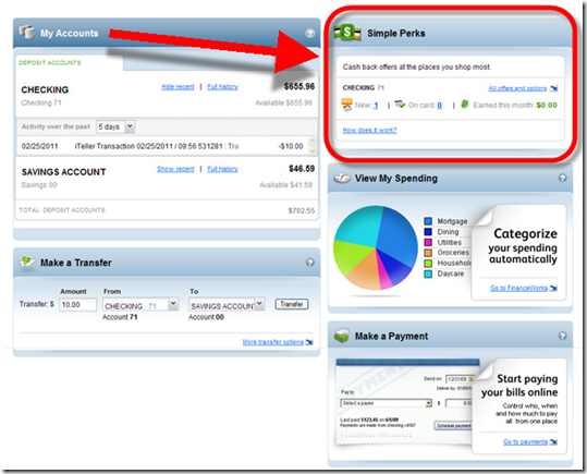
imageIf you are looking for an example of how to promote your rewards program, take a lesson from 140,000-member South Carolina FCU. The company just launched an in-statement merchant-funded rewards program called Simple Perks (press release) for its 58,000 online banking customers.

The CU posted a great 2-minute video showing how the program works (see second screenshot). It also posted a quality supporting blog entry, "Are you a ‘clipper’ or ‘clicker’ (note 1).

The new rewards program is delivered through the CU’s PFM dashboard powered by Intuit’s Personal FinanceWorks (see third screenshot). The rewards program is powered by Cardlytics, an Atlanta-based startup we’ve written about several times (previous posts).

Bottom line: Regardless of whether you personally think rewards programs pollute the online banking experience, this is a genie that’s not going back in the bottle. Targeted advertising based on spending behavior is too lucrative to ignore.

It reminds me of the advent of keyword advertising on search engines. At the time, there was concern that the technique, based on actual user queries, was an invasion of privacy. It may have been, but it’s worked pretty well for Google, and most users benefit from the well-targeted ads as well.

We are pretty confident the same scenario will play out with debit and credit card statements (note 1). As long as offers are relevant, unobtrusive, and probably opt-in, the majority of customers will like them and the rest will tolerate them.

South Carolina FCU homepage with six mentions of rewards (10 March 2011)

image

Simple Perks landing page with great demo video (link)

South Caroline FCU Simple Perks landing page with great demo video

Simple Perks rewards module is highly visible within online banking

Simple Perks rewards module is highly visible within Intuit Personal FinanceWorks online banking

——-

Note:
1. Side note: This is how to blog about something new. Author Troy Hall doesn’t just repeat the press release, he tells a story to make it interesting and relevant. (I would lose the salesy…"life simplified" line at the end, but that’s just being picky).  
2. For more info, see latest Online Banking Report on merchant-funded rewards.  

Finovate 2008 Digital Insight

image Next up is Digital Insight, now part of Intuit. Karen Van Kirk, director of small business solutions, will conduct the demo.

Calabasas, CA-based Digital Insight will be demonstrating its Small Business Finance Works online banking platform.

FinanceWorks has all the same functionality of Quicken Online. The small business version has been designed to be simple and easy to use for the small business manager. The accounts receivable function includes integrated email capabilities to send personalized payment reminders on the fly.

The service includes integrated remote deposit-capture capabilities.

Online Personal Finance Heats Up: Part 2

One of the biggest themes at our upcoming FINOVATE 2007: DEMOing the Future of Online Finance (here) is the interesting developments in the online personal finance space (see lineup below).

As we mentioned last week, the race to add personal financial management (PFM) features to online banking sites is just getting started. To some extent, every bank and credit union supporting online banking already offers extensive personal finance functionality. Think back on how the average person managed day-to-day finances prior to 1997: telephone calls, ATM slips, or in my case, the moment of terror once per month when opening the monthly bank statement.

But now that everyone offers base level PFM, the new race is to provide advanced features to hold on to customers, attract new ones, and potentially cross-sell complimentary products such as debt consolidation, mortgage refis, insurance and so on (see note 1). We also hope to see some fee income from the new features, either through elevated checking account fees, or with premium online banking surcharges (note 2). The latter appears unlikely to happen in the United States unless Bank of America starts charging fees.

At FINOVATE we'll see demos from five key players:

  • Two industry veterans, both two-time OBR Best of the Web winners, will be launching significant new versions this fall: Digital Insight (Intuit) and Yodlee
  • Two "class of 2007" new startups: Jwaala (coverage here) and Mint (coverage here)
  • And Geezeo, which recently changed its name and moved aggressively into personal finance (coverage here)

Digital Insight (Intuit)
One of the most intriguing acquisitions in online banking in the past ten years was Intuit's purchase last year of online banking platform provider Digital Insight (see coverage here and here). Everyone expected the merged companies to push hard on personal finance, the core of Intuit's much-admired brand. I've had a chance to see the Personal FinanceWorks and Small Business FinanceWorks demos several times and came away impressed. Combined with the depth of Digital Insight's client base, these products have a chance to become the online banking standard within a few years. Intuit is a two-time OBR Best of the Web winner with its Web-based tax services.

Yodlee
Yodlee
used to be known as "that account aggregation company." But over the years they've worked hard to shed that image and morph into a full-service financial tools provider. The company offers account-opening tools, bill payment services, personal financial management, long-term archives, and, yes, account aggregation, although it's now more integrated with the company's other services, especially its MoneyCenter personal financial manager. MoneyCenter is the engine behind Bank of America's MyPortfolio which helped Yodlee win its second OBR Best of the Web (see coverage here).    

Notes:

1. For more info on online personal finance, see Online Banking Report #132/133 and #142/143.

2. For more info on premium online banking pricing, see Online Banking Report #109.

Valley National Bank of New Mexico Triples Website Traffic in Two Months with Redesign

Yesterday, I participated on a panel that delivered a program called Extreme Online Makeovers to community bank execs at ABA's National Community Bank Convention in Palm Springs. The star of our panel was Valley National Bank of New Mexico <vnbnm.com> CIO Richard Carlisle.

He described how his 25,000-customer bank took their website from an IT-designed animation-heavy site to a slimmed down, Web 2.0-inspired gem with the help of Digital Insight. See below for before and after screenshots.

The redesigned website, quietly launched online at the first of the year, has already tripled site visits, increased online banking registrations by 20%, and increased average time on the site by 50%. The bank is so happy with the website they intend to feature it in multi-media advertising campaigns later this year.

Before                                                                      AfterValley National Bank homepage before redesign  Valley National Bank homepage AFTER redesign


Analysis
Here's what we like about the new site:

  • Extremely limited use of text on the homepage, about 50 words. That's a few more than Google, but still 75% less than a typical banking homepage.
  • Good use of color: The blues are very soothing, and the restrained use of two shades of orange add life to the site while directing attention to the key area for most users, the online banking login.
  • Fits easily on a single screen: This is a no-scroll homepage on nearly any computer, and the liquid design means it will shrink or expand to fit most-common monitor sizes and resolution scenarios.  
  • Rotating image: Today, the site rotated through four different graphical images, each connected to a different area or bank promotion. And they are not all just "happy family" pics, but make good use of local imagery to showcase its position as the home-town bank (see after screenshot above).
  • Large and prominent search box: Although the site-search box is not located in the standard, upper-right corner, its large size and prominent position make it much easier to find for most users.

There is still work to be done (Business Banking, Giving Back and Community Calendar are all under construction), but overall, it's an excellent example of why you should consider making your homepage simpler and more focused. 

Valley National Bank of New Mexico homepage