Citibank’s 4.5% Direct Banking Savings Account

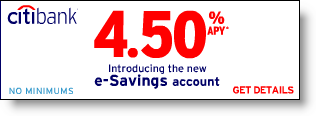
Citi_hysa_ad_yahooIn more direct banking news,* Citibank landed all over the media with the launch of a 4.5% no-minimum-balance savings account. A Citi checking account is required to qualify. The reason for the media attention had nothing to do with the rate, and everything to do with the channel conflict inherent in the offer.

The first line of fine print under the offer was (click on screenshot below for closeup; click on "Continue reading…" below for the full text of the mousetype):

This offer is not available at Citibank financial centers

Citi_hysa_landing_yahooMany stories contained an inaccurate observation that Citibank was launching an entirely new Internet bank. This inaccuracy seems to have its roots in the Reuters wire piece that first discussed the savings account offer.

The truth: This is NOT a new bank. It’s NOT a new website. It’s NOT even a strategic shift for Citi, which has previously made high-rate deposit offers to online customers (see OBR 120/121). This is simply a new advertising campaign targeted to online users, especially those frequenting Yahoo’s homepage (click on inset to see the ad positioning).

Any of Citi’s existing 2.5 million online banking customers can open the account by logging in to online banking and selecting "open an account" and following the directions. A small link in the lower right of the landing page directs existing Citi customers to these instructions.

Initial funding can be made by mail, credit card, debit card, or ACH (electronic interbank funds transfer). After the account is open, additional deposits can be made at Citi ATMs or through IN-BRANCH deposits.

Analysis
You’ve seen high-rate savings account offers before. There is little new here. What can you really say about a savings account once you deal with the rate and the balance requirement?

Citi_hysa_acctopening What sets Citibank apart in this instance is its near-perfect sign-up form (click on inset right). The page is dominated by a banner promising that it will "take 10 minutes & 4 simple steps." The bank backs that up by showing the four steps immediately below the banner.

  1. Tell us about yourself
  2. Confirm your identity
  3. Fund your account
  4. Provide your E-Signature

Although these steps are the same as what thousands of banks have done for years, Citi’s language is exceptional in its clarity and how it addresses consumer fears. The "confirm your identity" demonstrates the bank’s commitment to stopping fraud. The "provide your e-signature" lets customers know they won’t have to mail some old-fashioned signature card to the bank before they can start enjoying the new rate.

The bank also uses several other devices to ensure that customers feel confident about acting on this offer:

  • "We care about your privacy and security" box with link for more info (upper left)
  • VeriSign clickable logo (left)
  • Ability to save and complete the application later (upper left)
  • Ability to print a blank application to mail in (upper left)
  • Link to account details and fees (upper right)
  • Link to live chat or toll-free number (right)

But we called this "near-perfect" for a reason.

There are several concerns not addressed on this page:

  • Timing: How long will it take before my initial deposit starts earning 4.5%?
  • Guarantee: Even though they address the need to confirm your identity, the bank doesn’t come right out and guarantee the safety of the process.
  • No reinforcement of account benefits: Although it’s been only a few moments since the customer navigated to this page, don’t let them lose sight of why they should go through the uncomfortable process of typing their personal details into a browser that may or may not be transmitting their keystrokes to Uruguay. Keep that 4.5% number right in their face.

Another weakness: navigation overload. Citi has included its full My Citi personal navigation across the top along with all the site utilities in the upper right. While this is helpful for research purposes, it tends to be distracting and will pull customers away from the savings account application.

Final Grade
Despite a few minor weaknesses, it’s impressive work. Definitely scores an A and is closing in on A+.

Web address for offer: http://direct.citibank.com/CBOL/06/esavings/default.htm?

*We’ve started a new Direct Banking category for Financial Marketing Week, so you can easily find all the articles on the topic with a single click.

Continue reading “Citibank’s 4.5% Direct Banking Savings Account”
Update on EmmigrantDirect

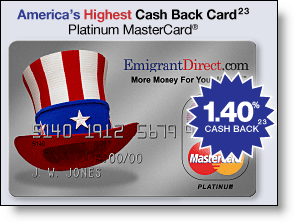
Emigrantdirect_card_websiteHow does a small bank rate a WSJ-bylined story when it ups its credit card reward percentage by 15 basis points? Sure, it helps to be headquartered in NYC, home to much of the country’s financial media. But you also need a compelling story line.

What could be better than a small player eating the big guys’ lunch? Layer in the online-only factor, a strategy that had been declared dead by many analysts after botched attempts by Bank One (Wingspan Bank), Citibank (eciti), and Benchmark Capital (Juniper Bank). Finally, top it all off with a 150-year old company all of a sudden making like a Bay-area startup, and you have a story with real legs.

EmigrantDirect, the direct-banking unit of Emigrant Savings Bank, once again landed in the media (WSJ Mar. 28), with a relatively small change to its credit card launched earlier this year. It’s the second time this month, and sixth this year, that the bank has been mentioned in personal finance articles in The Wall Street Journal.

This time the story highlighted EmigrantDirect’s credit card, touted on its website as America’s Highest Cash Back Card, that now pays a cash rebate of 1.4% on all retail purchases, up from 1.25% earlier (see note 1). The fine print on the claim says that other cards may pay a higher percentage, but they require minimum purchase levels before the higher rebate kicks in (see note 2).

Analysis
Since the launch of EmigrantDirect a little over a year ago, the bank has raked in $6 billion in deposits and 225,000 accounts for an average balance of about $27,000. The direct-banking unit’s success essentially doubled the deposit base of the bank in a single year, halting a gradual decline in total deposits over the previous decade.

It will be interesting to see how Emigrant reacts as more banks enter the market such as Washington Mutual (NetBanker Nov. 18, 2005) and Puerto Rico-based Popular that is planning to go after U.S. deposits under its own name and that of its well-established E-Loan brand. For more information, refer to last fall’s report, Lessons from the High-Rate Marketers (OBR 120/121).

JB

Notes:
1. Interestingly, the higher rebate is retroactive to Jan. 2006, an unusual bit of financial services generosity.
2. Another bit of crucial fine print: The EmigrantDirect card requires a $10,000 average deposit balance FOR THE PAST SIX MONTHS in order to earn the rebate.

Paperless Checking Accounts

Ing_ball3_1If the statute of limitations on "I told you so" is seven years, then word that ING Direct is contemplating a "checkless" checking account called e-Orange comes in just under the wire. Our Virtual Checking Accounts report, which outlined just such an account, was published six years and eight months ago (OBR 50/51) (see note 1).

We've always enjoyed the ING Direct story because it defies conventional wisdom in so many ways. Here are the "rules" that the Dutch banking giant, thirteenth largest in the world, has broken:

  1. Branchless, Internet-only banks can't build a large deposit base
  2. Large entrenched financial institutions can't create a hip online brand
  3. Mass-market banks must offer checking accounts

Worldwide, the ING Direct unit serves 15.7 million customers, and in 2005 it earned a profit of 617 million euros, about 9% of the parent's earnings. The U.S. version accounts for about 20% of the customer total, approximately three million accounts, and has been portrayed as profitable by company execs.

Why "checkless" checking?
No details are available on what an e-Orange checking account might look like. The company will only say that it's in "testing" in the United States. We've held an account at ING Direct since it opened (Q3 2000), and we haven't been approached. But it's pretty easy to guess what it would include:

1. Simple account-to-account transfers (already part of its savings product)
2. Online bill payment
3. Debit/credit cards
4. A high rate of interest, although checking is a point or so less than savings accounts

The lack of paper checks may be more a publicity stunt than a true cost savings, although if they succeed in keeping the paper out of customers' hands, it might help keep funds on deposit. Consumers facing a fat tuition bill may be more likely to pull out the checkbook connected to their Citibank account rather than arranging an electronic deduction from e-Orange.

The company, which portrays its savings account as a "companion" to the customer's existing branch-based checking account, is likely not looking to displace the typical 30-transactions-per-month checking account. More likely, they are positioning it more as a money market account with a competitive interest rate along with the convenience of paying a few major bills from it on an infrequent basis.

With ING Direct's core savings product under attack from all sides (see previous NB articles), it has to look to other avenues of growth. A unique checking account, one that bags free press and a few billion in deposits, makes a lot of sense for a company with a keen grasp of how to make bold, attention-grabbing launches (see note 2).

JB

For more info:

End Notes:
(1) The seeds of that report were published a year earlier in Creating the Amazon.com of Financial Services (OBR#38/39)
(2) The company has entered new markets with clever stunts, such as giving all transit riders a free ride (Washington DC, SF-Bay area); a free tank of gas (LA); coffee bars in prime locations (NYC, Philly); and so on.

E*Trade Looks for Investment Funds at Logout

The best time to grab the attention of your online banking customers is immediately after they log in. Many financial institutions post offers and important information on a "splash screen" shown to customers before they see their account info. PayPal has been especially active in this area, placing new info in front of users every month or so for the past four years.

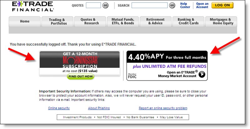
Etrade_logoff_offersWhere’s the second-best place to position an offer to online banking customers? In our view, it’s the screen displayed after successfully logging out. At that point, customers have completed their tasks, but you still have their attention as they wait to see that they’ve successfully ended their session. Last month, we looked at Bank of America’s preapproved credit card offer at logout (NetBanker Feb. 23).

E*Trade is another financial institution using the logoff-screen real estate effectively. Today, they displayed two offers designed to attract additional customer assets to the bank (click on inset for a closeup):

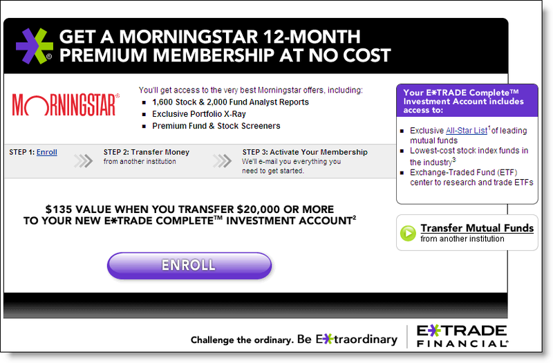
  1. Free one-year subscription to MorningStar’s stock-information service ($135 value) for transferring $20,000 or more into a new E*Trade Complete Investment Account (see the landing page below)
  2. 4.4% teaser rate (good for three months) for deposits into the bank’s Money Market Account. New customers earn the rate on any deposit amount, existing customers must deposit $25,000 or more to earn the special rate. After three months, rates revert to the normal, 3.6% for $50k or more or 2.75% for $5k to $25k (see the landing page below).Etrade_morningstar_offer

MorningStar offer landing page >>>

4.4% APY offer landing page>>> Etrade_logoff_mmda

JB

Bank of America’s “Keep the Change” Banner on MSN

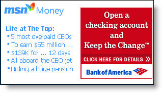
Bofa_msn_homepageAlthough we have concerns about the underlying program (see NetBanker Oct. 5, 2005), you have to tip your hat to the marketing execution of Bank of America’s Keep the Change campaign. Today a small but distinctive postage-stamp ad on MSN’s homepage, tied in with MSN Money headlines (see inset), invites readers to "Open a Checking Account and Keep the Change."

Bofa_msn_landingpageIt’s an intriguing headline and likely does well prompting clickthroughs. The landing page (click on inset right for a closeup) is also well done. A graphical explanation of the keep-the-change rebate is shown on the right, which helps alleviate the need for prospects to wade through the 479 words of fine print on the bottom of the landing page.

Another landing-page graphical element that you should immediately consider adopting: pictures of the three key banking products being pitched with simple checkboxes for selection (see below). However, in this case it’s used in a backwards fashion. Users are supposed to tell the bank which accounts they already have, rather than the ones they want to buy. This is counter-intuitive and should be redesigned.

Bofa_msn_landingpage_orderform_5

Bofa_msn_ddasav_appAfter selecting the BofA accounts already owned, users arrive on a secure Checking & Savings Account Application page that does a good job reinforcing benefits and referencing the original "Keep the Change" hook (click on inset left). A pop-up box offers live chat with a Deposit Specialist if desired.

Summary
The bank scores high for great online copywriting, superb graphics, and good ad positioning at MSN. We also like how Bank of America reinforces the benefits of automated savings. However, the offer is complicated and smacks of a gimmick that will do little to engender long-term loyalty or create a real savings ethic. Finally, the low 0.50 percent rate paid on the underlying savings account damages the program’s credibility and makes it less likely the account will be used to amass meaningful deposit balances.

Grades:
A+ for online advertising and sales (banner, landing page, application)
B+ for encouraging savings
C- for the debit card rewards program

PNC Bank Bundles ID Theft Insurance with Checking

Pnc_idtheftlogoHow do you make your checking account stand out from the one across the street, around the corner, or two clicks away in Internet Explorer? It’s not easy if you want to maintain or increase profitability.

Several banks, including Washington Mutual (NetBanker Nov. 8, 2005) and PNC Bank, use a relatively new technique that is inexpensive and plays to the current hysteria surrounding online security: identity theft insurance. Pnc_idtheftinsurance

In PNC’s case, three of its core checking account options come bundled with $2500 to $5000 in insurance: Premium Plan, Choice Plan, and of course Digital Checking (click on inset right for more details). Free Checking does not include ID theft insurance.

Action Items
Before giving away identity theft insurance, look instead at creating a profit center around fraud protection services. As we discussed in a previous Online Banking Report (OBR 83/84), identity theft protection and related credit bureau-monitoring services are among the few relatively easy fee-income opportunities online.

Pnc_truecredit_cobrandIn fact, PNC Bank sells a full suite of credit bureau services housed under Identity Theft Safeguards in the Personal Finance area. The options range from a $29.95, one-time, three-bureau report to relatively pricey $120/yr and $180/yr subscription plans powered by TransUnion’s TrueCredit, an OBR Best of the Web winner in 2002 (click on inset for closeup).

JB

ING Direct Personalizes Emails for Security

Ingdirect_personalized_emailING Direct <ingdirect.com> is the latest bank to move to greater personalization in order to distinguish its messages from phony phishing attempts. The bank has added the customer’s first name and masked all but the last three digits of the customer’s number (click on inset for a closer look).

The message at left was sent to customers to market ING’s latest deposit promotion: 4.75 percent APR for new money.

Ingdirect_personalized_alertThe same technique is also used for routine account alerts (see inset right).

Note: The high-impact sales pitch for its 4.75 percent deposit promotion.

Analysis
While it doesn’t prevent phishers from attempting to recreate the same look (see footnote), it’s an effective first line of defense. Besides, the personalized greeting is a friendler way to communicate with customers. Citibank has been using a similar approach for more than a year (NetBanker, May 30, 2005).

Citi_phishFootnote: Yesterday, we received a fake email that recreated the Citibank personalized area in the upper-right corner. The crooks just left blank the Email Security Zone in the upper-right corner, figuring many users won’t look that closely at the box (click on inset for a closer look).

JB

Everbank Reinforces Interest Rate Increase with Email

Everbank_emailThere is nothing like a long run of rate increases to make your deposit customers happier. You might as well take some credit; it probably won’t be long before they move in the other direction.

So every time you raise rates, make sure to let customers know with an email message. Of course, this assumes competitive rates. If you are increasing from 0.45 percent to 0.65 percent, you probably want to keep that to yourself.

EverBank raised checking account rates Jan. 1 from 3 percent to 3.5 percent depending on balance levels. On Jan. 3, it sent an email with the subject (click on inset for closeup view):

You’re earning more with EverBank – interest rates rise again!

Analysis
EverBank’s message is straightforward. Here’s what they did right:

  • Included security graphic/link in upper-right corner
  • Kept copy concise and to the point
  • Included a chart showing rate by balance level; subtle encouragement to add funds
  • Reinforced free online banking and bill pay (underneath chart)
  • Cross-sold its Yield Pledge Money Market and CD for those looking for better rates; Yield Pledge products are guaranteed to offer a rate in the top 5 percent at BankRate.com
  • Included toll-free phone number
  • Signed by real person with real signature; in this case, Frank Trotter, president

And a shorter list of improvements:

  • Personalization helps make a message look genuine, but there’s no personalization in the salutation: "Greetings EverBanker!"
  • Clicking through the security graphic leads to a generic page full of links to terms and conditions; the bank should create a page that specifically addresses users’ security concerns, especially regarding phishing emails
  • The bank should improve its unsubscribe function; currently, it’s an all-or-nothing choice triggered by sending a blank email with UNSUBSCRIBE in the subject line; that’s easy for users, but the bank’s just lost an opportunity to query the customer in more detail about what they do and don’t want to receive via email
  • Weak P.S.: "The FreeNet Checking Account gives you the yields and the service you deserve. Bank on it!"

Grade
Overall, we’ll give it an A-

JB

$28 Billion in U.S. Banking Deposits Up for Grabs Online

Forrester’s Ron Shevlin weighs in Jan 10 with an estimate of the amount of deposit balances chasing higher rates online. Using recent (Q4 2005) survey data gathered from 4700 online households, he concludes that 30 percent of online consumers have $10,000 or more in liquid assets. Furthermore, three out of four of those households (24 percent of all online households) are interested in increasing the rate paid on their savings accounts. But one in four of those wouldn’t move until they could get 3.5 percent or more in additional interest, an unlikely scenario for most consumers. That leaves 18 percent of online households (24 percent x 74 percent) ready, willing, and able to make sizable deposit moves online.

Analysis
To quantify the amount of deposits in play, a number of assumptions must be made: the amount of liquid assets held in checking accounts; the amount that would be available to move to another account; and the willingness to move balances for various rate differentials (see the Forrester report for complete details). Forrester’s conservative analysis assumed that only those willing to move for 1 percent or less in rate differential (6 percent of all online households) would take action, potentially moving $28 billion from low-interest checking accounts to high-interest savings accounts.

Taking a less conservative approach, one could also argue that with many direct banks paying 3 percent more than typical interest-bearing checking accounts, the potential deposit switchers are much more prevalent, closer to the 18 percent we derived in the first paragraph. Under these less conservative assumptions, much more would be at stake, as much as $60 billion or more. Furthermore, the Forrester estimate considers money being held only in checking accounts and does not include other liquid assets in savings accounts, CDs, and money-market funds.

Whether $28 billion or $60 billion, the total deposits at play are a small percentage (0.5 percent to 1.0 percent) of the $6 trillion in insured deposits in the United States.

Action Item
We highly recommend the report for anyone looking to reprice deposits for online customers, or even if you just want to understand what’s at stake. The report is available free-of-charge for Forrester clients, or $249 pay-per-view from its website.

JB

ING Direct Savings Account Demo

Ingdirect_demoING Direct US <ingdirect.com> has added an online demo, perhaps the only pure savings account demo online: a good idea, if you are serious about the high-rate deposit business. Users need reassurances you are trustworthy and competent. A good online demo helps on both counts (click on inset for closeup). To view the demo yourself, click here.

JB

Four Banks with 4% for Homepage Special Savings Rate

Online competition continues to heat up as the major banks begin offering 4% APY specials just in time for the holidays, and those year-end bonuses. Today, four of the top 20 U.S. consumer banks are offering specials of 4% or higher on their homepages:

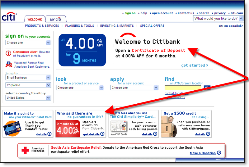
Citi_4cd_homepageCitibank (2nd largest U.S. deposit base) is the biggest player to crack the 4% mark with a nine-month certificate aggressively promoted on its homepage with a page-dominating animated banner and hawked in one of the bank’s four postage-stamp ads running along the bottom (click on inset for a screenshot).

Note also the large Red Cross donation banner (bottom) supporting fund-raising for South Asia earthquake relief.Citi_4cd_email_10_21

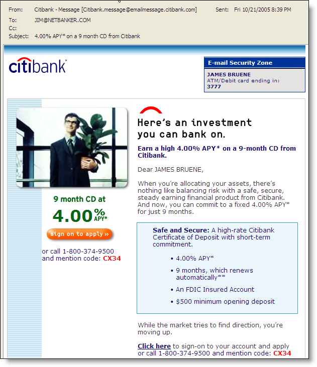
An email advertising the 4% CD was sent to customers 21 Oct. 2005. It was identical to one sent 1 July 2005, except the rate was 3.45% at that time (click on screenshot right).

Other Top-20 Bank Specials
Three other top-20 banks also offer 4% or higher deposit specials on their homepages:

  • HSBC (10th largest), which has marketed a high-rate savings account for much of the Hsbc_4savings_homepageyear (NetBanker, Aug. 26), increased the emphasis with a huge front-and-center ad on its homepage, a red piggy-bank with 4% in it (click on screenshot right).
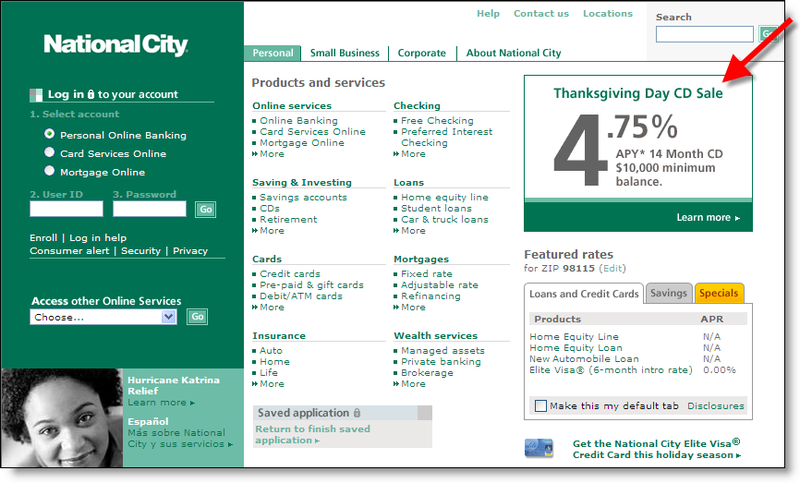
  • National City (11th largest) has raised the bar even higher with a 4.75% Thanksgiving SpeciNat_city_4cd_thanksgivingal, a 14-month CD that requires a National City checking account ($1500 minimum opening deposit) and at least $10,000 (click on screenshot right). Here’s the fine print:

    To qualify for this offer, depositor must have an existing National City personal checking account or open a Preferred Interest Checking account with $1500. Annual Percentage Yield is available from 11/21/05 through 11/30/05. Maximum deposit limit $250,000. Offer only available for consumer deposits.

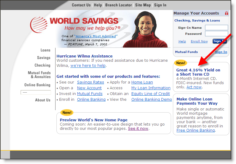
  • World Savings (#17) has a lower-key link to a 4.16% 4-month Internet Special CWorld_4cd_homepageD (click on screenshot right). The rate is good for $10,000 to $250,000 and must be opened with "new money" (from outside the bank).

JB

Washington Mutual Adds High-Rate Deposit Accounts

Washington Mutual, the sixth largest U.S. bank ($172 billion in deposits), becomes the most high-profile financial institution to officially throw their hat in the direct banking business, looking to stem the tide of high-balance deposits headed to ING Direct, Emigrant Direct, and others.

According to yesterday’s report in American Banker, the bank will begin testing a high-rate deposit product available only from its direct banking unit, WAMU Direct, in four markets: Boston, Philly, Atlanta, and Phoenix.

Apparently the bank will be using the domain name <wamudirect.com> once the transfer of the name is made from the California man who had originally registered it. The bank won rights to the domain name in an arbitration case settled Oct. 14.

JB