 The ongoing migration to mobile provides financial institutions a chance to reboot their approach to delivering information digitally. Digital banking v1.0 (desktop online banking) was primarily about porting paper-based statements into an online format. It was a huge change and made banking more convenient, though not really any more effective than the paper-and-call-center system it replaced.
Digital banking v2.0 (mobile banking) is where modern processing power and machine intelligence pays off. Banking becomes not only more convenient, but much simpler, less time consuming, and helps consumers make better financial decisions. But to get to those payoffs, FIs need to provide advanced features, that we in the industry call PFM (personal financial management).
But it’s hard to transition entrenched desktop-banking users to the more powerful PFM platforms. Many customers have been happily using desktop-online banking for a decade or more. And it’s a painful process to move them into what looks initially like a more complicated system.
So some FIs are gently pushing users into the future by offering ONLY a PFM-based native app. The largest U.S. financial institution to use that approach is Seattle-based BECU, the fourth largest credit union in the nation, with nearly 1 million members and 350,000 using mobile banking (up 75% in the past year).
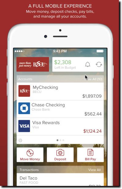
A year ago, the credit union replaced its simple mobile-banking app with a fully PFM-integrated version powered by MX (see them at FinovateFall next week). CU members using native apps (Apple, Android, Windows) now do all their banking through a full PFM interface.
 It’s a good long-term move. Users expect, and need, more functionality than simple balance lookup and funds transfer. But making such a big change all at once carries risks too. With more than 200,000 users at conversion time, there ensued some initial member grumbling, inevitable with such a big change. But the latest version released in May 2016 carries the highest 5-star rating, so apparently users have come to grips with the change. You can see the reviews in the iTunes and Google Play stores. Check out the MX case study for more details.
The full-conversion approach used by BECU may be the fastest way to move customers into the future. But to minimize initial pushback and work out any UX hiccups, grandfathering the old app could provide some breathing room. Or call the new version “Pro,” charge $1.50/mo for it (waived for a few months), and let both versions live side by side indefinitely. TD Bank in Canada offers the Moven-powered MySpend app as an add-in to its regular mobile banking app (see Moven at FinovateFall next week).
Alternatively, users turned off by a the full-featured app can be referred to the mobile website with instructions on how to save it as an icon on their phone. As long as you have a reasonably responsive, well-designed site, non-power user customers will be satisfied.
—–
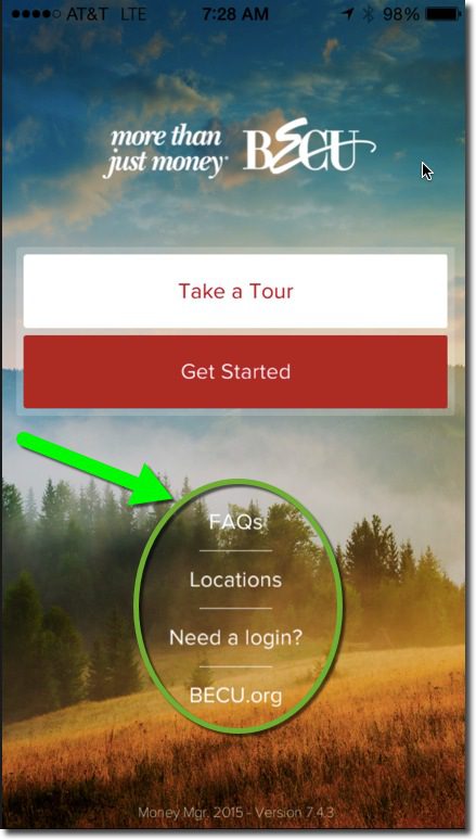
The BECU Money Manager has a start page (inset) that includes links to a tour, FAQs, new member application, online banking enrollment (required for mobile banking), location finder, and a link to the full mobile website.
——
Here’s a 3-minute MX-produced video of BECU exec Howie Wu discussing the desktop PFM platform and integration:


