There are many ways to boost the sales effectiveness of your website, from the navigational layout to copywriting and security assurances. But one area that deserves attention is the design, layout, and placement of the homepage promotions, along with landing page displayed when clicking through for more information.
In terms of overall design, we recommend banners and links that attract attention without dominating the page. Since most visitors are at your site to find specific information, say CD rates, you don’t want a banner for auto loans dominating the page, potentially sending users to another site that’s easier to navigate.
You also need to be mindful of your image. Do you want to look like Overstock.com, pitching special offers and deals, or do you prefer a more understated tone, like a professional adviser? You want the homepage to reflect your overall marketing strategies to the online segment.
There are several approaches that have gained popularity in the past several years. Today we’ll look at one of the best approaches:
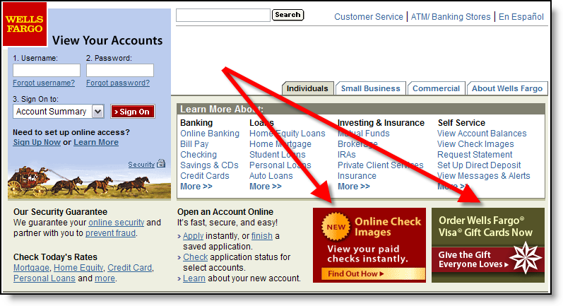
Small "postage stamp" banners in the lower portion of the screen, but above the fold (click on inset above for closeup). For example, Wells Fargo’s layout for the past three years displays square banners in the lower-right corner. Currently, two of eight possible choices are shown when the user arrives at the site (click refresh a few times to cycle through all eight).
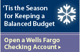
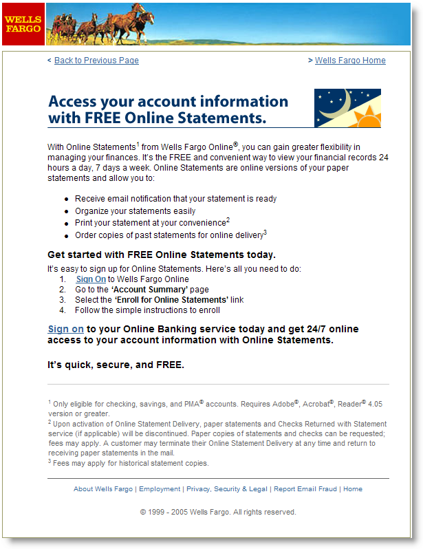
Each banner leads to a well-crafted landing page with more information about the product or service. Not all of the banners are product pitches. For example, one describes an online feature, My Spending Report (NetBanker Feb. 17); another is service oriented, reminding users that they can access accounts 24/7 even during the holidays; while another (see Landing Page below) is designed to save the bank money by encouraging users to receive electronic statements instead of paper ones (click on the banners below for a closeup).
Gallery of Wells Fargo homepage banners displayed Dec 27, 2005


Landing Pages
It’s one thing to get your banner noticed, but then what? Users that click for more information should be led to a specific page, called a landing page, that reinforces the banner and provides more information. If the ultimate goal is a product sale, then the landing page should act as a funnel, delivering users to a single, actionable step, BUY. Extraneous navigational choices, like cracks in a plastic funnel, simply cause leakage of an extremely valuable commodity, interested prospects.
 Wells Fargo has a separate landing page for each of the eight banners shown above. At left (click for closeup), you can see the one created for the "FREE online statement delivery" banner. In this case the bank is hoping to boost usage of online banking, and specifically the online statement feature, which has the potential of not only improving account retention, but also cutting printing and postage costs as users elect to turn off paper statements (required in this case).
—JB
If you’re in need of more financial interactive marketing ideas, check out the Interactive Financial Marketing Database from our sister publication, the Online Banking Report.

