Forrester Calculates the ROI for Publishing a Company Blog

Forrester analyst, and blogger, Charlene Li announced Forrester's latest look at so-called "corporate blogging" (see post here). I haven't read the full report, but Charlene's post, and the Excel model she linked to (here), provide significant detail on the model. The full report is available to Forrester clients free of charge or to anyone else for $379 here (see also, Charlene's powerpoint presentation that accompanied her December webcast on the ROI of blogging here).

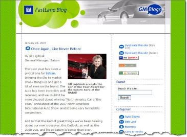
I'm sure there will be plenty of debate about the assumptions that went into the model, but here's the bottom line for one of the highest profile corporate blogs, General Motors Fastlane (see screenshot below; Forrester case study on Fastlane available for $279 here).

Blog benefits (2006): $410,000
  – PR value (articles) $215,000
  – Product feedback value (virtual focus group) $180,000
  – Word of mouth/awareness value $15,000

Blog costs (2006): $255,000
  – Producing content (mostly exec time) $155,000
  – Brand monitoring service $50,000
  – Blogging platform $25,000
  – Review & direction $21,000
  – IT support $3,000

Net value to GM (2006): $155,000
ROI: 69%

Much of the blog's value stems from the product feedback gathered and press articles written about the blog or what was mentioned in the blog's posts and/or comments. The estimated value of the word-of-mouth generated is minimal, just $15,000. 

Front page of GM's Fastlane blog CLICK TO ENLARGE

A Year’s Worth of Fake ATM Receipts for $15

Fake ATM receipt example CLICK TO ENLARGEFor something completely off-topic, here's a niche service that couldn't have existed prior to the Internet.

Four-year-old Custom Receipts.com (screenshot below, link here) will create a year's worth of personalized fake ATM receipts. For $15 + $1.50 shipping, with payment via PayPal, you receive 52 ATM slips printed on thermal paper and dated every Friday for a year. 

The receipt includes your name, the last four digits of your account number, a withdrawal amount and closing balance of your choosing. The example shown on its homepage shows a balance of $629,112.23 with a paltry withdrawal of $60 (see inset above). They ought to up that to at least 3 Benjamins for credibility.

At $15 per order, the site operator won't get rich, but it's a clever idea and hopefully all in good fun. In an email exchange with the owner, who prefers to remain anonymous, he said that he previously offered to produce any personalized receipt. Intended to be used as a joke, he shut down the service after receiving numerous requests for items obviously intended to defraud employers or insurance companies. 

Custom Receipts fake ATM generator

WT Direct takes on ING Direct at Kiplinger.com

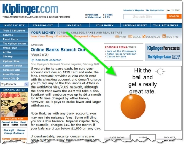
Kiplinger published an article on the state of online banking (see article here). It's an interesting read, but it's the WT Direct ad in the upper-right corner that I found most interesting (see screenshot below). WT Direct is the new direct banking arm of Wilmington Trust (see coverage here).  

WT Direct ad on Kiplinger.com CLICK TO ENLARGE

It's a Flash animation that's part parody of the whack-a-mole banner ad and part a direct shot at ING Direct.

Viewers are directed to:

"Hit the ball and get a really great rate."

That's when the humor begins. Attempting to move the cursor over the ball causes the ball to move away. So there is no way to actually click on the ball. After a few seconds a new screen appears with two words, "Give up?" It's a not-so-subtle dig at  ING Direct rates which are revealed on its homepage usually after an orange ball bounces across the screen. ING Direct is currently paying 0.75% less than WT Direct on a $10,000 balance (see note 1).   

WT Direct Flash animation part 2

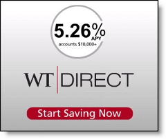
Then finally, it's revealed who is sponsoring the ad, WT Direct: 

WT Direct Flash animation part 3

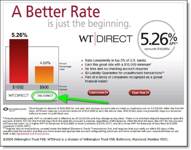
The landing page reinforces the banner ad with a direct comparison to ING Direct's payout with the animated graph in the lower-left corner (see screenshot below).

WT Direct landing page from Kiplinger ad with parody of ING Direct orange ball CLICK TO ENLARGE

Nicely done.

Notes:

1. After the first 60 days, balances of less than $10,000 earn just 0.6% at WT Direct. ING Direct pays 4.5% on all balance levels.

Key Bank Uses TV Advertising to Promote Deposits in its Saveday Promotion

Thursday night, as my son was Tivoing his way through the commercial breaks on The Office, I noticed a Key Bank logo at the end of the commercial break. I had him go back and play the 5-second spot which was teaser style with a brief voiceover, logo, and the URL:

KeyBank.com/saveday

Expecting to see an interesting web-based savings account marketing effort, I typed "key bank save" into Google and came up empty handed (see note 1). The first link was to a Key Bank loan application, and there were no sponsored results.

Key Bank error page for keybank.com/save CLICK TO ENLARGENext, I tried connecting directly to the bank using what I remembered of the URL show in the TV spot, <keybank.com/save>. I realized that was the wrong address when all I saw was an error page, which unfortunately contained no guidance on what to do next (see inset). Finally, I went to the Key Bank homepage and found a large banner announcing the program aimed at encouraging users to curtail their discretionary spending on a designated day (your "Save day") each week (see second screenshot below).

Key Bank homepage with Saveday banner CLICK TO ENLARGE

Analysis
I'm like the idea of creating an interesting program to spur savings. For example, even though I didn't much like it initially (see post here), Bank of America's Save the Change does have a certain amount of appeal, at least from a marketing standpoint (see note #2).

And Centra Credit Union's <centra.org> new prize-based savings plan deserves a second look (thanks Doug True for the original post on this, here; see screenshot in note #3 below).

However, there isn't much to like about Key Bank's Saveday effort. The television spots may work as image advertising, but the website execution left a lot to be desired. Not only did the bank fail to support its television buy with search advertising, the landing page has little of interest besides the standard suite of savings calculators (see screenshot in note #4 below). There are no incentives, contests, or benefits to motivate a consumer to do something as unpleasant as giving up their daily latte.

While the bank does offer a handy PDF worksheet that can be printed out to calculate a monthly budget, there are no links or discussions of automated savings plan. Putting savings on auto-pilot is a much more powerful saving system than trying to get customers to sacrifice their caffeine one day per week.

There's also no interactive elements that might help get someone started. For example, why not send customers a text message to their phone or email each Saveday to encourage them to save.

However, the biggest blunder, is calling attention to the bank's incredibly low savings rates. For example, for a $10,000 saving balance, a typical amount in high-yield savings accounts, Key's three options paid a paltry 0.10%, 0.20% and 1.24% (see note #5). And no, those are not typos, that's two-tenths of a percent, in the KeySaver account, or a grand total of $1.66 per month, before tax. Not even enough to buy that cup of coffee the bank wants you to forego on your Saveday.

It takes a $25,000 balance to get above 1.24% in any of Key's savings accounts (note #6). And anyone who's managed to stash away that much in liquid savings probably doesn't need a Saveday.

Notes:

1. Later we tried, "key bank saveday" and the first link was a press release on the promotion, but it was at a csrwire.com URL (see release here). Searching from a Seattle WiFi IP address in Seattle.

2. Bank of America has recently been touting the Save the Change debit card benefit in its usual excellent television ads.

3. Centra Credit Union Super Savings page

Centra Credit Union Super Savings landing page CLICK TO ENLARGE

4. Key Bank Saveday landing page

Key Bank Saveday landing page CLICK TO ENLARGE

5. Rates quoted on Keybank.com for zip code 98115 on 22 Jan 2007

6. Update Jan 30: According to a bank employee, a $25,000 deposit now pays 3% in Key Ultra Money Market which I confirmed online. And in markets where Key Bank doesn't have a branch presence, the rate is as much as 5.25% through Key Direct (see screenshot below).

Keydirect_rates_30jan07

Wells Fargo Adds "Comment Box" to Student LoanDown Blog

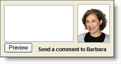
Comment input box at Wells Fargo blog, Student LoanDown Wells Fargo has tweaked the design of its Student LoanDown blog by adding a comment input box for the most-recent blog post (see inset). The bank uses this a similar technique at its first blog, Guided by History.

This should spur more comments, especially with the call to action at the bottom, "send a comment to Barbara." Users preview their comment, and read an onerous Wells Fargo disclaimer (see second screenshot below), on a separate page before submitting.

The comment input box is only used on the first blog entry on the main page. Late entries revert to typical blog format, with the comment function at the bottom of the post.

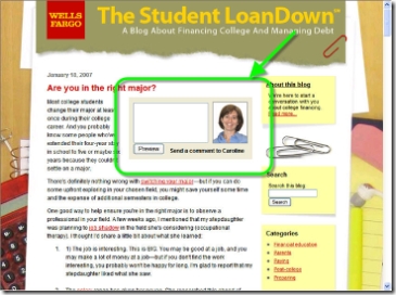
The main downside to this layout is that it's a bit distracting (see screenshot below), but that's probably a good trade-off if it helps drive more comment activity.

Wells Fargo Student LoanDown blog CLICK TO ENLARGE

Comment Preview

Comment preview at Wells Fargo Student LoanDown blog CLICK TO ENLARGE

How Bank of Montreal Puts an Orange RSS Feed Icon in the Browser Address Bar

Over at BankWatch (post here), Colin Henderson, who recently stepped down from his exec post at Bank of Montreal, wrote that his old company recently became the first bank to add an important line of code to their websites (see note 1).

Bank of Montreal RSS feed indicator in Internet Explorer IE 7 CLICK TO ENLARGE

The feature is called RSS Auto-Discovery, and it alerts Firefox, Safari, and IE 7.0 users to available feeds by placing an orange RSS feed indicator below the address bar (see IE 7 above) or on the right-hand side of the address bar (see Firefox, first, and Safari address bars below, source Soxiam).  

RSS Auto Discovery in the address bar

At Bank of Montreal, the icon shows on most pages, but NOT on the homepage. While Bank of Montreal may have been the first major bank to use RSS Auto Discovery, two Canadian credit unions had already implemented it, including:

  • North Shore Credit Union <nscu.com> which has used it for 2 years
  • VanCity <vancity.com> which began using it in November (see screenshot below)

Analysis
Financial institutions are encouraged to add this code since there is no major downside (see note 2). However, it should not be the sole method for publicizing feeds. Most consumers have no idea what an RSS feed is, much less that they can add one by clicking on an orange icon by the address bar.

We like how VanCity has added the RSS feed icon to the right-hand navigation and also included an important link to an explanation of what an RSS feed is (see screenshot below).

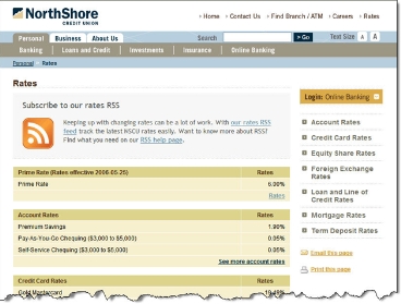
In comparison, North Shore publicizes its feed only on the rates page. Although, it is certainly prominently displayed there (see screenshot below).

North Shore Credit Union RSS feed on rates page CLICK TO ENLARGE


Notes:

  1. According to software engineer Peter Freitag (link here), it requires just a single line of code, plus a few attribute tweaks, to add RSS Auto-Discovery to your website.
  2. The only downside is a small amount of customer confusion on what the icon means. Banks should address this in its FAQs or Help screens and brief website tech support reps in how to answer customer queries.

A Do-It-Yourself Outsourced Sweepstakes from ePrize’s Caffeine Unit

Sweepstakes and contests are a proven way to generate new leads and add a bit of excitement to your website marketing, especially when tied to online banking and/or bill payment usage (see previous coverage here). 

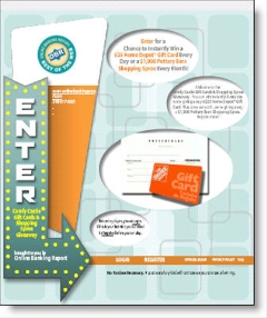
However, if you are a smaller bank or credit union it may be difficult to justify the overhead necessary to create a contest for a few hundred website visitors. A new service from ePrize, called Caffeine <caffeinenow.com> makes it easy to create your own professional sweepstakes or interactive instant-win game complete with optional discount coupon (see my test sweepstakes mockup above). The service was profiled in The Wall Street Journal today (article here).

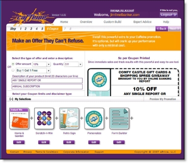
The service has no upfront fees, costs about a buck per new user, has attractive templates, and is drop-dead easy to use. A first-time user could easily create an entire promotion in under an hour using the company's web-based tool.  Go ahead and see for yourself, you can create a free account and build a sample promotion (see screenshots below).

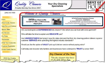
The downside is that the prize pool is shared, so your customers may never actually win, and customization options are limited. Check out <myqualitycleaners.com> to see the service in use (screenshot below).  

ePrize Caffeine landing page at MyQualityCleaner.com CLICK TO ENLARGE

Using Caffeine
An online console is used to create the promotion in seven easy steps (see below). The company says you can setup a sweepstakes in 10 minutes. From my tests, I'd say that is possible; but the first time through you will probably spend closer to an hour deciding which prize to offer, which theme to use and so on. Subsequent promotions could be setup in five minutes or less.

Here's the process, which requires no technical knowledge or expertise other than access to your company's credit card to pay for it:  

  1. Choose from a half-dozen promotion themes
  2. Set the background color
  3. Enter business info and upload your logo
  4. Decide whether you want to giveaway low-dollar instant win prizes worth $10 to $25 each or use a $10,000 sweepstakes prize, then select from several dozen prize choices.
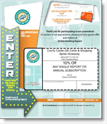
  5. (Optional) Choose what type of coupon you want to offer after entering the contest. Unfortunately, the only choices are a percentage discount or 2-for-1 offer, neither of which are particularly good for financial institutions.
  6. Create a budget limit, including how many times you will let someone replay the game (0 to 4), and enter billing info.
  7. Copy the code for the contest banner and enter it into your content management system.

A dashboard at the Caffeine website allows you to track usage, budget, and registered users. The free tell-a-friend option allows your contest to spread virally.

Cost
The best thing about the solution is there are no up-front costs, it's all variable depending on usage. Here's the basic charges:

$1 per new registration
$0.05 per coupon printed (optional)
$0.04 per email sent (optional)
$0.15 per subsequent log-in to replay the game (optional)

Screenshots
MyQualityCleaners home page with contest banner:

ePrize's Caffeine service in use at Quality Cleaners CLICK TO ENLARGE

OBR test sweepstakes setup showing the elements I chose for my online game: a $25 blockbuster gift card awarded daily, an interactive scratch-off game, the retro sign, my logo, and other form items:

OBR contest setup CLICK TO ENLARGE

An optional coupon shown after a user participates in the game:

OBR test showing the optional coupon CLICK TO ENLARGE

The billing screen clearly shows the prices for all services and allows business owners to set a weekly budget amount:

ePrize Caffeine test showing budget amount CLICK TO ENLARGE

Paper-check Conversion is Bigger than just Business Remote Deposit Capture

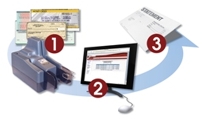
remote deposit capture Recently, we've focused on one aspect of paper-check conversion, so-called remote deposit capture, where a business deposits paper checks by converting them into electronic items instead of driving them to the bank. It's an important new service that benefits both the bank and the end user.  

However, there is more to this story than saving businesses at trip to the branch. There is also a significant opportunity for capture at branch locations, including:

  • Capture at the ATM (in-branch or off-site)
  • Capture by the teller
  • Capture by the customer at an in-branch kiosk)
  • Hybrid model with customer doing some of the work with the branch staff assisting 
  • Capturing in the branch back office (i.e., not at the teller line, but later in the process)
  • Capture at a third-party such as a UPS Store or check cashier

An insightful summary of the issues was published Friday by Gonzobanker's Terence Roche  http://www.gonzobanker.com/article.aspx?Article=314. Previous Netbanker coverage is here.

Make Sure Your Wikipedia Entry is Factual and Up-to-Date

Link to Wikipedia Ten years ago, we advised banks to make sure their listings in Yahoo were up to snuff. Now, the major search engines are so good, there isn't much work needed to appear at or near the top of the results for searches on your company name (see note 1). 

However, there is one important online database with massive reach that still needs manual maintenance, Wikipedia. As the sixth-busiest Internet property in the world, with 150 million monthly visitors (see note 2), you should make sure your institution's entry is both factual and up-to-date. One of Wikipedia's defining attributes is that anyone is allowed to edit the content. So there is no reason you shouldn't jump right in and change any factual errors right away. You should also consider adding info and links to missing or incomplete listings, but make sure to follow the strict guidelines prohibiting self promotion.  

Nor surprisingly, Wikipedia prohibits all forms of advertising. And they'll take down any entry deemed to be made to further sales rather than add to the world's knowledge base.

Wikipedia does allow company listings provided your company is deemed "significant" by Wikipedia. Most financial institutions should qualify. However, don't try to put a listing in for your SuperDoubleNet Gold Card. It won't fly.

Also, copy must be devoid of hype, be totally unbiased, and basically read like an encyclopedia entry (see guidelines for company listings here). That said, the online encyclopedia does allow limited use of logos and pictures, so you want to make sure your entry is attractive without being a brochure. Any violations of Wikipedia's guidelines will be quickly deleted.  

Below is the first part of the 1500-word entry for Citibank. Note the use of its current logo and an attractive branch photo. 

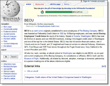
In comparison the entry for Boeing Employees Credit Union is just 170 words and devoid of graphics.

Wikipedia entry for BECU Boeing Employees Credit Union CLICK TO ENLARGE

In addition, you might look for other Wikipedia "marketing opportunities" where your bank could be listed as a service provider or reference. Again, it has to add to the facts of an existing article, not be positioned solely for marketing purposes. Of course, this is as gray an area as you can get, so there is no harm in trying as long as you keep the edits in line with the spirit of the website.

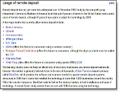
Wikipedia entry for remote deposits CLICK TO ENLARGEFor example, in the Wikipedia listing for "remote deposits", under the sub-heading, "usage of remote deposit," the following financial institutions are listed (see screenshot right):

If you have a good remote deposit capture service, add your name to this list. It may or may not be accepted, but it's worth a try.

Notes:

  1. You should make sure your tags and titles are up-to-date and appropriate (see previous article here). 
  2. Worldwide unique visitors in Sep. 2006, according to comScore (press release here)

Wachovia is Developing User-Managed Security Controls

Link to Wachovia Security Plus page In an American Banker article today (here), Wachovia says it is developing security controls that will put users in charge of some of their own security settings such as the size of a funds transfer allowed. According to John Watkins, Wachovia's Director of Online Services, the new capabilities will be available "sometime this year."

This is not a new concept. The first full-service online-only bank in the world, Security First Network Bank, offered user-set bill payment limits more than ten years ago. Other international banks, such as ABSA Bank in South Africa, have long allowed users some control over security matters.

However, in the United States user-controlled security has been slow to catch on, other than via triggered email alerts, which remain the first line of defense. For several months, Bank of America has been reminding online banking users that alerts can help them prevent fraud in their accounts. 

While it's too early to speculate on what Wachovia will or won't do, the concept is a good one, and will eventually be used to some extent by all financial institutions. It's a win-win, providing users a better sense of control while reducing actual fraud losses within the bank.  

For more information:

See Online Banking Report #119, "Marketing Security" for more ideas on how to turn security concerns into a marketing advantage.

Singapore’s OCBC Bank Uses "Mobile" in its URL to Help Users Find Mobile Offerings

Both Yahoo and Google have creating landing pages for their mobile offerings at http://mobile.google.com and http://mobile.yahoo.com.

OCBC  banner image on its mobile banking page

As interest in mobile banking picks up, financial institutions should create a mobile service page under the URL http://mobile.yourbank.com.

OCBC's downloaded mobile banking application on Sony Ericsson phone CLICK TO ENLARGEFor example, Singapore's OCBC Bank has a WAP site at http://mobile.ocbc.com. that has links to basic info and the downloadable application used for True Mobile Banking (see mobile phone image right).

The bank also has a mobile information page on its regular website (here) that provides information about its mobile services. Currently, there is nothing like it in the U.S., but Citibank/mFoundry appear to be on the verge of a launch in early 2007 (see OCBC banner above and screenshot of complete webpage below, click to enlarge).

OCBC Singapore main mobile banking info page CLICK TO ENLARGE

Even if you don't have a WAP site or other mobile services, you should at least provide information on text-based alerts which work well for most mobile devices.

In a test of the 20 largest U.S. retail banks, only Fifth Third has a URL with the word "mobile" <http://mobile.53.com>. However, unlike OCBC, Fifth Third's mobile URL has not been optimized for mobile access (WAP), nor does it contain any info on mobile services. Either Fifth Third is about to launch a mobile initiative or they just have very thorough Web programmers.

Apple’s iPhone to Provide Even More Reasons to Bank on the Go

Yesterday, I wrote about how new downloadable search apps were likely to spur mobile banking adoption as users grew more accustomed to using their phones for more than just voice calls (see post here).

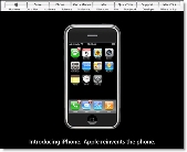
Apple's home page on 9 Jan 2006 announcing iPhone CLICK TO ENLARGEToday, a potentially bigger driver was unveiled. The much-anticipated Apple iPhone which was such big news that the company's homepage was given over to a single image of the iPhone (see screenshot right).

Given Apple's recent track record, the combo iPod/phone/camera/browser may do even more to spur adoption of mobile services than the Google/Yahoo/Microsoft offerings (see note 1). 

Why? Because, the user interface appears to do an excellent job of exposing the non-phone functions. While the same can be said of Blackberry's and Treos, this phone, co-marketed by Apple and Cingular, is expected to be a mass-market hit along the lines of the iPod (see note 2). As one blogger put it, "Apple didn't unveil a phone today, they unveiled a $500 fashion accessory" (see note 3).

Apple iPhone stock-tracking widget CLICK TO ENLARGEWhile the built-in Safari browser and magnification function will spur mobile browsing and banking via standard and WAP websites, there is no indication if and when the iPhone will support True Mobile Banking via downloadable third-party applications. The demo phone on the Apple website <apple.com/iphone> does includes a stock tracking widget (see inset).

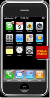
Apple iPhone mockup with Wells Fargo Bank logo CLICK TO ENLARGE However, given Cingular's involvement in mobile finance, with pilots underway with MasterCard, BancorpSouth/Firethorn/ CheckFree (see our coverage here), we expect that bank's will have the opportunity, most likely at a significant cost to add a widget to the phone (see our Wells Fargo iPhone mockup at right; see note 4).

Bonus prediction: Within two years one of those buttons on the iPhone will activate contactless card payments via MasterCard, Visa, or American Express.

Notes:

  1. Apple's iPhone will ship with integrated Google and Yahoo search.
  2. Apple is forecasting 10 million unit sales in 2008, but at least one analyst has already called that low according to today's Wall Street Journal. Worldwide iPod sales are expected to be 40 million units in 2006. However, no one expect the iPhone market share to get anywhere close to the iPod's 80%. Competition is far more advanced and intense in phones than it was in MP3 players.
  3. I can't recall where I read this, still looking for the attribution.
  4. We added the Wells Fargo logo to the iPhone image; the bank has no known relationship with Apple or Cingular.