MBNA’s Big & Ugly Card Application

In direct mail, sometimes "big & ugly" beats "short & sweet." But when it comes to preapproved credit card applications, we're pretty sure the 8-screen form posted by Bank of America's FIA Card Services (formerly MBNA) isn't going to help improve response rates (see the full form by clicking the continue link below).

My wife received a preapproved, direct-mail offer from Fidelity Investments where she has an investment account. The solicitation included the usual one-third sheet mail-back "acceptance form." Recipients could also either call a toll-free number, or go online to www.ibscredit.com.

Fidelity_mbna_cardapp_firstThose that went online were greeted with this almost-blank screen operating under a different URL www.applyforcreditnow.com and had no reassuring message or graphics to assure users they had not arrived at a phishing site.

Fidelity_mbna_cardapp_subsetAfter entering the 6-digit code from the mailing, prospective cardholders are transported to this boring form, which surprisingly includes MORE fields than its paper-based counterpart (click on inset for closeup; click on continuation below to see the full 800 x 5200 screenshot). For example, it contains a section to be completed by students, who are unlikely to be receiving this particular Fidelity Investments WorldPoints Visa card with no preset spending limits.

Not only are the layout and design dull, but also two major design flaws are readily apparent:

  1. No reinforcement of product benefits above the fold, especially the "0% through Nov. 2007" offer
  2. No division into smaller segments, the first of which should gather the email address

See Online Banking Report #104 for more on application design.

— JB

Endnote: Full online application (820 x 5200)

Fidelity_mbna_cardapp_long

Web-Based Calendar Company for Sale

Kiko_calendar_home In Online Banking Report, we've looked at online calendars as nice-to-have additions to banking websites. They fulfill a personal financial-management role by tracking and sending reminders of bill payment and other deadlines.

If you are interested in adding a calendar to your user interface, there is a unique opportunity to purchase a turn-key calendar website, that provides not only the code, done in a Web 2.0-like look, but also 40,000 monthly visitors. You could potentially pick up some customers from the existing user base as well.

The site, Kiko.com, is for sale in an eBay auction that ends on Aug. 26. Opening bid = $50,000.

Thanks to TechCrunch for the tip.

Chartway Federal Credit Union Referral Campaign Falls Short

Chartway_logo_1Sometimes it helps to see how NOT to do something. Today's victim: Chartway Federal Credit Union <chartway.com> which has been running a clever, but poorly executed, 8.00% APY certificate-of-deposit special on its website for the past month (see screenshot below).

Chartway_8apy_referral

Analysis
The good news
: It's a great offer. Any member making a successful referral gets to put up to $8,000 in an 8-month CD earning 8% (notice a theme there?). To qualify, the referral must bring in a new credit union member that opens a checking account along with the certificate OR initiates a $500-minimum direct-deposit relationship. The new member also gets to put up to $8,000 in an 8-month CD.

Members can make up to three referrals for a total deposit of $24,000. With the CU's normal 6-month rates at 3.4%, its more than double the normal rate of return, earning both the referrer and referee an extra $31 per thousand over the 8-month term or almost $250 extra per certificate (pre-tax). The eye-catching offer is featured front and center on its webpage.

The bad news: There is no hyperlink. Clicking on the logo, headline, or text does absolutely nothing! There aren't even any instructions on how to participate. Viewers are simply left hanging. The only extra info provided are the disclosures delivered via mouseover (see screenshot above).

It harks back to websites of the mid-90s that were put together by the "ATM guy." Unless you are trying to entice users to go on scavenger hunt through your website, this is a major mistake, and it's been that way for nearly a full month.

JB

Hiding Your Offer from Existing Customers

Usually, when designing targeted offers, you focus on what you know about the prospect. Where do they live? What products do they use? What's their balance? What if you wanted to offer a product only to folks you know nothing about, such as new visitors to your website?

Suppose you had a hot APY offer you wanted to make only to new customers to avoid cannibalizing that cash cow, the passbook savings account. Using cookies, you could avoid showing the offer to online banking users, minimizing their awareness of the product.

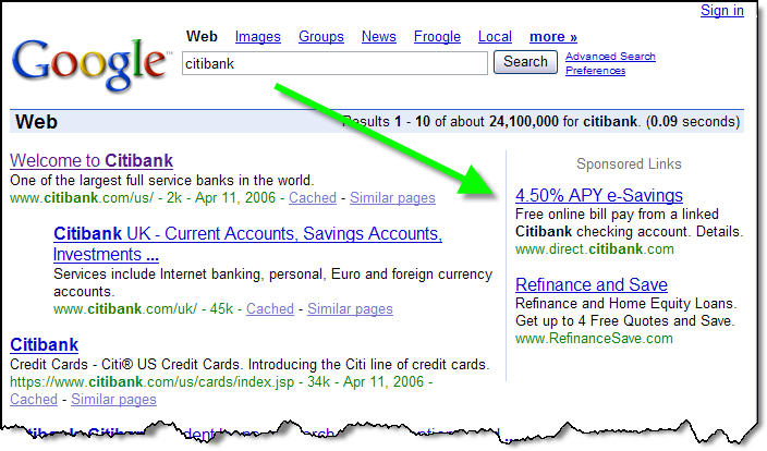
Citi_esavings_homepageApparently, Citibank is using this approach. In a routine visit to Citibank's website in mid-April using our laptop, we were surprised to see advertisements for its 4.50% e-Savings account dominating the website (click on inset for a closeup). When the high-yield product was announced (NetBanker March 29), many observers believed it was a stealth offer made through a new "Citibank Direct" entity.

But when we returned to the office, the offer had disappeared from the homepage. We had to click on the small "special offers" link to find it listed along with several other offers. Apparently, the cookies on our office PC, which identify us as a Citibank online banking user, triggered the website to load a different homepage. We confirmed this through testing on other PCs.

But before you use this tactic, realize it has significant drawbacks. First, it doesn't work with users who delete or disable cookies, estimated to be as high as 40%. Also, an online banking user visiting from a different location, or with a different browser, will also see your offer.

There is also the risk of your clever marketing being outed to the press and public, which may find the practice deceptive (see SmartMoney, April 2006). Finally, you may be teaching users to game your system, deleting cookies more often, entering different zip codes, and so on. This could hinder your ability to deliver targeted promotions to the customers you DO know something about.

JB

Citi_google_citibankNote: Citibank isn't shy about putting the offer on Google, where it shows as the top paid result on searches for  "Citibank" (see screenshot right).

Bank Branch Website Pages

Firstnorthern_thatsmybankIt's no secret that a vast population researches online and buys offline, as much as 50% of your customer base according to recent research by Yahoo Search Marketing (NetBanker April 24). Whether the practice has evolved from habit, security reasons, or a need for face-to-face interaction, it's an important dynamic for financial institutions that have billions invested in retail branch networks.

Until consumers are ready to give up the branch experience, an important function of financial institution websites is to funnel prospects into the branch. Most banks now have prominent branch/ATM search functions.

These tools, often outsourced, usually provide good utilitarian results: name, location, hours, phone, and directions. This is enough information for current customers just looking for the closest place to pick up $100 with no ATM fee or deposit the rebate check from Procter & Gamble.

But as a sales tool for prospects considering a major purchase such as a new checking account or mortgage, the typical "branch finder" leaves a lot to be desired.

Analysis
Considering how inexpensive it is to post content online, why is it that banks do so little to help their branches create a unique presence online? After all, bank "stores" are usually multi-million dollar operations with aggressive sales and profitability goals. Even our tiny US Bank branch, staffed with two or three employees, plus a security guard, is surrounded by $500,000+ homes where the largely middle-class owners often have equity of $300,000 or more.

Why doesn't my branch use every tool in the book to tap into this market? Just one or two additional home equity loans per year would pay for a killer website. 

We know the reasons banks keep branches from attempting their own creative marketing efforts: low-budget fliers may not align with company graphic standards; complicated disclosure rules must be followed; branch efforts might conflict with larger "branding efforts," and so on.

Those arguments don't hold as much weight online. Banks could employ a content-management system that allowed branches to customize their personal webpage for use in neighborhood marketing efforts, and that would be more likely to pull a website visitor into their branch.

While we've reported on several of these efforts over the years, it's still difficult to find a comprehensive "bricks-and-clicks" effort. We recently came across Thatsmybank.com from Sacramento-based First Northern Bank (click on screenshot upper left). While the bank does better than most with a branch page that includes a picture of the branch and branch manager along with the names of lending officers, it is still very basic. It doesn't even include the email address of the branch or any of the key contacts.

Huntington_mtg_loanofficerpagesMortgage banks have done a better job. Wells Fargo Home Loans has had individual Web pages for its lending offices for several years. Huntington Bank also provides each mortgage loan officer their own Web page (click on inset for closeup). The page is tightly controlled. The mortgage officer uploads a picture, fills in basic contact info, then adds a paragraph about themselves and their lending specialty.

The template is completed with a list of local links provided. The only interactive element is the mail-to link that allows visitors to send an email to the loan officer via the user's email client.

Action Items
We believe branches should have a larger Web presence than just name, address, and phone number. Consider installing a content manager that allows branches to input custom localized content. It's a cost effective way to help branches and loan officers leverage their community connections and unique expertise.

JB

Making the “Back” Button a Bank Profit Center

Nothing frustrates a Web user more than clicking the browser's back button during the middle of an online form, only to be hit with a browser-error message, followed by losing all the data previously entered.

There are a number of website-design techniques to reduce this problem, such as disabling the browser navigation, but those solutions can impact overall usability.

Getsmart_backbuttonwindow_1We like GetSmart's approach (click on inset for closeup). Rather than hiding the back button, the LendingTree unit (owned by IAC/InterActive), delivers a pop-up message with two choices:

  1. Continue: Users that inadvertently used the browser's back button are provided instructions on how to use the navigation tools within the webpage.
  2. Exit: Those truly wishing to leave the application are transported to the About Us page in case they need reassurances about the authenticity of the company.
  3. Search: Users not opting for doors one or two can go directly back to searching the Web through an Ask.com search box. GetSmart earns a few pennies on the transaction and keeps their name in front of prospects with a co-branded search screen at sister company Ask.com.

Action Items
Financial institutions could use a similar strategy on their forms. Any customer abandoning a form, either on purpose or by accident, should be greeted by a pop-up screen containing several of the following choices:

  • Talk to a specialist via phone, chat, or email
  • Go back to read more about the product's features and benefits
  • Save the form to complete later
  • Review other product options
  • Go to a special landing page designed to encourage completing the application
  • Search the bank's website for more info

Finally, one of the most important functions of the popup, something missing from GetSmart's, is snagging the customer's email address and permission for follow-up communications.

JB

Reinforcing Online Banking with Your Own Customers

If you've been in the business as long as I have, you sometimes forget that not everyone is banking online. Even among online users, the penetration has only recently reached the 50% mark (U.S. totals, see OBR 125).

Evidently, banking website strategists also lose sight of this fact. Because banking sites too often seem to ASSUME consumers are willing to transact online. Yet, most consumers, even those registered for online banking, need reinforcement and encouragement to be assured that online banking is a safe and sound practice.

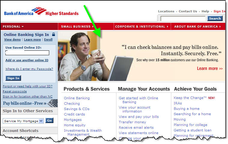
Bofa_homepage_olbWe've reviewed the all-important security messages in great detail (see previous NetBanker articles). But you should periodically run promotions and messaging highlighting the advantages of banking online.

While we love a good sweepstakes that encourages online transactions such as bill payment, good old-fashioned testimonials are also a great tool to encourage usage. Bank of America demonstrates how it's done with a large homepage graphic touting its 15 million users, the largest online banking base in the world (click on inset for a closeup).

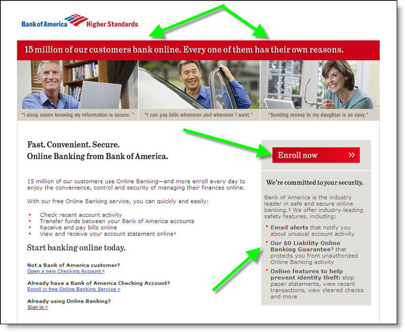
Bofa_homepage_olb_landingClicking on the graphic leads to a simple landing page (click on screenshot right) that includes:

· three testimonials running across the top

· security reassurances in the box on the right

· a prominent "enroll now" button on the right

· several benefit statements in the copy

· link to the log-in page for already enrolled customers

JB

Making Online Retail Error Messages Standout

Dell_error_msgOnline retailers, including financial institutions, routinely find that 50% to 90% of shopping carts or in the case of banks, product signup forms, are abandoned.

Many of the reasons are out of your control: the customer changed their mind, didn’t like the price/terms, or the boss just walked in.

One important variable you do control is the feedback provided when the user makes an input mistake. The best practice is to show errors in red along with detailed instructions on how to fix each missing or incorrect field.

But sometimes, with small fonts and multiple error messages, even these messages get lost, forcing the customer to abandon the application out of frustration.

Contrast that to Dell’s approach. If you type the wrong password, a large red warning sign is returned right in the password-input screen (see inset). This is one error message you absolutely cannot miss.

JB

Should You Launch a Financial Podcast?

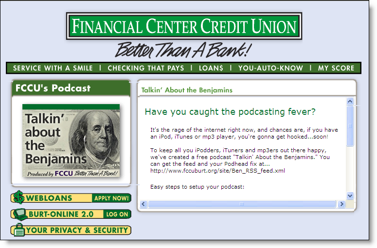
Fccu_podcast_logoPodcast was voted the 2005 Word of the Year by New Oxford American Dictionary. That alone is enough to make it an interesting marketing technique, even though it’s more associated with music than banking.

So far, two U.S. financial institutions have jumped on the podcasting bandwagon:

  • The first financial podcaster was Stockton, CA-based Financial Center Credit Union <fccuburt.org>. Its rambling, 56-minute first effort, Personal Finance Tips, from CEO Michael Duffy, was posted on Apple’s iTunes on August 30. The program is more philosophical than factual and sounds almost unscripted, as if the CEO just sat down and talked about whatever came to mind for an hour. It’s hard to imagine anyone other than his mother or marketing manager listening to the whole thing. Since then, they’ve published two more installments of the series: a 31-minute Personal Finance Tips, posted Oct 17, and a nine-minute discussion of phishing and pharming on Dec. 14. The latter program, which did NOT feature the CEO, was a more appropriate length and dealt with facts and actionable information.

    Fccu_podcast_page_1While the content is of questionable value, the website design is good, positioning the CU as hip and with it. The podcast series is entitled, Talkin’ About the Benjamins, and features a clever visual of Ben Franklin with the signature Apple earphones on his head (see inset above left). The credit union has a link on its homepage to a dedicated podcast page (click on inset above for closeup) that explains how to subscribe to the series via Apple’s iTunes site or to download directly from the CU site in MP3 format.
  • The first bank to post a podcast was UMB Bank <umb.com> out of Kansas Umb_podcast_1City. The first of the three planned recordings was posted Dec. 5, The Ins and Outs of 401(k) Retirement Plans. The bank also makes its podcast available for free downloading at the iTunes store or directly at the bank’s website. The recording is a question-and-answer session with UMB Portfolio Manager Casey Matthews. The UMB program is also relatively amateurish, with the participants nervously chuckling at their own jokes. At more than 24 minutes, it’s too long, but for a listener with little knowledge of retirement plans, it’s not a bad educational program.

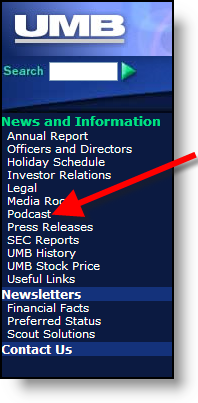
    In contrast to the marquee placement of FCCU’s podcasts, UMB bank buries the program in the middle of a long list of content within the News and Information part of the website (click on inset above for a closeup). This considerably diminishes the marketing value.

Analysis
The question isn’t really whether to podcast or not, but rather whether audio/visual content should be added to your website. The answer to the second question is a resounding YES. It’s time to leverage the high-speed Internet connections enjoyed by the majority of your customers with professional audio and video content. There are numerous programming tools that can be used; the most common is Macromedia FLASH, to develop good audio and video programming.

There isn’t really a pressing need to provide the information in the proprietary iPod format. The number of users who will want to download your sales pitch and listen to it on the train ride home can be counted on one hand. However, given the hype surrounding everything iPod, it’s not a bad idea to post your work as an iPod recording.

If you do end up with a podcast, keep these tips in mind:

  • Keep it short and to the point: Strive for a tight, overall length of no more than 5 to 10 minutes. If the subject matter needs more time, break the broadcast into multiple parts.
  • Make it professional: Listeners expect a degree of professionalism from their bank that they don’t expect from other podcasters. If you can’t afford to hire a pro to develop the program, try tapping into the eager broadcasting majors at a local university or community college. At the very least, develop a script and practice before broadcasting.
  • Use a Q&A format: We like UMB’s format, pairing an interviewer with a bank expert. Had they kept to the 10-minute limit, it would have been worth listening to.
  • Lose the humor: Banking is serious. It’s OK to use some humor in advertising and promotion, but a broadcast from the bank should not include any attempts at humor, and NO laughing at your own jokes.
  • Post it at iTunes: Easily explain how to find it, so that users can quickly subscribe to future broadcasts.
  • Most important, marry the audio broadcast with visual aids: UMB’s 24-minute podcast on retirement savings would be much more effective with supporting visuals, especially as they run through several examples of after-tax returns of various investment options. A standard webcast using PowerPoint and an audio presentation would be far more effective, although less likely to land you a write-up in the local newspaper.

JB

Marketing Promotions on Your Banking Website

Wells_homepage_layout_2

There are many ways to boost the sales effectiveness of your website, from the navigational layout to copywriting and security assurances. But one area that deserves attention is the design, layout, and placement of the homepage promotions, along with landing page displayed when clicking through for more information.

In terms of overall design, we recommend banners and links that attract attention without dominating the page. Since most visitors are at your site to find specific information, say CD rates, you don’t want a banner for auto loans dominating the page, potentially sending users to another site that’s easier to navigate.

You also need to be mindful of your image. Do you want to look like Overstock.com, pitching special offers and deals, or do you prefer a more understated tone, like a professional adviser? You want the homepage to reflect your overall marketing strategies to the online segment.

There are several approaches that have gained popularity in the past several years. Today we’ll look at one of the best approaches:

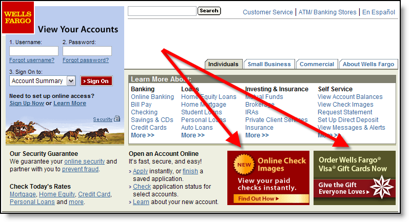
Small "postage stamp" banners in the lower portion of the screen, but above the fold (click on inset above for closeup). For example, Wells Fargo’s layout for the past three years displays square banners in the lower-right corner. Currently, two of eight possible choices are shown when the user arrives at the site (click refresh a few times to cycle through all eight).

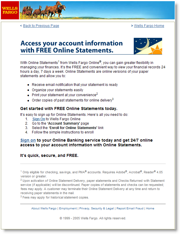
Each banner leads to a well-crafted landing page with more information about the product or service. Not all of the banners are product pitches. For example, one describes an online feature, My Spending Report (NetBanker Feb. 17); another is service oriented, reminding users that they can access accounts 24/7 even during the holidays; while another (see Landing Page below) is designed to save the bank money by encouraging users to receive electronic statements instead of paper ones (click on the banners below for a closeup).

Gallery of Wells Fargo homepage banners displayed Dec 27, 2005

Wellsfargo_homepage_ad8 Wellsfargo_homepage_ad7 Wellsfargo_homepage_ad6 Wellsfargo_homepage_ad5 Wellsfargo_homepage_ad4 Wellsfargo_homepage_ad3  Wellsfargo_homepage_ad2_1 Wellsfargo_homepage_ad1

Landing Pages
It’s one thing to get your banner noticed, but then what? Users that click for more information should be led to a specific page, called a landing page, that reinforces the banner and provides more information. If the ultimate goal is a product sale, then the landing page should act as a funnel, delivering users to a single, actionable step, BUY. Extraneous navigational choices, like cracks in a plastic funnel, simply cause leakage of an extremely valuable commodity, interested prospects.

Wellsfargo_landingpage_for_ad6Wells Fargo has a separate landing page for each of the eight banners shown above. At left (click for closeup), you can see the one created for the "FREE online statement delivery" banner. In this case the bank is hoping to boost usage of online banking, and specifically the online statement feature, which has the potential of not only improving account retention, but also cutting printing and postage costs as users elect to turn off paper statements (required in this case).

JB

If you’re in need of more financial interactive marketing ideas, check out the Interactive Financial Marketing Database from our sister publication, the Online Banking Report.

Citibank Logout Screen Example

One neglected area of the online customer experience is logging out. Are you thanking your customer for banking online? Reinforcing that their secure session has safely ended? How about a little cross-promotion from time to time?

We’ve logged off more than a thousand times from dozens of financial institutions and it’s never been particularly noteworthy.

Citi_signoff_screen However, this week Citibank’s logoff screen caught our eye (click on inset for full screenshot). Not only did the bank thank us for our business, they posted an attractive promotion for its banking rewards program.

You may not have offer something quite as elaborate as the Citi program, but you can effectively use the logoff page to highlight service improvements, call attention to upcoming events, or highlight community involvement and volunteer opportunities.

JB

Getting Online Banking Users to NOTICE Your Homepage

Online banking users often visit their primary bank’s website several times each week. Outside of webmail and chat services, few companies have this much traffic from their customers.

However, most online banking customers only touch down on the homepage for the briefest of moments; typing in a username and password then moving on. The challenge is to get them to notice your marketing and service messages.

One possible way to move those logging in eyeballs off the username/password corner, is to post easily-scannable, interesting, and ever changing information in a different area of the homepage, enticing the eyeballs to wander. In the banking world, there are few content choices available that fits this criteria.

Weather information.

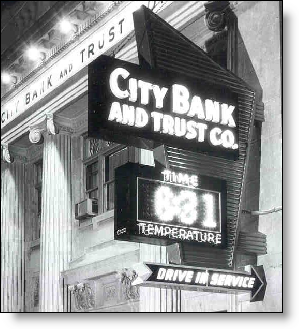
Time_tempThe time/weather sign in front of the bank branch used to be, and still is in some places, a common sight on main street.

Why not take that same approach online? Place a personalized weather "sign" some distance from your login area. If you have the capability to move content elements around, test different locations and see which cause the most click-throughs on other sales and service elements.

Analysis
Thankfully, most banks have retreated from the idea of becoming a news and information portal. It’s just not possible to compete with CNN.com, Yahoo Finance, and others in disseminating news and investment info.

However, weather is another matter. Almost everyone is interested in the subject matter; it takes only a few seconds to absorb, so it’s not distracting; it’s dirt cheap to post on your website; it changes constantly; and it can be easily personalized to the user’s zip code.

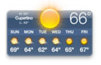
Apple_weatherAlthough it still carries negative connotations as an example of bubble-induced folly (e.g., at Net.Finance this week, a Wells Fargo exec told how in 2000, the bank was actually seeking suppliers for "horoscopes and weather info."), the latest upgrades to Apple’s OS X, Tiger, include a cool dashboard, which includes among other things, a weather display (see inset).

For more information, see OBR 85.

JB