The Evolution of Mobile Weather Apps (and what it means for banking)

The Evolution of Mobile Weather Apps (and what it means for banking)

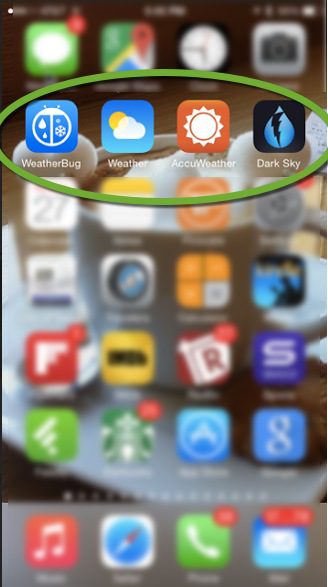
weather_buttons_iphoneIn 2007, I’d never used an Apple product. But I was one of the first to get an iPhone that year. I wanted to see for myself what the much-touted device meant for the future of financial services. While there was no banking in v1.0, I found myself enthralled with the weather button, my first taste of the elegance of a native app experience.

Fast forward (almost) 8 years, and the weather button(s) is still my most-used app (as you can see on my home screen at right with four weather choices). But in the face of fierce competition, even weather apps have evolved from being completely static to having a useful alerting functions. The Dark Sky app (screenshot below, note 1) hits me with a popup notification and jingle 10 minutes before it’s about to rain, which comes in very handy in Seattle.

Look at the schematic of the Dark Sky weather app below. Five years ago weather apps gave us the a simple probability of rain some time during the whole day. Now it predicts precisely the exact minute rain will start in my neighborhood. That’s a massive functional improvement.
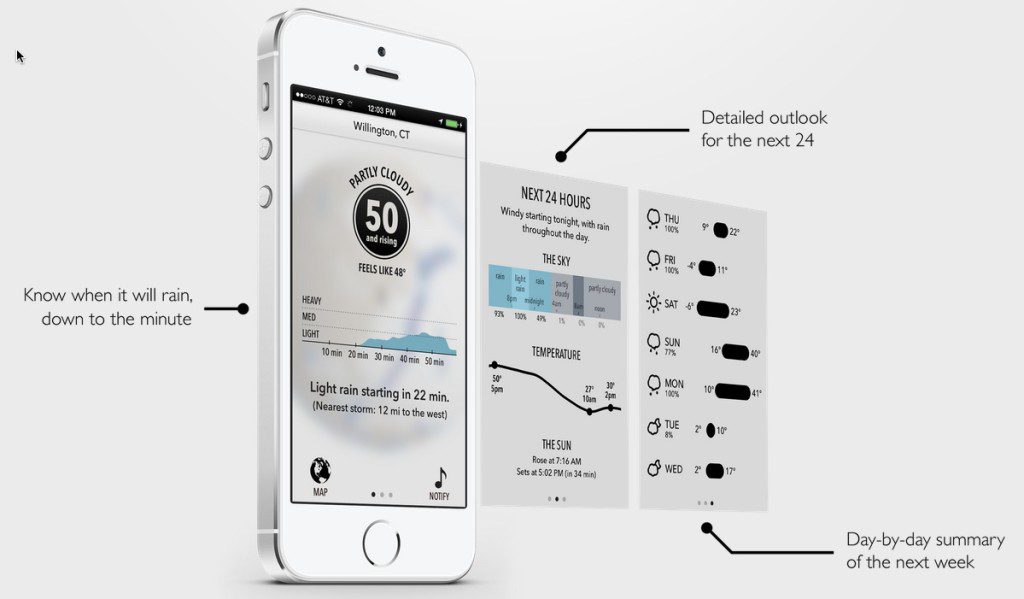
dark_sky

Relevance to bankers
The evolution in mobile weather demonstrates the importance of transitioning from static information retrieval to active alerting. A good passive experience was fine for the first wave of mobile information (2008 to 2013/2014), but the best apps now go way beyond that now.

Let’s switch gears to money management. Your preferred banking/PFM app knows how much you’ve spent compared to previous periods, it knows how much you make and what bills are due before the next paycheck. So your money app can alert you, in real time, when you are bumping up to the last of your discretionary spending each pay period.

And while that’s a pragmatic use case, it’s also a negative one since the app keeps reminding users how strapped they are. A more entertaining use revolves around purchase recommendations. My money manager (Mint in this case, but it could be my bank/card issuer), knows I’m a coffee shop addict. The app could give me a heads-up when I was in the vicinity of a high-rated coffee shop. Of course, the recommendations would have to be highly relevant and focused, or I would just ignore (or turn off) the alerts.

Bottom line: It’s time for banking/PFM apps to be as smart about your money as Dark Sky is about the rain. I forecast a bright future for FIs that get it right.

——–

Note:
1. Dark Sky is so good, they actually can charge $4 for it in face of dozens of free apps (including the one that comes bundled on all iPhones).
20 Mobile Banking Landing Pages

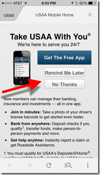
image Last week, I caught up with the USAA folk to share thoughts on the future of mobile banking. They explained how they are converting visitors on the mobile web to their native app with a popup (interstitial) prompt (see inset). It’s the first time I’ve seen a bank use that desktop technique on the mobile web.

It had been more than a year since I took a tour of major banks using my phone’s browser (Safari, iPhone 5, iOS7). The last time proved relatively uninspiring. Several banks showed a mobile-optimized view, but most defaulted to their desktop-PC view which is unusable without tedious “pinch and zooming.” And no one pushed users to the native app.

Today, that’s changed dramatically. Of the 20 major mobile banking websites I visited, only one (Citibank) delivered a desktop-PC view (and that varied depending on which URL was used to enter the Citibank site). And four of the 20 pushed their mobile app heavily (and three more showed a download link to the app store).

________________________________

Recommendations 
________________________________

  • While there has been much talk about pushing customers to less-costly HTML5 and  responsive-design mobile websites, it’s still an app world (1 million and counting on iOS alone). And that’s not changing if Apple has anything to say about it. If you have a native app, make sure your mobile customers know about it.
  • Every mobile web front landing page should include a prominent link (above the fold) to your native app(s). And it’s not enough to simply show the Apple and Android app store logos. That’s too subtle for many novice smartphone users.
  • The call-to-action should list at least one benefit to the native app. Facebook, for instance, simply says, “browser faster.”
  • Test an interstitial landing page such as the one currently used by USAA. Users can choose “remind me later” to defer their decision to download the app, or they can kill the interstitial permanently by choosing “no thanks.”

Table: Mobile web default view from 20 major mobile FIs
Key: Native promo = Promotes native app
Mobile web = Delivers mobile-optimized view
Pinch & Zoom = No mobile optimization on main landing page, requires pinching and zooming to navigate

  Mobile Optimized View? Native App Call to Action? App Store link? Large Promo?
Native app promo        
Bank of America Yes Yes Yes Yes
Barclays (UK) Yes Yes Yes Yes
Moven Yes Yes Yes Yes
USAA Yes Yes Yes Yes
Mobile web        
American Express Yes No No No
BB&T Yes No No No
BECU Yes Yes No No
BMO Harris Yes No No No
Capital One Yes No No Yes
Chase Yes No Yes No
Fifth Third Yes No No No
ING Direct (Turkey) Yes No No Yes
Regions Yes* No No No
Schwab Yes Yes Yes No
Simple Yes No No Yes
SunTrust Yes No No No
US Bank Yes No No No
Wells Fargo Yes No Yes No
Pinch&Zoom        
Citibank Varies by URL No No No
GoBank No No No No

*Regions uses popup to provide choice of mobile view or full website

4 Amazon Fire Smartphone Features that Should Be Used in Mobile Banking

imageSeattle was abuzz today with the launch of Amazon’s long-rumored smartphone, dubbed Fire. Naturally, I look at everything through a digital banking lens. So here are its innovations that could be leveraged or imitated for mobile banking.

_______________________________

1. Tilt to scroll
_______________________________

imageDescription: Fire users can tilt or swivel the phone to navigate through an app. For example, on the Kindle app, users can advance the page by tilting the phone so they don’t have touch the screen every time you get to the end of the page.

Mobile banking use: Tilting would make a convenient way to page through transaction records. It could also be used to open additional functions such as tagging transactions or initiating a payment (e.g., Starbucks “shake to pay”).

Verdict: Until I get my hands on the phone, it’s a little hard to know how useful this feature will be. But it sounds like a nicely useful UI improvement (note 1).

_____________________________________

2. Mayday button
_____________________________________

image Description: Like the Kindle Fire, the Fire smartphone has one-button access to 24/7 video customer service with response time measured in seconds. Amazon calls it the “mayday” button. 

image Mobile banking use: Most mobile banking applications include telephone integration for a voice call to the call center. Instant video conferencing could be a good premium feature for high-value and/or fee-paying customers.

Verdict: While video customer support is not a killer feature, it has a nice ring to it when listed on your feature/benefit list. Certainly, banks should work on quicker response times for various types of products and/or customers.

_________________________________

3. Unlimited cloud storage
_________________________________

image Description: Amazon raised the bar for photograph storage, promising unlimited storage for all the pictures snapped from your Fire’s camera.

Mobile banking use: Unlimited cloud storage for all transactions and statements.

Verdict: I know your compliance team gets queasy when discussing long-term data storage. But it’s time to rise above all that and invoke one of the best customer-retention tools imaginable, unlimited secure storage of all banking records (see note 2).

_____________________________________________

4. One year of Amazon Prime membership
_____________________________________________

image Description: Fire smartphone buyers get one year of Amazon Prime membership free of charge. This savings of $100 covers half the cost of the 32GB phone ($199 with 2-year contract).

Mobile banking use: Premium channel

Verdict: Digital banking channels need an identifiable revenue stream to help pay for needed innovations and specialized services. A $4 to $5/mo “bank prime” membership program would go a long way in making digital a profit center (see previous post, note 2).

——————

Notes:
1. For more info, see our latest OBR Report on advanced mobile features (published June 2014, subscription). 
2. For info on fee-based financial services, see Online Banking Report (subscription) on fee-based online services (May 2011); paperless banking and online storage (late 2010); and lifetime statement archives (2005).

New OBR Published: The Rise of Mobile Banking

clip_image002Seven years ago we published our first full report on mobile banking. At that point, you could see that it would be widely used to access current balances and transactions. However, the broader services powered by the camera (remote deposit); GPS (location-aware alerts); and the audio jack (Square) were practically unimaginable back then.  

But now it doesn’t take much of an imagination to see that banking is best done on a smartphone. The screen size is perfect for managing the small amount of data needed to understand your current financial position. And the always-on, always-with-you device is ideal for handling issues that just can’t wait until you are home in front of your desktop computer.

So let’s no longer think of mobile as a support channel. It’s the other way around. Branches, call centers, and even online banking will support mobile banking, which is destined to be the dominant form of money management for the next 20 to 30 years.

Last month, we looked at a key missing ingredient in mobile banking, the new account application. This month, we look at the advanced capabilities banks must support to make the mobile UX superior to online.


About the report


image Advanced Features for Mobile Banking (link)
A guide to the important smartphone features coming in 2015 and beyond

Authors: Julie Schicktanz, Research Analyst &
Jim Bruene, Editor & Founder, Online Banking Report

Published 9 June 2014

Length: 44 pages

Cost: No extra charge for OBR subscribers, USD $395 for others (here)


Companies mentioned: ABN AMRO (Netherlands), Amazon, Apple, Bank of America, BBCN Bank, Blippar, BNP Paribas (France), Chase Bank, Cluster, Emirates NBD Bank, First National Bank (South Africa), Fiserv, Fitbit, Google, Greater Texas Federal Credit Union, Halifax Bank (UK), Isis, Malauzai, Mitek, PayPal, Pixeliris (France), PrivatBank (Ukraine), Rabobank (US), Royal Bank of Canada, Samsung, Simple (BBVA), Square, Southern Bancorp, St. George Bank (Australia), Starbucks, USAA, Verity Credit Union, Wells Fargo, Westpac (New Zealand)

————————————

Report excerpt:

image

Apple Touches Off First Wave of Mobile Banking Biometrics

image We’ve known this day was coming ever since Apple acquired AuthenTec two years ago for $350 million. That was real money back in the pre-Beats/Nest/Oculus days.

Monday, Apple made it official at its annual developers’ conference: The fingerprint authentication system built into the iPhone 5S (Touch ID) will open to outside developers in the next iOS update (v8.0 expected in mid-September). That means that app publishers, including banks, credit unions & wallet providers, will be able to use it to provide initial authorization into a secure app. 

image The new feature was demonstrated on stage by logging in to Mint (see inset, screen cap tweeted by Bradley Leimer Monday). In the demo, Mint users are prompted to use the touchpad to open the app (the small type says, “Please authenticate in order to proceed”). Users are also given a password option.

Most likely, banks will use Touch ID, as well as other handset-resident biometric systems (note 1) to deliver “read-only” access to data. It’s an approach that’s been catching on around the world even before Apple’s biometric wizardry. Citibank is the most recent to provide a no-login glimpse in its mobile app (called SnapShot), rolling it out nationwide two weeks ago (press release). It’s also used at Westpac (NZ), Commonwealth (AU), Bank of the West, City Bank of Texas and many more (note 2).

For anything transactional, such as a wire transfer, banks will likely require additional authentication (see our Nine Circles of Security).

And of course, these security changes will generally need to be optional for customers until they become commonly accepted practices. Most users are still extremely wary of security on mobile phones, even though it is a marked improvement over the desktop (note 3).

While it’s too early to know if any financial institutions will have it enabled by September, one fintech payment provider, CardFlight, wasted no time, announcing support for Touch ID just a few hours after the Apple keynote (note 4).

—————————

Notes:
1. Celent’s Jacob Jegher showed me his facial recognition login on his Android phone (Samsung?) at last month’s FinovateSpring. Very cool, though he doesn’t have it enabled since it slows up the login process just slightly.
2. Malauzai Software powers more than 90 credit unions and banks alone (post).
3. See our latest report on Mobile Security (March 2014, subscription) for more info.
4. Cardflight will be showing off its latest tools at our first developer event, FinDEVr, 30 Sep 2014, in San Francisco. 

Mobile PFM: Tracking Automobile Trips

imageLast week, MileIQ cracked the top-50 in Apple’s “Finance | Free” category. Think of it as Fitbit for cars, running in the background automatically logging all car trips (and killing battery life). 

At the end of each trip, users categorize the trip by swiping left for personal or right for business (see screenshots below). Users can also annotate transactions by “flipping” them over and typing basic details (see screenshot 2 below).

That’s basically all there is to the mobile part. Users go to the companion desktop dashboard (screenshot #5) to further categorize trips, stitch the various segments into a single trip, delete items, add parking and toll fees, edit the tags, manually add a trip and create reports.

You can also create a quick email report at the push of button from within the app (screenshot #6).

It’s free for 40 trips per month, but then costs $5.99/mo or $60 annually. It could make for a nice auto loan/lease premium item.

___________________________

Relevance for FIs
___________________________

This feature would be a nice, fee-based value-add for personal financial management (PFM) programs. But the more interesting aspect is the UI. Banks could provide a similar function for handling all transactions. Users swipe to the left to categorize a transaction as tax-deductible/business or right if not. Later, just the left-swiped transactions could be tagged with more specific categories (business travel, charitable contributions, etc).

This simple approach ever so slightly “gamifies” mobile-transaction processing, helping users save money and better manage their finances. 

———————-

Screenshots
Mobile UI

#1 (left) Main page shows drive(s) to classify
#2 (right) Annotation available on the “back” of each drive card

 image        image

#3 (left) Congratulations for handling all transactions  
#4 (right) Pricing options

 image       image

#5 Desktop dashboard

image

#6 Quick email report, generated by button in mobile

image

————————

1. We’ve tackled PFM numerous times over the years in our Online Banking Report. Most recently here (subscription).

BillGuard Brings Email-Like UI to Mobile Banking Transaction Flow

image The ink wasn’t dry on my 2014 wishlist, when I got a message from BillGuard founder Yaron Samid, informing me that its new mobile UI was already doing what I’d most hoped for:

Wish #1: A Gmail-like priority inbox/feed for my financial transactions.

It’s as yet not quite Gmail-level functionality — for example, I’d like more tagging options than just “flag for later” — but compared to the state-of-the-mobile-art today, it’s pretty awesome. Thanks to BillGuard for getting the year off to a great start (note 1).

__________________________________

How it works
__________________________________

imageBillGuard aggregates credit and debit card transactions and flags suspicious items for review (see previous posts). So in that way, it has always acted like the Priority Inbox function within Gmail. However, its desktop UI looks more like a traditional PFM than an email inbox.

But for the smartphone, BillGuard has dramatically changed the interface. As you can see in the inset, they use “Inbox” as the name of the transaction register. There is even a red bubble showing how many new charges are available for review (see inset right).

The five primary items on the main screen:

  • Large green “card” >> Summarizes current month’s spending across all aggregated cards (you can also swipe through the individual cards)
  • Inbox >> New transactions and any that you’ve flagged for followup
  • All >> All transactions in a single infinitely scrolling list (I have 1,000+ transaction going back three years, and I can scroll through all of them in less than a minute). You can look at all transactions or just the recurring ones.
  • Analytics >> Month-over-month spending graphs
  • Savings >> Merchant-funded offers

___________________________________

imageMore on the UI
___________________________________

1. Inbox view (click screenshot for a larger graphic):

  • Transactions are sorted with suspicious and unknown merchants listed on top and new, unviewed transactions below
  • Users can choose the right “Follow Up” tab to view only those transactions they have flagged for followup (see #x below)
  • User can swipe the transaction right to move it out of the new transaction inbox, as shown in the green “Metropolitan Market” transaction at right

2. Transaction detail image

  • The transaction “card” contains expanded info on known merchants such as full name, location, and URL
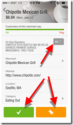
  • There are three key buttons:
    A. Green checkbox to okay the transaction, removing it from the inbox
    B. Orange “followup” button to keep the transaction in the pending list for later review
    C. Small gray box in upper right with a number that indicates how many transactions you’ve had with this merchant; clicking it brings up the list of all (10 in this case)


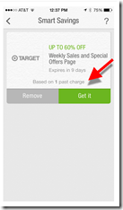
image 3. Merchant offer

  • Based on my transaction history, a discount offer from Target is displayed; clicking the green button brings up redemption options, in this case:
    – Email offer
    – Shop now


———————————-
Notes:
1. The mobile UI was actually released in the latter part of 2013.
2. Screenshot at top of post is an iPhone notification.

Mobile Monday: Reminding Customers to Make Mobile Number Primary

image Now that mobile is on its way to becoming the dominant banking interaction channel, we are going to obsess on the nitty-gritty details this year, both here and in our Online Banking Report newsletter. 

First up: How to get better mobile data into your CRM. By now many (most?) readers do a good job grabbing mobile numbers during new customer onboarding. But are you doing the same with existing customers? And even if you have a mobile number on file, is it the primary phone number on the customer’s account?

Capital One 360 (formerly ING Direct) is reminding customers at login to take a look at their account info on file. And furthermore, the bank has added a small reminder to make your mobile number primary, if desired (see screenshot below).

Bottom line: Having the best primary phone number is a small, but important, part of servicing customers effectively. My only quibble with Capital One’s implementation is that the reminder is easy to overlook as it’s buried mid-page in a small font with a blue “i” graphic. A more dramatic graphical treatment would improve the results.

——————————————

Capital One 360 login reminder page (30 Dec 2013)

image

—————

Image source: Mobile First webinar by Ken Fang posted on Howto.gov

Umpqua Bank Launches Mortgage Sales Tool: Home Hunter

image Ever since I saw CEO Ray Davis speak at BAI in the mid-1990s, I’ve been a huge Umpqua Bank fan. But most of the bank’s notoriety is around its fresh take on the brick-and-mortar experience. But that’s not my thing, at all, so I don’t get a chance to write about them often.

However, today I was delighted to see a new mobile app appear in the iOS store called Umpqua Home Hunter. It’s a simple tool for house hunting. When a home buyer runs across a home of interest when out and about, they can open up the Home Hunter and automatically document the address (via GPS), then add comments, pictures, and a 1-to-5 star rating (see screenshots below).

There is also clever integration to Umpqua lenders. Users can forward the house to the lender of their choice to start the mortgage prequalification process (see third screenshot). 

Bottom line: While the app is pretty basic, lacking integration to home value databases such as Zillow, or MLS/Realtor services such as Redfin, it could recoup its development costs with a couple incremental mortgages every month. And even if it fails to do that, it’s a novel mobile service that helps position Umpqua as an innovator in digital, like they’ve long been in branch banking. 

—————————————-

Users add a home details                    ….pictures, comments, rating

image       image     

Below left: Users have the option to send homes over to their Umpqua
loan officer to get the mortgage process started

umpqua_mtg_app.jpg

image   


—————————–
Note: For more on mobile banking and/or online lending, see our Online Banking Report archives (subscription).

BBVA Compass Bundles Microbiz Checking with PAYware Mobile Card Processing

imageI rarely get a chance to write about checking accounts, so I was glad to see the BBVA Compass announcement on the wires yesterday.

The bank launched a Business Mobility Bundle which has checking, mobile card processing and a free Galaxy Tab 3 Android tablet (wifi-only), a $200 value (note 1). It’s a soft bundle (note 2) of the bank’s existing e-Business Checking Account and its Merchant Mobility Pack, powered by Verifone PAYware

imageThe checking account is fee-free up to a certain level of activity (note 3). But the optional card-acceptance piece is $24.95/mo, which is waived in this promo for 12 months. The offer is not currently visible on the bank’s website, but a link in the press release leads to a landing page with the offer (see first screenshot).

Myimage take: The Business Mobility positioning is excellent, nicely tying two key business products together. The underlying accounts seem to be solid values, and the free Samsung tablet is sure to spark sales. 

However, my initial enthusiasm from the press release was somewhat tempered by the realities of the fine print (see second screenshot, note 1) and overall execution. For example:

  • No online application, it’s a call-me form (albeit a good one)
  • Mobile deposit is limited to $1,200 every 30 days
  • Both the free e-Business Checking and the 12-month fee waiver for mobile card acceptance are currently available on the bank’s website. There are no added benefits to the Business Mobility Bundle, outside the tablet premium
  • The free tablet is wifi only and sells for $199 online (it’s no iPad)

The offer is not currently visible on the BBVA website, even through site search, presumably so it doesn’t irk existing customers who cannot get the free tablet.

Bottom line: I like the promotion, although I wish the bundle had more features. For example, mobile banking pre-loaded on the Galaxy; customer service available via Skype; or even higher mobile-deposit limits for those using card processing (note 4).

—————————

BBVA Business Mobility landing page (link, 30 July 2013)

image

Fine print (positioned directly below the screen shown above)

image

————————————-

Notes:
1. Fine print: (A) New small business customers only, 1 per household/biz; (B) Must perform 10 transactions, not including intrabank funds transfers, within 30 days of account opening; (C) $100 minimum opening deposit
2. I just made up that term, but what I mean is that the customer is not required to add the Merchant Mobility piece to qualify for the free Samsung tablet. The checking account alone earns the premium.
3. Transaction limits before fees kick in:
– 50 items processed
– 2 in-branch deposits
– 5 processed checks and/or in-branch withdrawals
– $5,000 cash processing
In addition, mobile deposit has stingy initial limits of $500 max per item and only $1,200 max every 30 days  
4. The landing page could use more powerful visuals showing the BBVA mobile app and/or PAYware dongle in use.

Will mobile finally make PFM popular?

image In the online desktop era, we’ve seen only one direct-to-consumer PFM mega-hit: Mint (see note 1).

But looking at recent rankings in the U.S. Apple App Store (iOS) it looks like that may be changing. There are currently five specialty PFMs in the 13 most-downloaded free finance apps, including Mint of course. Is the mobile device finally what will make PFMs popular with consumers? Or are these apps just being downloaded by curious smartphone owners who will never register for the service, let alone become active users? 

My Take: Mobile is, and will be, a huge driver for specialty PFM apps. App stores help consumers find the services, and mobile makes them less daunting to use. But it’s not just the mobile platform driving usage at these four challengers (see below), it’s the way they have positioned themselves with tangible consumer benefits (e.g., save money by spotting fraud charges) rather than the nebulous (e.g., “manage your spending for a better life”).

Parsing this list a little closer, only Mint is positioned as a pure PFM. The challengers are all backing into PFM from various niches:

  • imageBillGuard (#5) is positioned as a fraudulent charge protector
    and accomplishes that through account monitoring. It appeals to
    those concerned about losing money to fraudsters and greedy merchants.
  • imageLemon (#7) is positioned around mobile wallets and payments, but it also offers account monitoring as a premium service. It appeals to early adopters wanting to use their smartphones for payments and all things financial. 

  • imageManilla (#12) revolves around billing and financial statements, but obviously aggregated bank and credit card statements is a core PFM feature. It appeals to those wanting better management of their mess of paper bills, receipts and records. 

  • imageCredit Karma (#13) focuses on credit scores and debt management, but recently extended into full account monitoring. It appeals to those wanting to improve their credit scores and better manage debt.

Because most consumers have no interest in looking at a bar chart of their spending, it makes sense to sneak in the PFM piece through more compelling, benefit-laden service offerings. For banks, all four of these approaches are worth a look. 

—————————

Table: 20 most popular free finance mobile apps in U.S. Apple App Store 
Does not include several non-financial apps

  Name Primary Type
1 Capital One Bank/card
2 Chase Bank/card
3 Bank of America Bank/card
4 PayPal Payment
5 BillGuard (note 2) PFM: cards
6 Wells Fargo Bank/card
7 Lemon PFM: cards
8 Mint PFM: general
9 American Express Card
10 Scottrade Investing
11 USAA Bank
12 Manilla PFM: billing
13 Credit Karma PFM: debt
14 Discover Card
15 Citi Bank/card
16 Xoom Money Transfer Remittances
17 TD Bank Bank
18 Venmo (Braintree) Payments
19 Fidelity Investing
20 US Bank Bank/card

Source: U.S. Apple App Store accessed via iPhone 5 from Seattle, WA on Fri. July 26, 2013 at 11 AM PDT 

——————————–

Notes:
1. Not counting bank-branded PFMs from Intuit, Yodlee, Geezeo, Money Desktop, et al. And not counting the packaged-software stalwarts from the 1990s, Microsoft Money and Quicken.
2. BillGuard moved up to the #1 position over the weekend and remains there as of 6:00 PM PDT today
3. Check (formerly PageOnce) should also be considered in this discussion. It has been a top-20 finance app for the past few years, despite currently running in the lower 30s, probably due to its recent rebranding to an entirely new name
4. For more info, see the Online Banking Report PFM library (subscription required): PFM 4.0 (June 2012); PFM 3.0 (May 2010); Social Personal Finance (June 2007); Personal Finance Features for Online Banking (Aug 2006).

Tablet vs. Smartphone Mobile Banking Usage Data from Malauzai Software

image I’ve always been a numbers junkie, so it’s much appreciated when companies send along snippets of proprietary data to share with readers. I have a few more items in the pipeline, so keep your slide decks handy.  

Today, we get a look at tablet vs. smartphone usage, courtesy of Malauzai Software. The data is from June 2013 (note 1) aggregated across 99 smaller banks and credit union clients with 98,000 total active mobile users (note 2). Some user behavior is significantly impacted by the Malauzai-powered app’s specific design while other behavior is more applicable to mobile banking users in general (see the comments below from Malauzai).  

  • Login frequency: In June, 1.2 million total logins occurred across 98,000 active iPad and smartphone (iPhone/Android) users. Both types logged in at the same rate of 3x per week.
  • Login failure: Surprisingly, the login failure rate is higher on iPads, 27% vs. 15%. 
    Why? It is mainly due to “fat-fingering” as most users are successful on their second login attempt. Malauzai believes that tablet users are less comfortable with their keyboards.
  • Session duration: iPad users spent 50% more time per session (105 seconds on average) compared to smartphone users (70 seconds).
  • Logging off:  On the smartphone, 21% regularly log off the device vs. 80% on the iPad. 
    Why? It may be due to the iPad being more of a shared device in a family or household. Also, the logoff button is more prominently displayed on the iPad.
  • Internal funds transfers: iPad users made transfers valued at 2.3x that of smartphone users. The average iPad user transferred just under $900 vs. about $400 via smartphone. 
    Why? Malauzai speculates (although they do NOT have customers’ balance-data to verify) that iPad users tend to keep higher balances and therefore have higher transfer volume. 
  • Transaction history: Transaction details are used by 73% of iPad users vs. 37% for smartphones. 
    Why: Malauzai believes it is caused by the transactional data being more readily available on the iPad due to its more-prominent display and larger text.
  • Branch/ATM lookup:  iPad users look up branches/ATMs 3x more frequently than smartphone users. 
    Why? The Locator on the iPad UI is more prominent, more user-friendly and has bigger graphics.

——————————

Notes:
1. Malauzai has been publishing metrics for five months; see previous months here.
2. Clients include Air Academy FCU, Ameriana Bank (see inset), Centier Bank, City Bank of Texas, First Financial, Greater Texas FCU, and Walden Savings Bank. See our most recent post for more info.