Boeing Employees Credit Union (BECU) Pitches 7.50% APR Savings/Checking Account

One of my favorite Sunday pastimes is seeing which bank dropped $25,000+ on a front-section full-page Seattle Times print ad. Over the years, there have been fewer and fewer sightings. And usually, it's BofA, Key Bank, or US Bank making the bold print buys in our market.

But today, Boeing Employees Credit Union, or BECU as they refer to themselves now that they allow anyone in the state to join, bought the entire page A10 and used most of it to say:

Shouldn't you profit from your bank rather than the other way around?

Bottom 1/3 of BECU print ad in Sunday Seattle Times 1 April 2007That's an attention-grabbing headline, especially in Seattle with plenty of anti-big-business sentiment. But it won't drive sales unless the CU can back it up with tangible benefits. And it does, with a large reverse-type rate offer for Member Advantage Savings & Checking (bottom section of print ad at right):

7.50% APY on your first $500  

Analysis
This is a great approach for going after mainstream consumers. Why?

  • They bash the banks to gain attention, always a popular strategy…even the banks do it (see here).
  • They don't waste space, or risk customer confusion, by going into detail about their credit union status; in fact they don't even use the words credit union, other than the CU in their name, instead using the generic "bank" in the headline. 
  • They pay 2%+ more on savings than even the highest-rate online bank…but it's only on the first $500. Now that won't bring in the $25,000 deposits, but it will bring in new checking accounts and relationships.
  • The extra 6% BECU pays out on the $500 balance, only costs them $30 per year…a small price to pay for a new relationship, which requires an electronic connection, either direct deposit, online bill pay, or electronic statements (of course, the Seattle Times ad drives the acquisition price up considerably).
  • The same headshot of "Cyrena S." runs in the lower-left of the print ad and in the middle of BECU's homepage (see screenshot below), nicely tying the website to the print-ad strategy.

BECU homepage with 7.50% Member Advantage pitch

A few areas could be improved, mostly within the Web portion of the call to action: 

  • The online signup option is buried at the bottom of the Member Advantage landing page (here), and uses a generic link and understated small maroon button, rather than the large red/orange "Apply Now" graphic used by most retail financial institutions. 
  • The online app appears in a small popup window and is an old school all-text version powered by uMonitor. If you want to drive online sales, the application should be more user friendly and graphic-rich. Despite the shortcomings of CashEdge's online application design (see here), its layout is easier to follow. 
  • The go-to rate after the first $500 is just 1.75%; that's a bit less than one would expect from someone spending so much money pitching "earn more" in 48-point type.
  • Although BECU appears as the top organic result in Google searches involving the credit union's actual name, it doesn't show up on the first page for generic searches for "seattle savings accounts" or even "seattle credit unions." BECU should consider supporting its print buy with search engine advertising.  
  • The 7.50% advertised APY is identical to the 7.50% APR used by US Bank to promote its home equity product a few pages earlier in the same Sunday Seattle Times section. It might help to show a competitive comparison against other savings rates to emphasize that this is a fantastic DEPOSIT rate, not merely a competitive lending rate.

Chase Attracts New Users with Catchy Button but Loses them on the Enrollment Form

Over the years, Chase Bank has made impressive design improvements on its homepage (see note 1). One thing they do better than most is attract the attention of their non-online banking customers.

A large blue square surrounding an orange button beckons users to "Get a User ID" (see inset). It's well positioned in the prime upper-left corner, and it has the ubiquitous "Web 2.0" orange working for it.

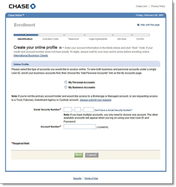
Unfortunately, after clicking the button you are transported back in time to a page virtually devoid of color and design (see screenshot below). In addition, the form immediately asks for info that many users may not want to reveal (SSN) or may not have access to at the moment (account number). 

Recommendations

  1. Redesign the page to make it more appealing.
  2. Add prominent links to customer service for help.
  3. Ask only easy questions on the first page: name and email address is enough to 
    engage the applicant and provide enough info for followup if the
    application is abandoned. 

Chase Bank first pag of online banking enrollment CLICK TO ENLARGE

Notes:

1. Here's the homepage today (left) vs. the busy look four years ago (20 Nov. 2002

Chase homepage 9 Feb 2007Chase homepage 20 Nov 2002 CLICK TO ENLARGE


YADB* Huntington Goes Direct

First reported by Bank Deals today (see note 1), Huntington Bank has recently launched a new direct bank, called DirectHuntington <directhuntington.com>. It goes against the naming convention of having "direct" follow the main brand name, but it shouldn't make too much difference. Still, the bank should secure domain-name rights to HuntingtonDirect.com, currently used by New.net Inc to post a few generic banking links and throw a pop-up or two at unsuspecting users. 

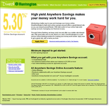
Huntington chose a color palette that makes it stand out from other financial institutions, a good move. However, the yellow 5.30% APR doesn't stand out as well as it should given its importance in the purchase decision (see sceenshot below).

But once again the CashEdge-powered online application leaves a lot to be desired (see previous coverage here and second screenshot below). But before you can even see the application, you must agree to the "Consent for Electronic Disclosure," a terrible first impression for someone who's thinking of sending you ten-grand or more (see screenshot below).

Direct Huntington pre-application consent for electronic disclosure

The upper-right Online Guarantee is a nice touch, but it links back to the main Huntington site which might be confusing for users (see screenshot below).

Direct Huntington online deposit application page 1

There is no mention of DirectHuntington at Huntington's main website <huntington.com>. However, there's a secret code (anywheresavings) you can enter into the Special Offers box that takes you to the direct banking site. 

*Yet another direct bank

Note:

  1. The Bank Deals writer had a relatively uninspiring call with DirectHuntington's customer service when he researched the account. 

The iGoBanking/CashEdge New Account Application Needs Improvement

Link to iGoBanking home page As mentioned earlier this week (previous post here), Flushing Financial's new Internet offering iGoBanking features a great price, modern homepage design, visible rates, and an overall good user experience.

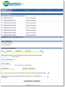
iGoBanking application hosted by CashEdge CLICK TO ENLARGEAt least until prospective customers decide to buy. Once the user clicks the grammatically challenged link, "iGo Open a New Account," things go downhill quickly. The application (see screenshots right and below), hosted by CashEdge (see related post here), fails to maintain the user experience from the bank's homepage.

In fact, the application is a circa 1999 all-text affair that leaves you wondering if the graphic designers at CashEdge are on strike. Here are a few of the problems:   

  • No Customer Service or Help on the application
  • No telephone number
  • No way back to the homepage, the bank's logo is NOT clickable
  • Overall lack of design and graphics, even the logo in the top looks like a low-resolution version
  • The application steps are hardly visible because the white font is too thin to be easily read through the blue background
  • Social security number required on first page
  • Application is massive in length for a simple savings account (see screenshots below); we realize the need for regulatory compliance and security, but it should be either shortened or broken into smaller steps to maintain

For more on best practices in application design, refer to Online Banking Report (#104).

Screenshot: iGoBanking application page 2 (click to enlarge)

iGoBanking/CashEdge application page 2

CashEdge Claims 25% Share of 2006 Online Account Openings

I had a good chat with CashEdge <cashedge.com> VP Neil Platt at BAI's Retail Delivery last week. The company is busy working on a much-needed channel integration initiative so that account applications begun online can be completed with a phone call or even a branch visit, with no need to start all over from scratch.

Source: Cashedge CLICK TO ENLARGEThe company hopes it can capture half of what it estimates is 70% of completed online applications that go unfunded
(see chart inset).
If that's true, the payback for the solution, at least at larger financial institutions, will likely be measured in months, if not weeks.

Other projects in the works:

  • Cross-selling other bank products during the new account-opening process
  • Facilitating other types of applications, such as loans
  • Improving risk management by tapping additional data sources outside the credit bureau

CashEdge is a great example of a specialist that carves out a profitable niche in a relatively narrow, but risky area of online operations, new account funding. Thanks to big clients such as Citibank, the company is on track to facilitate one million online account openings this year, about a quarter of the estimated 3.5 to 4 million new checking and savings accounts opened this year online (Note: CashEdge estimates). 

The company ranked number 101 in INC Magazine's list of the 500 fastest growing private companies. According to the published figures, the 177-person company grew from just over $1 million in revenues in 2002, to approximately $10 million in 2005.

PayPal’s 30-Second Credit Card Application

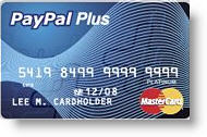
Paypal_card_ad_1 PayPal is advertising its PayPal Plus card with this box located in the upper-right of the main account start-page within the secure area (click screenshot below for a closeup).

With the falloff in response to traditional direct mail raising acquisition costs to $200 or more, a pitch delivered within an online banking session can be far less expensive. And with online banking users typically wanting to get in and out quickly, the 30-second response shows that the company is sensitive to the time constraints of its customers (notice they did NOT say that it was a 30-second process).

Paypal_pluscardThe PayPal card is issued by GE Money Bank, the same company behind PayPal Buyers Credit used by sellers to offer longer-term financing of major eBay purchases. The Plus card includes a free rewards program offering 1 point per dollar purchased. The current rewards structure includes three levels:

  • 1,000 points – Free shipping up to $7 on a PayPal purchase
  • 2,500 points – $25 voucher (for merchandise at most PayPal merchants)
  • 9,500 points – $100 voucher (for merchandise at most PayPal merchants)

The card carries a variable rate from 14.24% to 24.24% and has no annual fee.

Here's the main account page displayed after login:

Paypal_card_ad

Here's the landing page displayed after clicking on the apply button:

Paypal_card_ad_landing

MBNA’s Big & Ugly Card Application

In direct mail, sometimes "big & ugly" beats "short & sweet." But when it comes to preapproved credit card applications, we're pretty sure the 8-screen form posted by Bank of America's FIA Card Services (formerly MBNA) isn't going to help improve response rates (see the full form by clicking the continue link below).

My wife received a preapproved, direct-mail offer from Fidelity Investments where she has an investment account. The solicitation included the usual one-third sheet mail-back "acceptance form." Recipients could also either call a toll-free number, or go online to www.ibscredit.com.

Fidelity_mbna_cardapp_firstThose that went online were greeted with this almost-blank screen operating under a different URL www.applyforcreditnow.com and had no reassuring message or graphics to assure users they had not arrived at a phishing site.

Fidelity_mbna_cardapp_subsetAfter entering the 6-digit code from the mailing, prospective cardholders are transported to this boring form, which surprisingly includes MORE fields than its paper-based counterpart (click on inset for closeup; click on continuation below to see the full 800 x 5200 screenshot). For example, it contains a section to be completed by students, who are unlikely to be receiving this particular Fidelity Investments WorldPoints Visa card with no preset spending limits.

Not only are the layout and design dull, but also two major design flaws are readily apparent:

  1. No reinforcement of product benefits above the fold, especially the "0% through Nov. 2007" offer
  2. No division into smaller segments, the first of which should gather the email address

See Online Banking Report #104 for more on application design.

— JB

Endnote: Full online application (820 x 5200)

Fidelity_mbna_cardapp_long

Making the “Back” Button a Bank Profit Center

Nothing frustrates a Web user more than clicking the browser's back button during the middle of an online form, only to be hit with a browser-error message, followed by losing all the data previously entered.

There are a number of website-design techniques to reduce this problem, such as disabling the browser navigation, but those solutions can impact overall usability.

Getsmart_backbuttonwindow_1We like GetSmart's approach (click on inset for closeup). Rather than hiding the back button, the LendingTree unit (owned by IAC/InterActive), delivers a pop-up message with two choices:

  1. Continue: Users that inadvertently used the browser's back button are provided instructions on how to use the navigation tools within the webpage.
  2. Exit: Those truly wishing to leave the application are transported to the About Us page in case they need reassurances about the authenticity of the company.
  3. Search: Users not opting for doors one or two can go directly back to searching the Web through an Ask.com search box. GetSmart earns a few pennies on the transaction and keeps their name in front of prospects with a co-branded search screen at sister company Ask.com.

Action Items
Financial institutions could use a similar strategy on their forms. Any customer abandoning a form, either on purpose or by accident, should be greeted by a pop-up screen containing several of the following choices:

  • Talk to a specialist via phone, chat, or email
  • Go back to read more about the product's features and benefits
  • Save the form to complete later
  • Review other product options
  • Go to a special landing page designed to encourage completing the application
  • Search the bank's website for more info

Finally, one of the most important functions of the popup, something missing from GetSmart's, is snagging the customer's email address and permission for follow-up communications.

JB

CashAdvance.com’s Audio-Visual Loan Application

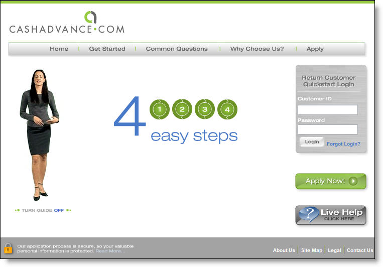
Cashadvance_avhelperNot knowing what to expect, I clicked on CashAdvance‘s <cashadvance.com> banner on eBay last night. The well-designed banner and intriguing name successfully caught my eye. It turns out that CashAdvance is the LendingTree of payday lending, referring online applicants to its lending clients, who advance $100 to $500 against next week’s paycheck. You find payday lenders all over the country, especially in strip malls and lower-income urban areas, but they are relatively new online. According to its website, CashAdvance.com was established in 1997 and has served more than a million customers.

While the product is straightforward and not a particularly good value for mainstream banking customers, financial institutions can learn a lot from how CashAdvance’s loan application is presented. While many banks and credit unions bury their application several layers deep in their website and/or post small "apply now" buttons, CashAdvance uses its spokesmodel Jade (see inset) to reassure visitors and explain the application to them in plain language and a calm voice. With broadband connections used by more than half of U.S. Internet users, it’s high time that financial institutions make better use of audio and video for customer service and sales assistance.

Cashadvance_homepage CashAdvance’s understated and well-crafted homepage uses Flash animation to deliver an audio pitch from Jade along with several benefits of its product (click on inset right for a closer look). Other than the fine print along the bottom, there are just 30 to 40 words on the entire page. While that won’t work for a full-service financial institution’s homepage, it’s a good approach for a lender’s landing page.

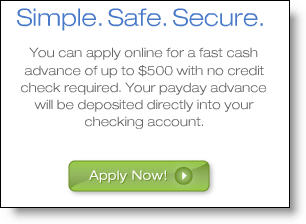
Cashadvance_calltoactionAfter the 30-second animation has run its course, an Apply Now button is left in the middle of the page (see left), along with Jade fidgeting slightly, making you feel like you should do something. A prominent Live Help button is available during daytime hours. Users also have the option of turning the animation off with a small button underneath the graphic.

JB

Progressive Insurance Quotes Competitors’ Rates

Over the years, many of our pet peeves, such as lack of email messaging, have either been resolved, or are on their way to being fixed.

Here are some of the rants that have appeared in the pages of Online Banking Report during the past 10 years:

  • Failure to use email for account-related messaging
  • Too easy to login to someone else’s account
  • Loan applications that were too cumbersome
  • Bill payment that was too slow and confusing
  • Lack of interbank transfer functionality

However, there is one issue that few have tackled; something we call open lending, or acting more like a mortgage broker than a lender. An open lender would give customers the option of seeing competitive lending products while researching loan options at your site.

IndyMac <indymac.com> is the only major lender we’ve seen embrace this idea, earning an OBR Best of the Web in 2001 (OBR 73). Another company that uses this technique in its online and offline advertising is Progressive Insurance <progressive.com>.

Progressive_comparison_ticker_2On its homepage, Progressive runs a near-real-time scrolling box with actual price comparisons for recent customers (see inset). It is even brave enough to show comparisons where they are NOT the lowest price. Note in the inset that GEICO comes in $36 less that Progressive; but if you watch the ticker continue to scroll, you will see a half-dozen companies with higher rates.

Why would a financial services company actually HELP its customers find a better deal elsewhere? Because in service industries, it’s not ALL about the price. Do you want to stay at the motel with the lowest price in the city? Do you want to be operated on by the doctor with the lowest bid? Do you want to buy insurance from a fly-by-night discounter?

No customers want a good VALUE from a company they TRUST. And what better way to demonstrate both by allowing customers to easily compare your prices with others. Many of them are going to do it anyway. Why let them off your site to do the research? Let them stay at a site they trust, help them convince themselves you offer acceptable value, the close the sale with a super-convenient application.

In Online Banking Report #125, due out in a few days, we’ll look at the pros and cons of open lending. Then in Part 2, scheduled to be published by year-end, we’ll take a closer look at Progressive’s comparative quote process in detail and build an open lending system that could be used by a bank or lender to deliver similar results.

In the meantime, if you’d like to look at our notes on Progressive’s innovative quote process, download the Word doc here.

Loan Landing Page Design

Google_homeequitydc_searchOver the next few months, we will take a long look at the marketing of loans and credit lines online. The information will be summarized and analyzed in an Online Banking Report scheduled to be published in fourth quarter. However, as we find interesting examples, we’ll report them here first, along with links to the live sites.

The first example is a good one from HomeLoanCenter.com. We ran a search on Google for "home equity Washington DC." One of the two AdWords banners on the top (click on inset for a closeup) was titled "DC Home Equity."

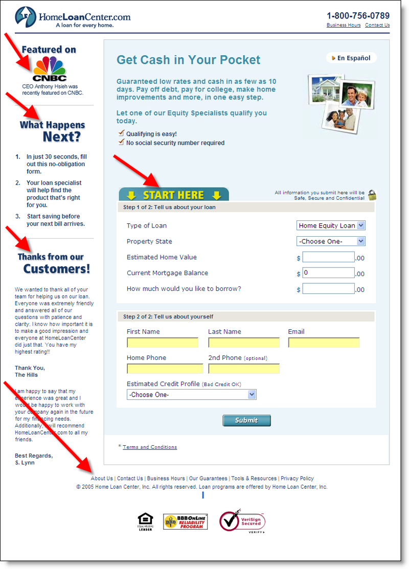
Homeloancenter_landingpageClicking on the link took us to the lender’s landing page (click on inset for closeup). Although, the page doesn’t reinforce the geographic element of our search, it otherwise does an excellent job in reassuring the user and leading them into the application process.

Along the left side are three important elements:

  • Third-party endorsement from CNBC
  • 3-point "what happens next" instructions
  • Customer testimonials

The middle of the page includes a toll-free phone number, several brief benefits, and a prominent Start Here to begin the application process. Prospects are only asked to provide a few key data points:

  • name/email/phone
  • state
  • home value/mortgage balance/desired borrowing
  • self-evaluation of payment history from a drop-down list

The page contains virtually no clickable links. Other than the prominent Submit button, the only links offered are in fine print at the bottom (About Us, Contact Us, Business Hours, Our Guarantees, Tools & Resources, Privacy Policy). This is a good trade-off. You don’t want to lose loan prospects by distracting them with navigation choices, but you want to give those that need more information an outlet.

Overall score: A

JB