Prosper Markets to Savers at Google

If you thought it was tough competing with the direct banks and their 5% savings products, now you have a legitimate company advertising rates of 8% or more. Of course, this is no FDIC-insured product; it's the interest rate paid to lenders at Prosper's person-to-person loan marketplace.
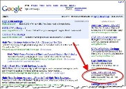
The person-to-person lender was bidding aggressively today at Google on both "high yield savings" and "online banking." The ads typically made the fourth position in the right-hand column, putting them "above the fold" (see inset).

The company is testing three different ads, all focused on rate levels substantially higher than the 5% to 5.5% advertised by the competition. Prosper is testing a straight up "8%" ad, an "8% to 12%" ad, and an "8% to 29%" one (see below). 

The ads lead to one of two landing pages. Here's the slick one that looks more "bankerish": 
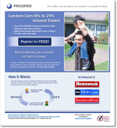
Landing page from Google ad

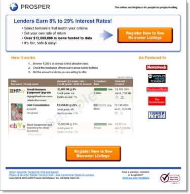
Or the more "Web 2.0" version that no one will confuse with a bank ad. There is even a small eBay logo visible in the screenshot (used by one of the participants seeking to bankroll an eBay store), a smart touch for a company that is positioning itself as "the eBay of lending." 

All-in-all, it's a good effort put forth by Prosper, which can only succeed if it attracts enough money into the marketplace. 

For more information on Prosper, Zopa, and the entire person-to-person market, see Online Banking Report #127.

Majority of Banks Offering High-Yield Savings are Traditional Brick-and-Mortar Institutions

Bankunited_savingsSavings accounts paying 5% or more are a sweet spot for consumers by allowing them to beat inflation with little risk. According to Bankdeals blog, <bankdeals.blogger.com>, 22 U.S. banks are currently paying 5% or more on consumer savings accounts (see BankUnited's "Sweet Rate" in inset).

While there's been much talk about online-only banks and their competitive threat, only 4 of the 22 fit this definition. The other 18 are traditional branch-based banks, often marketing the higher yielding accounts through direct banking brands such as HSBC Direct (see 26 Aug 2005), MyBankingDirect from New York Community Bank, or the latest entrant Grand Yield Direct from Apple Bank for Savings (see Sep 27). 

The traditional banks are evenly split on how they market the higher-yield product. Ten use a separate brand which is often not mentioned on their main website. Six of the ten simply append a "direct" to their main brand. The other eight market high-yield accounts online under their normal brand, but two (Zions and Wamu) hide the higher rate accounts from users of their main websites. 

Here's the list as posted Oct. 7 at BankDeals:

Pure direct banks with little or no branch network (minimum balance to earn rate, if more than $1,000):

Direct brands of traditional banks (parent):

Traditional banks with links to the high-yield account from its main website:

Traditional banks with "secret" online-only offer (not linked to regular product pages):

Apple Bank Joins the High-Yield Savings Game with Grand Yield Direct

Google_highyield_25sep06_1Yesterday, a new advertiser appeared at the top of Google searches for "high-yield savings accounts (click on inset for closeup)," Apple Bank for Savings <theapplebank.com>. The New York-based thrift is marketing the 5.25% APY account under the brand name, Grand Yield Direct <grandyielddirect.com>.

To market the account, the bank uses a single-product microsite powered by Digital Insight (see screenshot below). The Apple Bank name and logo appear in the lower-right corner in a subtle graphic image, but there are no links back to the main bank site. The online application is hosted by CashEdge (click on continuation link for screenshot).

The new product joins an increasingly crowded field that just two years ago was owned by ING Direct. Just yesterday, E-Loan launched its 5.5% savings account (see NB 26 Sep).

Applebank_grandyield_1

First page of the online application hosted by CashEdge

Applebank_grandyield_appfromcashedge

E-Loan Launches High-Yield Deposit Line

Eloan_logoSix months after announcing its intention to enter the direct-banking deposit market (NB 29 March), Popular Inc. launched a 5.5% deposit account through its E-Loan subsidiary. The fee-free account requires a $5,000 minimum opening deposit. The rate drops a quarter-percent if the balance falls below $5,000. The news was covered this morning in American Banker and The Wall Street Journal.

Popular execs clarified the timetable of its $3 billion deposit goal, saying it hoped to bring in that amount within a year. With few U.S. deposits to cannibalize and no branch network, the company expects to be aggressive with its pricing. To prove the point, it launched today at 5.5%, a full half-percent higher than Citi's E-Savings (NB Jun 26), Wamu (NB Sep 21) and HSBC, and a quarter-percent above Countrywide (NB Sep 20).

Eloan_home_savings_partial

The Delivery
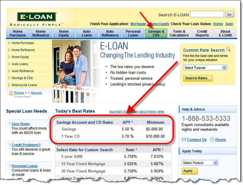
The E-Loan homepage has been remodeled to include a Savings tab across the top and a deposit box in the middle of the page (click on inset for a closeup; click on continuation link below for a screenshot of the entire homepage). There is also a high-yield savings category in the drop-down menu in the upper right.

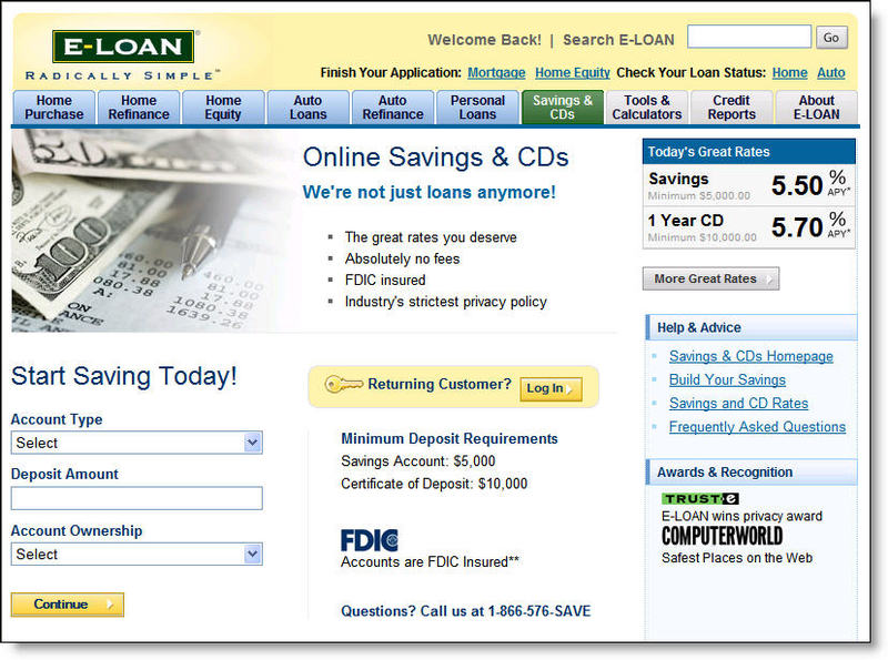
The main savings page is laid out in a modern style with clear rate and APY in the upper right and the beginning of the online application on the lower-left side (see screenshot below).

Eloan_savings_main

Analysis
Since this had been expected for six months, there's nothing earth-shattering here. The decision to market deposits under the E-Loan brand makes sense given its awareness level online as demonstrated by the four million loan applications since its 1997 launch. It will take some advertising and promotional efforts to make consumers aware that the pure-play lender is now in the deposit business. But it will be less expensive than if Popular had tried to create an entirely new brand.

E-Loan has not yet begun marketing on savings terms at Google, but they'll likely have to join Citi, Wamu, HSBC, Emigrant, ING Direct and others if they are serious about making the $3 billion goal.

New E-Loan homepage with "Savings & CD" tab

Eloan_home_savings

Wamu Targets Savers on Google

Wamu_google_savingsaccountAs we reported Aug. 16, Washington Mutual Bank is looking to win back some of the high-yield deposit business from ING Direct, HSBC, and Citibank. The bank is now bidding aggressively on Google with its "5.00% APY" landing it in fifth place for "savings accounts" (placing it second on the right-side list) and eighth for "high-yield savings" (see inset, search conducted 21 Sep, 1 pm PDT, from Seattle IP).

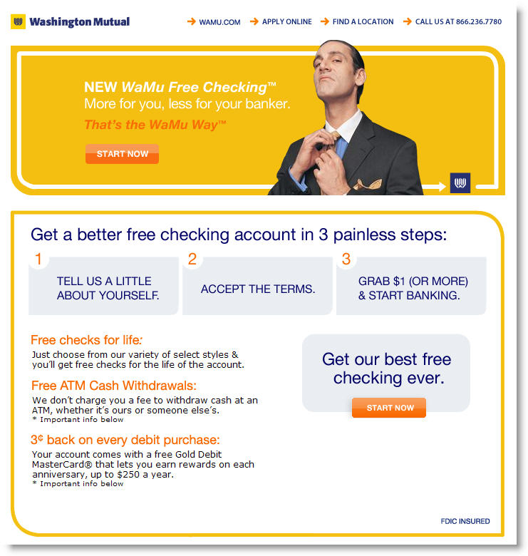
After clicking through the ad, potential customers are delivered to a well-designed landing page further emphasizing the "5.00% APY Statement Savings" rate (see screenshot below, click for larger view). Wamu continues its year-long effort to lampoon bankers with the three-piece suited icon "complaining" about the high rate paid on savings (see also, 28 April).

A new Wamu checking account (opened after 11 March 2006) is required to take advantage of the special rate. That important fact is downplayed on the landing page but is obvious once the user clicks through to the application (see screenshot by clicking the continuation link below). Furthermore, both accounts must be opened online. However, deposits can be made in the branch.

Wamu landing page from Google ads on "savings accounts" (see continuation link to see full page with fine print)
Wamu_landing_google_highyieldsavings

Full landing page (with fine print)

Wamu_landing_full_google_highyieldsaving_2

Full application

Wamu_application_full

Countrywide Uses Dedicated Microsite to Market SavingsLink

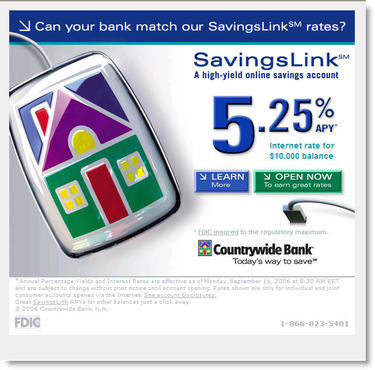
Countrywide_logoCountrywide Bank is using a microsite <savingslink.com> to funnel users interested in its new high-yield savings account (see screenshot below). The account was advertised in Sunday's (10 Sep) New York Times (Business section, National Edition, p. 4) with a one-third page, 5-inch tall ad that asked, "Can your bank match our online savings rate?"

The account is also to be advertised aggressivly on Google, appearing second from the top in the right-hand column for searches on "online savings accounts" and "high-yield savings accounts." However, it's only in eighth position on the more generic "savings account" search (searches conducted 20 Sep, 10 am PDT, from Seattle, WA, IP address).

The bank took a low-key approach to using its main brand by using just a small logo in the lower-right corner. The fine print explained that the advertised 5.25% APY applied to balances of $10,000 or more with smaller balances garnering a still-respectable 4.50%. The bank has raised the SavingsLink rate a full 1% since its launch in mid-May with a rate of 4.25%.

Countrywide_savingslink

Analysis
The use of a dedicated microsite for marketing a high-profile product such as a high-yield savings account offers a number of benefits:

  • Ability to focus users on a single product/offer
  • Easier to track traffic and test layouts
  • Avoids the distractions of other website navigation
  • Can use a different look and feel than the main corporate website
  • Makes the product feel like a true "special offer"

Washington Mutual Joins High-Rate Savings Game

Reports first surfaced Saturday (Aug. 12) that Washington Mutual was offering 4.75% on a no-minimum deposit savings account. But don't try to find it on their website. The offer is only visible after you begin the application process for one of the highly promoted free checking accounts (see NB July 20).

We searched the WAMU website using a variety of states and did not see any mention of the high rate. However, the bank could be using cookies or other methods to serve the banners to select customers (see Citibank, NB May 10). In our tests (from a Seattle IP address), users are first introduced to the savings offer on the first page of the online checking account application (click on screenshot below for a closeup).

Wamu_savings_xsell_1

Like Citibank's e-Savings Account, Washington Mutual is requiring a checking account to take advantage of the offer. However, WAMU's checking account is completely fee-free regardless of balance and with no direct-deposit requirement. Current WAMU customers can take advantage of the high rate, which is 12 times higher than the current 0.4% rate, only by opening a new checking account.

Analysis
WAMU is attempting to minimize deposit cannibalization by keeping the offer off the website. They are attempting to leverage their free checking campaign by upselling new customers at the point of sale. For a bank with a major branch presence, that's not a bad approach; however, it's not going to bring in deposits at the same rate as Citi or HSBC.

It will also be interesting to see how the bank deals with the inherent channel conflicts. If the high-rate deposits are credited to the Internet channel only, branches will be up in arms over the 12x rate advantage offered online. But if branches do get credit for the deposits, they will be converting their biggest customers into the new accounts as fast as possible (unless WAMU rewards branches by account profitability).

–JB

Good Landing by WAMU

Wamu_ad_rottentomatoesWashington Mutual, one of the more creative offline promoters, is beginning to apply its talent to online promotions. We're still not particularly fond of the "trapped bankers" creative (see NB April 28), but we like the bank's new "more than free checking" campaign.

We first ran across the promotion July 7 in a skyscraper-animated banner (175 x 500 pixel) on the right side of Rotten Tomatoes <rottentomatoes.com>, the popular film review aggregator (see inset).

The banner was good, but what we really liked was the landing page (see below). The design was clean and fresh (not so hard to do), and the copy was original and user-friendly, with just the right dose of humor (not so easy to do).

Wamu_ad_rottentomatoes_landing

Our only criticism is the crucial final step. Users clicking the "Get Started" button are delivered to a much different and more bank-like screen to begin the application. The relatively dull look (see below) is a real letdown after the originality of the landing page. It's so different, it may cause users to stop and rethink their decision to apply.   

Wamu_ad_rottentomatoes_startapp

The bank would likely convert more prospects if they continued the landing page theme through the first page of the application. Overall, we'll score the effort an A-.

–JB

Bank of America’s Expandable Landing Page

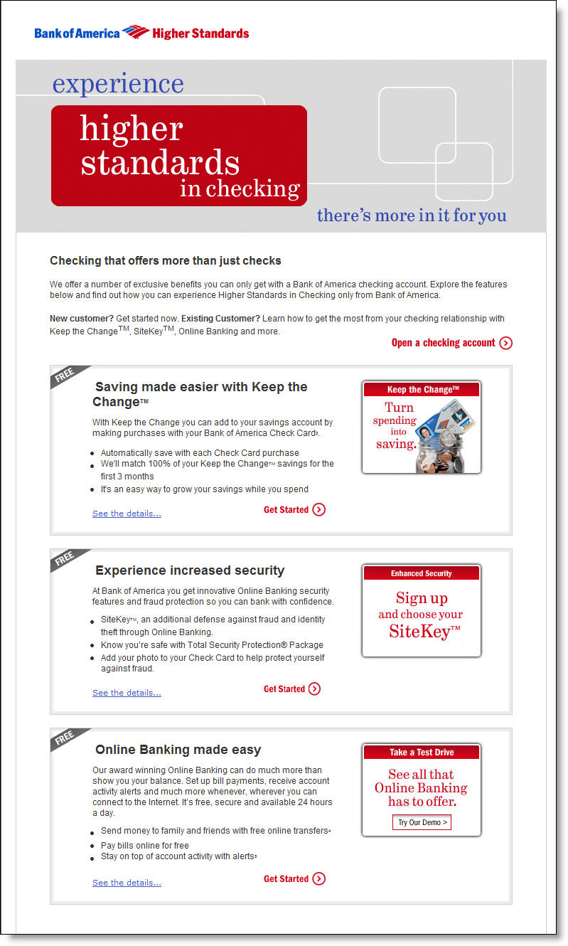
Bofa_keepchange_msn_landingBank of America is back on the MSN front page (see End Notes) using its clever, if somewhat misleading, Keep the Change program to lure new checking account customers (see End Note below). The pitch is similar to the last time we looked at it (see NB 2/13/06), but the bank has redesigned the landing page (click on inset for closeup).

It now features three compelling benefits:

  • Free money through "Keep the Change"
  • Extra security through Sitekey (powered by PassMark/RSA)
  • Free online banking

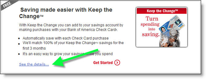
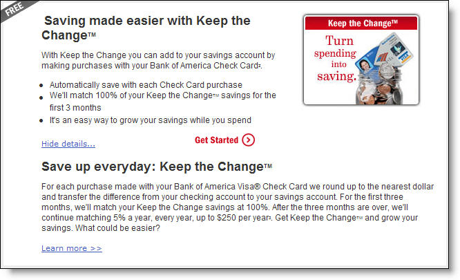
The bank has found an effective way to keep the landing page concise, but still discuss all the benefits of these three programs. Each of the three main features has a small box on the landing page (see right). Each box has a "more details" link that expands the box yet does not open a new browser window (click on before and after pics below). Finally, for users needing even more info, there's a link in the larger box to another page with full details.

Before expansion

Bofa_keepchange_box_1

After expansion

Bofa_keepchange_box_expanded_1

JB >>>>click below for End Notes

End Notes: Playing the "Keep the Change" game
Although we have mixed feelings about the value of the program overall, there's no doubt it has strong appeal for new account aquisition due to the 100% bank-match during the first three months. It creates a "game" for the user, incenting them to immediately begin using their new debit card to rack up free cash from the bank. That means new customers will need to deposit signficant funds, probably their paycheck, in order to fund the purchases needed to maximize the gains.

Assuming one debit card purchase per day, users will gain $10 per month from the bank, or $30 for the three-month introductory period. After that, the bank match drops to 5%, or $0.50 per month in this scenario.

Hard-core debit card users with two or three purchases per day could earn $60 or $90 during the matching period, And those gaming the system, splitting a $10.20 grocery bill into two $5.10 transactions (earning $1.80 from BofA), could drive their bonus into the $100+ category (the bank caps the rebate at $250, and doesn't pay it until the one-year anniversary). 

BofA Banner on MSN Homepage (July 11)

Bofa_keepchange_msn

Chartway Federal Credit Union Referral Campaign Falls Short

Chartway_logo_1Sometimes it helps to see how NOT to do something. Today's victim: Chartway Federal Credit Union <chartway.com> which has been running a clever, but poorly executed, 8.00% APY certificate-of-deposit special on its website for the past month (see screenshot below).

Chartway_8apy_referral

Analysis
The good news
: It's a great offer. Any member making a successful referral gets to put up to $8,000 in an 8-month CD earning 8% (notice a theme there?). To qualify, the referral must bring in a new credit union member that opens a checking account along with the certificate OR initiates a $500-minimum direct-deposit relationship. The new member also gets to put up to $8,000 in an 8-month CD.

Members can make up to three referrals for a total deposit of $24,000. With the CU's normal 6-month rates at 3.4%, its more than double the normal rate of return, earning both the referrer and referee an extra $31 per thousand over the 8-month term or almost $250 extra per certificate (pre-tax). The eye-catching offer is featured front and center on its webpage.

The bad news: There is no hyperlink. Clicking on the logo, headline, or text does absolutely nothing! There aren't even any instructions on how to participate. Viewers are simply left hanging. The only extra info provided are the disclosures delivered via mouseover (see screenshot above).

It harks back to websites of the mid-90s that were put together by the "ATM guy." Unless you are trying to entice users to go on scavenger hunt through your website, this is a major mistake, and it's been that way for nearly a full month.

JB

Five Percent Savings Rate from Citibank

In yet another aggressive deposit-pricing move, Citibank raised its e-Savings rate to 5%, the first major high-yield player to surpass the magic 5% mark on a savings account with a low minimum balance. IndyMac (5%, $25k min) and Countrywide (5.25%, $50k min) hit 5% before Citi, but have higher minimums.

Keep in mind, Citi's account requires a checking account, a significant part of the strategy that has attracted more than $2 billion in new money in the past three months (NB June 1).

Citi_5percent_home_1

Citibank’s e-Savings email

Last night, Citibank sent selected checking-account customers an email solicitation for its 4.75% APR e-Savings account. I live outside its branch network, so Citi may have elected not to send the message to customers serviced by traditional branches.

Citibank_email_esavings_with_imageThe message was direct and to the point (click on screenshot left). Citibank even included the impressive 4.75% interest rate in the message subject. The only distracting portion of the message was a garbled first word in the second paragraph. It was probably caused by incompatibilities in software rendering of the apostrophe in the first word, "there's." To avoid this type of error, make sure you proof your message in multiple email clients.

The bank continues to engender trust in its marketing messages by including the "email security" box in the upper-right corner which includes the customer's full name and last four digits of their ATM card. The security information is prominently displayed, in a blue shaded box to make it more prominent, even if the user has images blocked (see screenshot below).

The bank also includes short text messages that appear where the images would have been displayed (alt-text tags) making the message relatively readable even for users that never download the images.

Citibank_email_esavings_no_image

Surprisingly, the landing page for the offer was a generic product page. The campaign would be much more effective if the bank had reinforced the e-Savings benefits on the landing page like it does when it advertises online (see NB March 29). Click on the following link to see a screenshot of the landing page. —JB

Appendix

Landing page
(displayed when clicking on the "signup" button in the email).

Note: I tested the link on my laptop where I am not recognized as a customer and on my desktop that saves my username in a cookie. Both times I was served the same landing page (below).

Citibank_email_esavings_landing