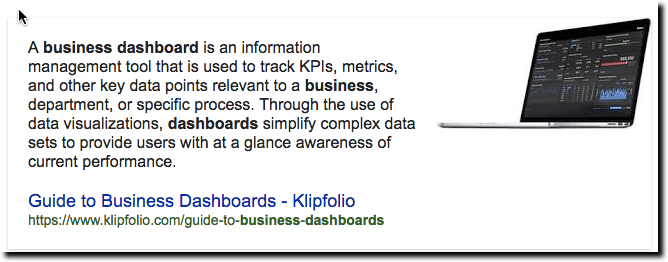
Every now and then a useful term comes into widespread use and it can be hard to decide whether it’s a fad (e.g., home banking) or something that will be around for decades (e.g., ATM). Dashboard is a term we are seeing more and more of. While it’s too soon to say if it will still be around in the next decade, let alone in 50 years, it’s a good word in wide use in consumer and business services today (see definition below).
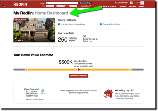
Redfin, for example, sends new homeowners an email suggesting they log in to the Owner’s Dashboard of their new property. Redfin must be matching home-buying records to its user database to make the connections. It’s a nice touch. Who wouldn’t want to sit in the virtual driver’s seat of their most important asset and get a look around. And with home prices appreciating in most parts of the country, it’s a mighty fine view. In the example, the home value is up almost 15% since February.
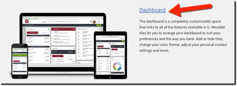
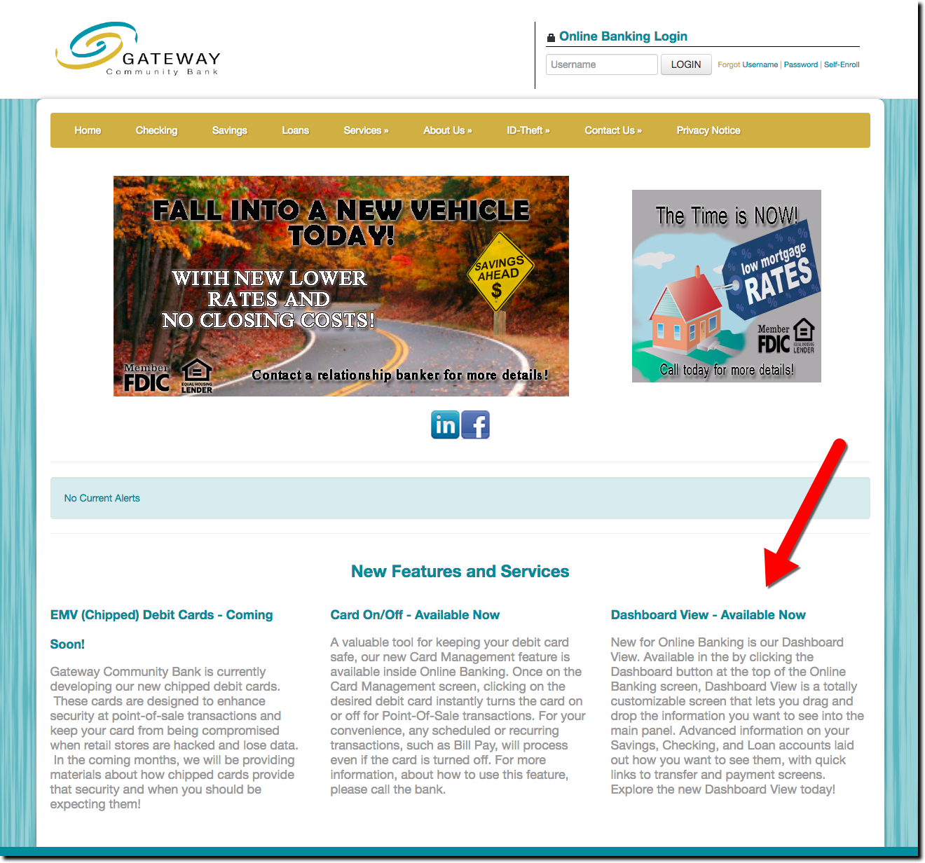
Banks should consider using similar language for their advanced digital banking services. Rather than a fancy name to confuse consumers, use Dashboard, which is not only easy to remember, but also has all the right connotations. One major bank already doing so is BB&T (see below), with its unique customizable mobile and desktop service, U. Another is Ohio-based First Financial Bank as well as $88 million Gateway Community Bank (screenshot below).
———
———
Bottom line: The name of a digital service isn’t going to make or break it. But as we struggle with educating users on the features and benefits, the use of known terms can ease the learning curve.
———-
Design: Creating Online Awareness of Digital Banking

![]() There is only one reason I visit a bank’s website: to learn about its online and/or mobile banking features. Granted, understanding digital banking is my livelihood. But normal people looking for a new checking account, credit card or loan also need to understand digital capabilities. Even for those that need the comfort of knowing there’s a branch nearby, online/mobile is still a key attribute for the vast majority of consumers, and businesses, shopping for banks.
There is only one reason I visit a bank’s website: to learn about its online and/or mobile banking features. Granted, understanding digital banking is my livelihood. But normal people looking for a new checking account, credit card or loan also need to understand digital capabilities. Even for those that need the comfort of knowing there’s a branch nearby, online/mobile is still a key attribute for the vast majority of consumers, and businesses, shopping for banks.
So I don’t understand why digital features are often relegated to a sub-menu buried in the Personal Banking section. Of the 10 largest U.S. retail banks, only two, US Bank and BB&T, feature online banking in high-level navigation. This is little changed from our mid-2013 overview.
My favorite among the mega-banks (again) is US Bank, which highlights digital on the upper left and uses both “online” and “mobile” in the navigation tab:
BB&T’s placement also works with “Online Services” on the far right of the top line. While that naming is okay, it would be better to see “mobile” mentioned. So, I’d recommend changing it to “Online & Mobile,” which is the same number of characters.

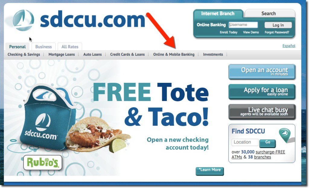
Plenty of smaller banks and credit unions are already showcasing their digital features. For example, San Diego County Credit Union uses “Online & Mobile Banking” along its top navigation.
—-
Image licensed from 123rf.com
Bank Opportunity: Online/Mobile Travel Insurance Sales
 When your core business has been around for hundreds of years, it’s harder to find new sources of revenue. One area ripe for expansion at many banks is insurance. Wells Fargo, for example, put more emphasis on the area by separating insurance from investments in its June 8, 2013, homepage remodel. See our full insurance report for more info on the market size and opportunities for banks.
While auto, life, health and home are the biggest in terms of overall premiums, they are also highly competitive with hundreds of thousands of established sales agents in the U.S. alone. But dozens of niche insurance-markets exist that might make it easier to find a foothold.
Take travel insurance.
You’ve seen these policies pitched when you are checking out at Expedia or other travel sites. While it’s tough to compete with the convenience of buying during the travel-booking process, financial institutions still have an advantage that Expedia doesn’t: Trust.
I’ve been using Expedia for 15 years and have booked 100+ trips there with few problems. So I trust them with travel arrangements. But does that trust extend to insuring my travel? Not so much. It’s hard to understand exactly what is included/excluded in their insurance upsells. And the one-size-fits-all approach rarely covers what I’m looking for in travel insurance (which is “no questions asked” cancellation). And often I’m exhausted after making complicated travel arrangements and have no energy left to figure out whether their insurance makes sense.
I’d much rather purchase a policy from a trusted source where I can get answers to specific questions, review policies after the fact, and be able to come back year after year for consistent choices. And since I don’t have a direct relationship with an insurance carrier (everything is bought through a small broker), I would be very interested in buying from my bank.
 I’m not sure how many U.S. financial institutions offer travel insurance, but I suspect it’s a small number. But there is one major player with a comprehensive travel insurance offering, BB&T (see screenshots below).
Getting a quote is easy. You simply tell the bank how many travelers you have, their age, travel date and cost. Within seconds, three options are presented (screenshot #1) covering basic trip interruption to one that covers medical evacuation and much more (screenshot #2, note 2). It even allows you to upgrade to “cancel for any reason” for a reasonable additional fee ($63 per person for my hypothetical $3,000 per person trip).
Actually buying the insurance requires a few more fields to be completed (see screenshot #3). But at that point, I already know that it’s worth my while and am not put off by additional data entry. And if I was already logged in, these fields should mostly be prefilled.
Bottom line: With a captive audience of authenticated online and mobile users, banks and credit unions could be the biggest providers of travel insurance. And with the added advantage of seeing travel-reservation charges appearing on debit and credit cards, you can cross-sell the service while the trip-reservation process is still fresh in the customers’ mind.
————————–
1. BB&T produces three options for travelers (24 June 2013)
Notes:
1. Live Chat option in lower right
2. Total cost shown for two travelers going on a $3,000 trip that begins 60 days from now
2. Detailed coverage of BB&T Deluxe Protection Plan
3. Complete application for each traveler
4. BB&T is one of a few financial institutions to include “insurance” as a primary navigation item
———————————–
Notes:
1. See our full Online Banking Report on “Banks in Insurance” here (Dec 2011, subscription)
2. To earn my business, I’d want to mix and match some of these benefits. The policy I want is basic interruption, but with the ability to cancel for any reason and with a deductible to bring the premium down.
3. Picture credit: 1938 vintage travel poster at eBay
Holiday Website Promos at the Top-20 Banks
 In my annual look at holiday offerings from major banks, I found that Scrooge still roams the halls at many of the big names. Only eight of the 20 largest U.S. banks are using holiday-themed promotions or graphics (note 1). That’s one more than last year, but still two less than 2010.
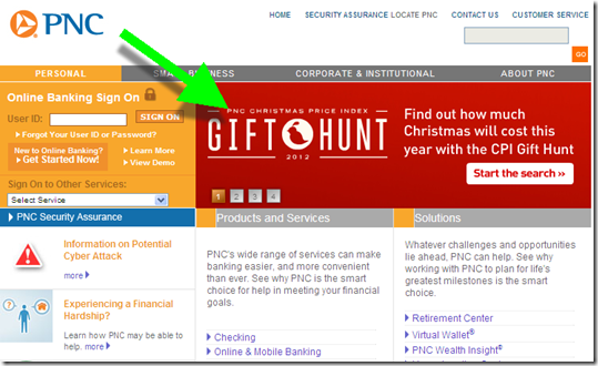
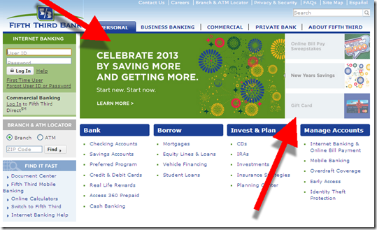
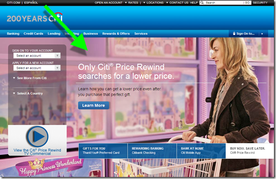
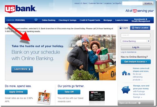
As usual, PNC Bank is the exception with their two-decade long holiday CPI (Christmas present index). BB&T, Comerica and Fifth Third are also festive this year with gift card promotions supported by seasonal graphics. And US Bank, Citi, Key and Regions Bank used some holiday imagery.
The scrooge list: top-20 banks with no holiday promotions or graphics on Dec. 20):
Bank of America, Bank of the West (BNP Paribas), Capital One, Chase, Citizens (RBS), Harris Bank (BMO), HSBC, ING Direct (Capital One), SunTrust, TD Bank, Union Bank (Mitsubishi UFJ), Wells Fargo
Following is a quick overview of the promotions, including a 1-to 5-bulb rating.
Previous year-end holiday posts: 2011 (big banks), 2011 (CUs/community banks), 2009 part 1, 2009 part 2, 2007, 2006, 2006, 2004
_____________________________________________________________________
Big banks in the holiday spirit
(rated 1 to 5 bulbs; screenshots from Thursday, Dec 20)
PNC Bank
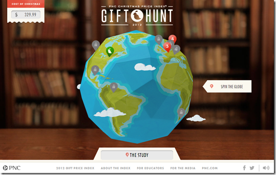
- Gift Hunt tied to its Christmas CPI (based on the song 12 Days of Christmas)
- Visa Gift Card promo (in rotation of four homepage promotions)
Hompage: PNC is leading with its 12 days of Christmas price index
PNC Bank microsite with gift hunt link
Also running gift card promo in rotation
———————————————–
BB&T (20 Dec 2012)
- Holiday themed graphic featuring mobile check deposit
- Small ad for gift cards
————————————
Fifth Third
- Rotation of three holiday themed promotions
— Holiday billpay sweeps
— New Years savings pro
mo
— Gift cards
—————————
Comerica
- Prominent gift card promo across page and in lower-left corner
—————————
Key Bank
- Holiday graphic, but no product promotion
—————————-
Citibank
- Toy shopping background image
———————————
US Bank
- Pitch for online banking, convenient while shopping
————————————-
Regions Bank
- Small saving money tips
——————-
Notes:
1. Observations taken between 2pm and 3pm Pacific on Thurs Dec 20 from Seattle IP address, Chrome browser with no cookies
2. Animation from http://www.millan.net/anims/christmas.html#
Everbank Takes Gold in Change Sciences Ranking of Small Biz Banking Online Sales, BB&T is Runner-up
 I’ve had a consumer account at Everbank since shortly after it launched in 1998. And I’ve continued to be a fan, both of the bank, and of its co-founder and product-guru Rob Foregger’s subsequent work at Personal Capital and others. But I hadn’t realized that Everbank excelled on the small biz side.
Change Sciences, which quantifies and compares bank user experience in various verticals, ranked Everbank #1 in its just-published report (subscription) on online sales of small-business banking services.
As you can see from the methodology below, Change Sciences is looking at the discovery and sales process for small biz banking, not the actual online banking experience itself.
Everbank took first by a solid 3-point margin over runner-up BB&T. Most of the big banks were bunched just below BB&T. PNC Bank and US Bank were just a point lower and BofA was just two points lower. SunTrust and Wells also finished four points under BB&T.
————————————
Everbank offers an extensive menu of business benefits via mouseover dropdown menu (6 Aug 2012)
————————————
Note: Change Sciences methodology (from its website)
Each site is evaluated (via desktop browser) against a series of criteria by a Change Sciences analyst. The analyst reviews pages and screens that are part of a critical user task. As the tasks are evaluated, the analyst does three things:
• Looks for predefined user-experience characteristics and features.
• Evaluates the page for ease of use or usability, and applies heuristics accordingly.
• Looks for unexpected enhancements, which we call pleasant surprises.
Tasks evaluated:
• Getting a first impression
• Learning about the bank’s approach to its small-business customers
• Finding out about checking and lending products
• Learning about online banking
• Getting to apply options
Holiday Promotions at the Top-20 U.S. Banks
 Since I began blogging in 2004, I’ve usually run a year-end post looking at the holiday marketing efforts of the top-20 U.S. banks (links below). This year, only 7 of the 20 banks are using holiday or seasonal imagery on their homepages. That’s a decrease of 3 over last year.
As usual, PNC Bank is the gold standard for holiday bank promotions, with its long-running (25+ years) “cost of Christmas index” which quantifies the cost of procuring all the items mentioned in the famous song, “12 Days of Christmas.” Following is a quick overview of the promotions, including a 1-to 5-bulb rating.
Previous posts: 2010, 2009 part 1, 2009 part 2, 2007, 2006, 2006, 2004
_____________________________________________________________________
Big banks in the holiday spirit
(rated 1 to 5 bulbs)
PNC: Christmas cost index
- Cost of Christmas based on the song 12 Days of Christmas
Homepage
Landing page: Amazing microsite, wonderful graphics, and slow loading (link)
Fifth Third: holiday sweeps
- Pay Your Bills sweeps with holiday graphics
- Small ad with a card wrapped with ribbon which directs users to branches for “holiday shopping made easy,” presumably for gift cards, but neither the ad nor the landing page make that clear
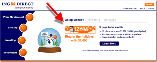
ING Direct: Mobile usage sweeps
- 12 Days of Mobile sweeps
Landing page
Chase: sweeps and car loans
- Winner Wonderland, credit card sweeps with one entry for every credit card purchase and 5 entries for every donation put on the Chase card
- Add joy to your wallet, car refinance promotion
BB&T: Visa gift card
- Small advertisement in lower right
Homepage
TD Bank: Visa gift card
- Small advertisement in lower right (below the fold on my laptop)
Homepage
Key Bank: gift cards
- Very small gift-card promo, below the fold on my laptop and rotating with a half-dozen other items
Homepage
————
Notes:
1. No holiday imagery on the homepages of BofA, Wells Fargo, Citibank, HSBC, US Bank, SunTrust, Capital One, Citizens, Regions, Harris, Bank of the West, Union Bank, Comercia
2. Screenshots taken from Ft. Myers, FL, IP address, between 7 and 8 PM, 20 Dec 2011
3. Credit: Happy Holidays animation from LayoutSparks.com
Mint.com Traffic Soars Under Intuit Ownership
 I don’t know if it has anything to do with the publicity Mint received in recent months following its acquisition by Intuit or the promotional links from Quicken’s website, but the online PFM juggernaut just blew the roof off its monthly traffic. According to Compete, in January, Mint had 1.7 million unique visitors, 600,000 more than a year earlier.
To provide a little context, not counting the Dec. to April tax-time traffic spike at Intuit, Mint’s traffic is now slightly HIGHER than that of its parent company (see chart #1 below). That gives you a little understanding of why Intuit coughed up $170 million for the startup.
Another way to look at it: Mint now has as much traffic as the tenth largest U.S. retail bank, BB&T (see chart #2).
The interesting question for 2010: Now that Mint is part of the establishment, what startup will rise up to challenge it? Or will the banks, back on a path to profitability, fill the need going forward?
Chart 1: Mint’s traffic is now similar to Intuit’s non-tax-time traffic

Source: Compete (link)
Chart 2: Mint now has about the same number of visitors as the tenth largest U.S. retail bank, BB&T
Note: Mint is blue line below

Source: Compete (link)
Note: For more information on the PFM space, see our Online Banking Report on Personal Finance Features.
BB&T Pushes Online Statements on Homepage
 Most major financial institutions have been pushing estatements for several years (see previous coverage). The appeal of shaving $10 to $20 off the annual servicing cost for every account is an attractive payoff.
Yet, you rarely see estatement appeals elevated to the homepage. BB&T bucks convention with this attractive graphic with the big-three benefits: security, convenience, accessibility (see first screenshot). The green button leads to a landing page reiterating these three benefits plus adding the environmental message.
Bottom line: It’s a good, educational effort. But with most consumers already aware of online statements, there’s little motivation to change something that’s worked fine for the past 10, 20, 30 or more years.
If you are serious about reducing paper and postage expense, give your customers a reason to change their behavior:
- Low-cost gifts, such as a pair of movie tickets, 2-for-1 meal, $10 Starbucks card, etc.
- Sweepstakes (one-time or ongoing; see Wells Fargo example below)
- Extra online services such as increased archives or an electronic vault
- Enhanced security guarantee
- Discounts on other services
But whatever you do, don’t introduce a fee for paper statements unless you want to get T-Mobiled.
BB&T homepage promotes online statements (7 Oct 2009)
Access via Seattle IP address; we do not have any accounts at the bank
Landing page (link)
Wells Fargo $60,000 estatement sweepstakes landing page (link)
Note:
For more information, see our Online Banking Report: Lifetime Statement Archives (June 2005)
BB&T Pushes Intuit’s TurboTax on its Homepage
Branch Banking and Trust (BB&T), <bbt.com> has one of the better-looking bank homepages. Although a bit cluttered for our taste, the colors, fonts, and other design elements are well conceived (see screenshot below). It's certainly far better than the previous version, which was replaced in late 2003.
 One area that's a bit unusual is the prominence of the TurboTax cross-promotion. On Saturday, Feb. 24, the BB&T website displayed a prominent start button in the upper-right PLUS a medium-size (250 x 125) banner along the left side (see screenshot below). Update: The TurboTax banner is NOT displayed today; it appears to have been replaced by the bank's $50 bonus for a new checking account. The start button remains.
I'll give BB&T credit for timeliness, but for the few buck-per-return in fees, I'm not sure online tax prep warrants so much attention. It's especially surprising to see a major bank dropping users into a third-party site with no warning message about impending transfer. Also, although TurboTax's co-branded site carries three links back to BB&T, it's primarily Intuit-branded with separate registration and login required (see second screenshot below).
 While millions will use Turbotax online during the next seven weeks (see 2005/2006 sales right), there is still an underlying security concern that keeps many users from entering their family's social security numbers and intimate financial details into a website at a software company.
We'd like the co-branded TurboTax site a whole lot better if it was integrated into online banking, especially with an automated data-import function and security assurances.*
If you are thinking about promoting TurboTax this tax season, here are the pros and cons to consider:
Pros:
- Positions your bank and website as useful for everyday financial tasks
- Associates your brand with a powerful, positive personal finance brand which sold more than 12 million copies of TurboTax/TurboTax online last year
- Reminds customers to get started on their taxes; reinforces the role of the financial institution as a consumer advocate
- TurboTax online is an excellent program that simplifies a complex task about as much as possible
Cons:
- Raises security concerns about the submission and storage of ultra-sensitive financial info online
- Could be bank liability if a phishing scheme or website takeover results in exposure of sensitive data
- Generates customer service calls to ask questions about BB&T's involvement or about taxes in general
- Necessitates tech support if customers have questions or problems with TurboTax
- Competes with other bank promotions for users' attention
- Users may be disappointed to discover they have to undergo a completely separate registration, username, password, and so on at the TurboTax site
What do you think? Do homepage references to other service providers reinforce the bank's brand while providing some fee income, or should financial institutions concentrate on their core services?
BB&T Homepage, 24 Feb. 2007 <bbt.com>
*Interestingly, BB&T is silent on the security issues inherent in the co-branded site. They neither display the typical "you are leaving our site" warning, nor provide any disclaimers about the use of a third-party site.
