Bank Email Alerts Featured in Major Print Advertising

The first widespread use of online features for overall corporate branding was the now-famous fall of 2002 Bank of America television advertising campaign touting it’s recently-set-free bill payment program. At the time the bank said that these advertisements were some of its most effective TV spots of all-time with recall percentages through the roof.

Three years later you see online features used in all sorts of media campaigns. Two print advertisements caught our eye this month.

  1. Chase Bank ran a three-quarter page color ad in The New York Times on Oct. 9 focusing on its free email alerts using the following headline:

         The morning news.
     
       The morning weather.
         Maybe even your morning balance.

    The ad was mostly white space with a smaller picture of a 30-something guy lounging in his Adirondack chair on his deck in the woods with laptop and coffee (evidently enjoying a wireless connection).

    Our take: Good, but too subtle; unlikely to increase awareness of alerts to any great extent.

  2. Much more interesting, though unrelated to banking, was the full-pager from General Motors introducing its OnStar service running in the A-section of the Oct. 13 Wall Street Journal. The title read:

         Introducing
         OnStar Vehicle Diagnostics.
         A monthly email from your vehicle.
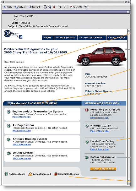
    Onstar_emailThe picture featured a woman peering at her laptop on the patio with her car in the background. On the laptop screen was a message, blown up in the lower part of the ad (click on inset for similar message), summarizing the mechanical condition of her 2006 Chevrolet Impala.

    Our take
    : Extremely well done, demonstrating an almost unbelievably valuable service that most wouldn't otherwise have known about; should increase awareness dramatically.

Analysis

You can only talk about great service and free checking so many times. Online features that help improve perceived security and/or financial control are becoming interesting to a wider cross-section of customers.


For example, Wells Fargo took an essentially plain feature, a combined online statement, and turned it into My Spending Report (see previous NetBanker article, Feb. 17, 2005), a point of differentiation for its online services, and by extension, the bank as a whole.


We don’t work at an ad agency, so we won’t begin to try to tell you how to cost justify large print ad in the local paper. But most financial institutions devote at least some of their advertising budget to so-called “image” spots and if you serve a tech-savvy market such as NYC, 2006 would be a good time to test online-oriented spots to see if they bump up your brand and ad recall numbers.


JB


Setting Flags in Electronic Bank Alerts

Inbox_flagNow that consumers are beginning to receive multiple alerts and other email messages from their financial providers, you risk the problem of "alert fatigue." It happens with any warning system. If you get too many warnings or status messages, you start to ignore them, rendering the system ineffective.

One way to make your message standout is to add a "high importance" flag to your outgoing message. In Outlook and Outlook Express, a small red exclamation point will show on the subject line in the message list (click on the inset for a larger image). In this example, the Washington State Department of Revenue added the flag when it sent password-changed alert. But it didn’t add the flag when sending a routine payment confirmation.

The key to making the flag effective is to not overuse it. Don’t ever put it on an advertising or marketing message. And use great restraint when attaching it to balance or confirmation messages. It’s best use, might be for security-related notices such as password resets and other sporadic and relatively unusual activity.

JB

American Express Spruces Up its Email Confirmations

American Express, long one of the savviest financial marketers, recently updated the look of its routine "payment received" email confirmation.

Amex_payment_confirmation_1It’s a nice change from the typical text-only message. Key features include:
– last 5 digits of card number for verification
– account login
– balance transfer offer
– Blue Cash offer

But the "Dear Cardmember" salutation is a mistake.

With all the hysteria about phishing and email fraud, the opening should be personalized, both to differentiate itself from SPAM and to insulate cardmembers (and itself) from phishing attacks. This is especially important in a communication which includes a built-in login button, an inviting target for phishers.

American Express does provide several unique identifiers: the last 5 digits of the card number, the payment date, and payment amount. But those aren’t instantly recognizable to all cardmembers. The combination of account name and the last few digits is much more effective (see Citibank article).

Grades
A  for look & feel
A- for cross sales (two offers might be a bit much)
A for self-service with five links to popular online card management functions
B- for security (last 5 digits included, but no cardholder name, no mention of how to verify the authenticity)
————————–
A- overall

JB

If you’d like to learn more about the bank and financial services email trends, check out Email Marketing in Financial Services: Leveraging the Inbox from our sister publication, the Online Banking Report.

Citibank Fights Fraud with Personalized Emails

Citi_secure_email_closeupIt’s fitting that the financial company most targeted in phishing attacks, Citibank, would be the first to introduce a new email format that goes a long way towards helping users identify legitimate email messages.

Citi_secure_email_message The personalized emails (click on inset to enlarge) include not only the name of the recipient, but also the last 4 digits of the user’s ATM card. While simple personalization with the customer name would help many users identify legitimate emails, it’s far from fool-proof.

First, there’s the relatively common practice of including first name and/or last names in email addresses. Also, some phishers are using direct marketing tactics and first running email addresses through various databases to append actual names and other info to the email record in order to develop a personalized pitch (see ZD-Net article).

Citibank’s new email format was announced to customers through a short message on the top of the online banking screen in early May. It is also now mentioned in the bank’s main FAQ page.

Analysis
This is a great first step in winning back the confidence of users. Eventually email standards will evolve so that the email client will be able to readily identify legitimate emails, but that could be years in the future.

If you are considering a similar approach, you might want to let users choose the name and identifying information that appears in the personalization box. In February, we reported on a UK security initiative that took that approach.

For more information:

JB

Editor’s Note: Citibank received an OBR Best of the Web award for this and other security features in Online Banking Report #119, "Marketing Security."

Secure Bank Message Area Grows in Importance

One way around the rapidly declining effectiveness of email communications is to prominently post new messages within the secure online banking area. Not only is it useful to create an archive of bank communications, it also provides reassurance that no message(s) have been missed.

Ebay recently added this capability to its the My eBay platform, where users can login to track account activity. Ebay keeps messages for 60 days. Financial institutions should allow storage for far longer, one year at least.

Because bank messages are often time sensitive, you should also send the message, or a message notification to the user’s standard email account. Better yet, allow users to receive message notifications at multiple email accounts, therefore increasing the chances that one will go through.

Action Item
Many banks already have this capability, but it may be overlooked by customers, as they have become accustomed to receiving messages over the Internet.

Now would be a good time to remind customers to look in their message folder periodically. You might run a sweepstakes or treasure hunt that requires looking into message folders to win.

If you’d like to learn more about the future of online bank messaging, check out the Online Banking & Bill Pay Forecast: Current, future and historical usage: 1994 to 2016 from our sister publication, The Online Banking Report.

U.S. Bancorp’s Stingy Email Storage

Usually we discuss innovations, this is an exception. We’ll call this a non-innovation, non-ovation for short.

In a time where all the huge Web-based email providers, led by Google’s free 1 GB of storage, U.S. Bank decides to delete emails sitting in customer in-boxes (within their online banking platform) after just 30 days. This includes estatement notifications.

Assuming the average customer gets one message per month, and each message is 2k in length, that saves about 20k in storage costs per customer, compared to keeping the messages for one year. Assuming the marginal cost for disk space is $10 per GB, that policy change will save an awesome 2 one-hundredths of a cent per customer per year, or $200 per 1 million customers.

Extensive online archive space is one of the biggest benefits of banking online. Don’t be pinch pennies on one of the lowest-cost aspects of your online Usually we discuss innovations, this is an exception. We’ll call this a non-innovation, nonovation for short.

In a time where all the huge Web-based email providers, led by Google’s free 1 GB of storage, U.S. Bank decides to delete emails sitting in customer in-boxes (within their online banking platform) after just 30 days. This includes estatement notifications.

Assuming the average customer gets one message per month, and each message is 2k in length, that saves about 20k in storage costs per customer. Assuming the marginal cost for disk space is $10 per GB, that policy change will save an awesome 2 one-hundredths of a cent per customer per year, or $2,000 per 1 million customers.

Extensive online archive space is one of the biggest benefits of banking online. Don’t be pinch pennies on one of the lowest-cost aspects of your online presence.

JB

——————————————————–
The full text of the message is repeated below:
——————————————————–

Date: 09/14/04
To: Jim Bruene
From: U.S. Bank

Subject: Messages now refreshed after 30 days

In an effort to populate the message center with current information, all messages, including ones related to online statements, will be deleted after 30 days. However, online statements will continue to be available for up to 90 days and can be accessed in the Recent Statement area at the top and bottom of each account Transaction History page. Online statement customers will continue to receive a message in the Message Center when a new statement is available.

——————————————————–
If you’d like to learn more about the future of online bank messaging, check out the Online Banking & Bill Pay Forecast: Current, future and historical usage: 1994 to 2016 from our sister publication, The Online Banking Report.