Wasting your Advertising Budget on Google

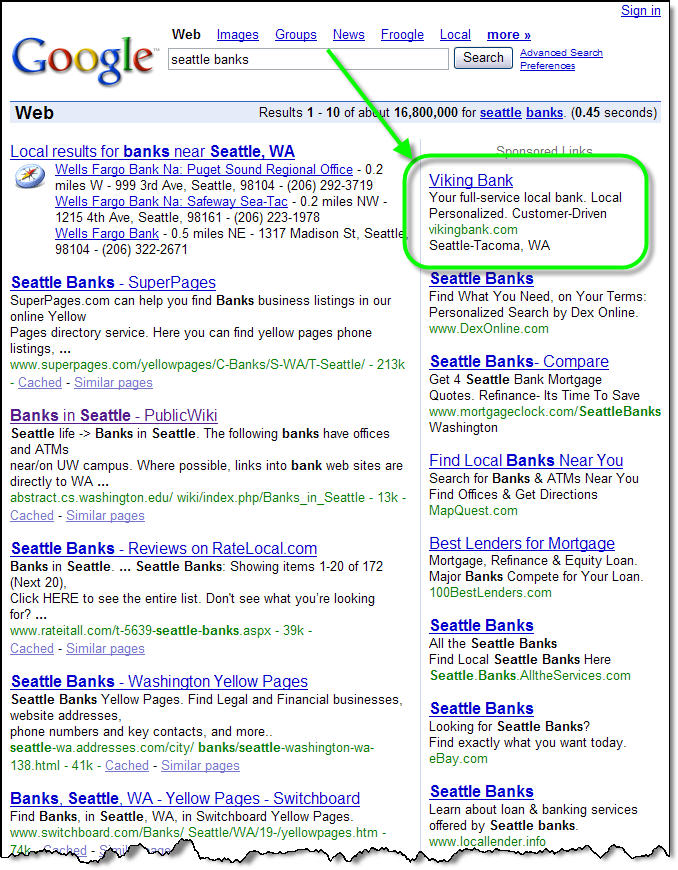
Viking_googleresults_1We've been poking around on the search engines to see what banks are doing to attract new customers moving into their area. In a search today for "Seattle banks," we were impressed to see a local community bank, Viking Bank, with the top spot on Google AdWords (upper right in inset). Viking was the only area bank with a paid listing. The other seven listings making the first page of Google results were from various information aggregators, such as MapQuest, or lead generators such as 100BestLenders.com.

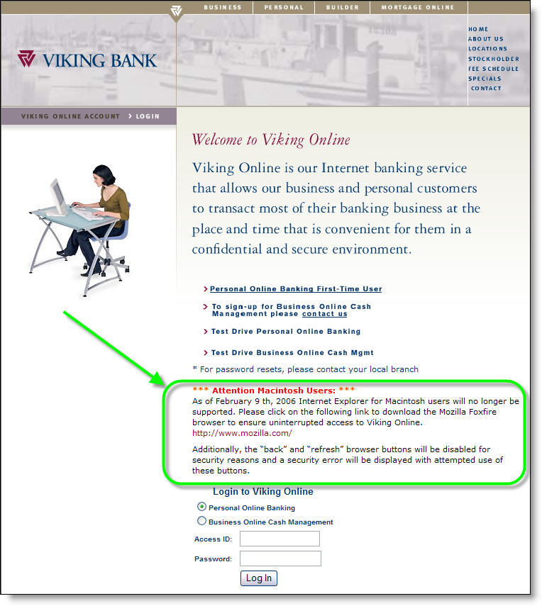
However, clicking on the ad sent us to one of the worst landing pages we've ever seen. For some reason, the bank is paying big money to drop Google searchers onto its log-in page, which has not a single benefit listed. In fact, the item that draws the most attention, especially since it loads first, is a warning about a service problem for Mac users (click on screenshot below for a closeup). To make matters worse, the Viking Bank logo isn't even clickable, so prospective customers have to search the navigation to find a way off the log-in page.

Vikingbank_landing_fromgoogle_1Analysis
Viking Bank's search-engine buy is smart. You want to be seen when users search on "yourcity" and "banks." But you must spend some time to build a landing page that quickly communicates user benefits (see NetBanker April 5).

JB

E*Trade Looks for Investment Funds at Logout

The best time to grab the attention of your online banking customers is immediately after they log in. Many financial institutions post offers and important information on a "splash screen" shown to customers before they see their account info. PayPal has been especially active in this area, placing new info in front of users every month or so for the past four years.

Etrade_logoff_offersWhere’s the second-best place to position an offer to online banking customers? In our view, it’s the screen displayed after successfully logging out. At that point, customers have completed their tasks, but you still have their attention as they wait to see that they’ve successfully ended their session. Last month, we looked at Bank of America’s preapproved credit card offer at logout (NetBanker Feb. 23).

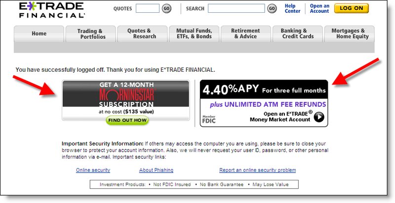
E*Trade is another financial institution using the logoff-screen real estate effectively. Today, they displayed two offers designed to attract additional customer assets to the bank (click on inset for a closeup):

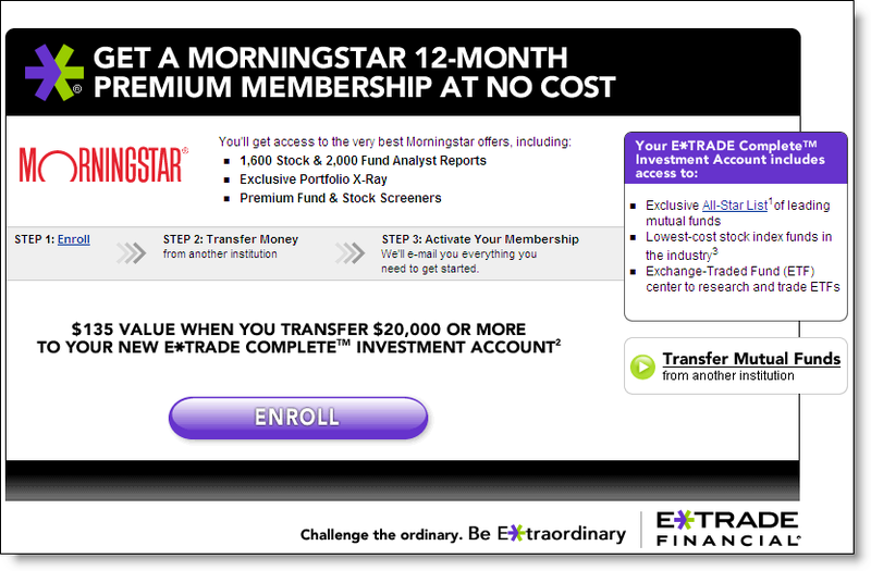
  1. Free one-year subscription to MorningStar’s stock-information service ($135 value) for transferring $20,000 or more into a new E*Trade Complete Investment Account (see the landing page below)
  2. 4.4% teaser rate (good for three months) for deposits into the bank’s Money Market Account. New customers earn the rate on any deposit amount, existing customers must deposit $25,000 or more to earn the special rate. After three months, rates revert to the normal, 3.6% for $50k or more or 2.75% for $5k to $25k (see the landing page below).Etrade_morningstar_offer

MorningStar offer landing page >>>

4.4% APY offer landing page>>> Etrade_logoff_mmda

JB

Chase Bank Pioneers New Advertising Outlet

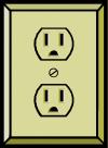
ImagesIn a novel advertising gimmick, Chase Bank affixed two-foot long banners, each pointing to one of 90 electrical outlets in the Indianapolis International Airport. The unique signage, which also includes four months of exposure on in-terminal flight-information monitors, will cost the bank $65,000 for the year, or just under $200 per day.

The signs and slogans are designed to appeal to traveling businesspeople. They include:

This outlet works. Now you can too.

You and your laptop may sigh with relief now.

Congratulations. You found a charge chair.

Analysis
We’ll leave the question of cost effectiveness of "outlet advertising" to the outdoor advertising pros. However, similar tactics could be used throughout a community to market online banking and small business services to users of WiFi-equipped cafes and coffee shops. For example, a bank could sponsor a WiFi directory that included names, locations, and hours of WiFi-equipped locations throughout town. For extra credit, include a map of electrical outlets, desired by many laptop owners so they don’t have to worry about having to rely on their batteries which are drained relatively quickly when going online.

Most coffee shops aren’t going to want a bank slapping advertising stickers on their walls. However, tent cards or brochures carrying the bank’s logo could provide WiFi instructions and locations of wall outlets.

With summer just a few months away, this would be a perfect task for a summer intern. Working with existing WiFi directories, the intern could scout out possible locations, map the electrical outlets, document contact information at each location, and post it all to the bank’s website. Alternatively, a bank could contract directly with an existing locator service to carry the bank’s advertising message.

–JB

Bank of America’s “Keep the Change” Banner on MSN

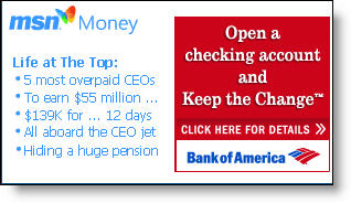
Bofa_msn_homepageAlthough we have concerns about the underlying program (see NetBanker Oct. 5, 2005), you have to tip your hat to the marketing execution of Bank of America’s Keep the Change campaign. Today a small but distinctive postage-stamp ad on MSN’s homepage, tied in with MSN Money headlines (see inset), invites readers to "Open a Checking Account and Keep the Change."

Bofa_msn_landingpageIt’s an intriguing headline and likely does well prompting clickthroughs. The landing page (click on inset right for a closeup) is also well done. A graphical explanation of the keep-the-change rebate is shown on the right, which helps alleviate the need for prospects to wade through the 479 words of fine print on the bottom of the landing page.

Another landing-page graphical element that you should immediately consider adopting: pictures of the three key banking products being pitched with simple checkboxes for selection (see below). However, in this case it’s used in a backwards fashion. Users are supposed to tell the bank which accounts they already have, rather than the ones they want to buy. This is counter-intuitive and should be redesigned.

Bofa_msn_landingpage_orderform_5

Bofa_msn_ddasav_appAfter selecting the BofA accounts already owned, users arrive on a secure Checking & Savings Account Application page that does a good job reinforcing benefits and referencing the original "Keep the Change" hook (click on inset left). A pop-up box offers live chat with a Deposit Specialist if desired.

Summary
The bank scores high for great online copywriting, superb graphics, and good ad positioning at MSN. We also like how Bank of America reinforces the benefits of automated savings. However, the offer is complicated and smacks of a gimmick that will do little to engender long-term loyalty or create a real savings ethic. Finally, the low 0.50 percent rate paid on the underlying savings account damages the program’s credibility and makes it less likely the account will be used to amass meaningful deposit balances.

Grades:
A+ for online advertising and sales (banner, landing page, application)
B+ for encouraging savings
C- for the debit card rewards program

Final Bank Marketing Score: Steelers 2, Seahawks 1

Pnc_steelers_homepageAs we analyzed PNC Bank’s identity protection services (see previous article), we happened to notice this timely photo of its hometown Pittsburgh Steelers, scheduled to compete Sunday in the Super Bowl against the Seattle Seahawks (click on inset for closeup). PNC is the official bank of the Steelers.

We were curious as to how many banks were leveraging Super Bowl fever in the states of Washington and Pennsylvania. Using Yahoo’s directory, we found only one of 27 Washington Banks (see below), and two of 68 Pennsylvania banks with homepage references to their home teams.

Firstmutual_seahawkcdAnd only First Mutual Bank <firstmutual.com> in Bellevue, Wash., has a promotion tied to the big game: a 4.05 percent "Championship Rate" on its High-Yield Money Market Deposit Account (click on inset for closeup).

Fidelitybank_steeler_homepageThe two Pennsylvania football tie-ins were simple eye-catching graphics on the homepage from Fidelity Bank (click on inset right for closeup) and PNC Bank (see above).

JB

Editor’s Note: Since the Steelers won 21-10, we are wondering whether bank website appearance may be a leading indicator of Super Bowl performance. We’ll see next year.

LendingTree promotion on MSN

Lendingtree_on_msn_jan06

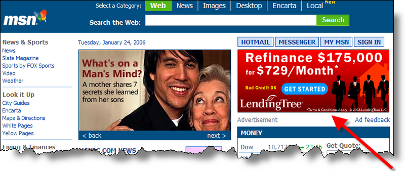
LendingTree has a prime spot on MSN’s main page today <msn.com>. The eye-catching burgundy ad in the upper-right corner features a 10-second animation ending with the call to action, "Refinance $175,000 now for $729/month." (click on above for closeup).

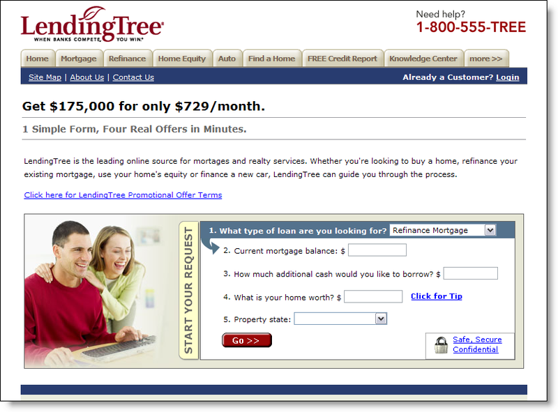
Lendingtree_on_msn_jan06_landingClicking through the advertisement leads to a five-question landing page designed to get the prospect engaged in a loan application (click on inset for a closeup). A small link near the top of the landing page takes visitors to a promotional offerings page with disclosures for several loan offers.

It’s simple and effective online marketing. The slogan on the top of the landing page says it all:

1 Simple Form, Four Real Offers in Minutes.
JB

Lead Generation Ideas for Finance Companies

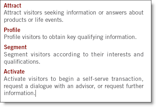
One of the goals of online marketing, especially financial services marketing where consumers may not be comfortable submitting personal data over the Web, is generating leads. According to LeadFusion <leadfusion.com>, the parent of Financenter, the leading financial calculator provider, there are four steps to good online lead generation:

Leadfusion_foursteps_1


The last step, ACTIVATE, is the key to identifying sales leads. While most major financial institutions have financial calculators available online, how many of them are used to capture leads? Since most customers will not put up with a registration process BEFORE using the calculator, you must entice users to identify themselves at the end of the calculations.

Some common methods:

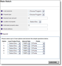
  • Etrade_ratewatch_signup_1Subscribe to an information alert: Users sign up to receive email messages when certain events occur, such as rates hitting a certain level; for example, E*Trade's Rate Watch (click on inset to see the sign-up form).
  • Complete an interactive coupon: Even normally wary consumers will hand over a surprising amount of personal data if you provide a tangible benefit, such as a significant discount or valuable freebie. One of our favorite examples, which was used continuously for more than five years, was Salem Five Bank's <salemfive.com> $100-off Mortgage Closing Costs coupon. The coupon, which is no longer used, required users to enter their name, phone number, and email address. Then they could print a personalized coupon that would save them $100 on a mortgage.
  • Fine-tune these calculations: Users wishing to perform deeper analysis will be asked to register first. Registration should be brief: name, email address, and optional phone number. You can also capture inputs to the calculator, but intent to retain this data must be disclosed to the user.
  • Lock in a special offer now: A tried-and-true DM practice, the time-sensitive offer. Tell users that rate/price/discount/premium can be locked in, if they enter their name and email address now.
  • Sweepstakes/contests: It's one of the most cost-effective ways to pull a large volume of leads. The downside is the sheer volume of unqualified prospects that throw their name in the virtual hat for a chance at that iPod NANO. Make sure you include several simple qualifying questions. For examples, see the previous NB articles in the Advertising & Promotion category.
  • Set up an appointment: This may not be selected by many, but you should offer the option of setting up a meeting on the phone or in a banking office to discuss the product further.
  • Apply Now: Most importantly, ask for the order.

For more information:

Marketing Promotions on Your Banking Website

Wells_homepage_layout_2

There are many ways to boost the sales effectiveness of your website, from the navigational layout to copywriting and security assurances. But one area that deserves attention is the design, layout, and placement of the homepage promotions, along with landing page displayed when clicking through for more information.

In terms of overall design, we recommend banners and links that attract attention without dominating the page. Since most visitors are at your site to find specific information, say CD rates, you don’t want a banner for auto loans dominating the page, potentially sending users to another site that’s easier to navigate.

You also need to be mindful of your image. Do you want to look like Overstock.com, pitching special offers and deals, or do you prefer a more understated tone, like a professional adviser? You want the homepage to reflect your overall marketing strategies to the online segment.

There are several approaches that have gained popularity in the past several years. Today we’ll look at one of the best approaches:

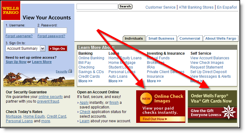
Small "postage stamp" banners in the lower portion of the screen, but above the fold (click on inset above for closeup). For example, Wells Fargo’s layout for the past three years displays square banners in the lower-right corner. Currently, two of eight possible choices are shown when the user arrives at the site (click refresh a few times to cycle through all eight).

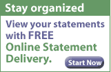
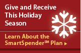
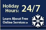
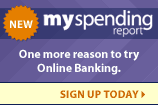
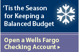
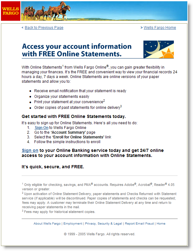
Each banner leads to a well-crafted landing page with more information about the product or service. Not all of the banners are product pitches. For example, one describes an online feature, My Spending Report (NetBanker Feb. 17); another is service oriented, reminding users that they can access accounts 24/7 even during the holidays; while another (see Landing Page below) is designed to save the bank money by encouraging users to receive electronic statements instead of paper ones (click on the banners below for a closeup).

Gallery of Wells Fargo homepage banners displayed Dec 27, 2005

Wellsfargo_homepage_ad8 Wellsfargo_homepage_ad7 Wellsfargo_homepage_ad6 Wellsfargo_homepage_ad5 Wellsfargo_homepage_ad4 Wellsfargo_homepage_ad3  Wellsfargo_homepage_ad2_1 Wellsfargo_homepage_ad1

Landing Pages
It’s one thing to get your banner noticed, but then what? Users that click for more information should be led to a specific page, called a landing page, that reinforces the banner and provides more information. If the ultimate goal is a product sale, then the landing page should act as a funnel, delivering users to a single, actionable step, BUY. Extraneous navigational choices, like cracks in a plastic funnel, simply cause leakage of an extremely valuable commodity, interested prospects.

Wellsfargo_landingpage_for_ad6Wells Fargo has a separate landing page for each of the eight banners shown above. At left (click for closeup), you can see the one created for the "FREE online statement delivery" banner. In this case the bank is hoping to boost usage of online banking, and specifically the online statement feature, which has the potential of not only improving account retention, but also cutting printing and postage costs as users elect to turn off paper statements (required in this case).

JB

If you’re in need of more financial interactive marketing ideas, check out the Interactive Financial Marketing Database from our sister publication, the Online Banking Report.

Holiday Bill Pay Sweepstakes

Digitalinsight_billpaysweeps_logoTo increase electronic bill payment usage, both Digital Insight and Online Resources are sponsoring holiday usage sweepstakes that client banks can offer to end-users. Modeled after similar programs at MasterCard and Visa, the promotions provide an incentive to pay bills online. By pooling the entries from all participating banks and credit unions, the prize pool is bigger than if a single financial institution sponsored it individually.

Some highlights of the two programs:

Digital Insight <www.diproductsite.com/q4_05_pay_anyone/splash/splash.html>

  • One single prize of $30,000 across all participating financial institutions
  • Three-month duration: One entry after paying 10 bills between Dec. 1 and Feb. 28
  • One additional entry for each payment greater than $10 (maximum 10 additional entries)
  • No more than one payment per payee per month counted towards total

Online Resources <www.orcc.com/sweeps/holiday05>

  • One grand prize of $5000, two first prizes of $250 gift cards, plus one second prize of $100 for each participating financial institution
  • Two-month duration: One entry for every bill paid between Nov. 1 and Dec. 31, 2005

AnalysisOrcc_billpay_sweeps
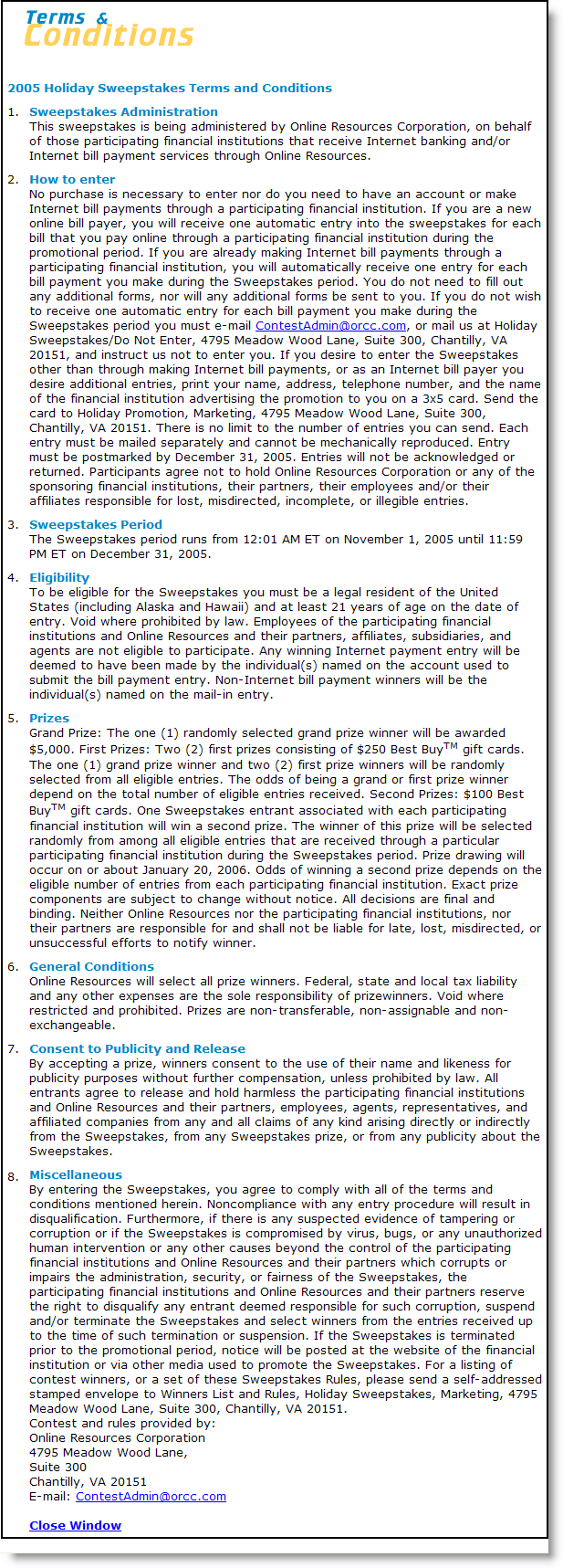
We like the concept behind both programs. Fourth quarter usage sweepstakes and bill pay marry very well. The Online Resources program is easier to understand with virtually no fine print (click on screenshot right for a closeup); however, it featured a stingy $5500 prize pool (not including the $100 for each participating bank/credit union).

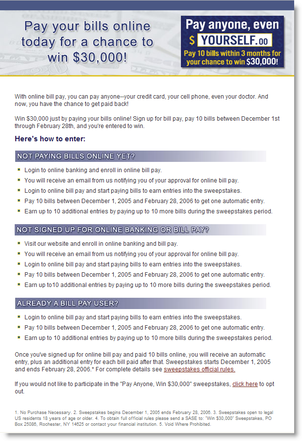
Suttonbank_billpay_sweepsIn contrast, Digital Insight offered an eye-catching $30,000 grand prize, but offered no smaller consolation prizes (click on inset left for a closeup of the contest rules). It also required 10 payments before the user was entered into the drawing, a detriment to lower-volume, casual users.

Other Bill Pay Sweeps

  • RBC Centura <centura.com> is offering a total prize pool valued at just under $10,000, with a grand-prize trip to the ACC basketball tournament (valued at $3500) and 100 runners-up earning $50 in ACC merchandise. Users receive one entry each day they pay a bill between Dec. 2, 2005, and Feb. 17, 2006 (click here for screenshot).
  • In another basketball-themed promotion, University Credit Union <ucu.org> in Southern California is giving away tickets to UCLA basketball games, and a grand prize of a John Wooden autographed ball, to members using bill pay in Oct/Nov/Dec. Users receive one entry per bill paid (click here for screenshot).
  • PNC Bank <pncbank.com> has been running a bill payment sweeps for its business customers since mid-year. Each month, one out of every 100 new bill pay customers receives their choice of an iPod, $300 Marriott travel card, or $300 Staples card. In addition, each month the same prize choice is awarded to one existing customer who paid a bill that month. The sweeps ran from July 1 to year-end. (click here for screenshot)

JB

Unique Identity for Business Banking

There are several ways to make it easier for business banking customers to find the right area of your website:

  • Complete unique URL such as Abbey National’s <anbusiness.com>
  • Business/biz appended to the URL such as Vancity’s <vancity.com/MyBusiness>
  • Business added within the URL such as Barclay’s <www.business.barclays.co.uk> or LaSalle Bank’s <vip.lasallebank.com> for its private banking area
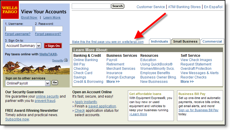
  • Use cookies to automatically display the business area when users type your normal URL. Wellsfargo_homepage_defaultsetting_2 Wells Fargo uses this technique. When homepage visitors choose the Small Business area, a small text link asks, Make this the first link you see on wellsfargo.com (click on inset for a closeup) which sets a cookie to redirect users to the Small Business area each time they go to the main bank site.

Analysis
All of these techniques are trivial to program and can help differentiate your business offerings from your personal product line. We especially like Abbey National’s unique business URL that can be a memorable device in print ads and direct mail. Also, anyone with a separate business offering should consider the optional user-set cookie approach of Wells Fargo.

JB

TD Waterhouse Gives Away iPod Nanos

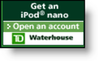
Tdwaterhouse_nano_yahoofinanceIs there a single online financial services customer that wouldn’t want an iPod nano? Even if you didn’t like sticking white tentacles in your ears, surely someone in the extended family would graciously accept one as a gift.

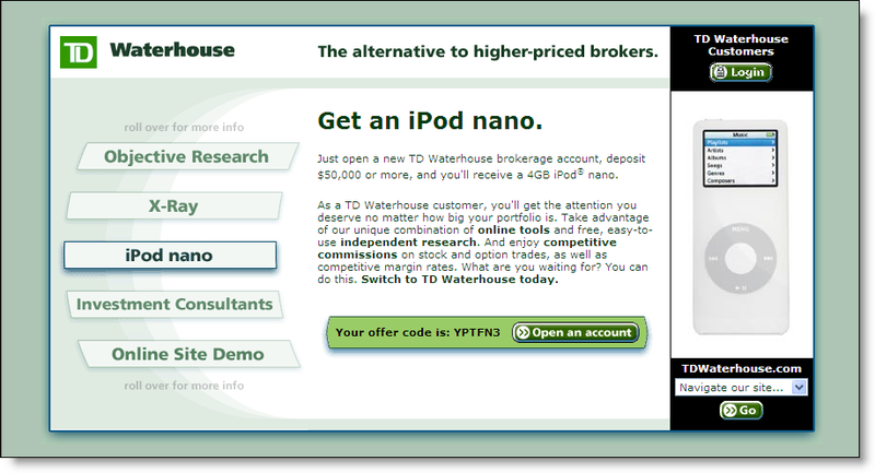
At $200 a pop, it’s a pricey premium, but TD Waterhouse <tdwaterhouse.com> is using it to attract new brokerage customers. Small banners located in various spots within Yahoo Finance <finance.yahoo.com> say exhort users to, "Get an iPod nano" (see inset). Tdwaterhouse_nano_landingpage_1 The brokerage doesn’t actually use the word FREE in the banner or on the landing page (click on inset for a closer look); but it’s certainly implied, and in fact, it is free if you follow the rules (see below). The offer is not mentioned on the broker’s main website.

Details
As an industry analyst, we love these offers; not because of the flashy premium itself, but for the mountains of fine print we get to dissect. Unlike Citi’s free iPod Mini offer, which has users jumping through hoops such as making at least two bill payments per month, TD’s offer is pretty straightforward:

     – Open a new account with at least $50,000
     – Keep it there for at least 6 months
     – New or existing customers qualify

The biggest exclusion: RETIREMENT accounts don’t qualify, nor do corporate, custodial, partnership and 529 college savings plan. Retail value is estimated at $249 and the company warns that it may be considered taxable income.

JB

If you’d like to some more original financial marketing ideas, check out the Interactive Financial Marketing Database from our sister publication, the Online Banking Report.

Citibank’s Comprehensive Loyalty Program

Definition: loy·al  (loil) adj. Steadfast in allegiance

Citi_thankyou_3 When I was a graduate student 17 years ago, I did a lot of research into so-called loyalty programs. At that time, other than the airlines and grocery stores (think S&H Green Stamps); it was a relatively new concept.

Now, just about every modern retailer has a loyalty program of one form or another, from pizza joints (our favorite spot has a “frequent pier” discount), to book stores ($25 annual fee for at 10% discount at Barnes & Noble), and even pet stores. The programs typically provide discounts, VIP services, and/or special programs for frequent customers.

Many financial institutions provide loyalty features such as relationship pricing, rewards for credit/debit card usage, personal bankers, and events for high-net-worth clients. But Citibank is breaking new ground with its Thank-You Points program.

The new rewards program has been featured in media campaigns for the past several months (thank you Citibank for focusing on the positive rather than continuing to over-publicize the identify theft problem). The program delivers points both for the depth of the Citi relationship and the amount of debit card spending. Spending on the many of the bank’s credit cards, including the new Simplicity card, also count for points.

Debit card spending is straightforward, earning 1 point for every $2 spent on signature debit and 1 point for every $3 spent on PIN debit. Credit card spending earns 1 point per dollar.

Citi_rewards_chart_1Relationship points are earned for anyone having 3 or more accounts with the bank, and range from 25 points per month with 3 products and a Citibank Access checking account to 1200 points per month for someone with 7 or more products and a CitiGold Account (click on inset for more detailed information). An online tool is available to help users estimate the reward points they will accrue.

Customers are NOT automatically enrolled; they must call a toll-free number to enroll. There is no online enrollment option. Points can be redeemed by phone or through a dedicated website, <ThankYouRedemptions.com> which is currently closed for remodeling and due to reopen next week.

Example rewards:

  • 20G iPod = 50,000 points
  • round-trip coach air fare = 25,000 points
  • make a wish = 25,000 minimum
  • gift certificates: $5 = 1000 points; $10 = 1500 points; $25 = 3000; or $10 per thousand for larger amounts

Analysis
Loyalty programs can have a significant impact on customer retention and purchase behavior. However, the programs have three inherent problems:

  1. Cost of communicating the incentives and member reward status
  2. Consumer disinterest/apathy/fatigue with the program
  3. Cost of the incentives

Online delivery helps solve the first two problems. With email and web-based delivery the cost to communicate the details of the loyalty program are negligible, other than the fixed cost to create the communication. Second, the program can be kept fresh with continual feedback to the user when logged in to online banking. A progress chart along and program news serves as a constant reminder of the program benefits.

However, online delivery does little itself to impact the cost of the incentives. In fact, by making it easier to track and redeem rewards, you may be actual increase incentive costs due to higher redemption levels. On the other hand, if you increase interest and awareness, you may be able to get equivalent lift from lower-cost rewards.

The final word: Online delivery has the potential to greatly increase the impact of bank loyalty programs. So, expect other major banks to enact programs similar to Citi’s. If you have a loyalty program, you may want to look at how it’s delivered online. If you are not doing anything to systematically reward your best customers, you may want to add this to your 2006/2007 plans.

JB

Reference: Citi ThankYouRewards screenshot (links do not work)